


Harcus Design – Chiaro
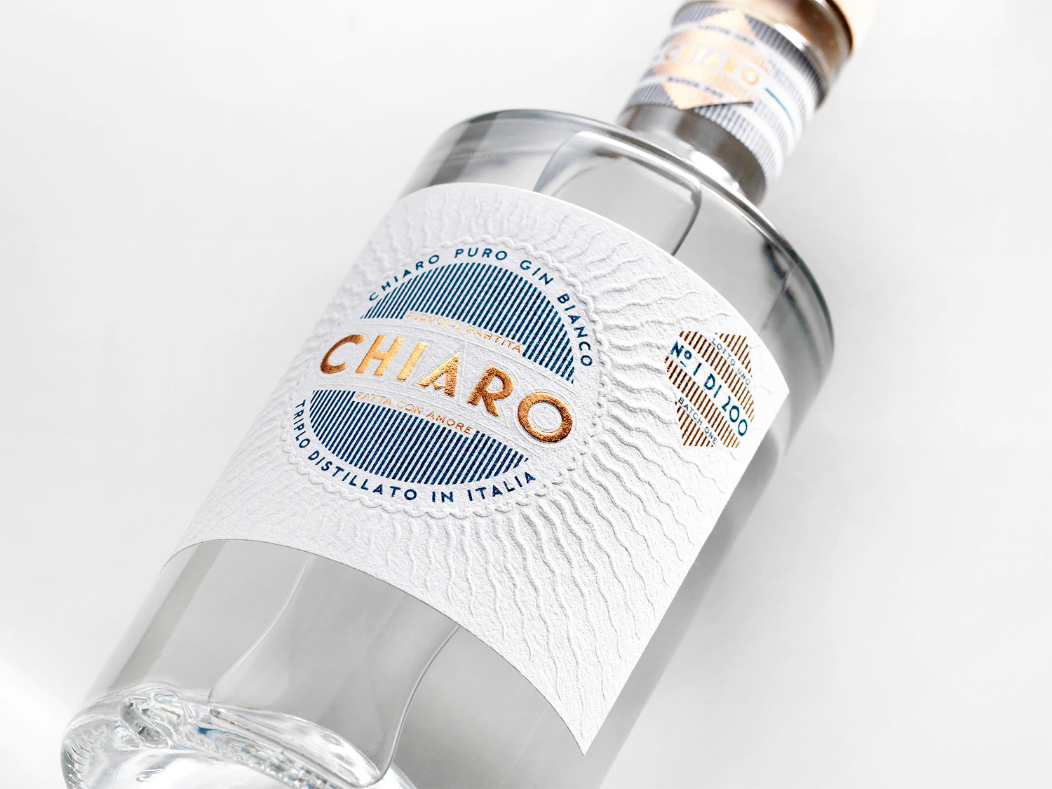
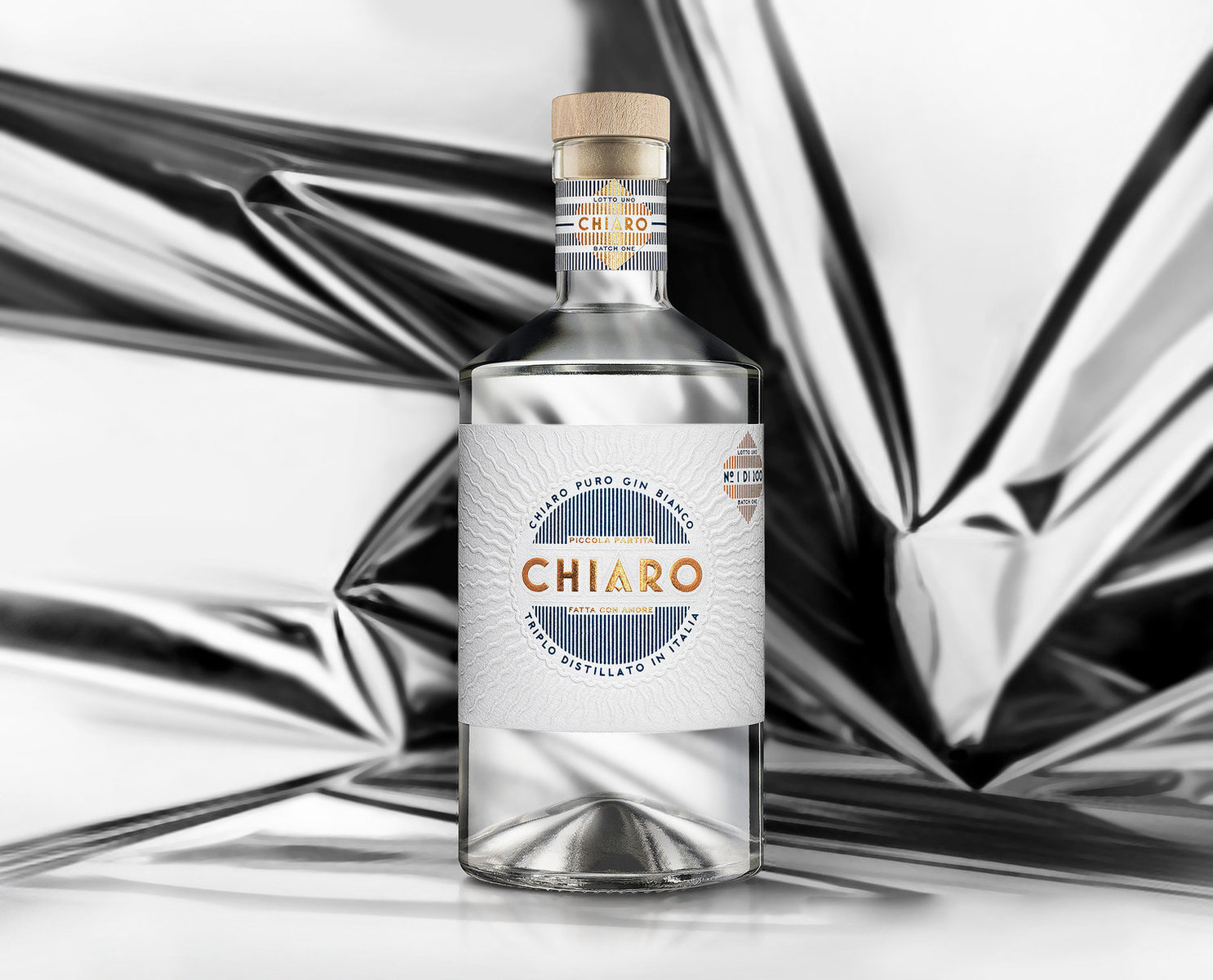
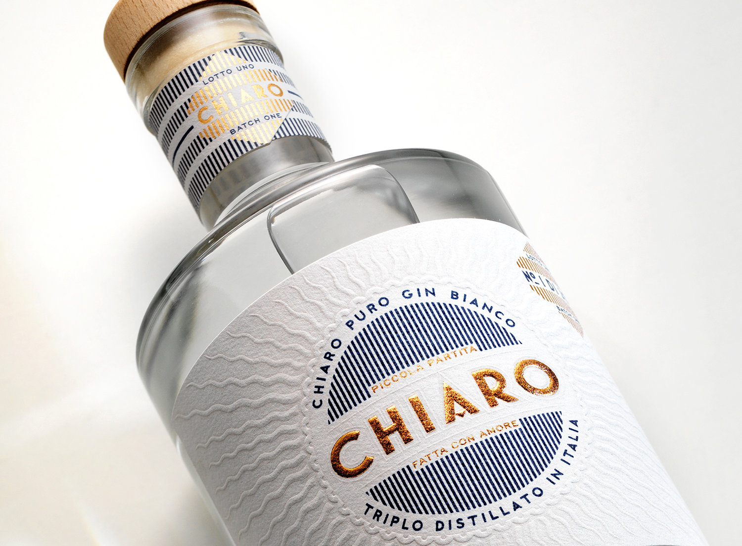
Chiaro – Italian; meaning bright, luminous, light.‘Chiaro Gin’ was designed as new addition to the Spicers Wine & Gourmet Companion, a compendium of their range of narrow web self-adhesive stocks, used primarily in the packaging of wine, beer, spirits and gourmet foods. Each was approached as stand-alone packaging project expressing individuality and appropriateness to relevant markets.A true reflection of the beautiful bright ultra-white cotton paper stock that is Spicers Cotone Extra Bianco Ultra. The design highlights its amazing embossing qualities.
CREDIT
- Agency/Creative: Harcus Design
- Article Title: Italian Origin Chiaro Gin
- Organisation/Entity: Agency, Published Commercial Design
- Project Type: Packaging
- Agency/Creative Country: Australia
- Market Region: Oceania
- Format: Bottle
- Substrate: Glass, Pulp Paper
FEEDBACK
Relevance: Solution/idea in relation to brand, product or service
Implementation: Attention, detailing and finishing of final solution
Presentation: Text, visualisation and quality of the presentation


