


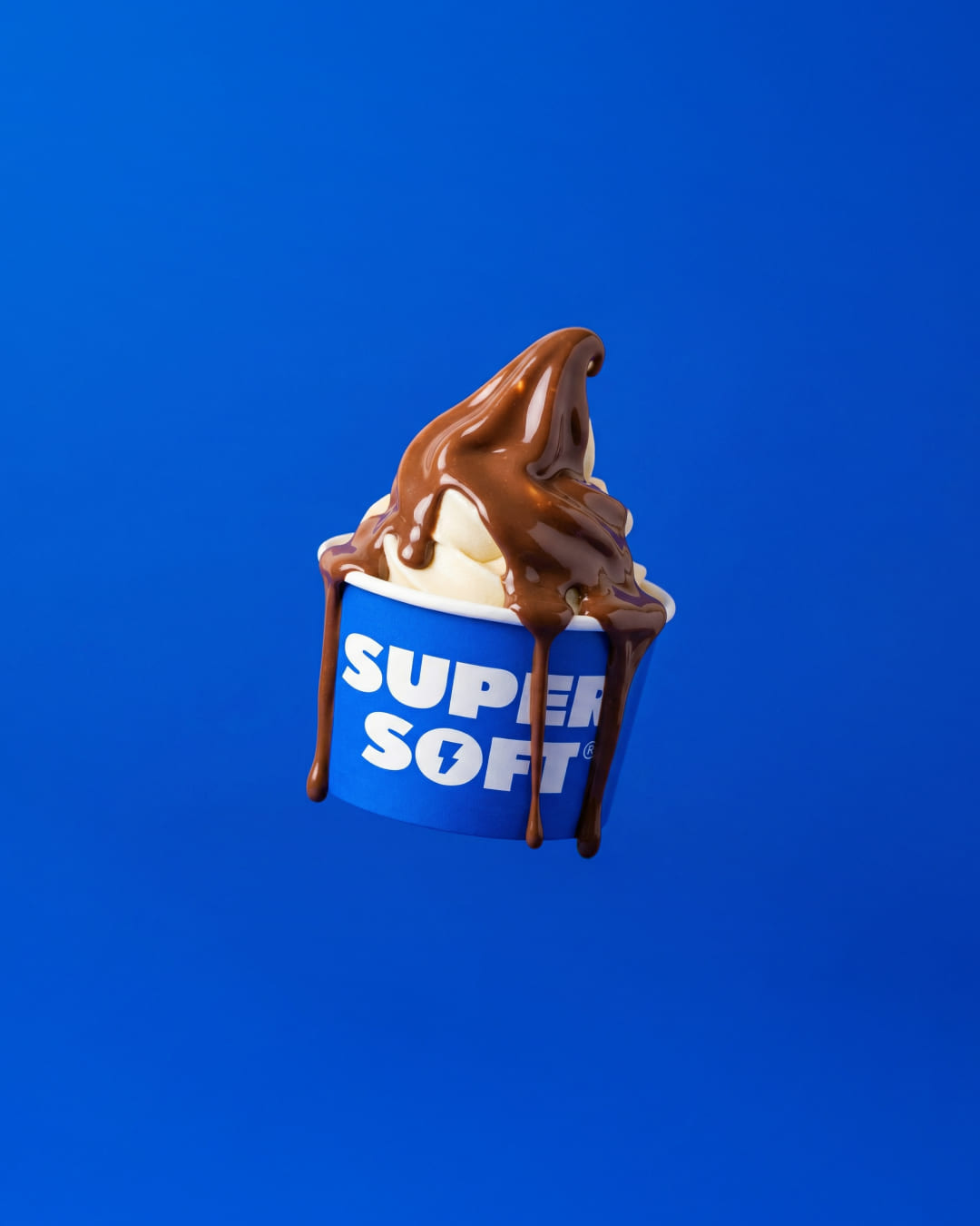
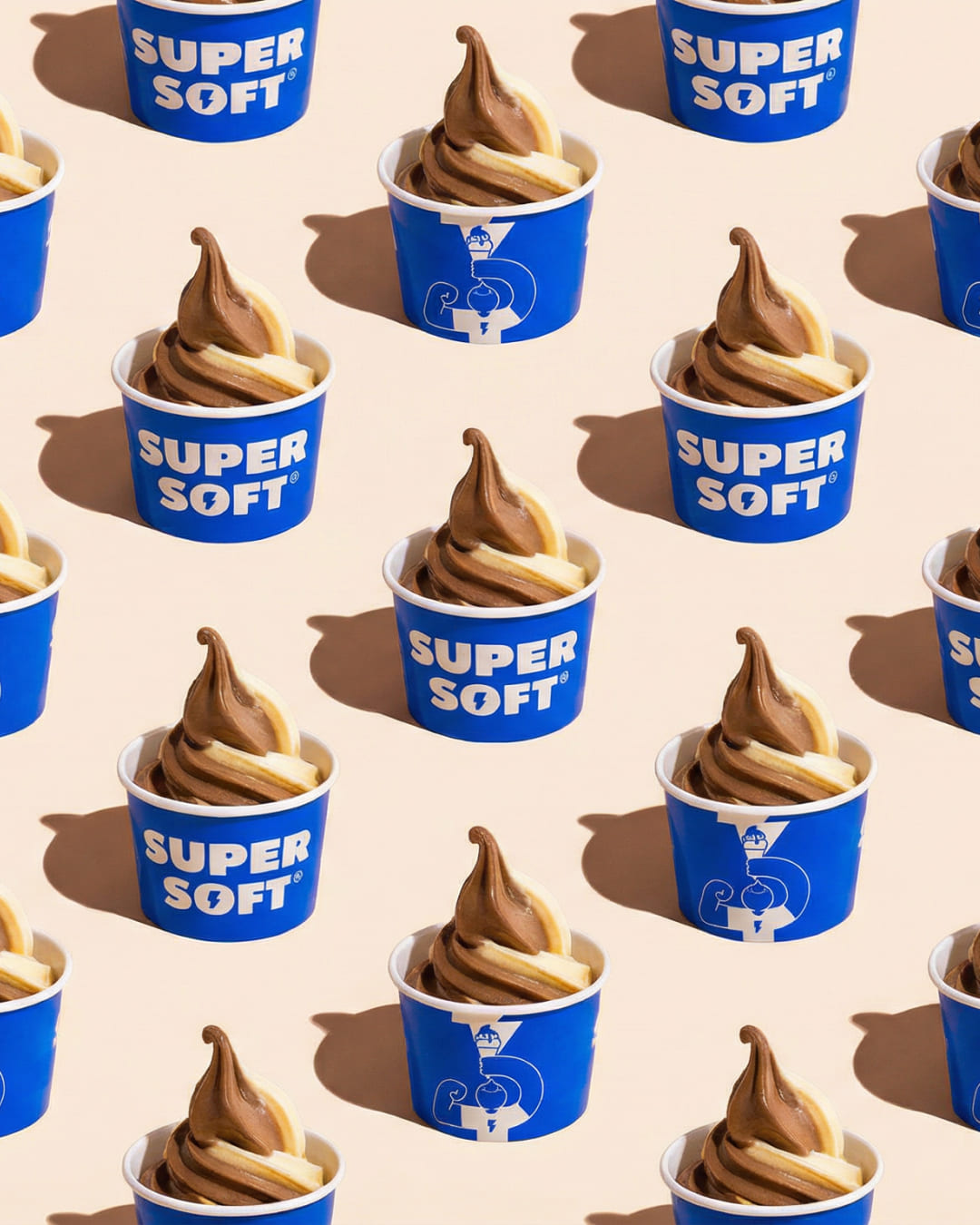
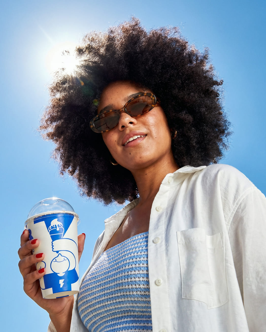
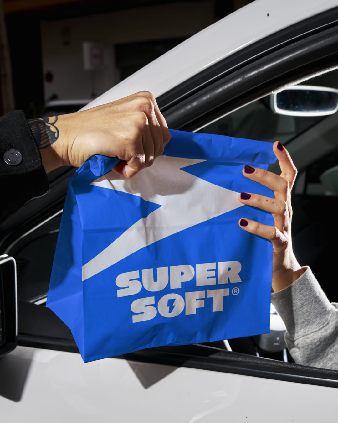
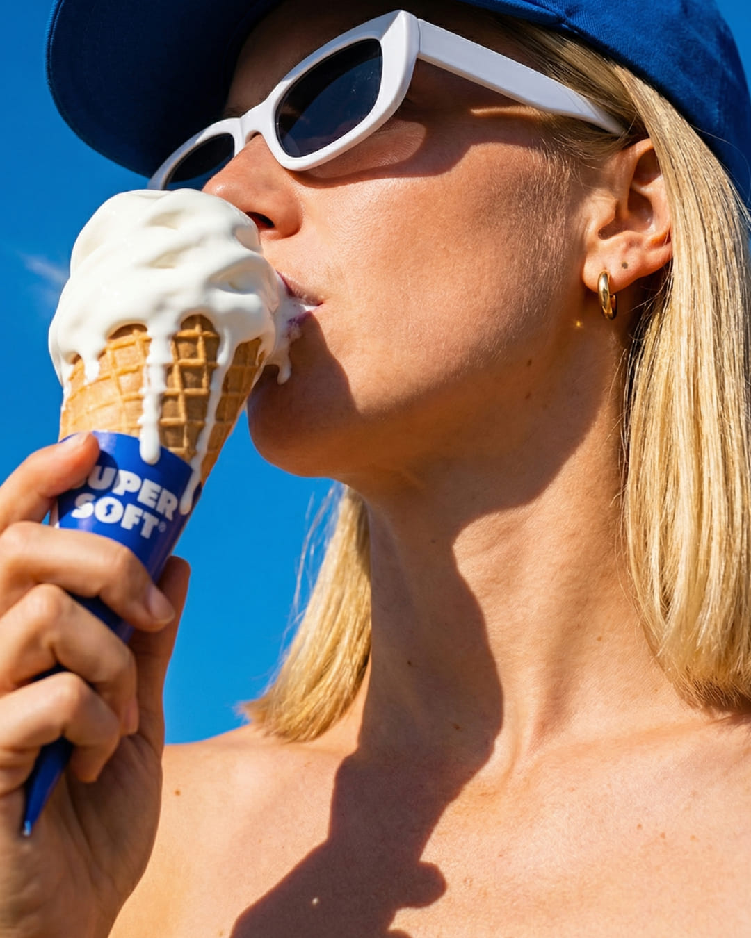
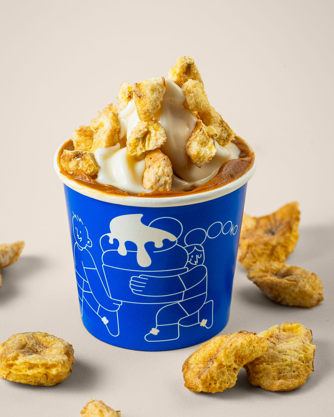
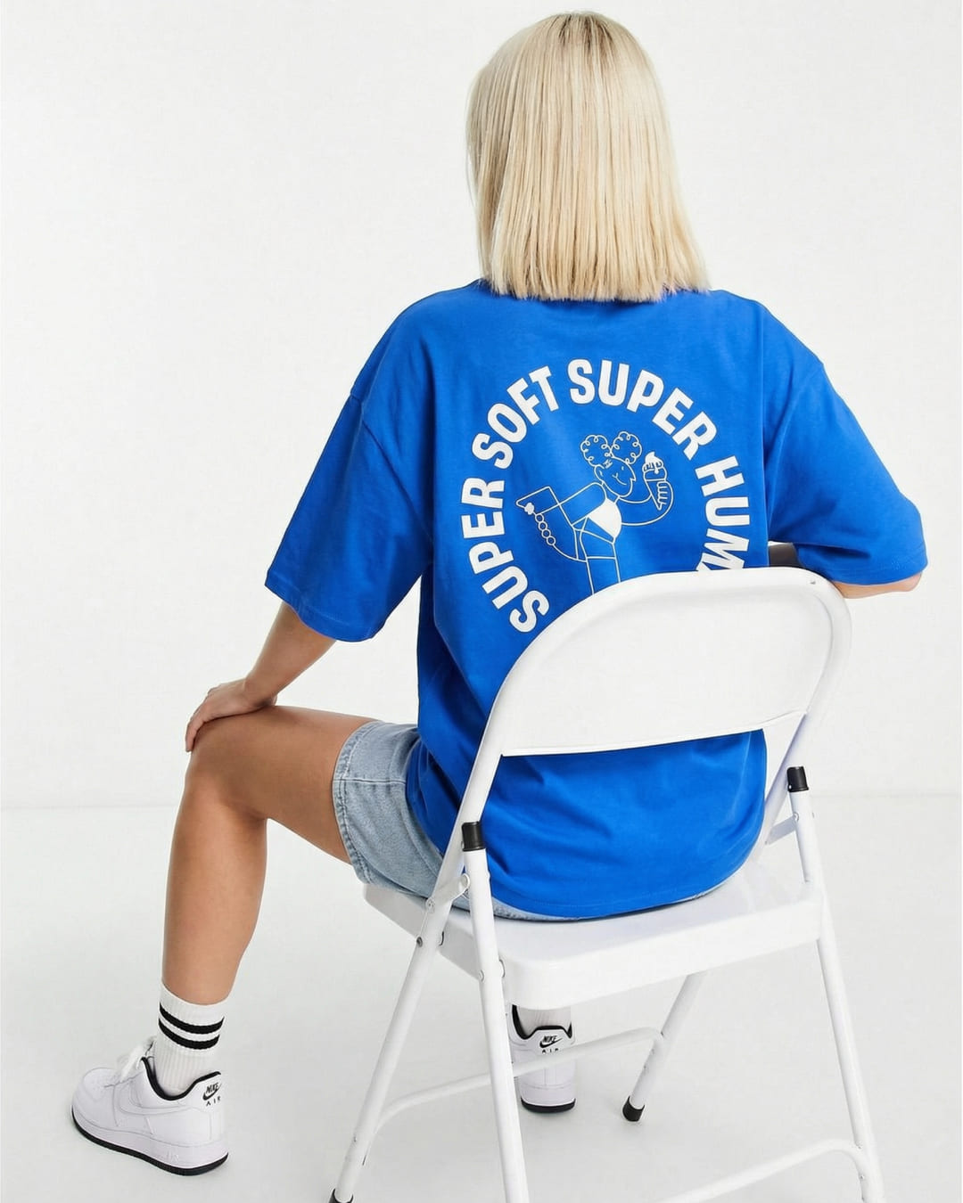
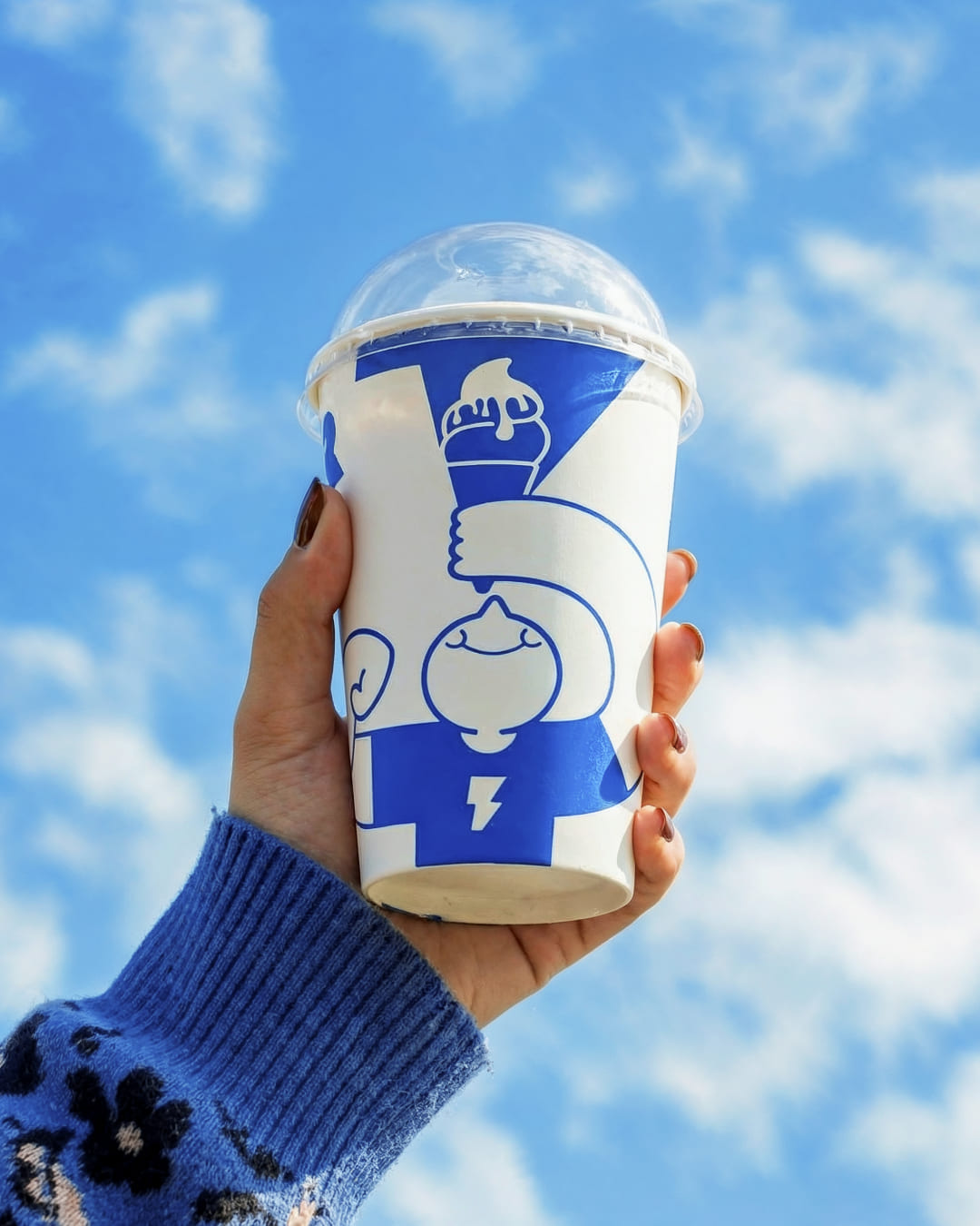
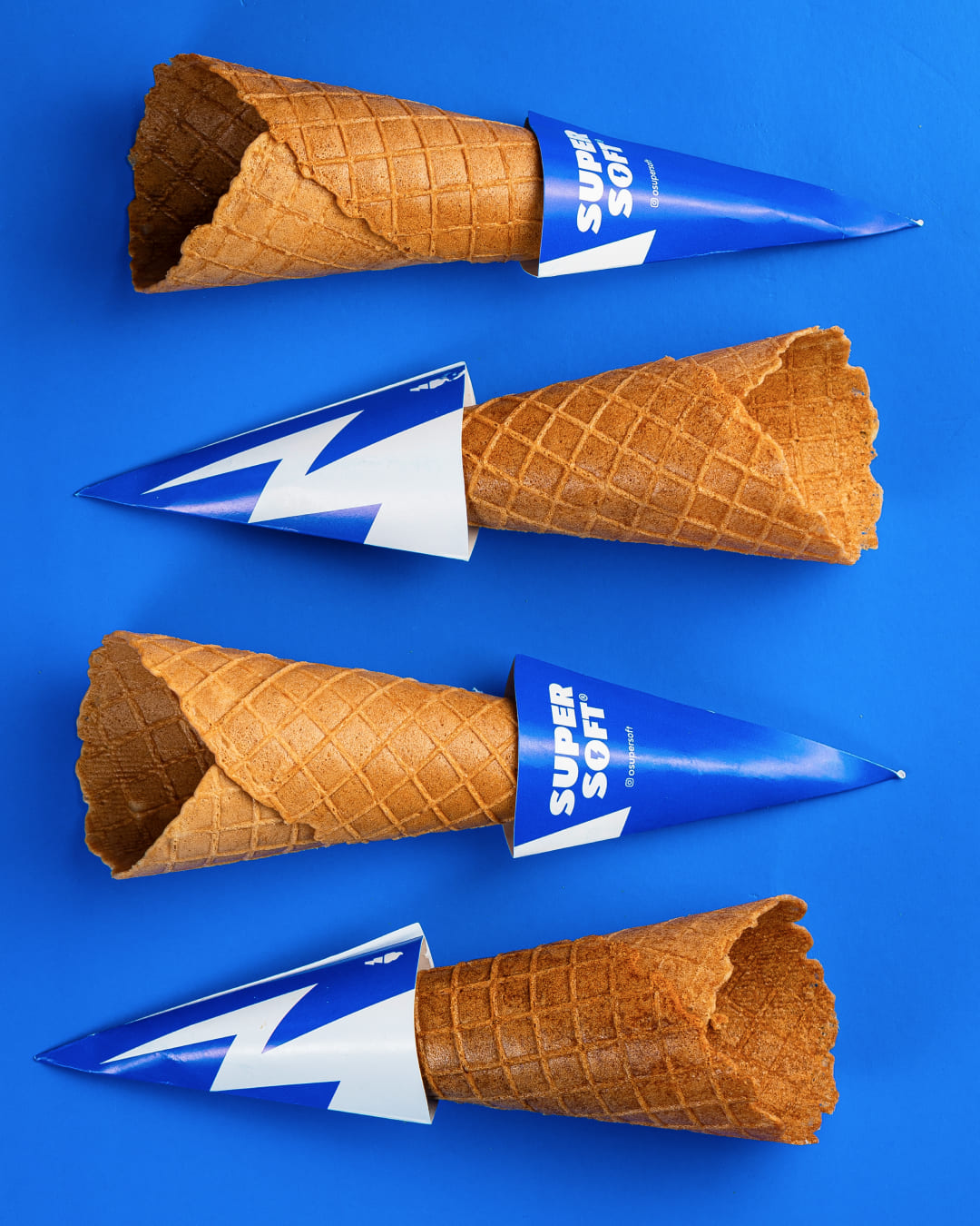
Super Soft was created from a bold question: how can a guilty pleasure become a daily ritual? Positioned as Brazil’s first protein soft serve, the brand introduces a new dessert category that combines superfoods, zero sugar, high protein content, and a creamy texture designed to fit naturally into a healthy lifestyle. Instead of being an occasional indulgence, Super Soft was built to become part of everyday routines — a dessert that supports performance, balance, and well-being. In a crowded market of “fit” ice creams, gelatos, and açaís, the strategy focused on reframing soft serve — traditionally seen as a sugary villain — into a hero. By embracing the hero archetype, the brand transforms dessert into a symbol of energy, strength, and empowerment. The narrative shifts the conversation from guilt to power, positioning the product not as a compromise, but as an evolution. Dessert is no longer something to justify; it becomes a smart, confident choice. From naming and brand storytelling to visual identity and tone of voice, every element reinforces this positioning. The name “Super Soft” reflects both the iconic creamy texture and its enhanced, functional qualities. The lightning bolt logo replaces the traditional cone, signaling dessert-powered energy and breaking category expectations. A bold blue color palette contrasts sharply with the pastel tones common in frozen desserts, helping the brand stand out while communicating freshness and modernity.Dynamic illustrations depict everyday moments when people need an energy boost — before workouts, between meetings, during study sessions, or as a better-for-you dessert option. Lactose-free, gluten-free, and sugar-free, Super Soft is designed to be fun, functional, and inclusive. More than a product, it represents a mindset: indulgence and performance coexisting in one powerful, lifestyle-driven experience. From naming and narrative to visual identity and tone of voice, every element reinforces this positioning. The lightning bolt logo replaces the traditional cone, signaling dessert-powered energy, while a bold blue color palette breaks away from the pastel tones typical of the frozen dessert category. Dynamic illustrations highlight everyday moments when people need an energy boost — before workouts, between meetings, or as a smarter after-dinner choice. Lactose-free, gluten-free, and sugar-free, Super Soft is designed to be fun, functional, and inclusive, turning dessert into a symbol of balance and modern living.
CREDIT
- Agency/Creative: Ismo design
- Article Title: Ismo Design Gives Super Soft a Fresh Identity for the Better for You Dessert Market
- Organisation/Entity: Agency
- Project Type: Identity
- Project Status: Published
- Agency/Creative Country: Brazil
- Agency/Creative City: Porto Alegre
- Market Region: South America
- Project Deliverables: 2D Design, 3D Design, 3D Motion, Art Direction, Brand Design, Branding, Design, Graphic Design, Illustration
- Industry: Food/Beverage
- Keywords: Branding, Brand strategy, Category creation, Positioning, Hero archetype, Disruptive branding, Narrative design, Tone of voice
-
Credits:
Art Direction: Caroline Campos & Felipe Johann
Motion Design: Otu00e1vio Castro
Illustration: Gabriel Klaus
Design: Maria Eduarda Conceiu00e7u00e3o & Gabriel Klaus
Portfu00f3lio Design: Otu00e1vio Castro & Gabriel Klaus


