The challenge
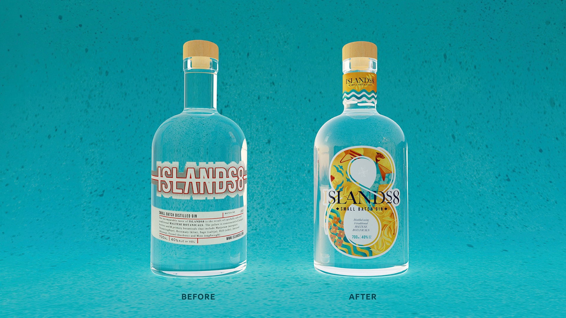
Islands8 gin had launched with a simple label design, but with ambitions of growing gin consumption in Malta, the owners needed a strong brand and standout label design to attract new consumers locally, as well as internationally.
The opportunity
Having done our research, it was clear that the following was true of the gin category:
Gin enjoying the same resurgence in popularity across drinking ages, as seen in Europe
A younger audience more readily choosing imported drinks brands for reasons of credibility
In various drinks categories, an increasing followship for artisan and craft products and small producers (reflecting global trends)
Couple that with the following market truths, and the bigger opportunity became to create a Maltese national gin icon – just as Cisk is for beer and Kinnie is for soft drinks.
Market truths:
The Maltese are almost universally proud of their heritage and national identity, although there is some reticence in younger consumers around overt nationalism.
Consumers across the social spectrum share similar concerns: the demise of the countryside and sustainability, congestion, corruption, the pressures of living in the ‘always on’ digital world.
The Maltese are inherent ‘foodies’ and there’s a vocal pride in national products and brands where quality is seen to be high.
The strategy
As its name suggests, Islands8 is made using eight traditional Maltese botanicals. From our review, it was clear that the brand fitted into the ‘New Romantics’ family of gins, where place and flavour is evocatively linked.
But with category cues of feminine, display worthy bottles combined with the botanicals and flavours inspired by the rugged Maltese landscape, we needed to embrace the tension of ‘rustic but refined’.
We did this by identifying two key brand principles:
Grounded – where Islands8 evokes a real sense of place and terroir and strong physical connection to the Maltese land. It’s down to earth and unmistakably Maltese. In design terms that meant simplicity, evoking the landscape and a sense of romance and warmth
Exuberance – Islands8 is a true and bold reflection of the Maltese people and their values. Where the festa fireworks are loud, proud and joyous. They’re never afraid of saying how they feel and islands8 gin is equally bold and generous in flavour. In design terms that meant playfulness, colour, generosity and intrigue
The idea
‘Full on Malta’ completely encapsulates these principles and provides a North Star for the brand:
“This is Malta. The centre of the Mediterranean in all its beautiful intensity. Where cultures collide, the language echoes every point of the compass, and the landscape is wildly dramatic. Our flavours are bold, and our attitude is uncompromisingly honest. Loud and proud, we don’t do anything by halves.
All this is perfectly captured in Islands8 – a big hearted gin that stirs the senses, unleashes the imagination and sets the pulse racing. Where the 8 native botanicals of our terrain – wild thyme, sage, rosemary, mint, fennel, aniseed dill and marjoram – together create a spirit of generosity and complexity.
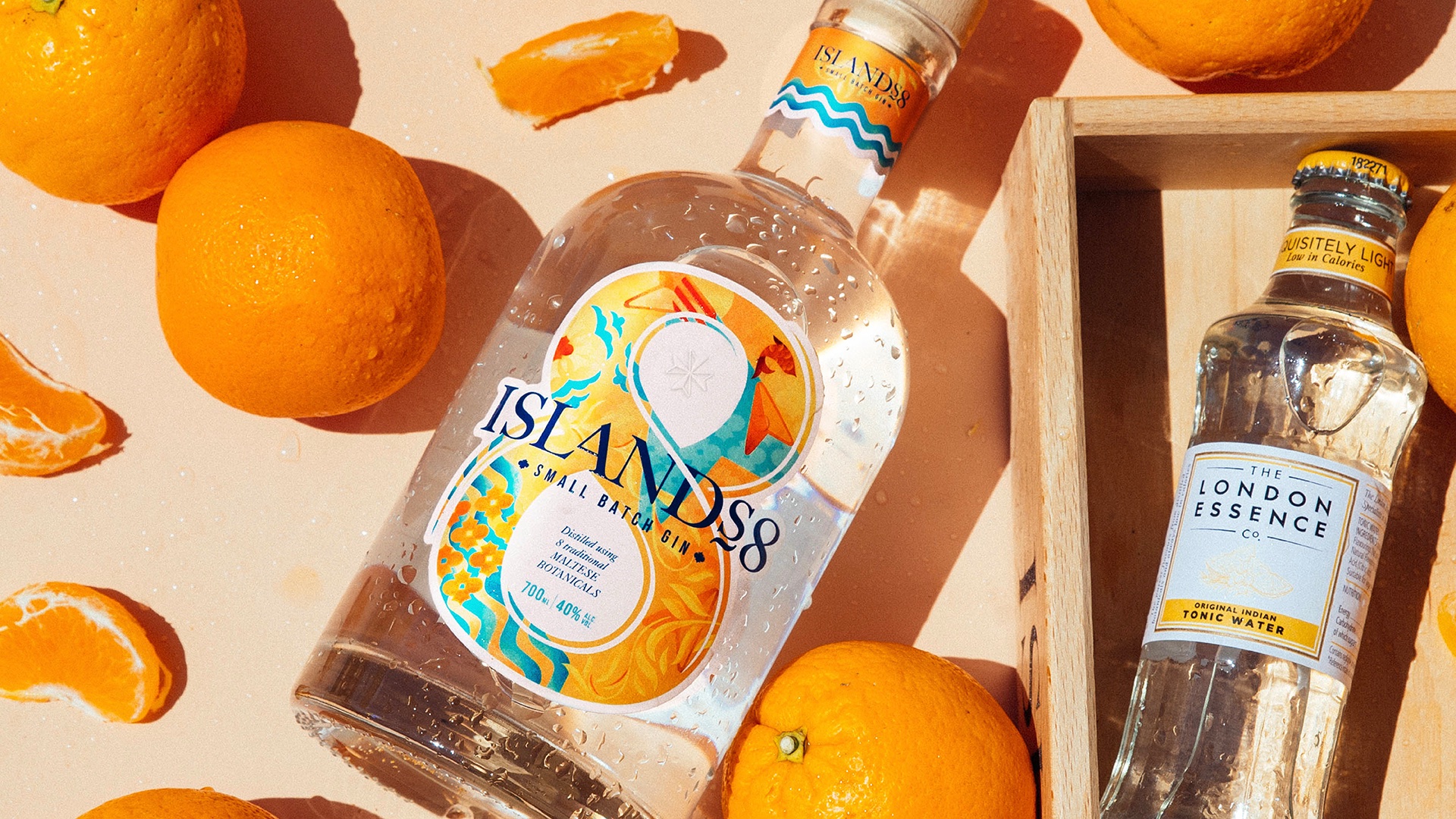
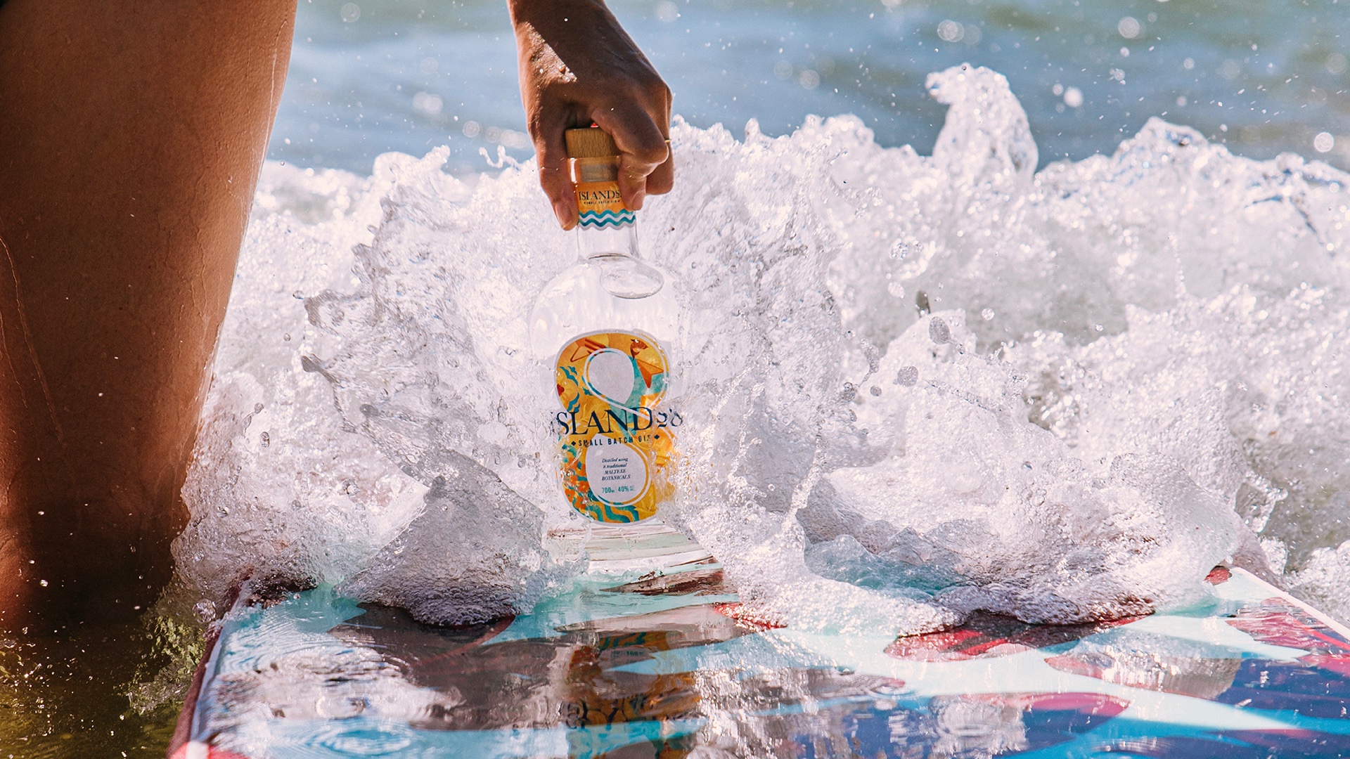
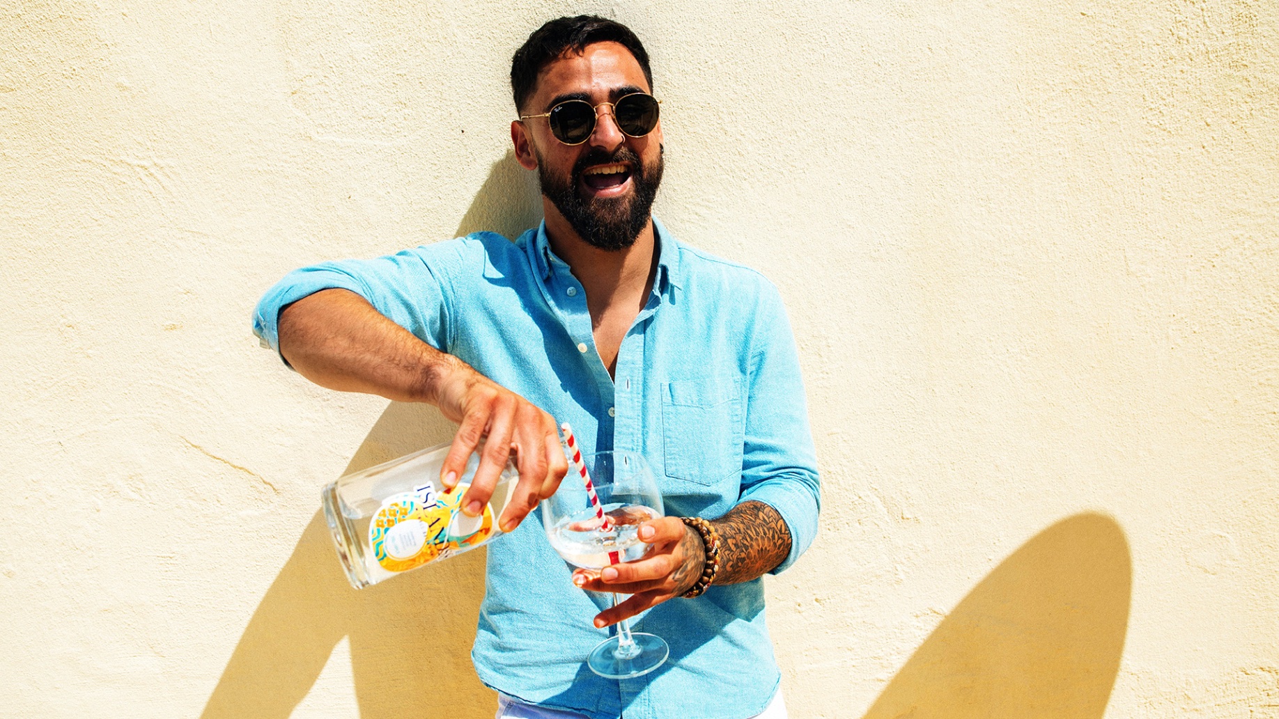
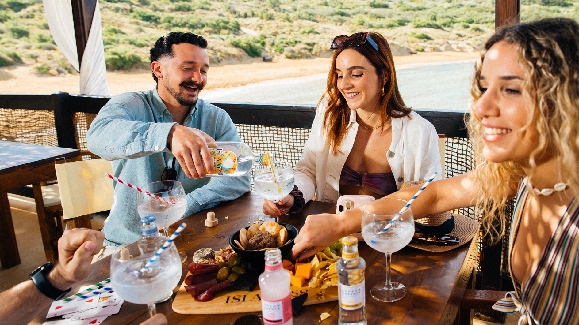
Islands8 is just waiting for a large glass and your favourite tonic, poised to be part of your own Friday-night festa. A brave and playful departure from the super-serious. A gin that invites you to take a walk on the wild side and throw your arms around our magical island.”
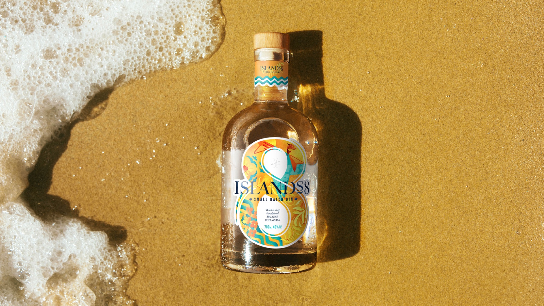
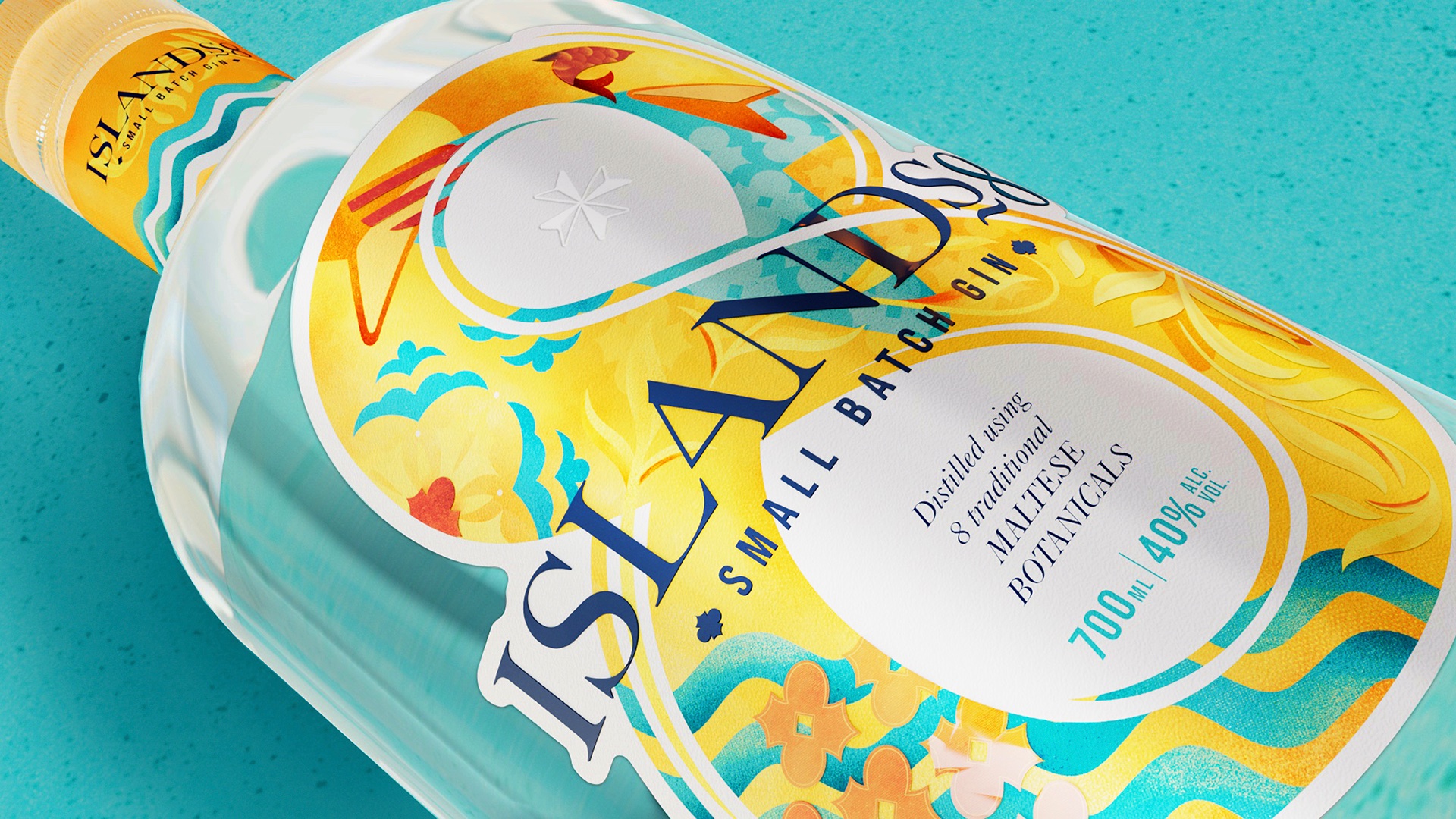
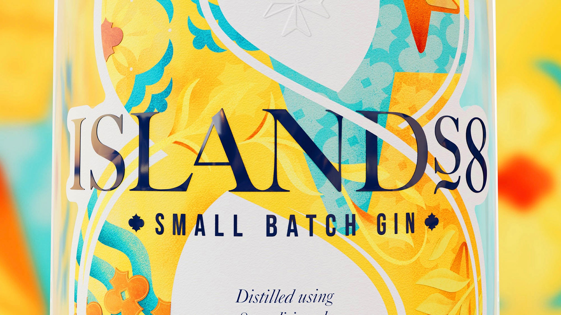
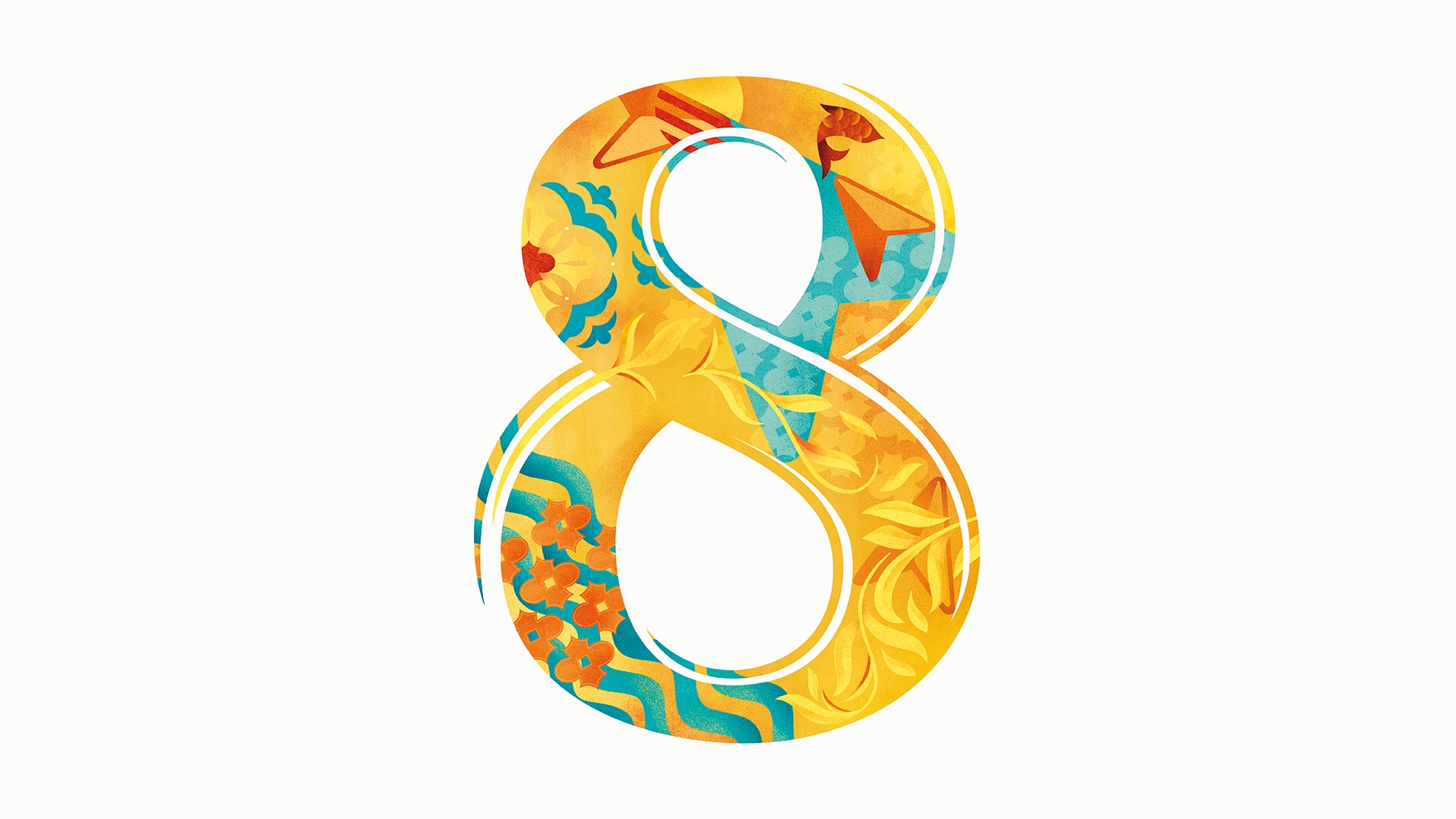
Our new label design heroes a big and bold #8 – designed to instantly convey the brand, and provide an ownable, distinctive asset that aids stand out, drives navigation and can be seen at the back of the bar to support the brand’s desire to enter the on-trade.
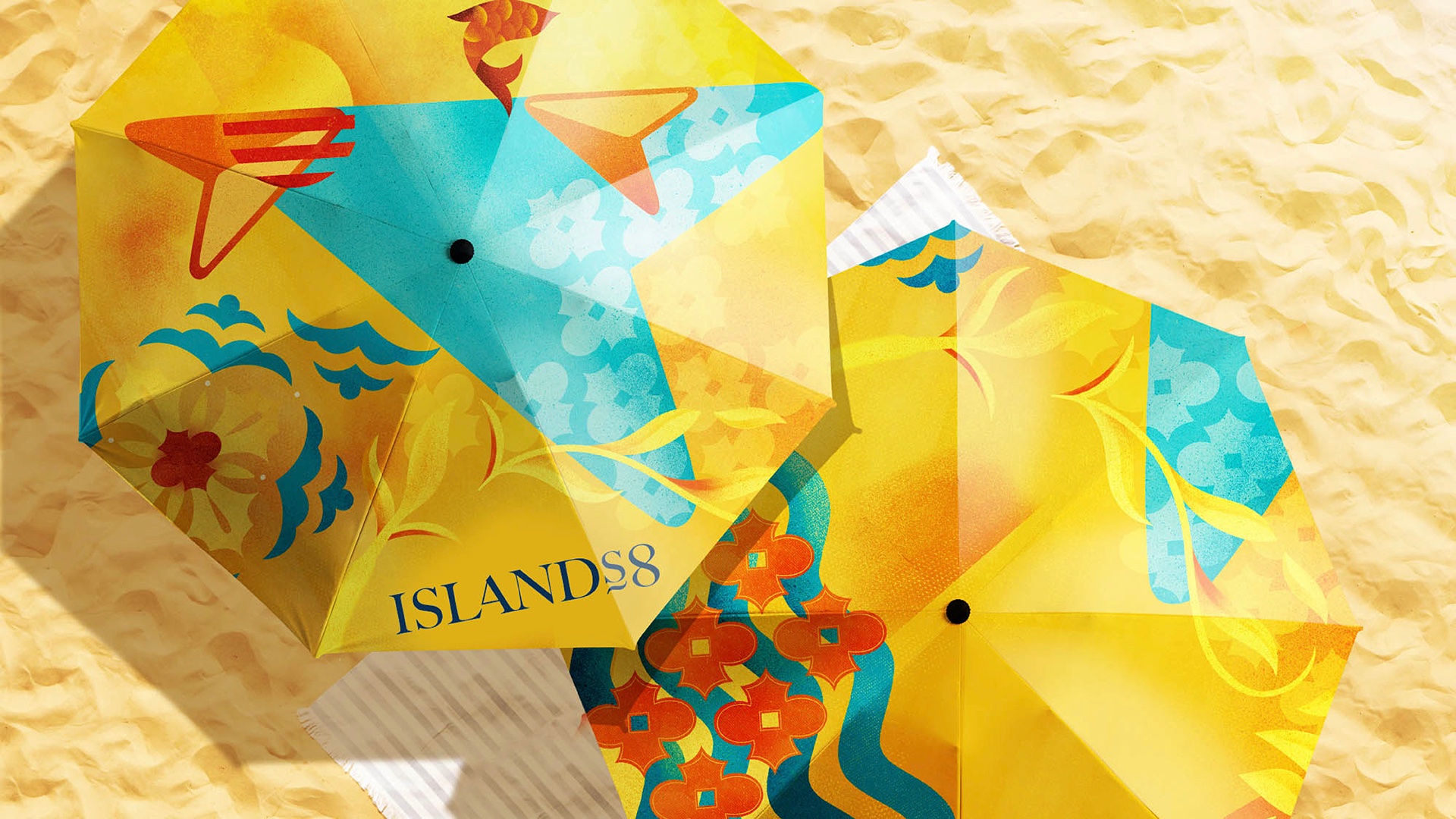
The illustrations within the #8 holding device captures the spirit of Malta and how it feels to its people – a place of unrivalled natural beauty; from the iridescent waters of the Blue Lagoon to its hidden caves and breath-taking cliffs. It’s bright, bold and sunny with an overall look and feel inspired by Malta’s Arabic-influenced decorative tiles and ornate filigree window frames.
The Impact
Islands8 now has a brand narrative and design system with real meaning for drinkers, and a platform for future growth.
“A big, heartfelt thank you to you! You’ve truly worked wonders in giving Islands8 gin a vibrant and lively personality. With your exceptional skills, you’ve turned it into a masterpiece that perfectly captures our thoughts and aspirations. We could feel your passion and dedication shining through every stage of the rebranding process. The result? A product that effortlessly catches the eye on store shelves, captivating both our loyal fans and exciting new enthusiasts. We can’t express enough how grateful we are for your tireless efforts and unwavering commitment to excellence. You’ve truly made magic happen!” George Xuereb and Annabel Xuereb – Founders, Islands8
CREDIT
- Agency/Creative: Bluemarlin
- Article Title: Islands8 – Making a Modern Day Maltese Classic
- Organisation/Entity: Agency
- Project Type: Packaging
- Project Status: Published
- Agency/Creative Country: United Kingdom
- Agency/Creative City: Bath
- Market Region: Europe
- Project Deliverables: Packaging Design
- Format: Bottle
- Industry: Food/Beverage
- Keywords: Packaging Design, Product Redesign
-
Credits:
Design Director: Gareth Roberts
Senior Artworker: Steve Gordon
Executive Creative Director: David Hodgson
Account Manager: Sarah McDougall
CEO: Andrew Eyles
Founder, Islands8: George Xuereb
Founder, Islands8: Annabel Xuereb


