The Brand:
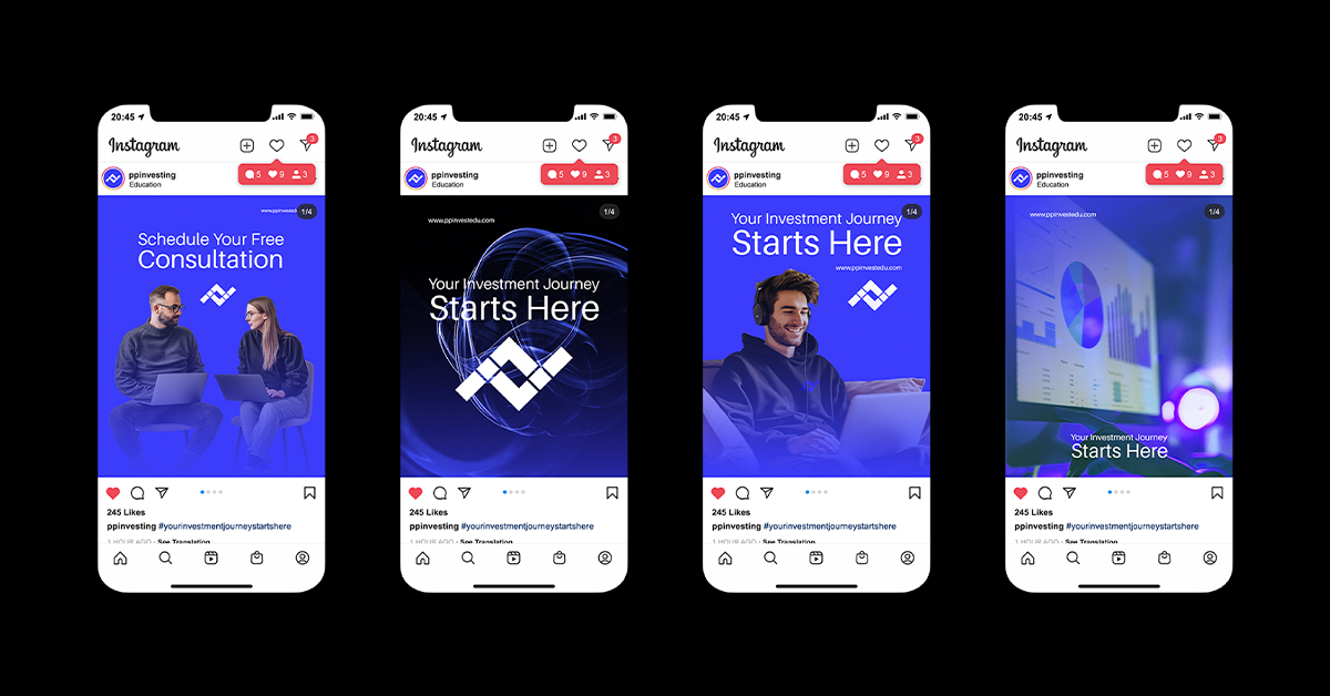
PP Investment Education is an online platform that offers personalized investment education to its clients.
Unlike traditional platforms with pre-recorded courses, PP focuses on one-on-one guidance and tailored strategies.
Key Features:
The platform provides customized investment education based on individual needs and goals. Clients receive direct support through one-on-one calls and ongoing mentorship. Packages include services like setting up brokerage accounts, crafting investment strategies, portfolio optimization, and real estate expertise. PP offers various packages to cater to different client needs and investment levels.
The Challenge:
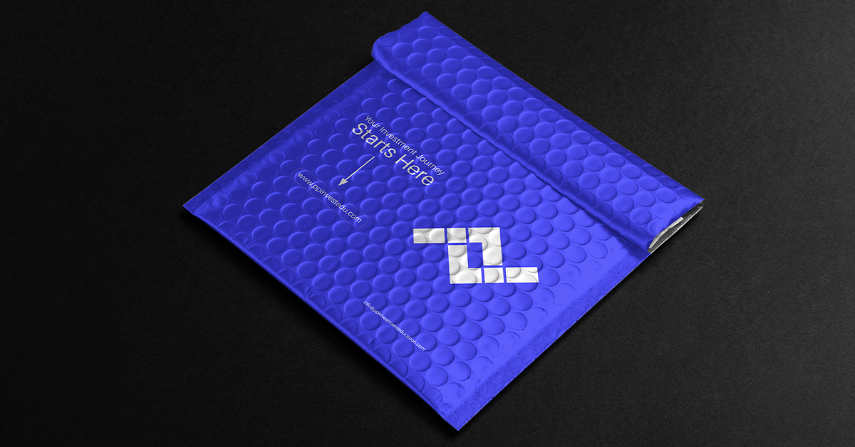
The challenge presented to us was to design a logo that effectively embodies the essence of PP Investment Education. Our goal was to create a visual representation that communicates our core values and mission in a simple yet powerful way. After much deliberation, we chose to use two intertwined letters “P” to symbolize a path. This path is not just any path; it is a carefully guided journey that represents our commitment to leading our clients towards sustainable wealth creation.
The intertwined “P”s serve as a visual testament to the belief that investing is a marathon, not a sprint. In a world where quick wins and instant gratification are often glorified, we stand firm in our conviction that true financial success is achieved through patience, persistence, and informed decision-making. The design of the intertwined letters signifies the continuous support and mentorship that PP Investment Education offers. Each twist and turn of the path reflects the personalized guidance and tailored strategies we provide to our clients, ensuring they are well-equipped to navigate the complexities of the financial markets.
Moreover, the logo encapsulates the idea of partnership and collaboration. At PP Investment Education, we see ourselves as partners in our clients’ financial journeys. The interconnected “P”s represent the strong bond between our clients and our advisors, emphasizing the trust and mutual respect that are at the heart of our relationships. This connection is fundamental to our approach, as we believe that understanding our clients’ unique needs and goals is the key to delivering effective investment education and advice.
In essence, the logo is more than just a visual mark; it is a reflection of our philosophy and the values that drive us. It captures the essence of our mission to empower individuals through education, enabling them to make informed and confident investment decisions. By choosing a design that symbolizes a path, we reinforce our commitment to guiding our clients every step of the way, helping them build a secure and prosperous financial future.


CREDIT
- Agency/Creative: Iskra Jovanoska
- Article Title: Iskra Jovanoska Redefines Investment Education Branding for PP
- Organisation/Entity: Freelance
- Project Type: Graphic
- Project Status: Published
- Agency/Creative Country: Macedonia
- Agency/Creative City: Skopje
- Market Region: Europe
- Project Deliverables: Branding, Label Design
- Industry: Education
- Keywords: logo, branding, education
-
Credits:
Graphic Designer: Iskra Jovanoska


