


Client’s details:
The company in question is called “Iodice Legami – società agricola” an agricultural company that deals with the production and wholesale of ornamental green plants.
The company has a history of a great family tradition as the company was founded around 1970 but after years of success, the business lost its strength and fell into decline, until around 1 year ago when the 5 grandchildren of the founders refounded the company, keeping the name, adapting it to the modern world.
Starting from these values, we understood that the only way to revive this activity from its ashes was to create a logo and a coordinated image that were modern but that recalled the glories of the past; for this reason, we immediately discarded the idea of representing flowers, plants, leaves, etc…
Logo:
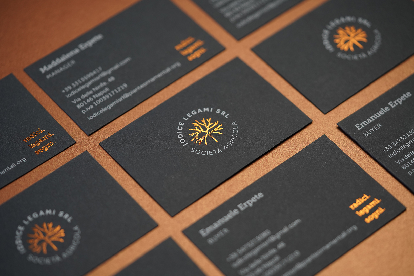
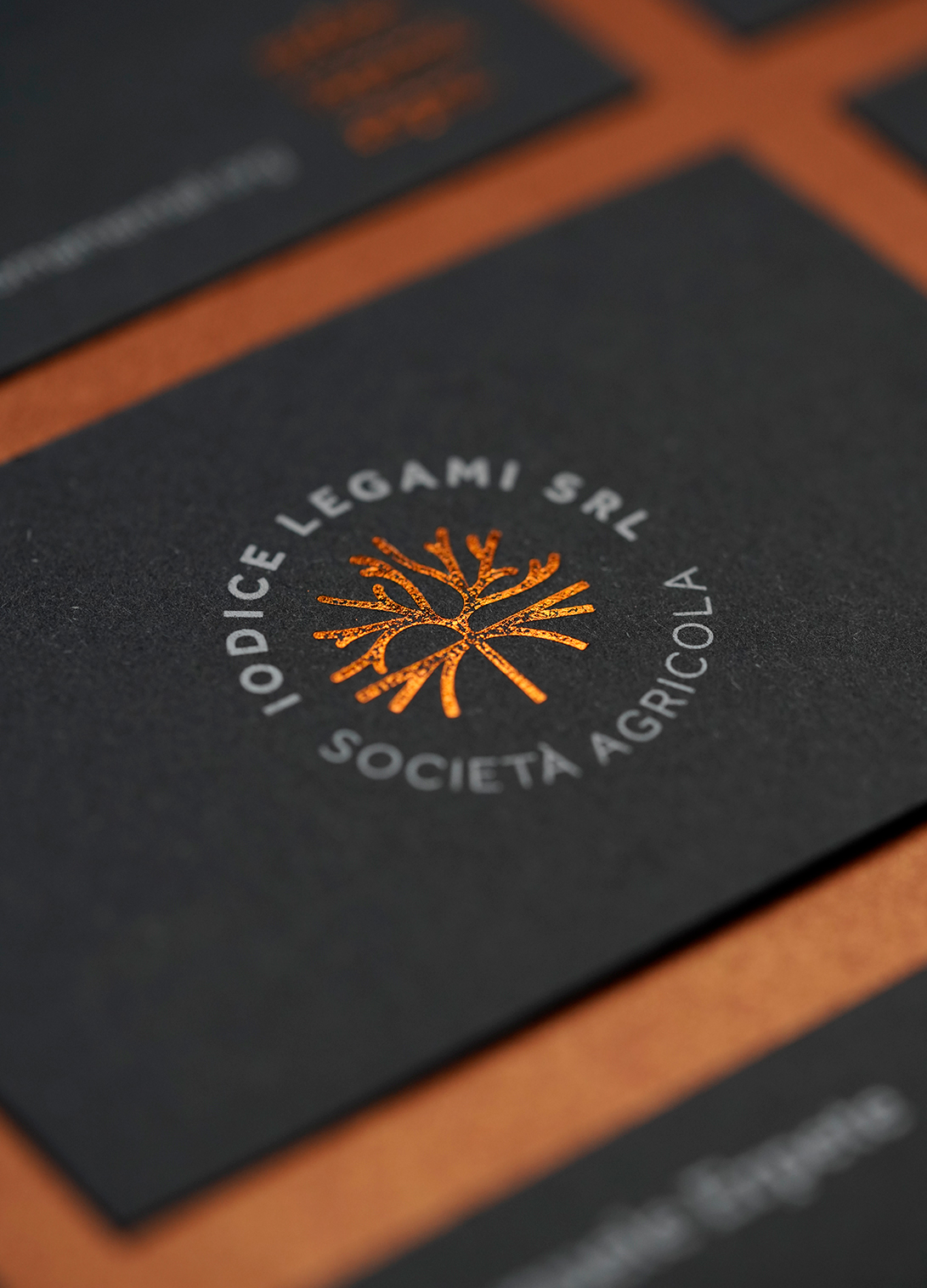
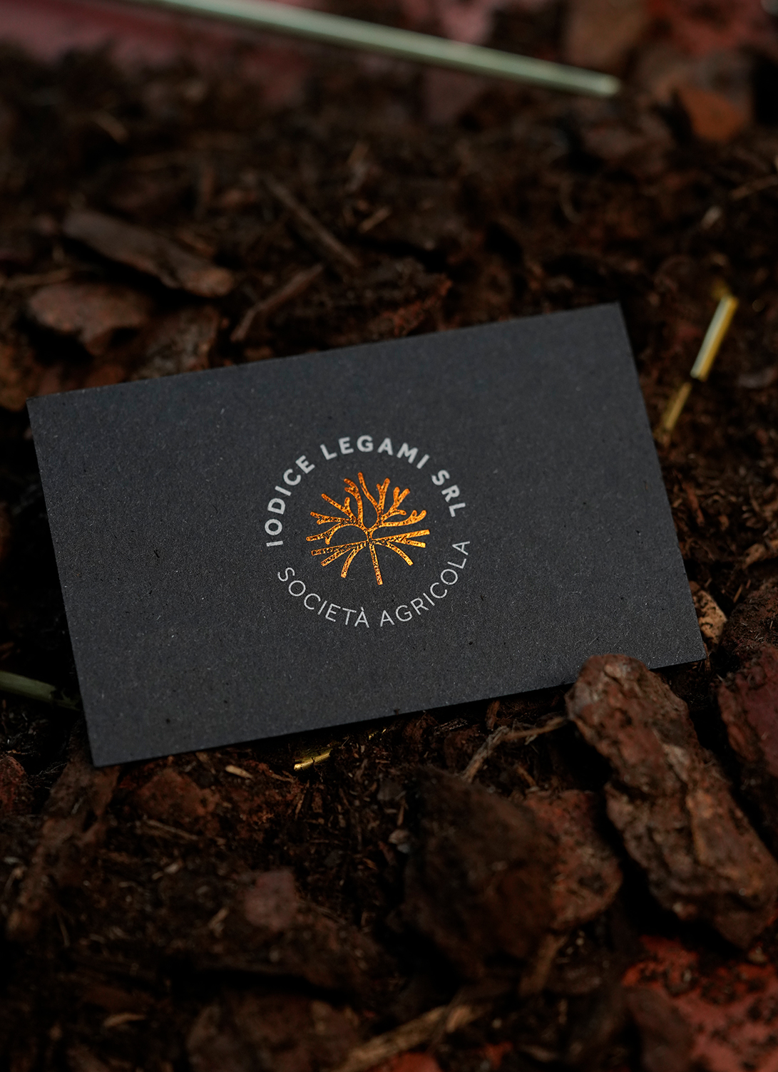
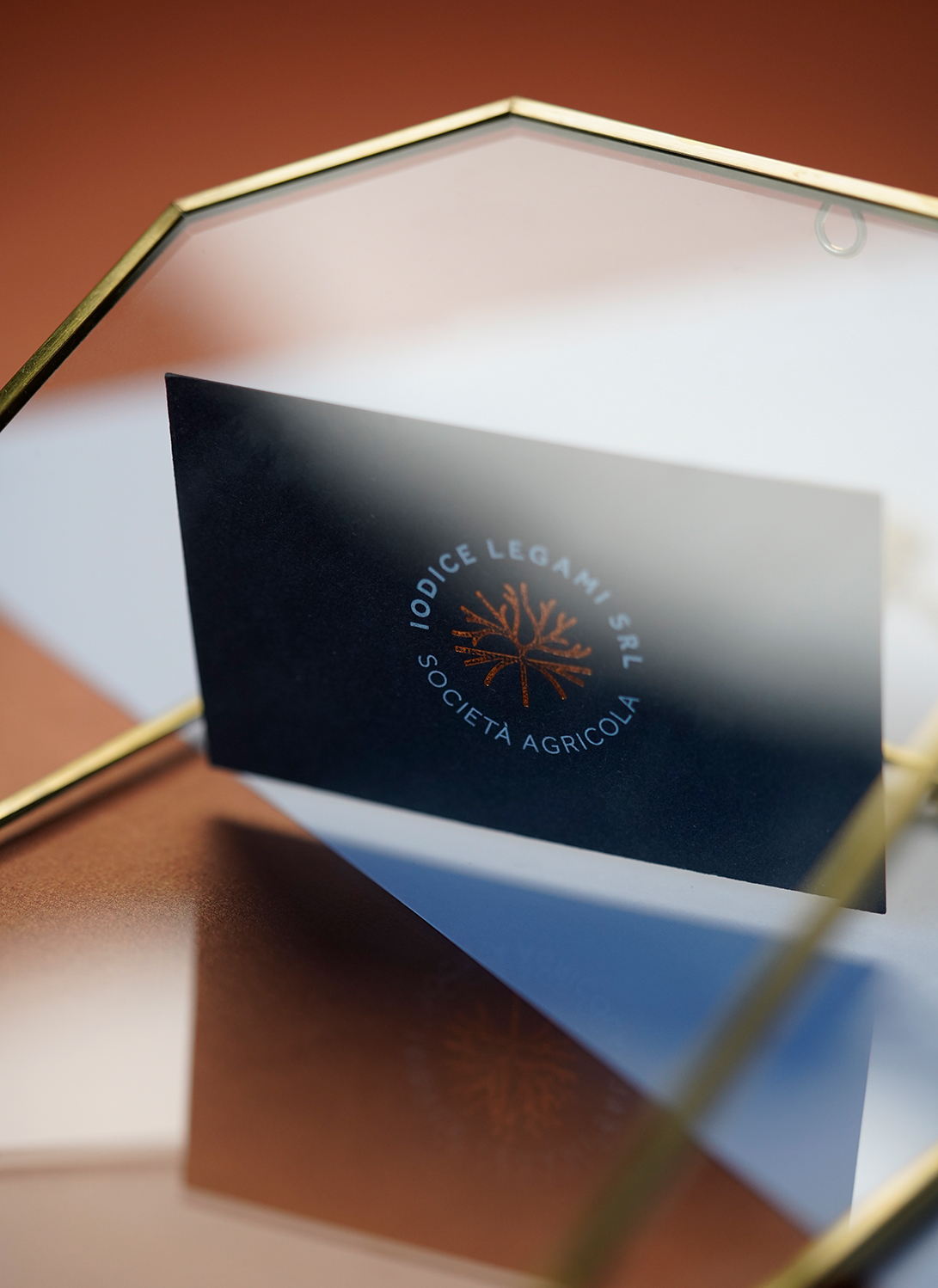
For the creative concept we leveraged and exploited the values corporate and on what is the soul of the company itself: a historical, deeply rooted company in the past, but with an eye to the future. The values that we have highlighted, through a pictogram structurally modern, but with a reference to tradition, are represented by the desire to always carry forward the old and the new, tradition and innovation, quality craftsmanship and, in perspective, the benefits of renewable energy.
This binomial is always present and alive within the pictogram in which, in the part lower represented by a rigid, static, rooted structure, is opposed, in the upper part, stylistically, a fluid, organic, innovative, aiming structure to the exponential and widespread growth of the business.
The lower segments of the pictogram indicate the roots, foundations, the family tradition rooted in this area. The roots are 5, like the number of grandchildren/partners, and they branch out in the upper part giving the idea of development, progress.
These segments, above the dividing line, instead indicate the progress, the future, the evolution of society. The horizontal segment between these two views indicates a dividing line and serves as a separator between the past (tradition) and the future (innovation).
Typo & colors:
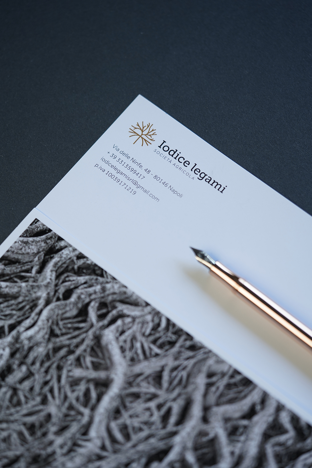
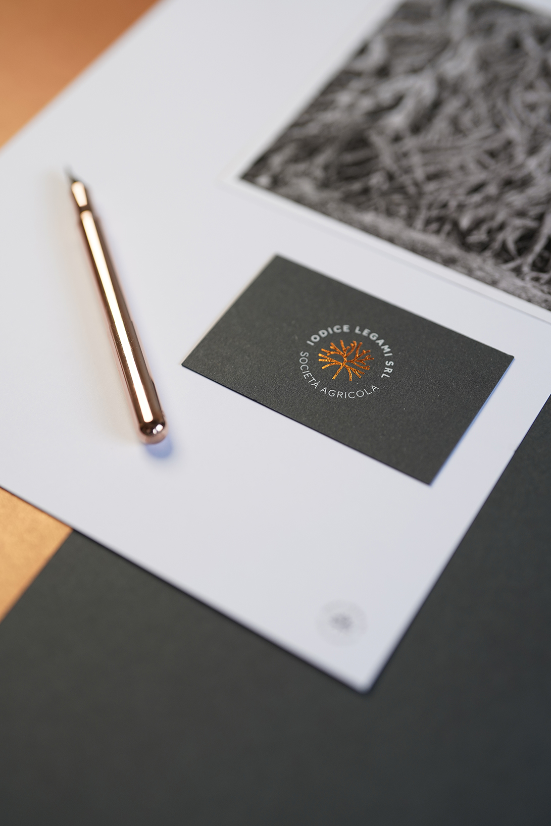
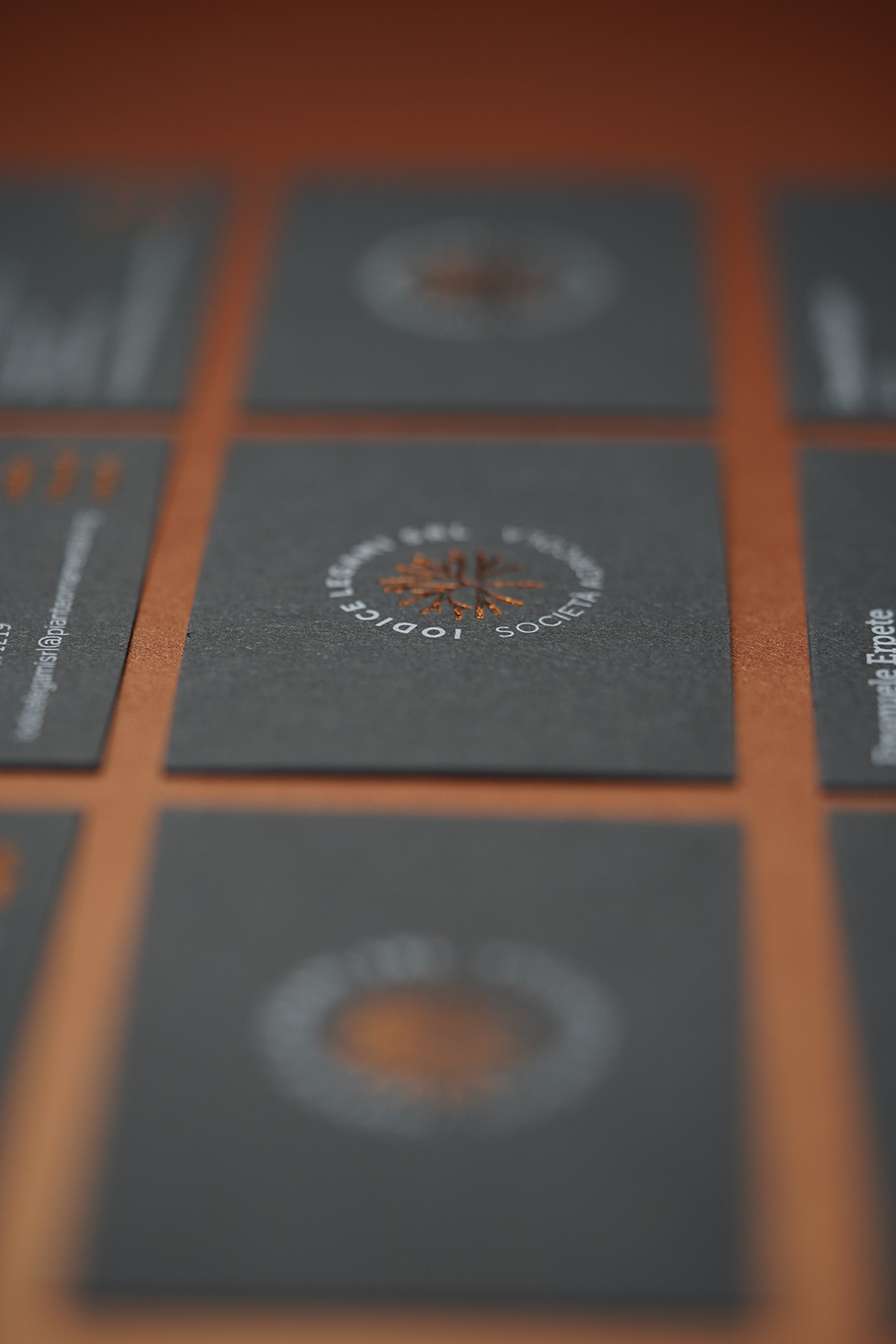
The identified color palette (slate and copper) gives the whole project a sense of modernity associated with a strong and rooted tradition, creating an elegant and refined chromatic visual system, differentiating itself, clearly, from the reference competitors.
Even the font, Museo Slab, is in line with these values and reflects the principle of solidity and reliability, but also conveys a modern message that looks to the future.
Print choices:
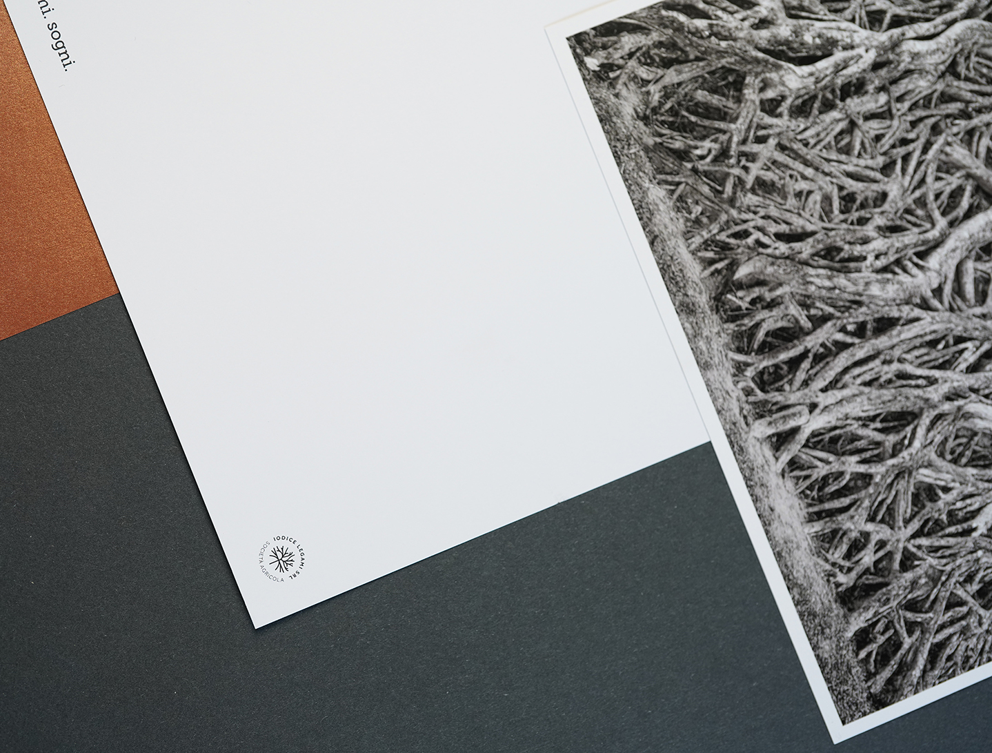
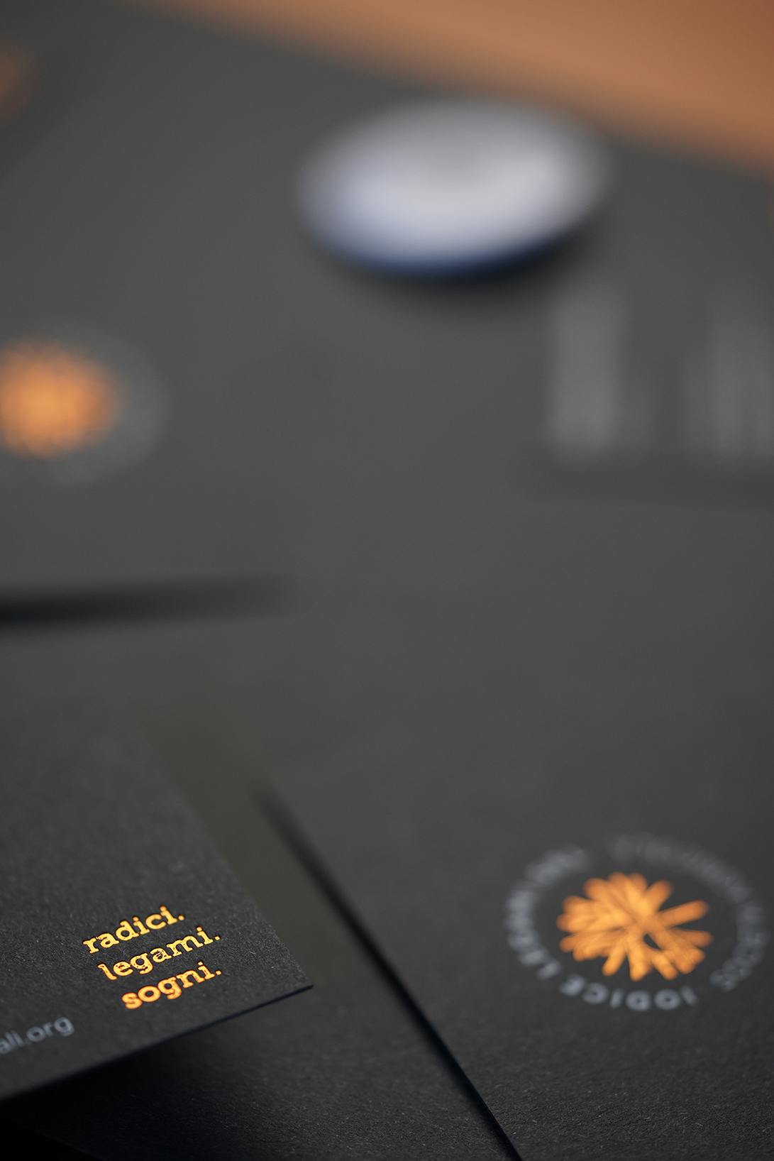
We have decided to exploit the idea of past and future also in print production; we have chosen a strong, tenacious, slate-colored paper combined with a type of print, hot foil, which smells of tradition, of strong roots, of a beautiful memory. This binomial, elegant, leathery and refined has become the synoptic element of all communication.
The tactile effect of the card is a dive into the past with a vision of the future.
CREDIT
- Agency/Creative: paolo de angelis | design & branding
- Article Title: Iodice Legami Società Agricola
- Organisation/Entity: Freelance
- Project Type: Identity
- Project Status: Published
- Agency/Creative Country: Italy
- Agency/Creative City: Nocera Superiore
- Market Region: Europe
- Project Deliverables: Brand Design, Brand Identity, Design, Identity System, Logo Design
- Industry: Agriculture
- Keywords: floriculture, ornamental plants, plants
-
Credits:
Art director: Paolo De Angelis
Photographer : Simona Lillo
Photographer : Tecla Apicella


