


Inver Galerie is a new urban and contemporary art gallery. It is located in Strasbourg, in the east of France. It is a unique gallery because it welcomes local, French and international artists and offers works ranging from silk-screen prints to original paintings, objects and installations.
The name “Inver” comes from the family name of the two brothers who own the gallery, Hugo and Julien Invernizzi. One is a professional basketball player and the other a history teacher. Both are passionate about urban and contemporary art and this is a project they have been keen on for several years.
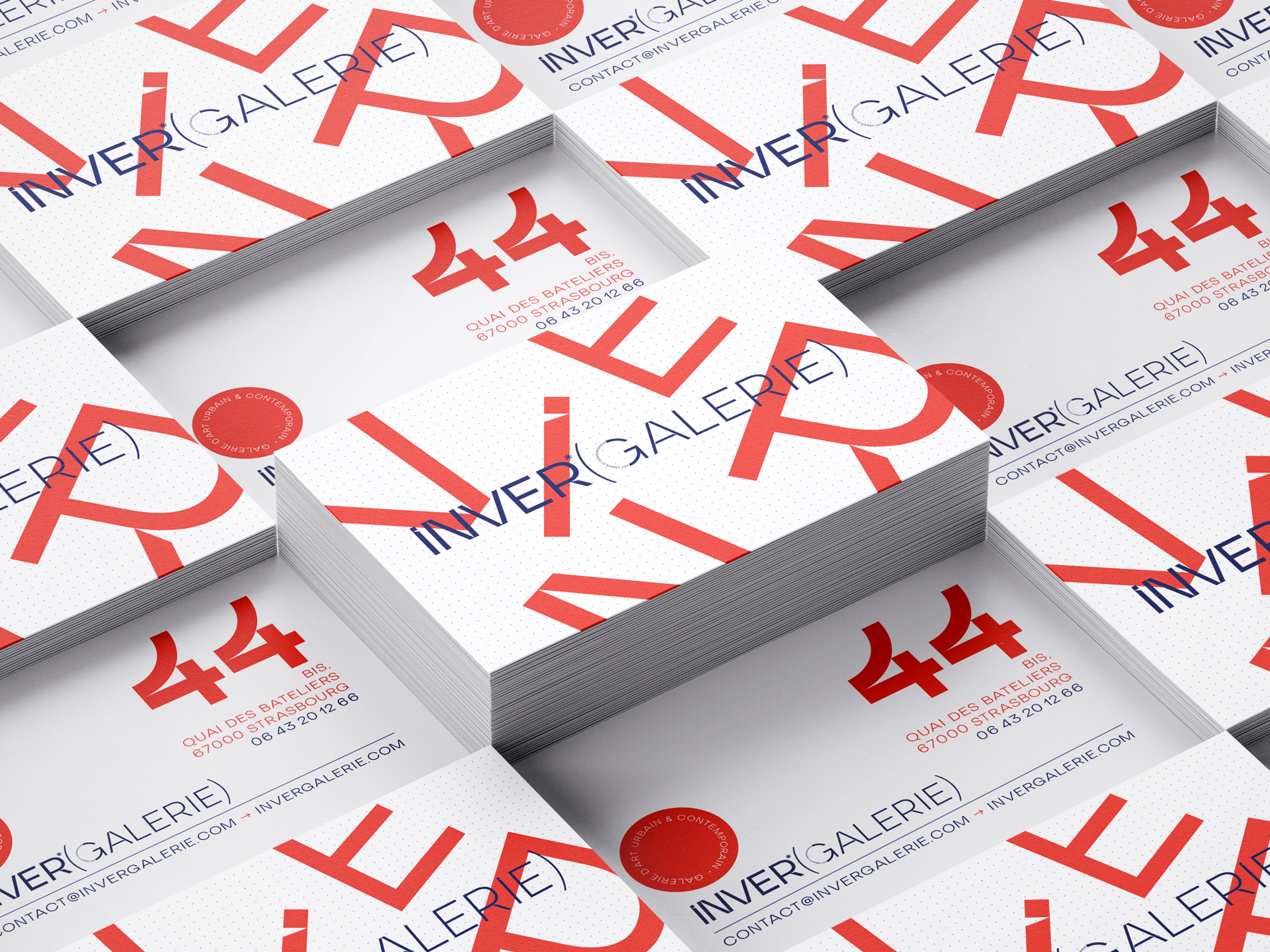
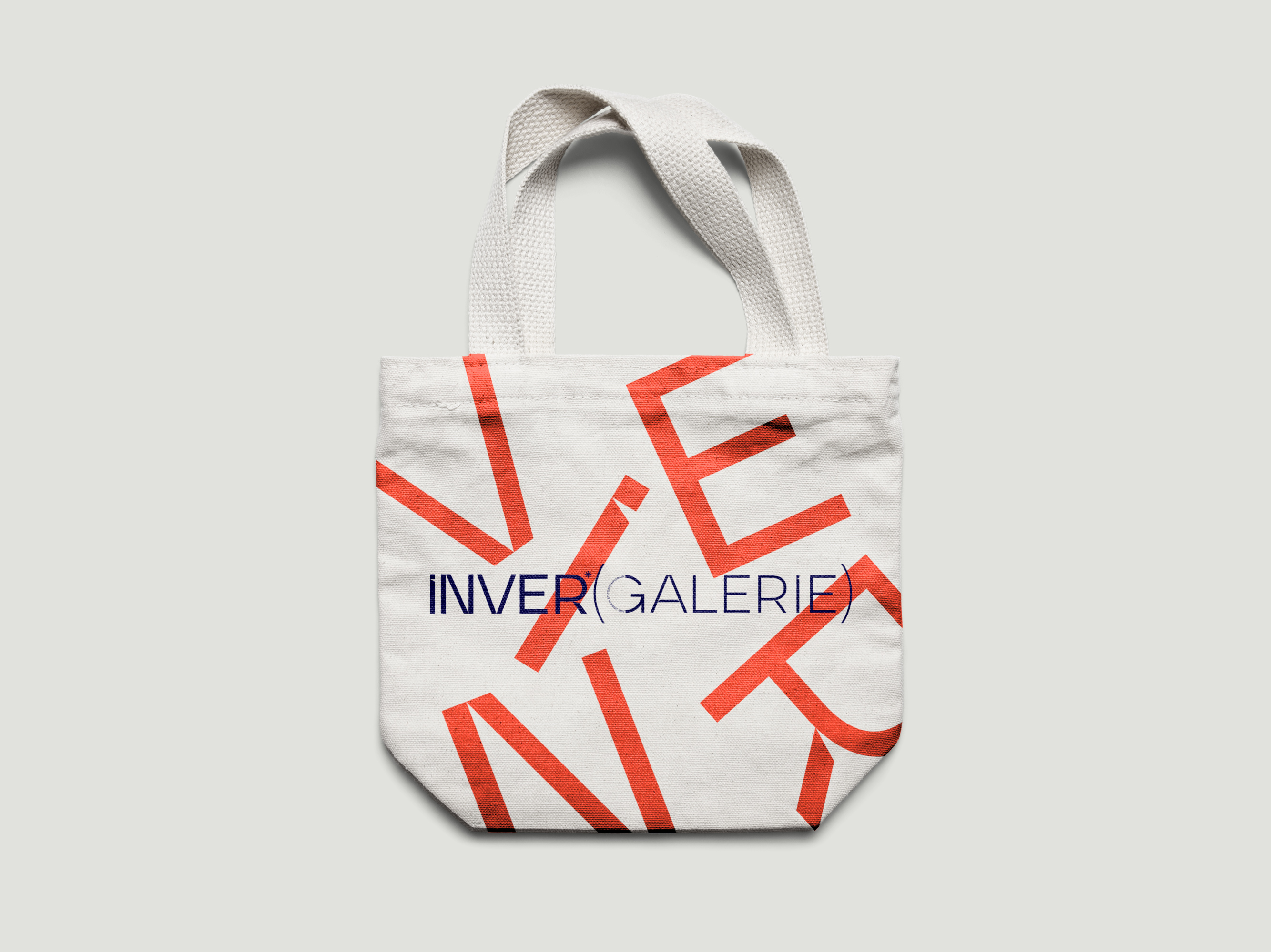
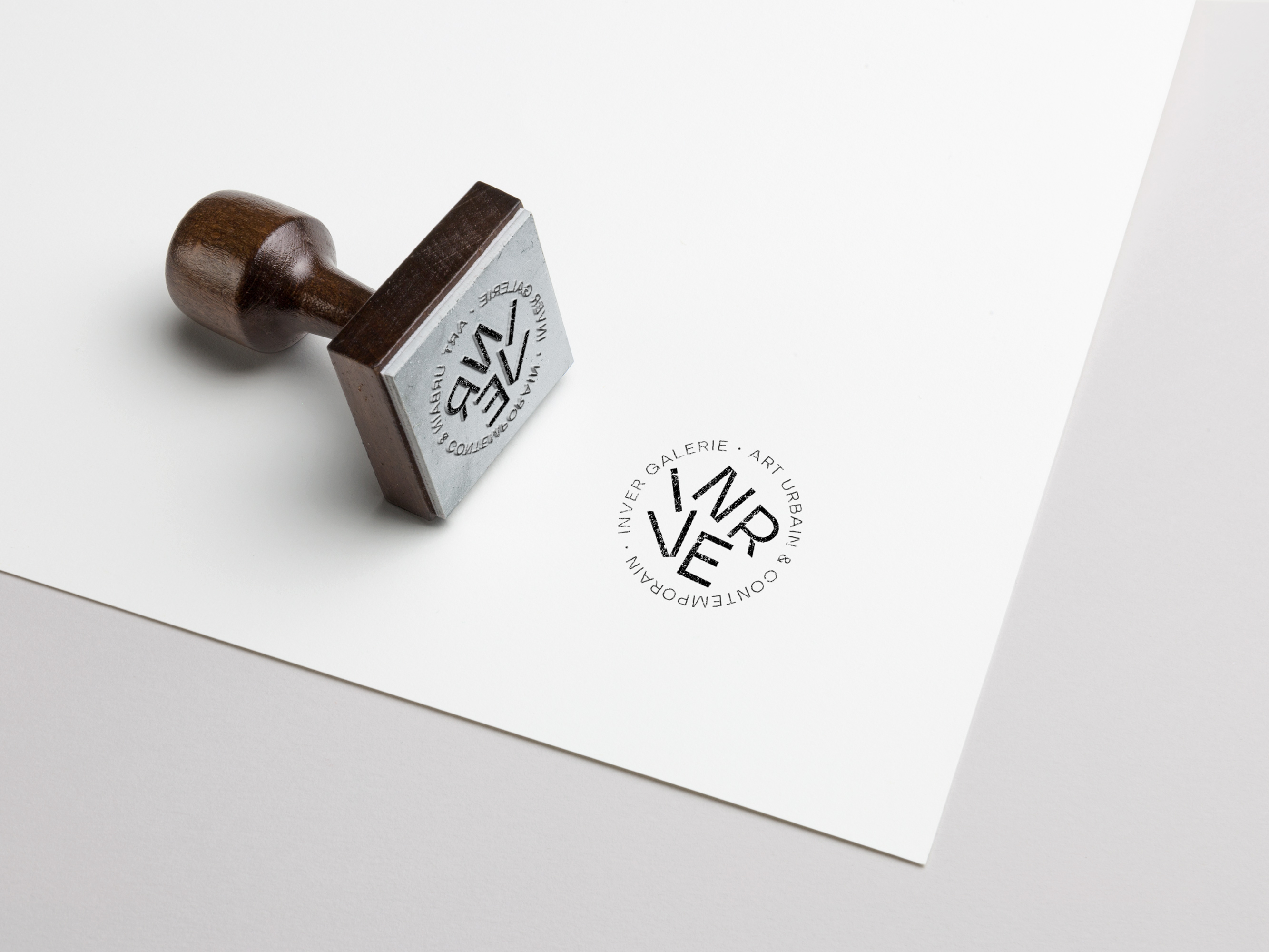
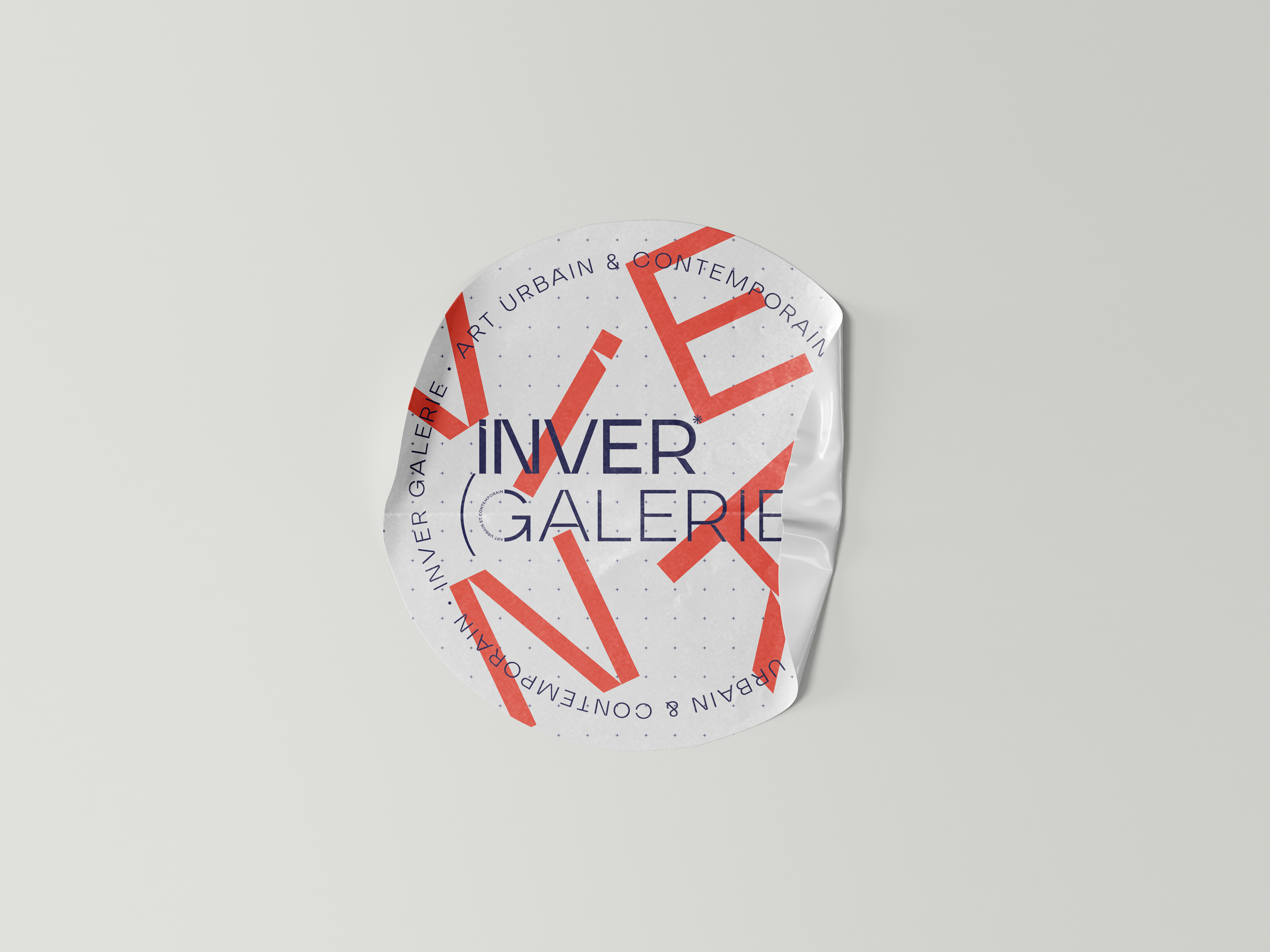
For this work, they had to come up with a simple and contemporary typography, but above all one of a kind. The idea came very quickly, with large, straight, thin lines and broken angles in places, in reference to the frames of paintings.The word “gallery” was put in brackets because the aim was to make this word disappear later on, if the gallery manages to have a sufficiently important notoriety, as all the current art galleries do.
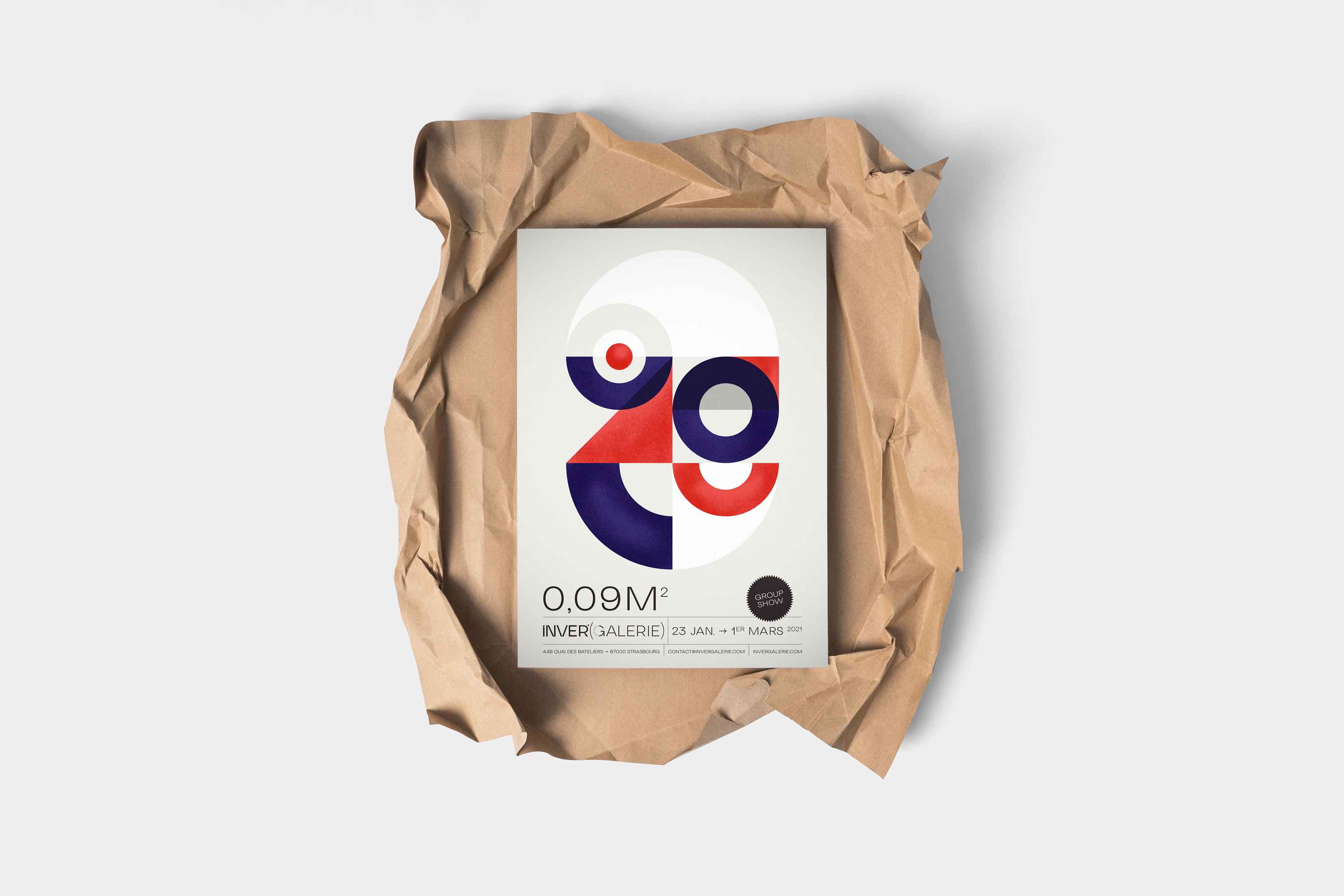
For the colours, a trichromatic range has been imagined: red, blue and white. These very contemporary colours once again mark a conscious choice to stand out from the usual galleries. To this was added a pattern composed of small “+” to give depth to the different communication supports.
Finally, the 5 letters of the name “INVER” are also added in an “exploded” way on the communication supports to create a virtual hanging.
Concerning the business cards, on the back, the number 44 (the address of the gallery) is highlighted, in homage to the basketball jerseys, a wink to Hugo.
The “urban & contemporary art” tagline is placed in a red circle, like the dots on the works when they are reserved. On the window of the gallery, the logo is placed above the entrance door, the left window is filled with the letters “INVER” to reinforce this notion of hanging. The right-hand window is empty because it offers a view of the gallery’s interior. All this identity and these graphic principles can be found on the different supports: business card, stamp, clip, tote bag, stickers,…Finally, for the group exhibitions, we imagined another principle of declination of the gallery’s identity with geometric forms and the trio of colours of the graphic charter. This principle will be repeated each time, so as to create a real series of posters, like serigraphs. This rich universe highlights a truly unique style.
CREDIT
- Agency/Creative: Buckwild
- Article Title: Inver Galerie Branding by Buckwild
- Organisation/Entity: Freelance, Published Commercial Design
- Project Type: Identity
- Project Status: Published
- Agency/Creative Country: France
- Market Region: Europe
- Project Deliverables: Brand Identity, Brand Naming, Branding, Graphic Design, Illustration, Research / Insight
- Keywords: identity design typography graphism illustration branding art


