


White Bear Studio – Donnelly
The Challenge:
Fresh fruit and veg brand Donnelly came to us looking to launch a new range of salad that offered a convenient solution to healthy eating without compromising on quality. A sector saturated with own brand, Donnelly needed to disrupt their aisle with shelf shout. Our challenge was to create a
brand that captured the deliciousness of fresh Irish produce, whilst maintaining the Donnelly family heritage. We wanted to create a future-facing brand that remained authentic and true to the core brand values established over three generations. We set out to ensure the high quality of the
product was reflected in both the branding and packaging. As Donnelly sits at the higher end of the price scale we had to ensure the branding matched the premium quality of product on offer. To ensure the new brand worked to its most effective we set out to tell a story through the branding.
The Response:
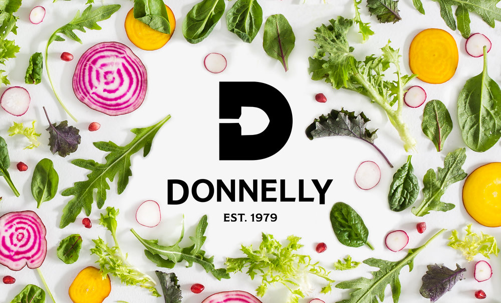
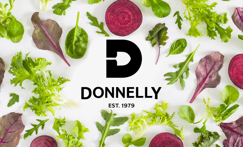
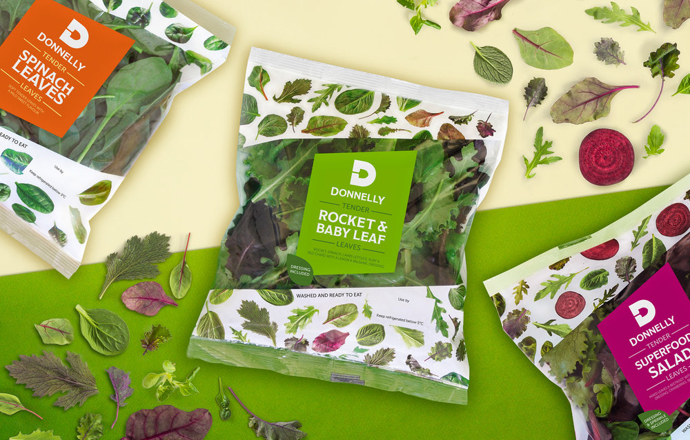
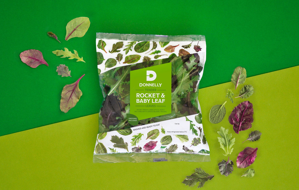
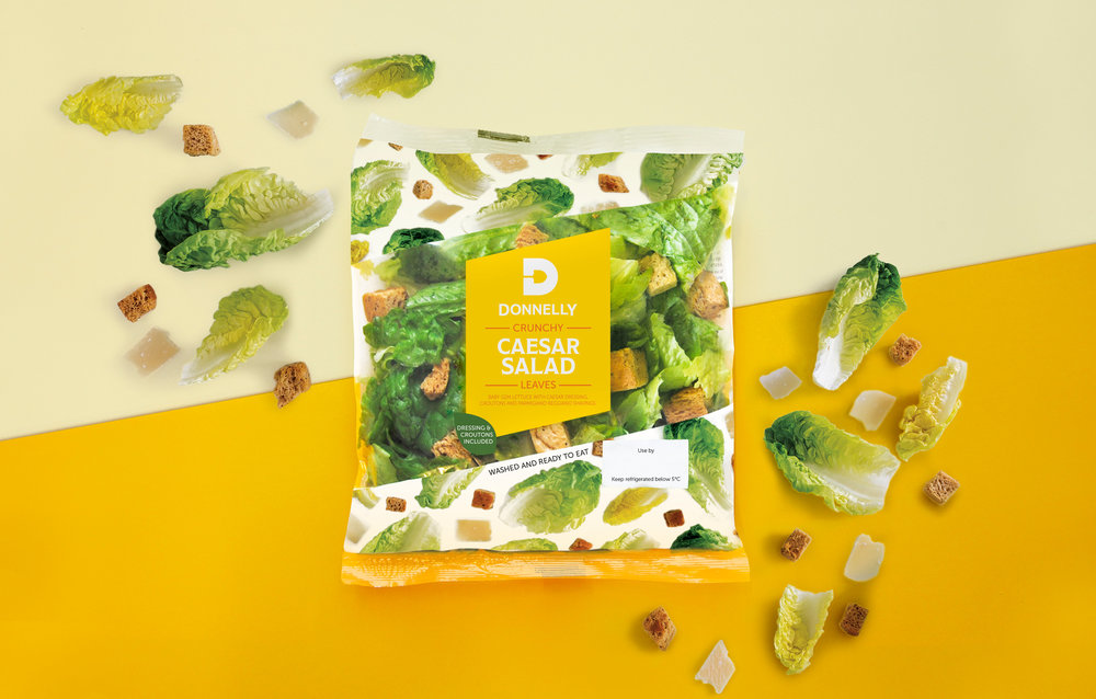
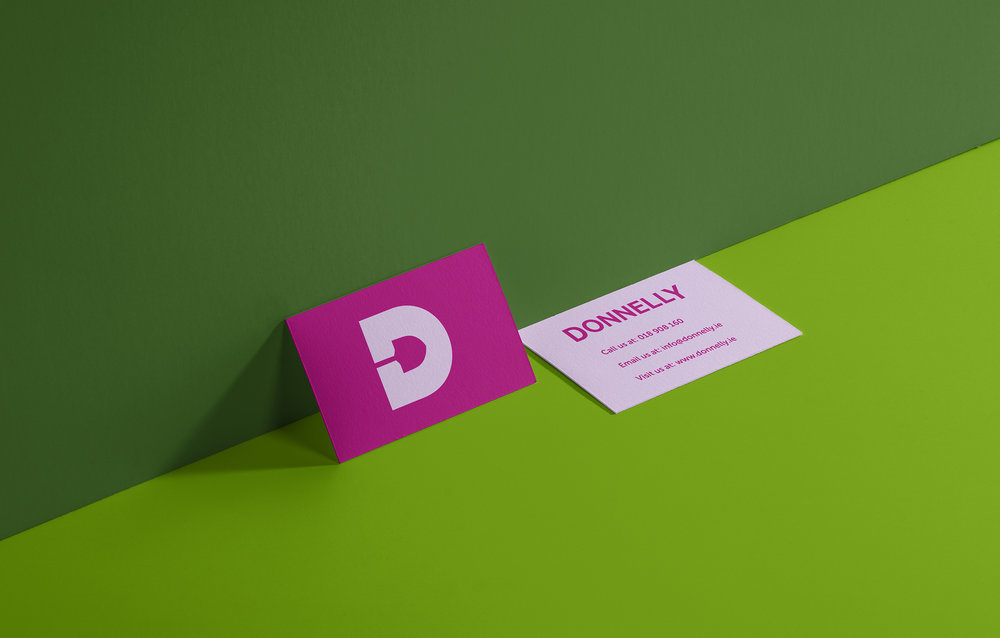
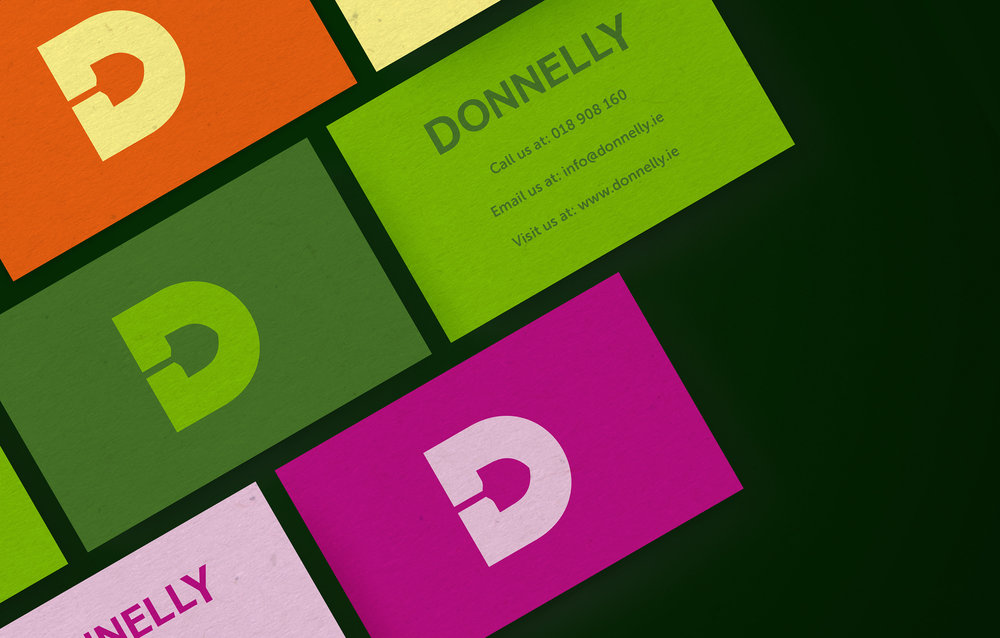
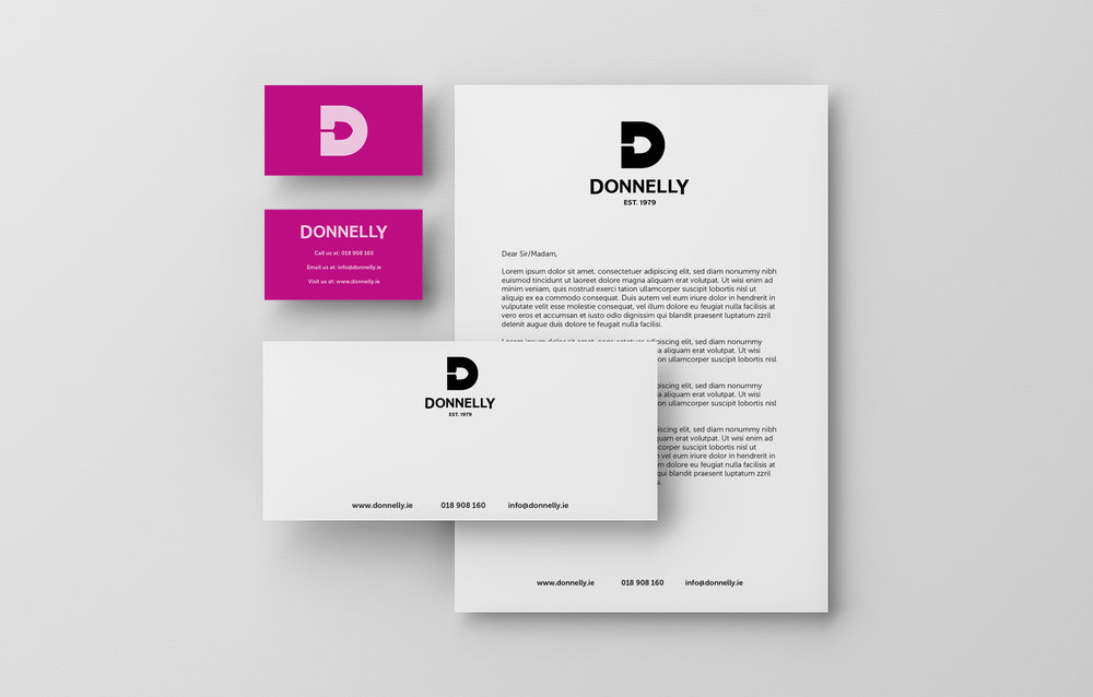
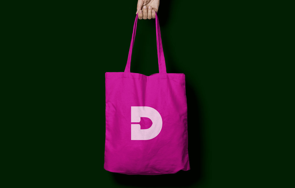
We created a brand design that centred around the freshness and quality of the product. Our logomark holds a garden spade in the negative space of the ‘D’. This epitomised our concept of ‘field to fork’, the shovel being a symbol of Donnelly’s commitment to freshness. The use of the
single ‘D’ allowed the brand more impact and flexibility when used at a small scale or on screen. We added the date that Donnelly was established in the larger logomark to pay homage to Antony Donnelly who started the business in 1979. This story was elaborated on through our use of
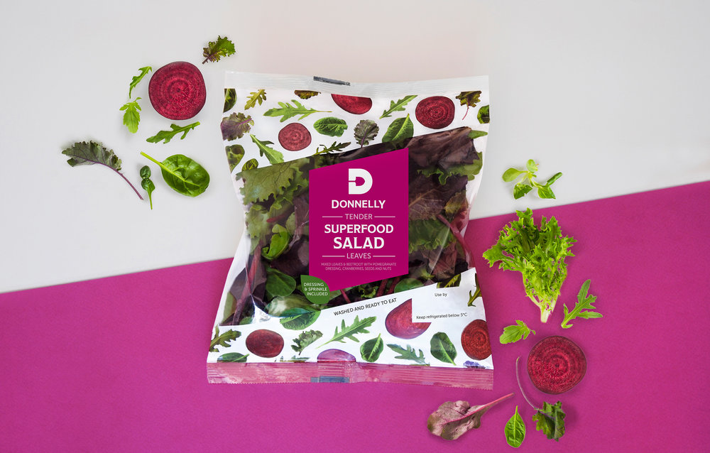
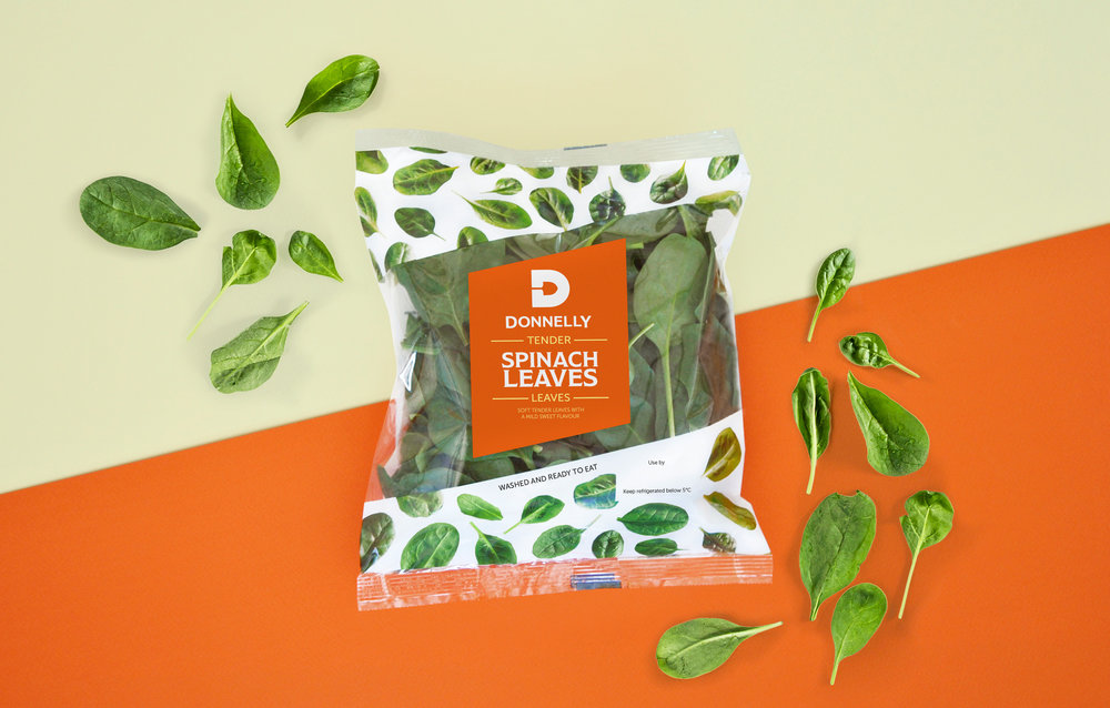
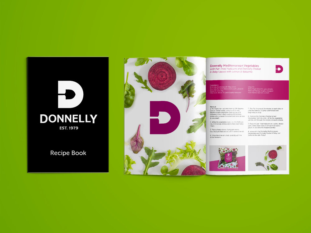
copywriting both on and off pack. By adding the personal story we were able to create a trustworthy brand that is seen as reliable because of its experience and expertise. We combined the mark with a contemporary crafted logotype that has flourishes reminiscent of past fruit and veg stall hand-painted signs. This style continues across packaging in the hierarchy of flavour descriptions.
Our colour palette was taken straight from the produce. We used greens, reds and purples from the leaves themselves to create a bold but natural colour scheme. These colours were paired with crisp white backgrounds to ensure the product itself was the main highlight of the brand and stood
out against more cluttered competitors.
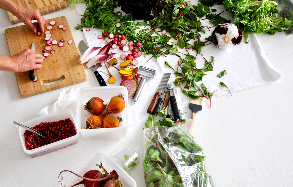
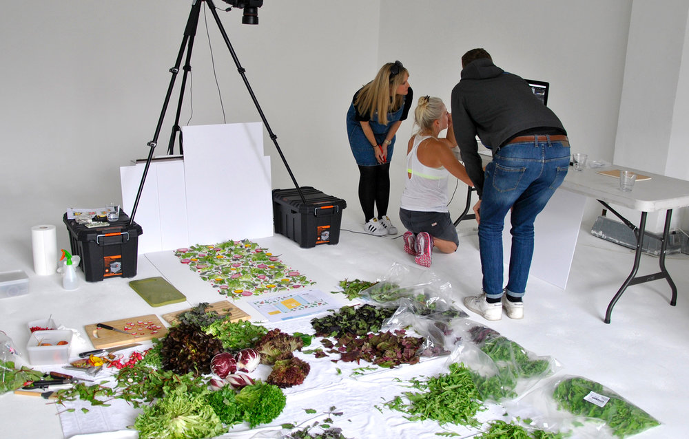
The concept of the branding focusses around putting the product at the heart of the design and so we created a visual style using the ingredients themselves. Partnering with photographer Amber Locke, we developed patterns of leaves that covered the packaging and brand world to highlight the quality of the product rather than hiding it behind an abstract design. We did the shoot in natural light to emphasise the freshness of Donnelly’s produce. We loved the fact these beautiful leaves became art pieces in their own right. We set out to create a premium brand that stayed true to the Donnelly family ethos whilst bringing it to the 21st century. Our new branding has successfully translated across packaging, promotional
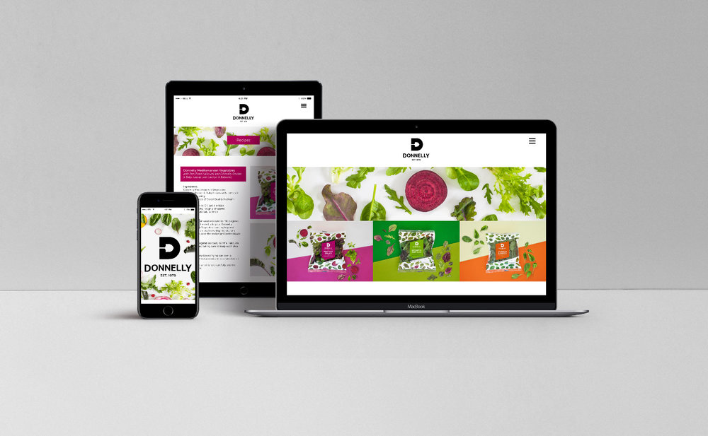
material and online services to ensure a 360 degree approach. It is stocked in premium stores like Super Value, Fallon and Byrne and Euro Spars, having only launched three months ago there are many other listings in the pipeline.
Update: How do you keep 40 years of history in a new brand?
Results: Since the rebrand, Donnely has stocked in premium stores like Super Value, Fallon and Byrne and Euro Spars, having only launched three months ago there are many other listings in the pipeline.
Challenge: Fresh fruit and veg brand Donnelly came to us looking to launch a new range of salad that offered a convenient solution to healthy eating without compromising on quality. Their previous packaging was lacking a brand story and message, but they needed a premium brand that stayed true to their family ethos whilst bringing it to the 21st century.
Our new branding has successfully translated across packaging, promotional material and online services to ensure a 360 degree approach. We created a brand that captures the deliciousness of fresh Irish produce, whilst maintaining the Donnelly family heritage. Thier brand strategy is now future-facing while still remaining authentic, honest and true to their core brand values. The artistic leaf art design mirrors the natural, fresh salad product whilst also illustrating the flavour options.
CREDIT
- Agency/Creative: White Bear Studio
- Article Title: Introducing Donnelly’s Fresh New Identity and Packaging
- Organisation/Entity: Agency Commercial, Published
- Project Type: Packaging
- Agency/Creative Country: United Kingdom
- Market Region: Europe
- Format: Bag
- Substrate: Plastic


