The packaging design for Cellini Aluminium Coffee Capsules showcases a vibrant and dynamic visual identity, emphasizing premium quality and a connection to culture and sustainability.
Bold Color Palette
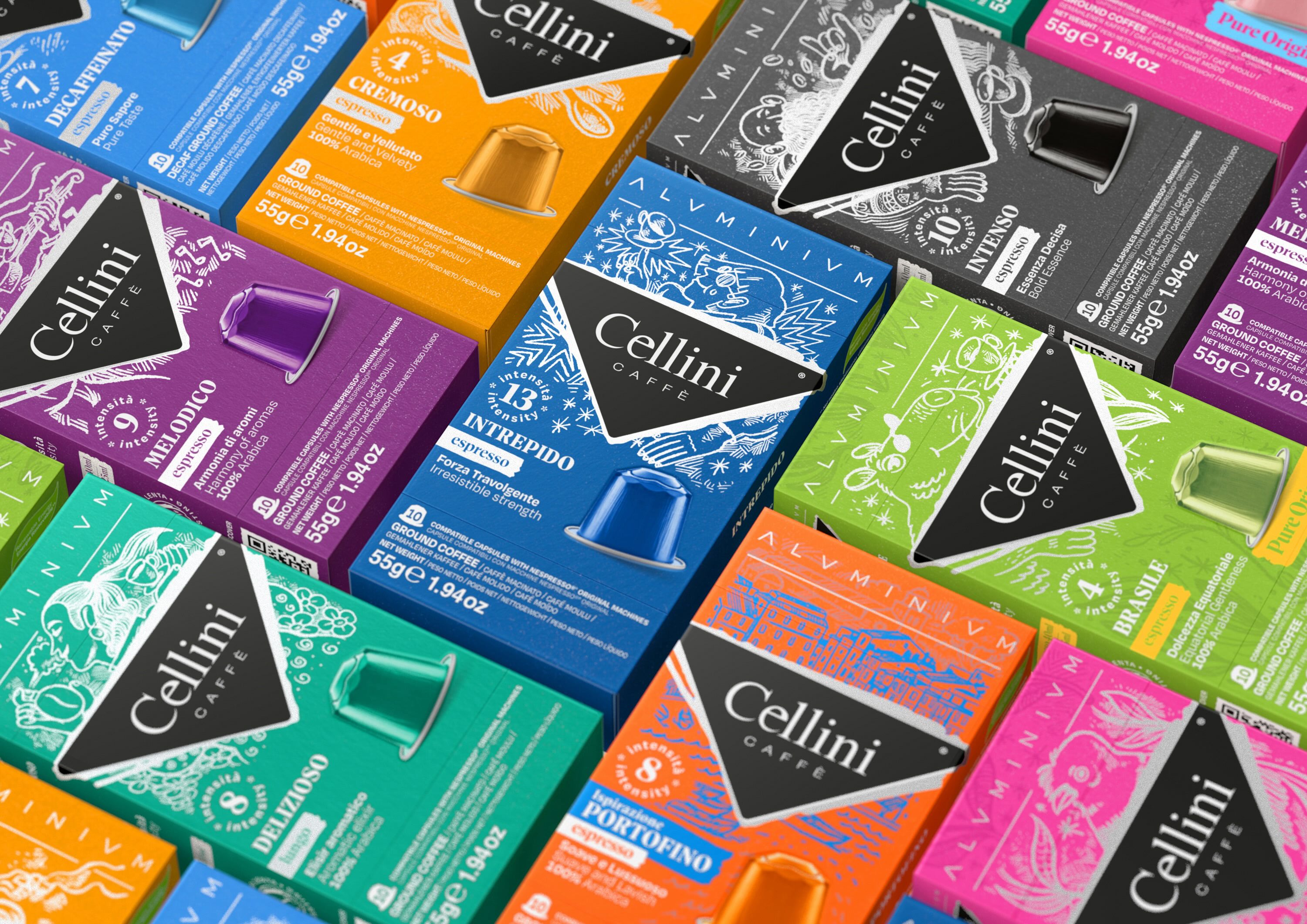
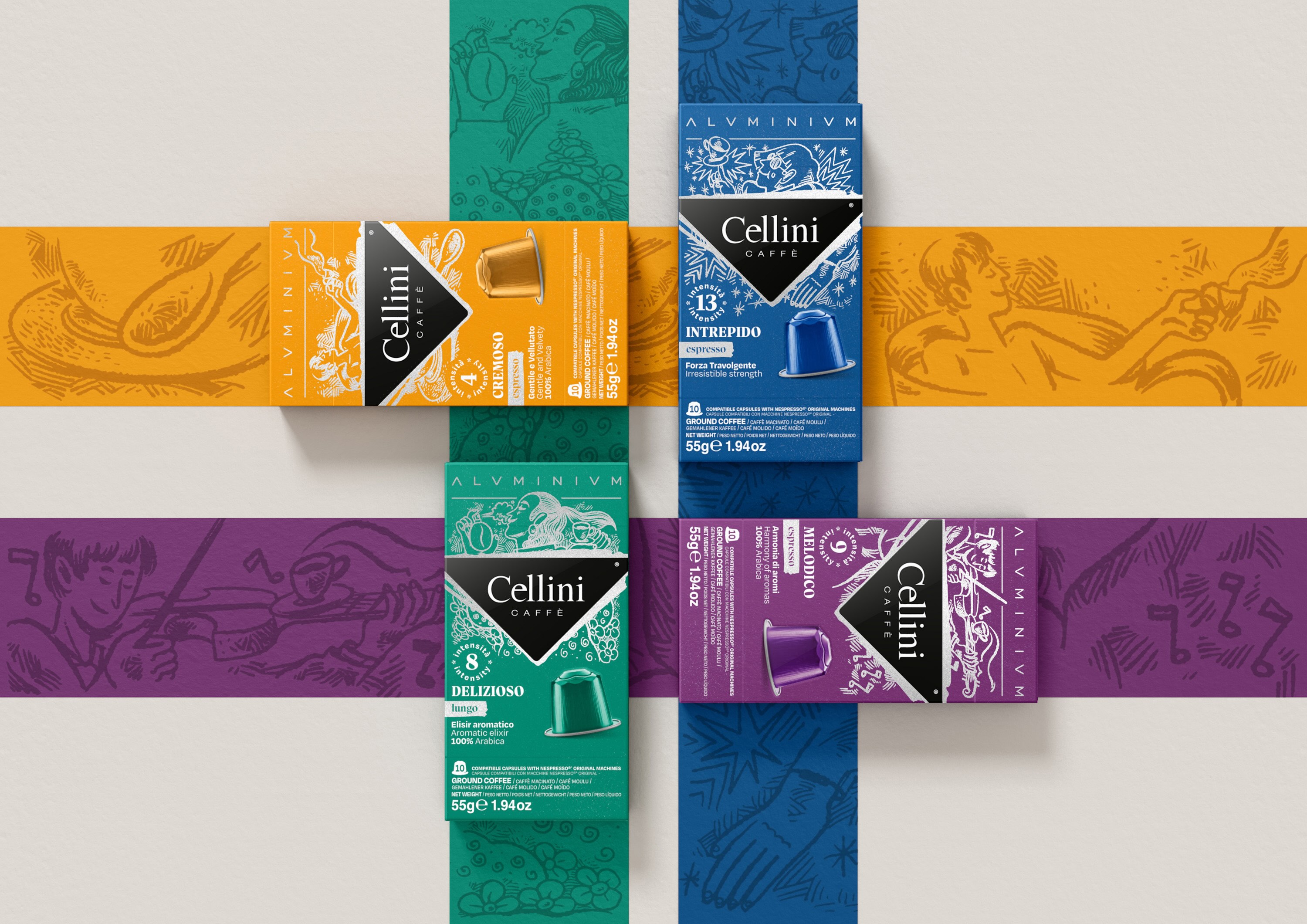
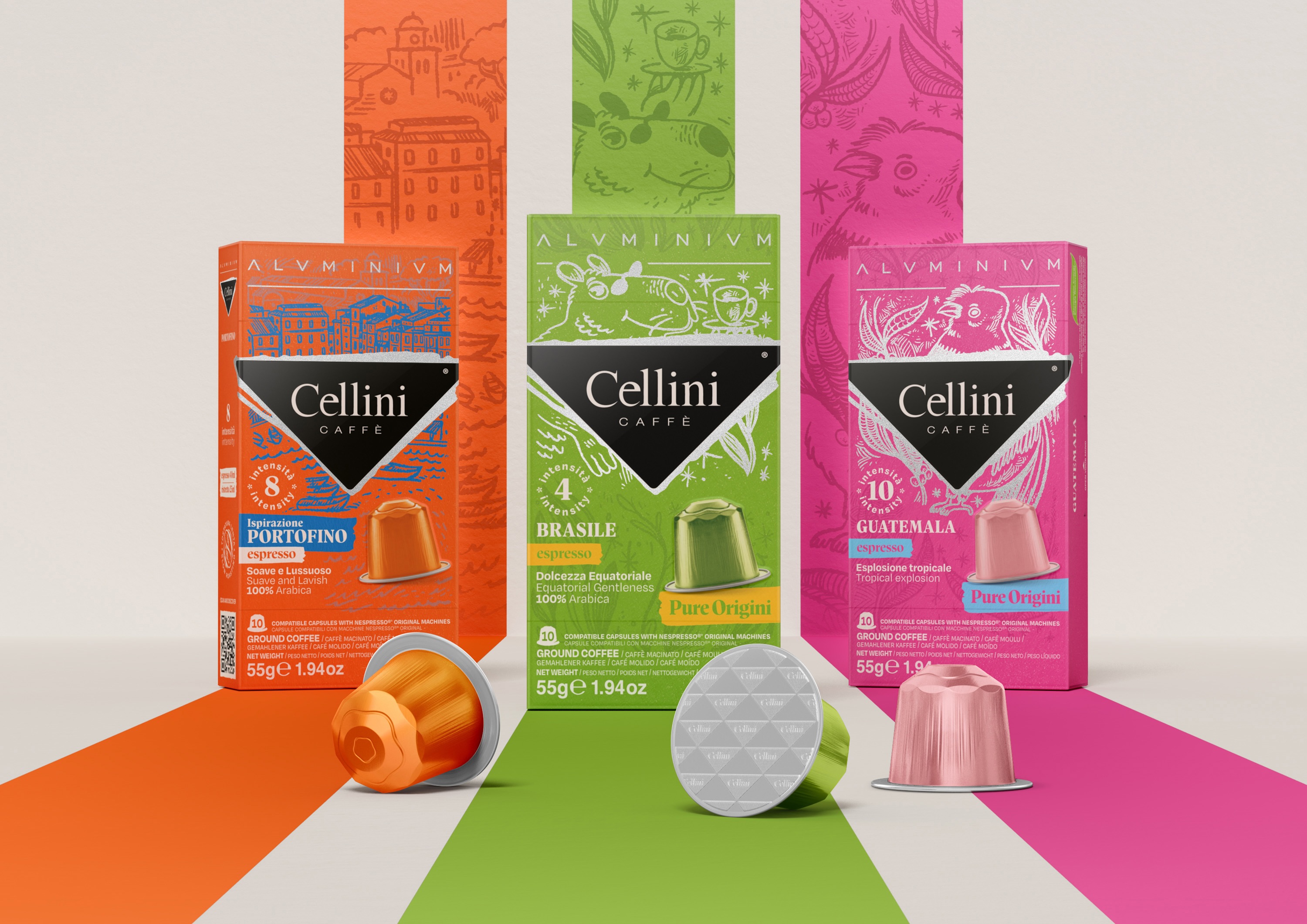
Each blend is differentiated by a distinct color: orange, blue, green, and purple. These colors not only create strong shelf presence but also help consumers easily identify their preferred blend or intensity.
The vibrant tones convey energy and sophistication, appealing to a modern, design-conscious audience.
Handcrafted Illustrations
The background features intricate, handcrafted illustrations that evoke artistry and storytelling, emphasizing the premium and cultural essence of the coffee.
The imagery reflects themes such as music, relaxation, and craftsmanship, subtly connecting the coffee experience to lifestyle and enjoyment.
Product Information Hierarchy
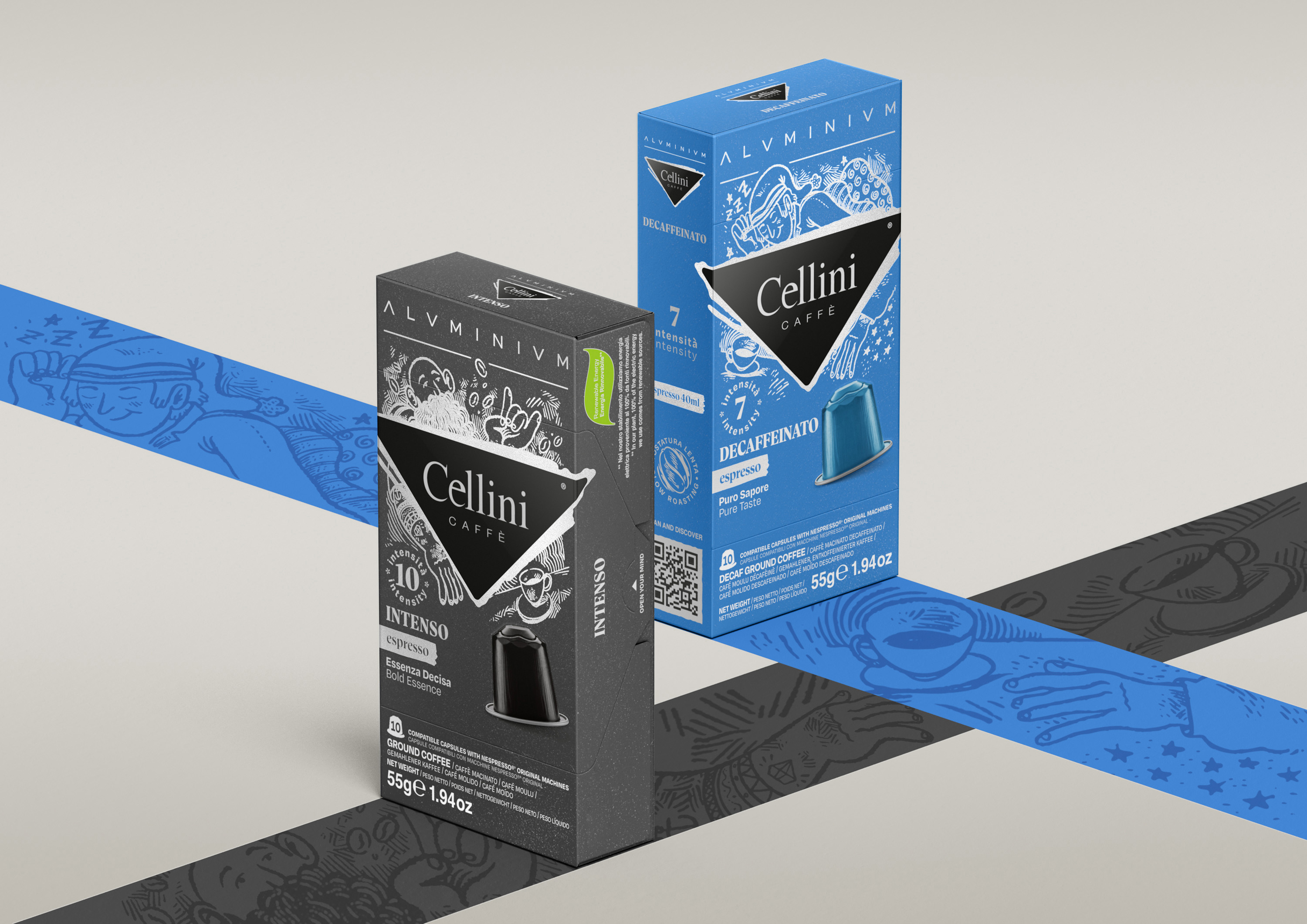
The Cellini logo is prominently displayed in white against a black triangular backdrop, ensuring brand recognition and creating a premium feel.
The coffee blend name and intensity are clearly highlighted, with large, legible text and a numerical indicator of the intensity level for quick identification.
Additional details, such as origin, taste notes, and preparation method, are neatly organized in smaller text, catering to informed coffee enthusiasts.
Capsule Imagery
A 3D representation of the coffee capsule is included on each package, allowing consumers to immediately recognize the product type and format.
The capsules are color-matched to the package, reinforcing the blend identity and making the design cohesive.
Sustainability Emphasis
The mention of “ALUMINIUM” at the top of the packaging highlights the recyclable nature of the capsules, appealing to eco-conscious consumers.
The use of sustainable materials aligns with the modern emphasis on environmentally friendly packaging.
Cultural and Emotional Connection
The design communicates more than just coffee; it ties the product to a broader experience, blending culture, artistry, and the joy of indulgence.
Each color and illustration suggest a mood or story, turning the coffee choice into a personal adventure.
Premium Presentation
The clean layout and high-quality visuals reflect a sense of luxury, positioning the product as a high-end choice for coffee connoisseurs.
The balance of bold colors, intricate illustrations, and clean typography creates a refined, contemporary aesthetic.
This packaging design effectively blends vibrancy, craftsmanship, and sustainability, creating a visually striking and emotionally engaging presentation. It appeals to both the practical and aspirational aspects of the coffee-drinking experience, making it memorable and distinctive.


CREDIT
- Agency/Creative: Arc's
- Article Title: Intricate Illustrations and Bold Colors Elevate Arc’s Packaging for Cellini Coffee
- Organisation/Entity: Agency
- Project Type: Packaging
- Project Status: Published
- Agency/Creative Country: Italy
- Agency/Creative City: Arc's
- Market Region: Europe
- Project Deliverables: Packaging Design
- Format: Box
- Industry: Food/Beverage
- Keywords: coffee
-
Credits:
General Manager: Matteo Rolfo


