


Grey Goose – A Brand World Creation
Introducing our brand world creation for Grey Goose. The project includes a new global brand identity with a reworked logotype and three geese icon. The design system also includes layout principles for above and below the line communications and the creation of a palette of photography that is now used across all touchpoints, such as advertising and social media posts. The brand world defines the aesthetic of every element of the brand, from point-of-sale display to experiential and environmental design.
The project began with Intertype Studio team hosting an online global workshop to deep dive into the brand’s roots and character and to gain an understanding of the functional requirements of the new brand world. We then defined the creative guiding principles of and created a new brand world concept AKA: ‘The big idea’. This creative strategic thinking now defines the aesthetics for all sensory experiences and touchpoint brought to you by Grey Goose.
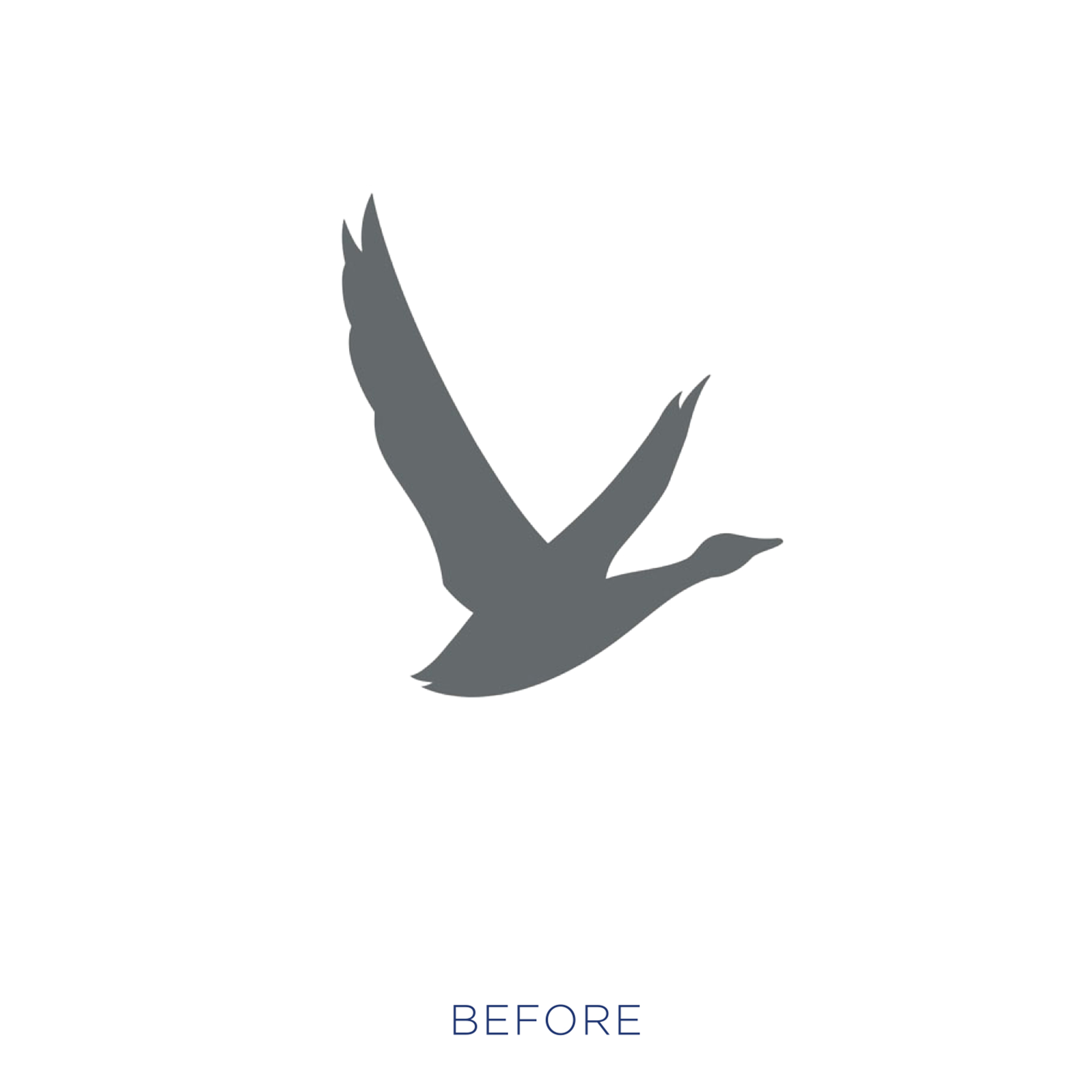
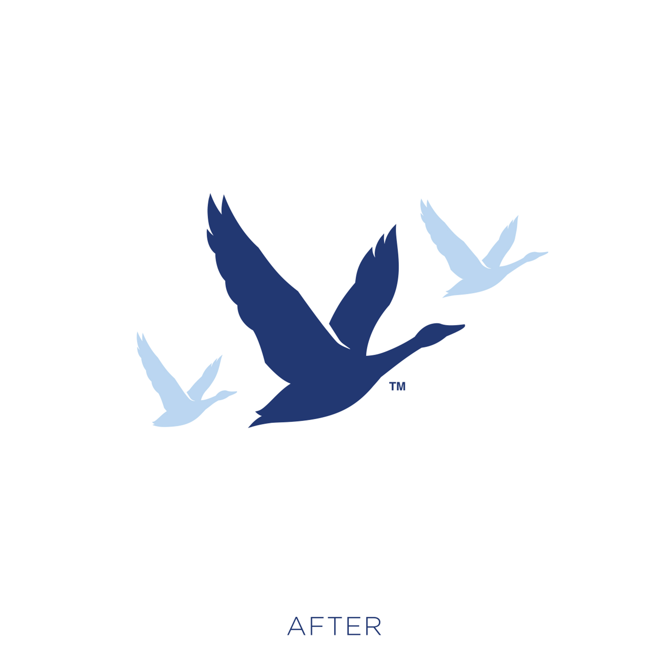
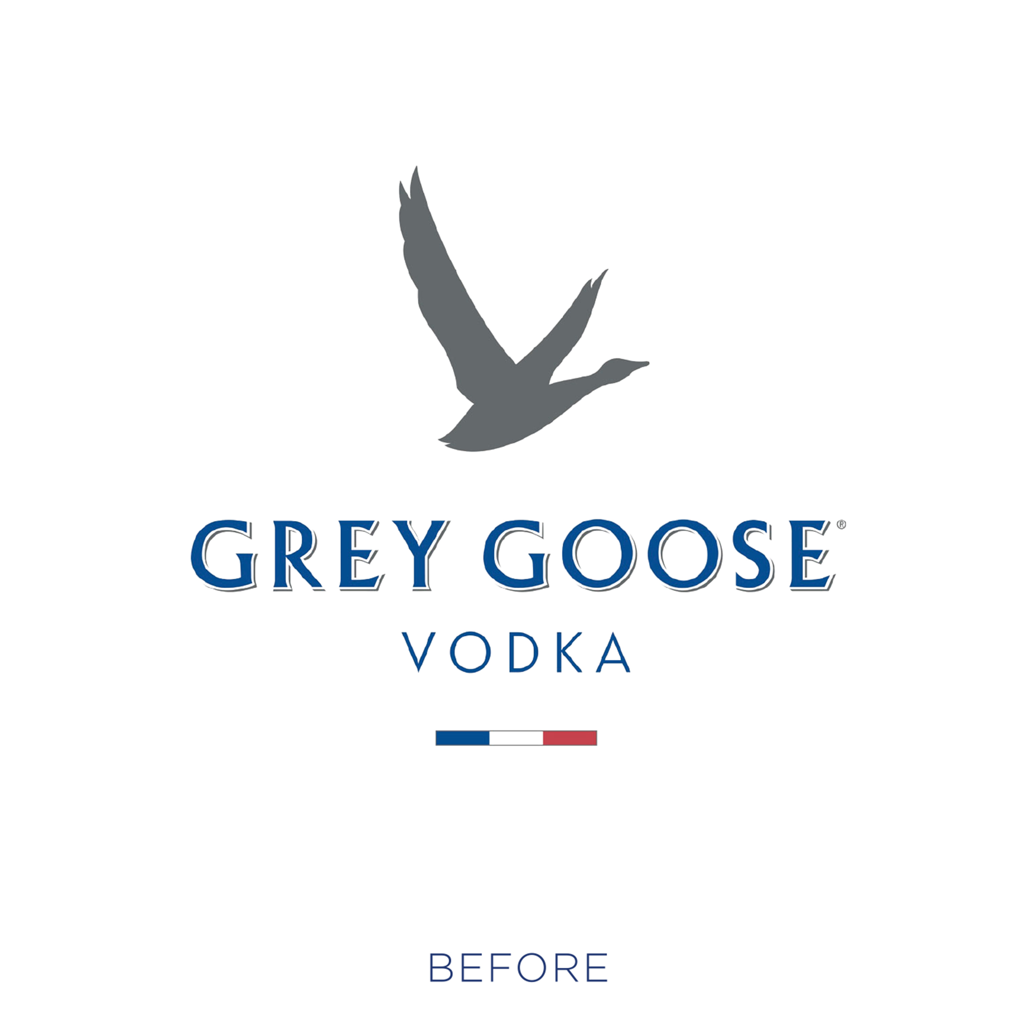
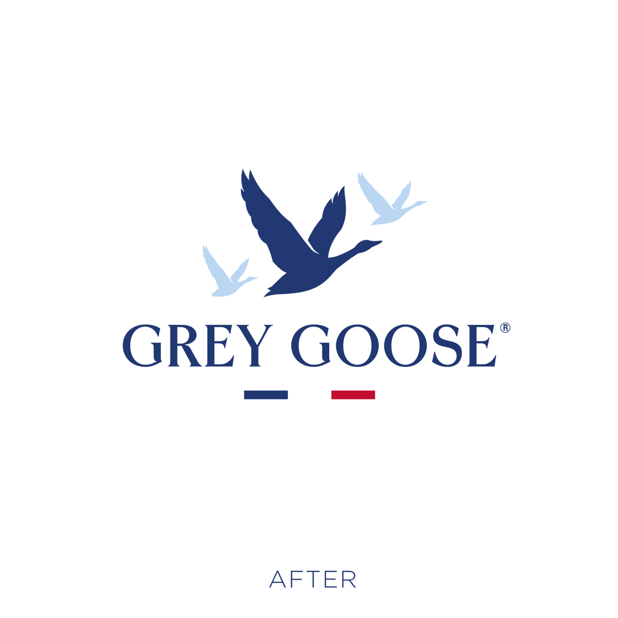
Every visual asset was recrafted. To us, the previous marque felt like a celebration of the individual. By making the brand’s primary symbol into the three geese lock up we hoped to convey a feeling of togetherness and conviviality. In the real world a goose is never seen flying alone, it’s always part of a flock – a metaphor for the vodka consumption occasion itself.
The brand also needed a collection of new visual equities, with guardrails for how to use them. These elements bring a natural home to the geese-in-flight and convey the unique underlying qualities of the vodka itself, which is made using pure spring water from Gensac-La-Pallue, French wheat from Picardie, and is distilled only once to retain its distinctively refined taste and viscous mouthfeel. The mountains also play a key role, so that the entire design system is an amplification of the uniqueness of the bottle itself, serving as an analogy of the origins and qualities of the liquid.
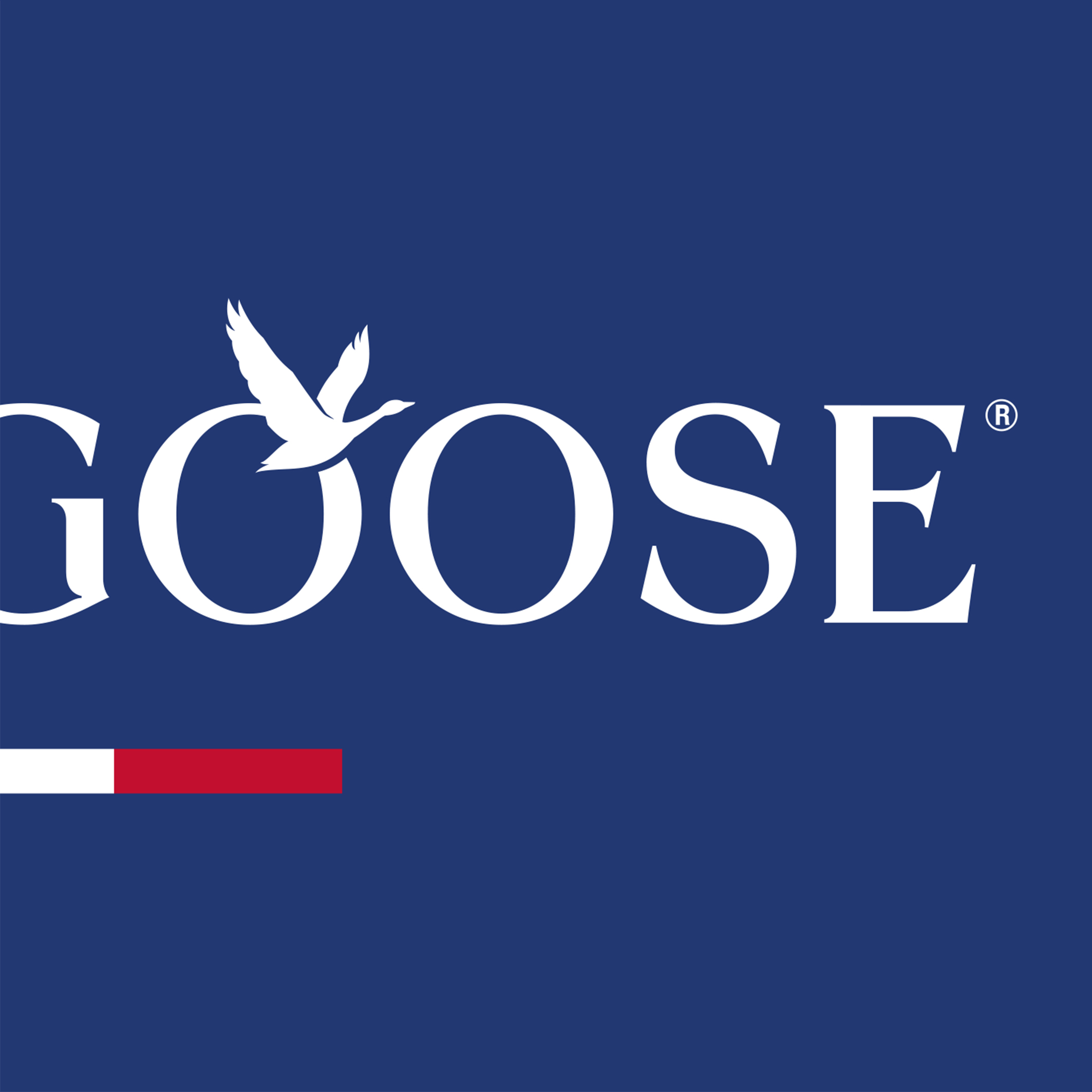
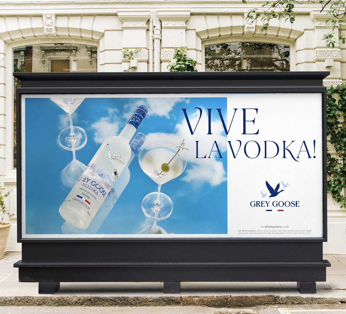
We re-crafted the letterforms of the Grey Goose logotype to bring a sense of flowing elegance, mirroring the natural forms and movement of the geese in flight. This aesthetic was then applied to an entire bespoke typeface for the brand. The typeface contains a palette of alternate glyph characters, allowing anyone who creates a headline to bring a unique variability and flow to the type. There is a subtle sense of flux, as though the type itself is natural and in motion. The font family was created in two weights to retain legibility at large and small scales. For the logo crafting we engaged the services of the super talented lettering artist ‘Ginger Monkey’, a long-time partner of our studio. The typeface was created in collaboration with type foundry Dalton Maag. The ‘Vive la Vodka’ line used in all communications was written by ad agency MullenLowe.
We also defined a new colour palette for the brand, with a flexibility that brings depth to the brand’s signature blue colour and a range of secondary colours that bring a sense of taste and vibrancy to the brand’s naturally flavoured products.
Our art direction of the photography took place across three shoots in New York and London with photographers Sidney Bensimon and Andy Grimshaw respectively. The resulting images were used on billboards and digital ads all over the world. Conceived from pencil sketches to set building, the images create a warm invitation to a subtly suggested occasion, both day and night, whilst highlighting the ice-cold purity of the brand’s signature serves.
During the year long process, our creative team were invited to consult on all aspects of creative execution. The brand world document provides guidance for experiential and environmental design – the ‘In Bloom’ Kehlani gig at pier 17 in Manhattan being the perfect first expression of the brand world vision.
The new scheme is an example of kinetic branding, with movement built into all executions – from the sky moving past and setting on the still life scenes, to the preparation of the serves and the flight of the three geese logo itself. We worked on a palette of animation for the brand assets which draw attention to the brand when people are in ‘auto pilot’ mode on social media and capture our goldfish-like attention at point of sale. The new Brand World even provides guidance for us in the metaverse, which is certainly not something we thought we’d be working in at the conception of the project!
The totality of the brand world brings a complete consistency for the brand in all channels, whilst allowing for constant updates – remaining fresh and relevant to a world which constantly seeks the ‘new’. The update brings a playful sense of Joie de Vivre, whilst also having a feeling of understated chic and effortless style.
CREDIT
- Agency/Creative: Intertype Studio
- Article Title: Intertype Studio Creates New Global Brand Identity for Grey Goose
- Organisation/Entity: Agency
- Project Type: Identity
- Project Status: Published
- Agency/Creative Country: United Kingdom
- Agency/Creative City: London
- Market Region: Global
- Project Deliverables: Brand Design
- Industry: Food/Beverage
- Keywords: Brand design Identity Design Logo Design Art Direction Bespoke Typeface
-
Credits:
Founder and Creative Director: Asa Cook


