


Project Description – InstaGold
InstaGold is a financial platform designed to help users evaluate and track their personal wealth in a precise, transparent, and empowering way. The brand’s vision is rooted in the belief that trust and clarity are the foundations of financial confidence. From that starting point, the entire identity system was developed to translate these values into a modern, balanced, and meaningful visual language.
Concept & Brand Essence
The name InstaGold combines two powerful ideas: “instant,” representing speed, accessibility, and modern digital convenience; and “gold,” symbolizing timeless value, wealth, and stability. The challenge was to merge these two qualities—technology and timelessness—into a single cohesive identity that feels trustworthy yet dynamic.
The brand essence revolves around three key pillars: trust, precision, and accessibility. Every design decision, from the logo’s geometry to the color palette and typography, was guided by these principles. The goal was to design a mark that feels premium but not distant, reliable but not rigid — one that communicates accuracy with warmth.
Logo Design
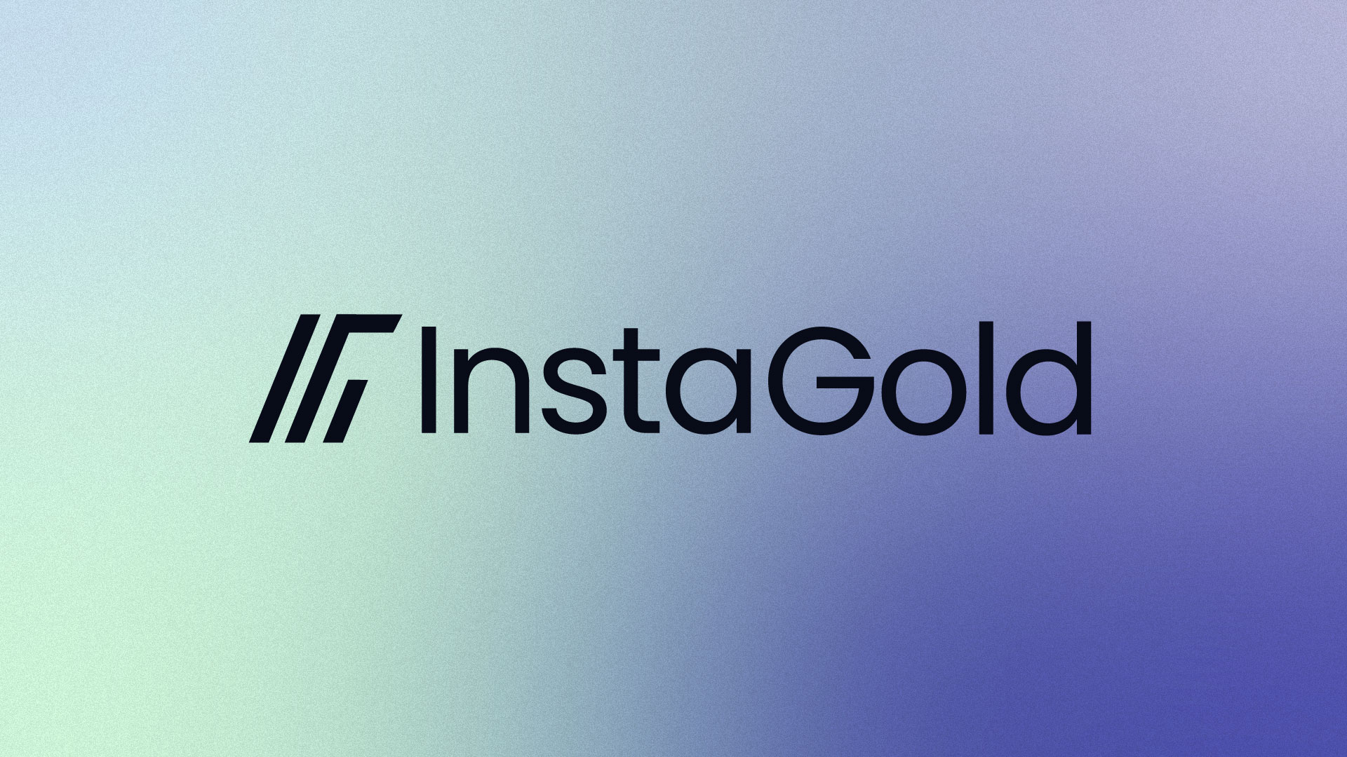
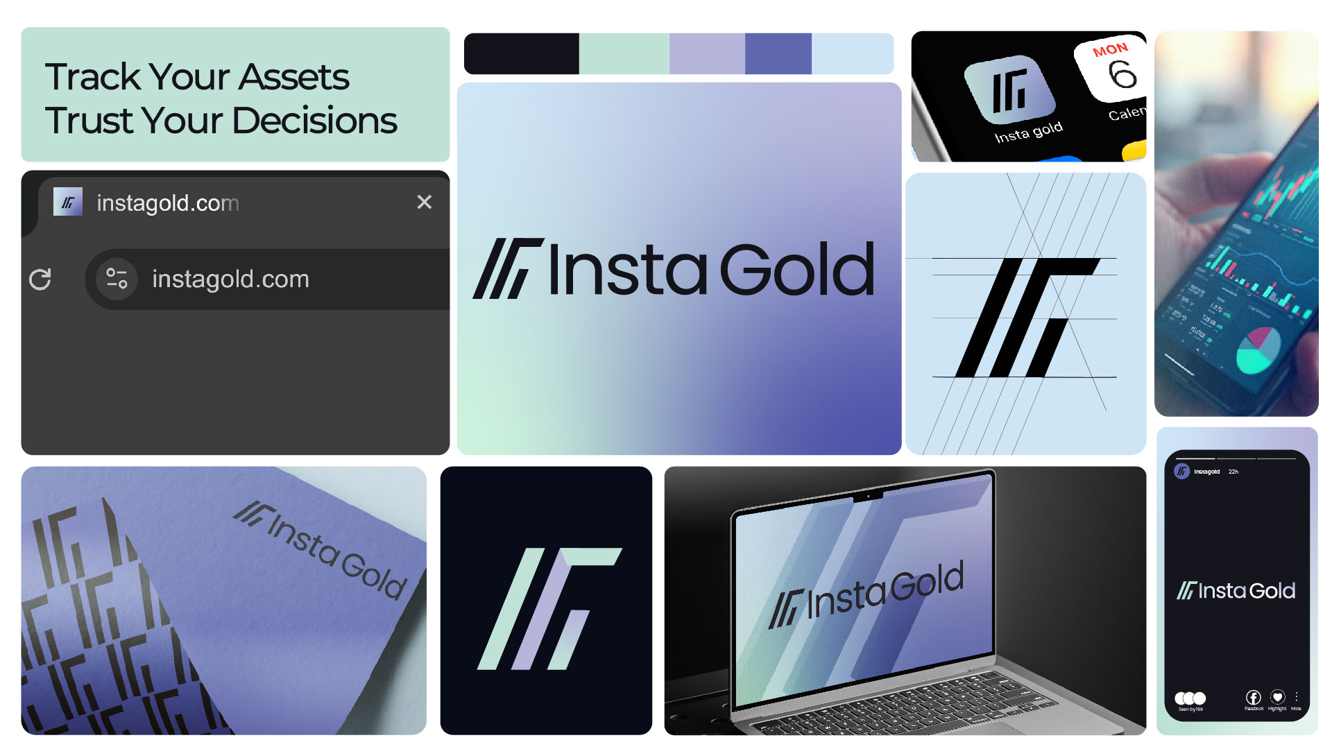
The logo was built from the initials “I” and “G,” merged into a unified symbol. The structure of the logo is based on geometric balance and symmetry, creating a sense of stability and order. A subtle visual metaphor is integrated into the design: when rotated, the mark forms a shape resembling an equal sign (=), symbolizing fairness, equality, and accurate evaluation — key aspects of the brand’s purpose.
The simplicity of the form allows it to adapt easily across different applications, from app icons to physical merchandise, without losing its visual impact. The minimalist approach also enhances memorability, ensuring that the mark stands as a timeless emblem of credibility and clarity.
Typography
The brand typeface was chosen to complement the logo’s clean and structured design. A modern sans-serif typeface with well-balanced letterforms was used to reflect professionalism and precision. The rounded edges of the type bring a friendly and accessible tone, balancing the sophistication of the identity with an approachable personality.
The hierarchy of text across different applications—headlines, subheadings, and captions—was carefully defined to maintain consistency and legibility. Typography plays a key role in establishing the brand’s voice: clear, confident, and refined.
Color Palette
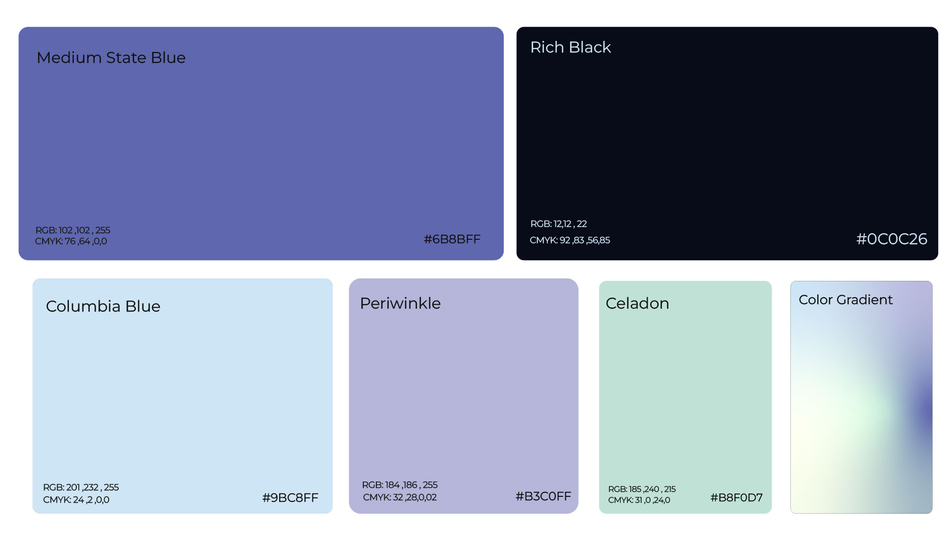
Color was used strategically to communicate both financial stability and digital innovation. The primary palette centers around shades of gold and deep charcoal, symbolizing value and trustworthiness. The gold gradient represents growth, success, and aspiration, while the dark tones provide contrast and strength.
A secondary palette introduces lighter neutrals and metallic variations to allow flexibility in communication, especially across digital platforms. The overall mood of the palette is premium yet modern — avoiding clichés of luxury to create something more authentic and forward-thinking.
Visual Language & System
Beyond the logo, the visual identity extends into a full brand system. Graphic elements are derived from the logo’s geometry, forming patterns and grids that can be used in backgrounds, icons, and digital interfaces. This consistent system reinforces the brand’s sense of order and reliability.
Icons and data graphics were designed using the same geometric principles to ensure coherence. Rounded shapes and consistent line weights tie all elements together visually, allowing the brand to maintain a unified presence across all touchpoints — whether in app UI, printed reports, or promotional materials.
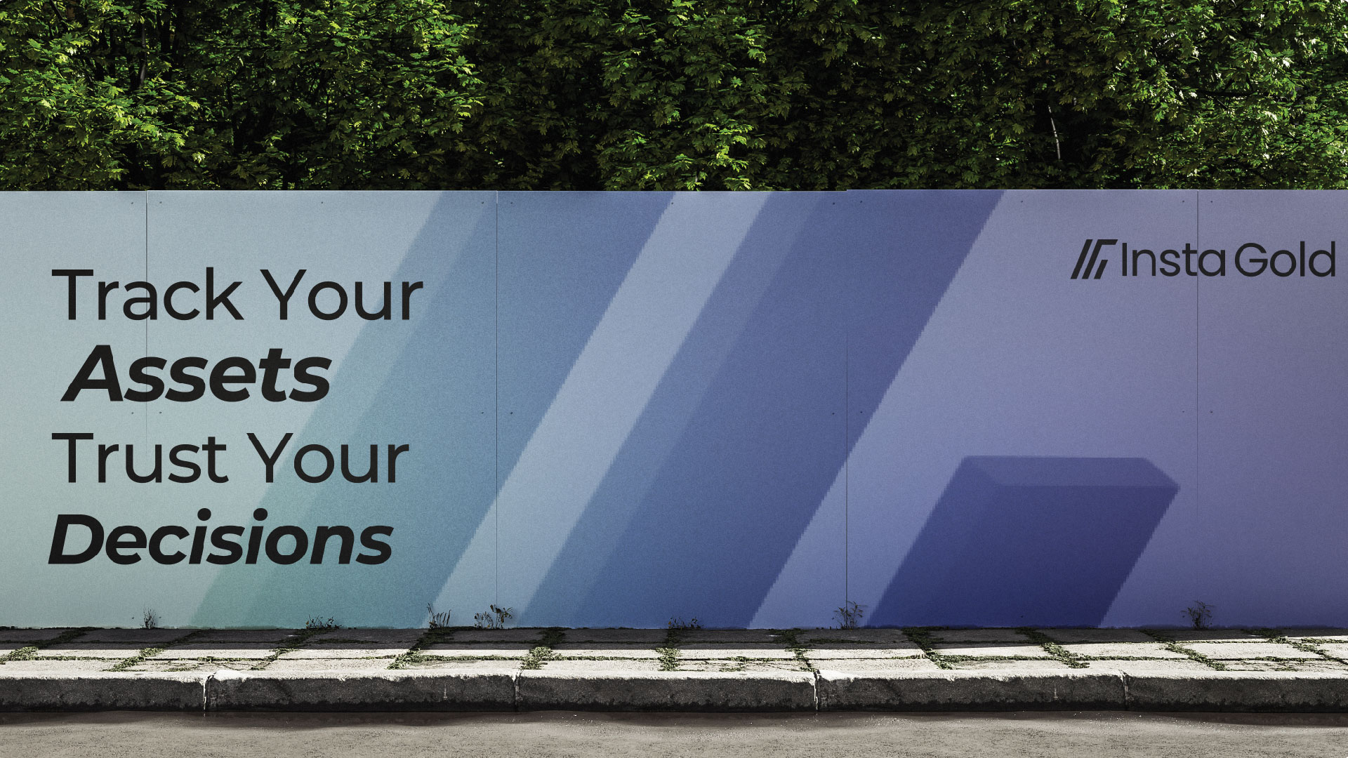
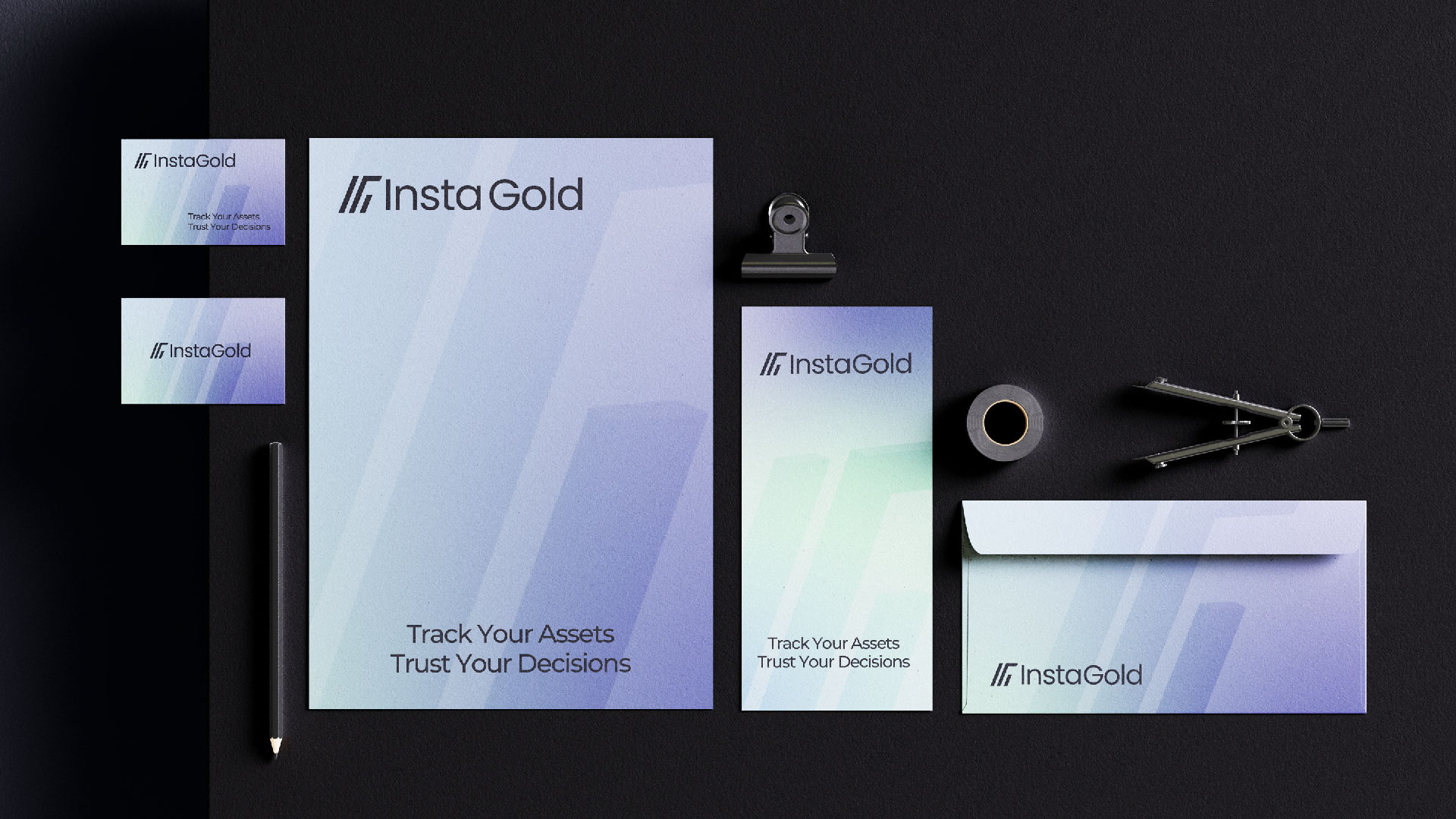
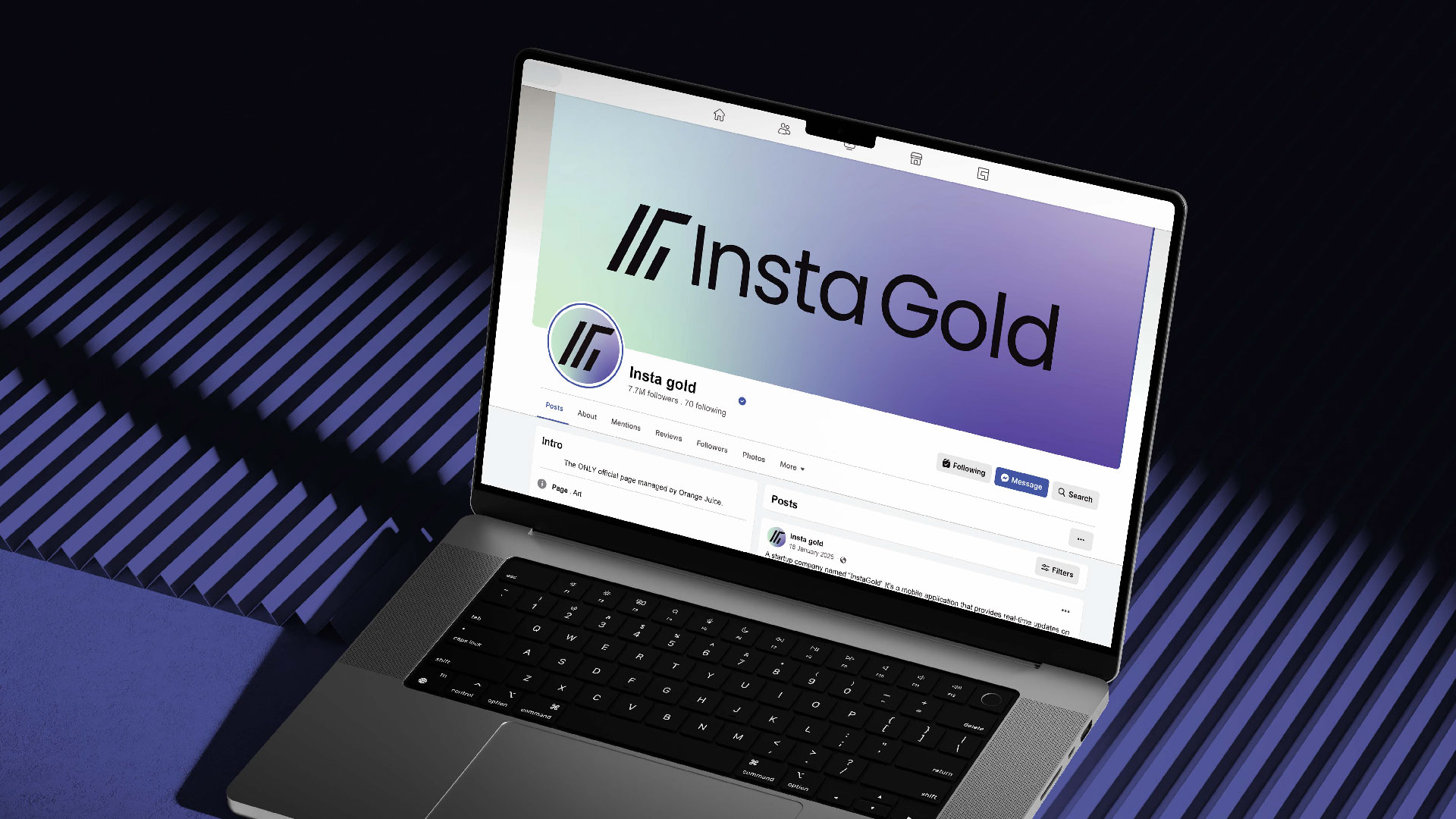
Applications
The branding was tested and visualized across multiple mockups to demonstrate flexibility. The logo performs equally well in monochrome and full-color settings. On digital screens, the metallic gold gradient creates a sense of depth and value, while in print, the mark retains its sophistication through foil stamping or embossing techniques.
Stationery items such as business cards, envelopes, and letterheads maintain a minimal and elegant layout, emphasizing negative space and subtle gold accents. Social media templates are designed to be clean and data-driven, showcasing content clearly while maintaining brand consistency.
The identity also adapts seamlessly to mobile interfaces. The simplified icon version of the logo ensures recognizability even at small scales, an essential aspect for a tech-oriented financial platform.
Design Process
The design journey began with extensive research into financial technology brands and user perception of trust. Early exploration focused on visual metaphors of stability, value, and connection. Multiple sketches were developed to explore different interpretations of the “I” and “G” relationship — from literal overlaps to abstract forms.
The chosen direction stood out for its balance between conceptual meaning and visual simplicity. Prototyping and refinement followed, focusing on proportion, alignment, and negative space to achieve perfect symmetry. Every curve and angle was tested to ensure harmony and scalability.
Color testing involved digital simulations to understand how gold tones render across various devices and printing techniques. The final palette was optimized for both accessibility and visual richness. Typography was also fine-tuned to ensure consistent weight contrast when used alongside the logo mark.
Tone of Voice & Brand Personality
InstaGold’s visual identity is complemented by a verbal identity that communicates confidence with warmth. The tone of voice is clear, supportive, and aspirational. It speaks to individuals who seek control and understanding of their financial journey, without intimidation or complexity.
This tone aligns perfectly with the visual design — sophisticated but approachable, technical yet human. Together, they create a brand that users can trust not only for its reliability but also for its empathy and clarity.
Outcome & Impact
The final identity successfully translates InstaGold’s values into a cohesive design language. The logo communicates balance and fairness, the colors convey stability and growth, and the typography reinforces clarity and precision. The entire system builds a sense of reassurance and professionalism that resonates with the financial technology audience.
Beyond aesthetics, the design enhances usability. Its simplicity and modularity allow effortless application across media, ensuring consistent recognition. Whether in an app icon, website header, or printed collateral, the brand remains instantly recognizable and trustworthy.
Conclusion
The InstaGold branding project embodies the fusion of strategy and creativity. Every visual decision was made to support a larger narrative of trust, precision, and accessibility. The result is a timeless, scalable identity that reflects the brand’s core promise: empowering people to understand and grow their financial worth with confidence.
By aligning conceptual depth with minimalist execution, InstaGold stands as a symbol of modern financial clarity — a bridge between the reliability of gold and the speed of technology. It’s not just a logo; it’s a visual expression of value, equality, and empowerment in today’s fast-paced digital economy.

CREDIT
- Agency/Creative: Eyediaes Competition Project
- Article Title: Insta Gold by Habiba Hatem — A Brand Identity from Eyediaes Competition
- Organisation/Entity: Student
- Project Type: Identity
- Project Status: Published
- Agency/Creative Country: Egypt
- Agency/Creative City: Cairo, Egypt
- Market Region: Middle East
- Project Deliverables: Advertising, App Design, Brand Creation, Brand Design, Brand Guidelines, Brand Identity, Branding
- Industry: Financial
- Keywords: Insta Gold, Branding, Visual Identity, Logo Design, Fintech, Trust, Accessibility, Minimal Design, Modern Branding, Gold, Elegant, Luxury Brand.
-
Credits:
Brand Designer / Visual Identity Designer: Habiba Hatem Ahmed


