Introduction:
Balance, a visionary company, approached Innovāt® with the ambitious goal of redefining the dairy market by creating a brand that embodies a philosophy of balance, harmony, and well-being, offering consumers a range of delicious and nutritious products that support a holistic approach to health. This presented a unique challenge: to develop a brand identity that resonated with health-conscious consumers and established a strong presence in the competitive dairy market.
The Task:
Balance presented a multifaceted set of objectives: to establish a strong market position, create a unique and compelling brand identity, develop a diverse range of high-quality dairy products, build a loyal customer base, and develop a brand identity that reflects the highest standards of quality, sustainability, and aligns with their vision of promoting a balanced lifestyle.
Research & Insights:
Innovāt® conducted thorough market research, analyzing competitors, consumer trends, and target audience needs. This research identified key consumer segments: health-conscious individuals, busy professionals, and families seeking healthy options, allowing us to tailor the brand identity accordingly.
Brand Strategy
The brainstorming process, exploring various brand names and concepts, led to the selection of ‘Balance,’ encapsulating the brand’s core philosophy. This positioned Balance as a premium brand that goes beyond simply providing dairy products, offering a range of delicious and nutritious options that nourish the body and mind.
Visualization: The Conceptual Foundation:
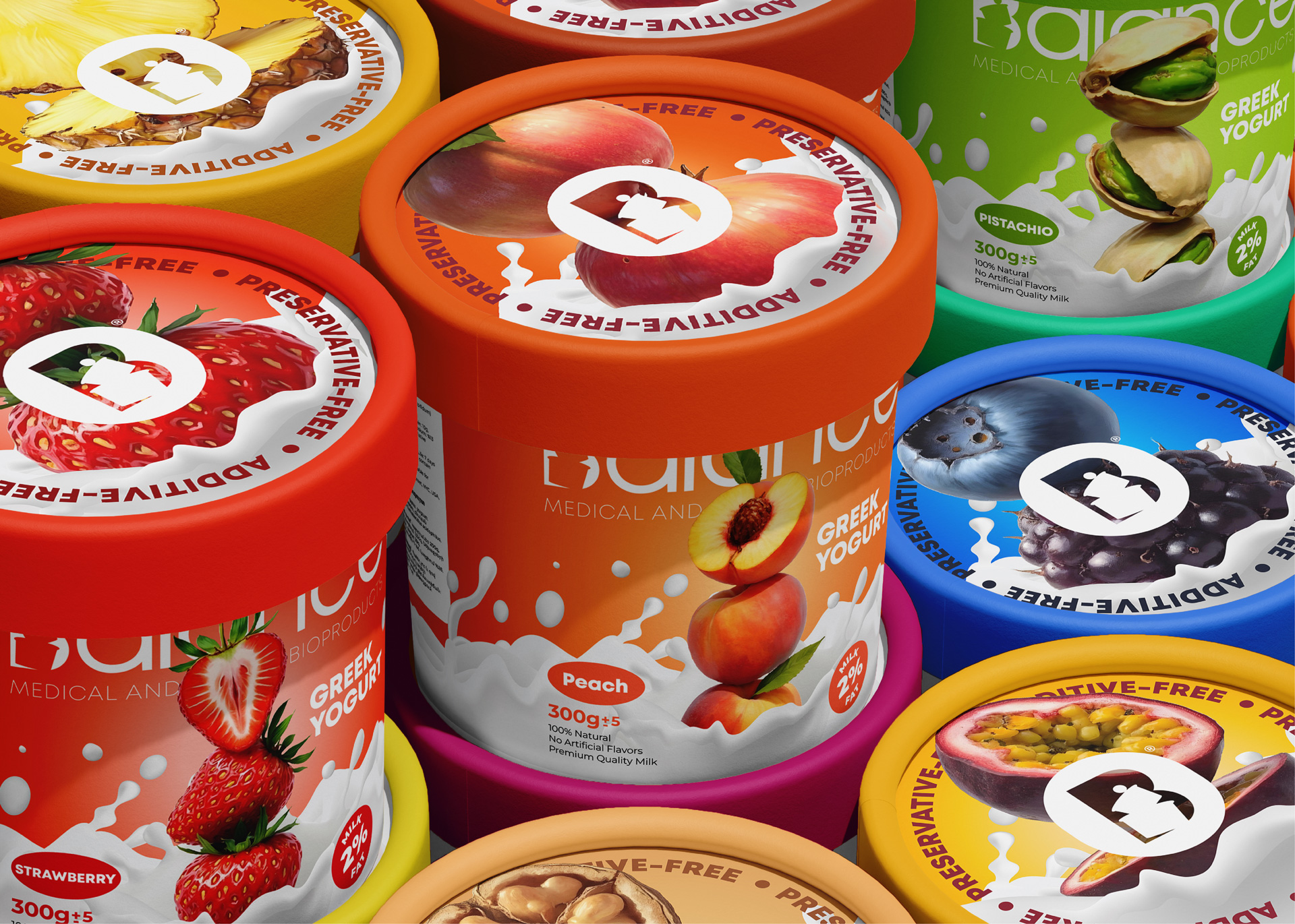
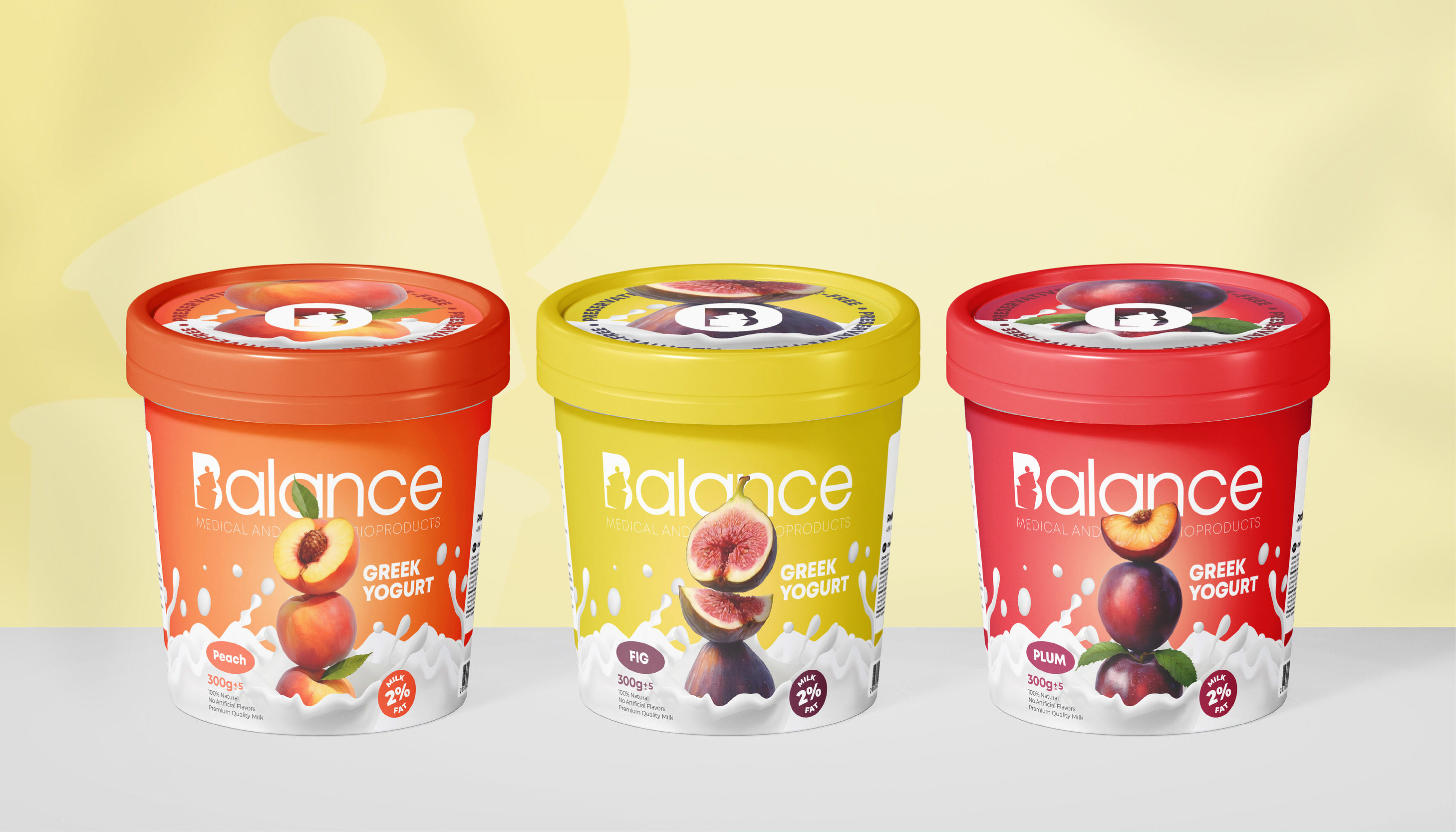
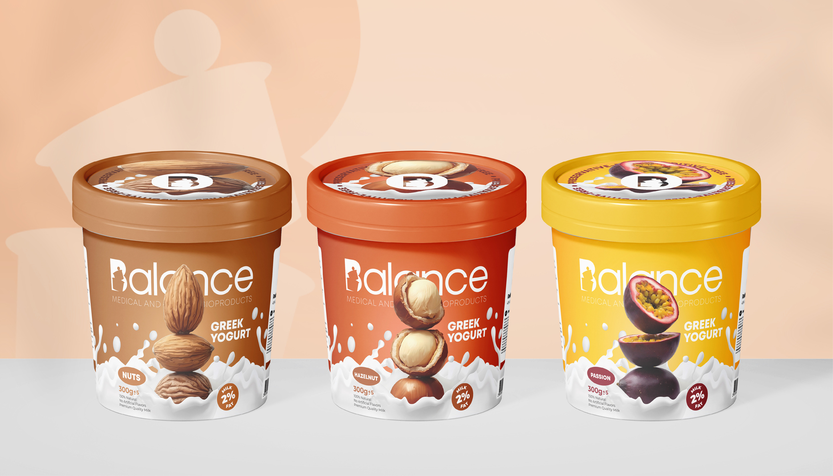
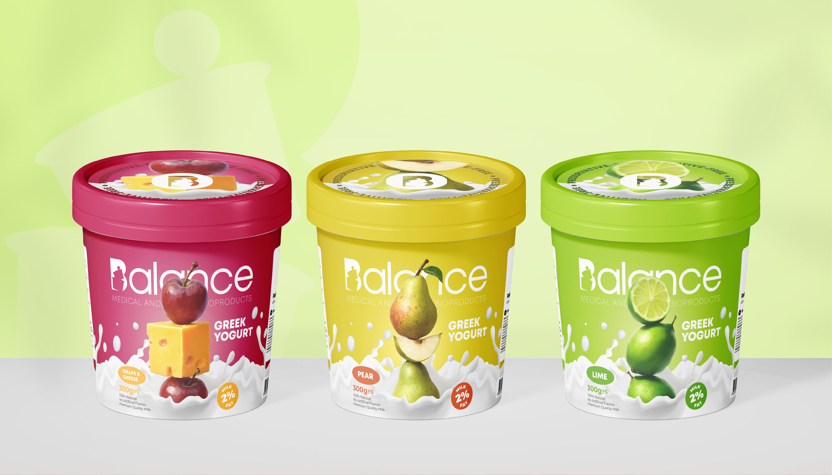
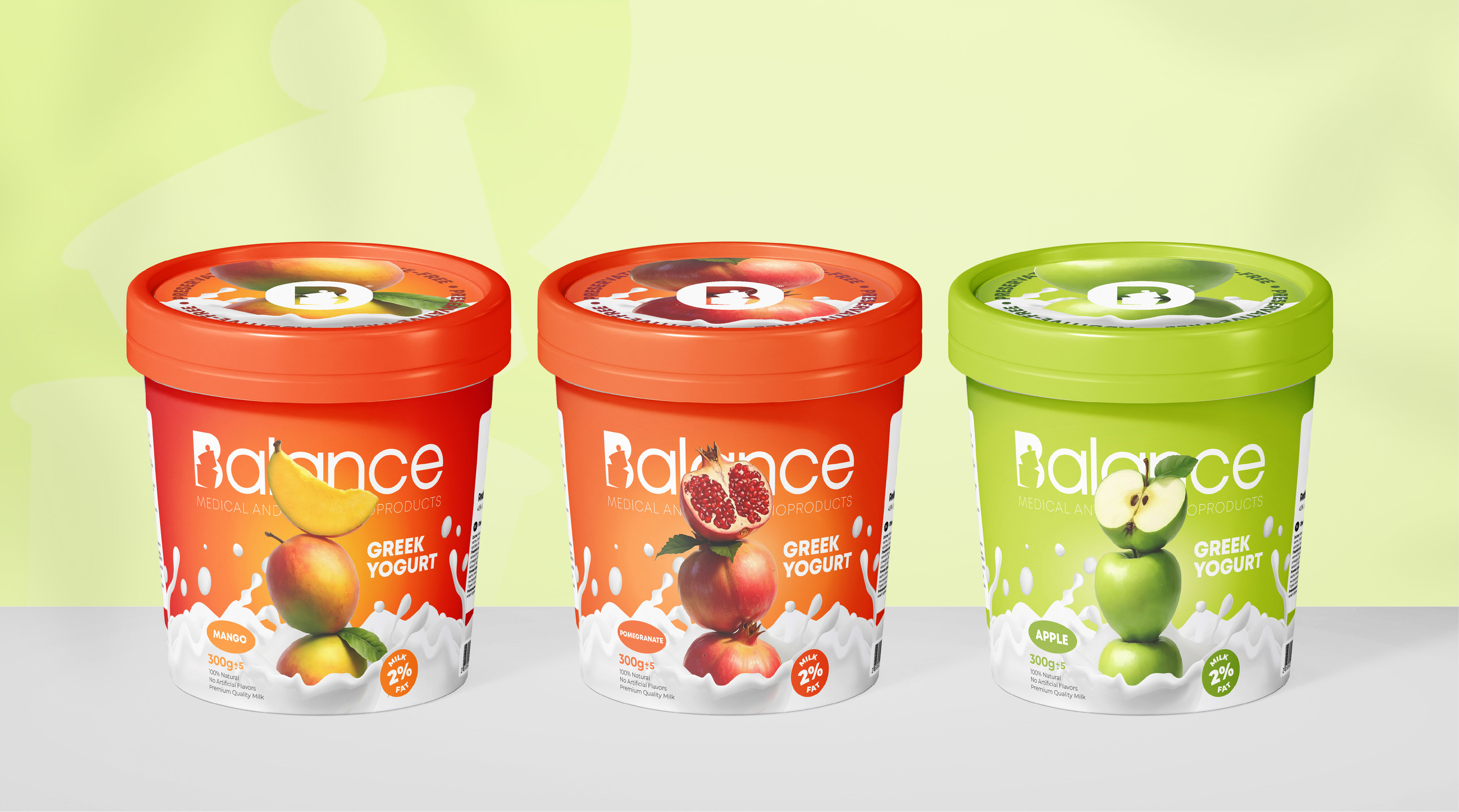
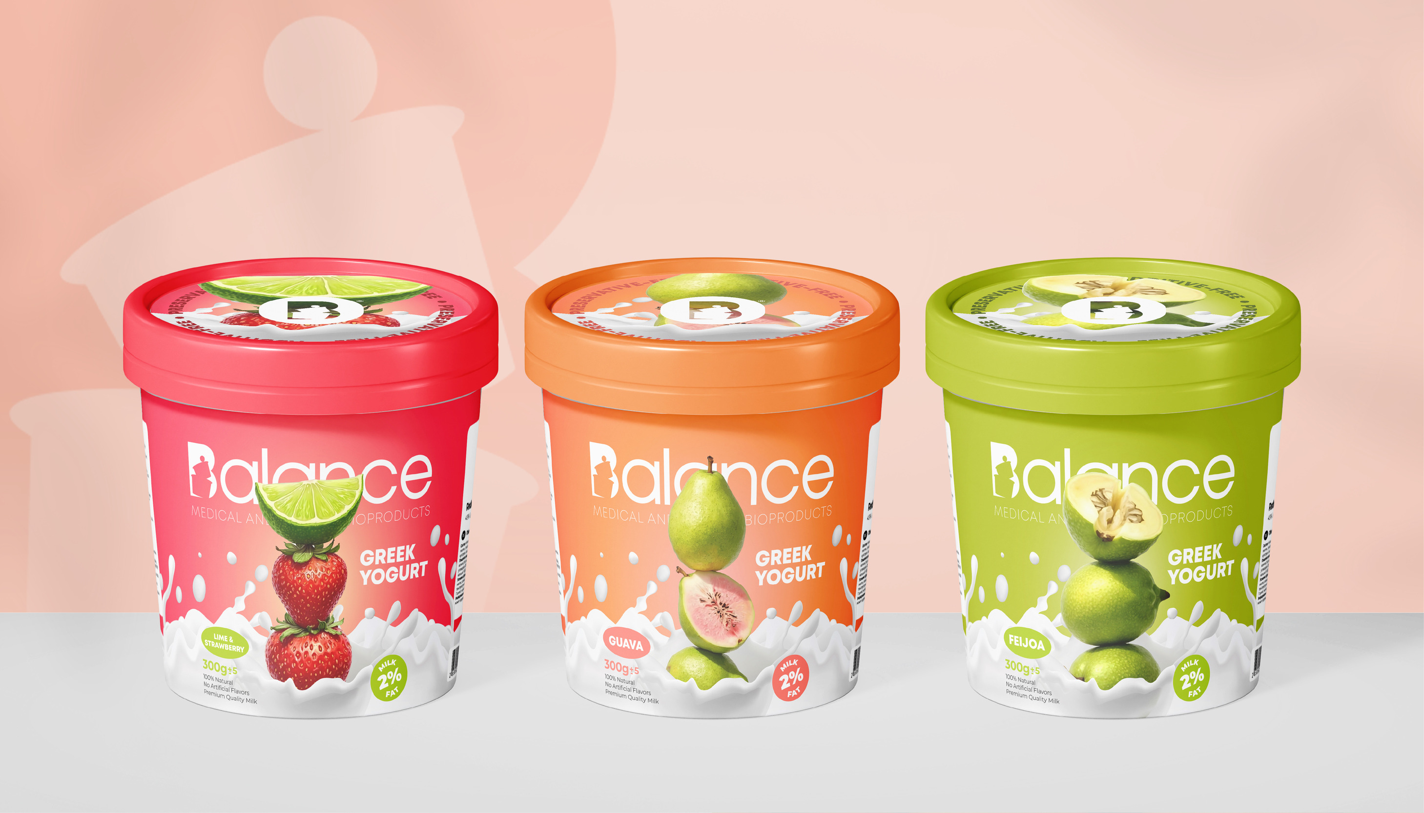
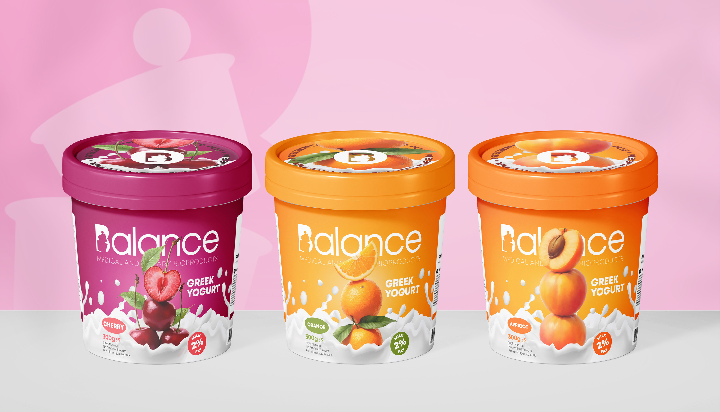
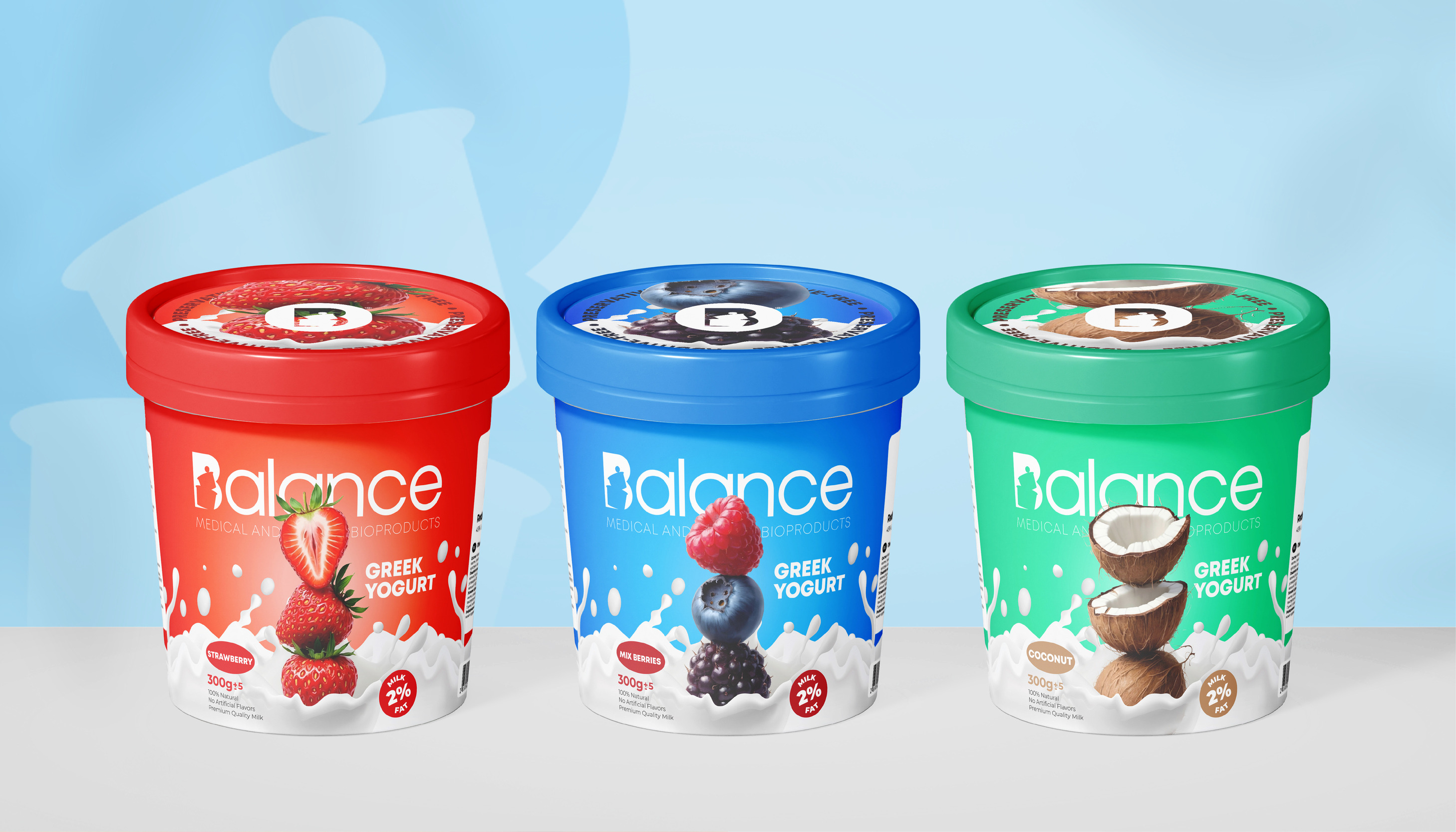
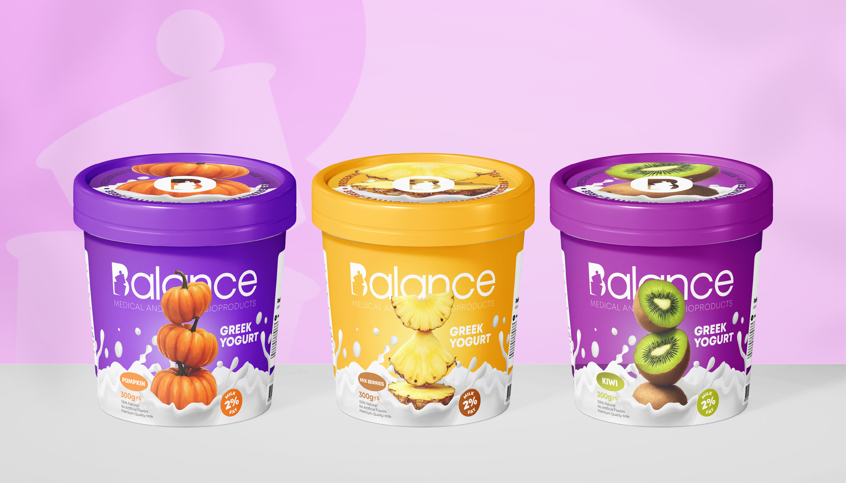
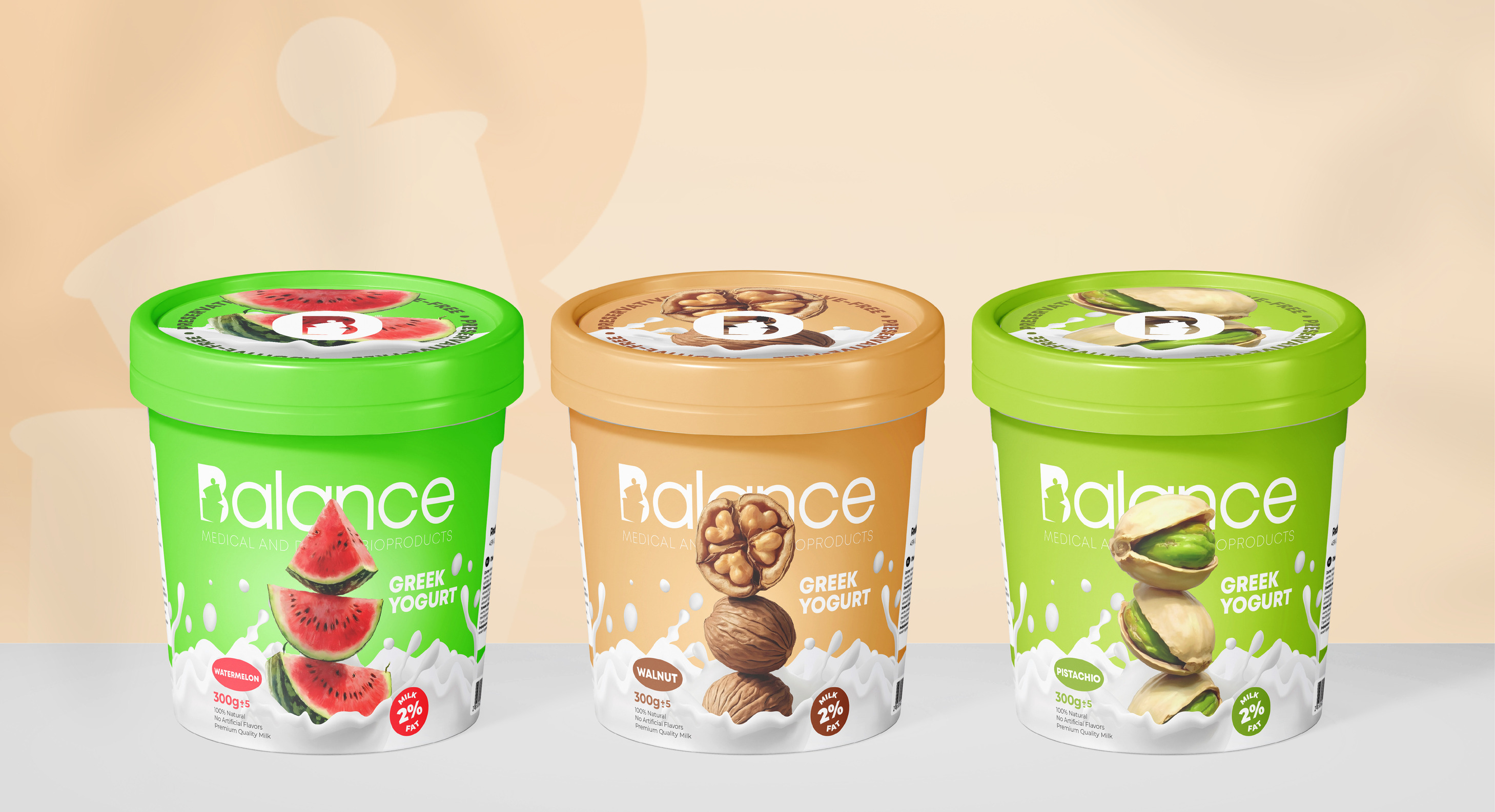
The core challenge lay in translating the abstract concept of ‘Balance’ into a visually compelling and engaging narrative for the packaging. Inspired by nature’s harmonious compositions, Innovāt® envisioned a scene where different fruits, representing the diverse flavors of our yogurts, seemed to have fallen gently onto the surface of the milk, creating a balanced and harmonious arrangement. This visual metaphor, inspired by the natural world, perfectly captured the essence of Balance – a harmonious blend of flavors, textures, and ingredients working together in perfect unison.
Bringing the Vision to Life: The Art of Illustration:
The illustrations were meticulously rendered using traditional hand-drawn techniques with colored pencils, capturing the vibrancy and texture of each fruit with exquisite detail. Achieving the desired balance and harmony within each composition presented a unique artistic challenge, requiring numerous iterations and refinements. Seamlessly integrating these intricate illustrations onto the packaging while ensuring optimal print quality and maintaining brand consistency demanded a high level of technical expertise and a meticulous attention to detail from Innovāt®.
Brand Storytelling:
Innovāt® developed a compelling brand narrative that revolves around the journey of achieving a balanced lifestyle through mindful choices and a focus on well-being. Engaging content was created across various channels, including social media, website, and in-store materials, to share the Balance story and connect with consumers on an emotional level.
Brand Positioning:
Balance is positioned as a premium brand that goes beyond simply providing dairy products, offering a range of delicious and nutritious options that nourish the body and mind. The brand emphasizes harmony, quality, integrity, and health in all its endeavors.
The Logo Concept:
The Balance logo, anchored by a circle symbolizing the cyclical nature of balance and the interconnectedness of all things, features a stylized ‘B’ representing the brand foundation. Upon this foundation, two containers emerge, signifying the diversity of choices and the importance of building upon a strong base, culminating in a delicately balanced ball symbolizing the dynamic equilibrium, aspiration, and the continuous journey towards a more fulfilling life. This harmonious interplay of elements, seamlessly integrated within the logo, effectively communicates the brand’s core values and creates a powerful and memorable visual representation that resonates with the target audience.
Color Separation and Patterns Management:
The Balance brand employs a strategic color separation model to visually differentiate and manage its diverse product lines.
Whole Nine Yards (Dairy Products):
The soothing green symbolizes nature, growth, and vitality, perfectly complementing the dairy product category. The pattern, featuring the balanced containers from the logo, reinforces the brand’s core values and visually represents the foundation of a balanced diet.
Aztec Turquoise (Prefabricated Foods):
The vibrant cyan evokes a sense of freshness and vitality, perfectly complementing the prefabricated foods category. The dynamic wavy lines pattern creates a sense of movement and fluidity, suggesting the ease and speed with which these meals can be prepared and enjoyed.
Flush Orange (Ready To Cook Meals):
The energetic orange evokes feelings of warmth and vibrancy, aligning perfectly with the ready-to-cook meals category. The pattern of stacked containers mirrors the layered nature of these meals, suggesting the simple steps involved in their preparation and evoking a sense of anticipation for the delicious meal to come.
Heliotrope (Desserts & Sweets):
The luxurious Heliotrope evokes indulgence and delight, perfectly aligning with the desserts category. The concentric circles pattern, reminiscent of the swirling motion of a whisk or the delicate layers of a beautifully crafted dessert, symbolizes unity and shared enjoyment.
This approach ensures that each product line maintains its own distinct identity while remaining cohesively connected to the overarching Balance brand.
Naming Concept:
The name ‘Balance’ transcended a mere label; it embodied the brand’s core philosophy, reflecting the target audience’s aspirations and cultivating a deeper connection with consumers.
Beyond a Name:
“Balance” is more than just a name; it embodies a lifestyle philosophy. It resonates with individuals seeking harmony in their lives, whether it’s achieving a healthy diet, managing stress, or finding inner peace.
Aligning with Values:
The name perfectly aligns with the brand’s core values, emphasizing the importance of balance and harmony in all aspects of life, from nutrition to lifestyle. It conveys a sense of equilibrium and well-being, suggesting a holistic approach to health and wellness.
Versatility and Memorability:
“Balance” is a concise, memorable, and versatile name that resonates across different cultures and languages. It is easily understood and readily associated with the brand’s core values.
CREDIT
- Agency/Creative: Innovāt® - Empowering Creative Innovation
- Article Title: Innovāt Redefines Balance Dairy’s Branding with Striking New Packaging Design
- Organisation/Entity: Agency
- Project Type: Packaging
- Project Status: Published
- Agency/Creative Country: Armenia
- Agency/Creative City: Yerevan
- Market Region: Asia, Europe, Middle East, Global
- Project Deliverables: Advertising, Animation, Brand Creation, Brand Design, Brand Experience, Brand Identity, Brand Mark, Brand Naming, Branding, Digital Art, Drawing, Graphic Design, Illustration, Packaging Design, Product Design, Product Naming
- Format: Cup
- Industry: Food/Beverage
- Keywords: yogurt, packaging, dairy, milk, cheese, balance, branding, packaging, illustration,
-
Credits:
CEO/Art Director & Senior Designer: Sako Habeshian
Creative Design Agency: Innovāt® - Empowering Creative Innovation
Creative Design Agency: Habeshian Graphics


