


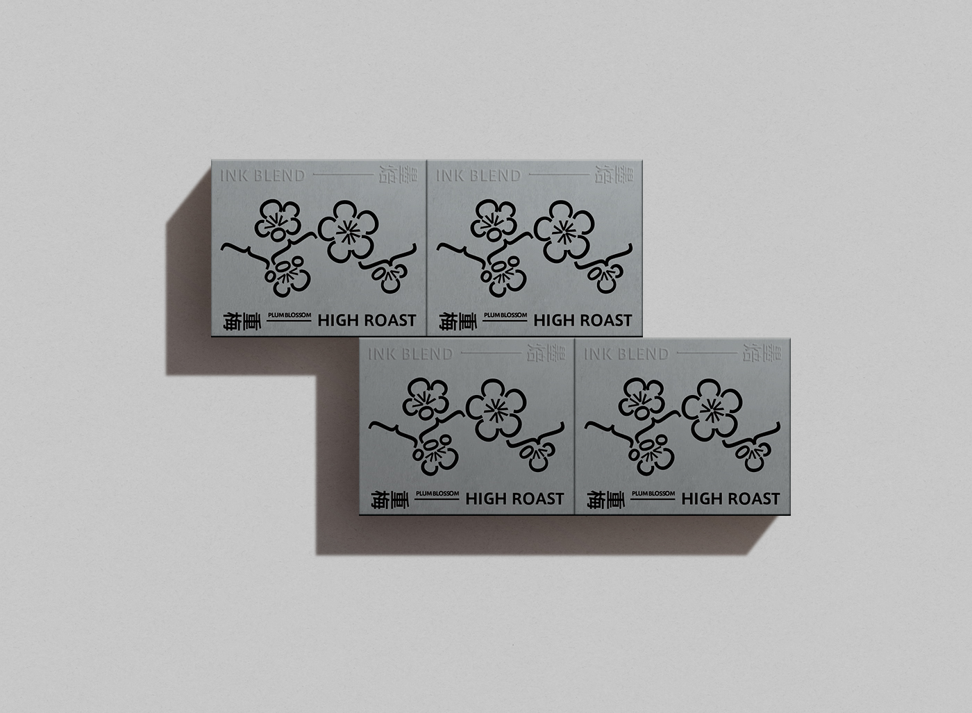
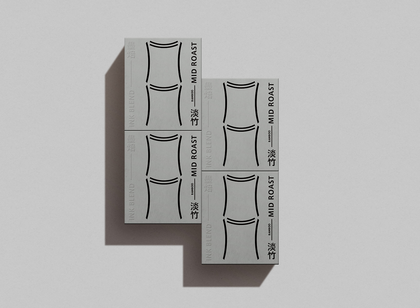
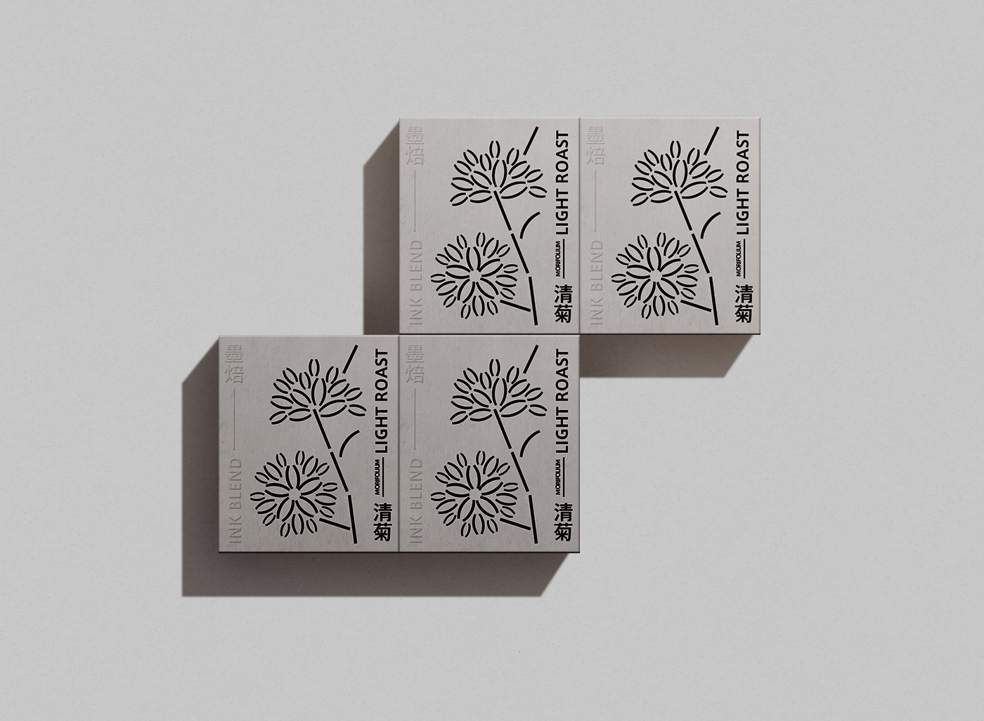
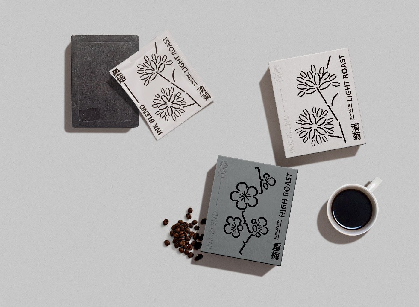
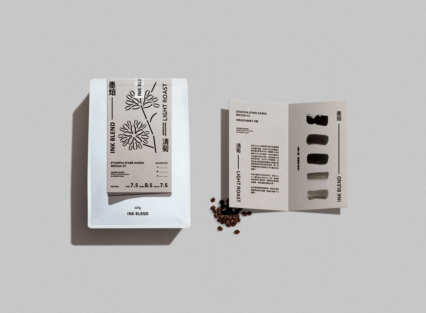
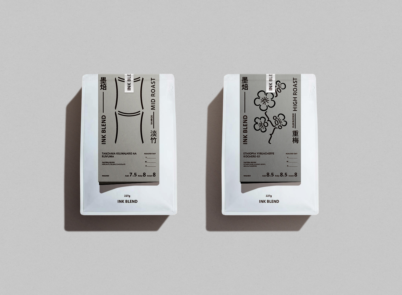
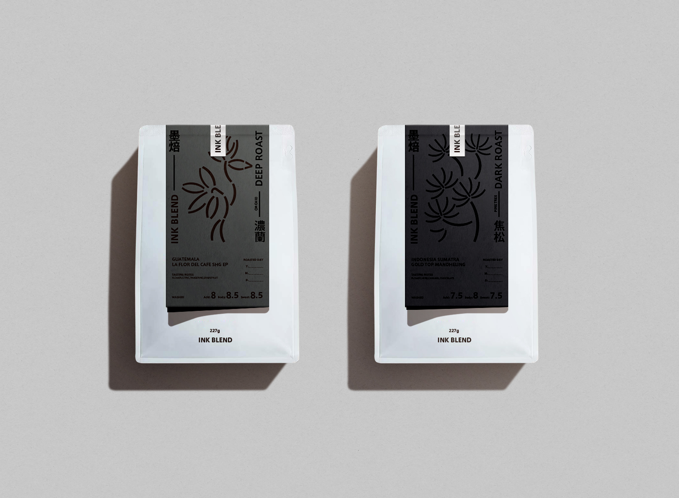
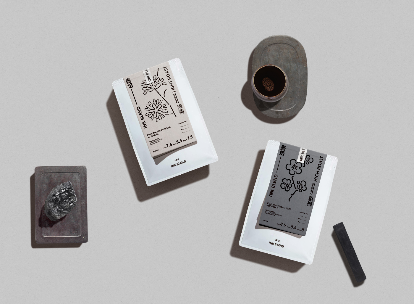
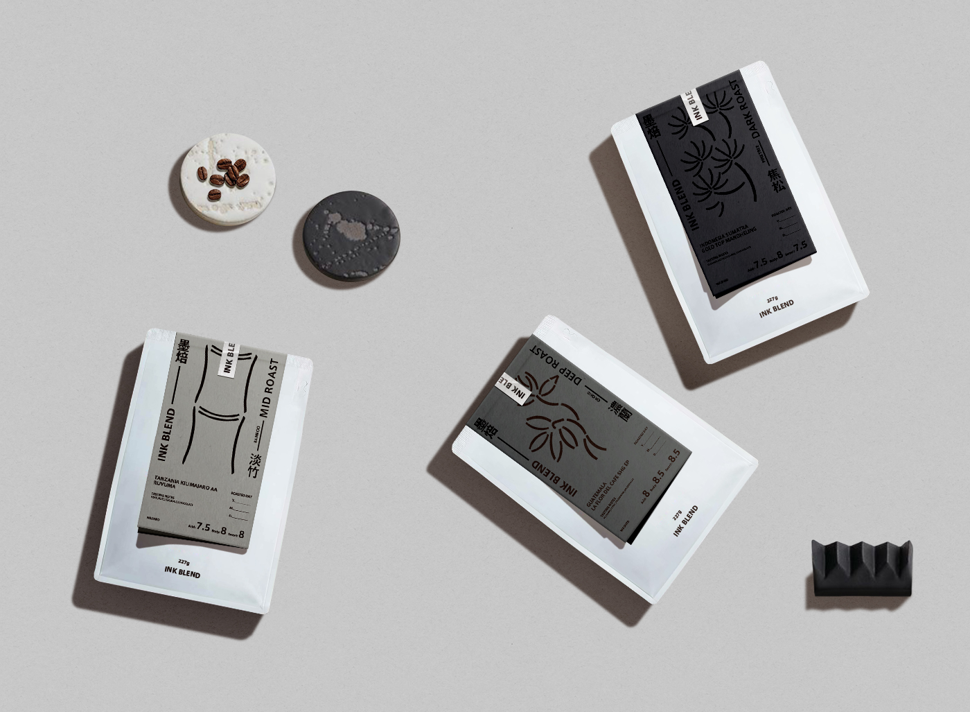
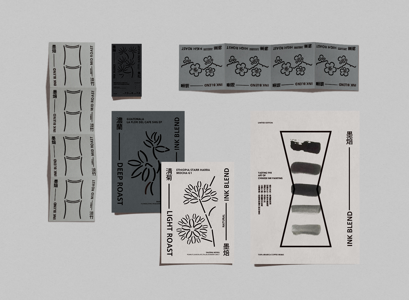
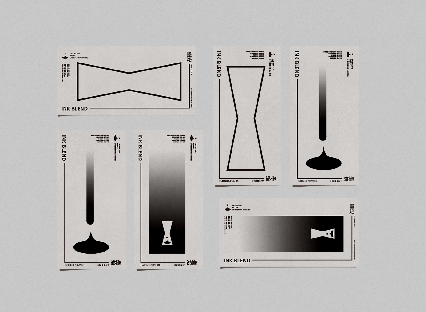
After grinding, drip water, and finally taste the black flavor, Coffee is black, ink is black, Chinese ink painting and coffee are both arts of black. Combining Chinese ink and coffee with playfulness, taste the art of a Chinese ink painting.
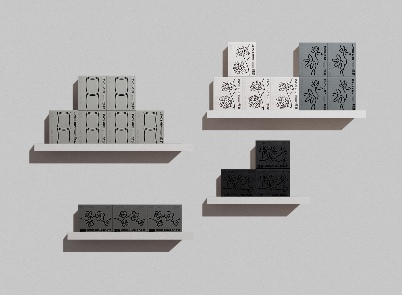
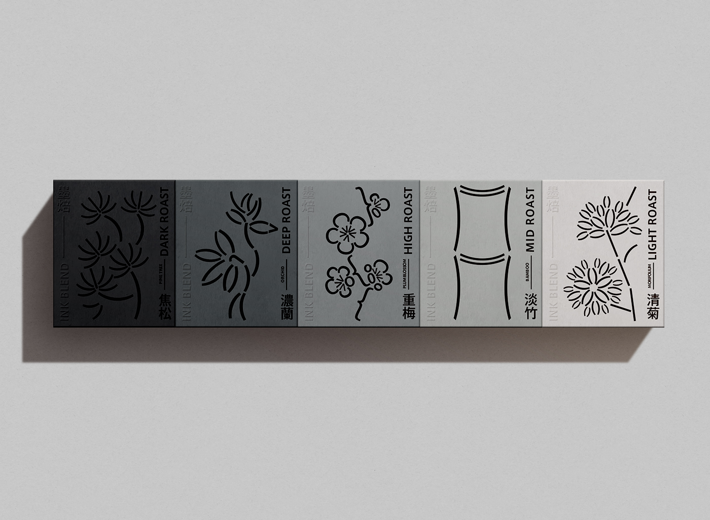
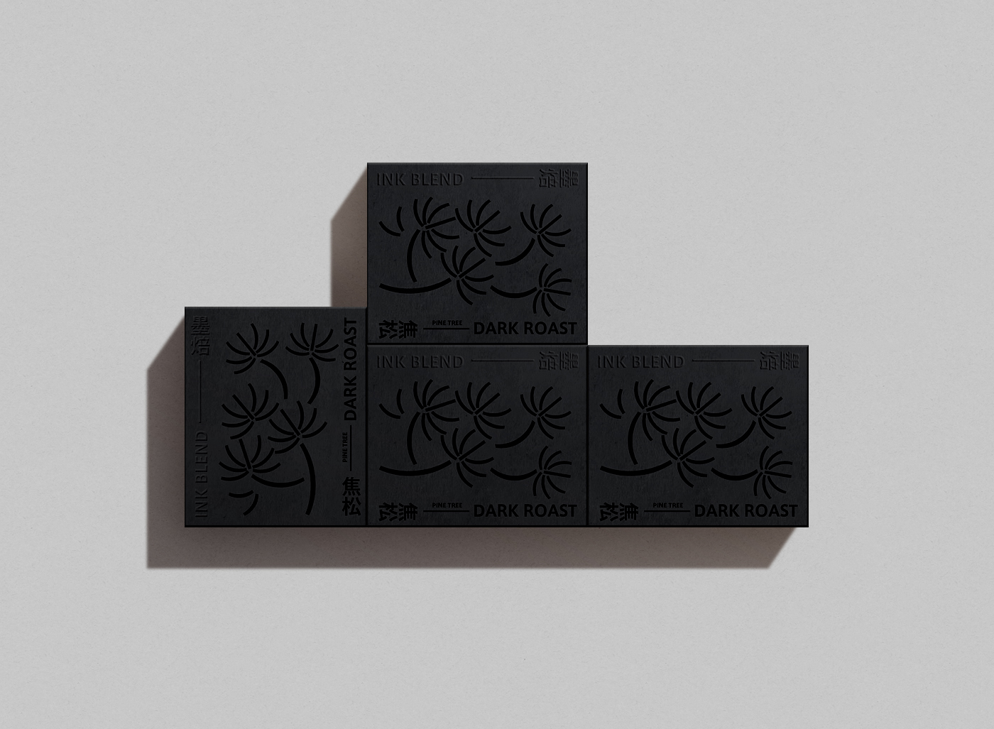
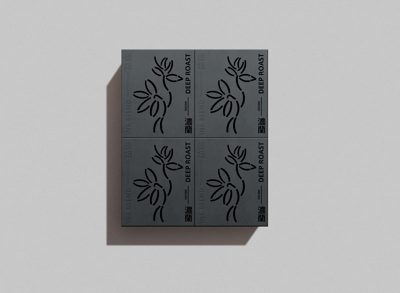
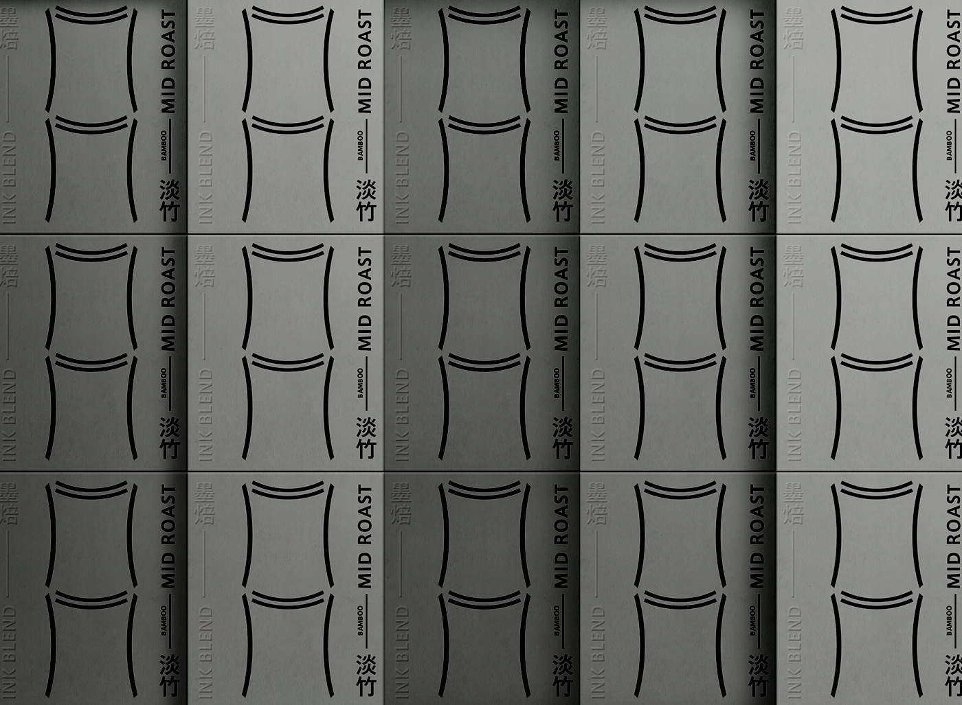
In the concept of Chinese ink painting, the ink has the concept of “five color levels of ink”, which means that the ink color changes from thick to light. With the concept of “ink-divided five-color levels”, the flower theme in ink painting is combined with coffee roasting and flavor. Roasting degree is burnt, strong, heavy, light, clear, and flavors are plum, orchid, bamboo, chrysanthemum, pine and cypress.
CREDIT
- Agency/Creative: Lung-Hao Chiang
- Article Title: Ink Blend Coffee Visual Identity Design
- Organisation/Entity: In-house, Non Published Concept Design
- Project Type: Packaging
- Agency/Creative Country: Taiwan
- Market Region: Africa
- Project Deliverables: Brand Advertising, Brand Creation, Brand Identity, Brand Naming, Brand Refinement, Brand Strategy, Branding, Graphic Design, Identity System, Illustration, Packaging Design, Product Architecture, Product Naming, Research, Retail Brand Design
- Format: Bag, Box, Flow-Pack
- Substrate: Metal, Pulp Carton, Pulp Paper
FEEDBACK
Relevance: Solution/idea in relation to brand, product or service
Implementation: Attention, detailing and finishing of final solution
Presentation: Text, visualisation and quality of the presentation


