


We partnered with Australian snack food company Majans on a strategic repositioning and comprehensive rebrand of their Infuzions snack brand. Our goal was to elevate the brand’s presence both on and off shelf, broaden its relevance with increasingly health-conscious consumers, and create distinctiveness and desirability within the highly competitive snacking category.
Described by Majans in press releases as “the biggest brand evolution in our recent history,” the project represented a decisive and necessary leap forward. Infuzions has long been a familiar fixture on Australian supermarket shelves, enjoying strong awareness and a loyal customer base. Over time, the brand’s visual identity, colour palette and tone of voice had become fixed, remaining largely unchanged for decades. In a snack category increasingly driven by new entrants, evolving dietary values and elevated aesthetic standards, Infuzions was at risk of being perceived as dated, static and out of step with modern snacking behaviours.
One of the most significant insights to emerge early in the process was that the brand’s positioning had drifted out of sync with both its visual expression and the reality of how people snack today. It lacked clarity and relevance in a market increasingly driven by functional benefits, authenticity and honesty. Snacking is no longer confined to indulgent treats or social occasions. It has become more permissible, more health-conscious and more fluid throughout the day. Snacks now replace meals, support active lifestyles, punctuate busy workdays. Today’s consumers expect brands to be clear about what they offer, why it matters, and how it fits into their daily lives.
In response, we redefined Infuzions’ positioning to be more heroic, more grounded and more optimistic. We deliberately shifted focus away from vague, magical language and towards tangible benefits: better ingredients, balanced nutrition and genuinely satisfying flavour. This reframing allowed the brand to communicate with greater conviction and credibility, positioning Infuzions as a positive, enabling choice rather than a niche or compromised alternative.
At the heart of this narrative was the evolving relationship between taste and health. Historically, healthier snacks were often percieved as a sacrifice: good for you, but lacking taste, and therefore enjoyment. That tension has shifted dramatically. Today’s consumers expect health and flavour to coexist, and they are increasingly intolerant of brands that ask them to trade one for the other. This insight played a central role in shaping the new Infuzions positioning and tone of voice.
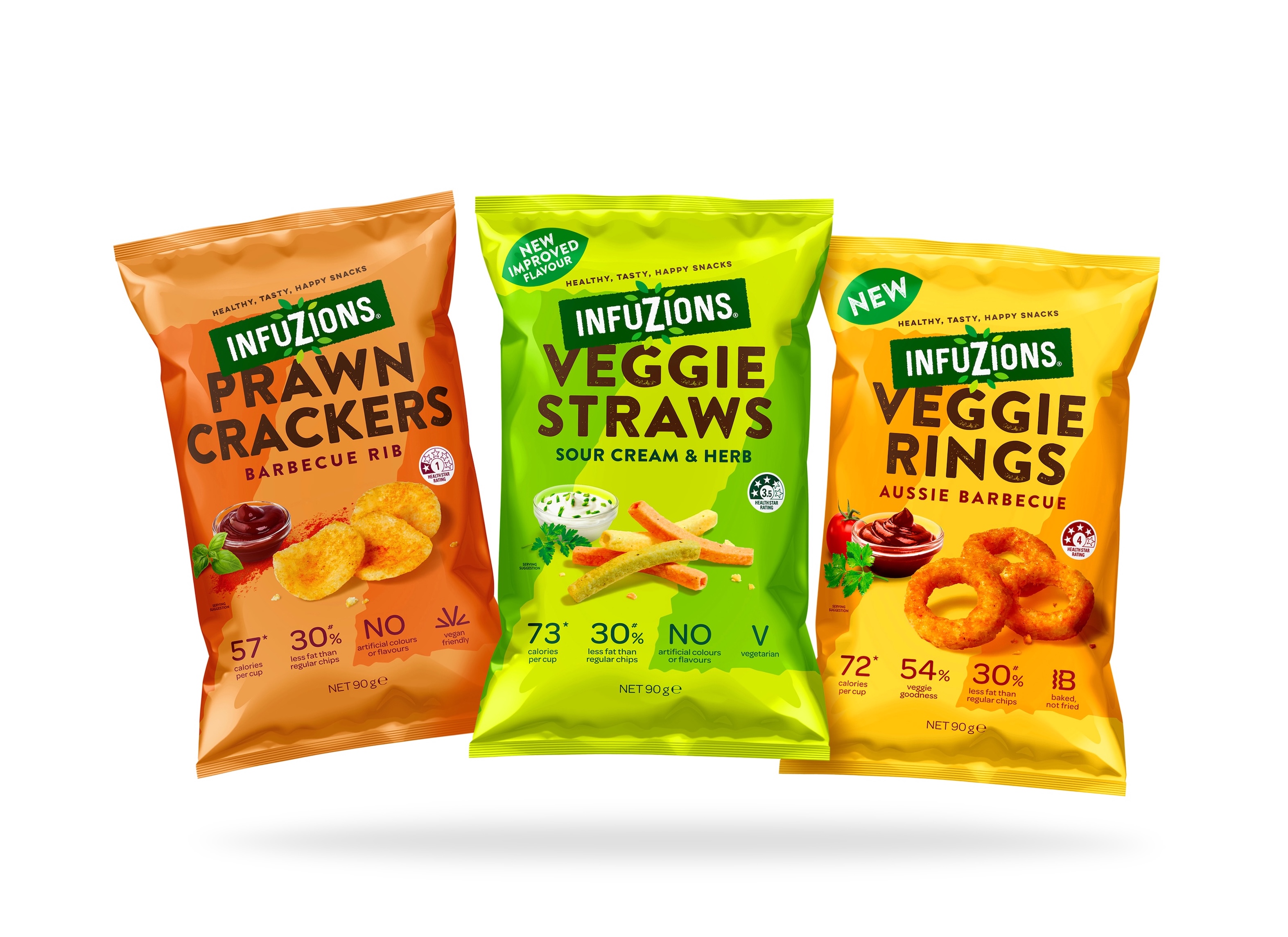
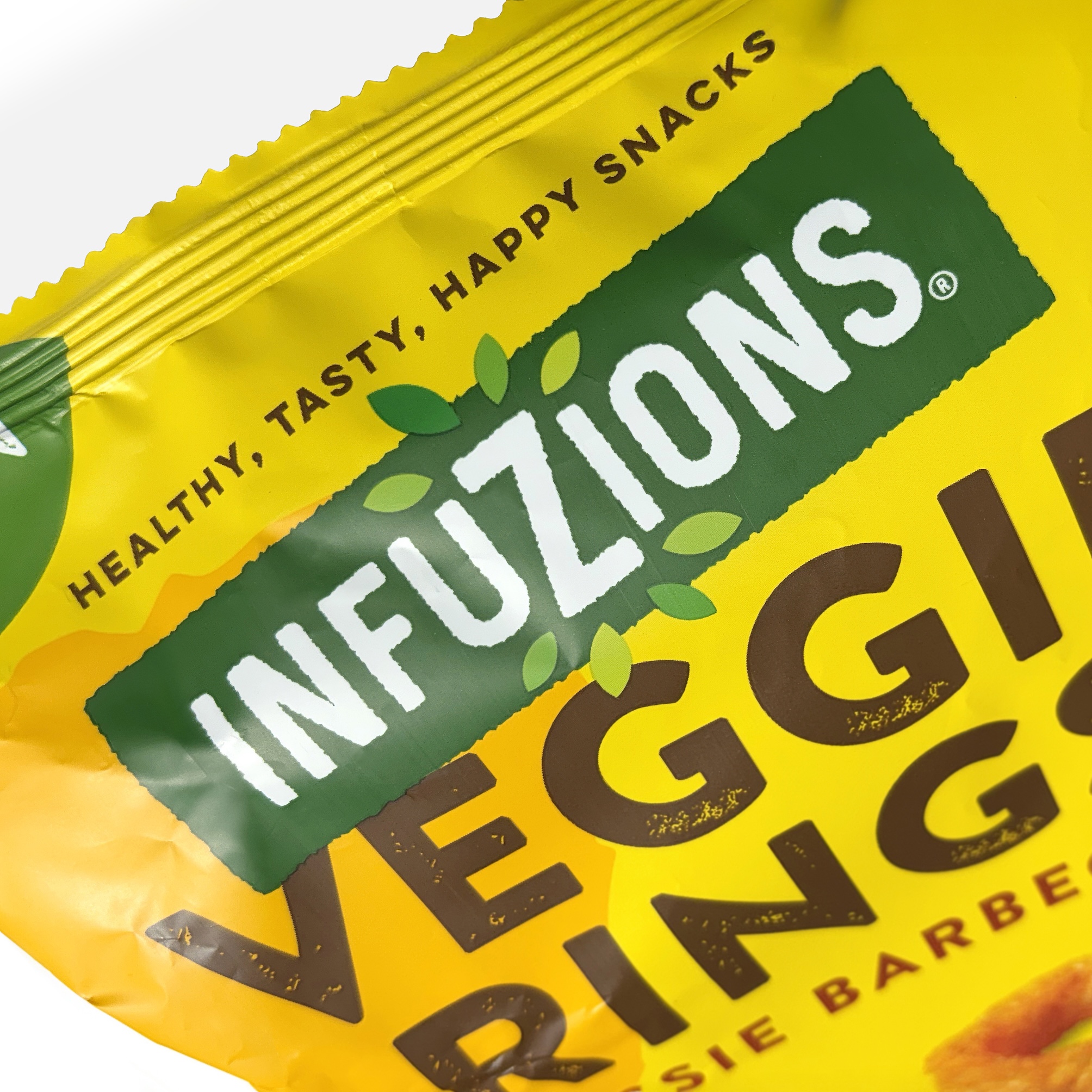
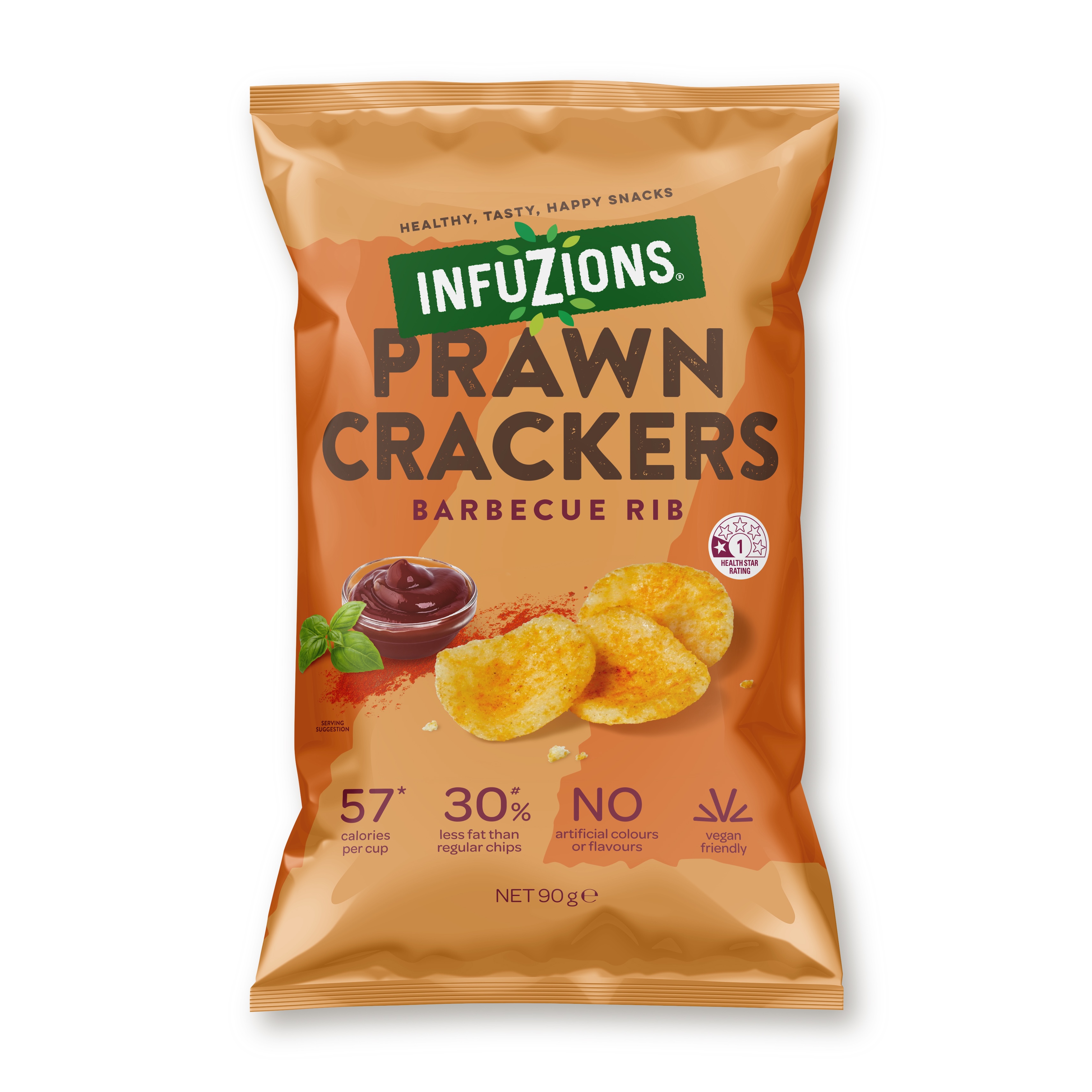
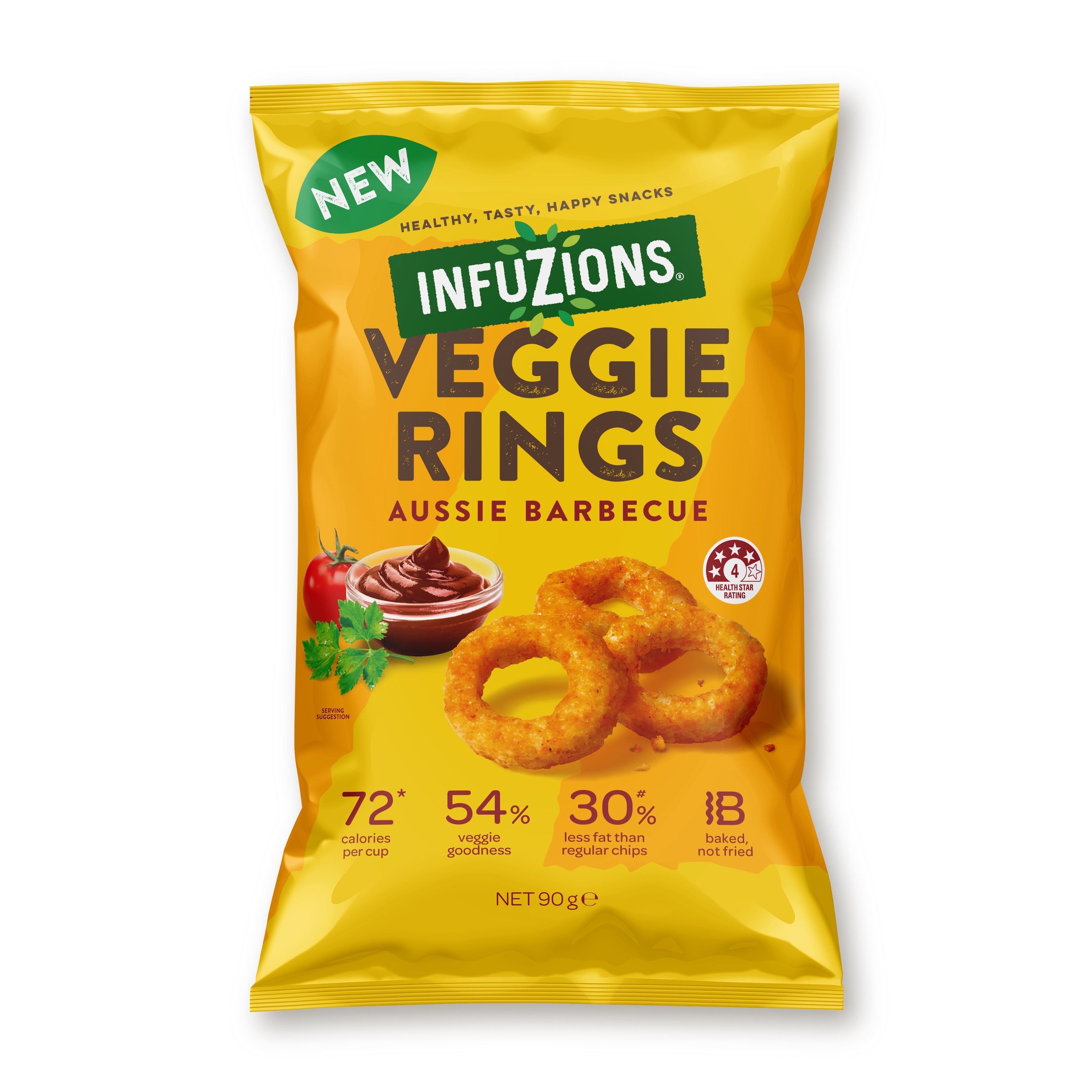
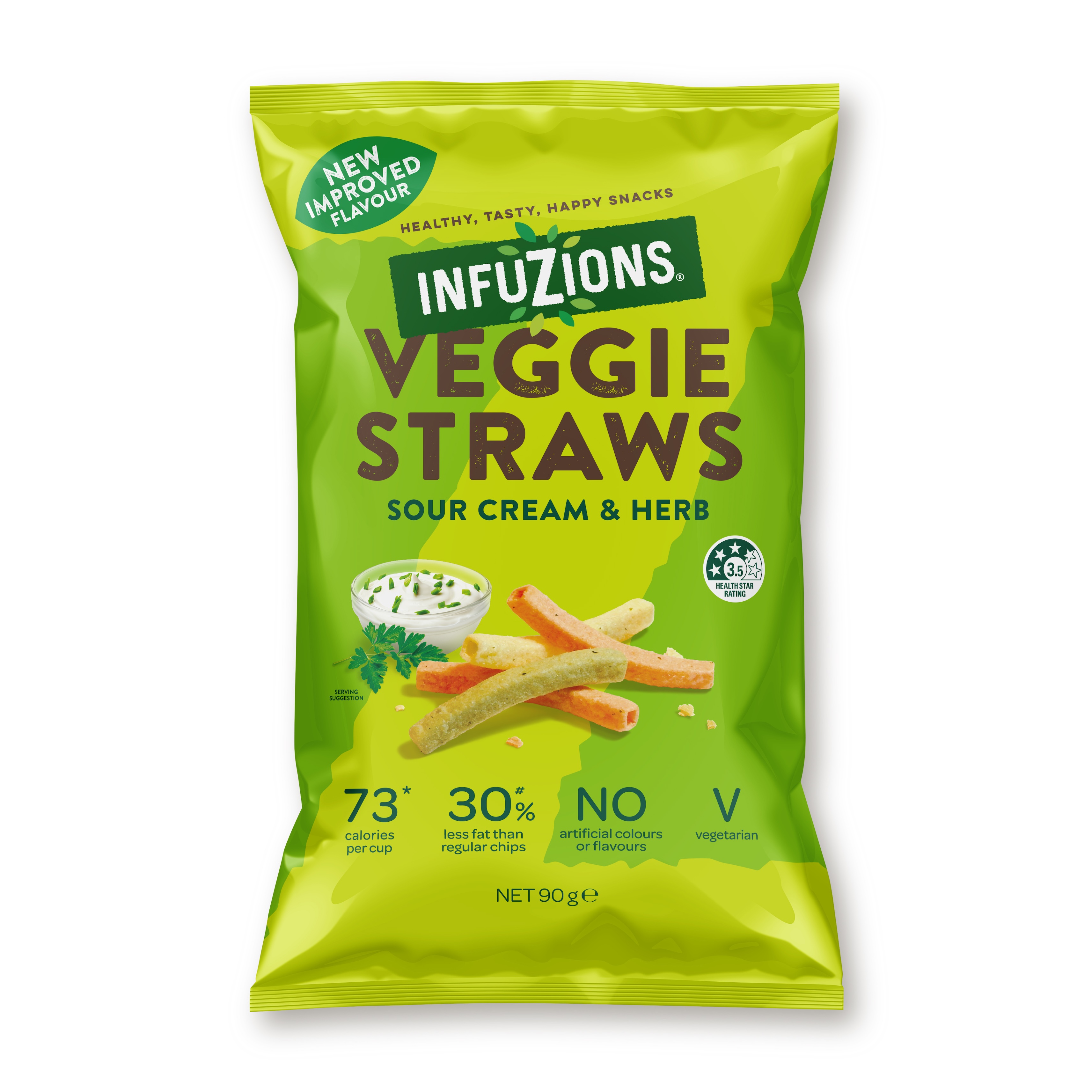
The existing brand mark and packaging was fundamentally misaligned with Infuzions’ new positioning. Its geometric, elegant construction felt restrained and overly polished, qualities that did not translate well in a fast-moving, visually noisy snack aisle. Nor did it align with contemporary expectations of warmth, tactility and approachability. To address this, we completely redesigned the brand mark. The enlarged “Z” letterform – a long-standing and recognisable element of the brand – was retained as a core asset, but re-expressed in a freer, more dynamic typographic form. Encircling the Z with a halo of leaves immediately reinforced the brand’s healthier positioning, providing a clear visual cue for natural ingredients and wellbeing. This was supported by a refreshed colour palette built around multiple shades of green, creating vibrancy and a stronger association with freshness and vitality. Typographically, we evolved a hard-edged, anonymous font to one that was looser and slightly distressed. This new typeface evokes the texture and crunch of the product itself, and enhances the sense of enjoyment the brand promises.
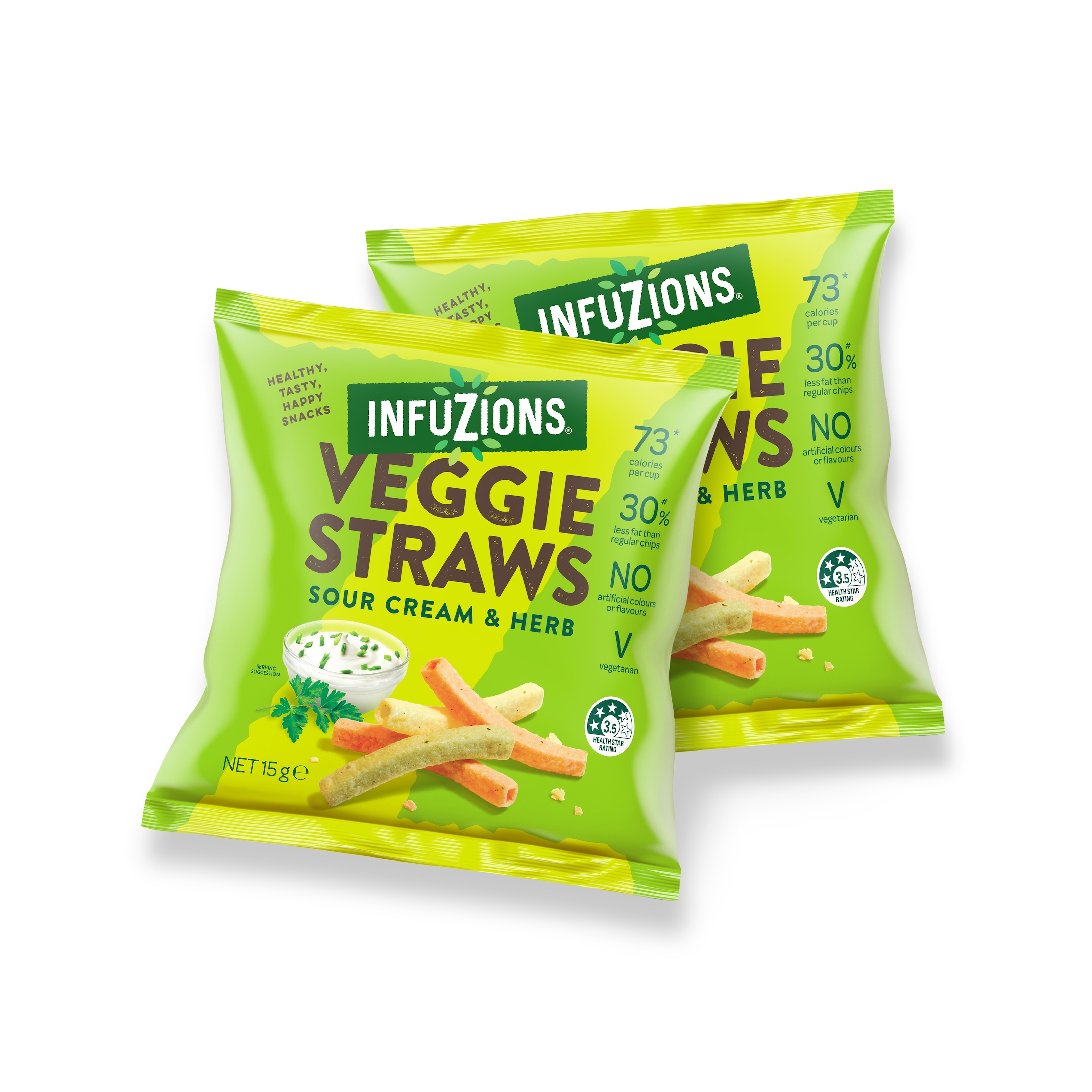
To simplify the on pack messaging, we removed the Majans parent brand mark, then developed a clear, intuitive lock-up between the Infuzions brand mark and individual variants. This created a comfortable hierarchy that allowed both elements to be prominent without competing for attention. The result was packaging that was easier to navigate, quicker to understand and far more exciting on shelf.
To strengthen cohesion across the range, we leveraged the enlarged Z as a flexible and distinctive brand asset. By applying it as a tonal variation within each base variant colour, we created a bold system that unified the range while allowing individual flavours to express their own character. This approach gives Infuzions a strong, ownable and easily recognisable shelf presence, helping it cut through in a noisy category.
Product imagery was also rethought. Previous imagery was overly styled and engineered, creating distance between the product and the consumer. We shifted to a more intimate, appetising approach that heroed the snack itself. Less fussy compositions and more natural lighting enhanced taste appeal and reinforced the brand’s honesty and confidence in what it delivers.
Perhaps the most transformative change came through the overhaul of the packaging colour palette. This decision went to the heart of a classic branding tension: balancing consumers’ category cue expectations with the brand’s need for differentiation. Infuzions had long been constrained by the belief that dark colours were intrinsic to its identity. Yes, there was a degree of uniqueness to this, but at the cost of the brand feeling fun, bold and energised – key purchase intent drivers in the snack category. By transitioning to a brighter, more vibrant and expressive palette, we repositioned Infuzions as a contemporary, trustworthy and credible healthier alternative to category leaders. The new colours signal vitality, flavour and positivity, helping the brand feel energised and modern without sacrificing trust or authenticity.
Taken together, the changes to Infuzions’ positioning, voice and visual system are a giant leap forward for the Infuzions brand. Its positioning provides a flexible foundation for future growth, and it’s packaging commands attention without shouting in a simpler, more honest way, balancing health cues with appetite appeal.
CREDIT
- Agency/Creative: Asprey Creative
- Article Title: Infuzions by Asprey Creative Upgrades a Familiar Australian Snack Brand With a Future Ready Identity System
- Organisation/Entity: Agency
- Project Type: Packaging
- Project Status: Published
- Agency/Creative Country: Australia
- Agency/Creative City: Melbourne
- Market Region: Oceania
- Project Deliverables: Brand Mark, Brand Strategy, Packaging Design
- Format: Flow-Pack
- Industry: Food/Beverage
- Keywords: brand repositioning, packaging design, FMCG design
-
Credits:
Creative Director: Peter Asprey


