


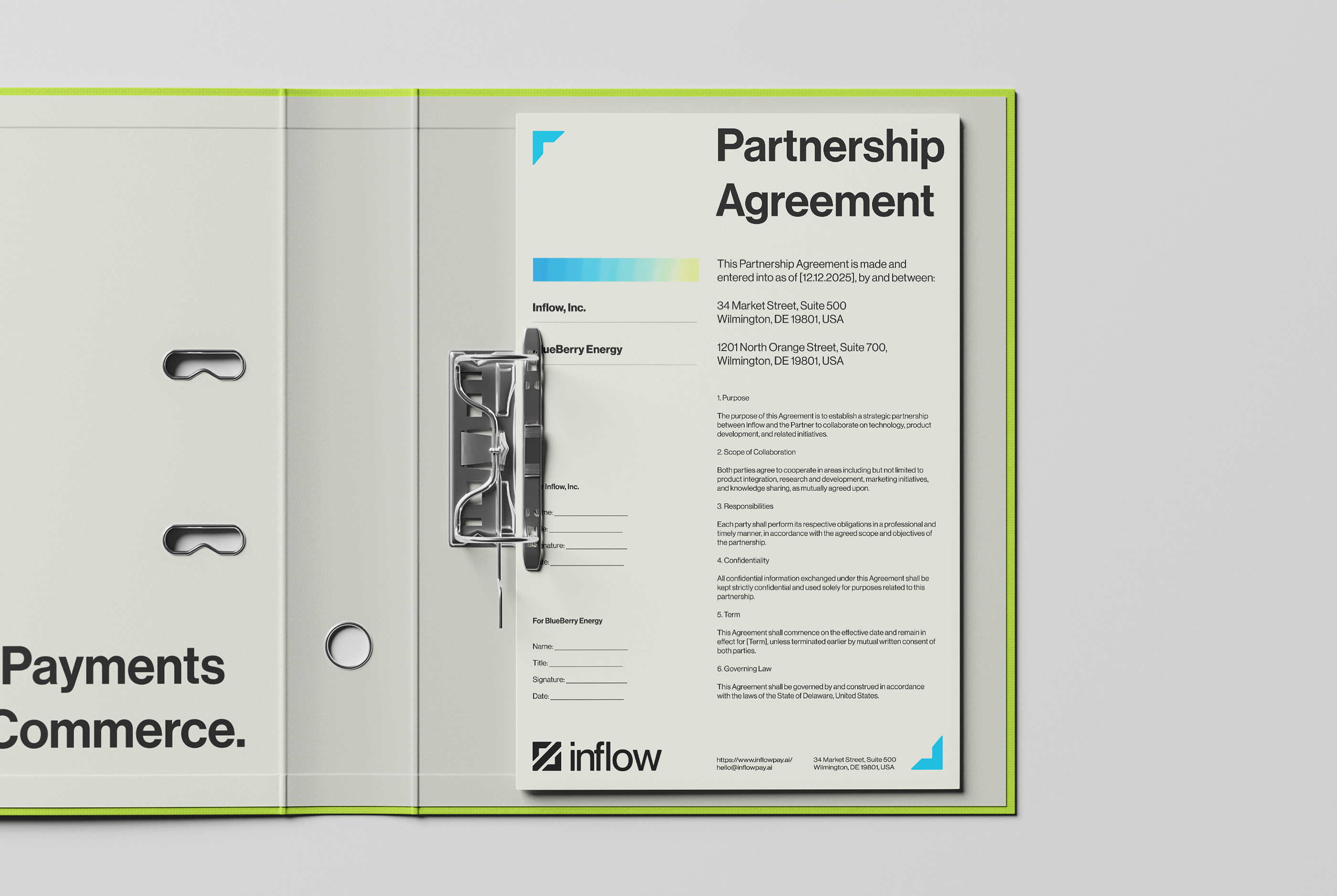
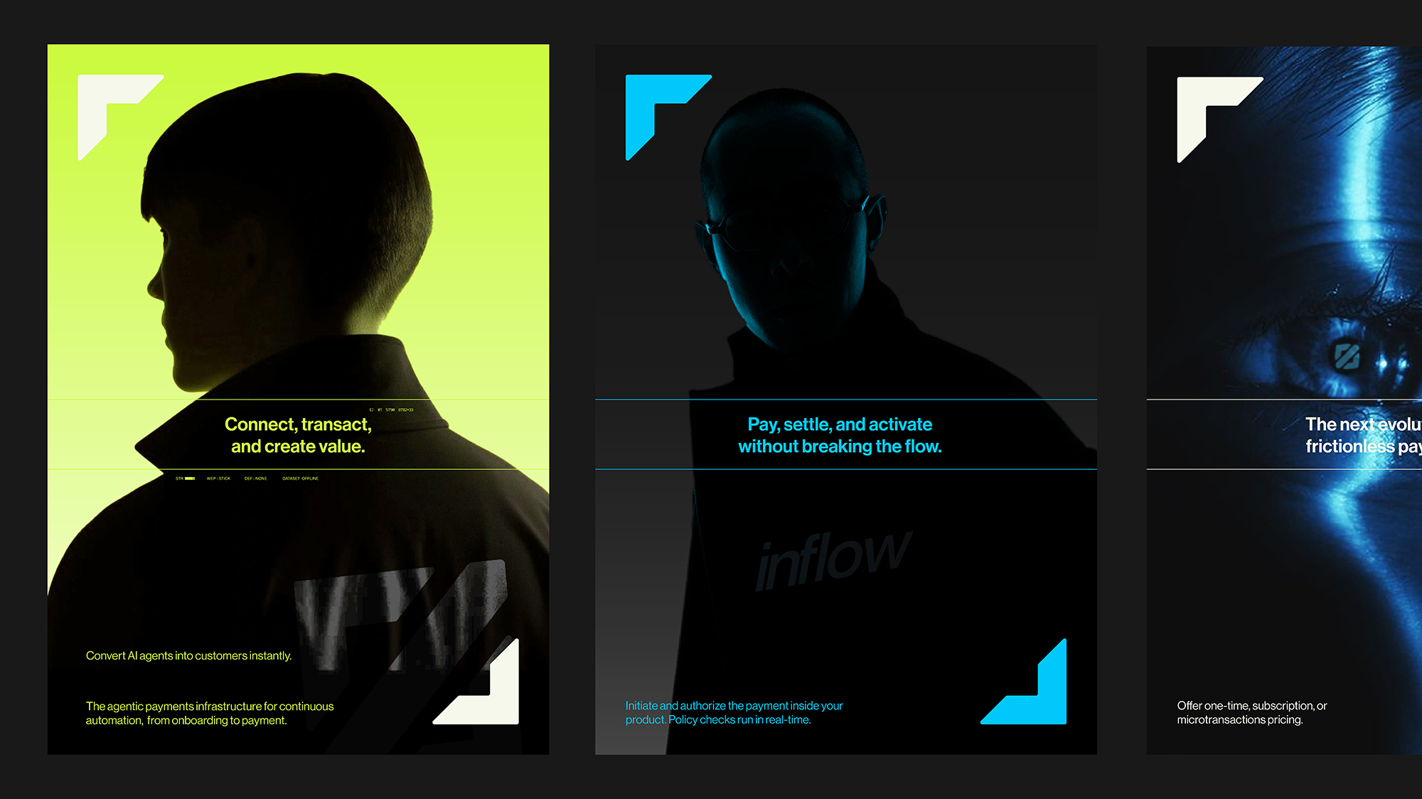
Inflow is a next-generation e-wallet, designed to function as the financial extension of an AI assistant. It is not just a payment tool, but an intelligent companion that stays by your side, understanding your spending habits, optimizing your finances, and safeguarding your transactions through AI-driven analysis.
The brand spirit is built on three core principles:
High speed, intelligent automation, and a seamless, frictionless.
These are not merely surface-level values, but the foundational pillars that shape how Inflow operates, evolves, and connects with its users. High speed is reflected in the system’s ability to respond and process tasks rapidly, helping users minimize waiting time and maximize productivity. Intelligent automation enables Inflow to function as a system that continuously learns, anticipates, and proactively handles tasks rather than simply reacting, thereby reducing errors and enhancing consistency. Finally, the seamless, barrier-free experience represents a commitment to a user journey that is simple and intuitive, where every interaction is smooth, straightforward, and uninterrupted.
Together, these three elements define Inflow’s unique identity: a modern, adaptive brand that places user experience at its core, ensuring that every interaction is fast, intelligent, and effortlessly fluid.
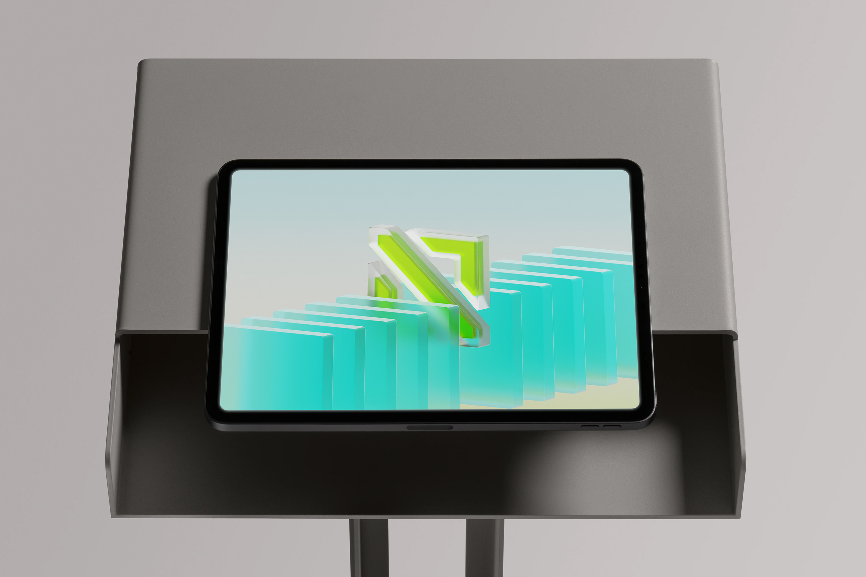
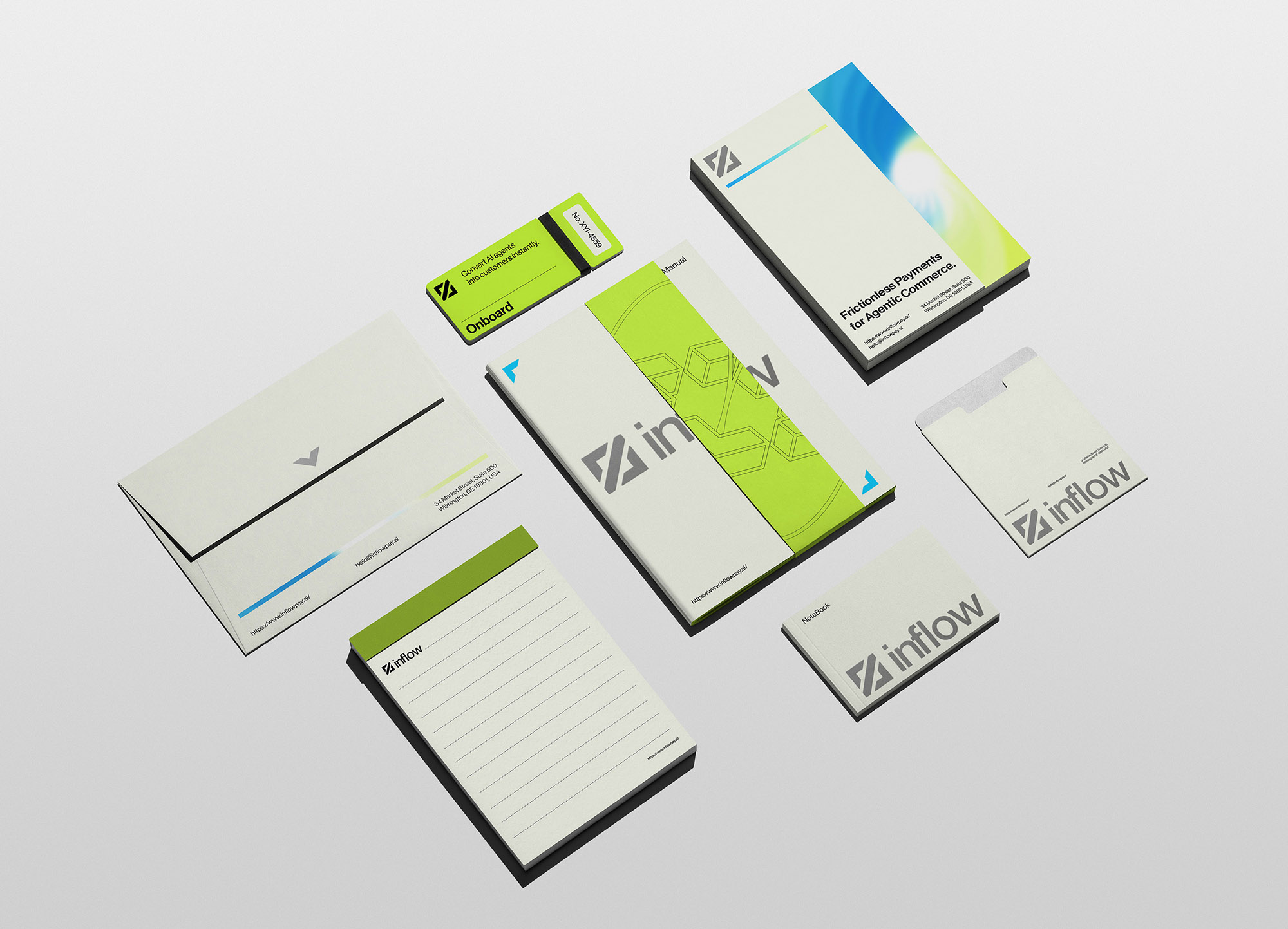
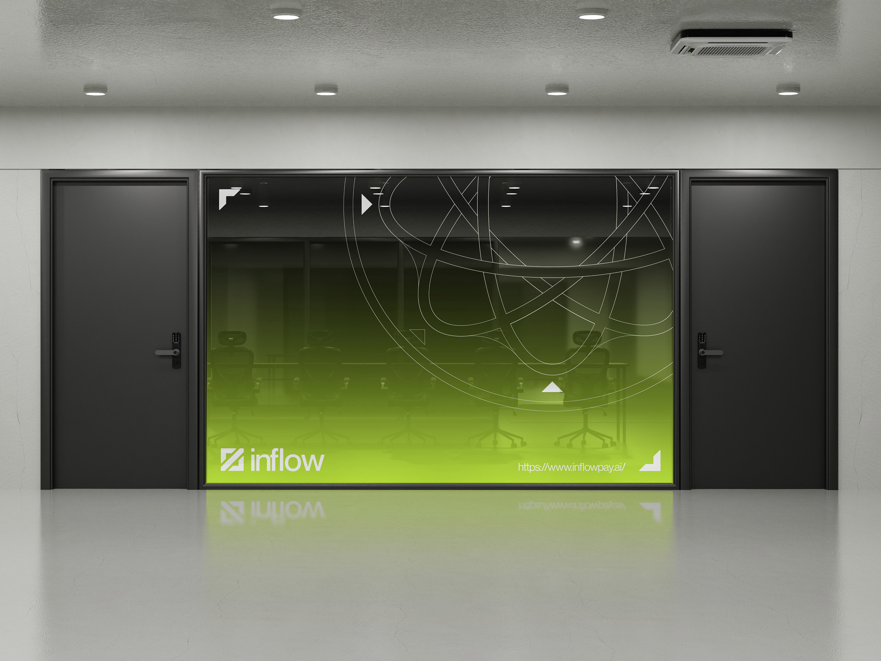
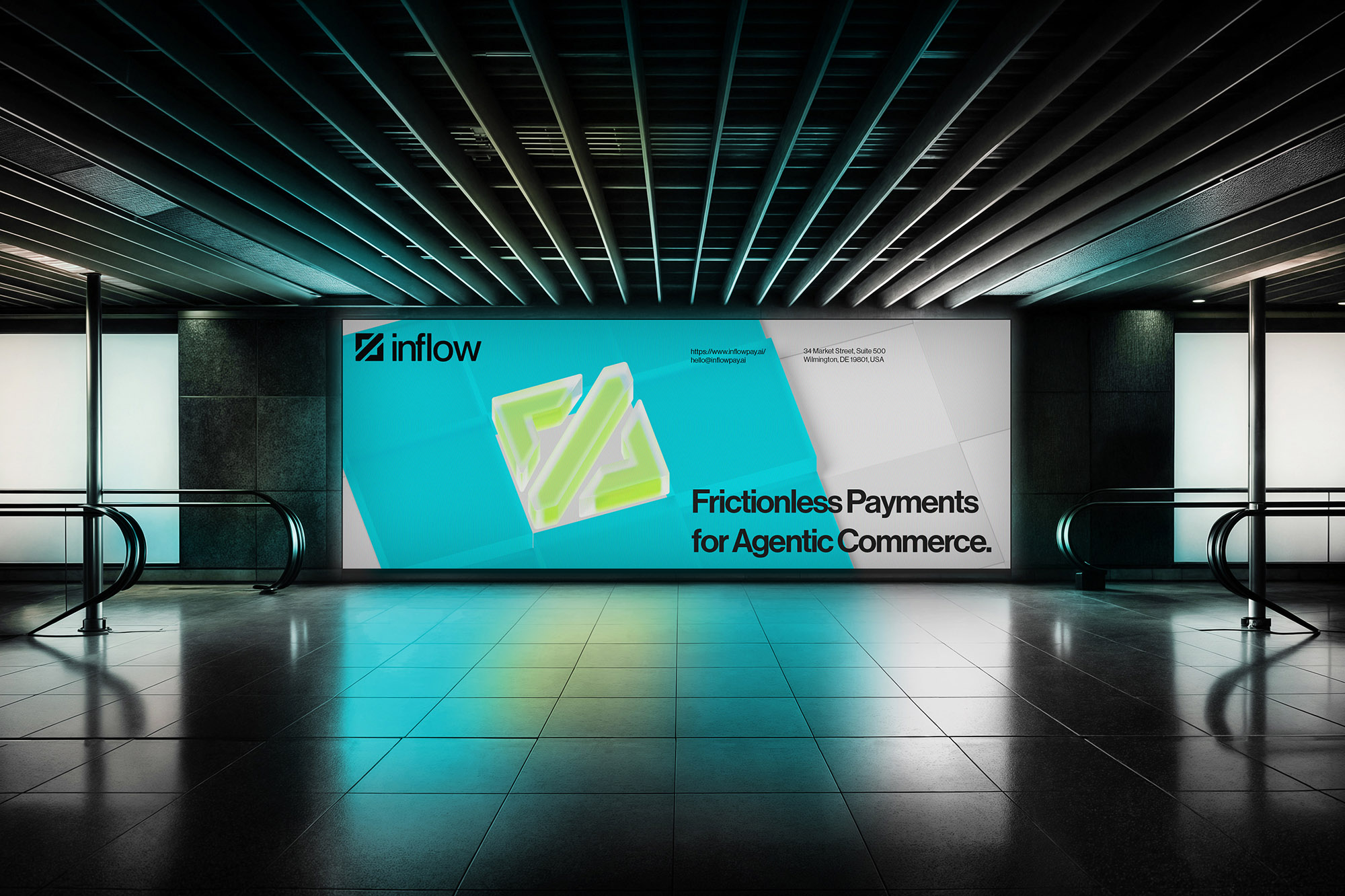
The Logomark is inspired by the opening and closing symbols in programming, an emblem of structure, order, and logic. Translated into design, this symbol is stylized into the image of a stream entering the digital realm, representing the flow of finance and value within the Inflow ecosystem.
The Wordmark embraces the modern, neutral character of Swiss Style, featuring clean lines, low contrast, and a structure optimized for readability. Together, they create a clear, trustworthy, and enduring visual identity that maintains timeless aesthetics across all applications.
The illustration system uses abstract visual forms, primarily stylized and transformed cube structures. Thanks to their flexibility, these elements can adapt seamlessly to various contexts, from product interfaces and marketing materials to internal documents. The cubes not only symbolize structure and technology but also establish a cohesive, modern, and direction-oriented visual language.
The design system uses a 16x grid, creating a clear, consistent, and scalable structure across all layouts. With units divided in multiples of 16, this grid ensures balance and precision in alignment, while providing the flexibility needed to adapt to various design formats. It serves as the foundation that keeps Inflow’s visual identity cohesive and professional across every touchpoint.
CREDIT
- Agency/Creative: LN Hung
- Article Title: Inflow Pay Brand Identity by LN Hung
- Organisation/Entity: Freelance
- Project Type: Graphic
- Project Status: Published
- Agency/Creative Country: Vietnam
- Agency/Creative City: Hue City
- Market Region: North America
- Project Deliverables: 3D Art, Brand Identity
- Industry: Financial
- Keywords: branding, logo design, visual identity, AI, Finace, techology
-
Credits:
Art Director: Le Ngoc Hung


