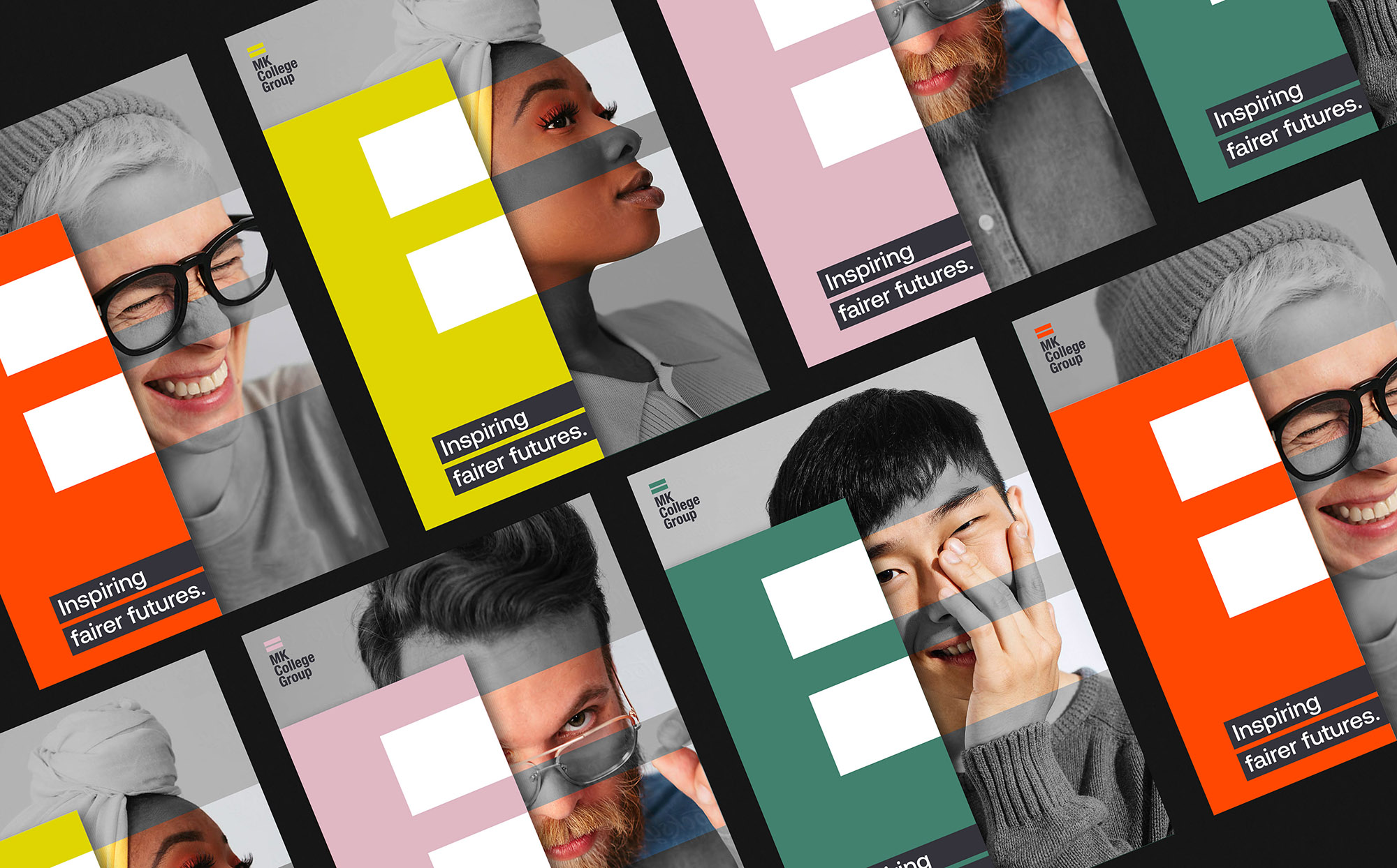
Milton Keynes College approached Fable&Co. once more, this time, with the objective of unifying their existing brands & services under a new, cohesive group strategy. Together, they delivered a robust identity system & visual style that was bold & confident – capturing how education can be the catalyst for a better, fairer & more inclusive society.
As the digital revolution continues apace, Milton Keynes continues to lead the way as one of the UK’s most exciting cities for technology & innovation.
The College’s burgeoning reputation & evolved positioning in the education sector has bought about a new need & focus on attracting more teaching talent, building better employee partnerships, & providing a platform to report accountability & positive change within their community. It is this admirable purpose & ambition that led Fable&Co to create a highly accessible, inclusive & diverse identity – one that inspires change, positivity & responsibility throughout the industry & beyond.
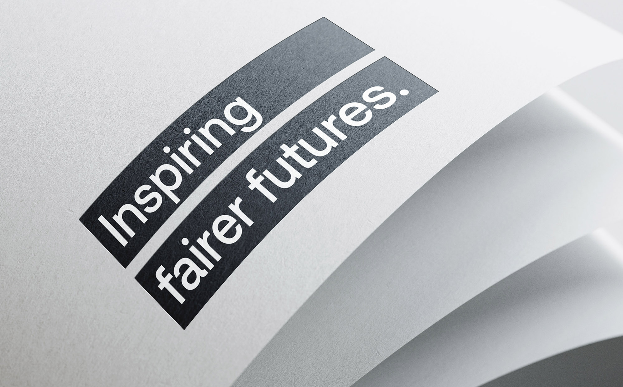
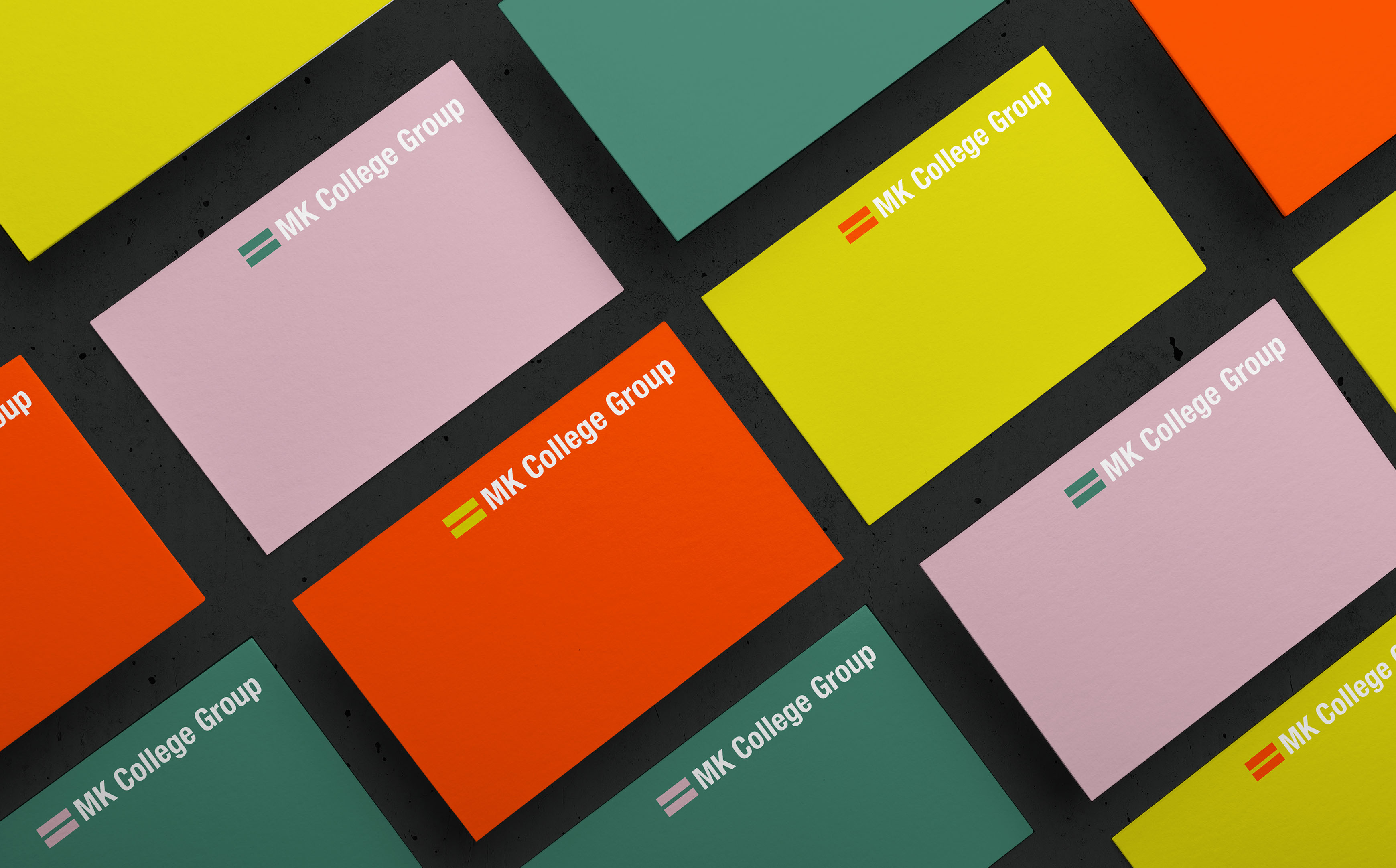
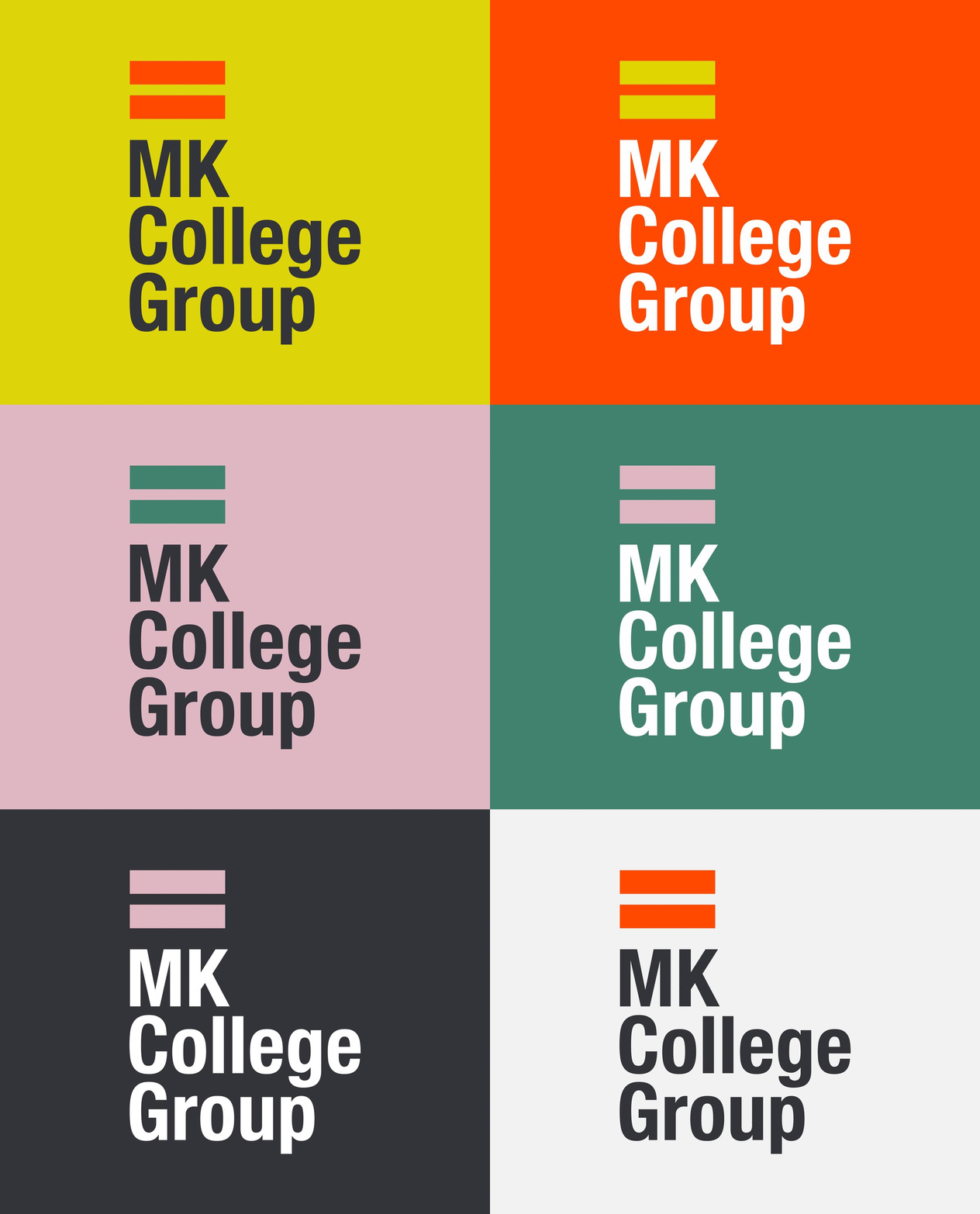
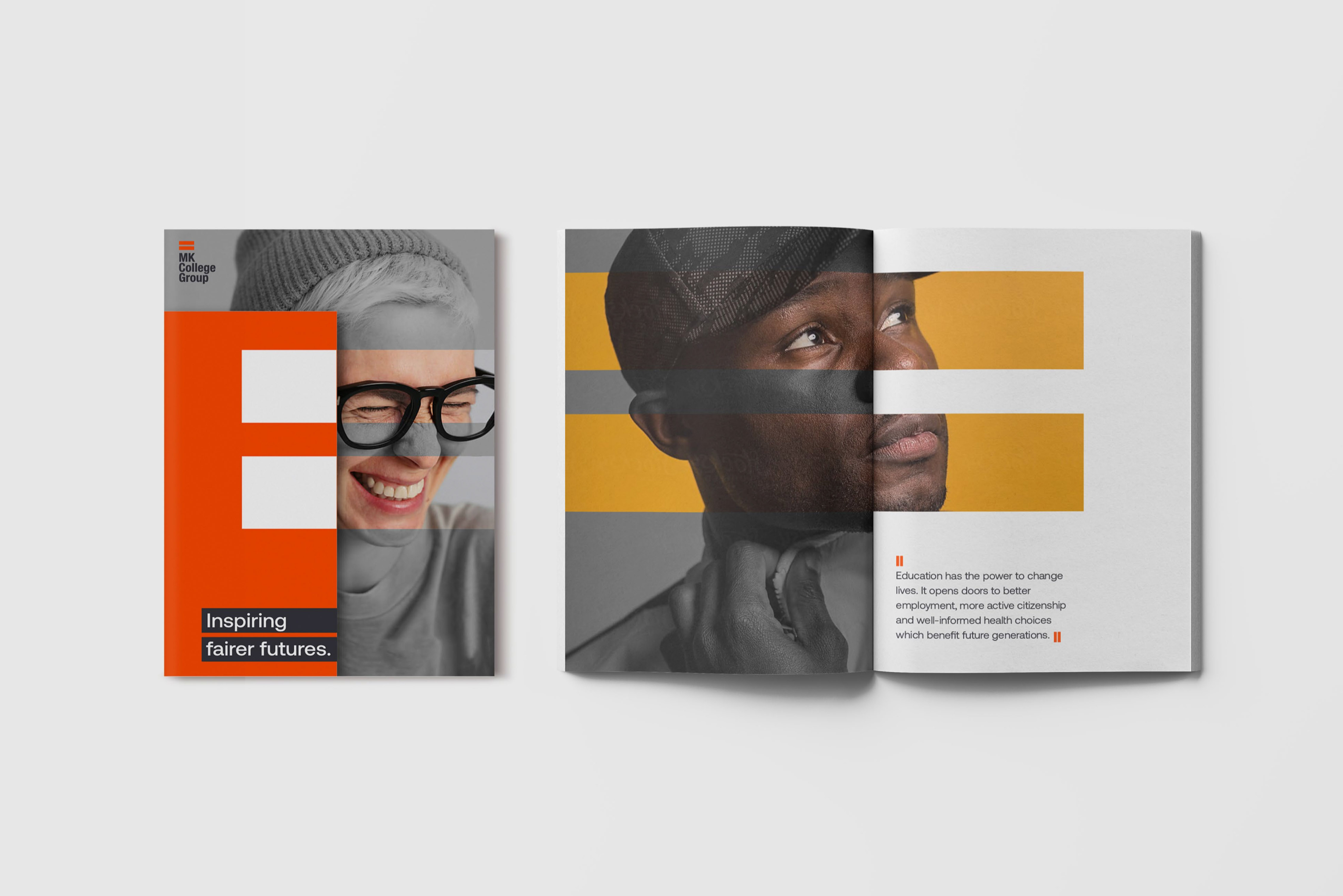
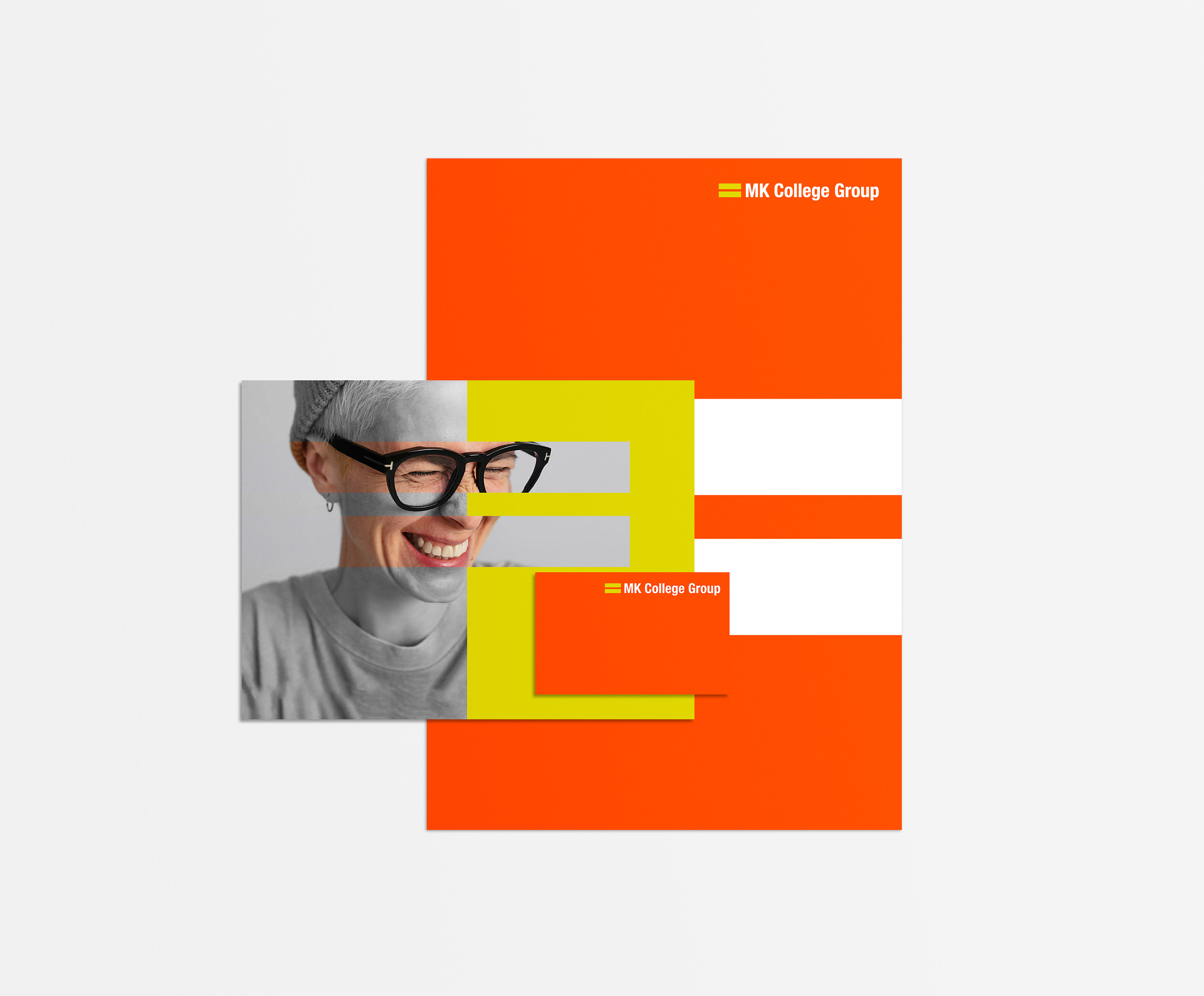
For the brand icon, Fable&Co have taken the simplicity of an equals sign – a universally recognised symbol that signifies something that is the same, or equal to – & used it boldly to ground the entire identity. The asset not only represents the groups’ entire ambition & purpose but also helps aid accessibility, the user’s direction & attention, highlighting text & other significant information. The use of a Sans Serif typeface for both the wordmarque & written copy aids clarity & legibility, with the wordmarque crafted in title case to ensure a highly legible & identifiable marque.
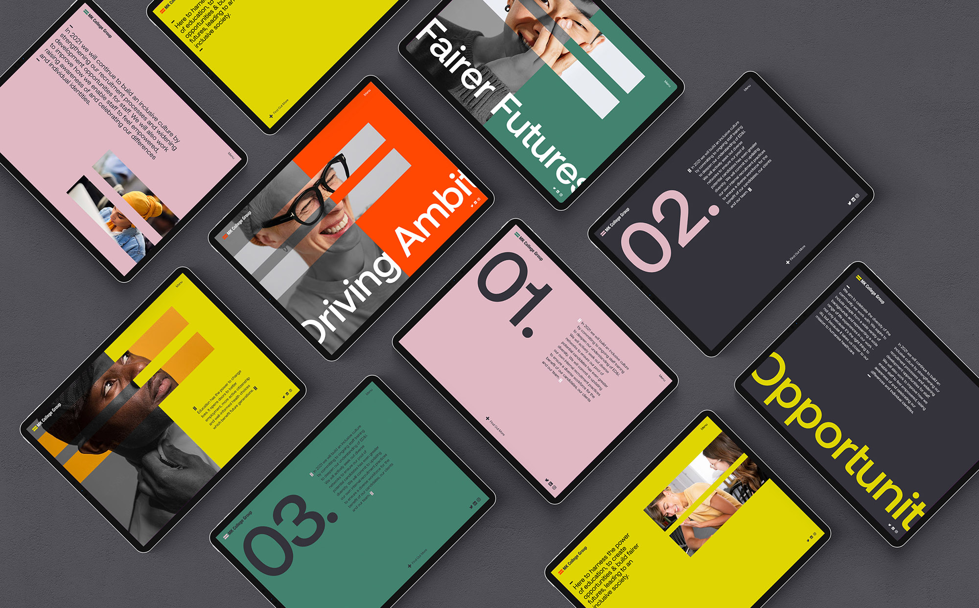
Accessibility & legibility needed to be front of mind when considering the visual identity for Milton Keynes College Group. Balanced with this would be a boldness, confidence & energy to communicate diversity & inclusion. Colour choice & combinations have been kept to a minimum, with high contrast when used together to ensure those with sight impairments are able to easily identify clear differentiation throughout.
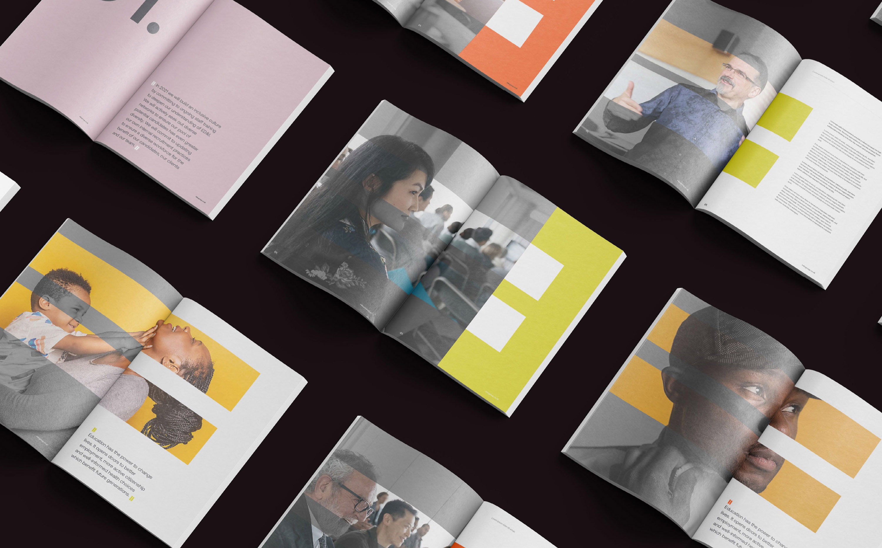
Imagery plays a vital role in the overall identity, giving a sense of diversity, positivity & personality throughout. Fable&Co set out clear imagery guidelines to ensure consistency & coherence moving forward. These consist of thought-provoking portraits & in the moment action shots, the imagery looked to portray a sense of energy, pride, ambition & passion, in turn helping to attract more of the right talent. The effect & transition going from black & white imagery into full colour was to represent life, positivity & inclusion.
Education has the power to change lives. Fable&Co are proud to have been part of such a worthy project & excited to see the Milton Keynes College Group brand launch. They believe this will set a new precedent for the industry & will encourage other schools, colleges, universities & businesses up & down the country to play their part in being more accountable – helping the UK progress towards a fairer, more accessible, inclusive & diverse society.

CREDIT
- Agency/Creative: Fable&Co
- Article Title: Inclusive and Diverse Brand Identity for Milton Keynes College Group
- Organisation/Entity: Agency
- Project Type: Identity
- Project Status: Published
- Agency/Creative Country: United Kingdom
- Agency/Creative City: Brighton
- Market Region: Europe
- Project Deliverables: Advertising, Brand Experience, Brand Guidelines, Brand Identity, Brand Strategy, Brand Tone of Voice, Creative Direction, Identity System, Logo Design, Web Design
- Industry: Education
- Keywords: Education Branding, College Branding, Education Design, Brand Identity, Logo Design, Visual Identity
-
Credits:
Creative Director: Ross Davison
Strategy Director: Jack Archer
Brand Artist: Isabella Hall


