


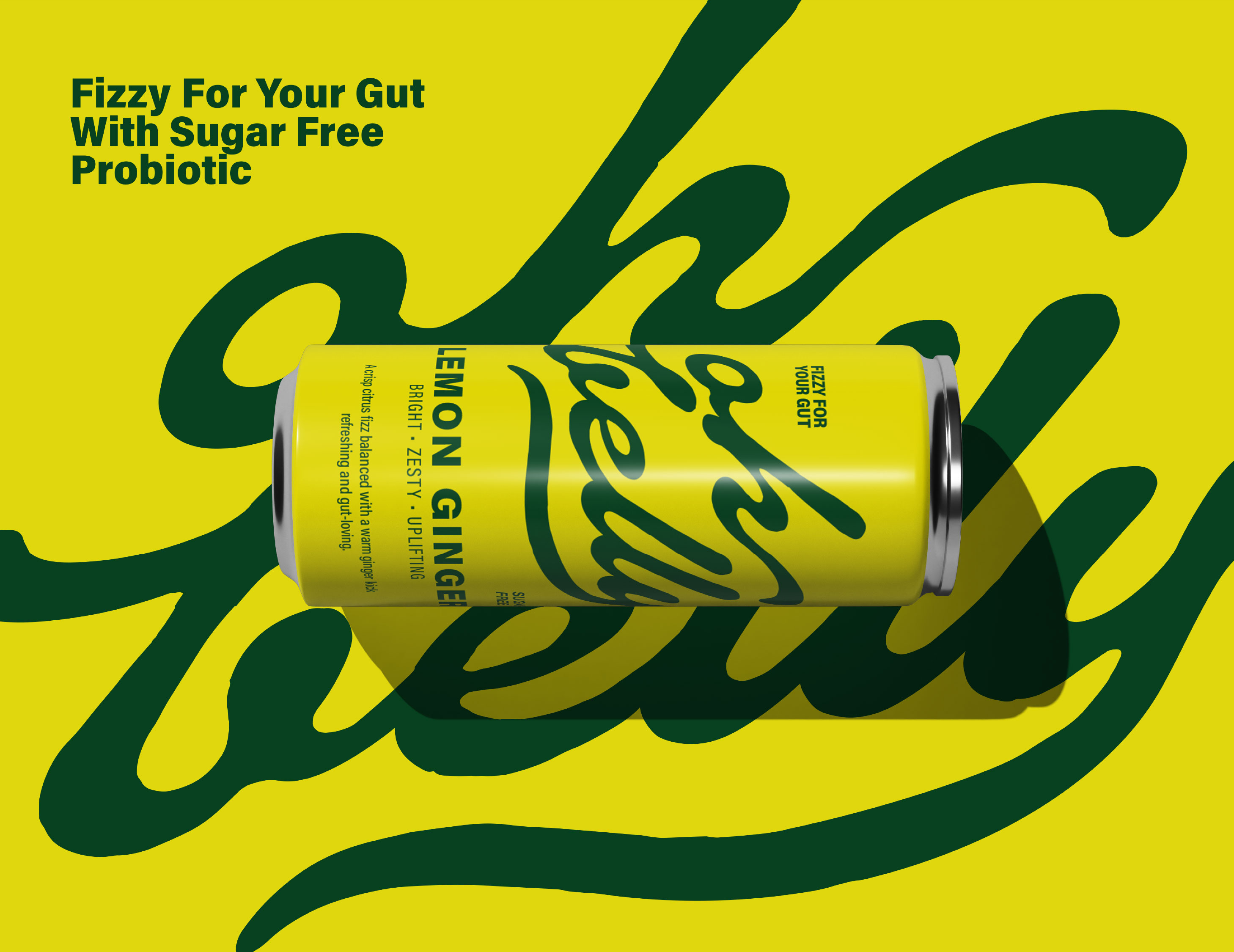
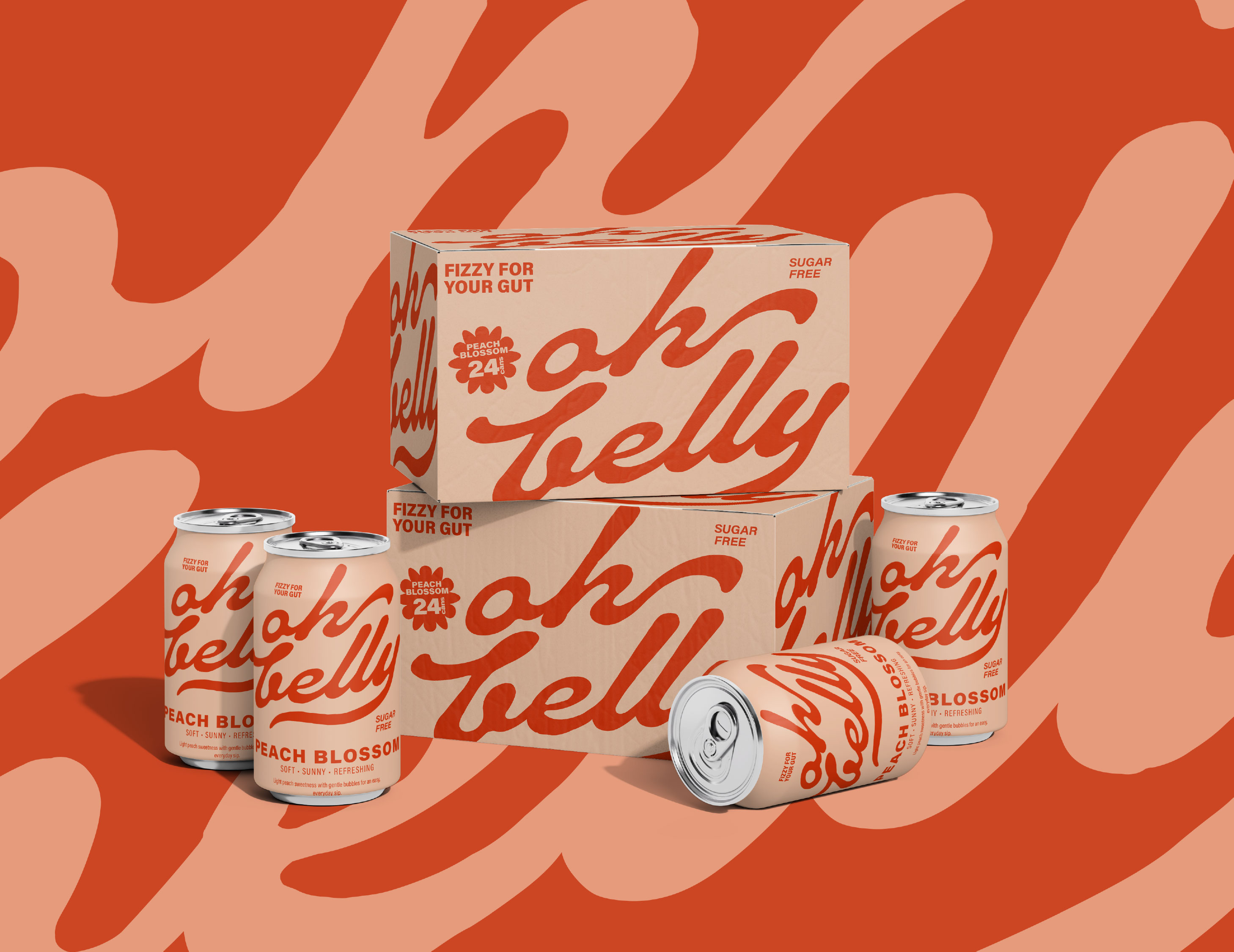
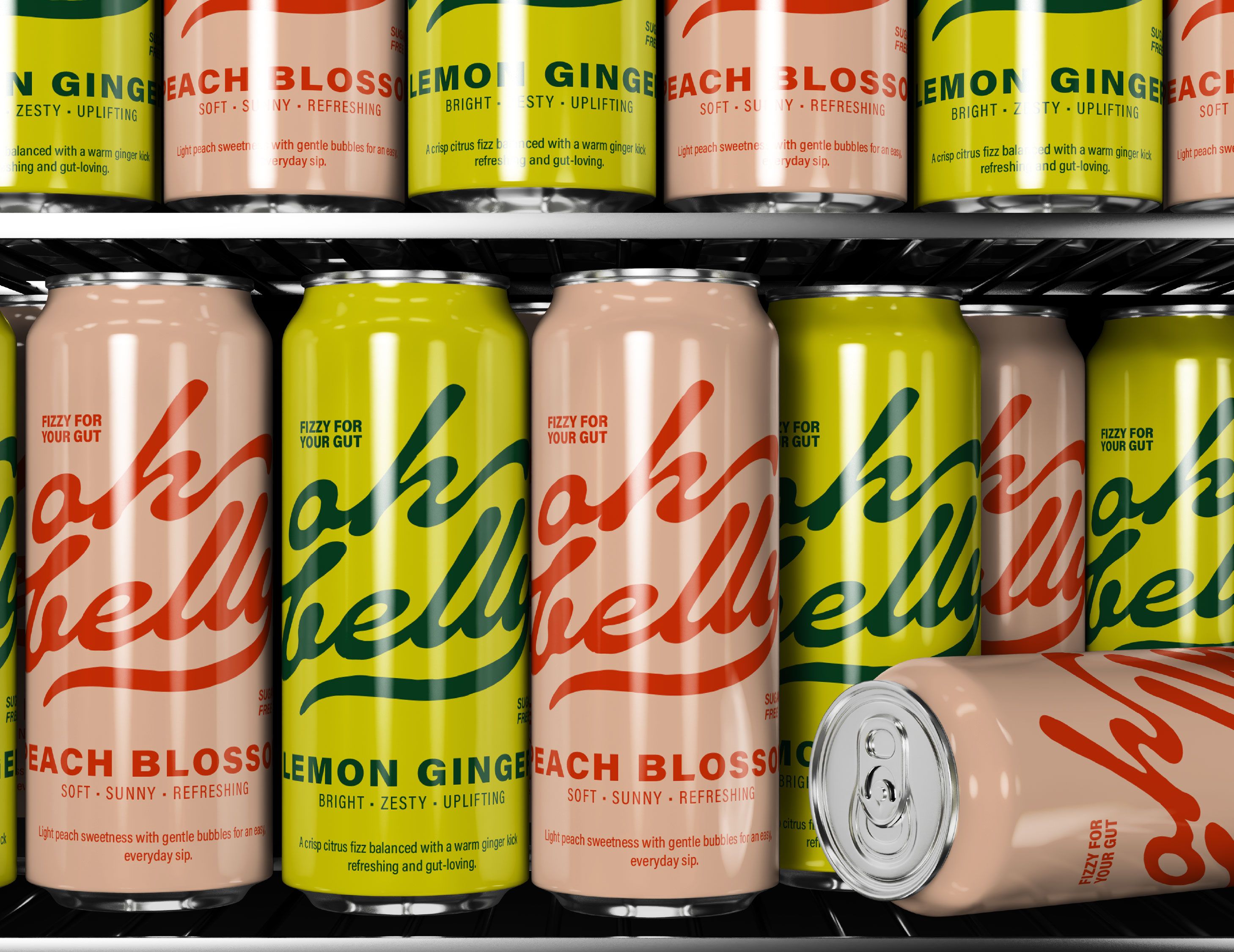
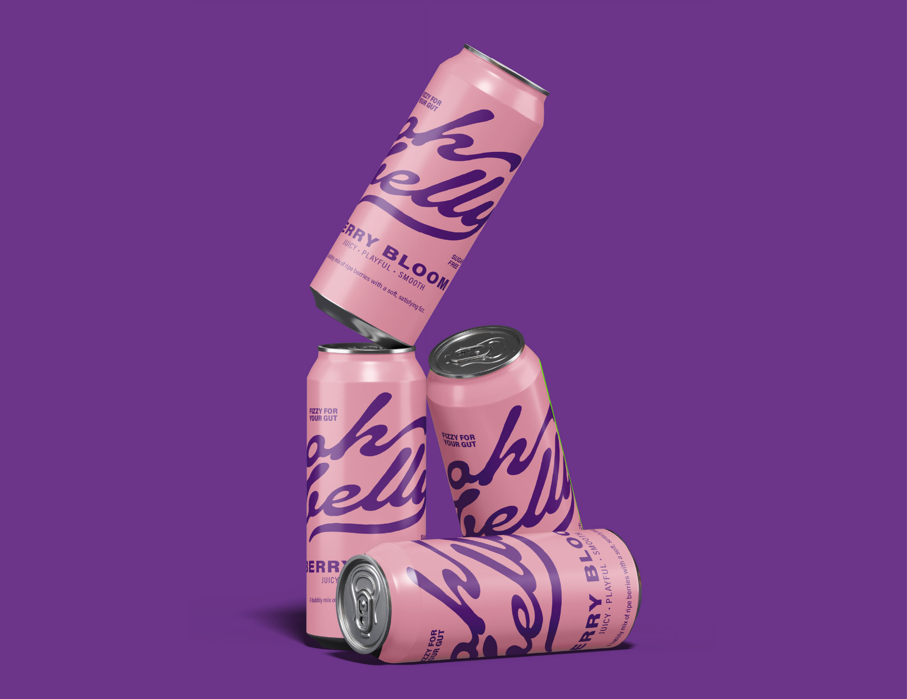
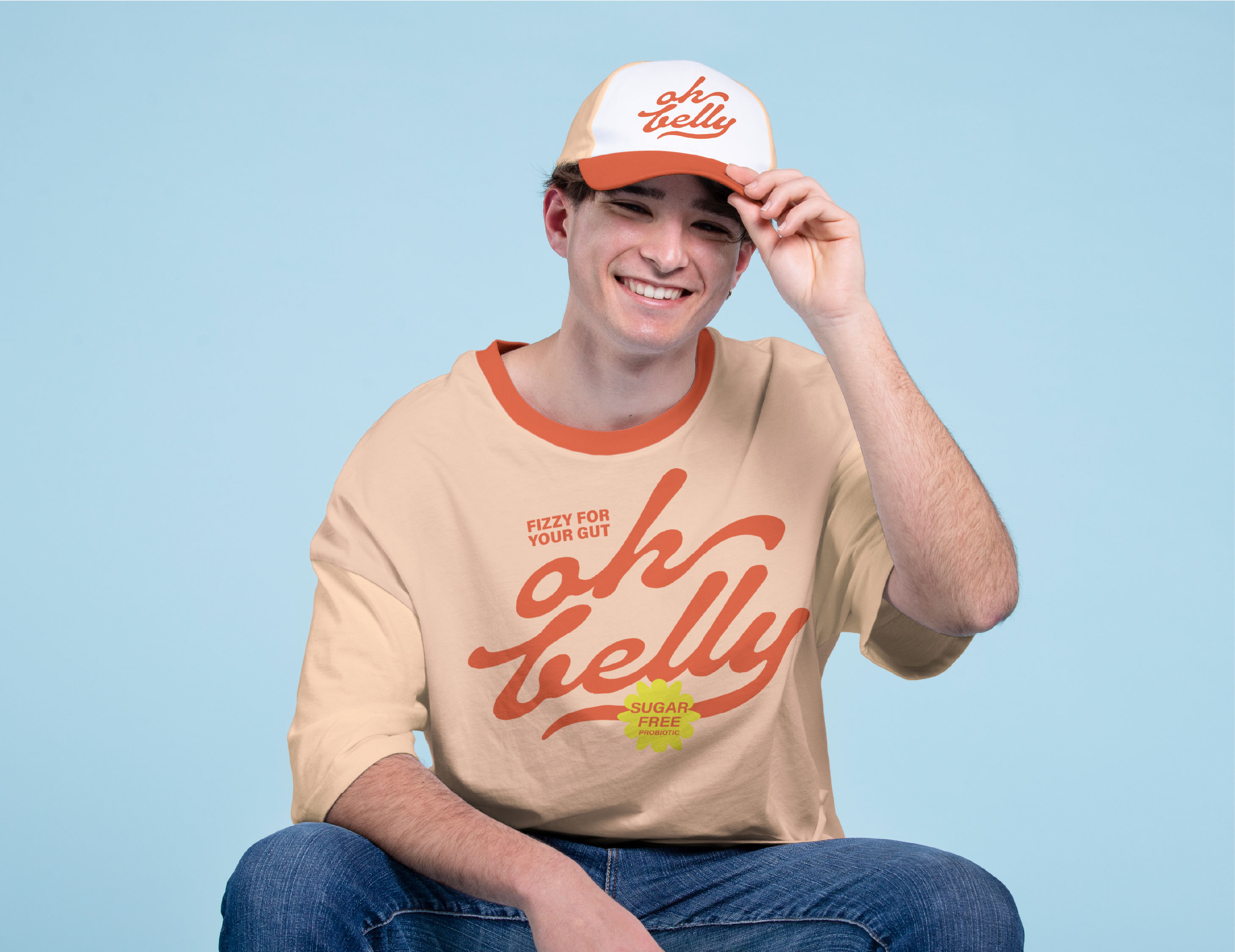
Oh Belly was conceived as a bold reimagination of the functional beverage category, where gut health meets joy, personality, and modern lifestyle culture rather than clinical wellness aesthetics. As a brand designer, I approached this identity with the intention of making probiotic soda feel approachable, playful, and emotionally uplifting, rather than medicinal or overly technical. The core idea behind the design is that wellness should feel effortless, celebratory, and part of everyday moments, not something intimidating or sterile. The logo is built around soft, rounded letterforms that mimic the feeling of comfort and movement, subtly echoing the idea of a happy, relaxed belly. Its playful rhythm and fluid curves create warmth while remaining clean and contemporary enough for a premium shelf presence. The color palette is intentionally vibrant and energetic, breaking away from the muted greens and neutrals typically associated with health drinks. Each flavor is expressed through a distinct, confident hue sunny yellows, juicy corals, refreshing aquas, and lively pinks allowing color to become the primary communicator of mood and taste. These colors are used in bold blocks and gentle gradients across the packaging, creating depth, movement, and a sense of fizz that visually connects to the drink itself. The typography throughout the system is friendly and rounded, reinforcing accessibility while maintaining sophistication through careful spacing and hierarchy. Instead of overcrowding the label with information, the packaging layout is minimal, allowing the color, logo, and simple graphic elements to breathe and make an instant impact on shelf. The choice of a slightly rounded can silhouette further enhances the brand’s tactile and joyful character, making it feel distinctive, collectible, and memorable in a crowded market. Subtle graphic motifs, such as wavy lines and organic shapes, hint at movement, digestion, and lightness without being literal or medical. Overall, Oh Belly’s visual identity is built around the idea that gut health can be vibrant, stylish, and fun transforming a functional drink into a feel-good brand that speaks to both the body and the emotions, inviting consumers to sip, smile, and feel better in a modern, colorful, and confident way.
CREDIT
- Agency/Creative: inchgraphica by khushbu
- Article Title: inchgraphica by khushbu Designs a Playful Probiotic Soda Identity for Oh Belly
- Organisation/Entity: Freelance
- Project Type: Identity
- Project Status: Published
- Agency/Creative Country: Qatar
- Agency/Creative City: Doha
- Market Region: Asia, Middle East, North America, South America, Global
- Project Deliverables: Brand Design, Logo Design, Packaging Design
- Industry: Food/Beverage
- Keywords: soda can, Brand design, Logo Design
-
Credits:
Brand Designer: Khushbu Parikh


