


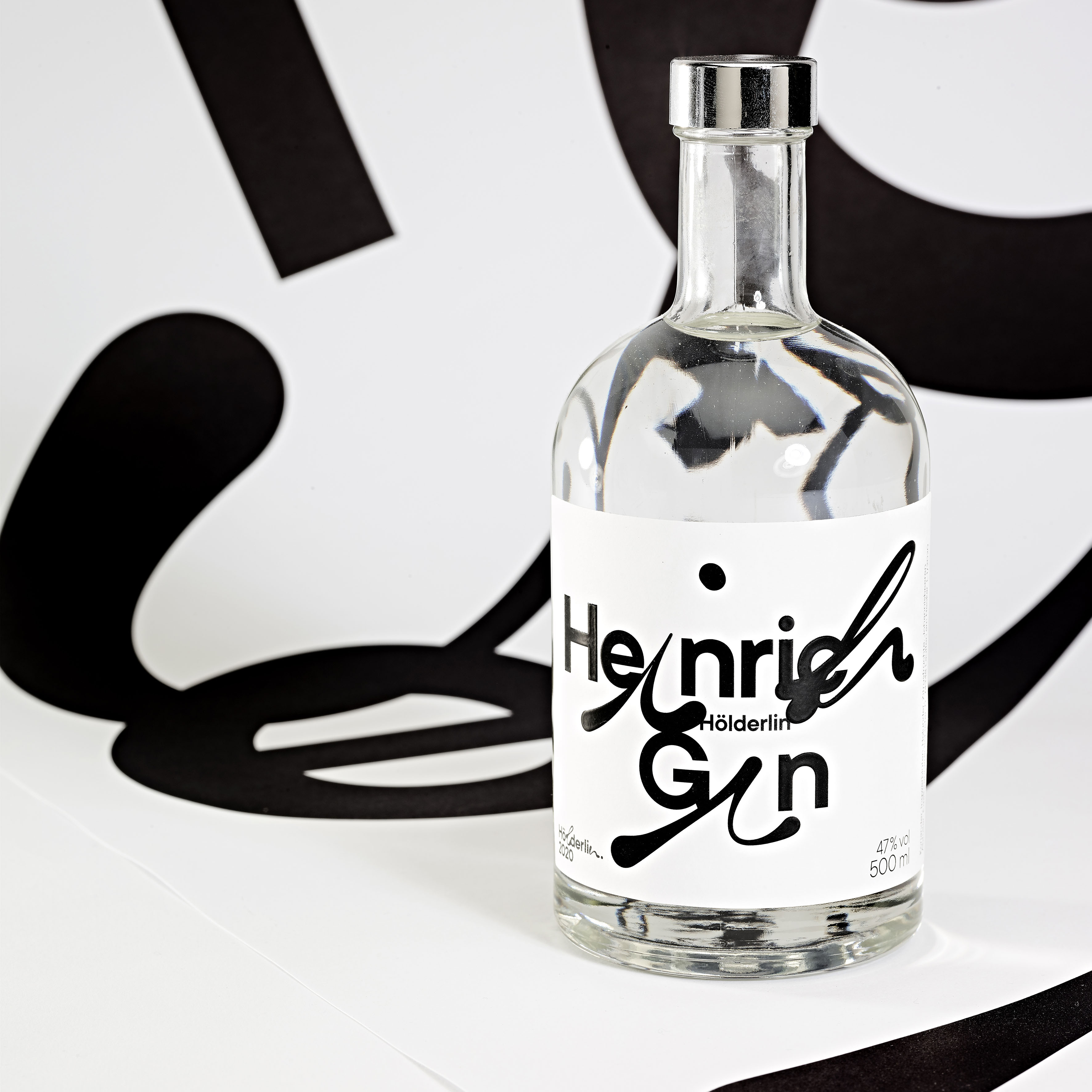
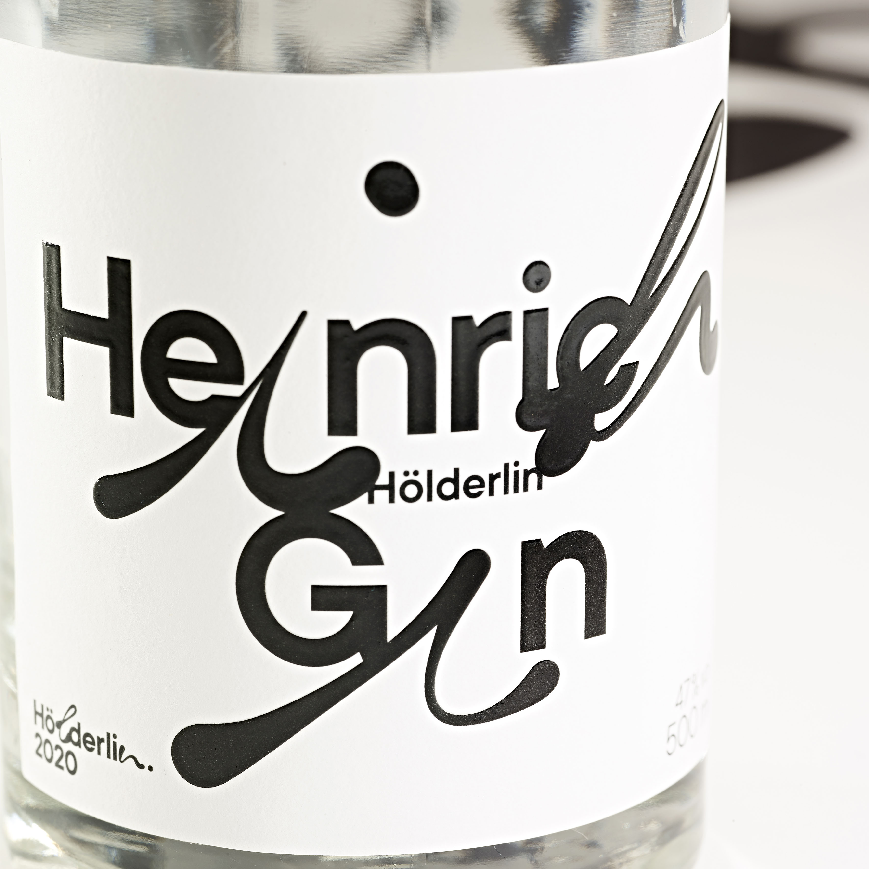
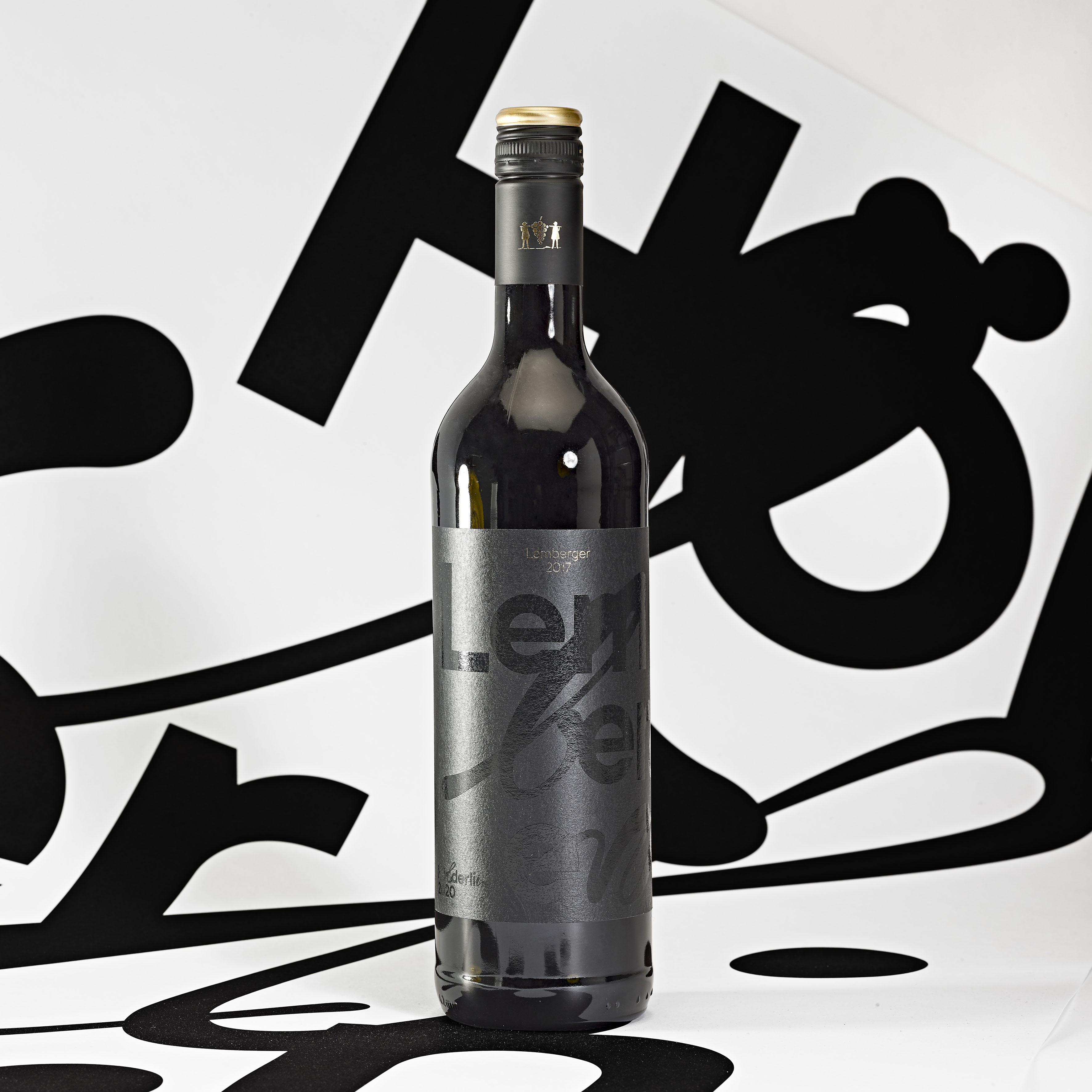
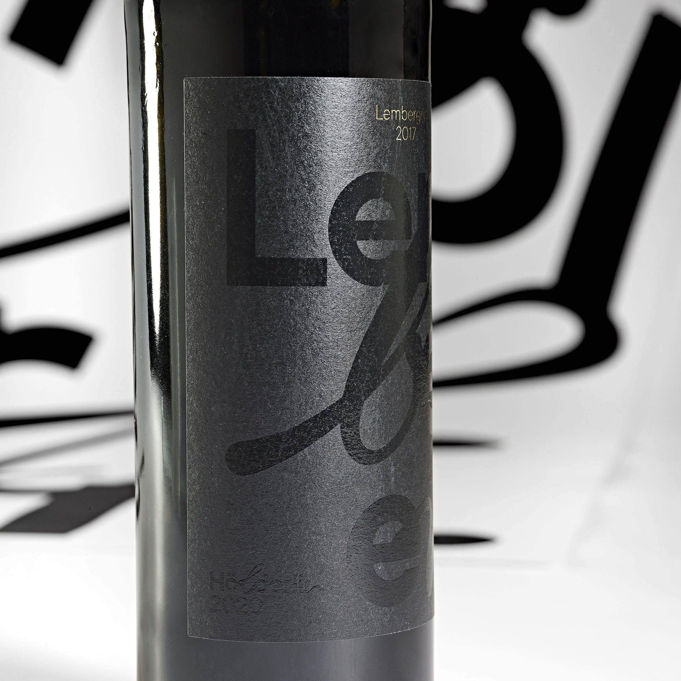
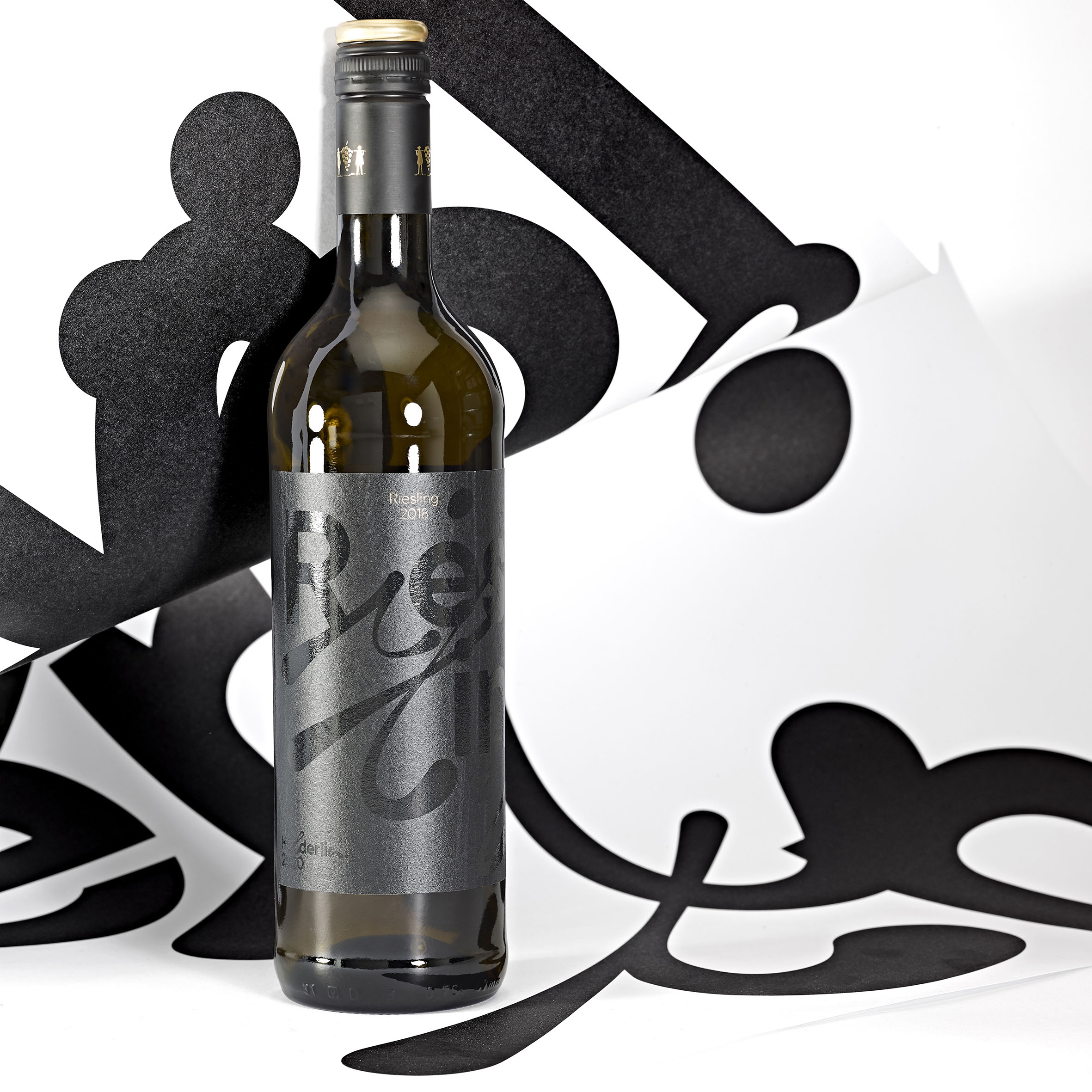
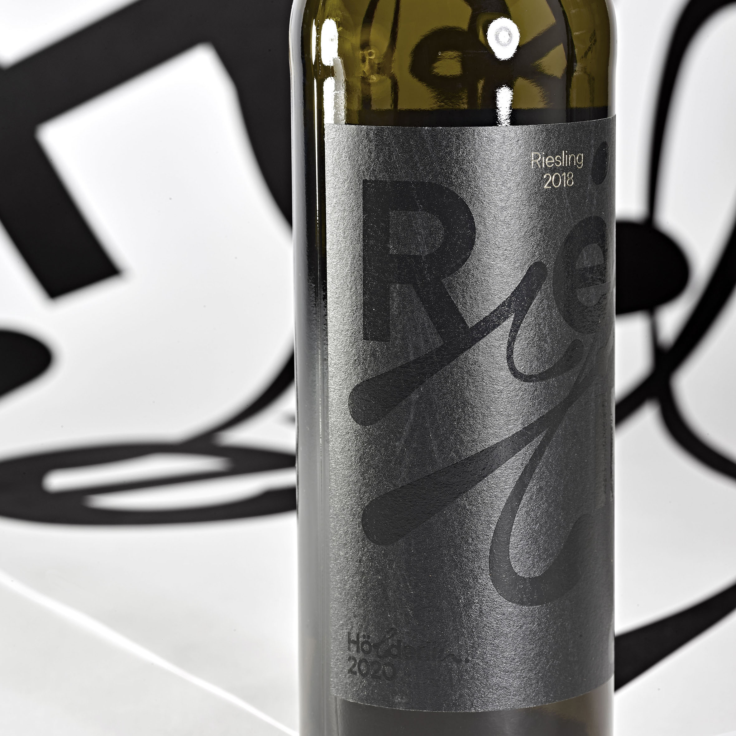
For the 250th anniversary of the poet Friedrich Hölderlin, a visual identity and various merchandising articles were designed for use throughout Germany. The aim was not only to promote individual events in the anniversary year, but also to celebrate Hölderlin throughout the year with different products and/or gift items. Hölderlin was not only to be recited, set to music, played, but all events and exhibitions were to be equipped with merchandising articles and products to accompany them. All merchandising articles, packaging, print and digital media do without a pictorial world throughout. The absence of imagery may be unusual in the consumer sector, but the (packaging) design is distinguished by the fact that it was virtually branded by Hölderlin himself: a typographic image is created, derived from individual glyphs of Hölderlin‘s handwriting. As on Hölderlin’s original manuscript sheets, only black was used for the typography; color is only added by the wine, gind or bottle color. For use on wine and gin bottles, the glyphs were used more or less heavily depending on the alcohol content. The wine labels were produced using a finishing technique (transparent varnish on black paper), which means that the name of the grape variety is not too clearly legible at first glance – depending on the incidence of light. This is like Hölderlin’s texts, too: they are not always immediately accessible and comprehensible and require repeated reading.
Wine and gin were produced in Hölderlin’s birthplace, Lauffen am Neckar, which is also famous for its wines. In the Hölderlin Museum, the house where Hölderlin was born, wine and gin are offered for sale as well as accompanying all Hölderlin events. The labels are characterized by a strong typographic image and there was a deliberate decision not to use additional outer packaging, as the labels with Hölderlin’s glyphs appear from afar to be a kind of wrapping paper. Packaging design here becomes wrapping paper at the same time, and the purely typographic level describes not only the content, but what was crucial in Hölderlin’s life and work: language.
CREDIT
- Agency/Creative: Ina Bauer Kommunikationsdesign
- Article Title: Ina Bauer Creates Label and Packaging Design for Hölderlin2020 Wine and Gin
- Organisation/Entity: Agency, Published Commercial Design
- Project Type: Packaging
- Agency/Creative Country: Germany
- Market Region: Europe
- Project Deliverables: Brand Strategy, Branding, Packaging Design, Product Naming
- Format: Bottle
- Substrate: Glass Bottle


