


Blue Zones Nicoya — Everyday Longevity
Blue Zones Nicoya reinterprets longevity as an everyday visual experience, translating the values of Costa Rica’s Blue Zone into a contemporary and adaptable packaging system. Rather than positioning longevity as an aspirational or distant goal, the project frames it as something built through daily habits, rituals, and connections that shape a way of life.
Inspired by one of the world’s longest-living regions, the project draws from its core principles: community, connection to nature, and a life guided by purpose. These values are not illustrated in a literal or folkloric way; instead, they are embedded into a flexible visual language that evolves naturally across applications and product categories, reflecting the dynamic and continuous nature of living systems.
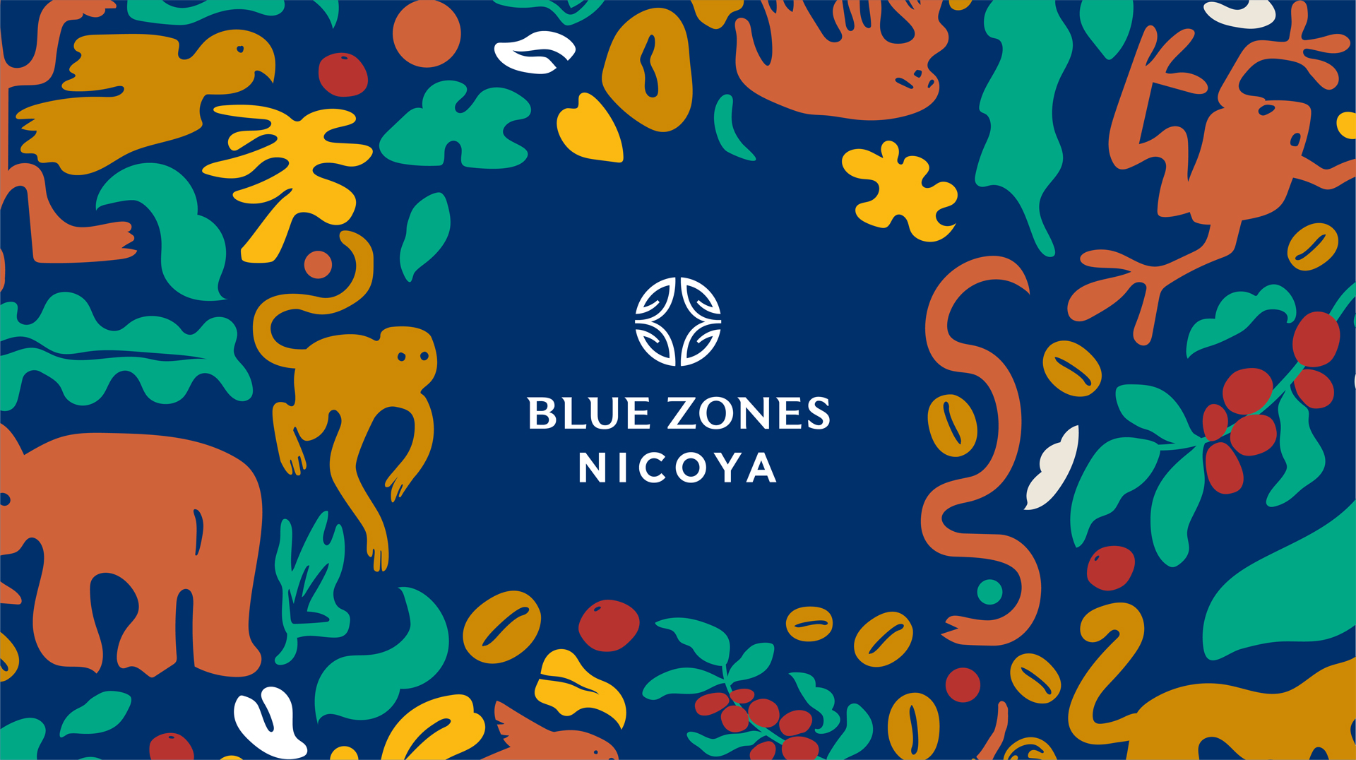
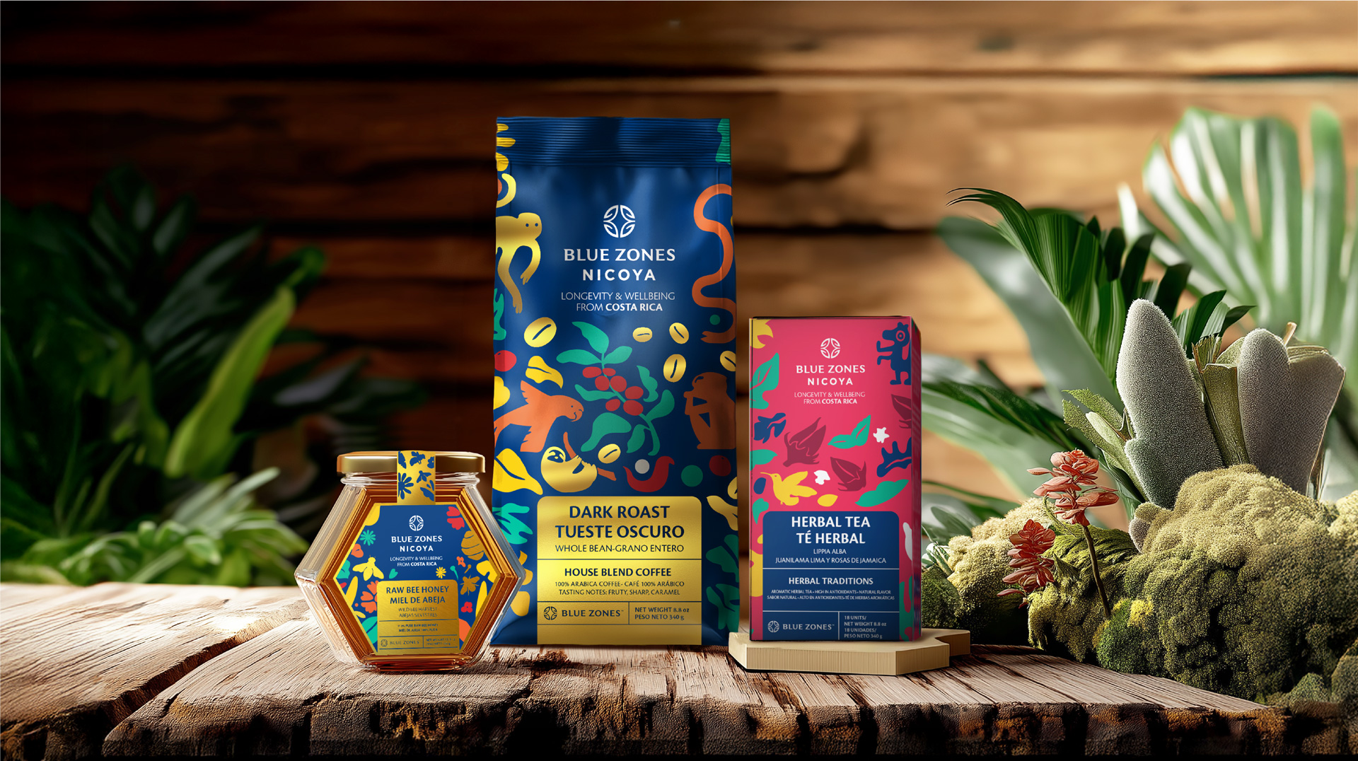
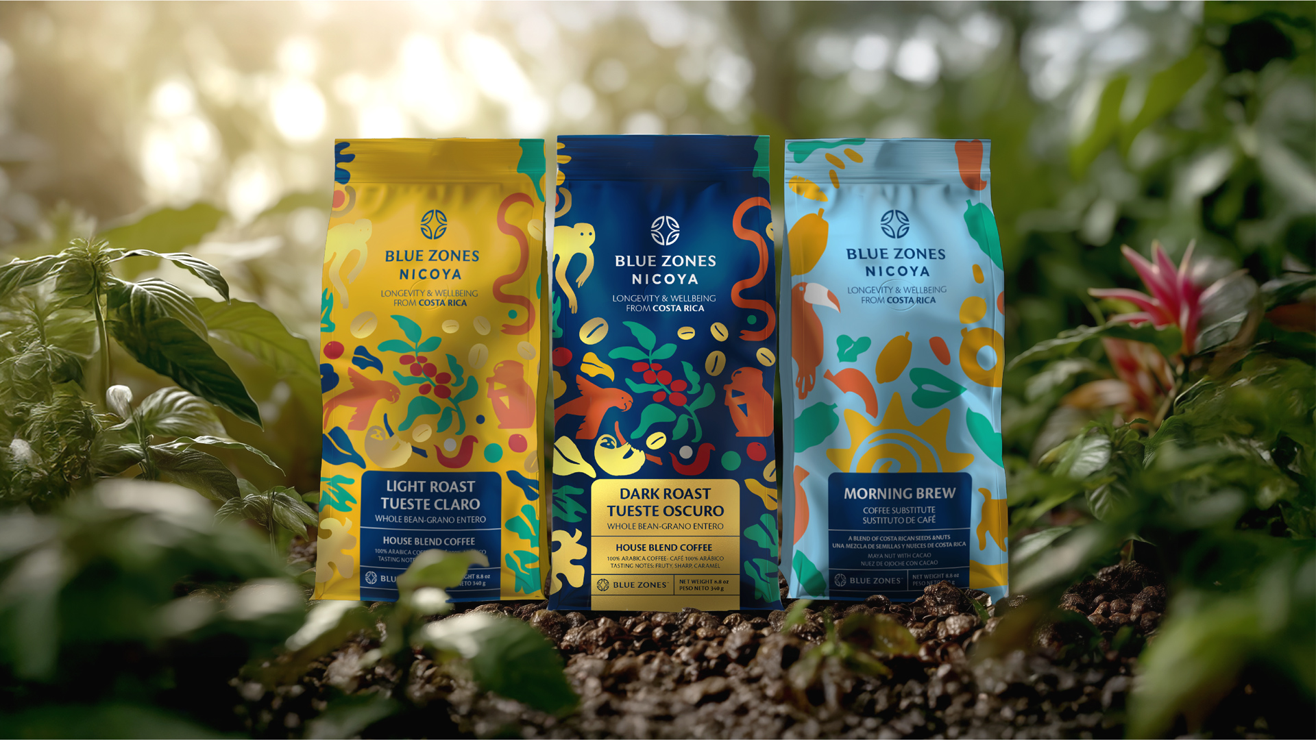
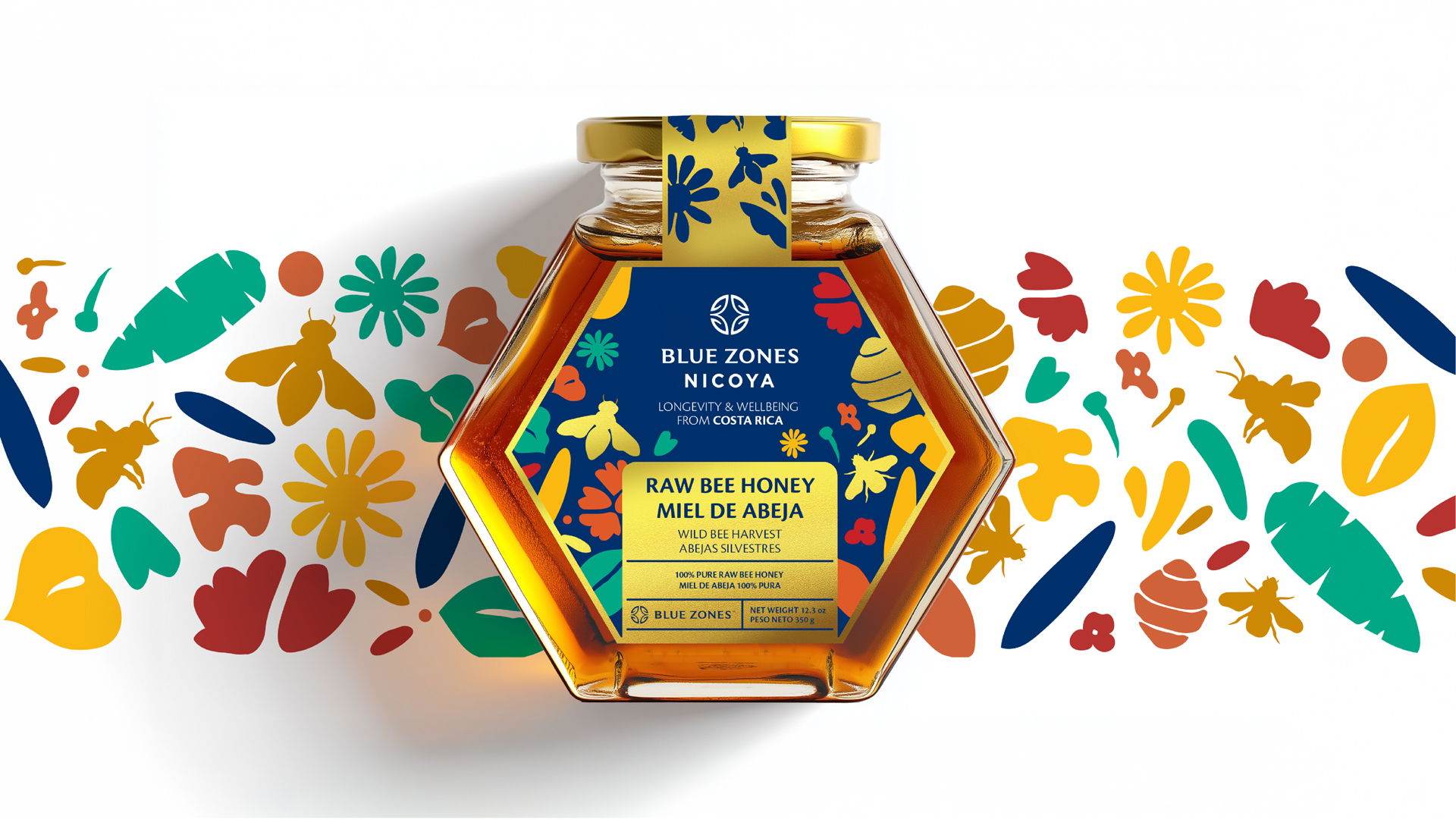
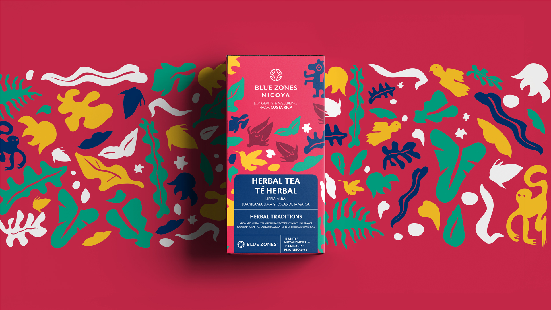
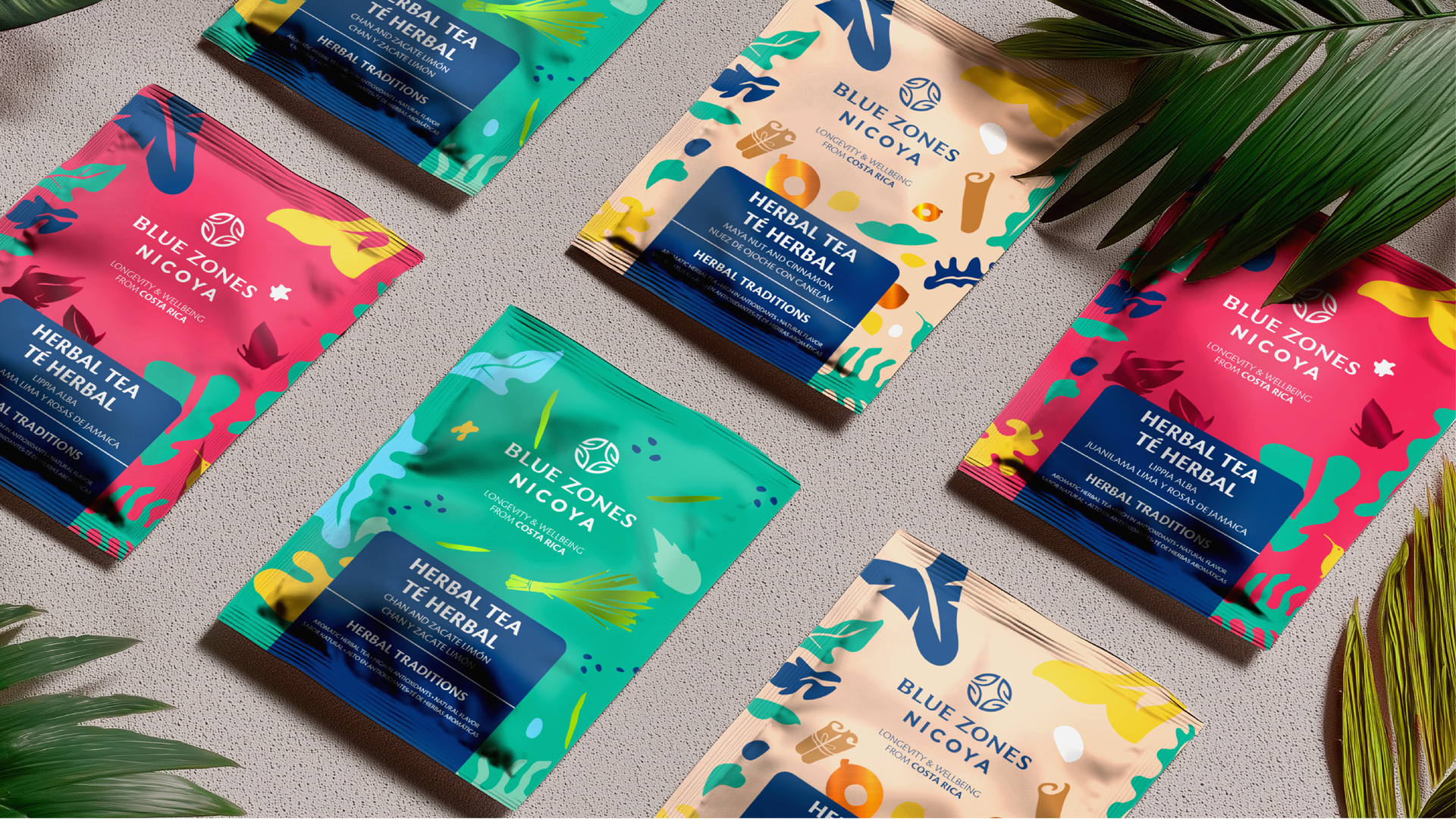
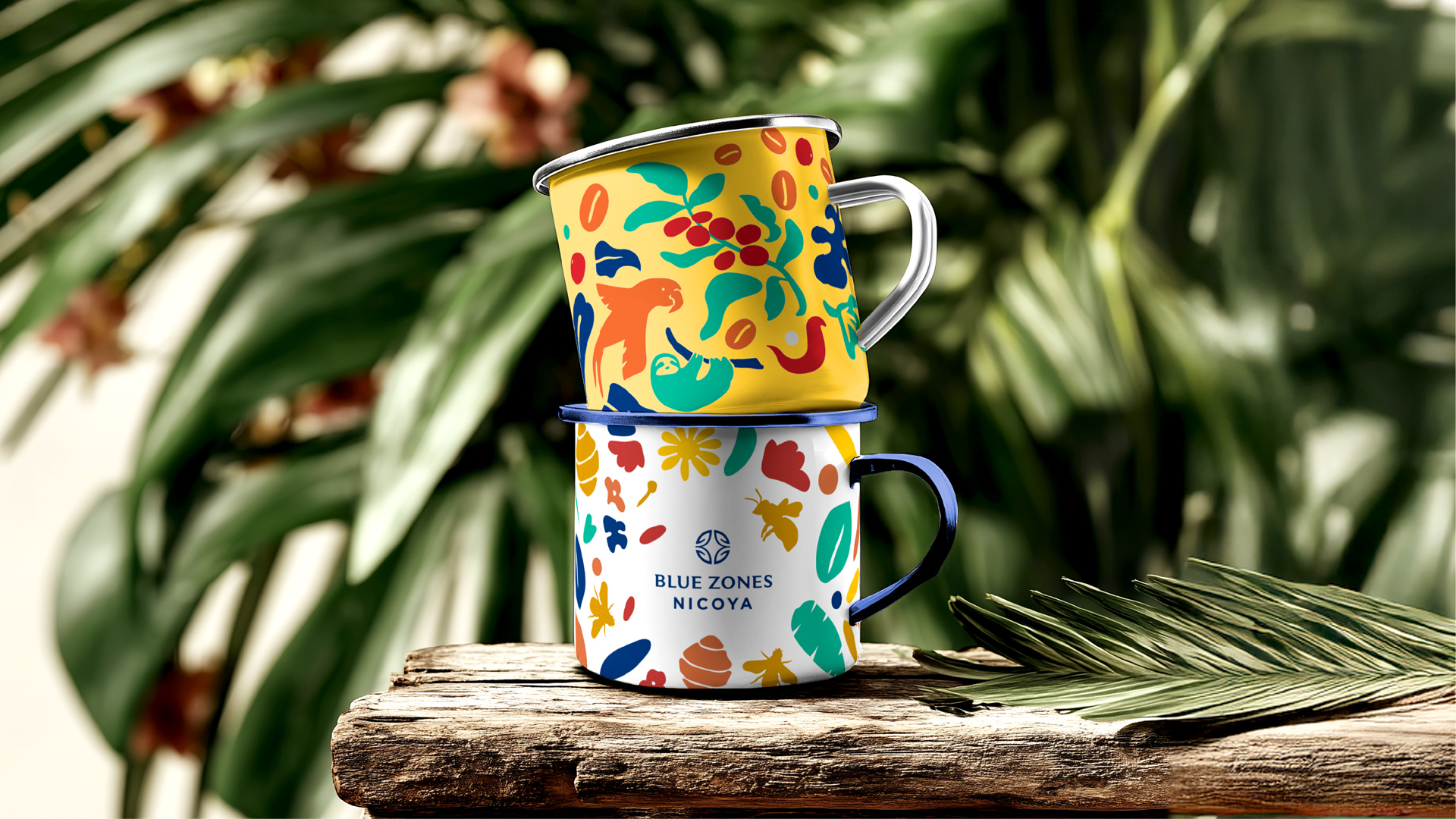
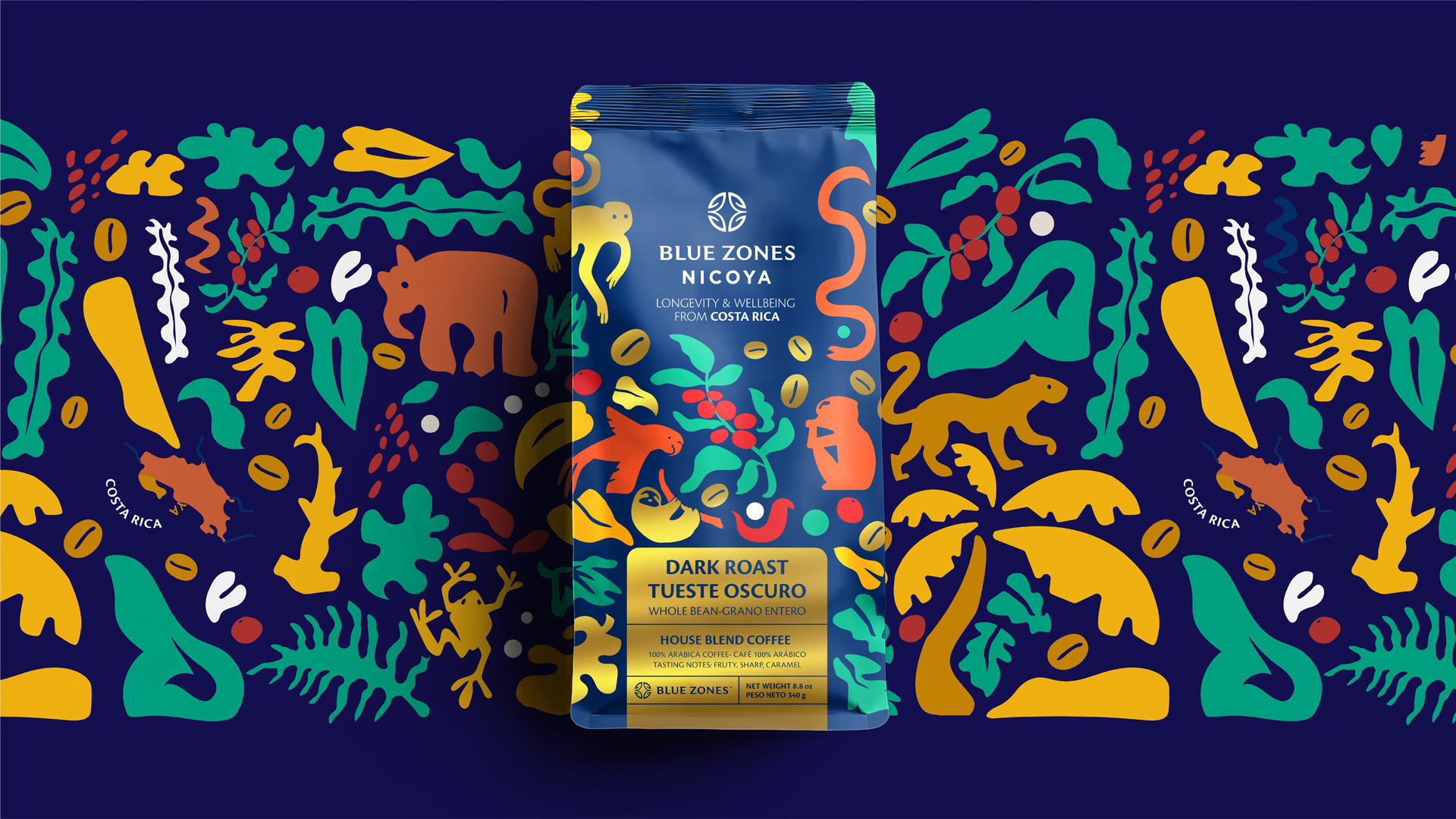
At the core of the identity is a modular illustration system derived from local biodiversity and a reinterpretation of the organic line work found in pre-Columbian graphics from the Nicoya region. These forms—fluid, imperfect, and expressive—create compositions that can be constantly rearranged, generating variety while maintaining a strong and recognizable visual structure. This approach allows the system to grow and adapt over time, much like the traditions and cultural practices that inspired it.
Color plays a fundamental role in reinforcing this diversity, introducing energy, warmth, and clarity across the portfolio. Each palette is carefully considered to differentiate product categories while maintaining cohesion within the overall system, supporting both functional navigation and emotional resonance.
More than a visual solution, the project proposes a living language—one that extends beyond packaging into a broader brand ecosystem. It reflects a way of understanding longevity not as an abstract promise, but as a daily practice rooted in simplicity, balance, and meaningful connections. In doing so, the system transforms each touchpoint into a reminder that living well is built through the accumulation of small, intentional actions over time.


CREDIT
- Agency/Creative: Ignite Branding Studio
- Article Title: Ignite Branding Studio Shapes Blue Zones Nicoya into a Packaging System Inspired by Everyday Longevity
- Organisation/Entity: Agency
- Project Type: Packaging
- Project Status: Published
- Agency/Creative Country: Costa Rica
- Agency/Creative City: San José
- Market Region: North America, South America
- Project Deliverables: Art Direction, Design, Illustration, Packaging Design
- Format: Box, Flow-Pack, Jar, Sachet
- Industry: Food/Beverage
- Keywords: Coffee, Tea, Honey, Blue Zones, Costa Rica, Nature, Pre-Columbian, Design, Packaging, Longevity
-
Credits:
Designer: Sofia Porras
Art Director: Daniel Flores
Business Executive: Maria Fernanda Quesada
Branding Director: Rodrigo Lobo


