


Date Better, a brand of rich and indulgent snacking Medjool dates, has a mission of helping you snack your way to a better life.
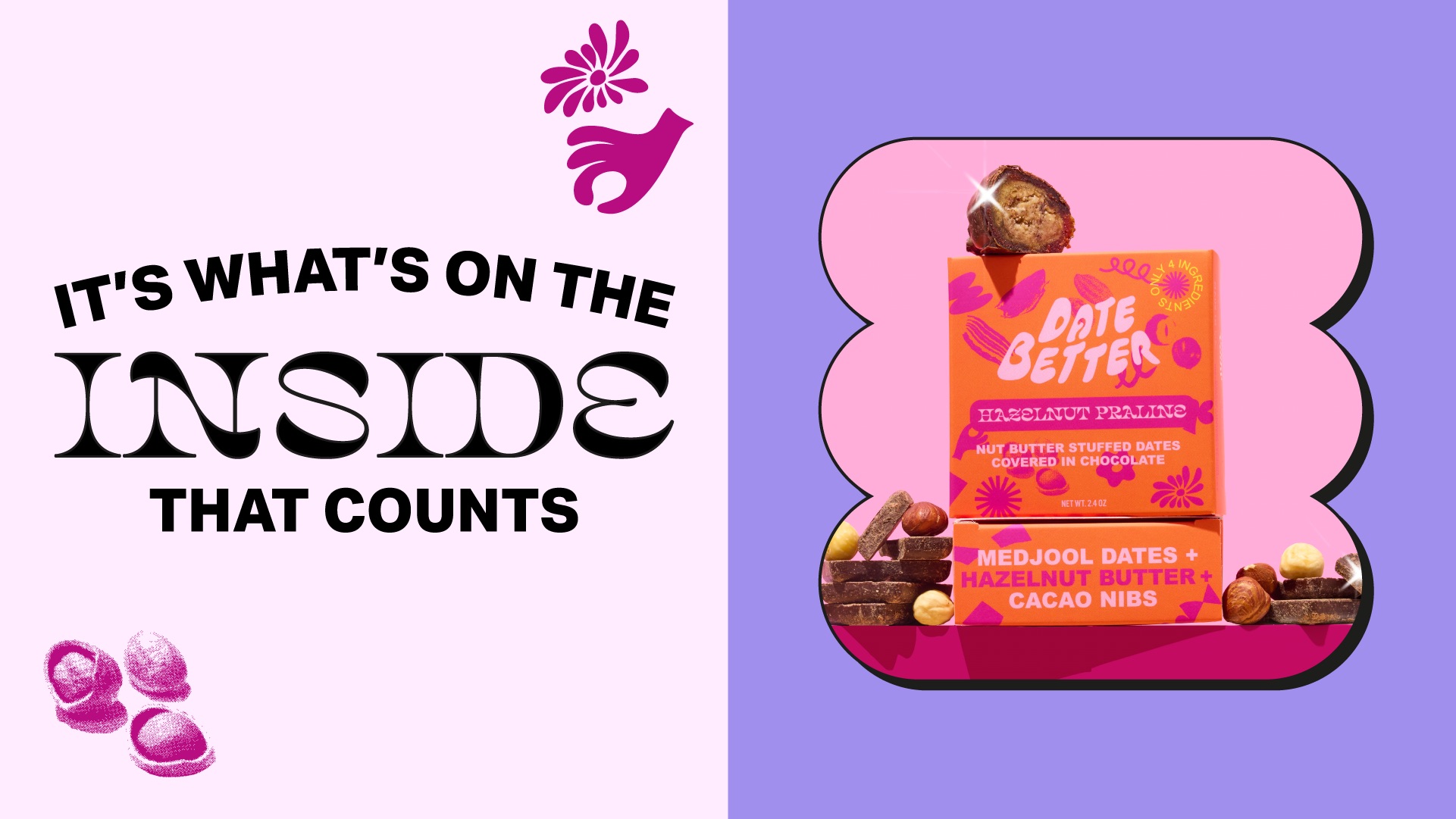
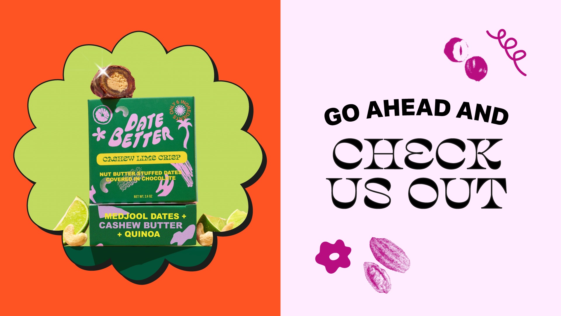
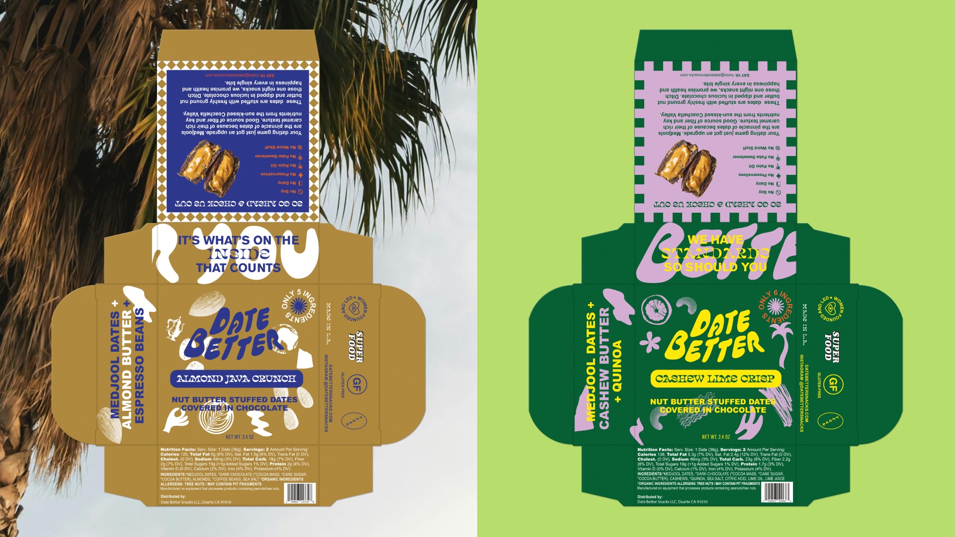
As the brand prepped for its launch in Whole Foods and other retail outlets, they realized that the product itself was getting lost. Date Better had already constructed a solid branded foundation with charming packaging and good recognition. But the flavors weren’t translating, the hierarchy was off, and the product’s obvious benefits weren’t coming through.
Our job was to bring those elements forward with vibrant color stories and a system that made it easy for the consumer to shop by flavor, not just by vibe. Most importantly, though, we needed to highlight what mattered the most—the snack.
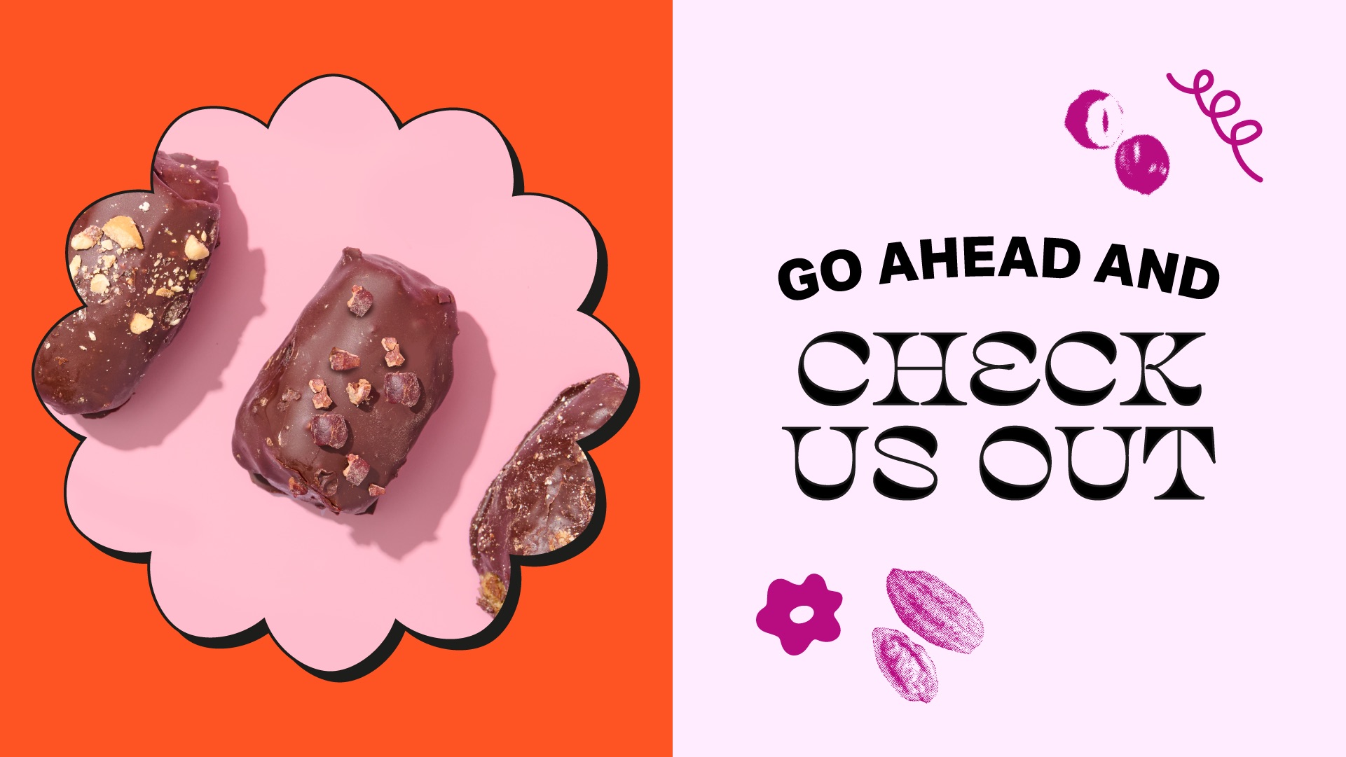
We rebuilt the packaging architecture around clarity, appetite appeal, and a sense of delicious discovery. The front-of-pack now centers on flavor, while the back-of-pack gets to the point and lets the brand’s voice shine with a system that educates, entices, and reflects the snack’s true personality. With a boldly playful tone, the brand’s main character energy exudes wit and confidence. It’s the brand that says, “These dates won’t ghost you,” and invites you to “snack your way to a better life.” The affable voice resonates with modern snackers as it humanizes the brand while subtly reminding them that these dates are as smart as they are satisfying.
Meanwhile, the logo still worked—it had warmth and appeal. Because it felt so recognizable and handmade, we crafted a world around it that allowed it to live in a more elevated, intentional, and focused space. Now, the new brand system makes space for visual and narrative richness while remaining shoppable and flexible for growth. It’s textured, flavor-forward, and fully dialed in—a big leap from functional snacking to a full-on lifestyle moment.
We rebuilt the packaging architecture around clarity, appetite appeal, and a sense of delicious discovery. The front-of-pack now centers on flavor, while the back-of-pack gets to the point and lets the brand’s voice shine with a system that educates, entices, and reflects the snack’s true personality. With a boldly playful tone, the brand’s main character energy exudes wit and confidence. It’s the brand that says, “These dates won’t ghost you,” and invites you to “snack your way to a better life.” The affable voice resonates with modern snackers as it humanizes the brand while subtly reminding them that these dates are as smart as they are satisfying.
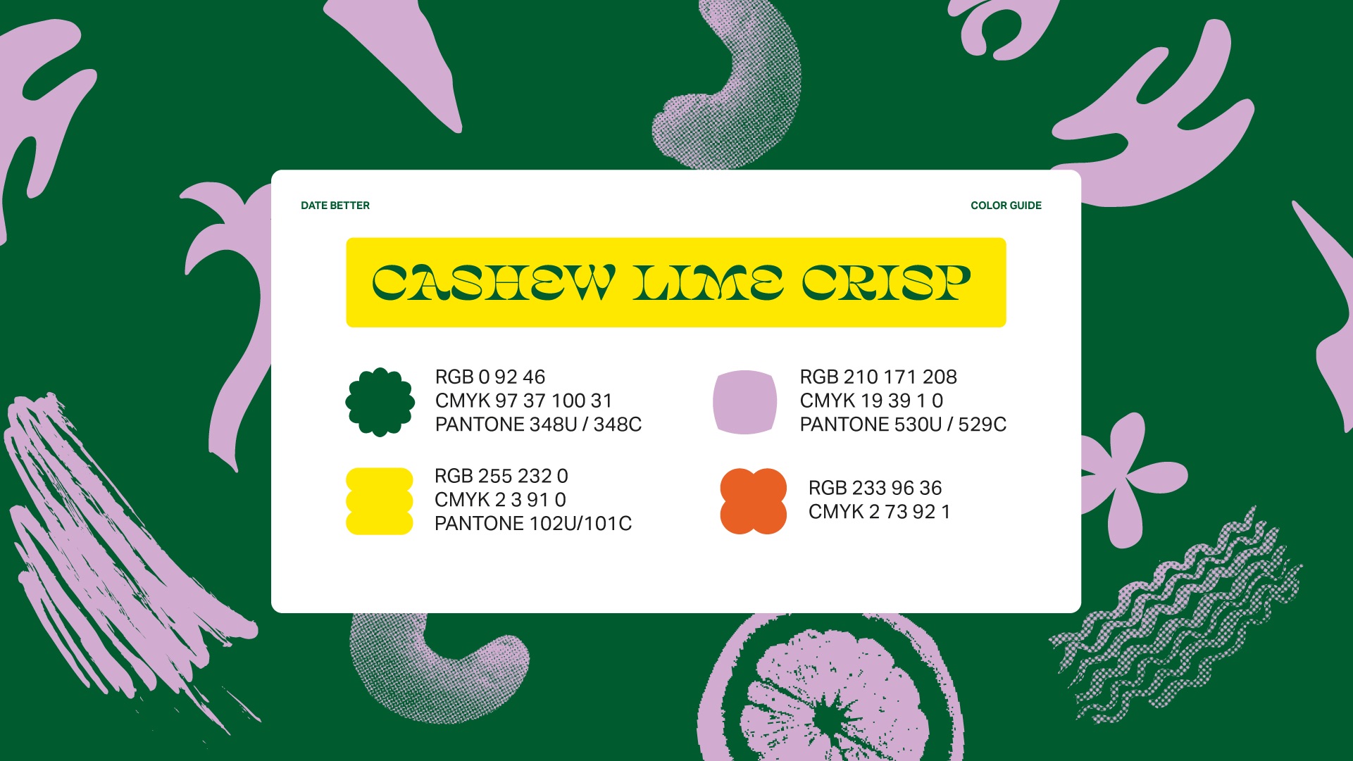
Introducing typography guidelines to the system, our primary typeface, Salvaje Display Regular, make use of a clean, bold sans-serif that brings modernity, legibility, and structure—used for flavor names, headers, and key claims. A secondary typeface in Aktiv Grotesk offers a softer, more expressive serif that evokes warmth and indulgence when used for storytelling moments and body copy. The pairing creates contrast and energy and introduces intentional hierarchy rules that ensure consistency across SKUs and formats, especially for product names, nutrition cues, and callouts. Critically, it leads with appetite while keeping everything organized and ownable.
“I came to the team wanting to keep the integrity of our original packaging while making it pop more on busy retail shelves, and they absolutely delivered,” said Date Better Founder Michelle Valdez-Wilton. “I love that they added the ingredient count on the front, clarified what the product actually is, and even included a beautiful photo of the date on the back. It’s thoughtful design that tells our story in seconds.” – Michelle Wilton-Valdez, Founder
CREDIT
- Agency/Creative: If Only Creative
- Article Title: If Only Creative Unveils Flavor-Forward Refresh for Date Better, Elevating Snack Experience for Retail Launch
- Organisation/Entity: Agency
- Project Type: Identity
- Project Status: Published
- Agency/Creative Country: United States
- Agency/Creative City: Oakland
- Market Region: North America
- Project Deliverables: Brand Architecture, Brand Identity, Identity System, Packaging Design, Product Photography, Web Design
- Industry: Food/Beverage
- Keywords: redesign, date better
-
Credits:
Agency: If Only Creative


