


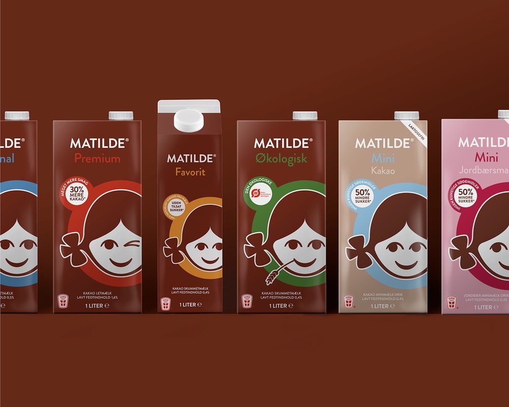
“THE TASK: Do you know MATILDE? If you are a Dane you probably do, because 96% of the Danish population knows MATILDE. However, due to the very fact that MATILDE’s brand awareness is as high as it is, many competitors have “borrowed” the same kind of key visual elements, leading to brand devaluation for MATILDE, as well as losing market share.
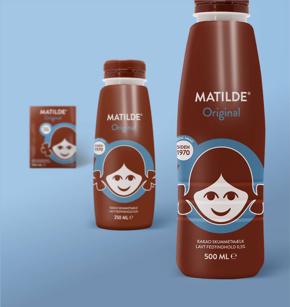
Arla asked us to help with a complete revitalisation, taking the brand to the next level – from a Mainstream Brand to a Star Brand. This was to make it stand out visually, and yet again claim the chocolate milk “throne”. Several years of New Product Development and line extensions have also left their marks on the packaging design, meaning that a complete visual alignment across all variants and formats was part of the assignment. ”
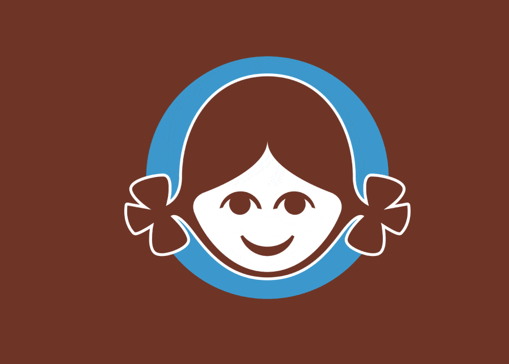
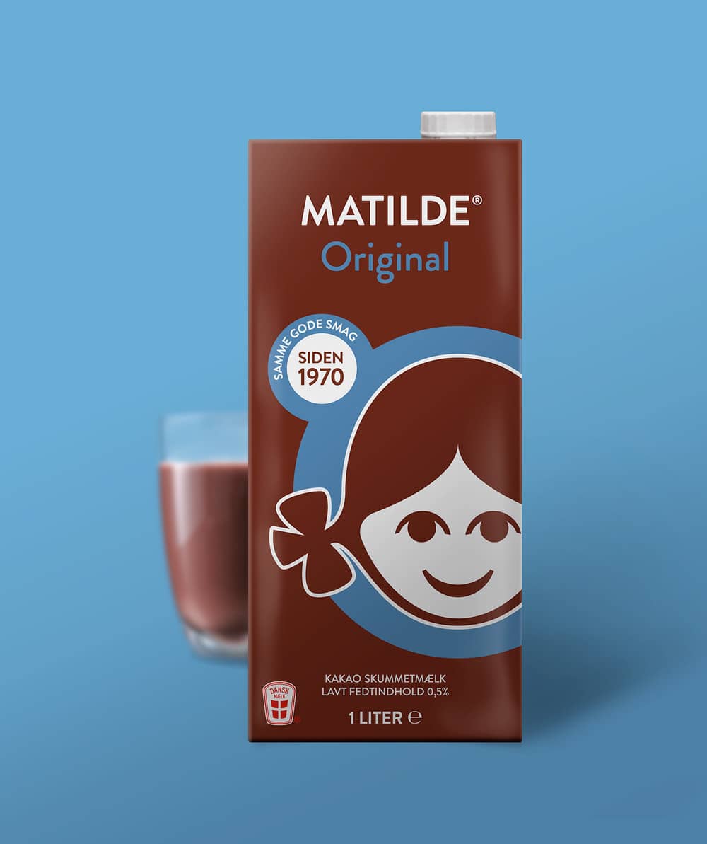
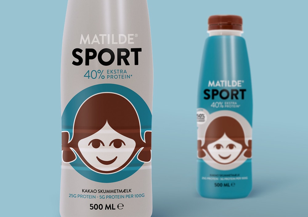
“THE SOLUTION: The purpose of MATILDE is to spark moments of joyful togetherness, by bringing the whole family together, and being the well-known “cosiness-maker”. This meant that the design had to be passionate, positive, playful, friendly, and fun.
This is achieved by enhancing the existing iconic visual symbol (the MATILDE-girl illustration) to the focal design element of the packaging. The MATILDE-girl is equal to the brand Dna and the symbol of chocolate milk in Denmark – no other illustration would tell that any story better. She is furthermore personified through different occasion-driven visual expressions, which together with a coloured circle.”

CREDIT
- Agency/Creative: IDna Group
- Article Title: IDna Group – MATILDE
- Project Type: Packaging


