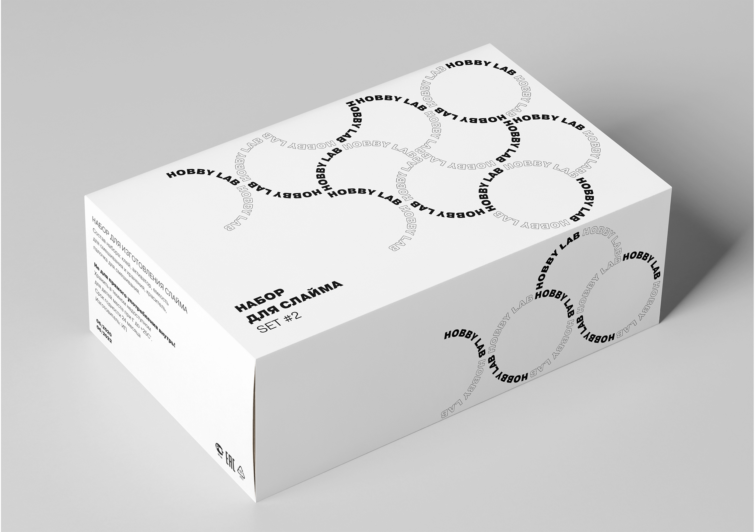
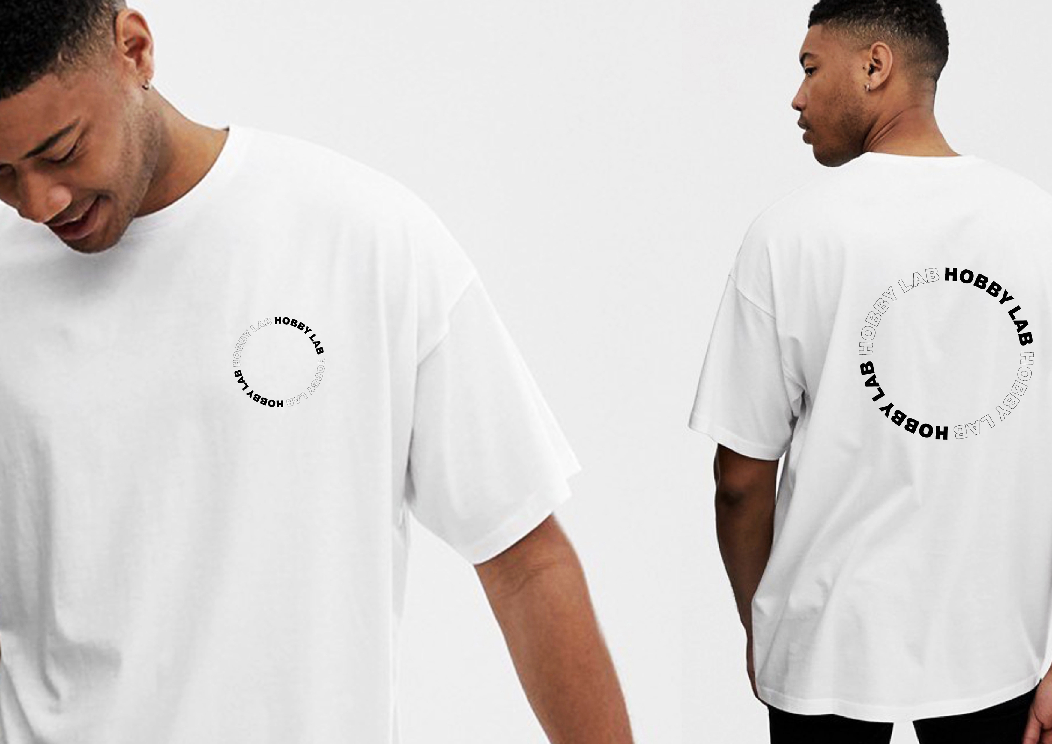
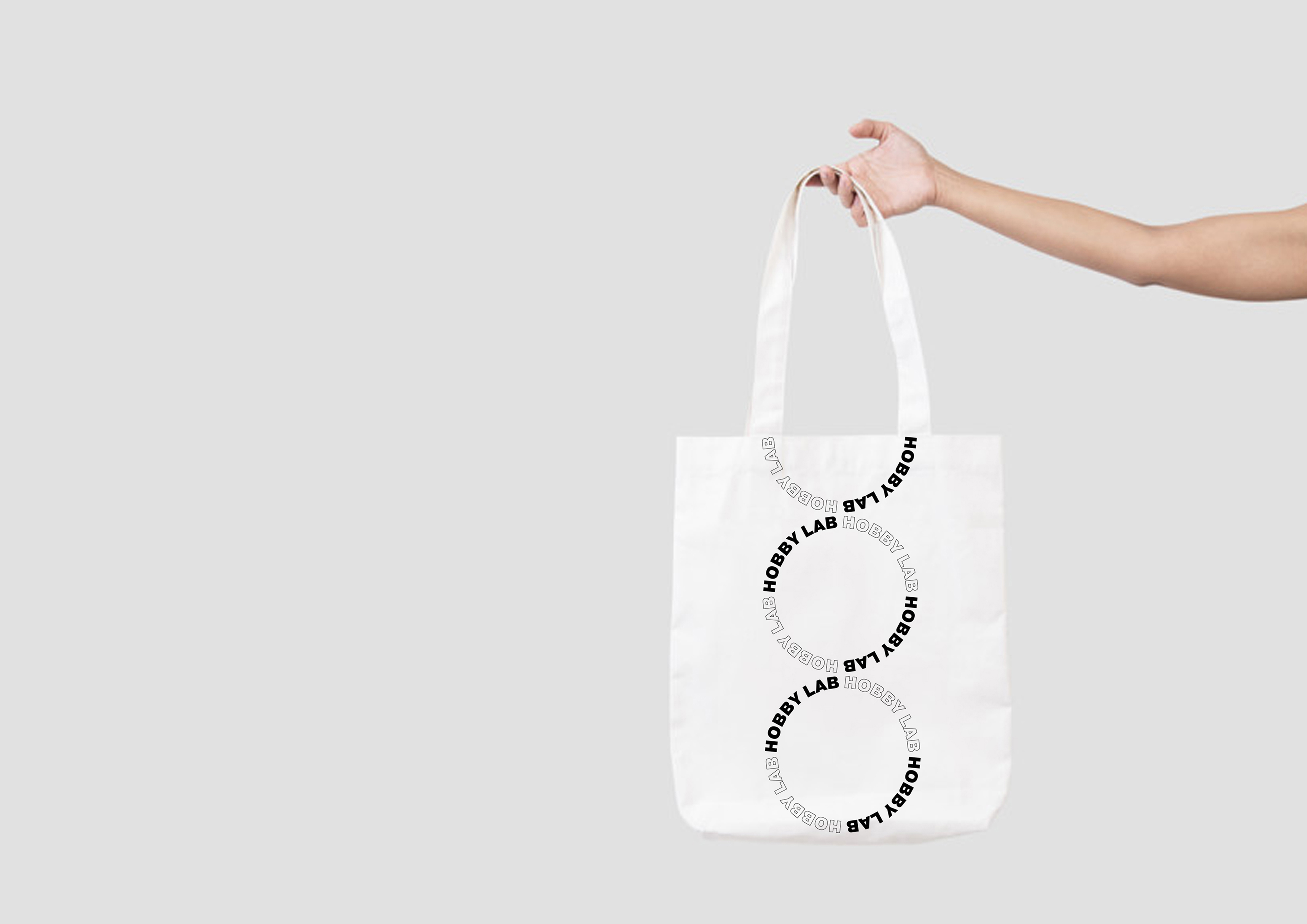
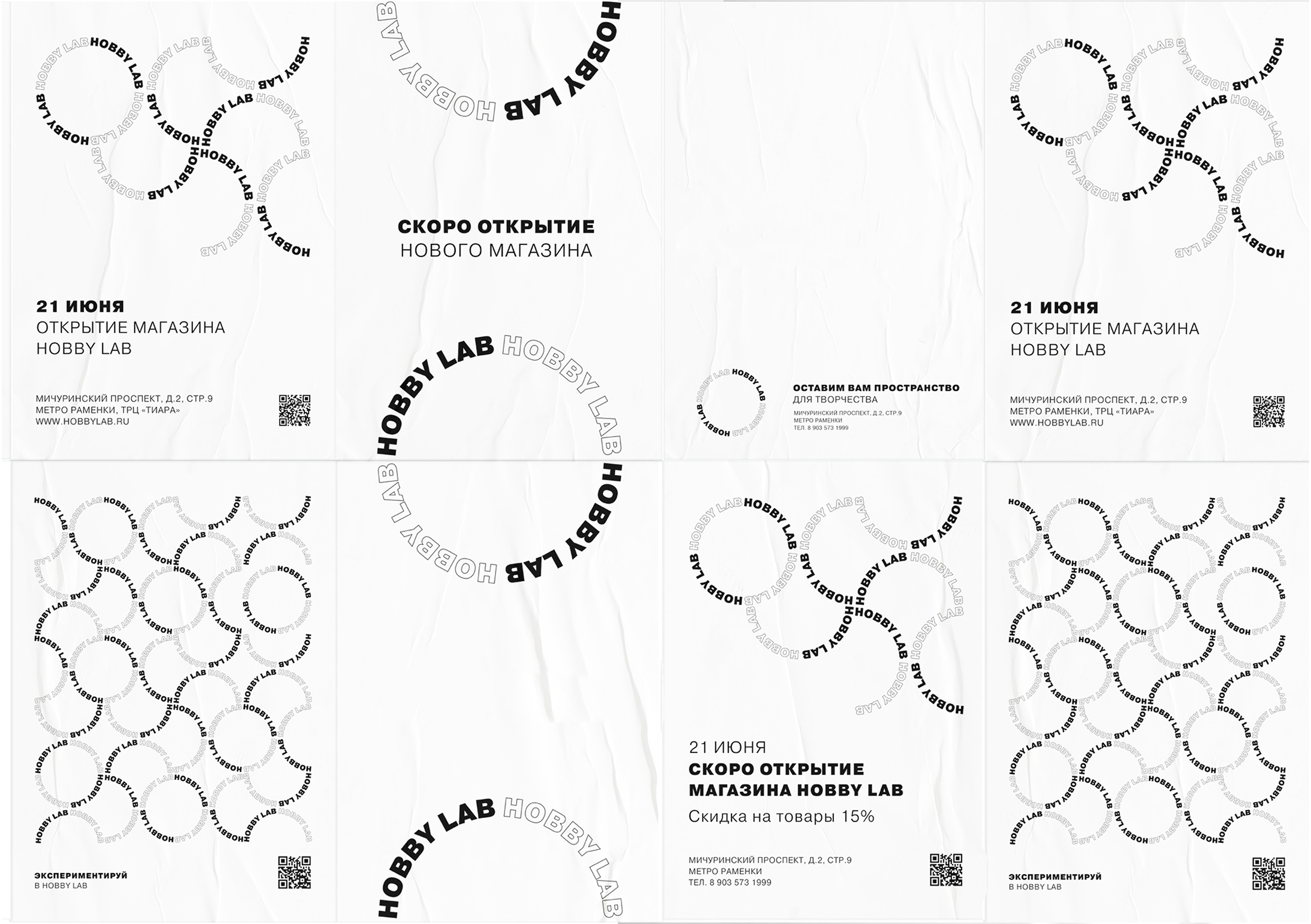
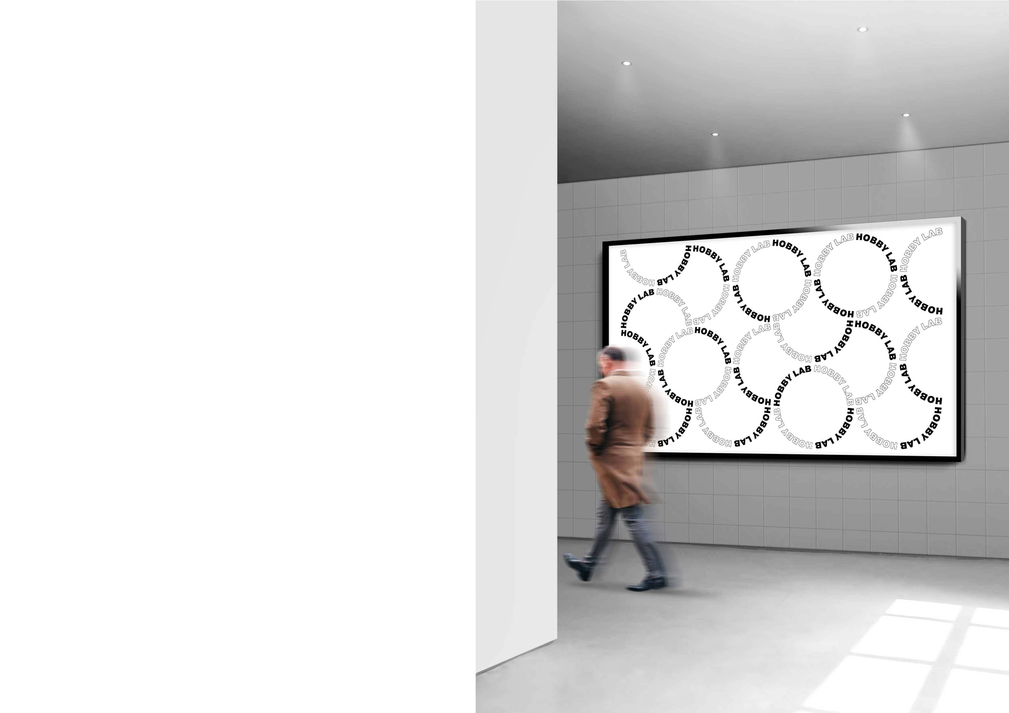
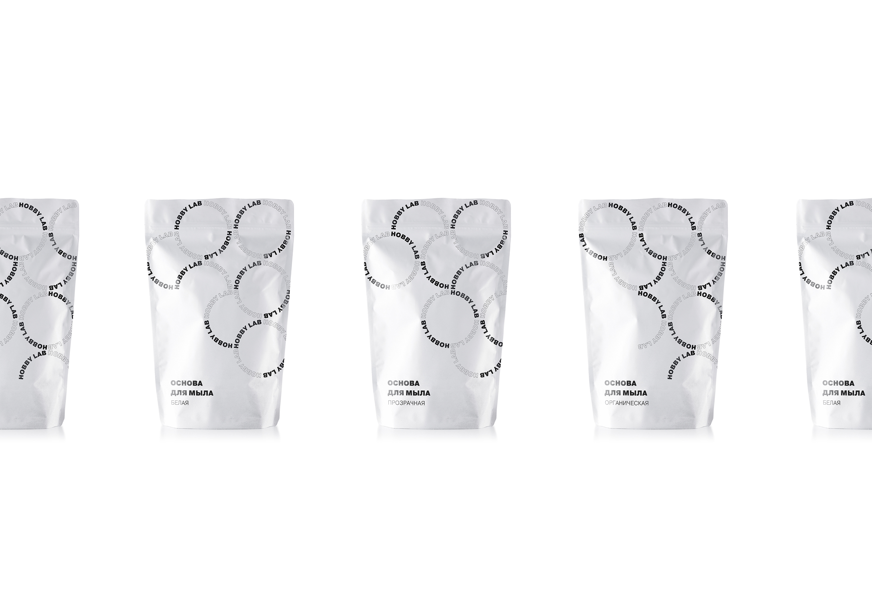
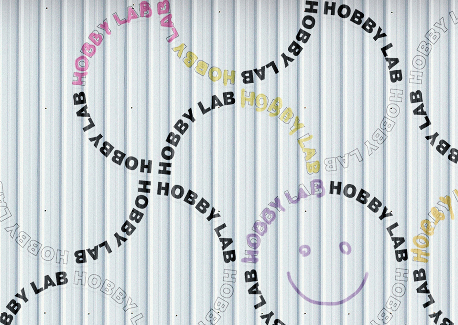
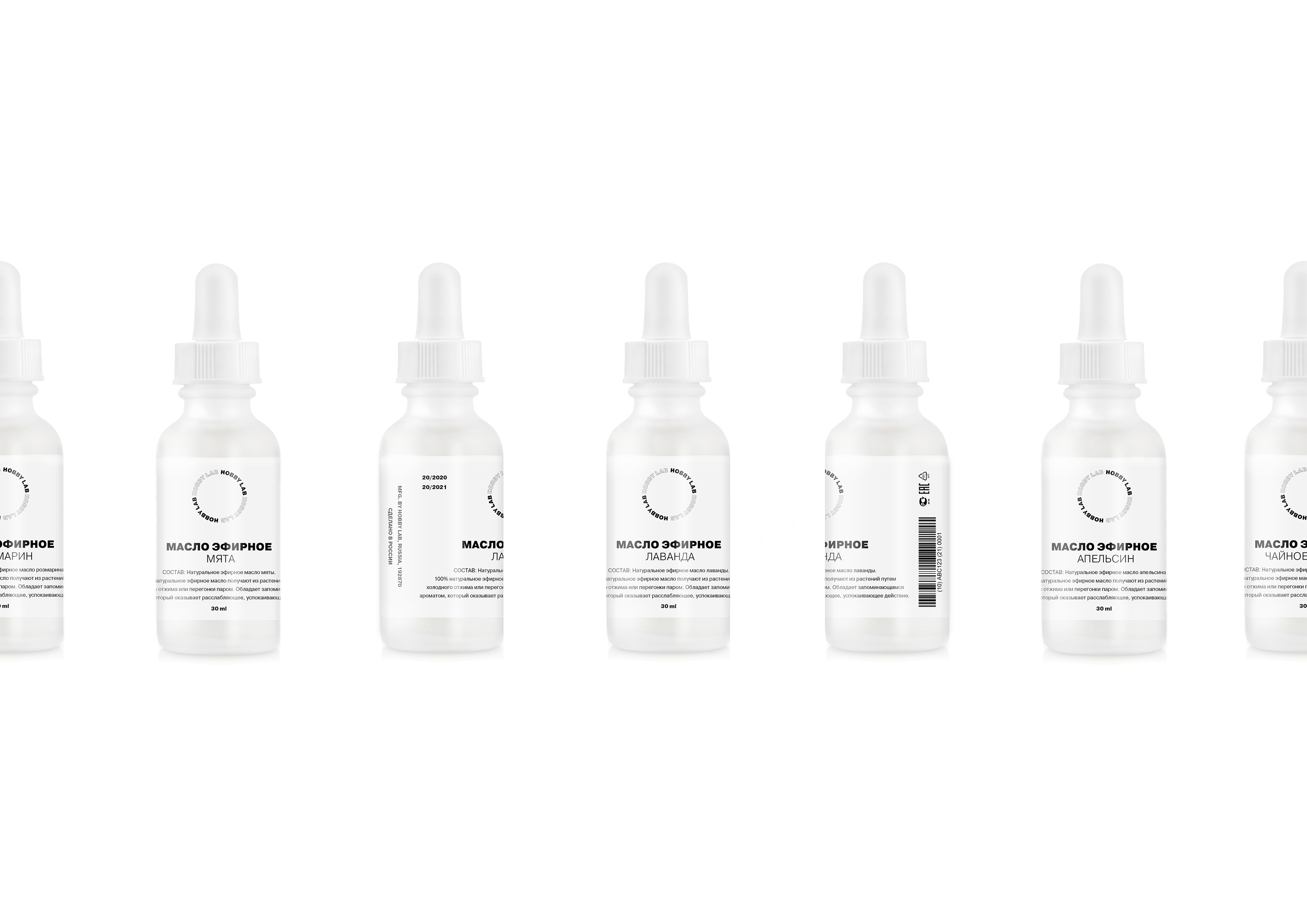
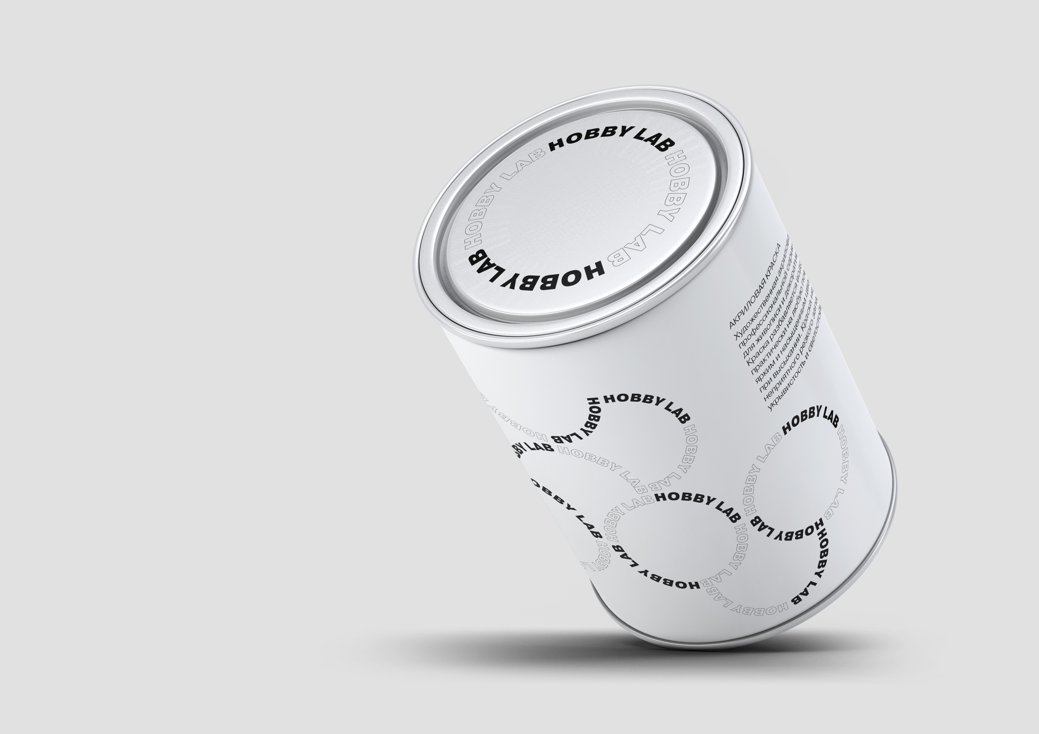
There are no drawings in the project, but yet we managed to draw. Everything is set on typography. The main issue is that all the hobby-shops are flashy and colorful, so it’s difficult to find what you need. When developing an identity, we went all the way around. On the contrary, we removed color everywhere, leaving space for creativity for our customers. We were inspired by two associations: bubbles and a laboratory. The laboratory is a clean space without anything superfluous, which is why we decided to make a “sterile” design.
CREDIT
- Agency/Creative: Natalia Martirorosva
- Article Title: Identity System for a Retail Store of Goods for Hobbies and Creativity
- Organisation/Entity: Student, Non Published Concept Design
- Project Type: Identity
- Agency/Creative Country: Russia
- Market Region: Multiple Regions
- Project Deliverables: Brand Architecture, Brand Identity, Brand Naming, Brand Strategy, Branding, Graphic Design, Identity System, Packaging Design
- Industry: Retail
- Keywords: Hobby, Identity, Packaging, Store, Typography, Logo
FEEDBACK
Relevance: Solution/idea in relation to brand, product or service
Implementation: Attention, detailing and finishing of final solution
Presentation: Text, visualisation and quality of the presentation


