Since 1906, St. Paul Lutheran Church has been sharing the gospel in Ann Arbor. In 1964, a fully-functioning school was in operation and amplified the reach and impact of St. Paul.
Though it has a long history, the brand of St. Paul has faced growing pains. They have struggled with accurately presenting the church & school as a unified unit while reaching different audiences. The school wanted to be better positioned in the competitive landscape. And an outdated and disjointed visual identity was in need of a modern refresh. So we set out to revitalize the brand strategy and the design of St. Paul Ann Arbor.
As we approached the identity development stage, we had to begin by evaluating the right aesthetic direction. We wanted the school and church to be able to share a logo, strengthening the connection between them. But that meant finding the perfect visual tone that captured the personality of both and appealed to a wide audience.
Upon presenting moodboards to the team, it became apparent that we had to bring a balance of refinement and liveliness to the identity.
We started with brand strategy workshops. Before considering the look of St. Paul Ann Arbor, we wanted to have a foundation of strategic understanding.
The workshops began with diving into the story of SPAA, identifying the unique position they have of being a church & school unit. We then moved into naming structure, bringing clarity to the way the church & school are identified.
As we dove further into the brand strategy, we uncovered insights into their dream student, target audience, emotional promise, and key differentiators. We refined their vision and mission statements and polished their tone of voice. The end result of the workshops was a comprehensive strategic roadmap that unified the vision of the entire SPAA team.
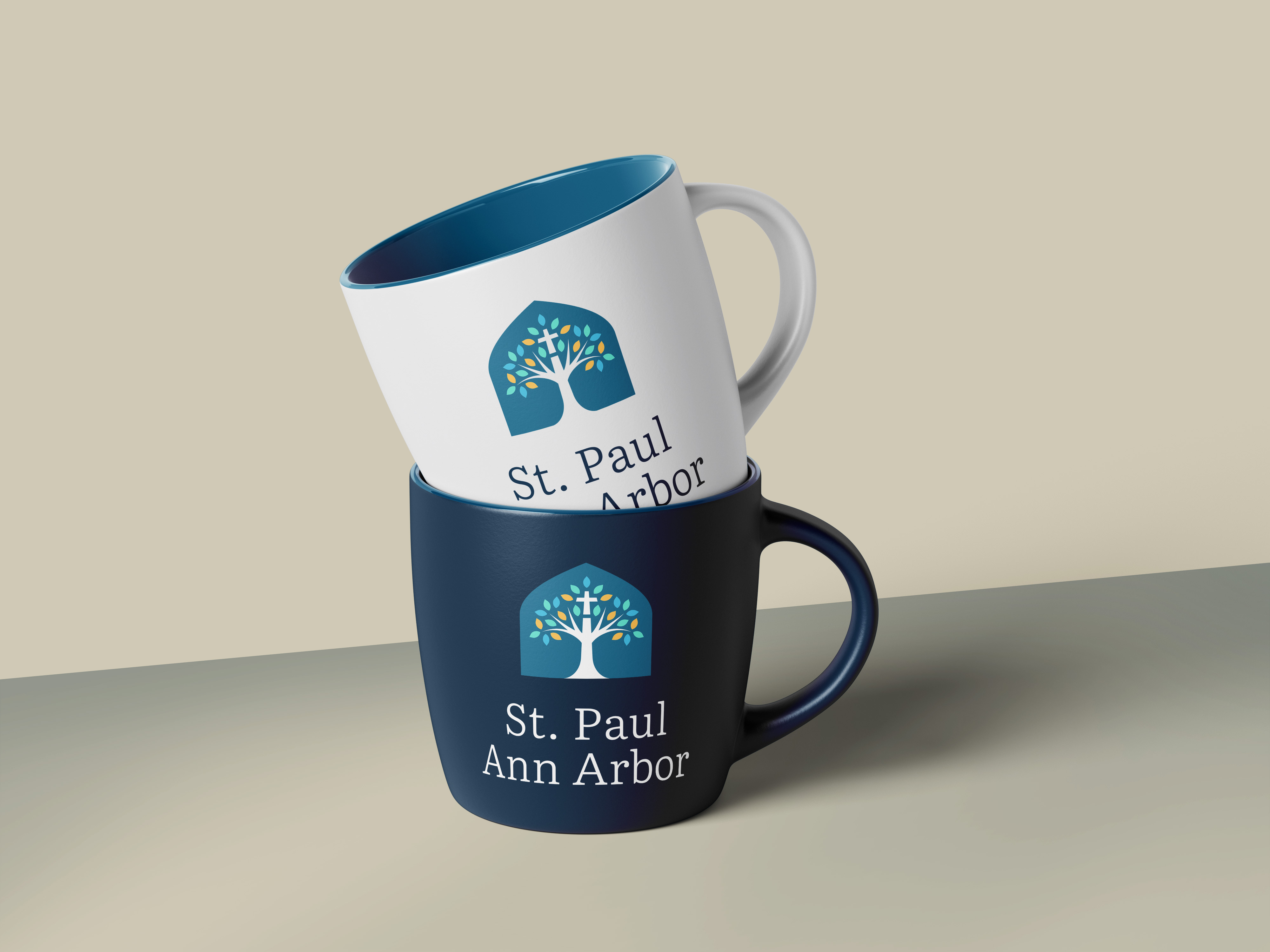
Three logo concepts were developed to gauge the right direction for the visual brand. By unanimous decision, we moved forward with a blossoming tree within a window. This concept brought together a few important elements to SPAA. In years past, a tree logo had been used off and on and reinforced the idea of growth and deep roots. The window element was taken directly from a prominent shape within their auditorium. And after a few rounds of revision, we were able to integrate a cross into the heart of the tree.
We spent time refining the color palette, which then came together to create a flourishing tree. This became the logo mark for the unified brand, with church and school specific lockups.
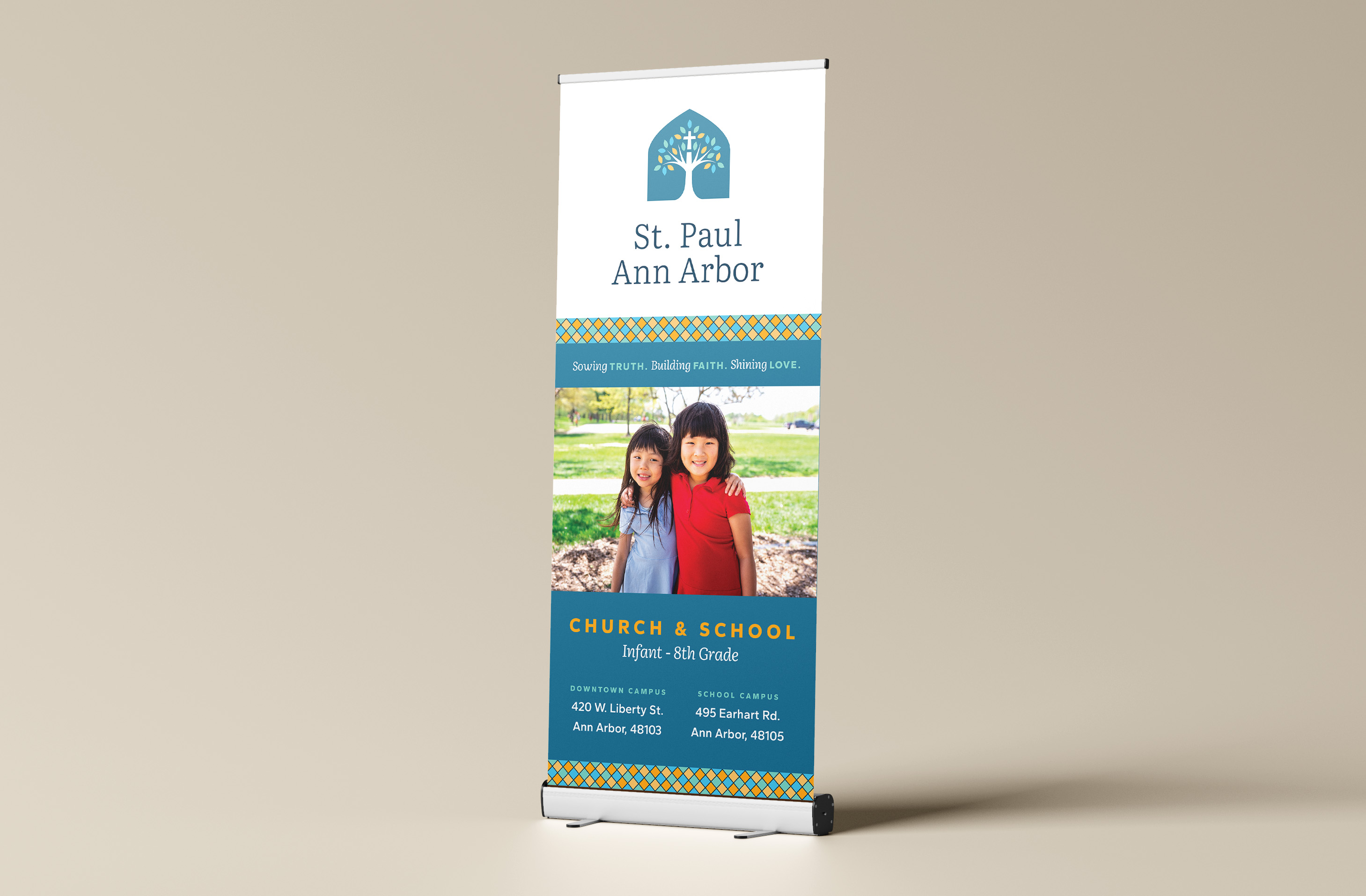
Once the logo was approved, we created a full identity system. All the crucial, foundational elements were defined, from colors to font usage to a stained glass window pattern. We also developed a set of customized icons to give support to their brand messaging. All the elements and their necessary rules were compiled with the brand strategy into a comprehensive brand book.


CREDIT
- Agency/Creative: Creative Chameleon Studio
- Article Title: Identity Redesign For School & Church Brand by Creative Chameleon Studio
- Organisation/Entity: Agency
- Project Type: Identity
- Project Status: Published
- Agency/Creative Country: United States
- Agency/Creative City: Cleveland, Ohio
- Market Region: North America
- Project Deliverables: Brand Design, Brand Guidelines, Brand Identity, Brand Mark, Brand Naming, Brand Redesign, Brand Strategy, Brand Tone of Voice, Branding, Logo Design, Rebranding
- Industry: Education
- Keywords: school branding
-
Credits:
Creative Director: Madison Carr


