


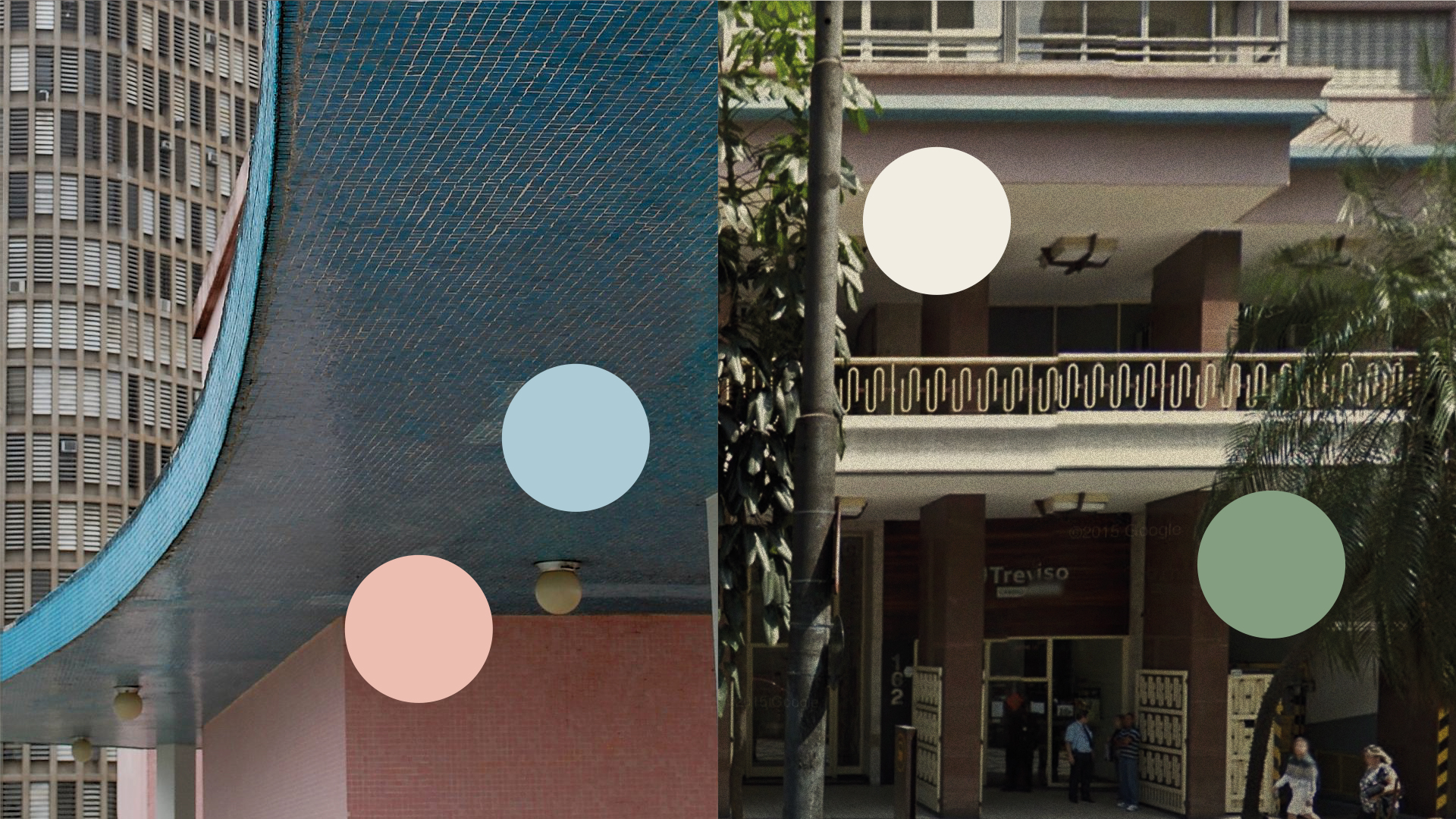
The inspiration for the Studio’s graphic identity came from the metalwork on the railings of the Edifício Louvre, an iconic building in São Paulo – Brazil that has a unique and emotional connection with the architect.
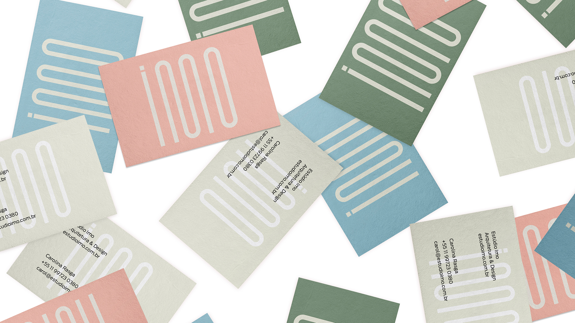
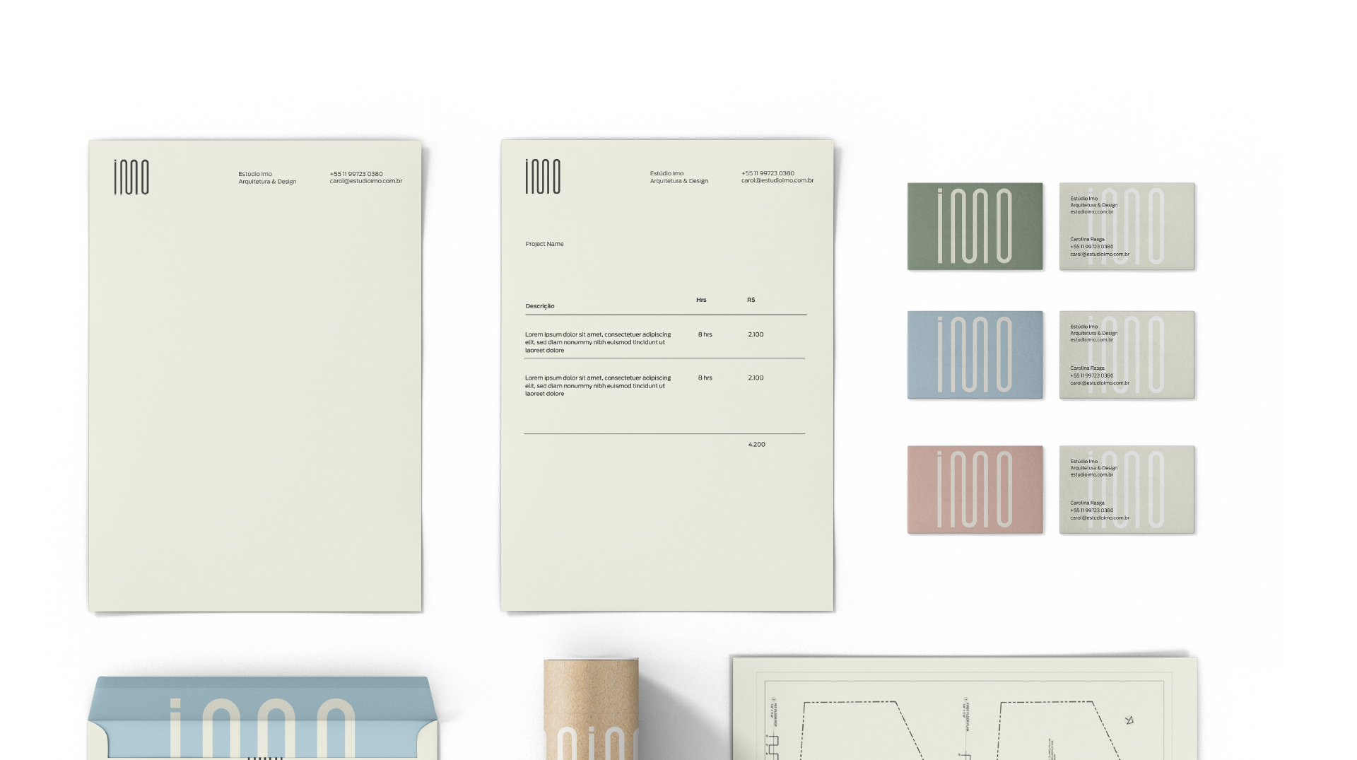
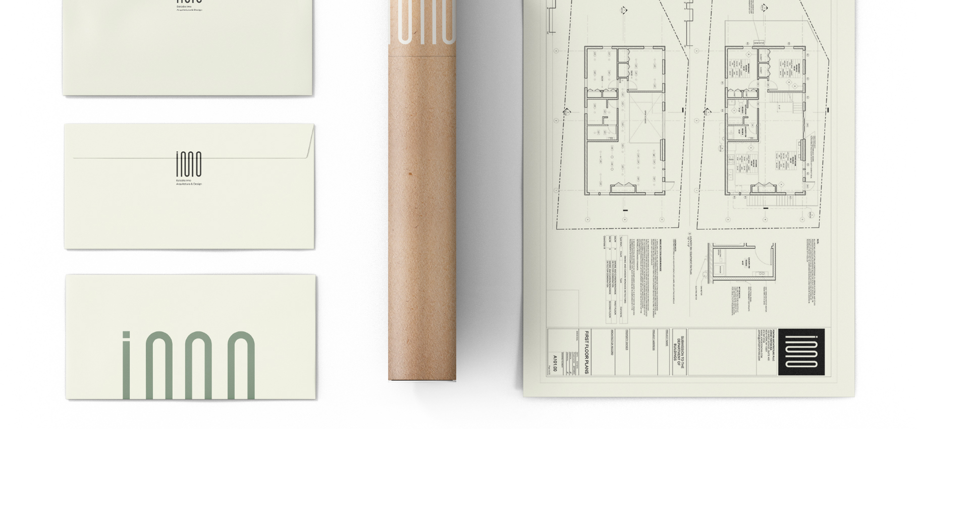
From the grid we built a new, unique type. The logo is almost abstract, symbolic at first sight. However, in a closer look, it gains meaning, showing itself to those who have attentive eyes for the unusual. Thus, it is logo and symbol at the same time.
It is our tribute to the architecture of the detail, the small beauties that often go unnoticed.
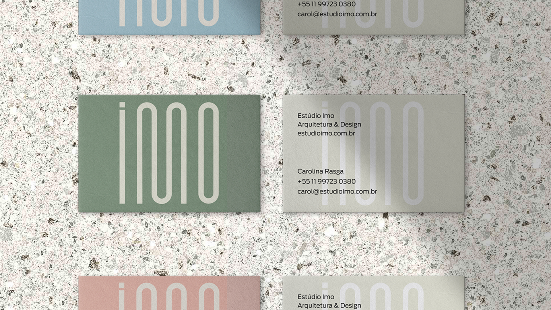
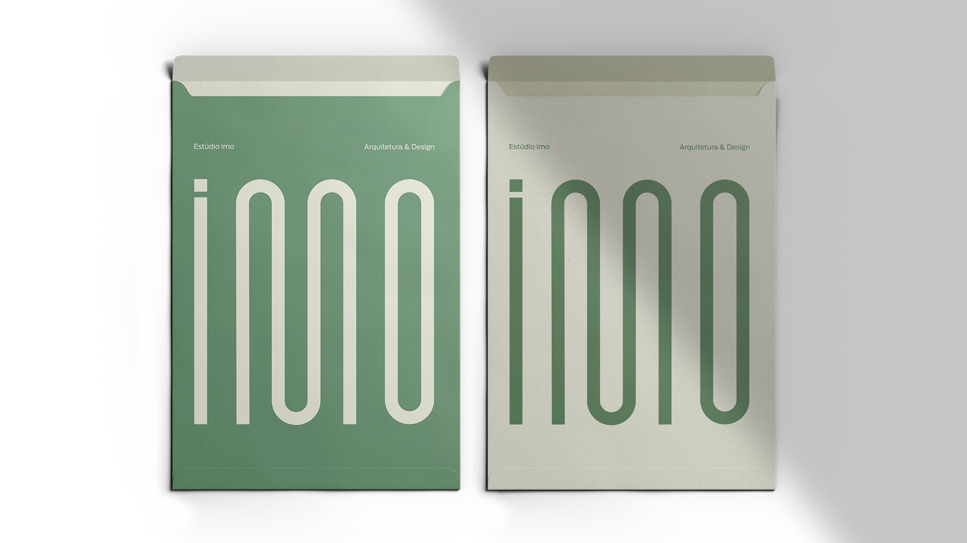
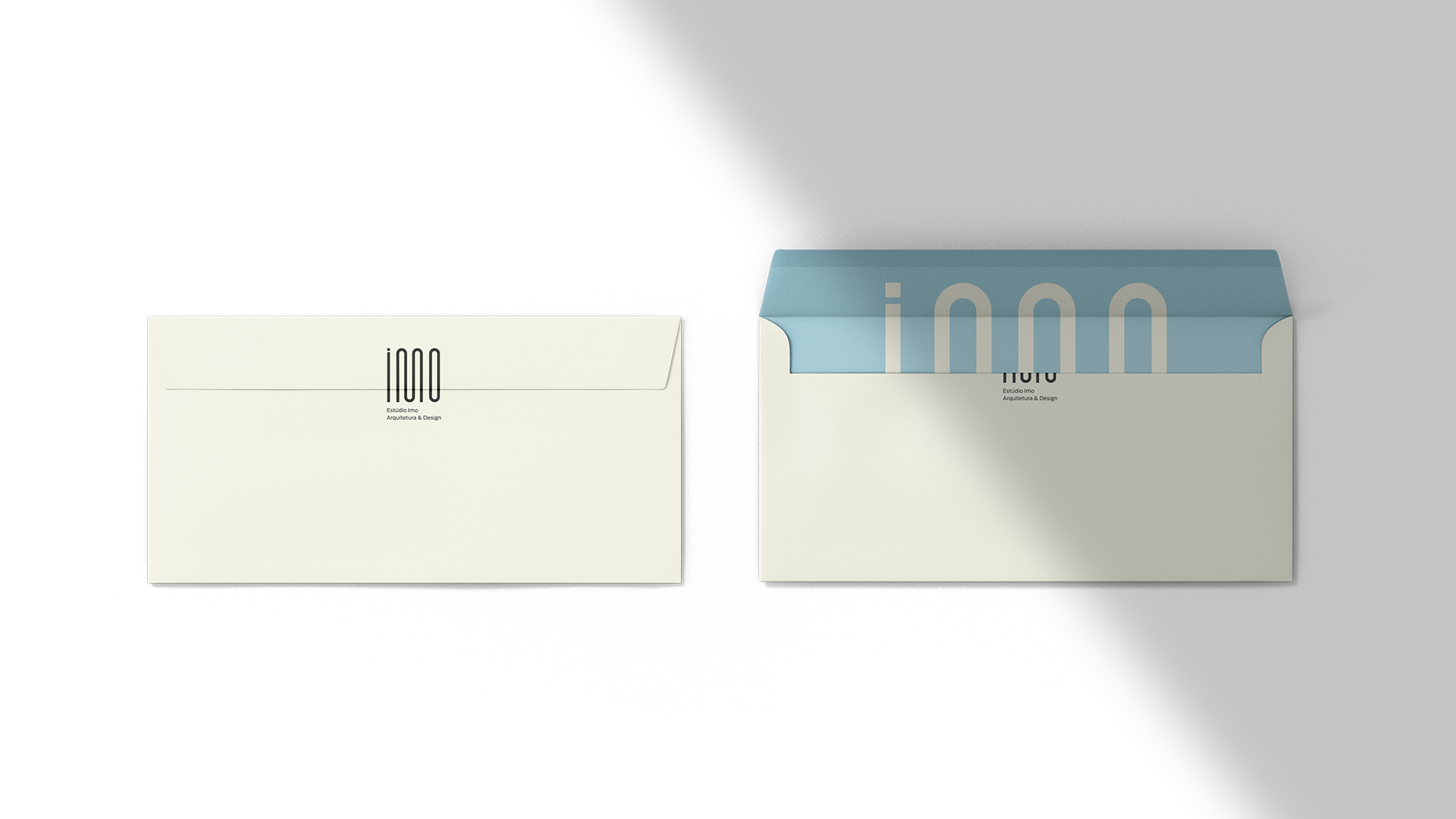
The color palette is inspired by the colors of the Edifício Louvre, but not only: the surrounding greenery is also incorporated into Estúdio Imo’s universe of colors.
CREDIT
- Agency/Creative: My dear Studio
- Article Title: Identity Founded on the Grids of the Best Brazilian Architecture
- Organisation/Entity: Agency, Published Commercial Design
- Project Type: Identity
- Agency/Creative Country: Spain
- Market Region: South America
- Project Deliverables: Brand Architecture, Brand Identity, Brand Naming, Branding, Graphic Design
- Industry: Construction
- Keywords: Architecture, Branding, Brand Design, Mydearstudio, Logo, Logotype
FEEDBACK
Relevance: Solution/idea in relation to brand, product or service
Implementation: Attention, detailing and finishing of final solution
Presentation: Text, visualisation and quality of the presentation


