


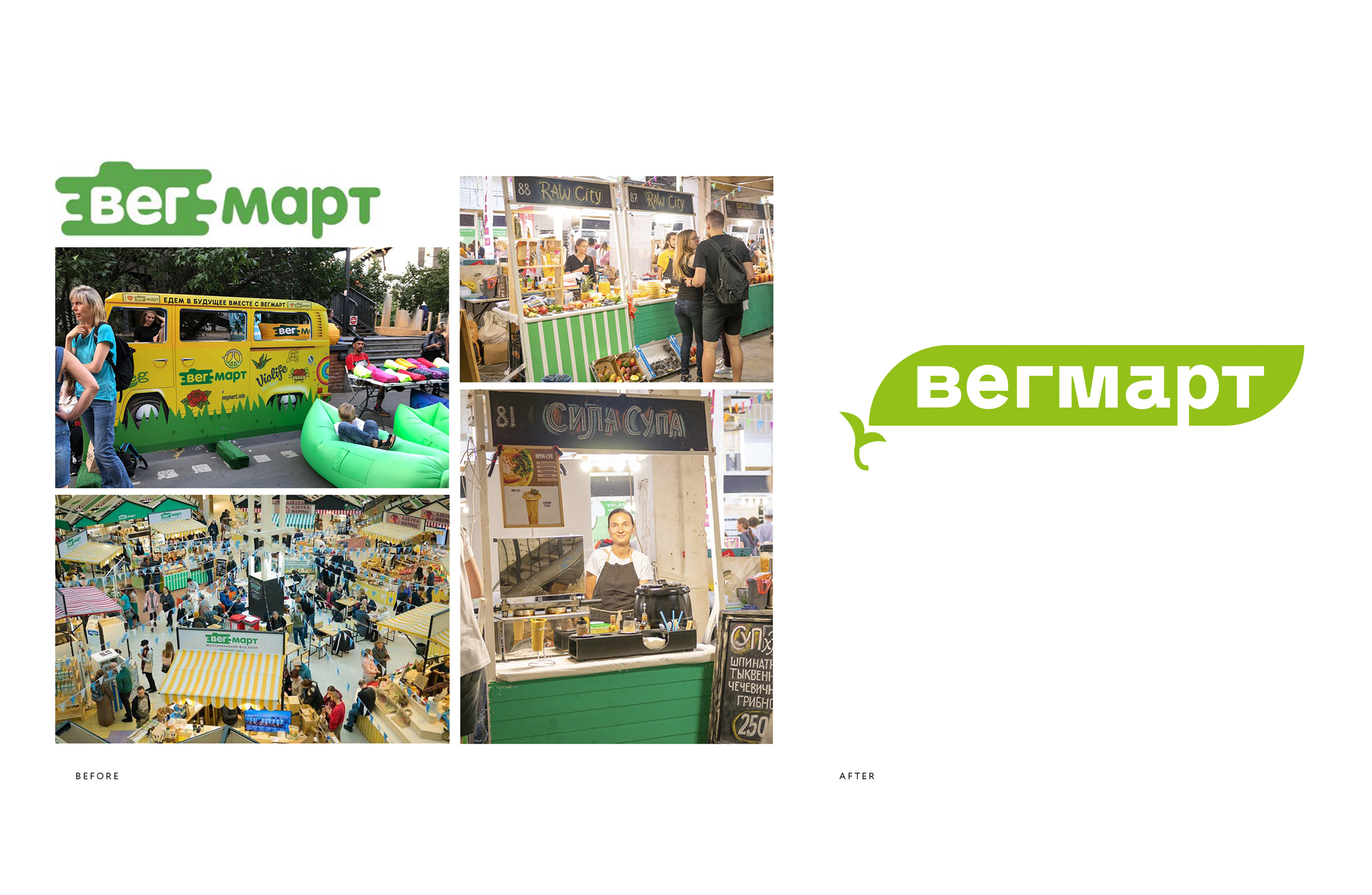
VegMart, a vegetarian food market held monthly in Moscow, Saint Petersburg and other Russian cities, has received a new visual identity system from the Ohmybrand Studio. The updated identity of the market has brought its perception to a new level. Now it is not just an occasional event, but a real club of like-minded people, both offline and online.
Task: Before contacting Ohmybrand, the monthly market VegMart did not have an identity as such, posters and other visual materials were made from scratch for each new event. Meanwhile, the number of events was growing (by the time the work started, the organizers had held 27 markets, 2 exhibitions and 4 festivals), and the need for a modern corporate style was growing strong. It had to be easy to adapt and scale for different formats and platforms and needed to have the potential of a recognizable marker and even a “quality label” for the target audience — the community of vegetarians, vegans and raw foodists as well as representatives of small and medium-sized businesses working in this segment.
Solution: VegMart markets were conceived as a meeting place for people who understand each other, speak the same language and have common values and interests, people who are ready to support each other, share experiences and develop together. The corporate identity developed by the Ohmybrand team is based on the image of green peas in a peapod as a metaphor for a gathering of like-minded people. This metaphor very accurately reflects the self-perception of the vegetarian community connected by the idea of healthy, eco-friendly food and lifestyle.
The image is made using simple “flat” graphics that has been on trend for years and is easily scaled and adapted to a variety of formats. A distinctive font CA Saigon was chosen as the corporate one.
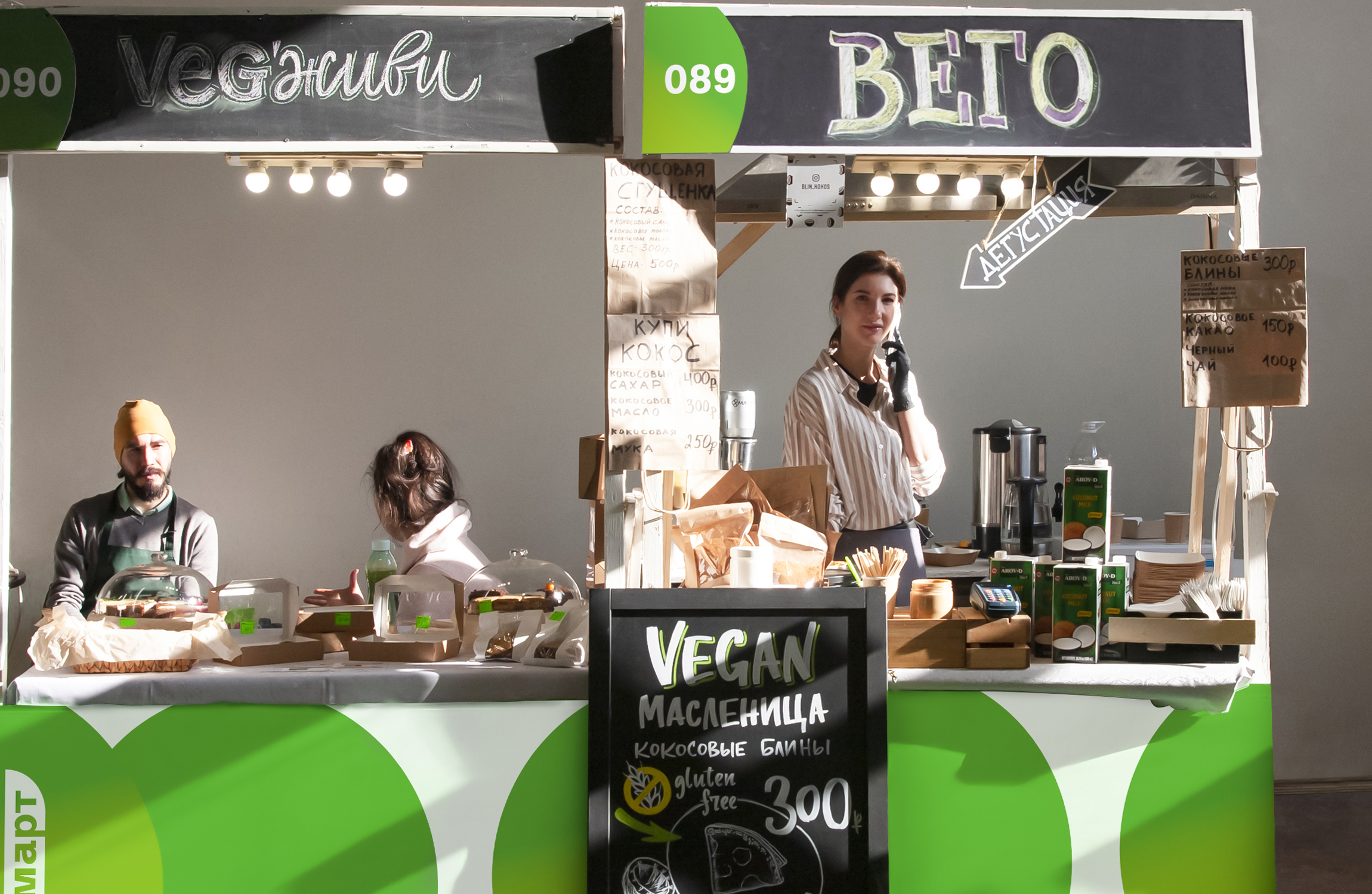
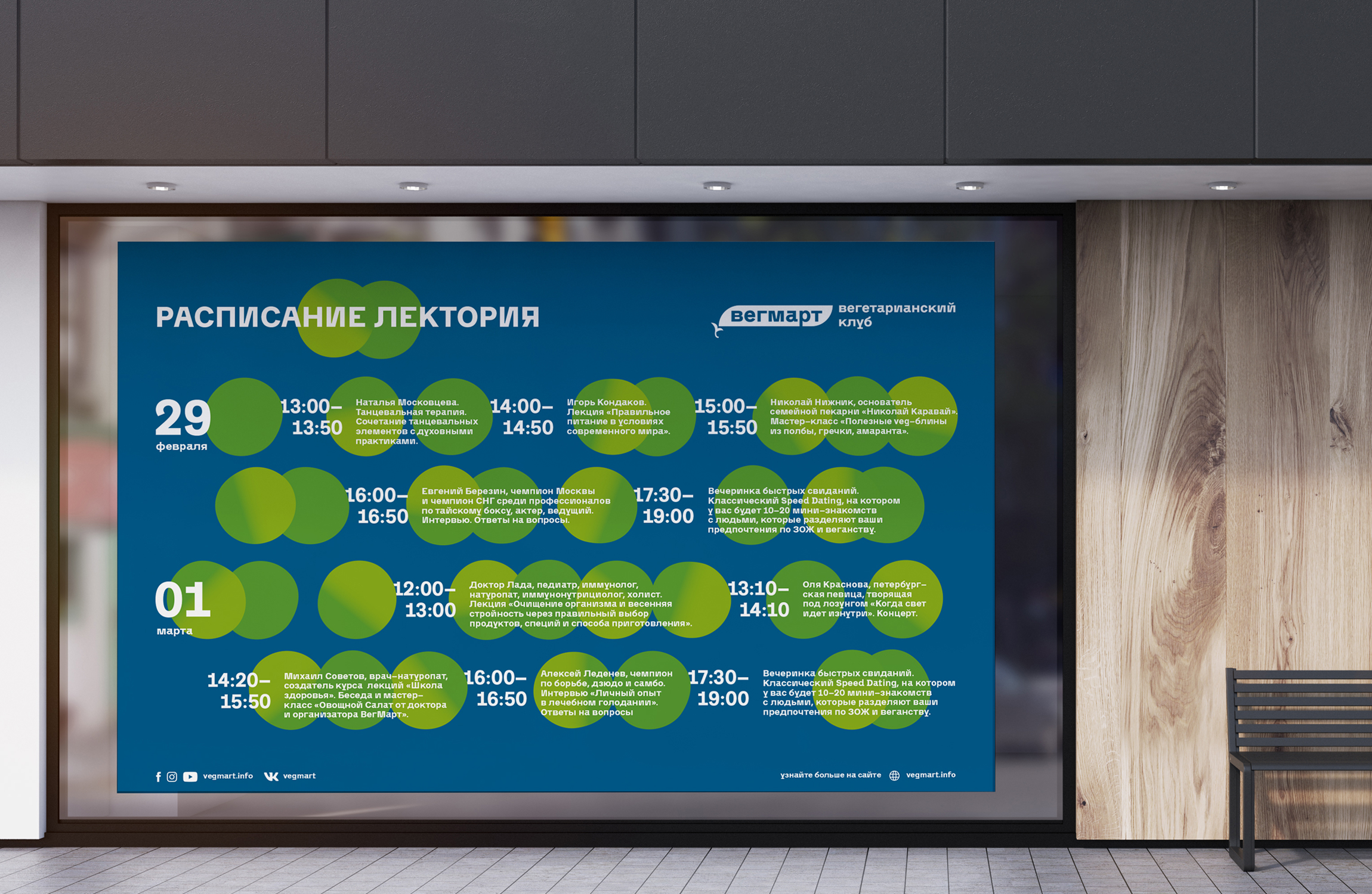
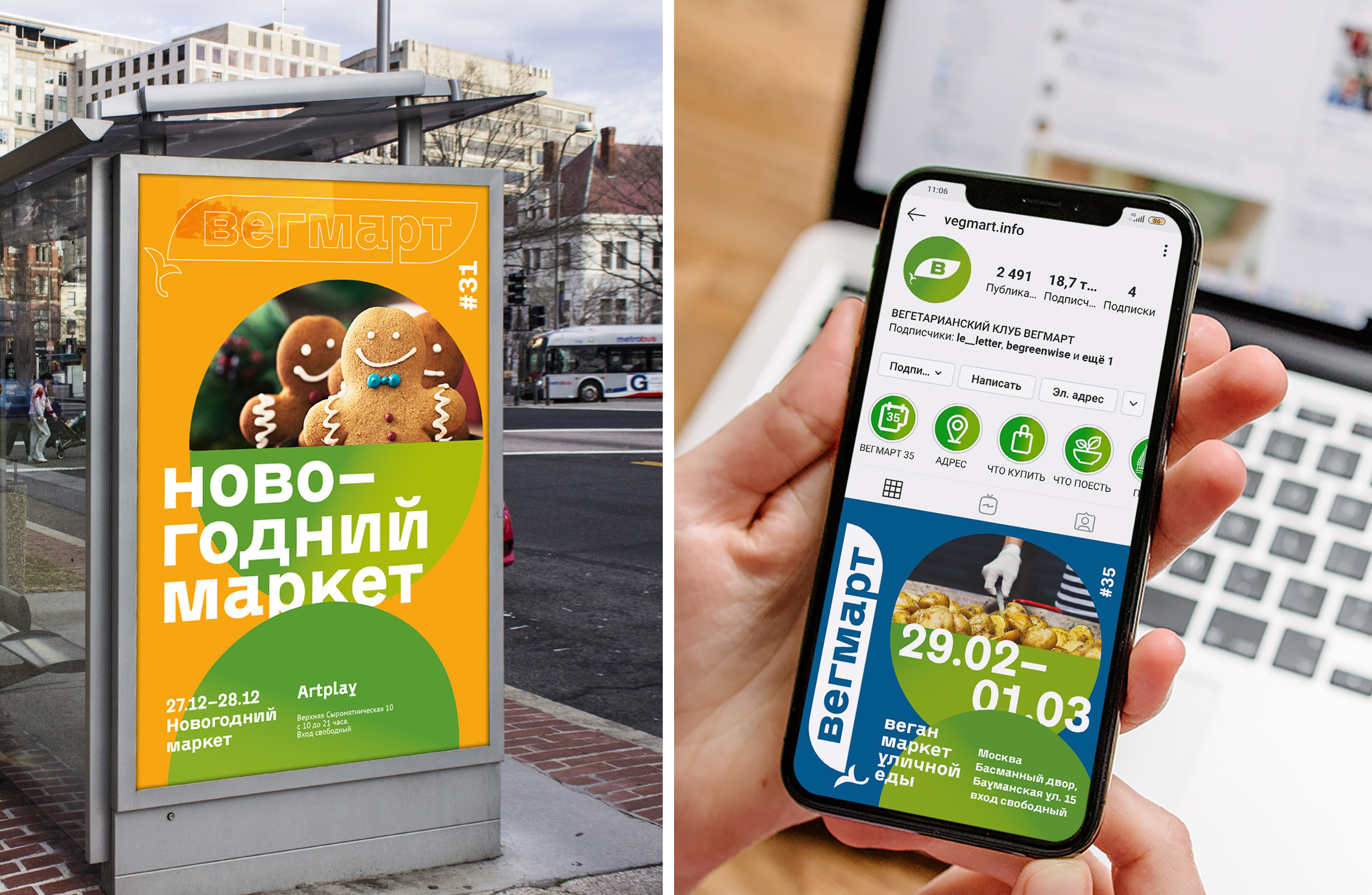
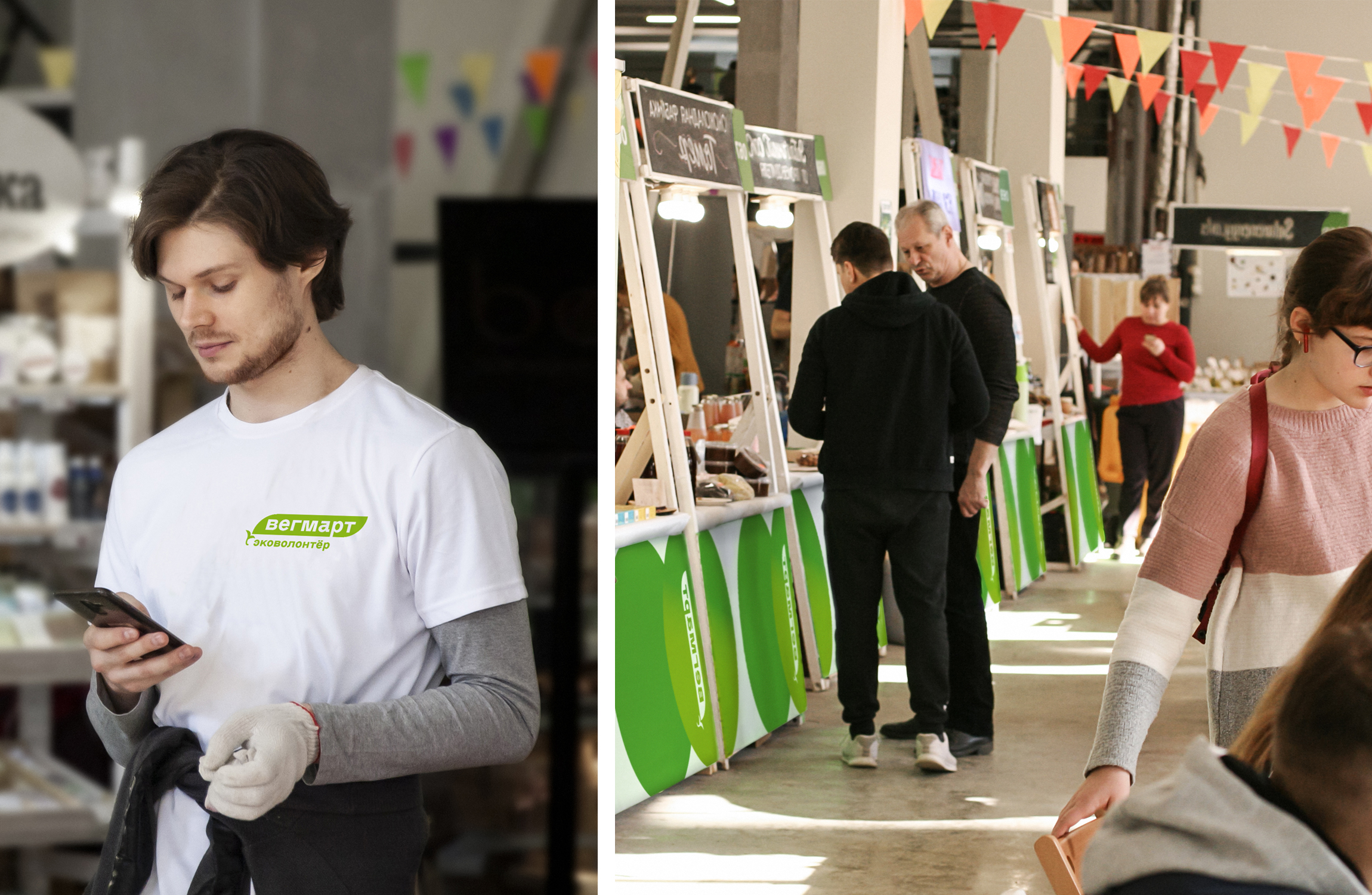
As part of the project, Ohmybrand designers developed a logo and a flexible identity system. Special attention was paid to the development of templates for advertising communications of VegMart (posters, banners, etc., design and space zoning directly on the market (stands of participants, photo zones, etc.) and to the guidelines for working with the brand in social networks.
Each following event of VegMart will have a new background color for communications. All other elements of the style will remain unchanged, forming a recognizable image for both visitors and market participants. Such uniformity and ease of production will also allow the organizers to cut expenses on the “technical” preparation for the events.
Results: The new identity has been used since December 2019. The update allowed VegMart to move in the perception of customers from the category of “garage” niche projects to the category of large urban festivals that people have heard of and trust.


CREDIT
- Agency/Creative: Ohmybrand
- Article Title: Identity for VegMart – Vegetarian Market
- Organisation/Entity: Agency, Published Commercial Design
- Project Type: Identity
- Agency/Creative Country: Russia
- Market Region: Europe
- Project Deliverables: Brand Identity, Brand Strategy, Branding, Identity System, Research
- Industry: Retail
- Keywords: brandidentity, vegetarian, vegmart, marketidentity


