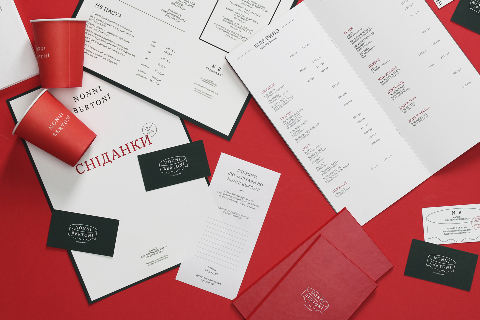
Nonni Bertoni is an Italian restaurant in the center of Kharkiv. A place about the love of food, family traditions and simple joys of life.
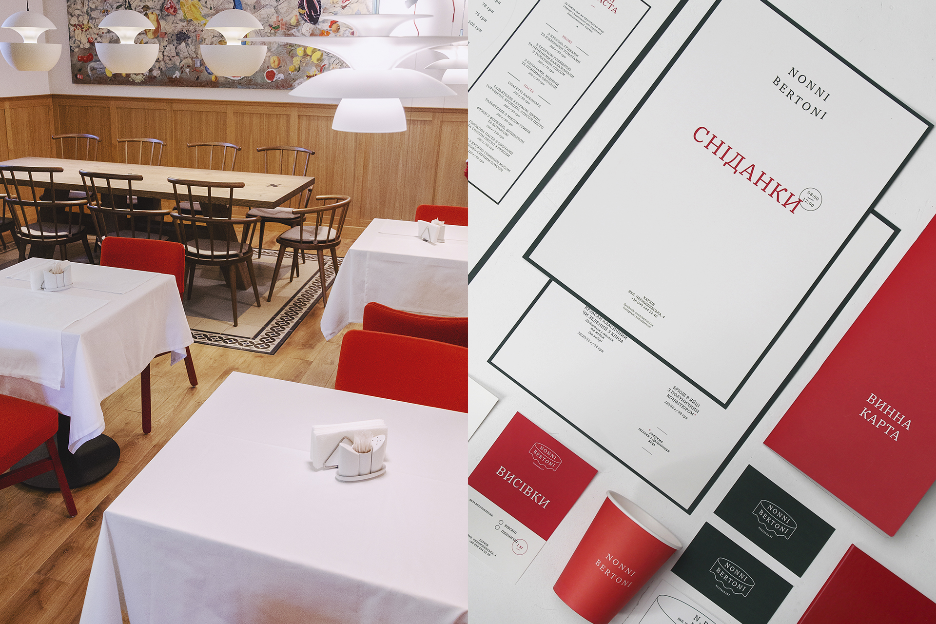
We decided to create a very laconic corporate identity that will not distract from the essence of communication messages.
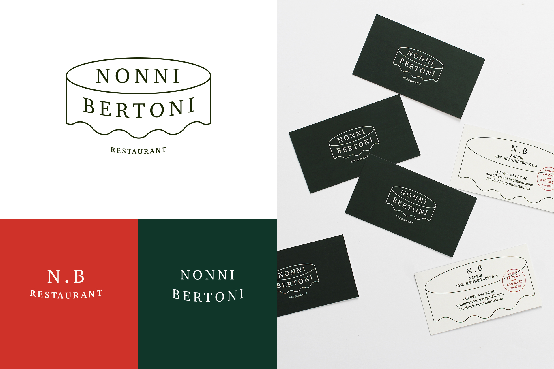
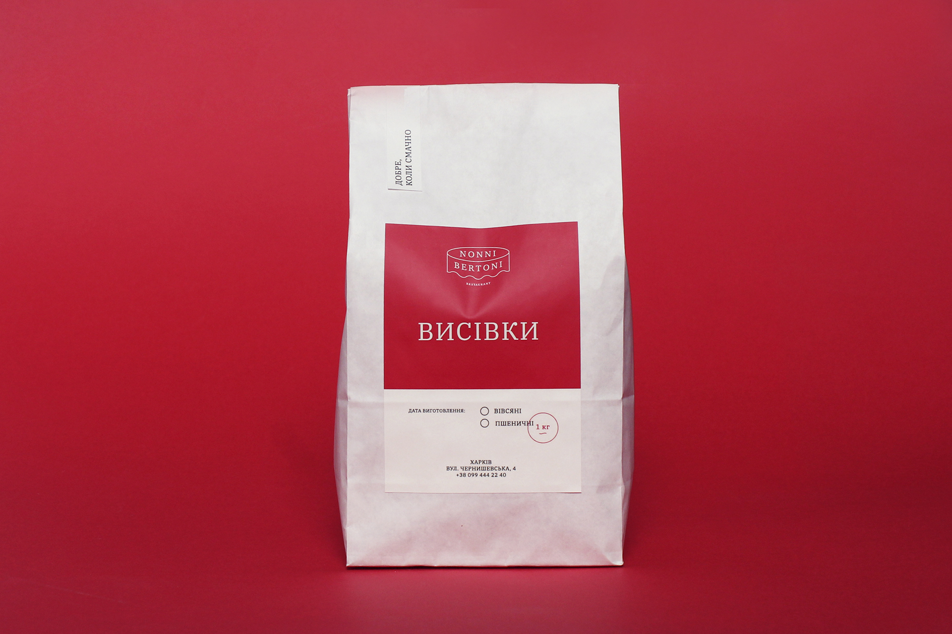
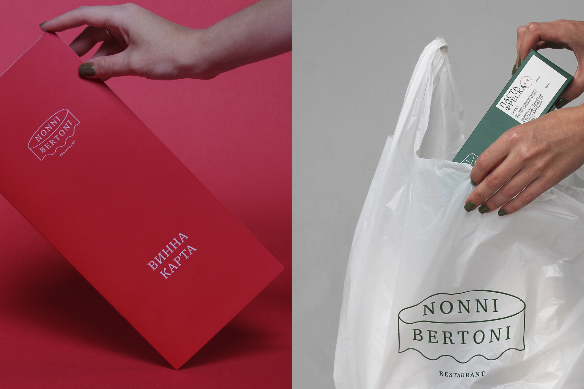
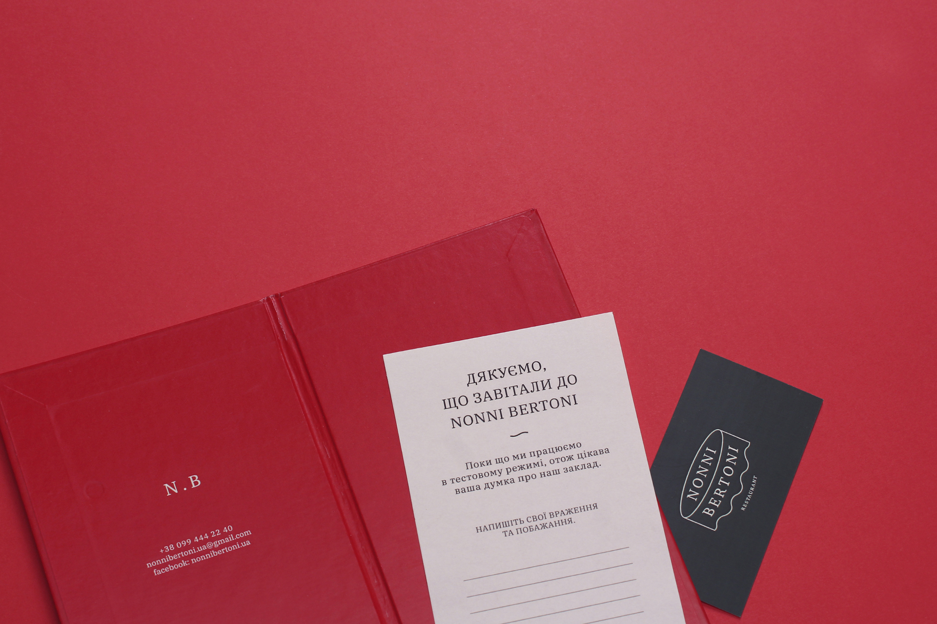
In the logo we showed a round dining table, covered with a tablecloth — an understandable image of family traditions and a festive atmosphere. Considering this stylized linear image of the table, you can immediately imagine how a big family is gathering behind it. In the house smells delicious food and in the air is a magical atmosphere of happiness.
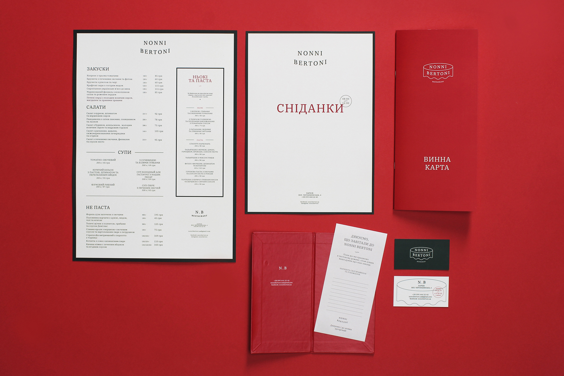
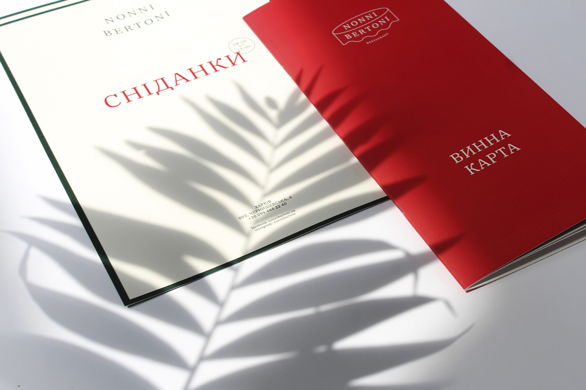
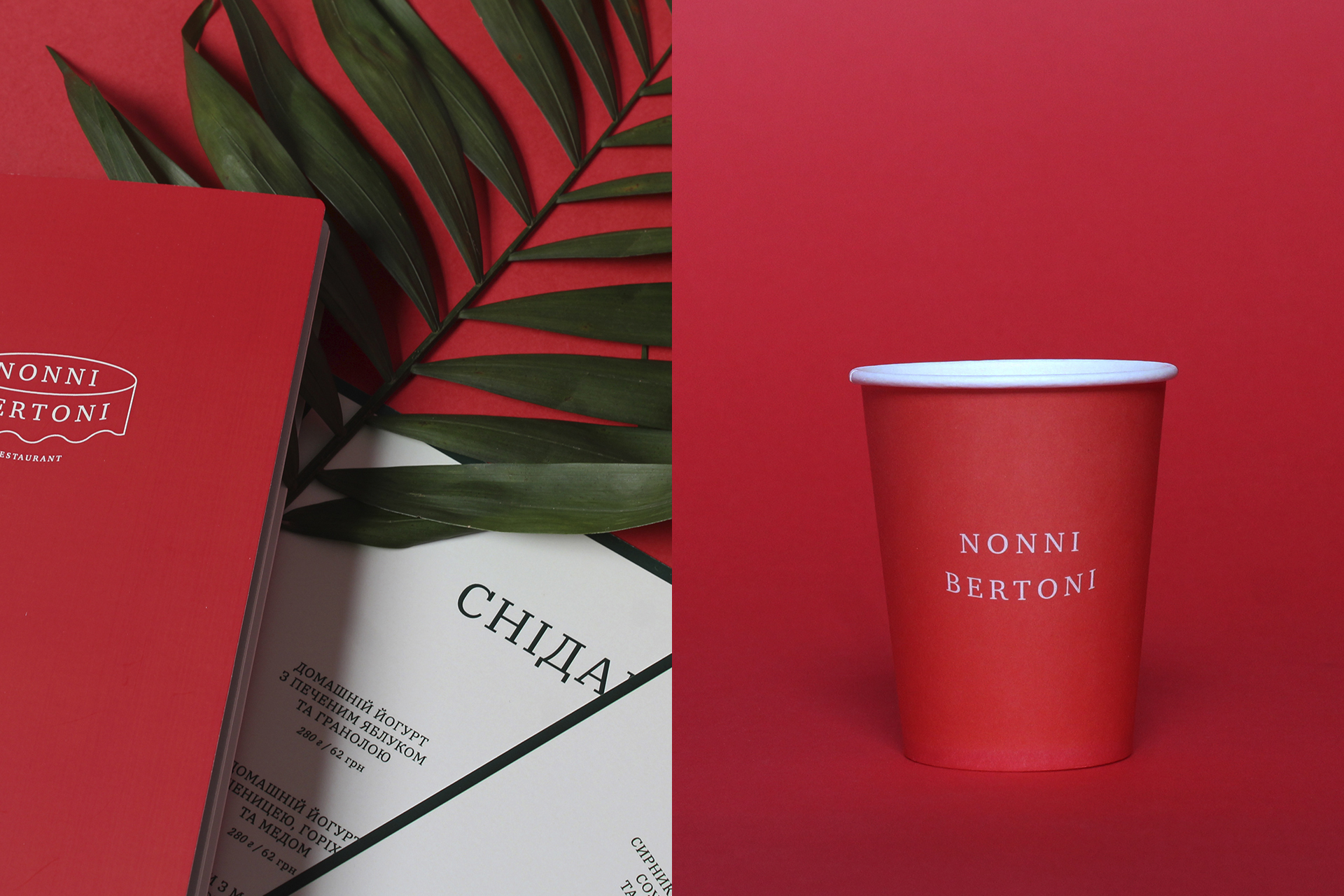
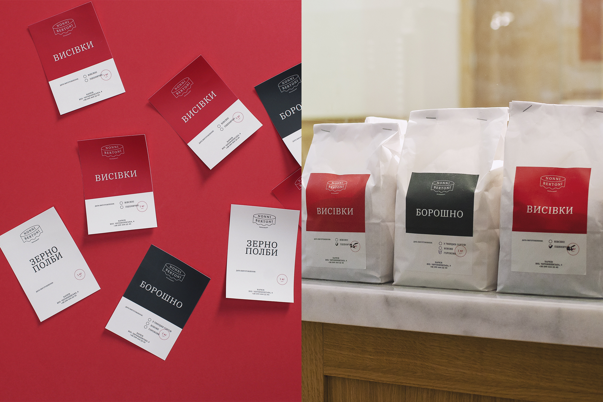
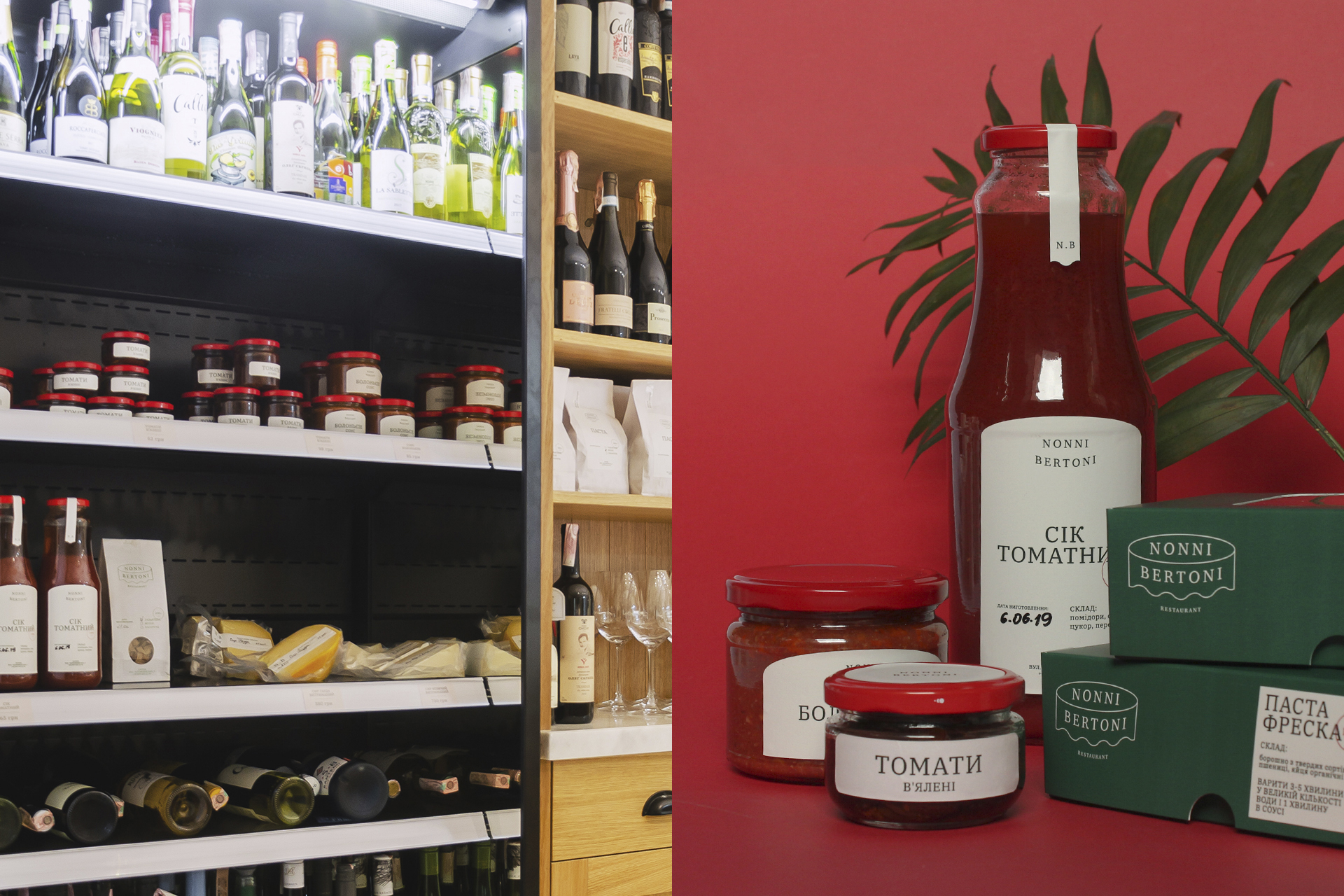
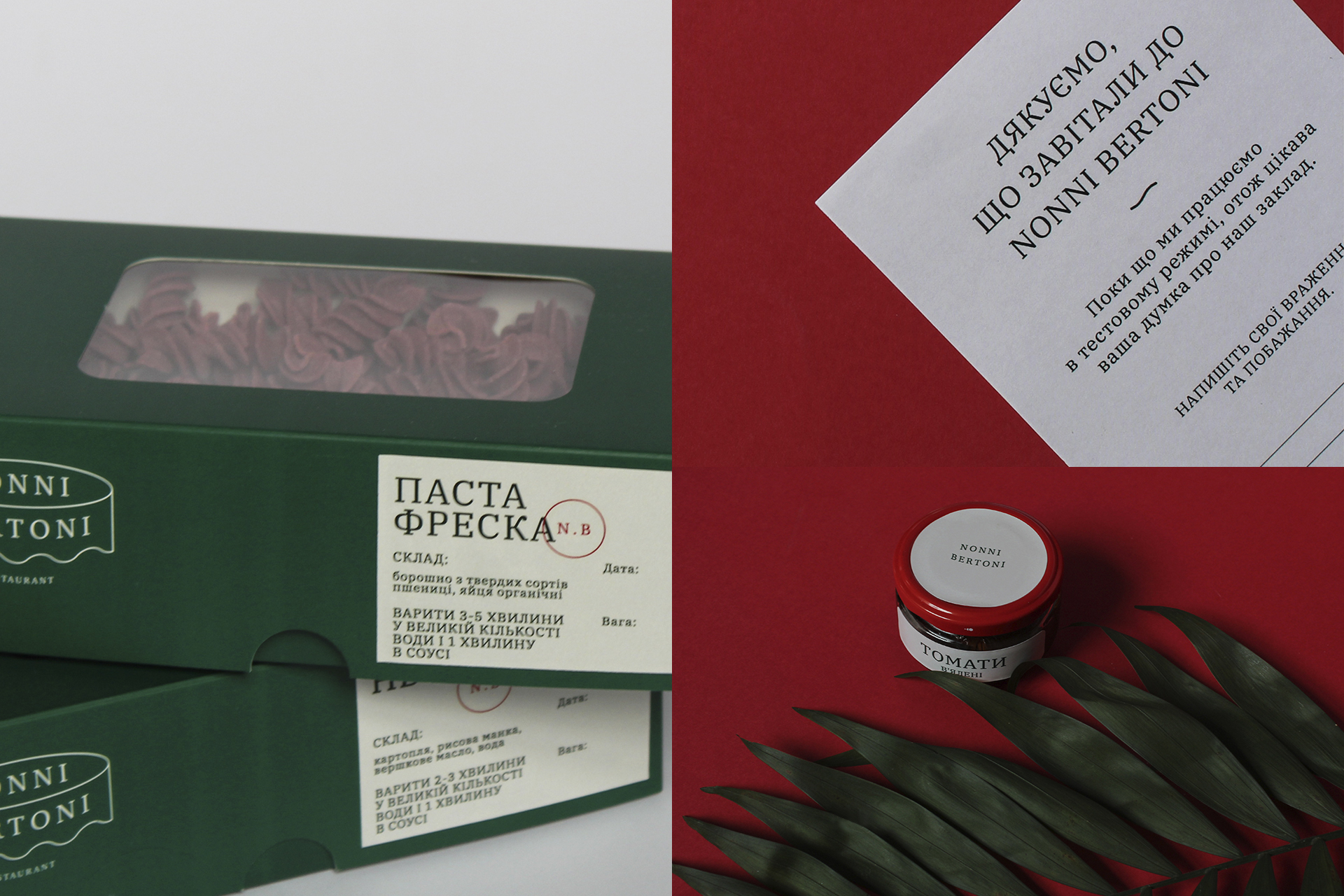
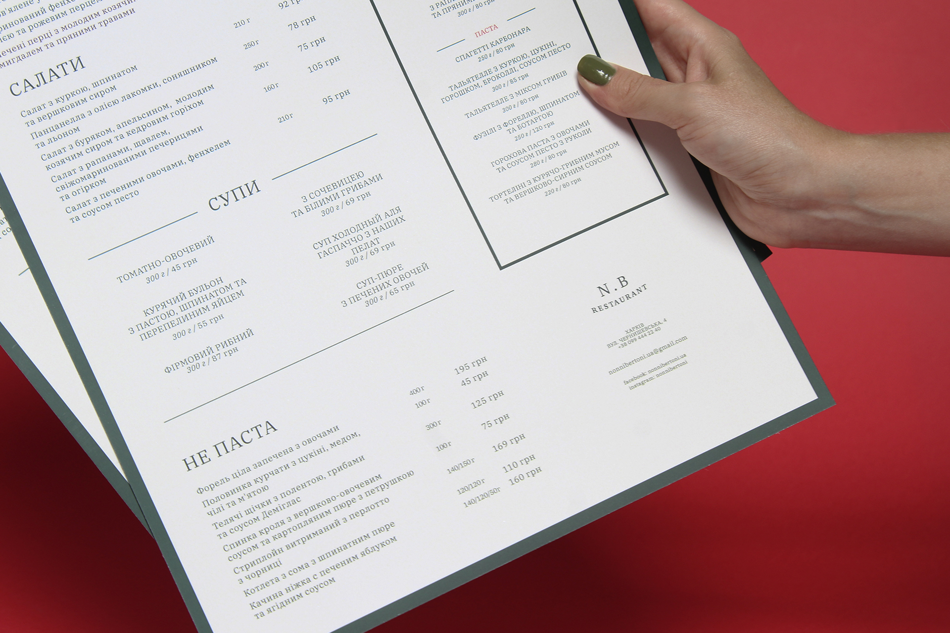
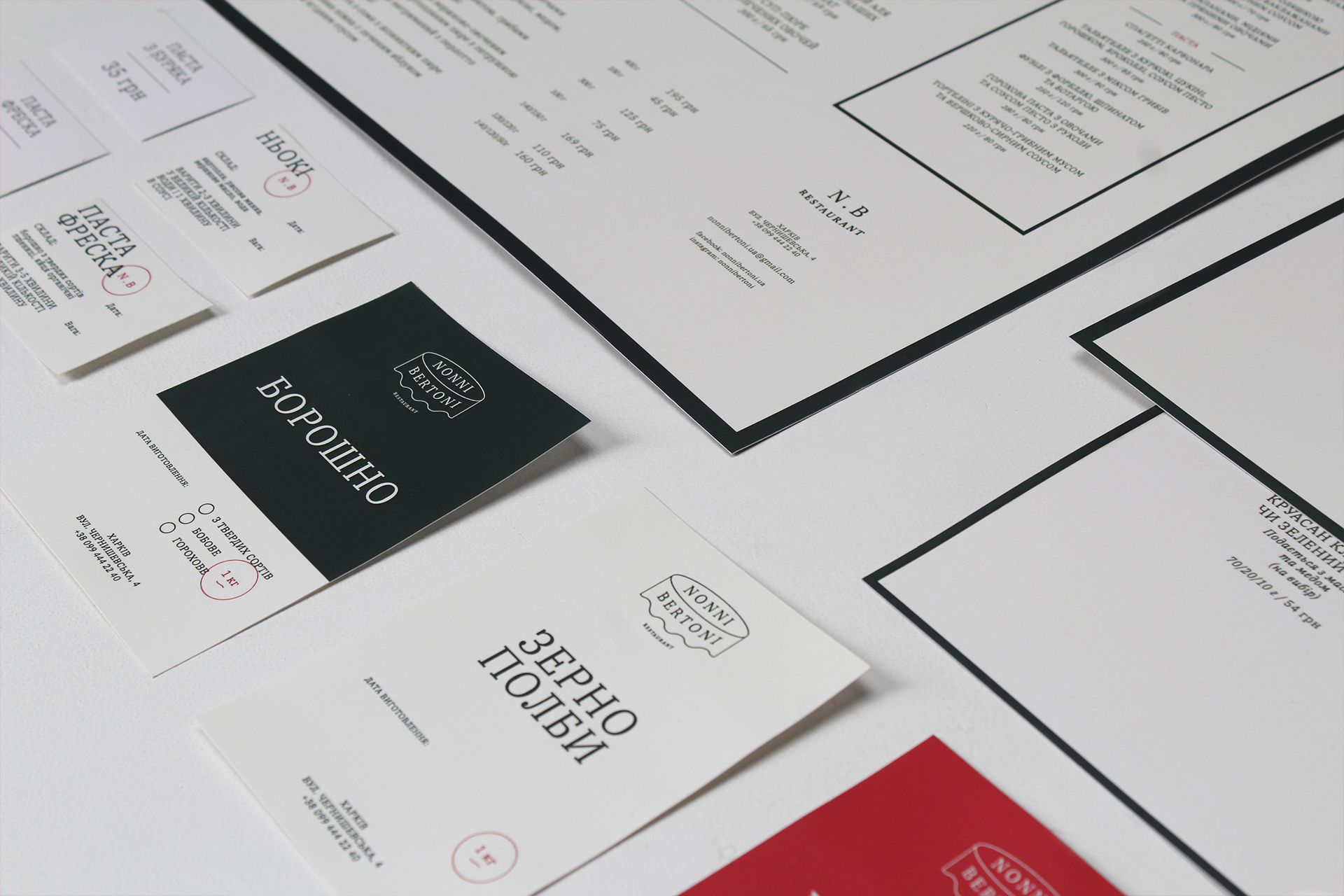
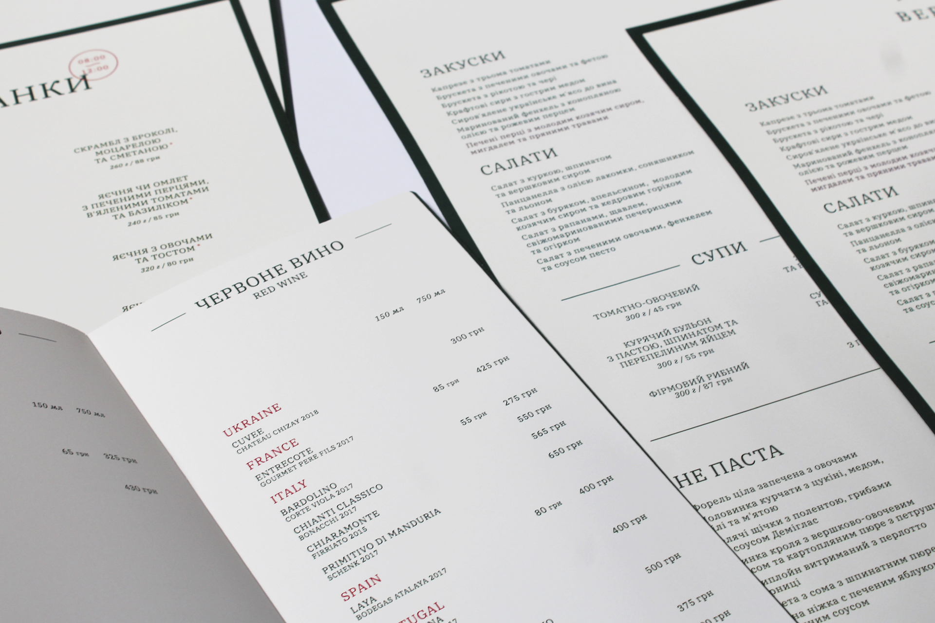
For the corporate palette we choose three colors — green, white and red. This are colors of the Italian flag and are often found in traditional dishes. With this combination, we were able to easily make important accents on the design objects and convey the emotion of the brand. Since our brand is a classic story of an Italian family, we also choose a classic — antiqua as the fundamental font in this identity system. Created corporate identity harmoniously integrated into the overall image of the restaurant. This allowed us to make typography the main method of communication with guests.
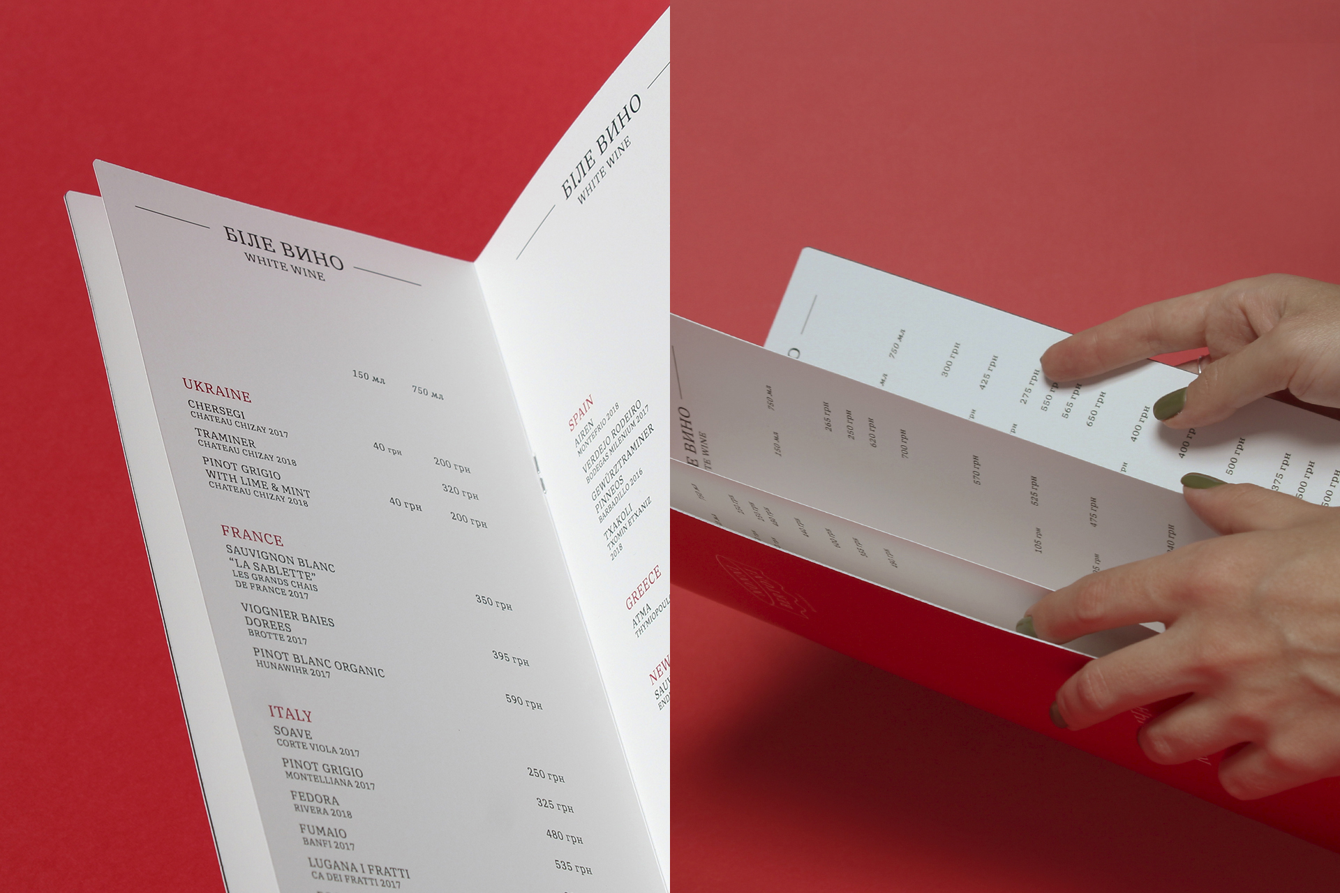
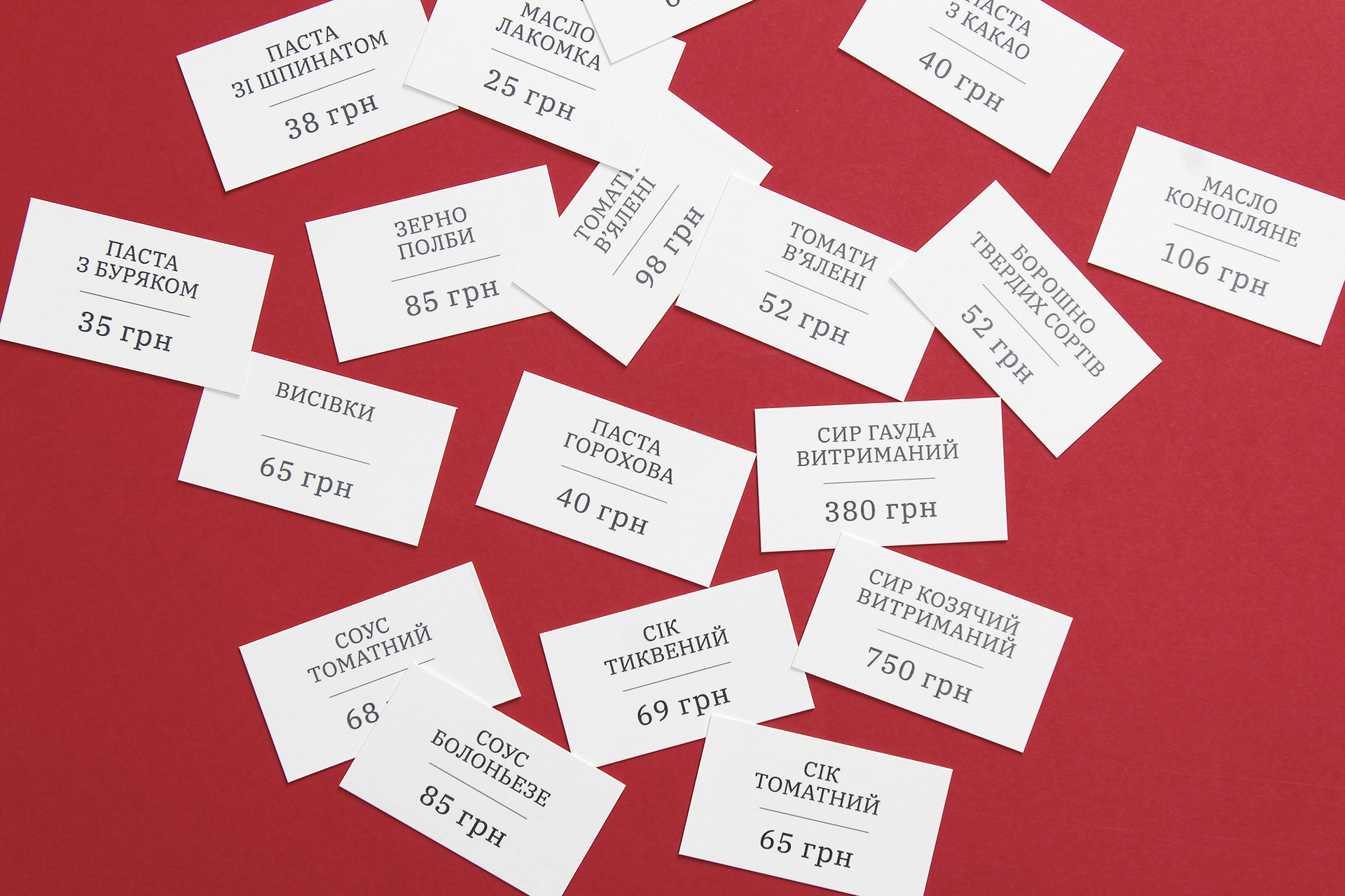
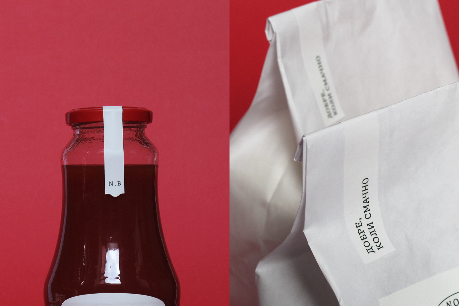
We also developed the design of packaging and labels for gastronomic products (pasta, flour, sauces), menus, paper cups, business cards, branded tote bags, certificates and other corporate stationery and merch.
CREDIT
- Agency/Creative: Canape Agency
- Article Title: Identity for Nonni Bertoni Restaurant
- Organisation/Entity: Agency, Published Commercial Design
- Project Type: Packaging
- Agency/Creative Country: Ukraine
- Market Region: Europe
- Project Deliverables: Brand Creation, Brand Identity, Brand Naming, Brand Strategy, Branding, Graphic Design, Packaging Design, Tone of Voice
- Format: Box, Case, Tray
- Substrate: Pulp Carton


