


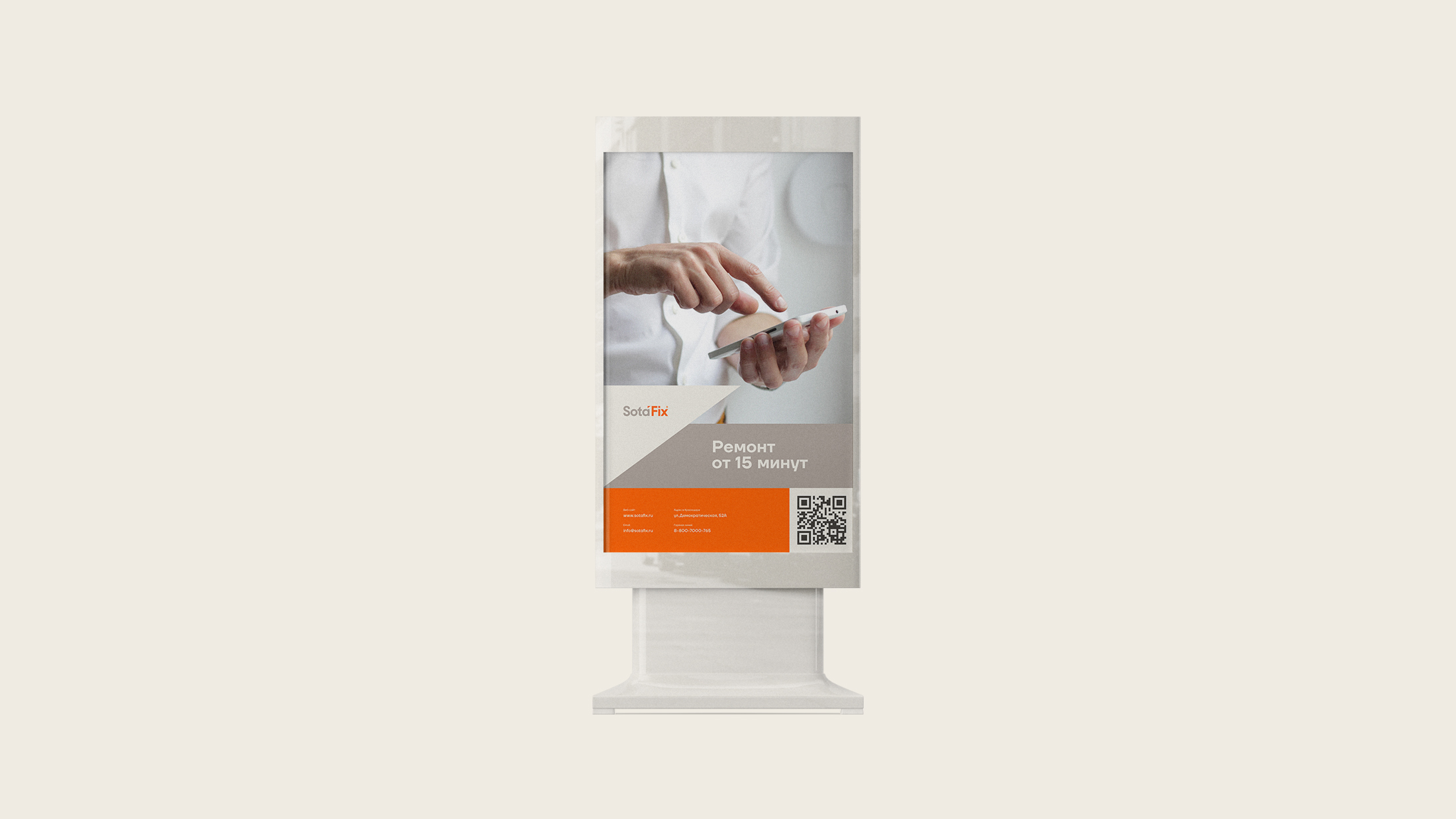
Customer: The first of its kind network of services for the repair of smartphones and various devices, the uniqueness of which lies in the fact that the SF specialist will try to repair, fix the gadget within 15-20 minutes, while the client drinks a cup of coffee in a comfortable armchair. The network covers the whole of Russia, being located in the vicinity of GreenSpark stores, thanks to this, the client always receives all the necessary components promptly.
The target audience: The target audience is young, energetic people, they don’t have time to part with their gadgets for a long time. For such people, speed, availability, and an honest attitude are important. That is why SotaFix focuses on the speed of work, and not on the low cost.
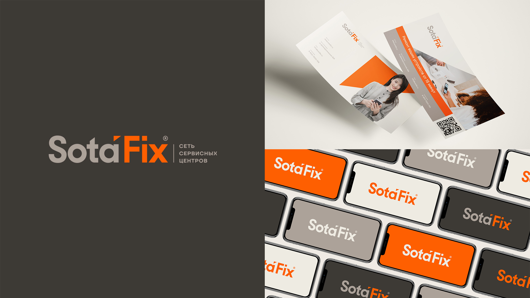
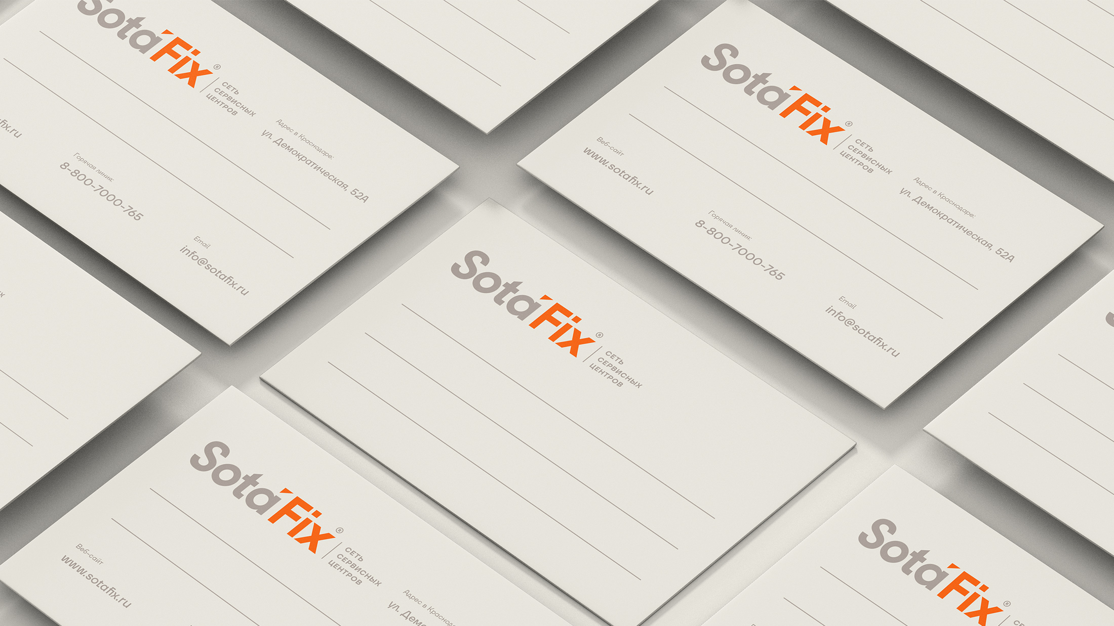
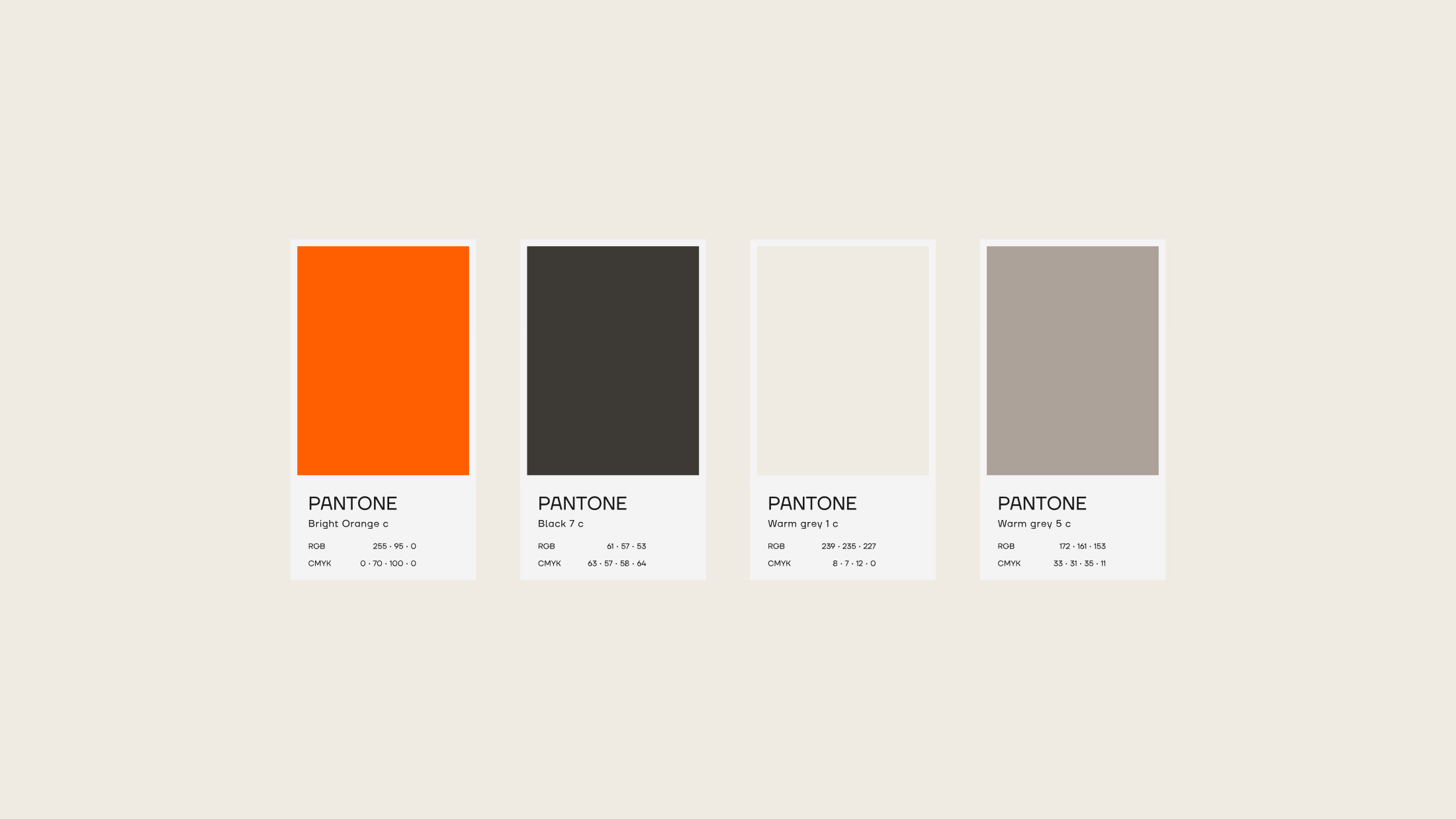
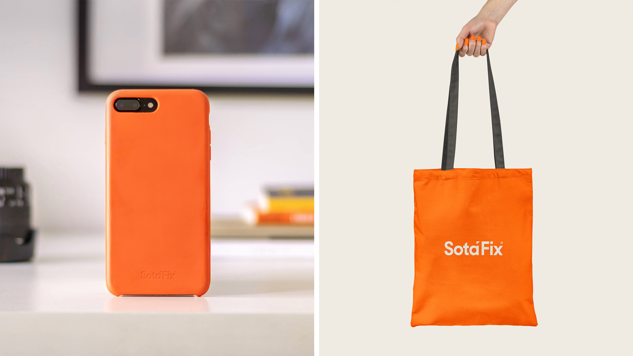
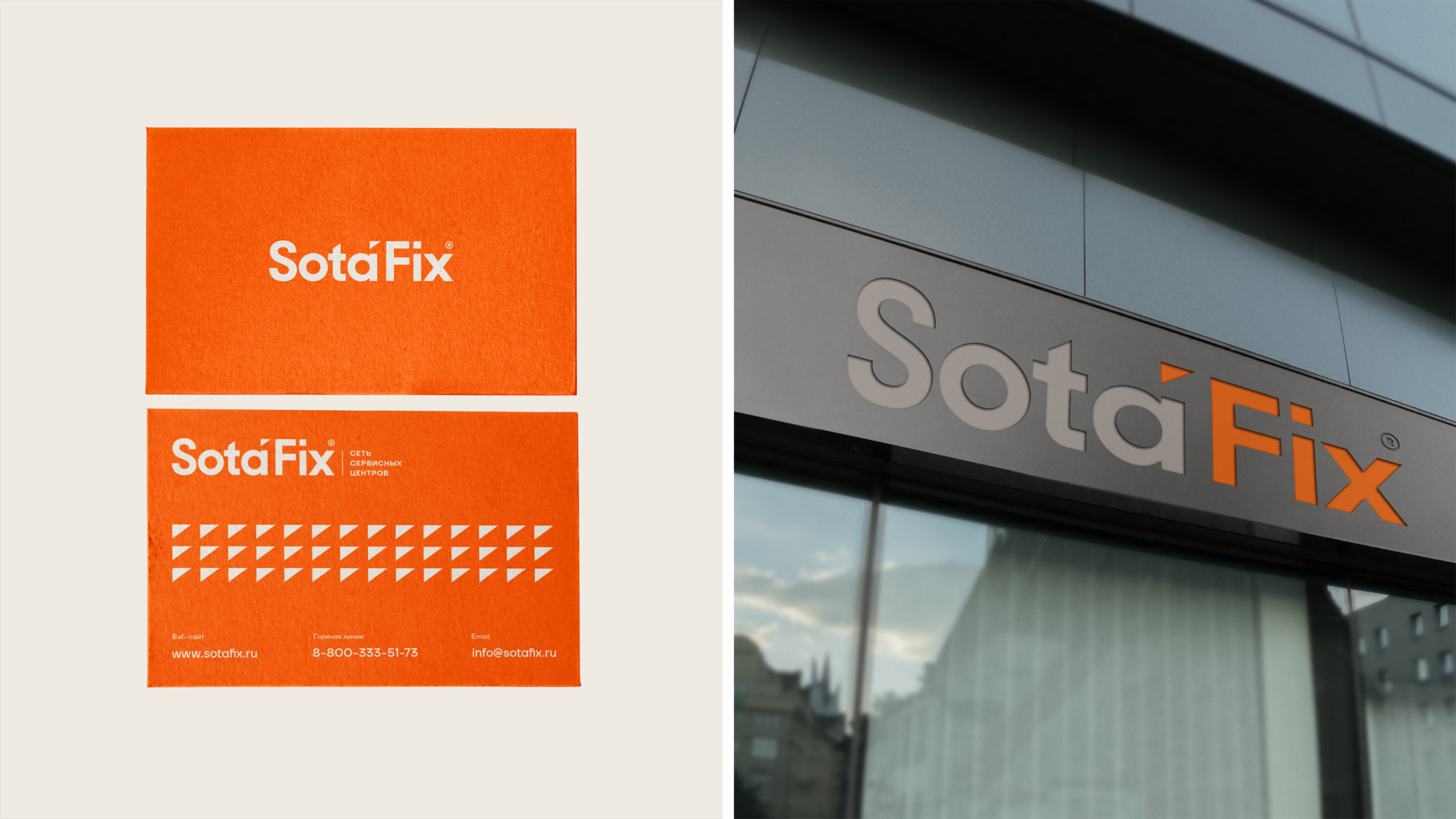
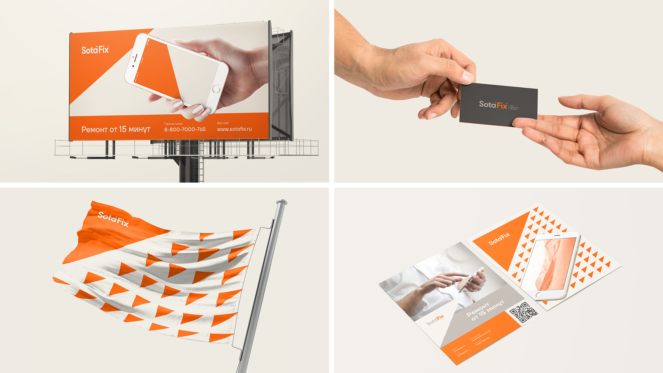
A task: Our task was to bypass the triviality of large and private repair services, images of wrenches and telephones are used in the corporate identity and logo. It was also necessary to replace the image of reliability and serious character in the corporate identity and logo. An additional check was the selection of the corporate color for both the printing industry and the interior. The corporate colors should be in harmony with the corporate color of the GreenSpark stores (white-green)
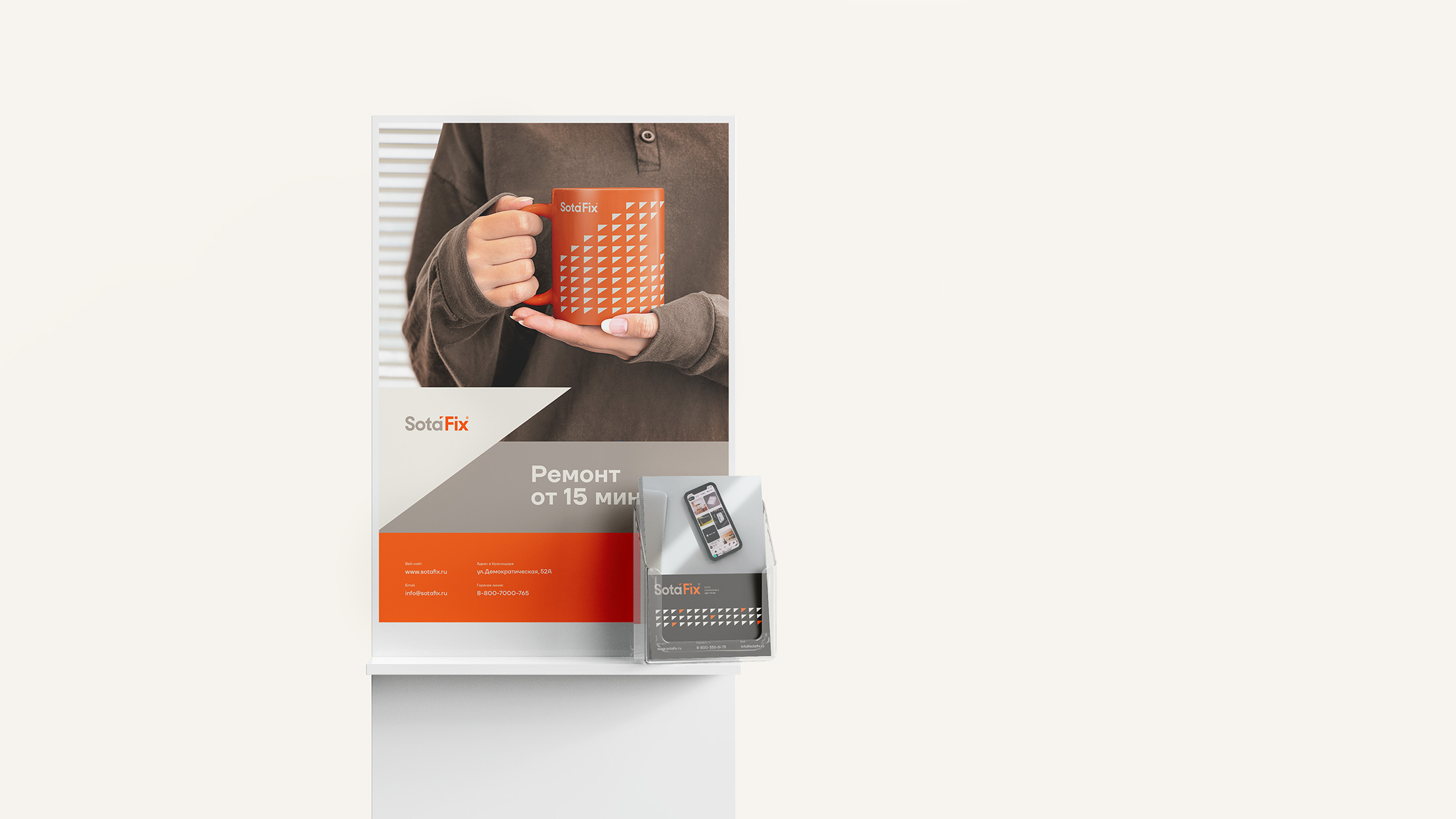
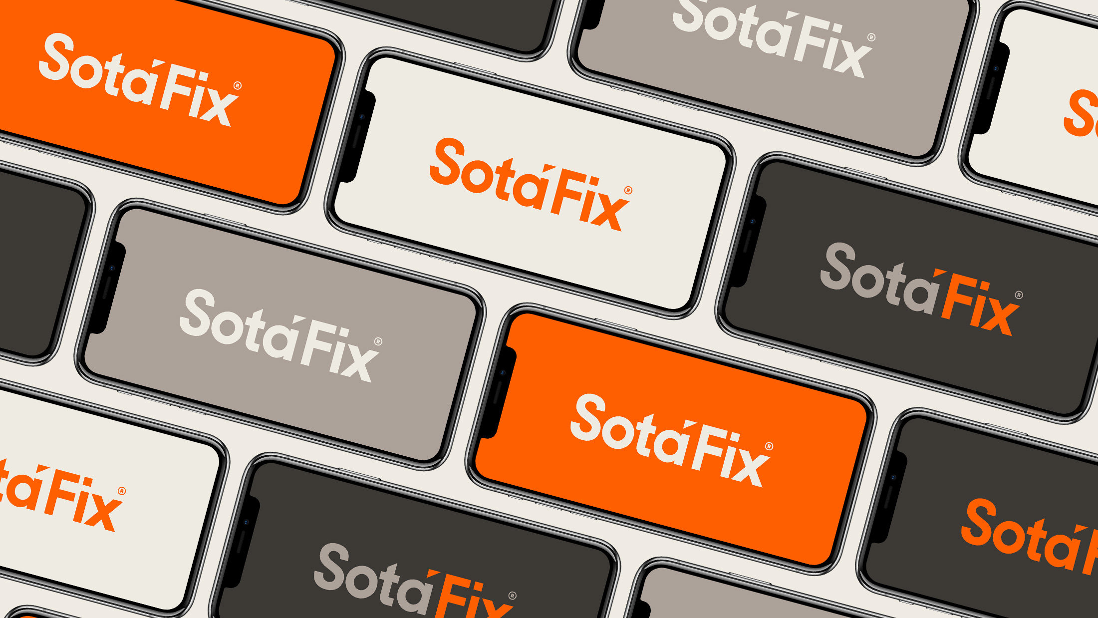
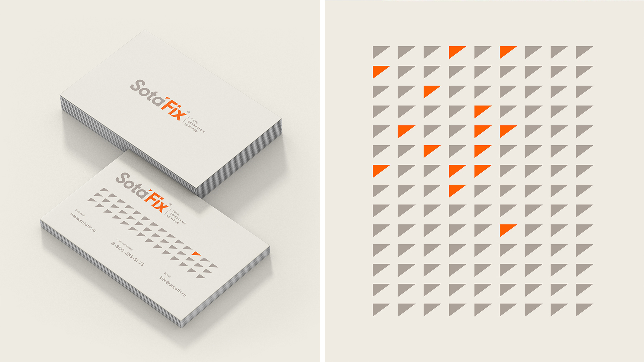
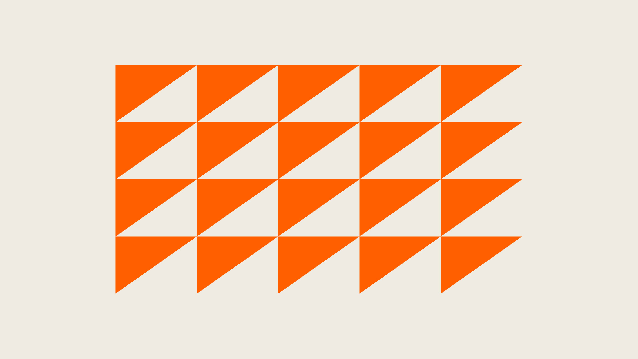
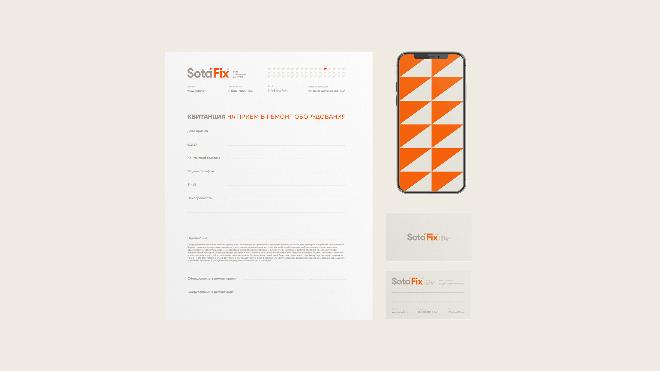
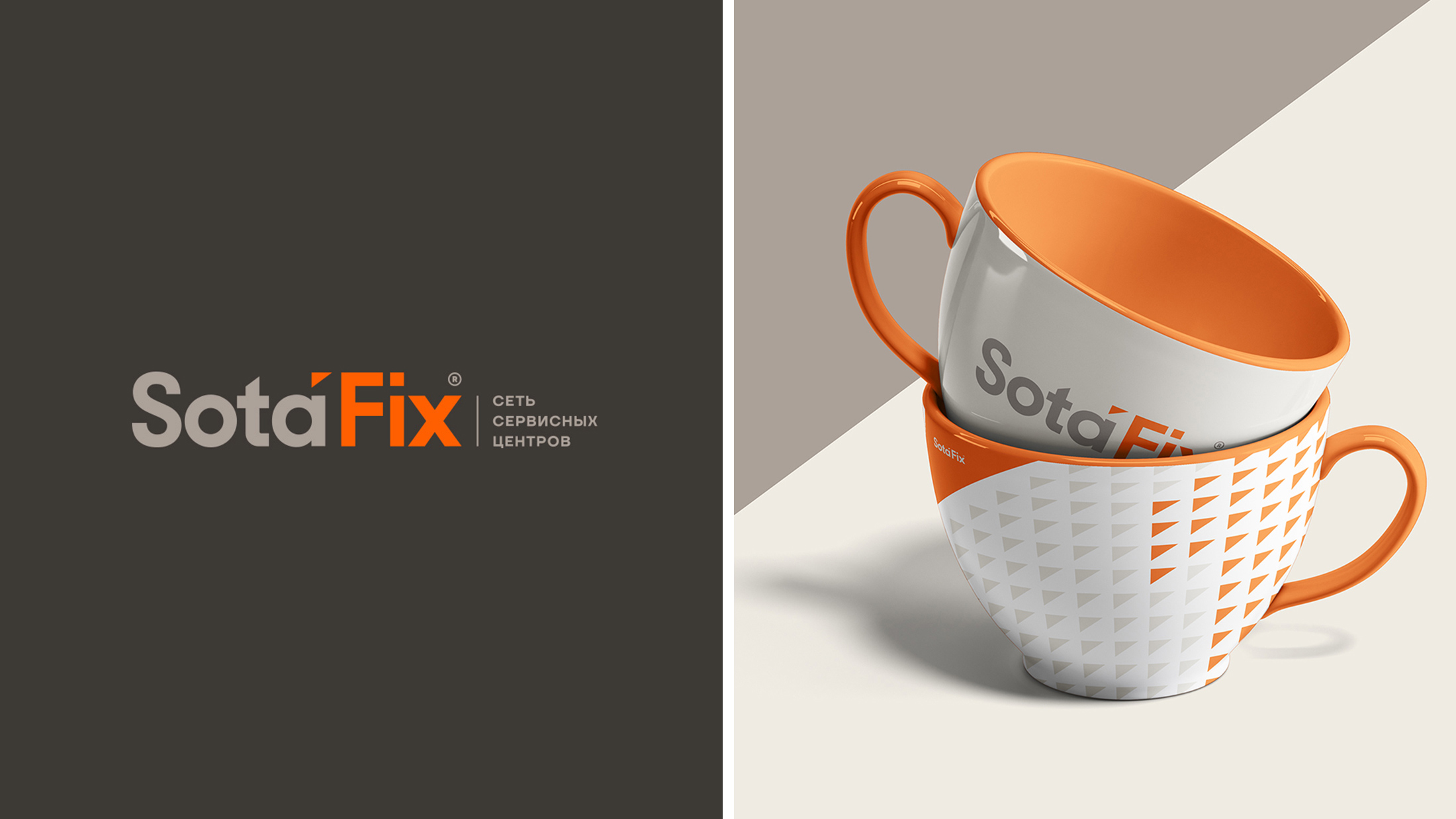
Process: The concept is based on the company’s goal – to always be the first for its customers, to be the first in terms of speed and quality of work, to be the number 1 service. The number one is visible in the logo, and the triangle above the typeface symbolizes a splinter – a breakdown that needs to be fixed. The selected soft corporate colors reflect the main task of the service – it is an emphasis on its trust.
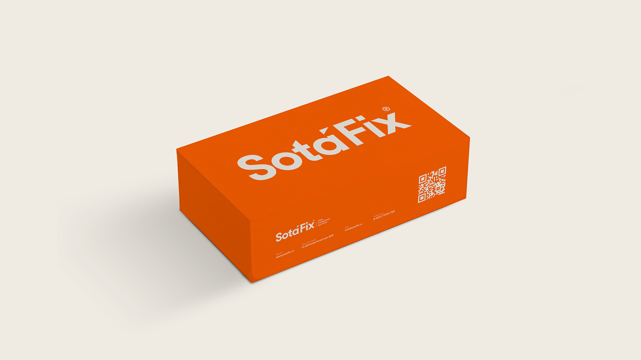
Result: We have a light corporate identity with a bright accent. It reflects the speed and accuracy in the work of customer-oriented service specialists. The minimalistic design of the media does not overload the presentation, the triangle is a memorable element of the SotaFix style. We also managed to develop a design that distinguishes the service from competitors and helps SF easily gain the trust of its customers. Some of the services have already been launched, and soon several services will be located in each city. For our studio Around, this project is one of the best sources.

CREDIT
- Agency/Creative: Around
- Article Title: Identity for a Network of Device Repair Services SotaFix by Around Group
- Organisation/Entity: Agency, Published Commercial Design
- Project Type: Identity
- Agency/Creative Country: Russia
- Market Region: Europe
- Project Deliverables: Brand Architecture, Brand Identity, Brand Strategy, Branding
- Industry: Technology
- Keywords: DEVICES FIX GREY IDENTITY LOGO MOBILE ONE ORANGE REPAIRS SMARTPHONE


