


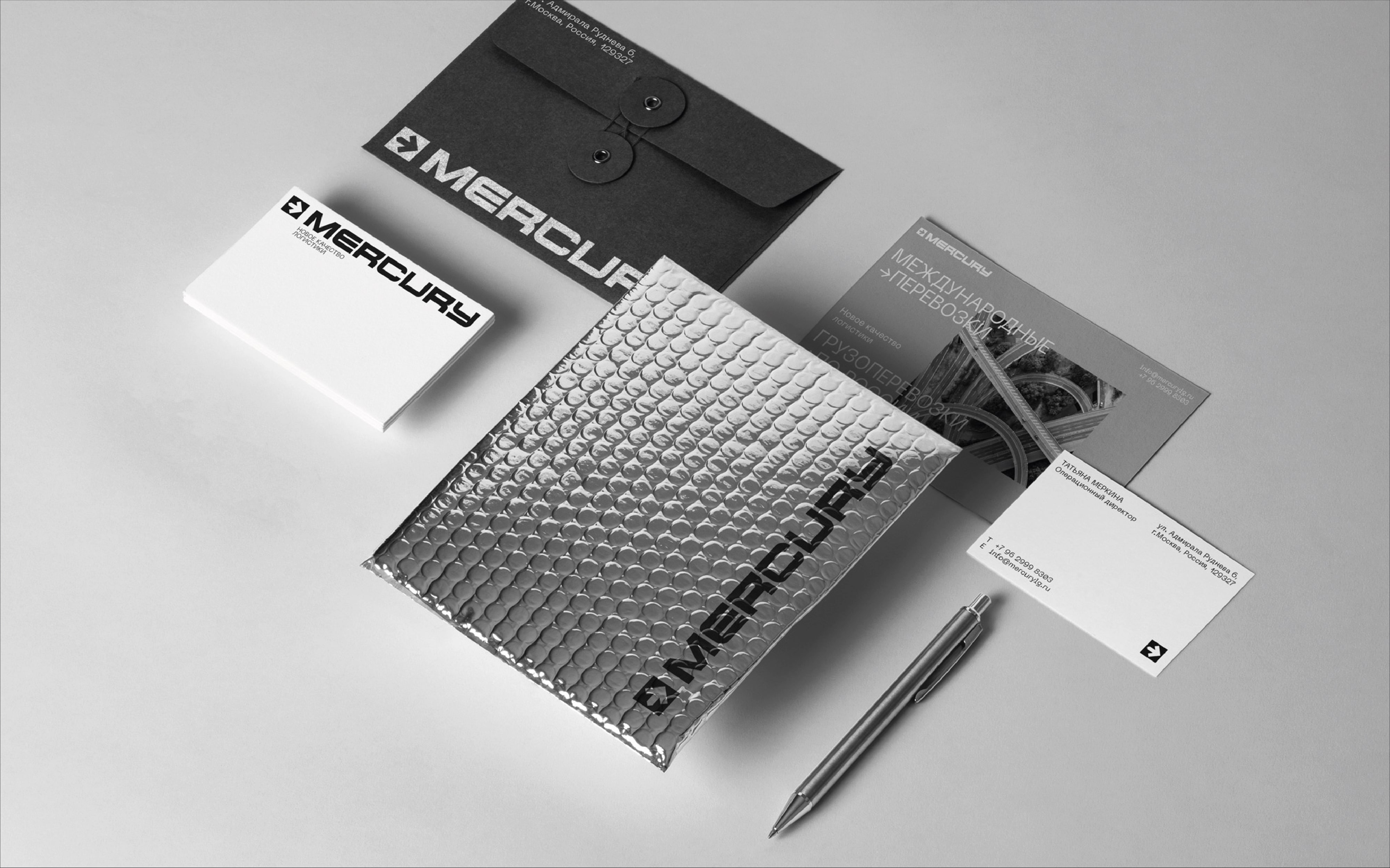
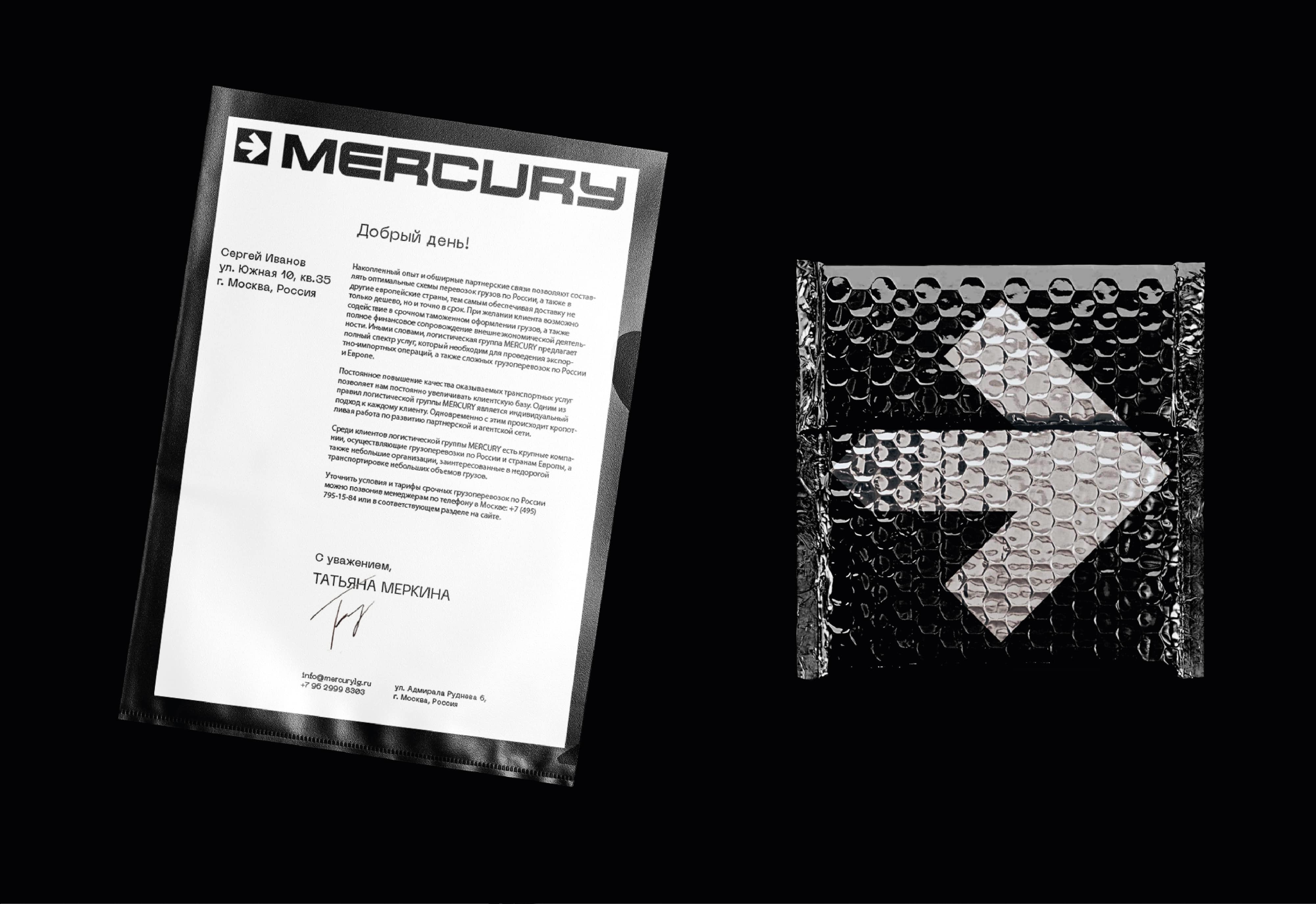
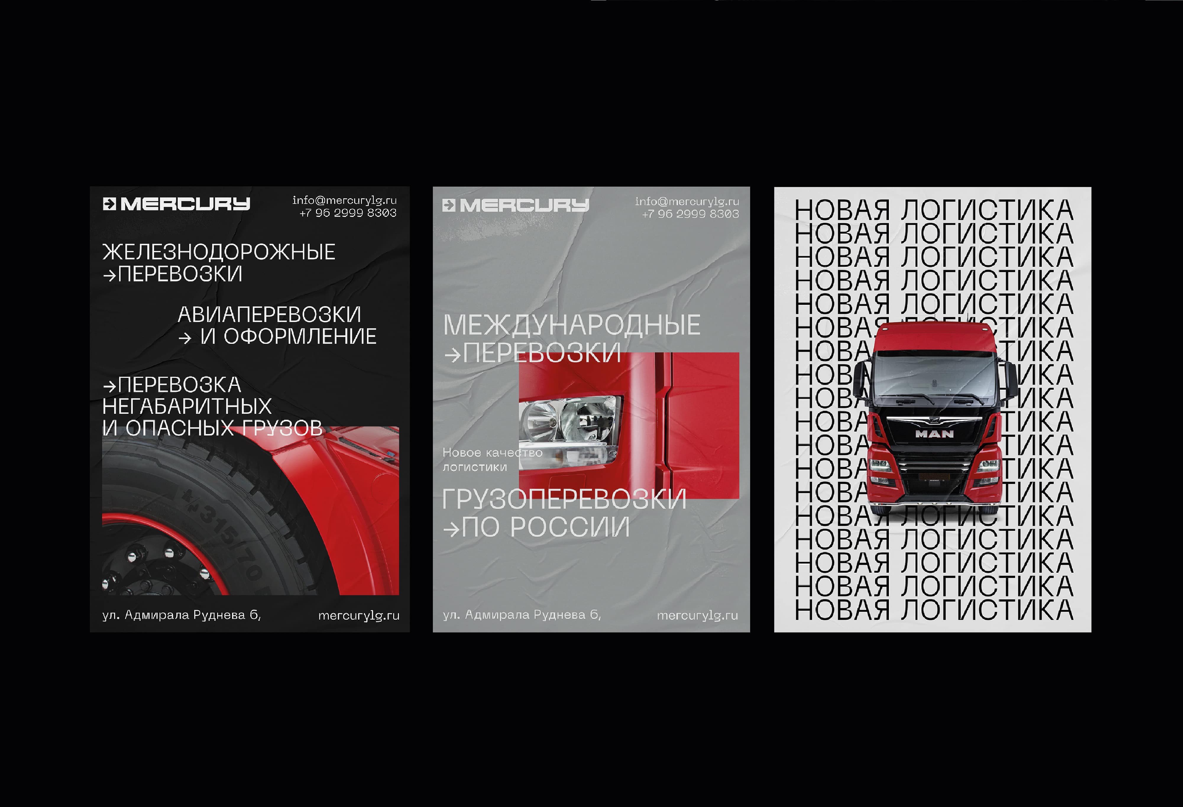
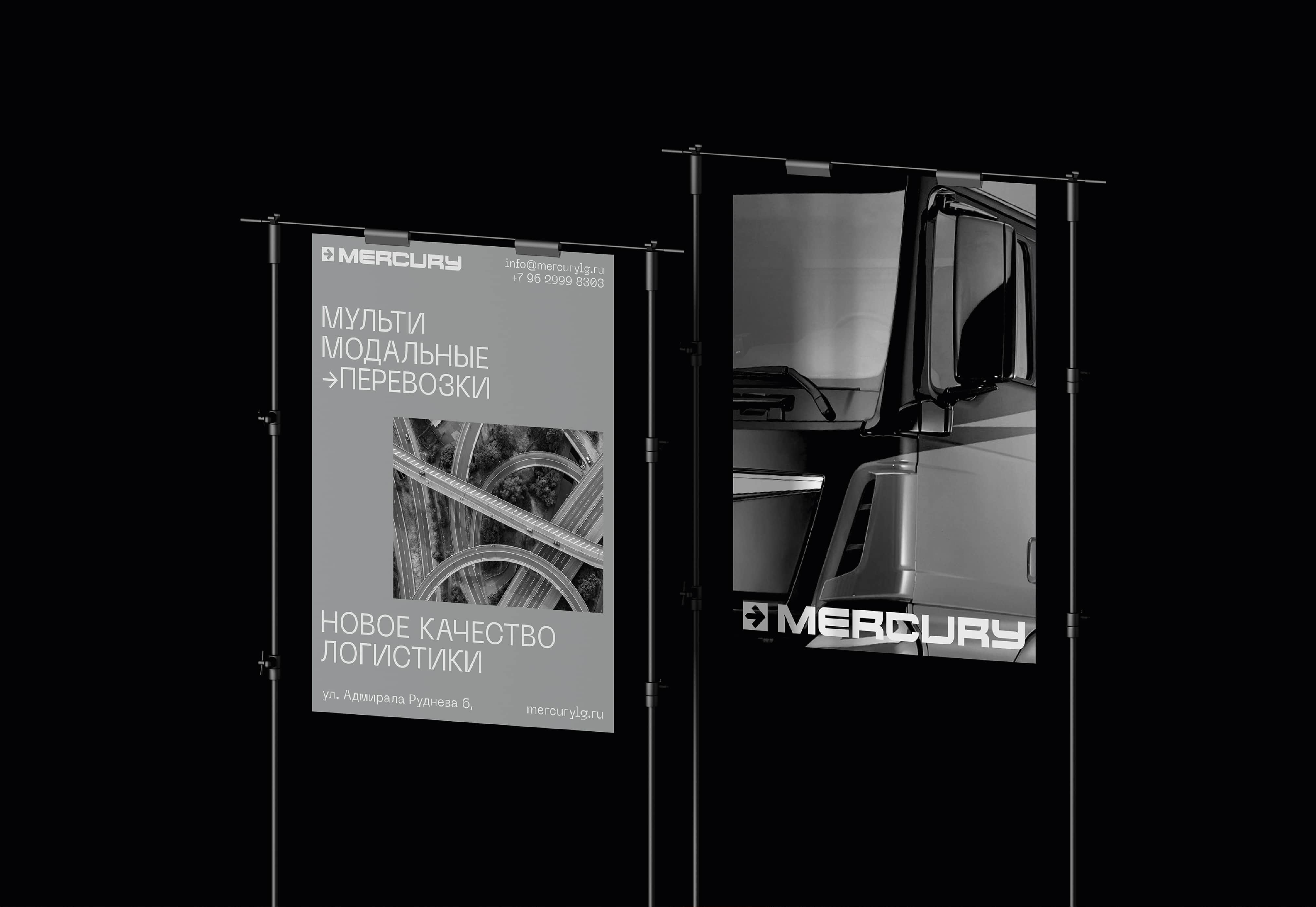
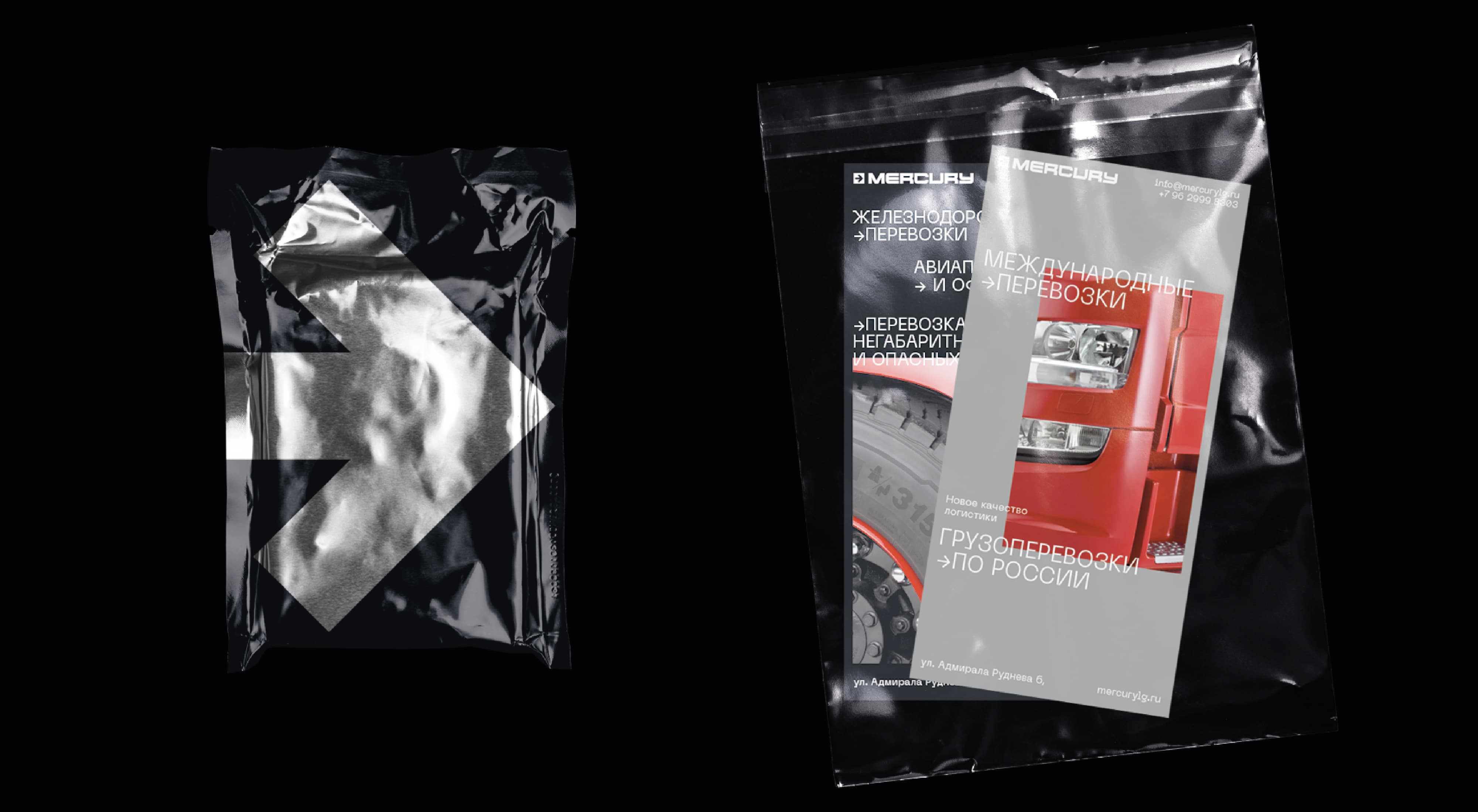
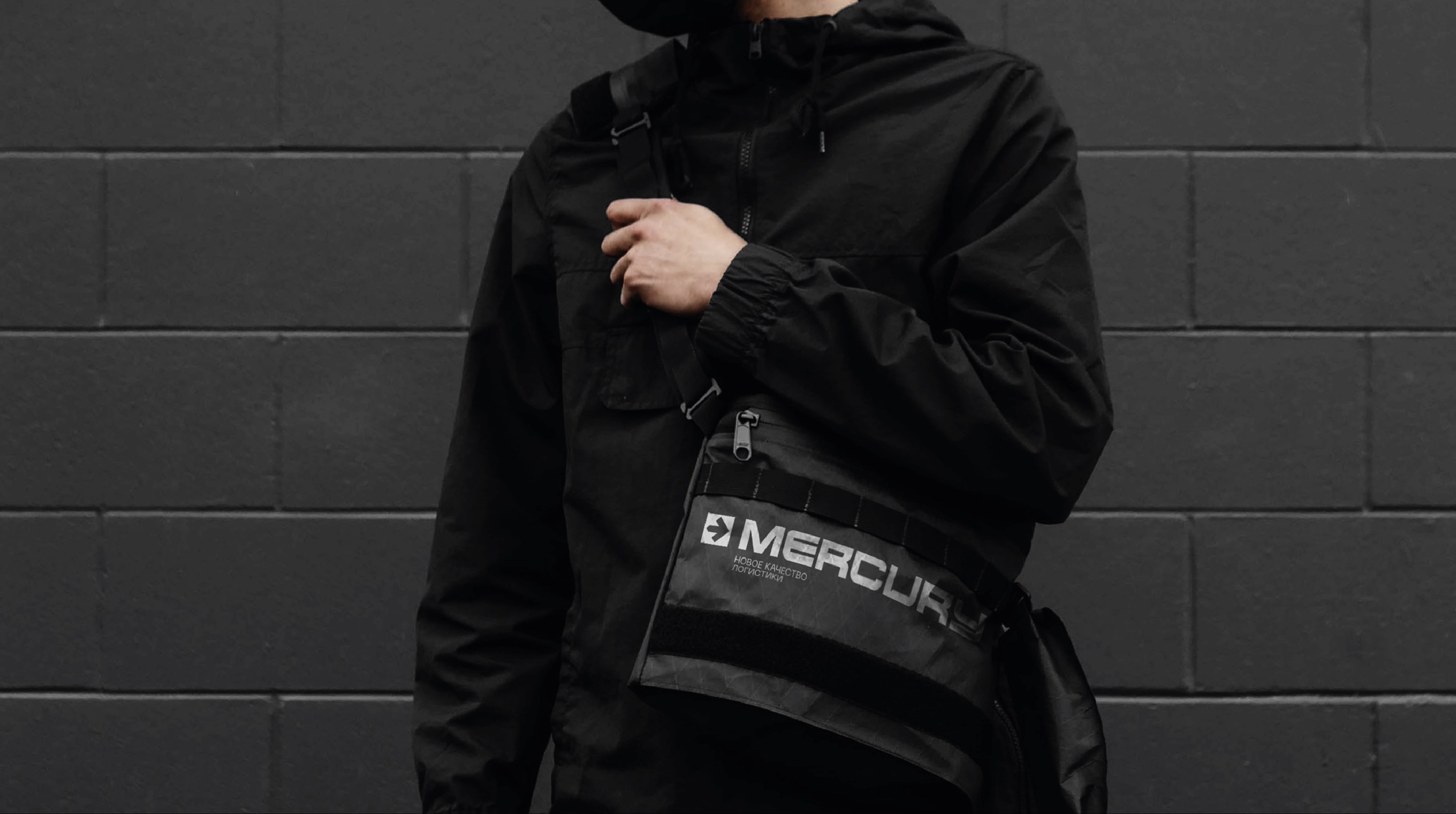
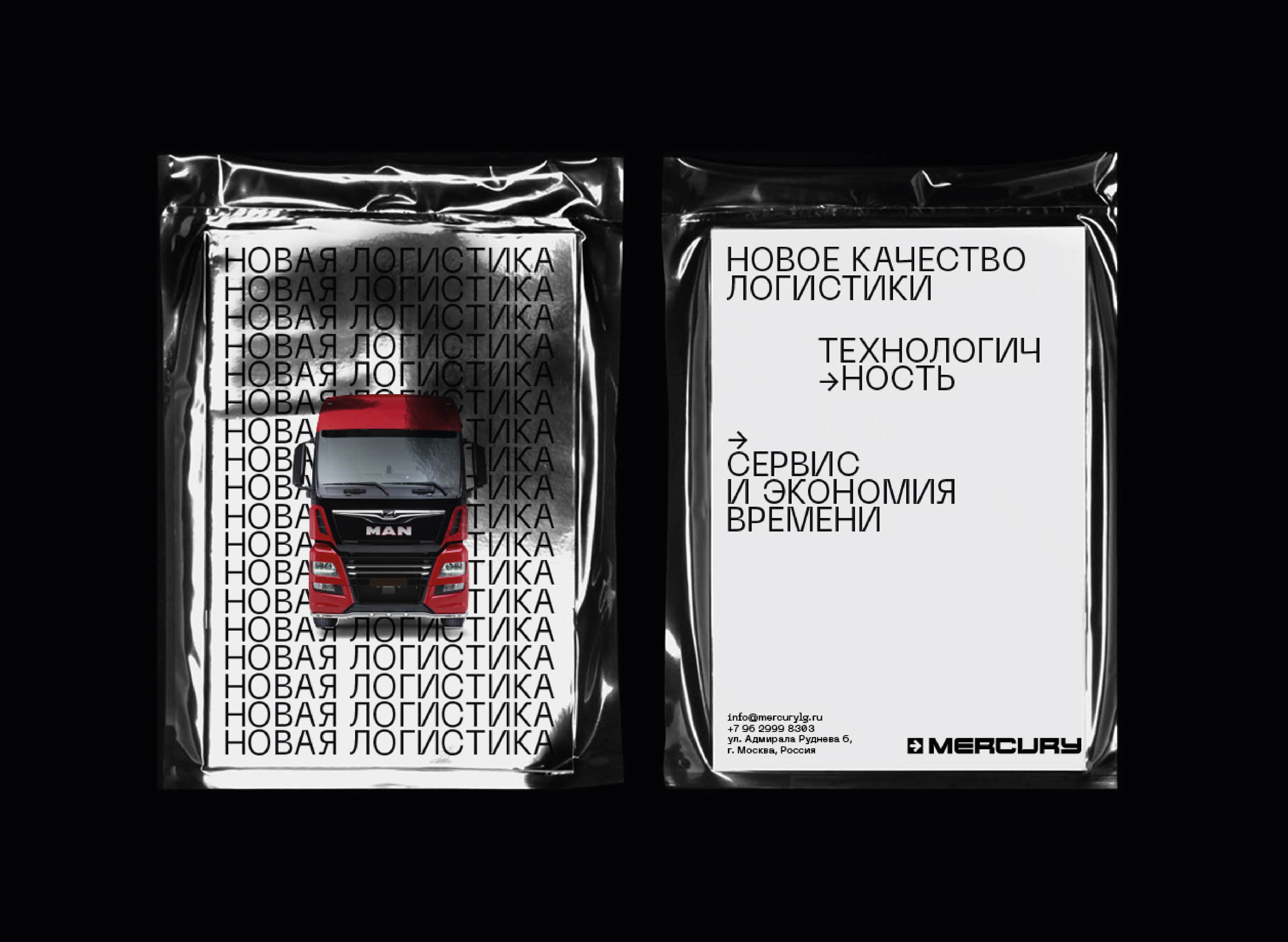
The main task we had while working on the Mercury project was updating brand’s perception, improving and making it more modern and stylish. The MERCURY Logistics Group provides a full range of transportation services. They take a leading position in this industry and have established themselves as a reliable partner. The scope of activity also includes the transportation of heavy and oversized goods, for which the route is separately worked out. An important aspect of their work is the control of the entire process of transporting the goods and ensuring their safety. The MERCURY Logistics Group carries out a full range of cargo transportation services in Russia and other countries using combined transportation. To deliver cargo from Moscow to any place in the world, we offer the preparation of a complete set of accompanying documentation, the development of an optimal cargo transportation route, as well as the agitation of cargo at destinations and departures. The client needed a new logo to be developed and a new corporate identity for a logistics company operating in Russia. The design was supposed to look technologically and it should have been associative with movies about the future, modern technologies and the corresponding task of returning of a reliable brand of world scale. The logo was divided into two parts: a sign – an arrow that indicates the movement forward, development and main type of company; font – a wide grotesque with ink traps, which create a technological and serious image of the logo and hence the brand. The visual style of the Mercury brand was decided to appear in two colors: black and white layout and backgrounds complement the image of red trucks used by the company.
Thanks to the new modern and technological design, Mercury brand has clearly become prominent in the logistics market and began to stand out among competitors in this niche. Updated design adaptation for all communication channels which means more convenience, mobility and attracting more new customers. The brand has become more dynamic and now it is a new stimulus for the development of their business for customers.
CREDIT
- Agency/Creative: Yaroslav Kryzhanivsky
- Article Title: Identity Design for Mercury Logistics by Yaroslav Kryzhanivsky
- Organisation/Entity: Freelance, Published Commercial Design
- Project Type: Identity
- Agency/Creative Country: Ukraine
- Market Region: Europe
- Project Deliverables: Brand Architecture, Brand Identity, Branding, Identity System, Tone of Voice
- Industry: Transport
- Keywords: CARGO LOGISTICS TRUCK ACCENT BLACK AND WHITE FORWARD RED TECH TECHNO TECHNOLOGICAL


