


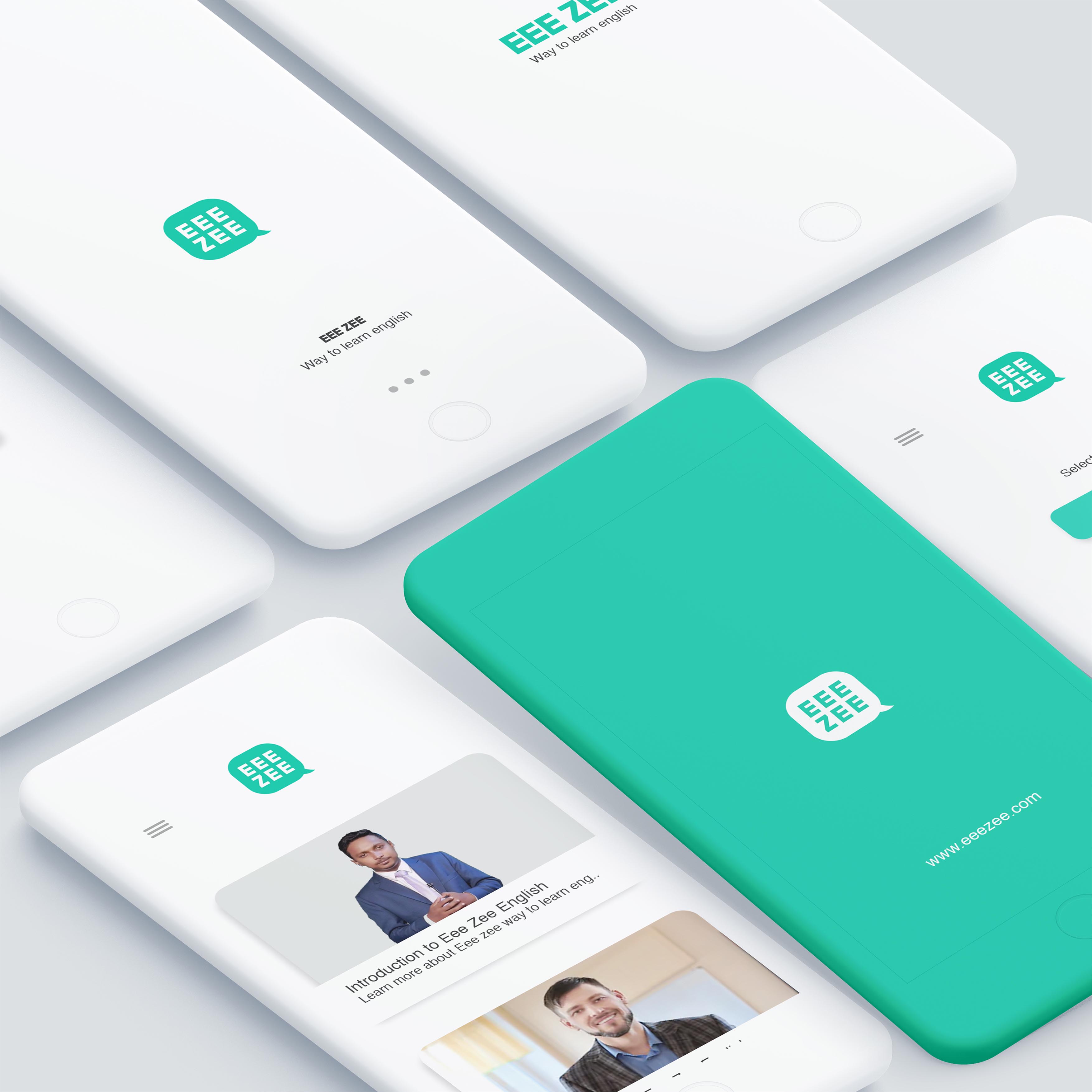
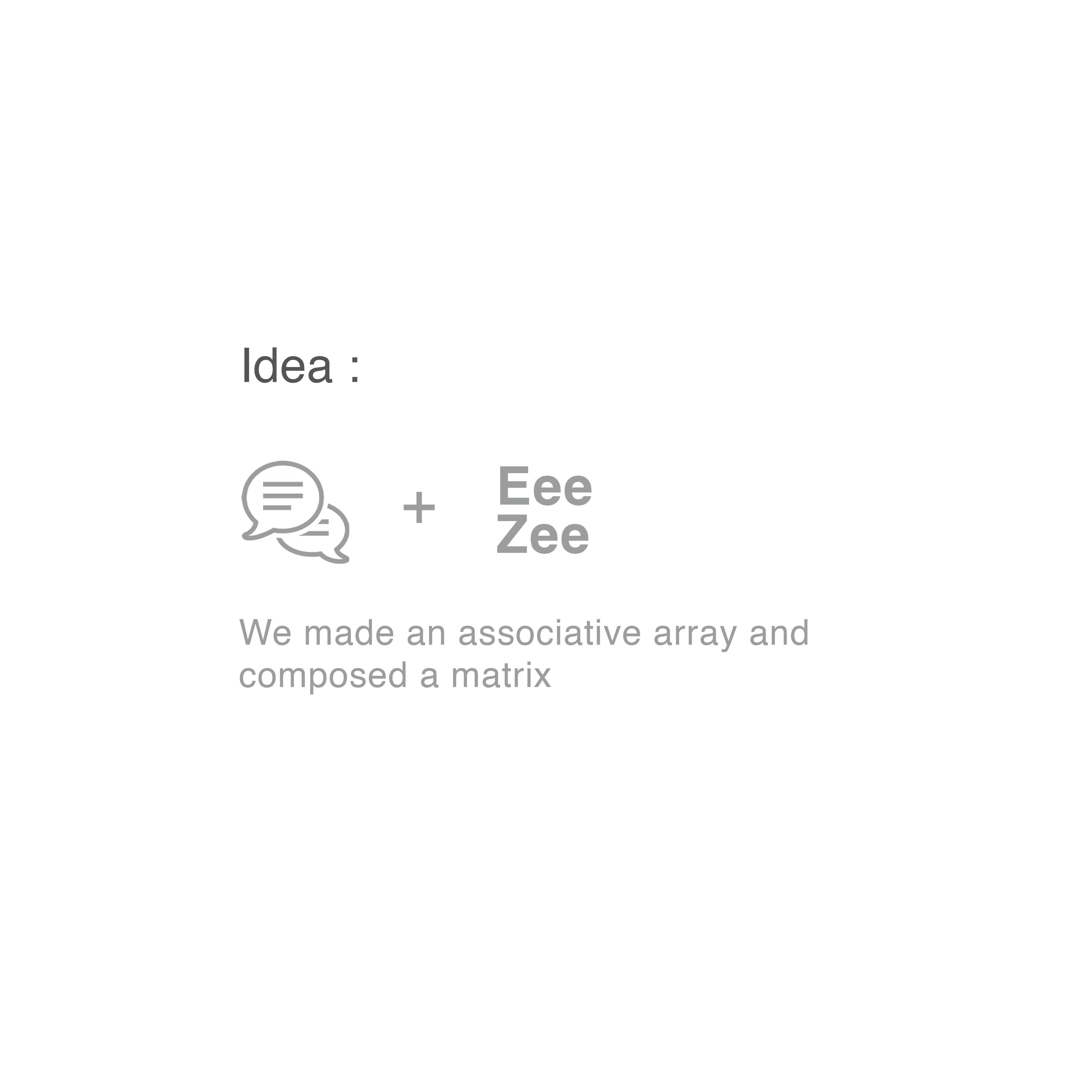
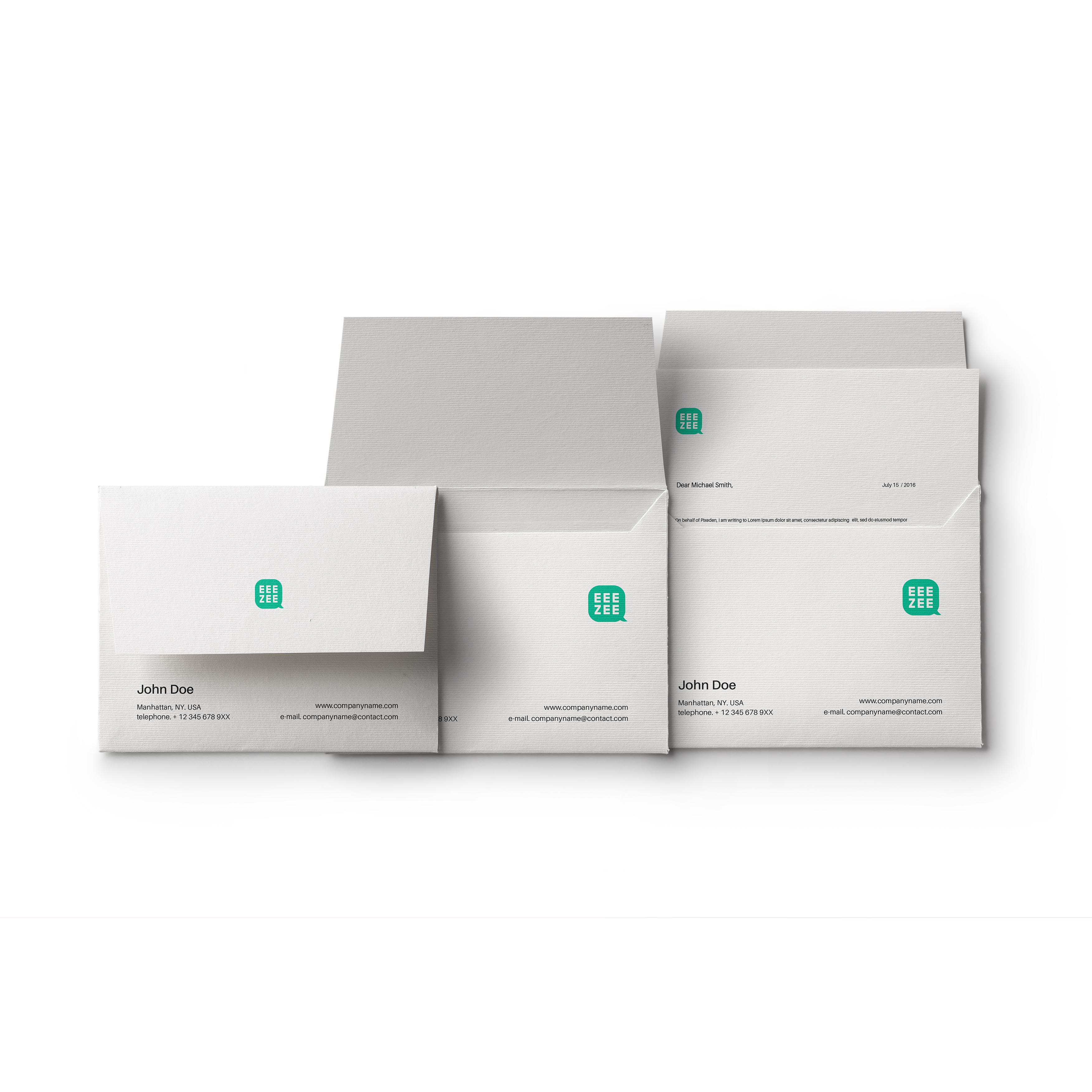
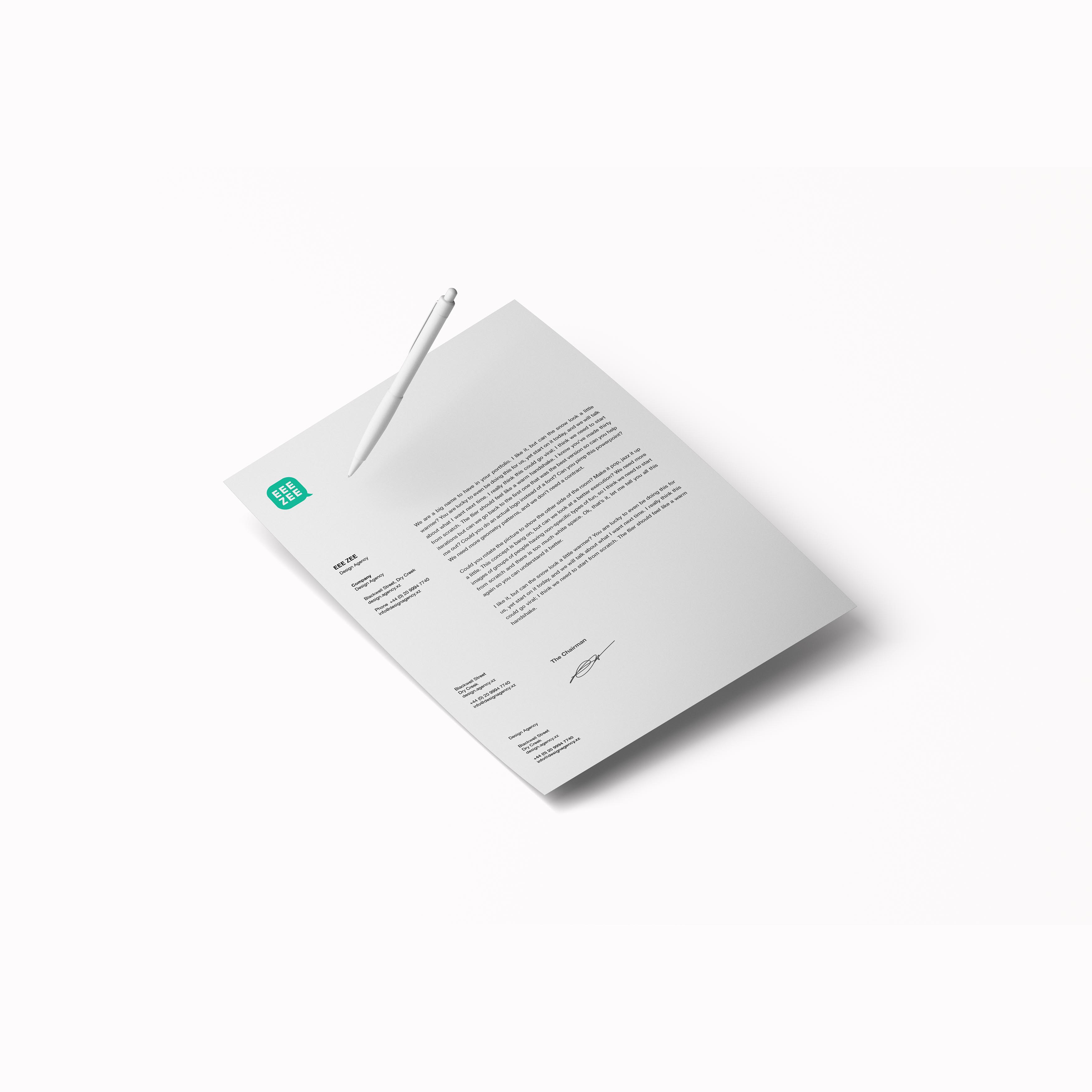
Simple yet effective. That is what the identity of Eeezee represents. Eeezee is an English learning app representing an easy and simple way to learn English with integrated video-based pedagogy.
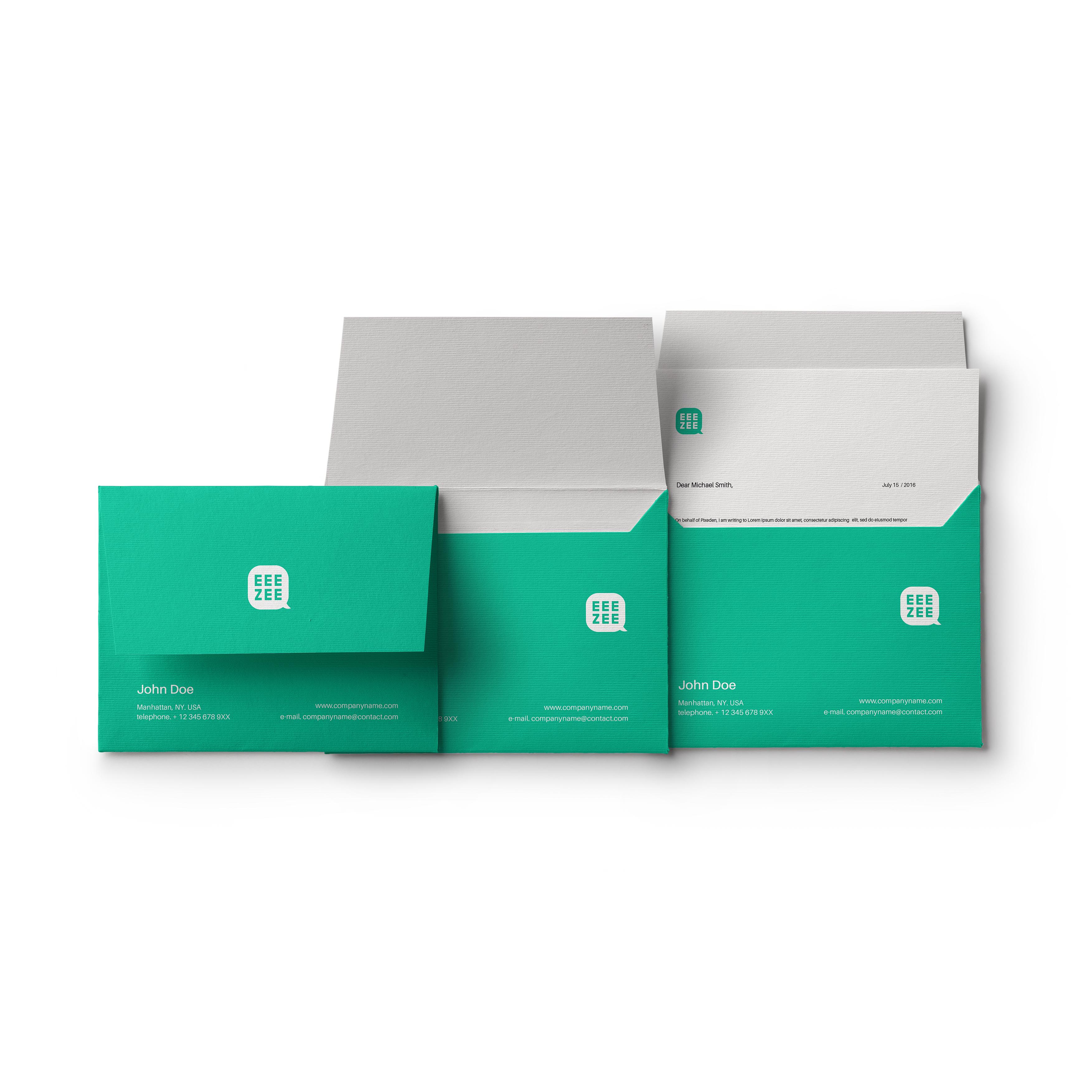
Conversation, Simplicity and Engagement were chosen as the three maxims for our design process to create visual language for the Eeezee brand. We choose the color green consciously for improved readability as research suggests. It also invokes a sense of optimism which is crucial for learning.
CREDIT
- Agency/Creative: Design polygon
- Article Title: Identity Design and Branding For Eee Zee English Learning App
- Organisation/Entity: Agency, Published Commercial Design
- Project Type: Identity
- Agency/Creative Country: India
- Market Region: Asia
- Project Deliverables: Brand Creation, Brand Guidelines, Brand Identity, Brand Naming, Brand Strategy, Branding
- Industry: Education
- Keywords: branding, identity design
FEEDBACK
Relevance: Solution/idea in relation to brand, product or service
Implementation: Attention, detailing and finishing of final solution
Presentation: Text, visualisation and quality of the presentation


