Cursor Design Studio – ALOADES / extra virgin olive oil
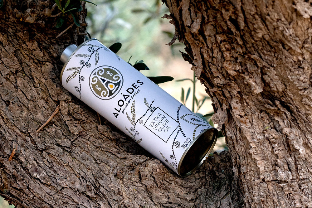
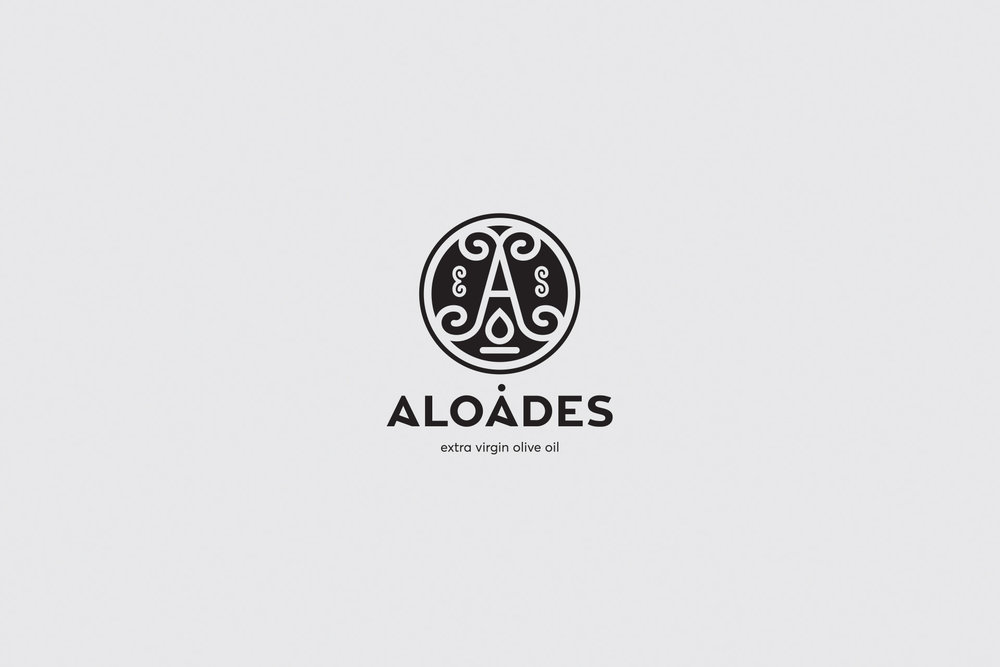
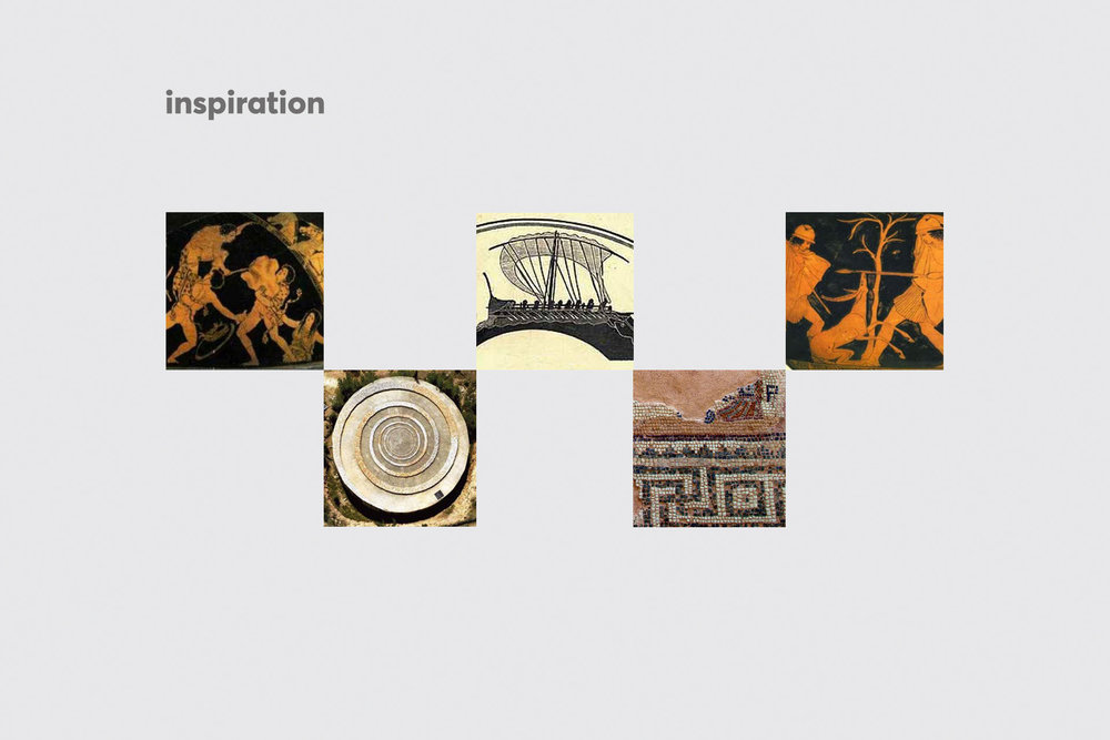
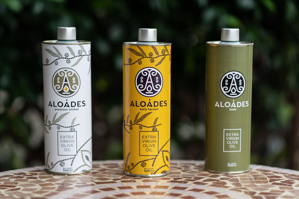
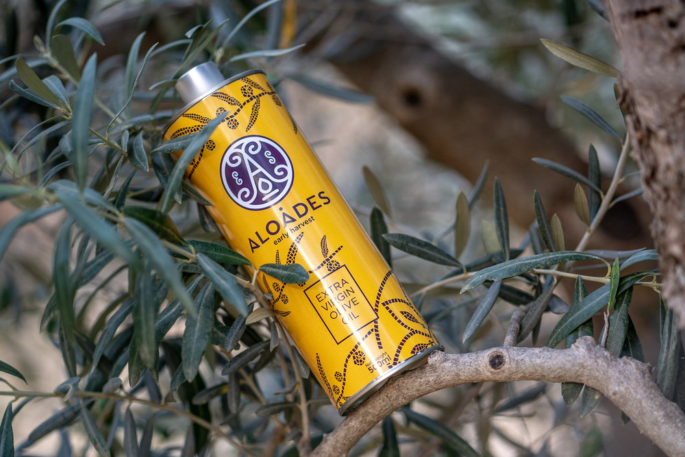
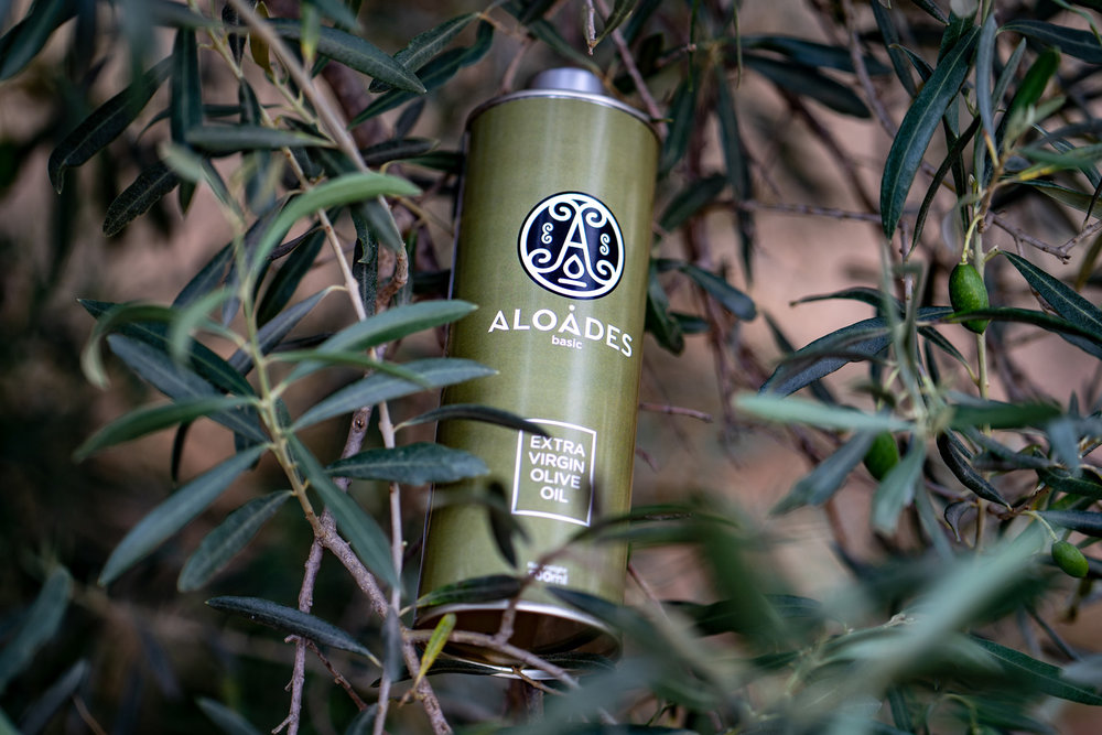
“Logo and packaging for a Greek extra virgin olive oil. Our creative team dominated straight away by the Thessalian mythology. Aloades, the almighty Poseidon’s sons, moved in the epicenter of the logo forming a robust monogram and getting surrounded by spirals: symbols of power and life. In a second-level the logo communicates the fundamental elements of olive and sea, without being bubbling though. The packaging of the olive oil based on the design of naturalistic illustrations that represent mosaic olives and leafs. An everlasting value claims a post in the modern cuisine.”
CREDIT
- Agency/Creative: Cursor Design Studio
- Article Title: Identity Creation and Packaging for a Greek Extra Virgin Olive Oil
- Organisation/Entity: Agency Commercial / Published
- Project Type: Packaging
- Agency/Creative Country: Greece
- Market Region: Europe
FEEDBACK
Relevance: Solution/idea in relation to brand, product or service
Implementation: Attention, detailing and finishing of final solution
Presentation: Text, visualisation and quality of the presentation


