


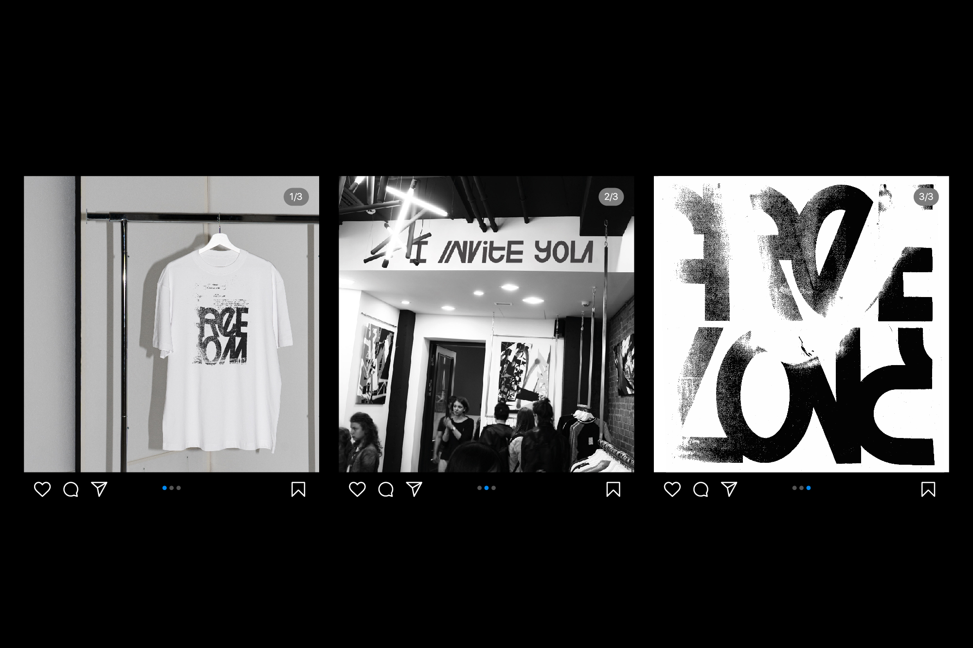
Freelabel is a concept apparel brand for every day and everyone, which uses sustainable and recycled materials to make their clothes. The store creates exclusive capsule collections by collaborating with contemporary artists and supporting independent art.
The main brand values are freedom, creativity and individuality. Freelabel translates these values through bright slogans on their clothes. These statements and expressions show some point of view of the world around us and share feelings about it.
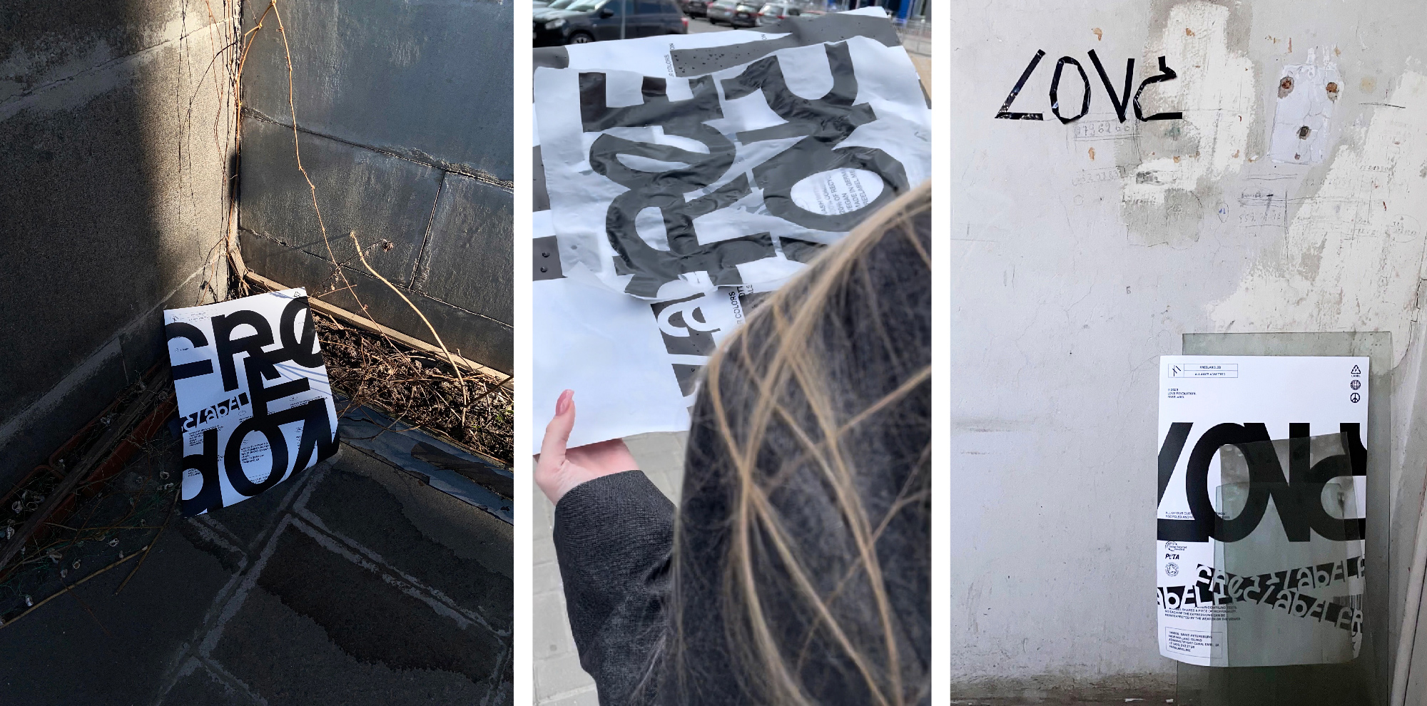
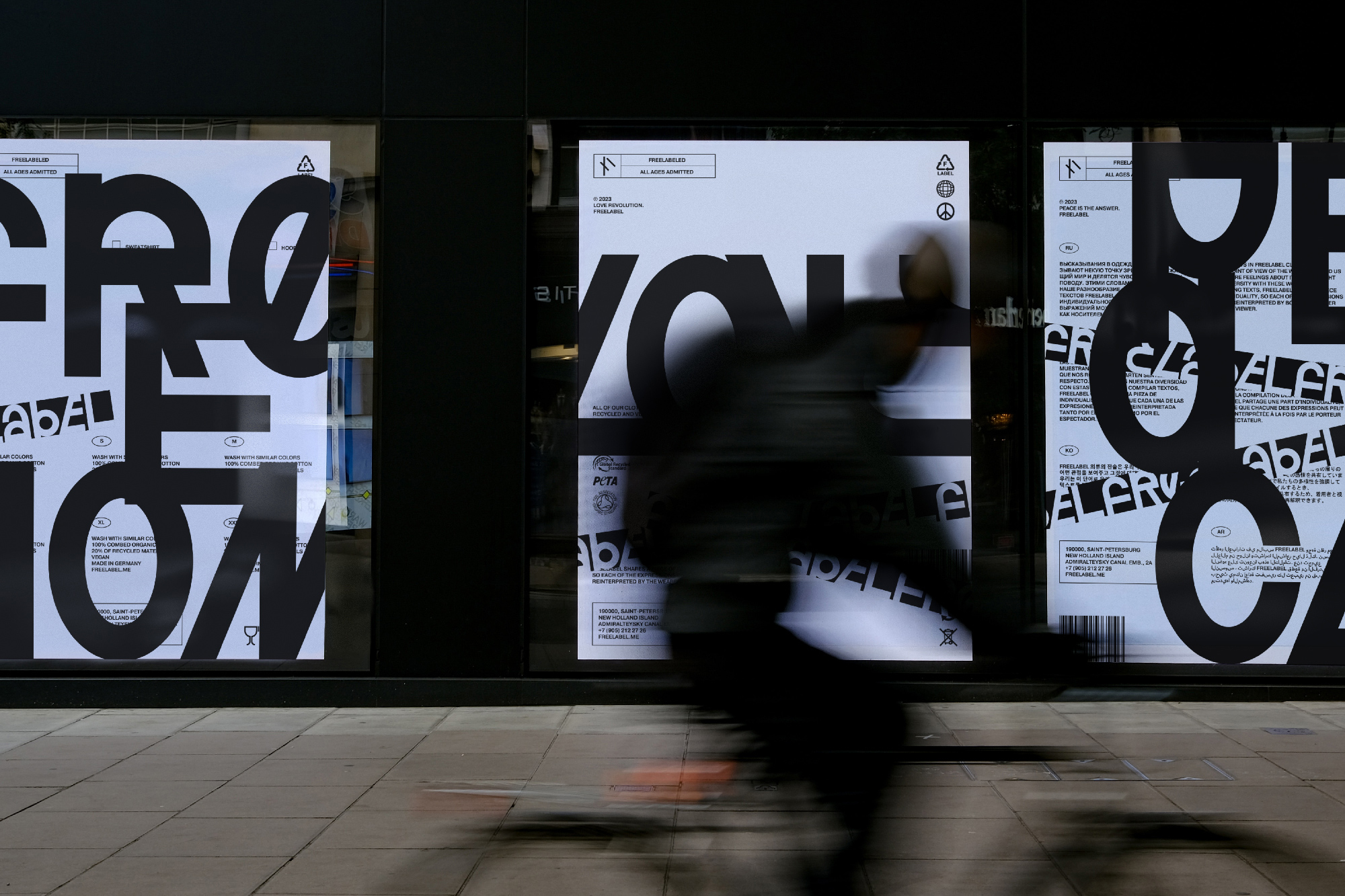
When compiling texts, Freelabel shares a piece of individuality, so each of the texts can be reinterpreted by the wearer or the viewer. Brand basically highlights our diversity with these words. This brand positioning is quite similar to the atmosphere of the protest posters, so we decided to create an identity based on the features of such kind of graphics.
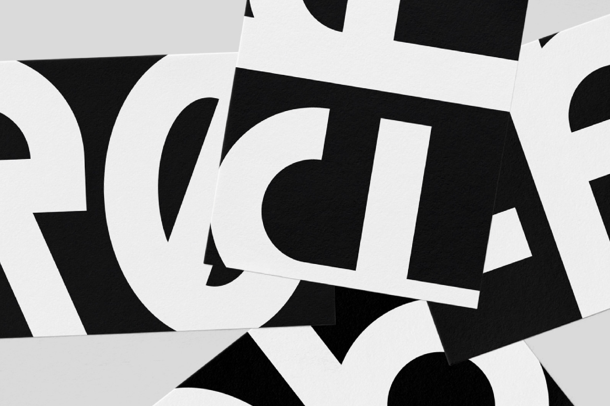
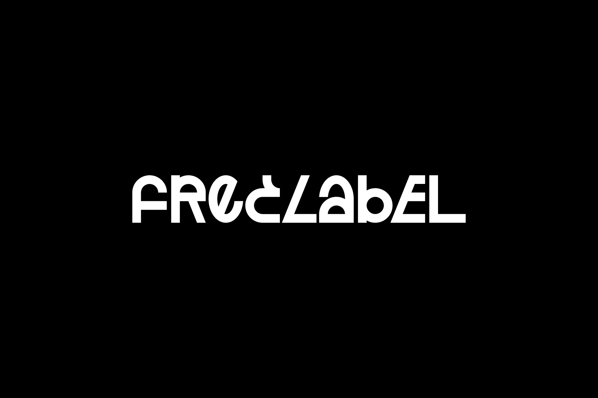
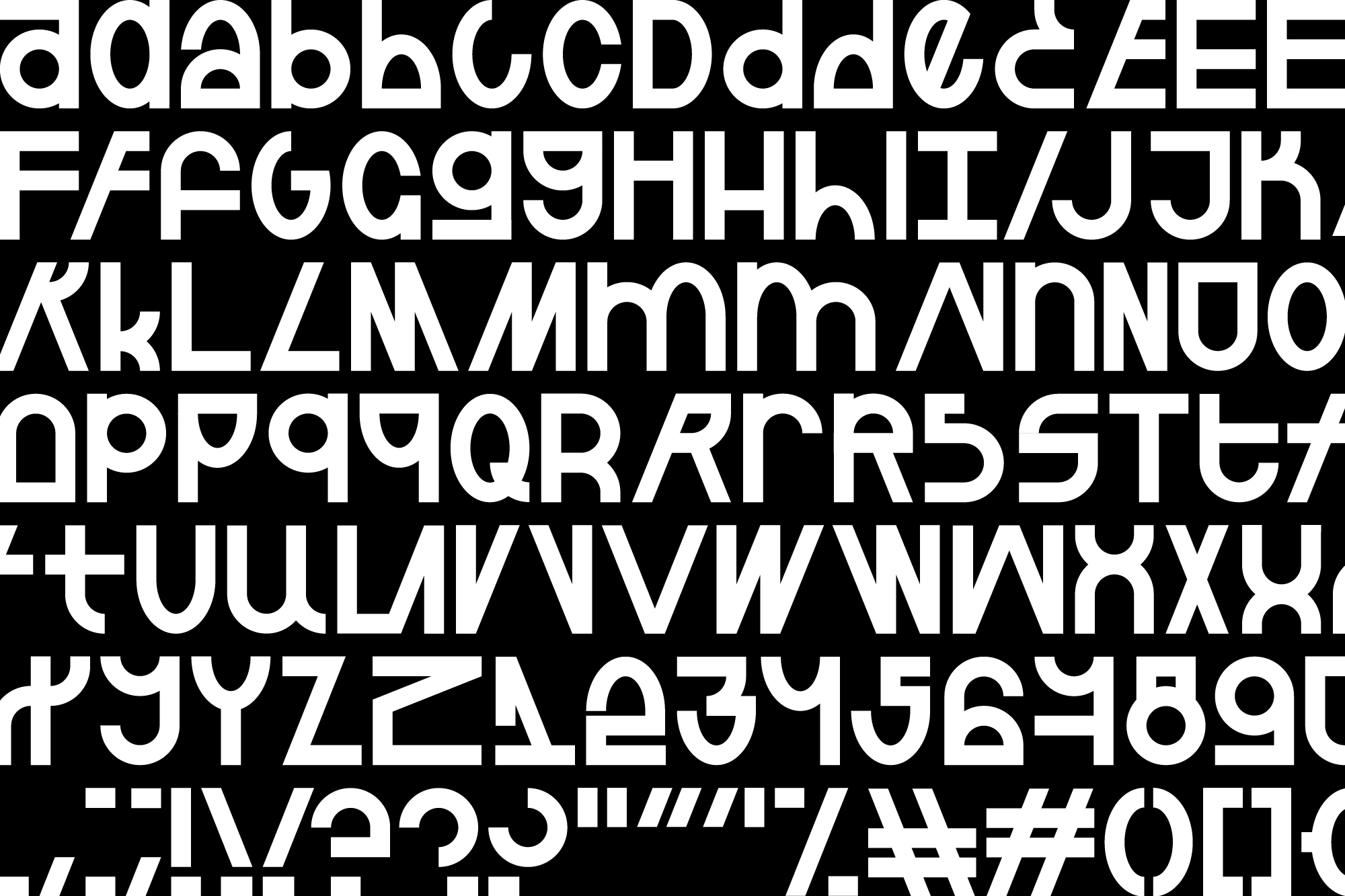
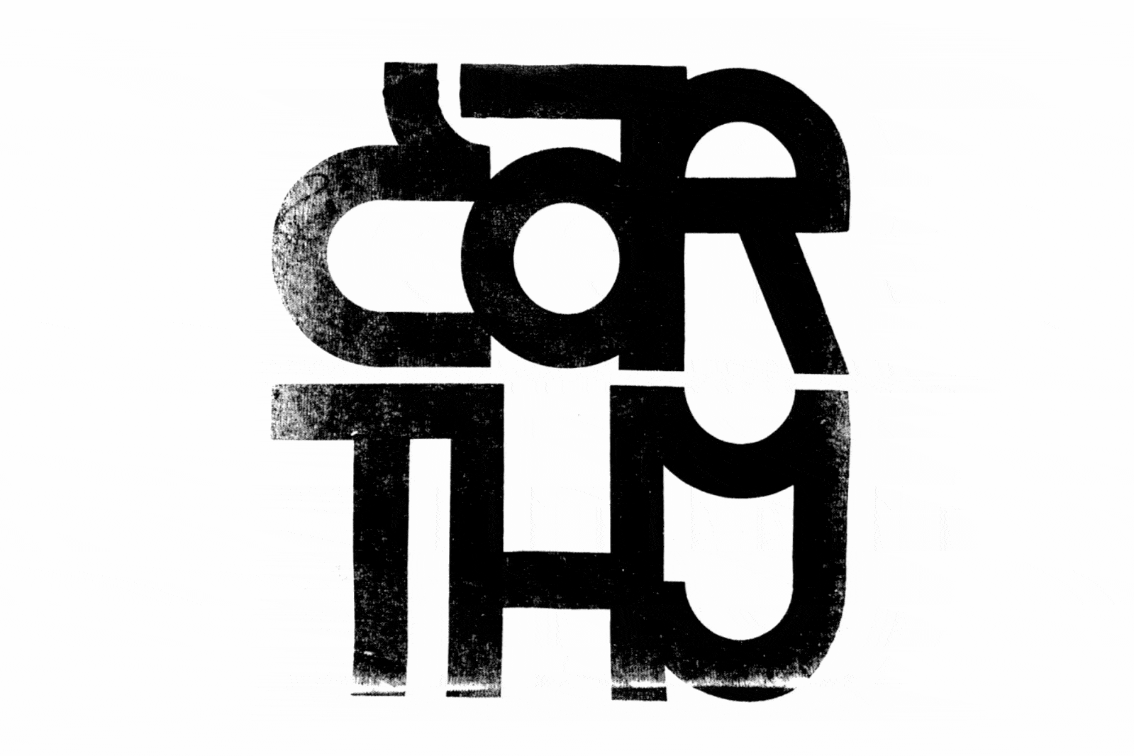
As a basis for the style, we took the shape of the letters made with adhesive tape. A feature of this type of folk lettering is the simplicity of forms, the uniform width of the used line and the variability of writing the same letters within the word. This is how the logo appeared, in which the repeated letters “E” and “L” look different. Based on the logo, we developed a display font with alternative characters. One of the principles of its use is not to repeat the outline of the letter until the variations are over.
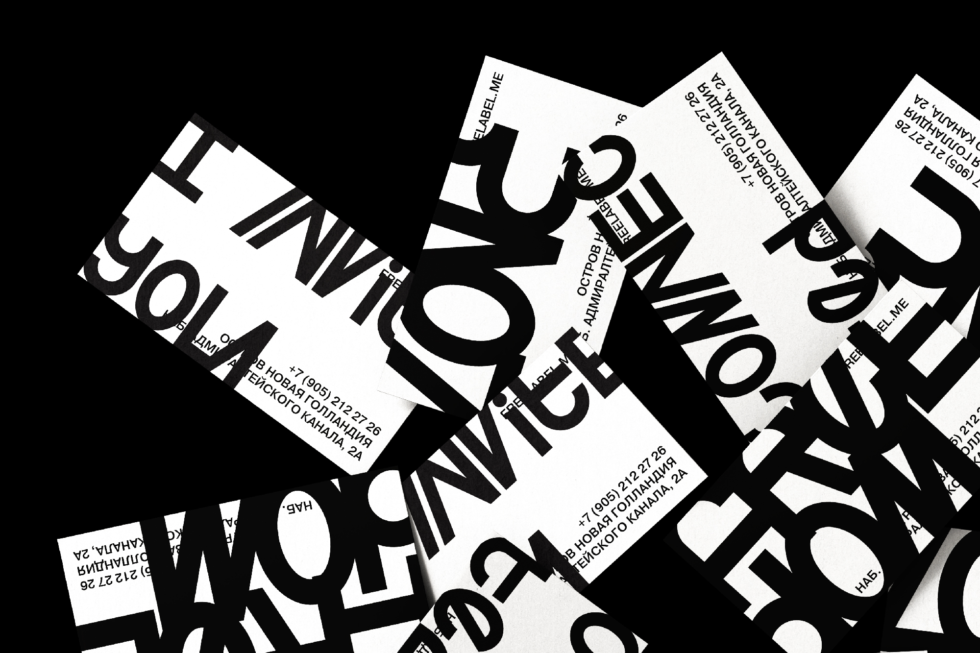
Protest posters are characterized by the largest layout of the text, which is often cramped in the format. Their main task is to make sure that as many people as possible know about your position. From here, a rule was formed, according to which the text occupies the maximum area, so kerning can be greatly reduced, and letters rest against the edge or be cut off altogether.
The carriers of such ready-made typography are often cut out parts of cardboard boxes, on which technical information from previous use has remained. It serves as a background for slogans.
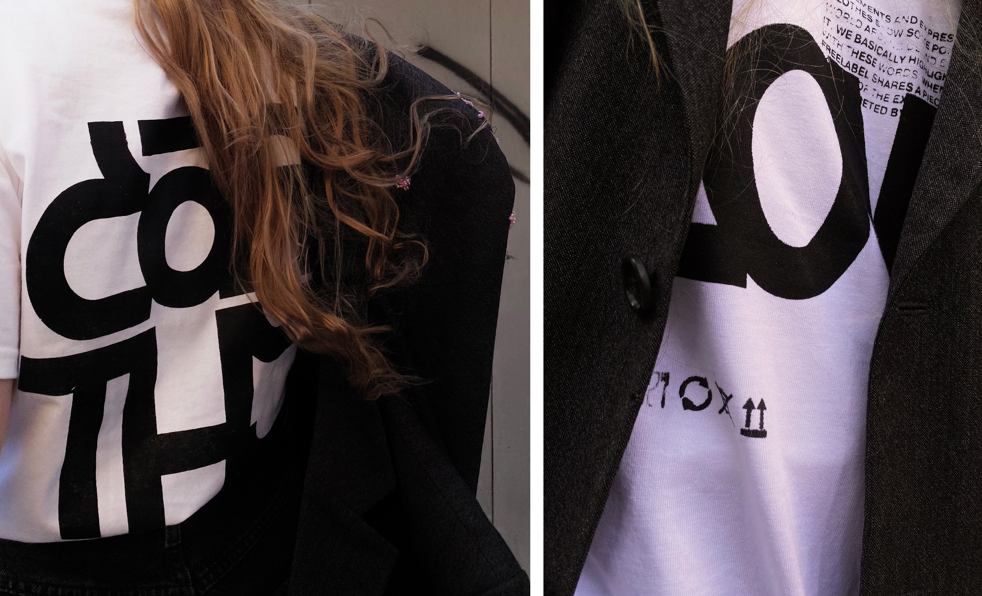
The mood and atmosphere of the Freelabel identity is supported by prints on clothes made using handmade silk-screen printing. Random bumps and voids reflect ideas of freedom and individuality.
The identity of the Freelabel brand forms the attitude to clothing as a statement. Clothing is a means of broadcasting the thought that a person wants to convey to the outside world. Thus, the protest poster-inspired typeface became the main tool for manifesting Freelabel’s values.

CREDIT
- Agency/Creative: Terminal Design Branding Agency
- Article Title: Identity and Typeface for Freelabel Clothing Brand
- Organisation/Entity: Agency
- Project Type: Identity
- Project Status: Published
- Agency/Creative Country: Russia
- Agency/Creative City: Saint-Petersburg
- Market Region: Europe
- Project Deliverables: Brand Design, Brand Identity, Logo Design, T-Shirt Design, Type Design, Typography
- Industry: Fashion
- Keywords: Brand Identity, Typeface, Type Design, Logo, Clothing Brand, Typography, Silk Screen Printing, Fashion, Poster Design, Ready-Made
-
Credits:
Art Director: Ivan Kulikov
Designer: Sofya Sorokina


