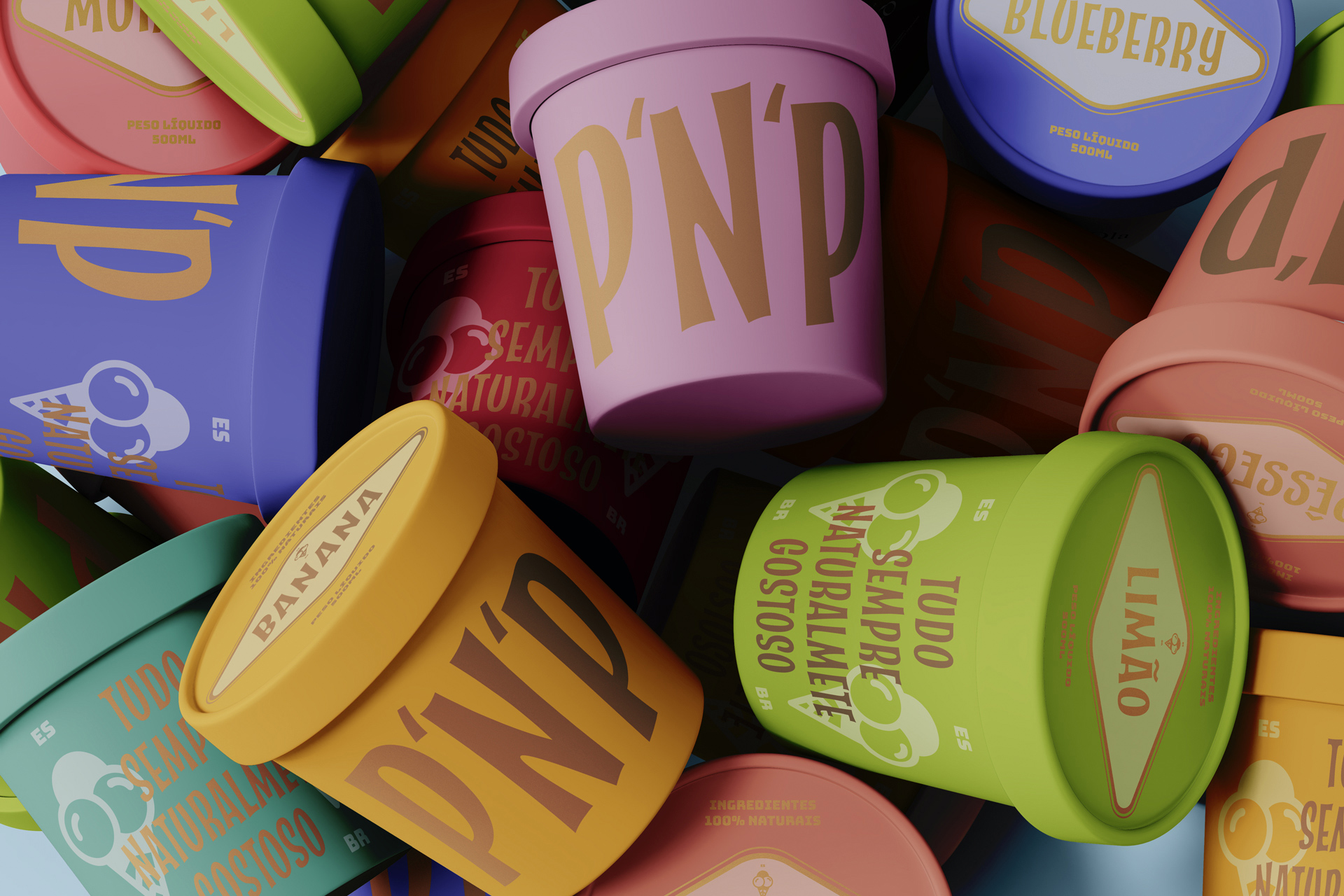
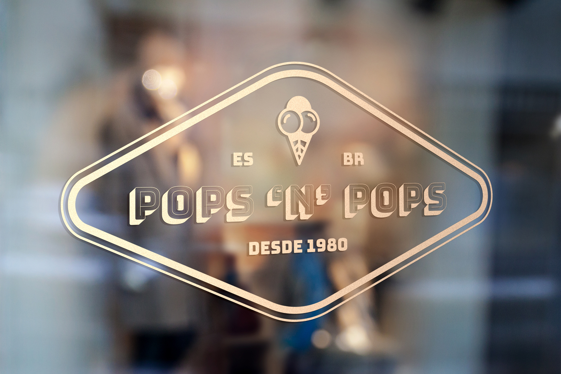
We created a new version of the typography established for the identity of pops ‘n’ pops to be able to bring a better applicability of the logo to always have a better visualization, regardless of the surface on which it will be applied. City. The concept was created to satisfy the need for a fun and creative alternative keeping the company’s origins. Each flavor is handmade, with 100% natural ingredients.
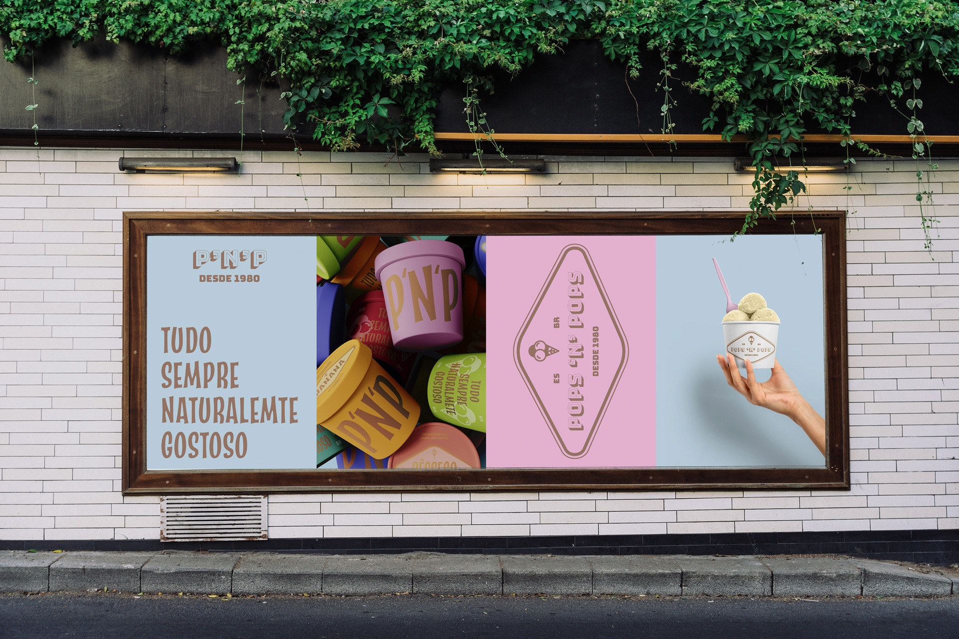
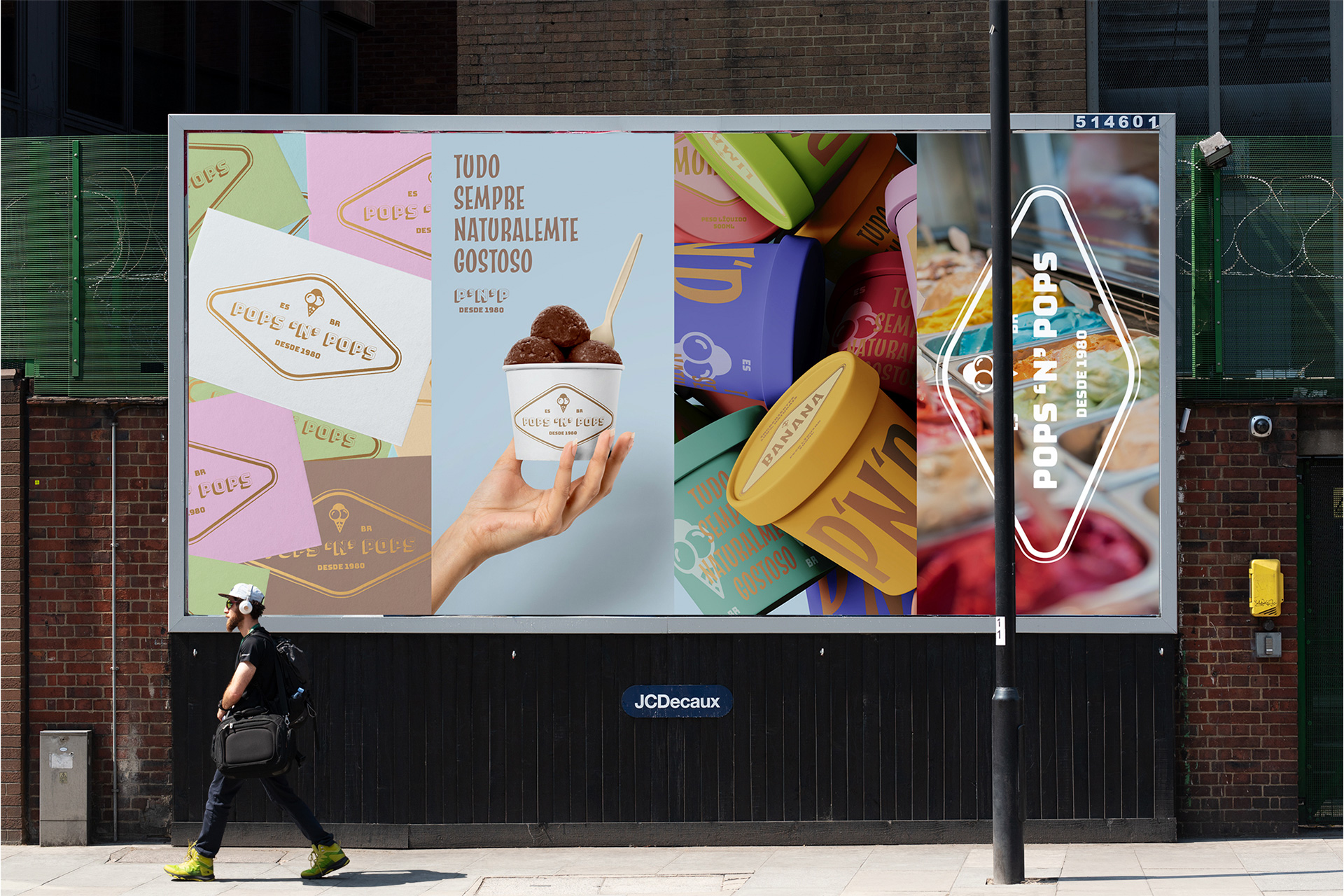
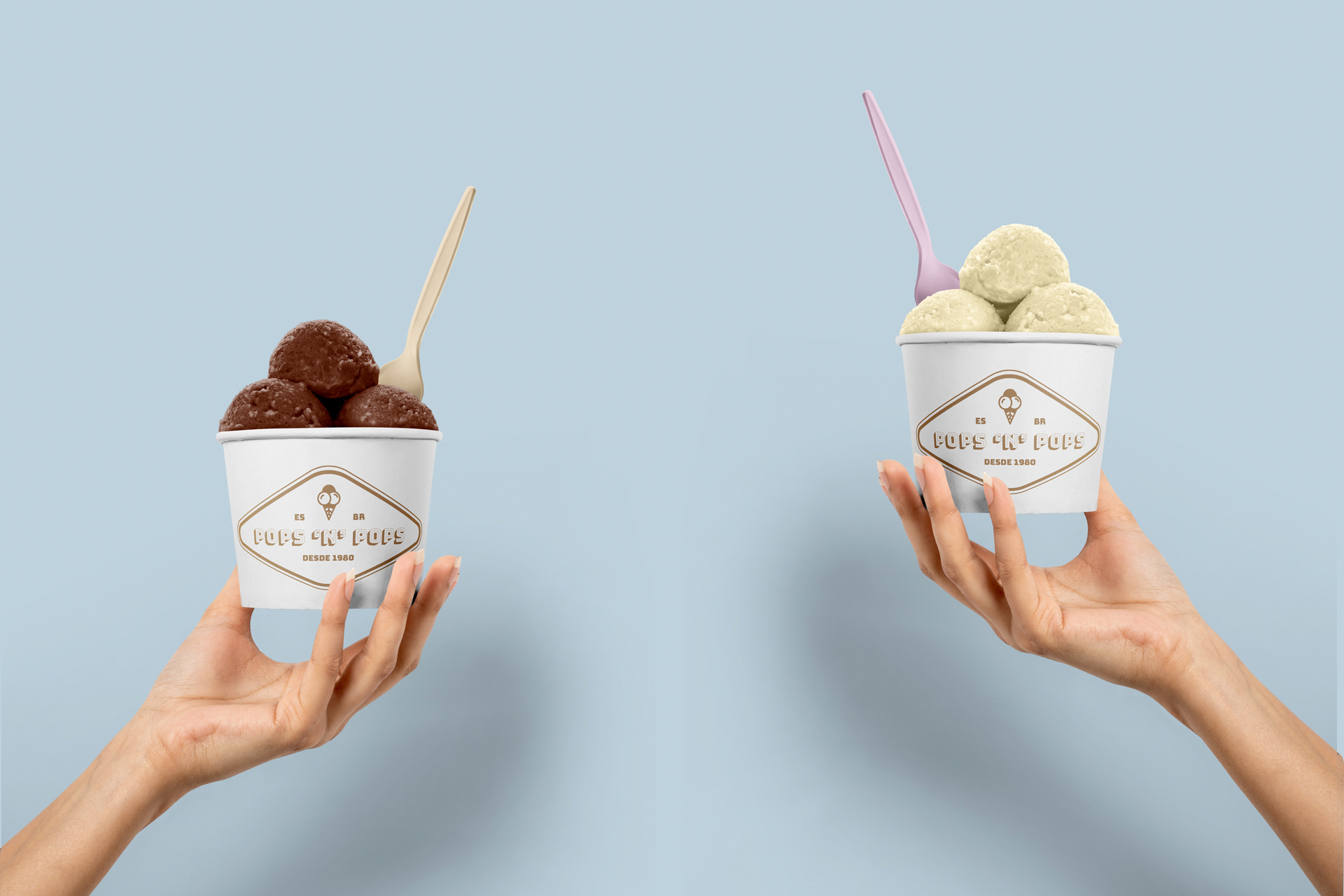
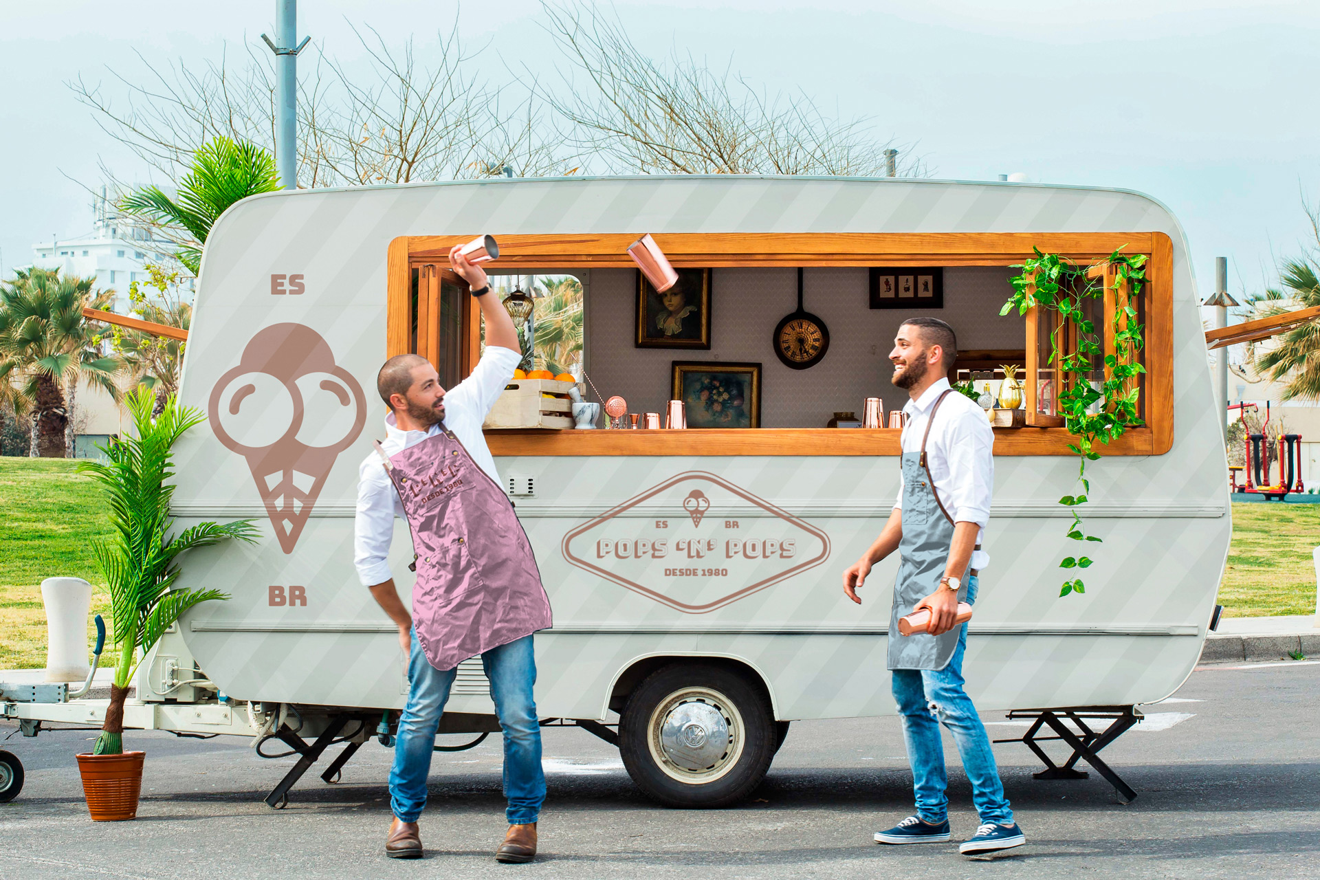
They represent the uniqueness in flavor and design of pops through branded design and packaging, creating a seamless experience from arrival at the ice cream shop to serving at the buffet. The brand must be relevant and always with a touch of class.
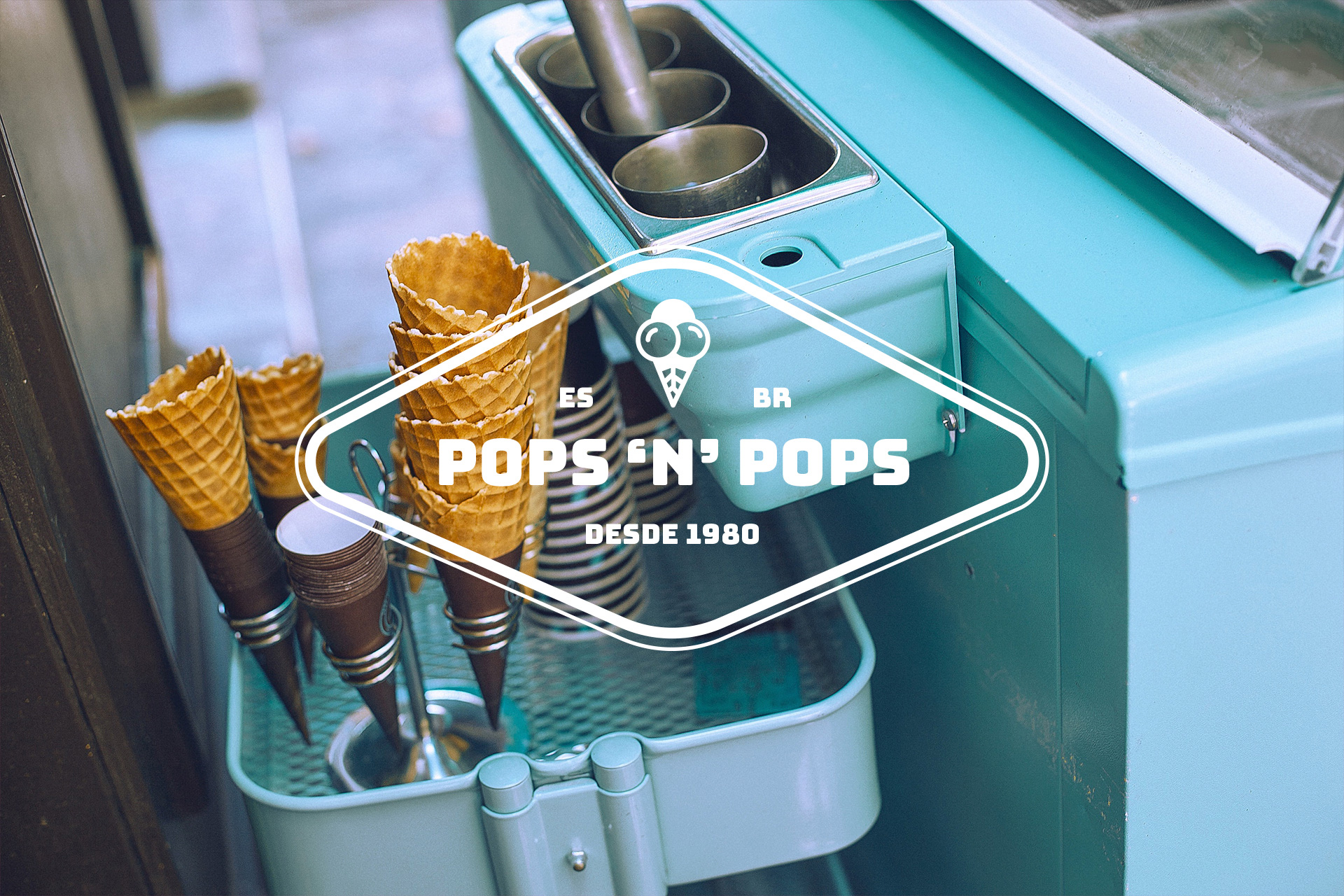
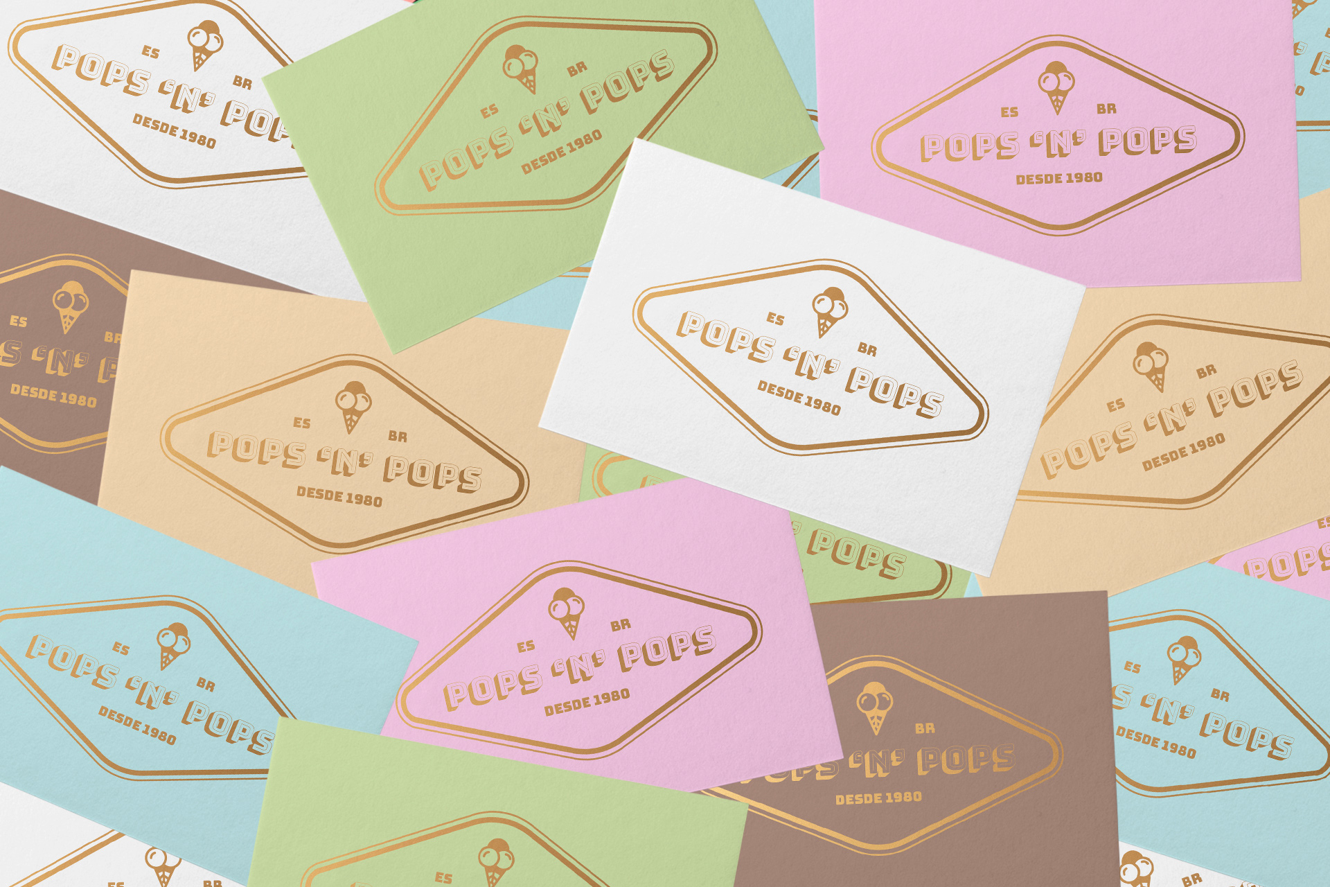
For the logo, we developed a design that integrates the elegant, modern and fun essence of the brand. We were inspired by the signs of old restaurants, one of the most iconic symbols of the 50’s (owner’s age of birth) to create the brand’s icon. We also designed a new packaging design. For the color palette, we chose colors that would remind us of the celebrations, conveying warmth and emotion and easily adapting to any type of environment.
We designed the brand’s packaging to highlight each flavor, considering the delicacy of the product. The packaging can also be used as a collection format, allowing you to assemble the popsicles into a good-looking presentation format.
We created a new version for the typography established for the pops ‘n’ pops identity to bring a better applicability of the logo to always have a better view, regardless of the surface on which it will be applied.
CREDIT
- Agency/Creative: Machado Design Studio
- Article Title: Identity and Packaging for Pops ‘n’ Pops Created by Machado Design Studio
- Organisation/Entity: Freelance
- Project Type: Graphic
- Project Status: Published
- Agency/Creative Country: Brazil
- Agency/Creative City: Uberlândia
- Market Region: South America
- Project Deliverables: Art Direction, Brand Guidelines, Brand Identity, Branding, Graphic Design, Packaging Design, Packaging Guidelines
- Industry: Food/Beverage
- Keywords: Ice Cream Shop, Ice Cream, Tradicional, Vintage, Ice Cream Packaging
-
Credits:
Designer: Matheus Machado


