


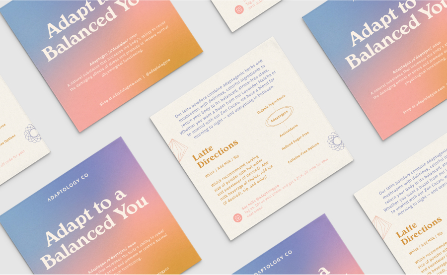
Adaptology is a vibrant brand offering adaptogenic latte powders designed to support both energy and balance. The blends combine functional mushrooms, herbs, and superfoods, formulated to help people feel their best, without compromising on flavor or visual appeal. With ingredients like reishi, chaga mushrooms, turmeric, and maca root, each blend is crafted to deliver real benefits while being as delicious as it is effective. The brand’s playful, modern identity was created to appeal to a younger audience—specifically Gen Z and millennials—who are increasingly turning to alternative, functional ingredients but often find traditional wellness brands intimidating or too serious. The goal was to make adaptogens feel fresh, fun, and shareable, so we designed a brand that would stand out on the shelf and get people excited to try it.
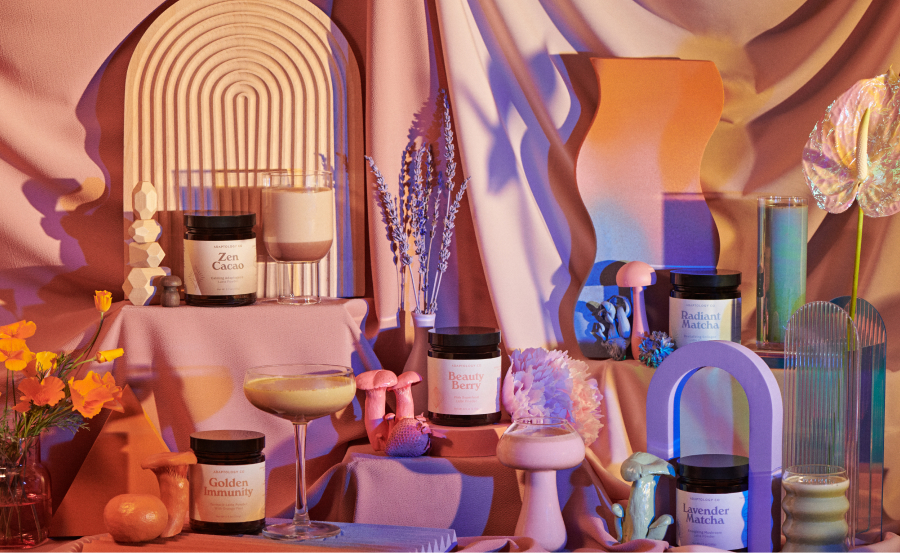
At Edition, we worked closely with founder Thea Wayne to create a full brand experience that spoke to both the brand’s joyful spirit and the serious benefits of its ingredients. The design is grounded in a color palette inspired by the vibrant hues of the latte powders themselves, using pastel gradients, quirky typography, and minimalist, new-age icons that represent the benefits of each product. These details help the products feel trendy and approachable, even while communicating that they’re made with high-quality ingredients that really work.
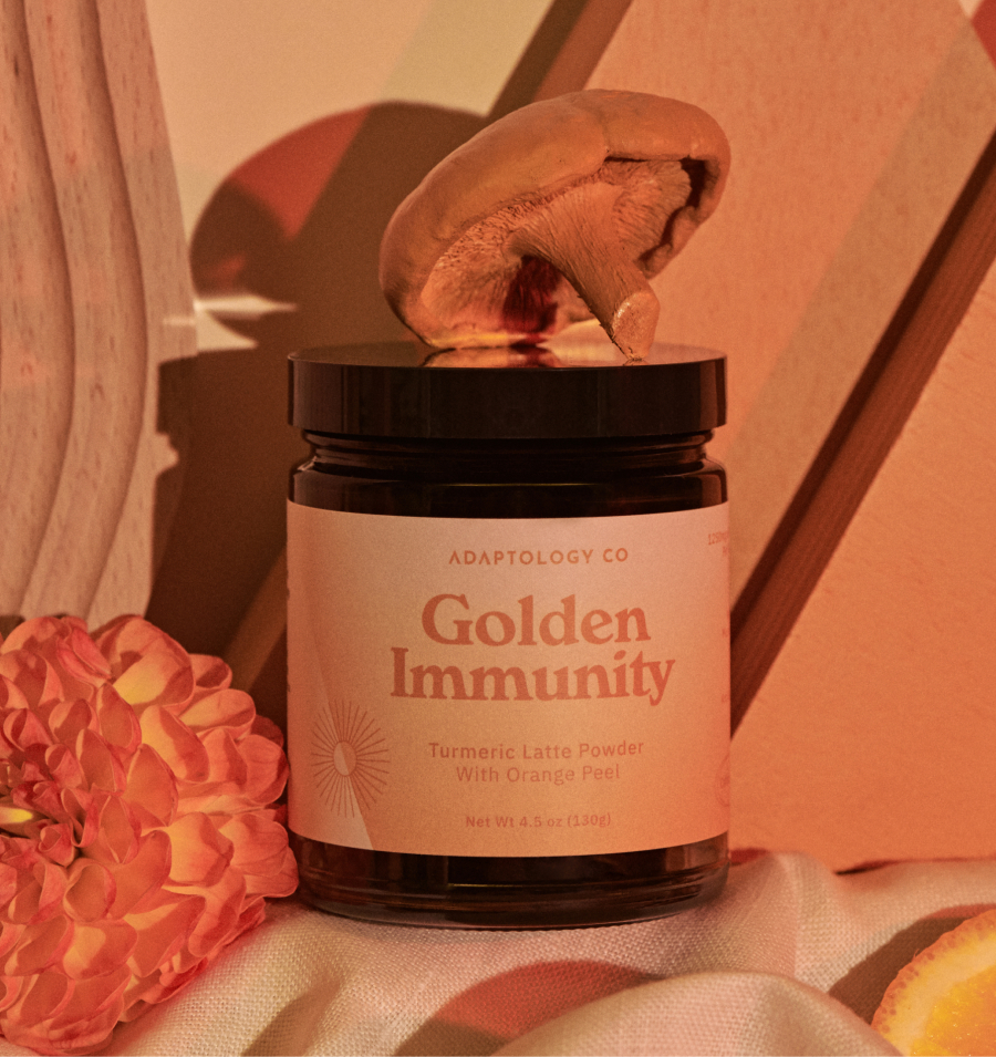
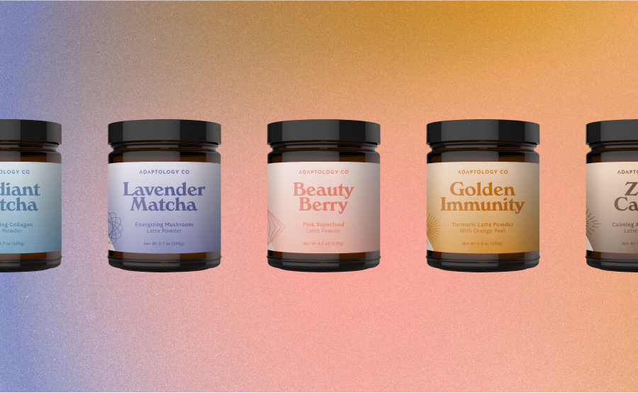
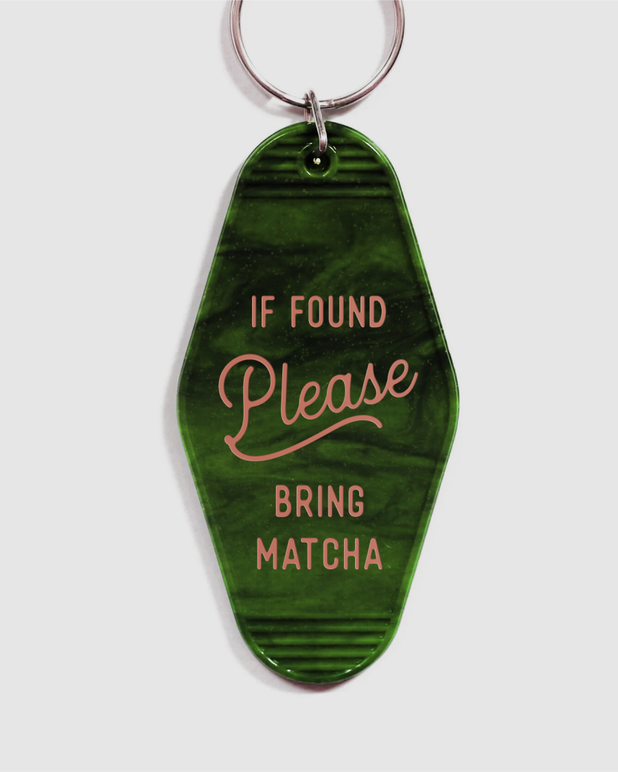
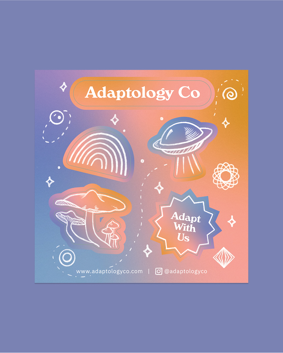
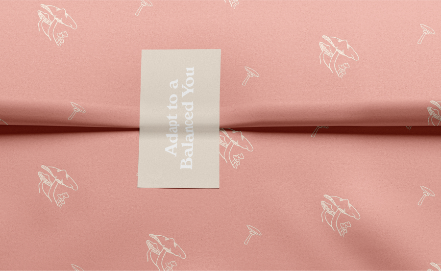
Packaging was a key part of our design strategy. The single-color labels feature soft gradients and simple line-art icons that make each product distinct and easy to identify. We wanted to create packaging that would not only catch the eye but also encourage customers to share their experiences on social media. The design of the shipper boxes and influencer kits took this further by including thoughtful extras like vintage-style keychains, hand-drawn space-themed stickers, and branded pink tissue paper. These unexpected touches transformed the unboxing process into an experience, surprising and delighting customers while building brand loyalty and excitement.
Beyond packaging, we helped establish Adaptology’s visual system through custom illustrations, website assets, and animated GIFs that brought the brand’s quirky, fun personality to life. Every touchpoint was designed to capture the vibrant, energetic feel of the product, ensuring the brand felt consistent and memorable, from website to social media to product in hand.
By creating a brand that feels as fresh and dynamic as its ingredients, we’ve helped Adaptology carve out a place in the wellness space where fun, flavor, and functionality coexist. Our goal was always to build something that wasn’t just another wellness brand, but a brand that speaks to a new generation, bringing adaptogens to the mainstream in a way that feels exciting, approachable, and above all, shareable.


CREDIT
- Agency/Creative: Edition
- Article Title: Identity and Packaging for Functional Latte Brand Adaptology by Edition
- Organisation/Entity: Agency
- Project Type: Packaging
- Project Status: Published
- Agency/Creative Country: United States
- Agency/Creative City: San Francisco
- Market Region: North America
- Project Deliverables: Art Direction, Brand Creation, Brand Design, Brand Guidelines, Brand Identity, Brand Mark, Creative Direction, Graphic Design, Identity System, Label Design, Packaging Design, Product Photography
- Format: Jar
- Industry: Food/Beverage
- Keywords: Adaptagentic Matcha Powders
-
Credits:
Art Direction & Design: Katelyn Peterson
Art Direction & Design: Malin Reedijk
Photography & Styling: Jordan Darian


