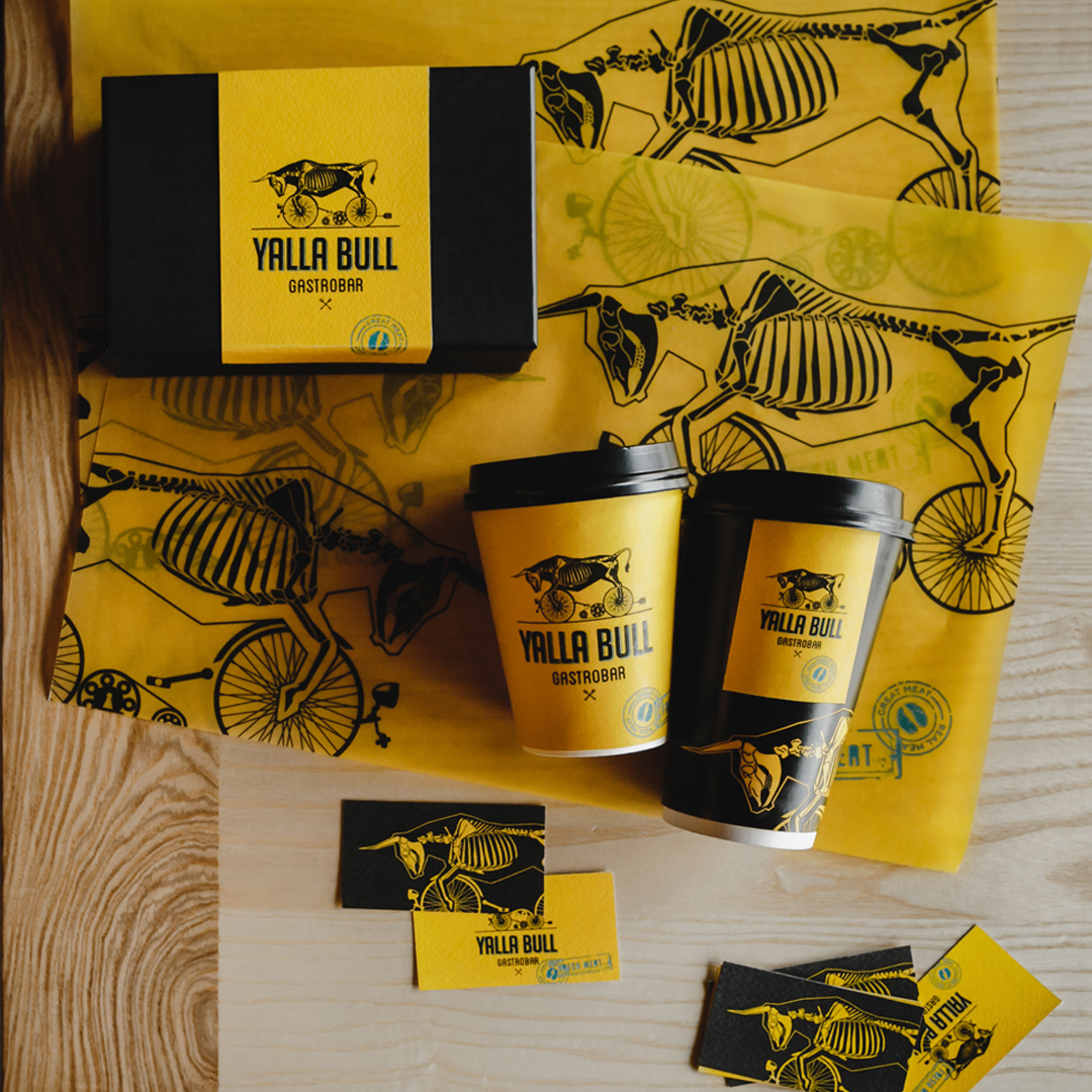
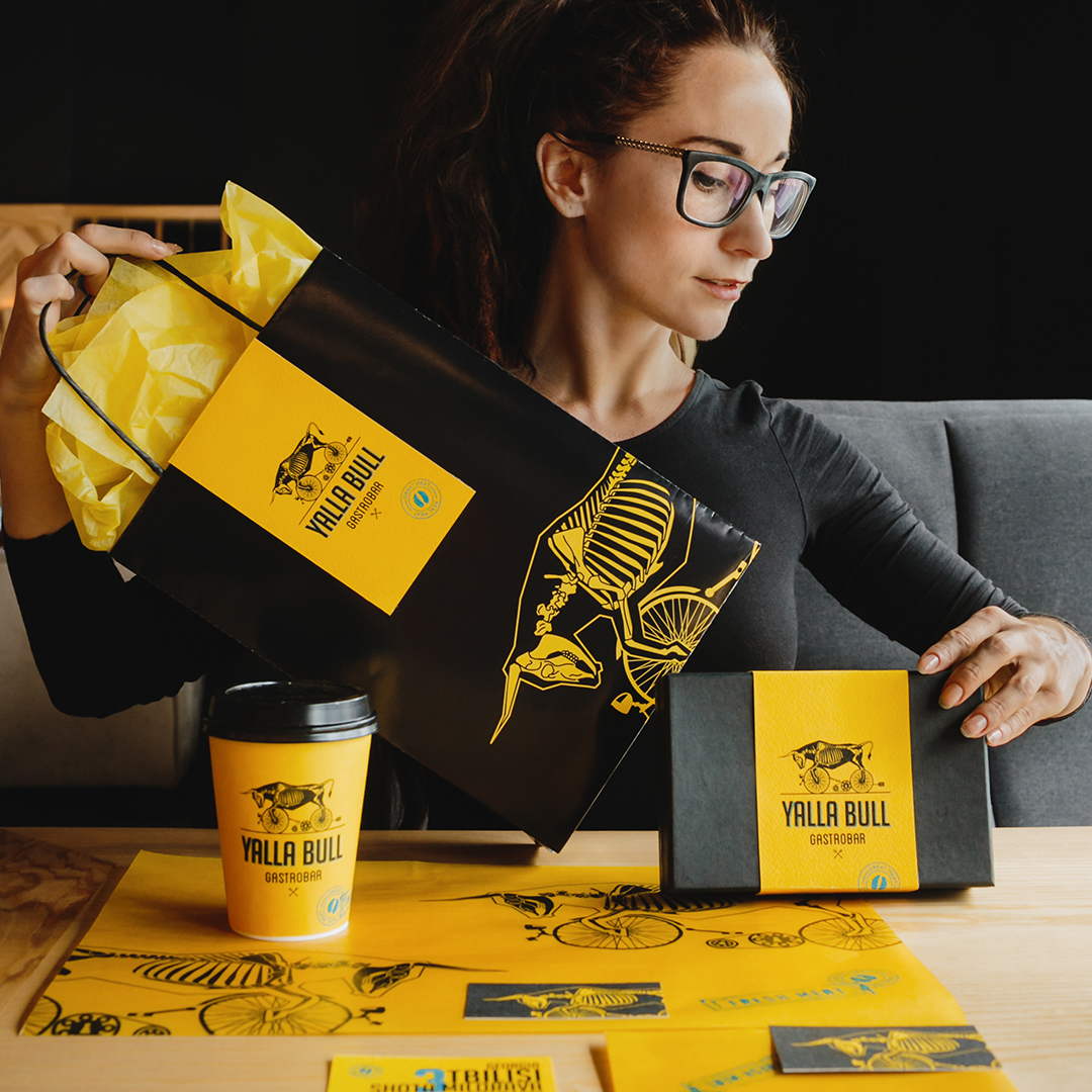
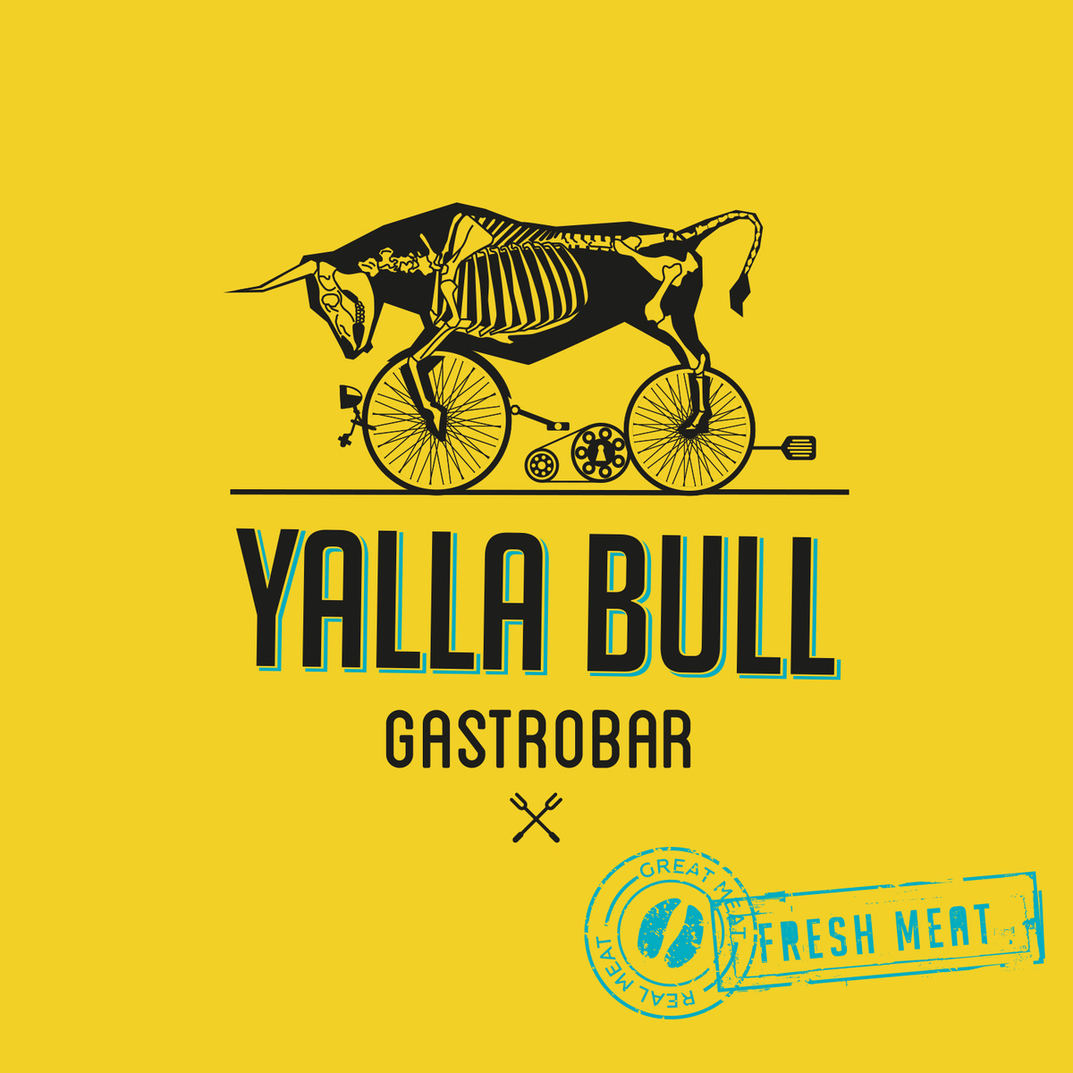
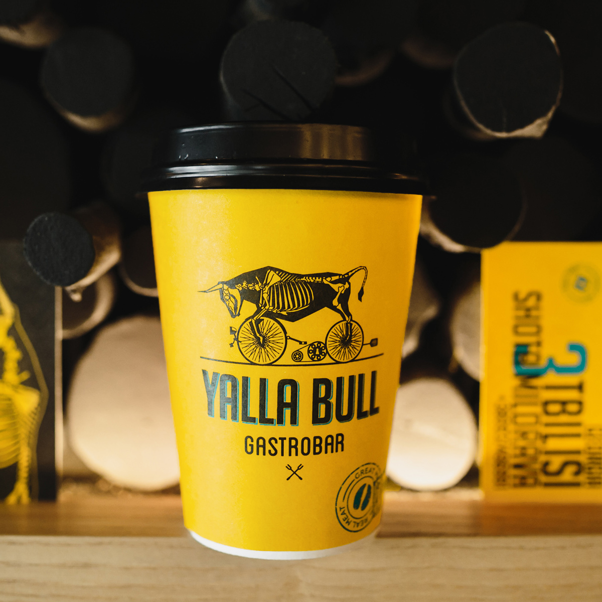
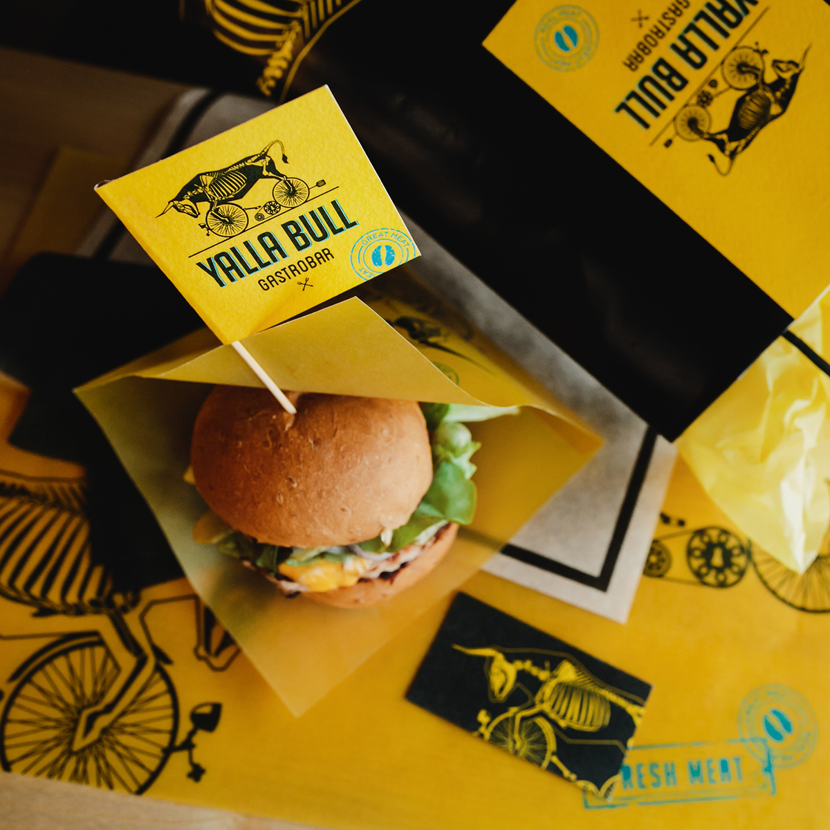
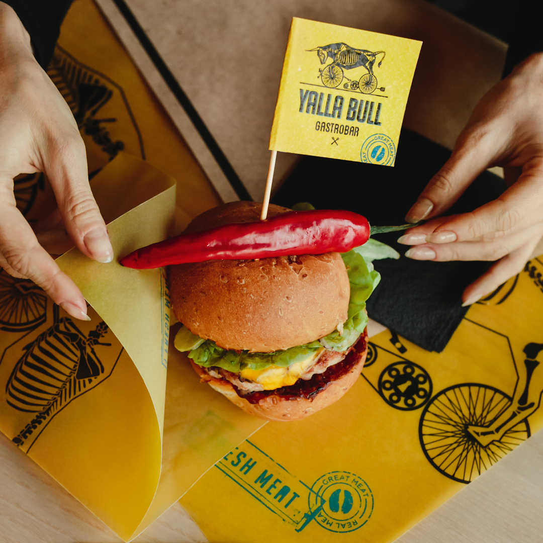
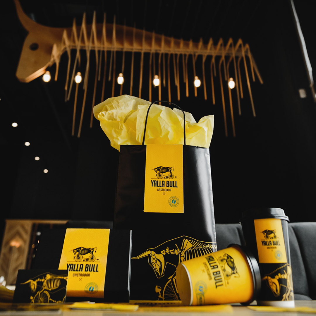
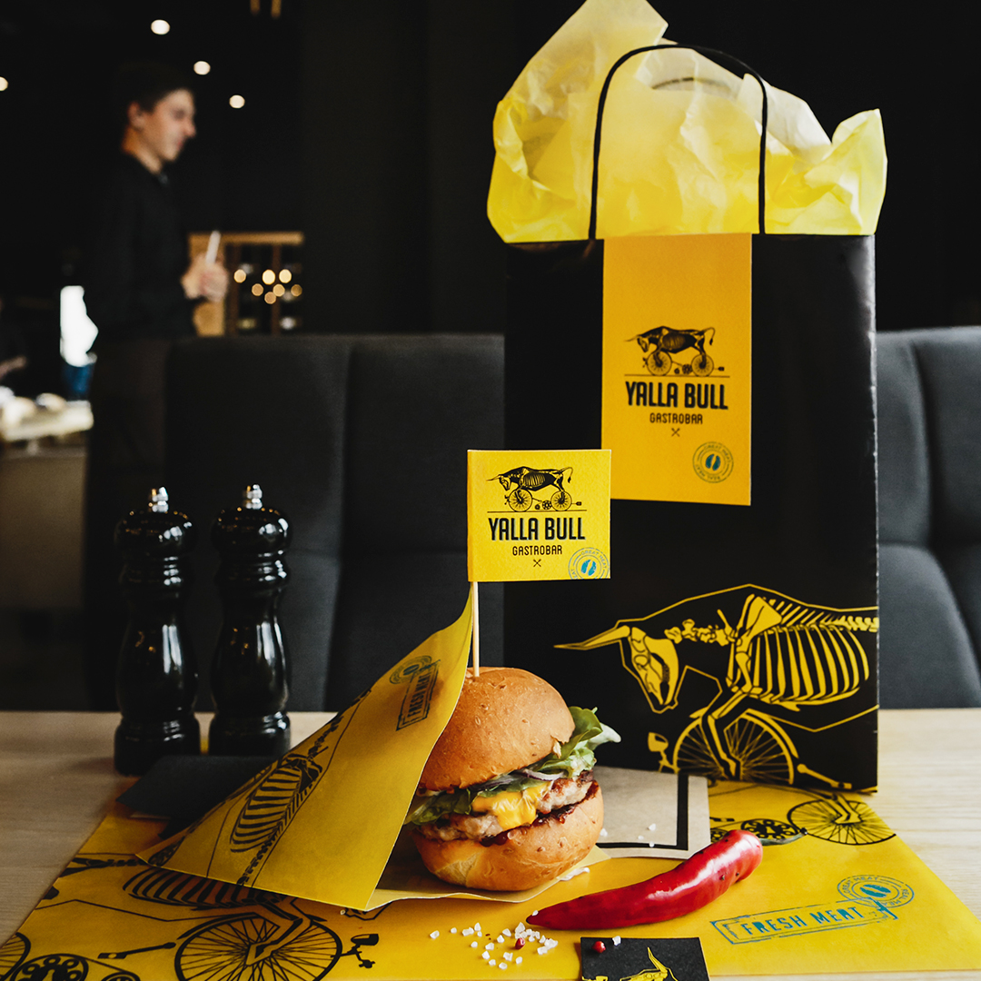
Yalla Bull is a restaurant, which specialises in the meat meals and burgers, based on the Texas recepies of cooking stakes and cutlets. The idea of the name is based on the Texas dialect, where the word yellow sounds like yalla, thus, we decided to highlight this Texas pronunciation. In the image we used a bull in an extraordinary and weird modification. We used the images of kitchenware and bicycle wheels as the parts of the bull to create a surrealistic image. This made the logo really memorizable and non-agressive
CREDIT
- Agency/Creative: olena Fedorova
- Article Title: Identity and Packaging Design for Gastro Pub Yalla Bull
- Organisation/Entity: Freelance, Published Commercial Design
- Project Type: Identity
- Agency/Creative Country: Ukraine
- Market Region: Multiple Regions
- Project Deliverables: Brand Architecture, Brand Identity, Brand Naming, Brand World, Branding, Graphic Design
- Industry: Food/Beverage
FEEDBACK
Relevance: Solution/idea in relation to brand, product or service
Implementation: Attention, detailing and finishing of final solution
Presentation: Text, visualisation and quality of the presentation


