“Pyaterochka” is the largest trade network of “store by the house” format in Russia. Recently the company has launched an internship program for senior students and graduates in administrative positions in the chain stores. “The Pyaterochka Challenge” gives students the opportunity to start their careers before they graduate. It is an opportunity for the company to attract young specialists to the team who are ready to introduce and adapt new technologies in the food retail.
The company asked DEZA Studio to create visual components of the internship program.
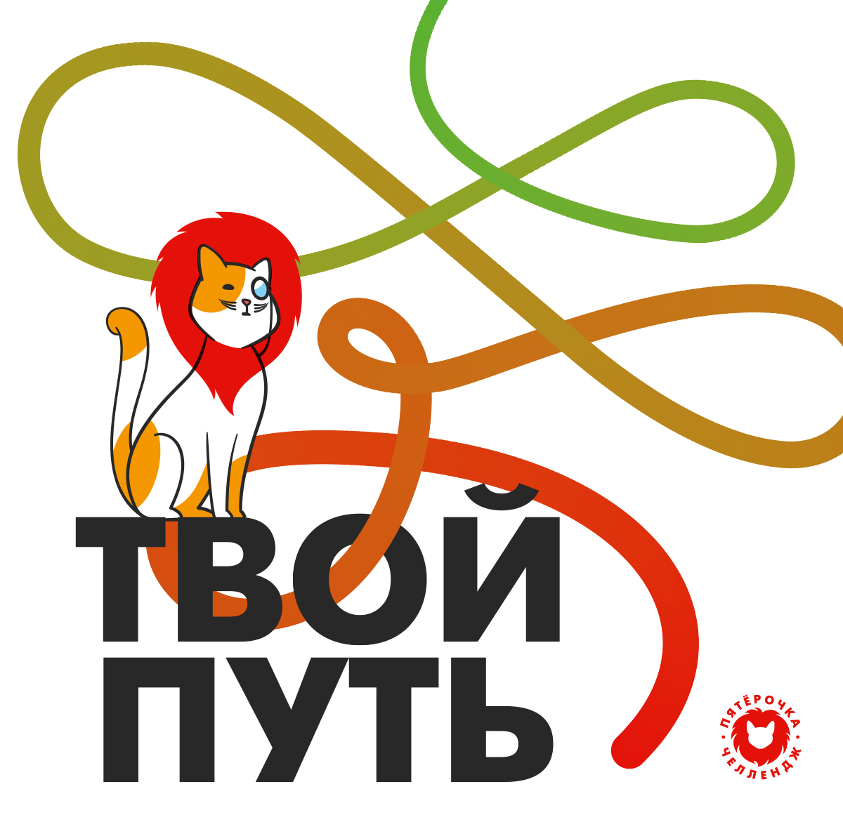
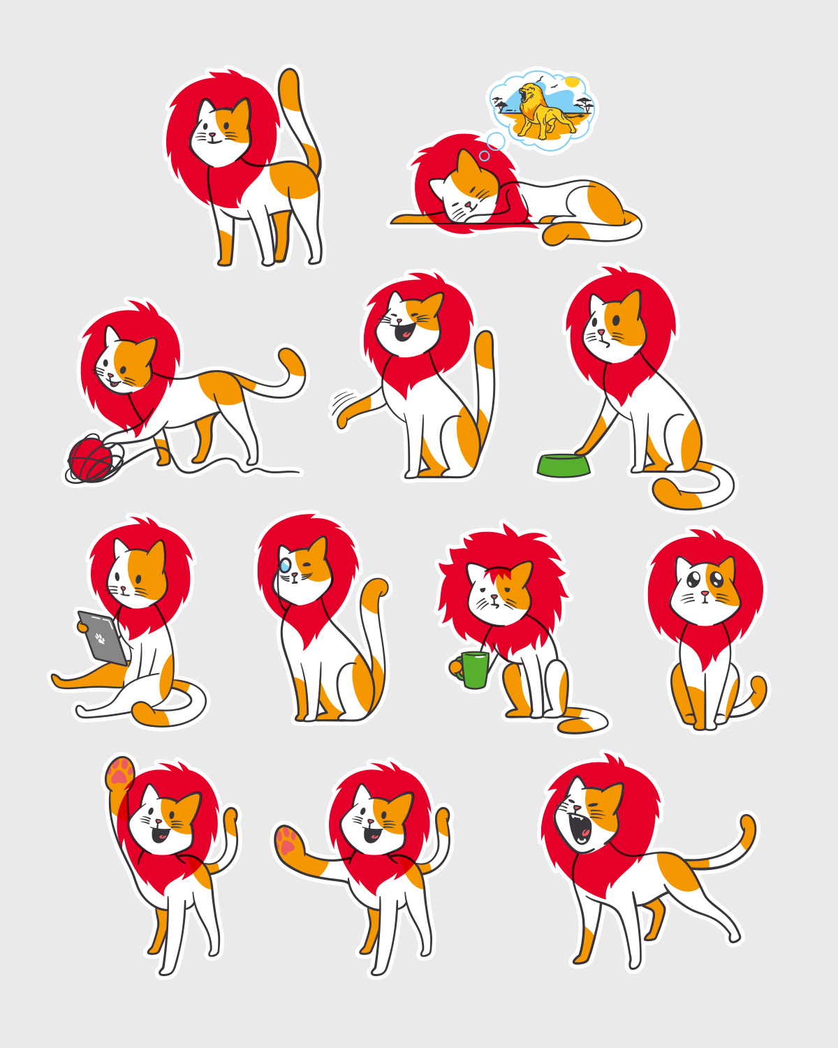
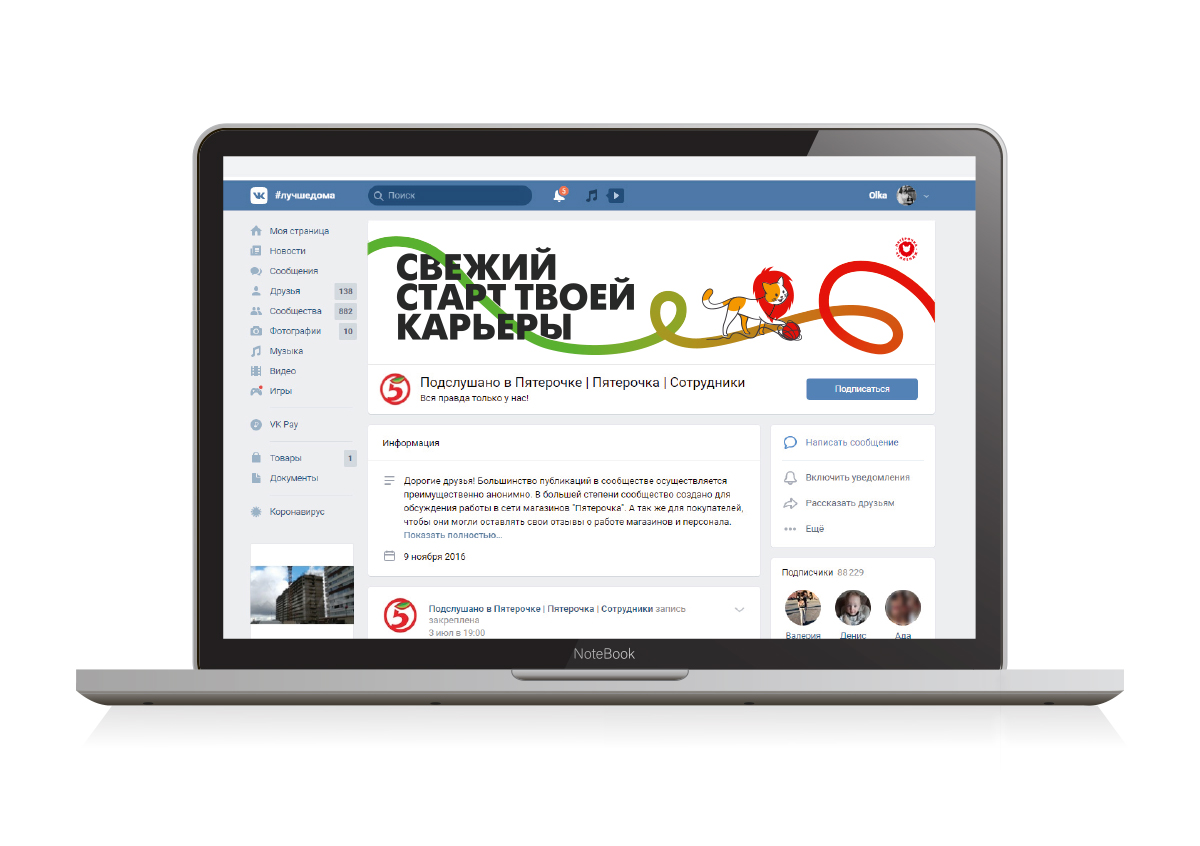
The internship program already had a logo and a sign, from which our main symbol, a cute brand character, – a friendly cat with a lion’s mane, was born. A cat’s mane is a constant element that symbolizes growing up, professional growth, experience and useful skills during the training process.The brand character is rather grown up, calm and wise in life, he acts as a mentor and senior friend of students.
The character’s mood, posture and behavior change depending on the message and situation, while his image remains the same: cat, mane, friendly and supportive.
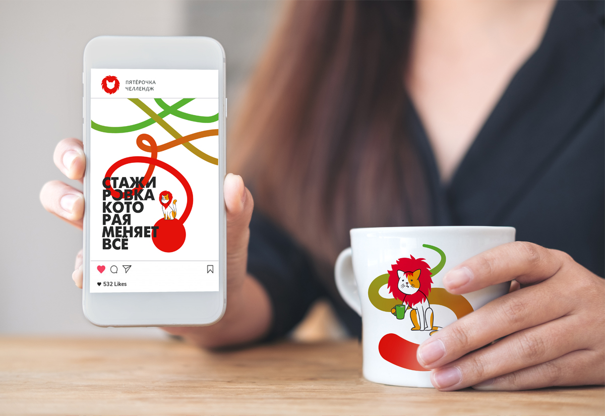
In identict, we develop the theme of the way and gaining professional strength. The path is a line, a thread from a tangle, which is unwound by a cat. It is a peculiar thread of Ariadne, holding on to which one can reach the achievements and successes. A cat is a guide for a man on this winding but grateful path.
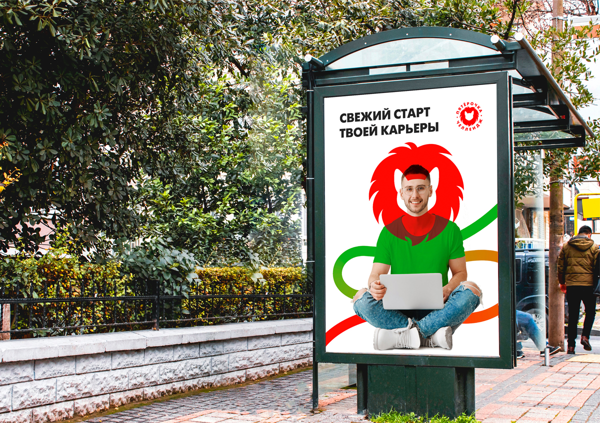
There are knots on the threads – stages and milestones of training, as well as loops and tangled places to be untangled by the trainee. The thread changes its color from green to branded red “Pyaterochka”. This is a metaphor – so a young, green employee in the process and as a result of an internship becomes a full professional and part of the company.
The elements of identica are present in the photographic images that convey the spirit of new discoveries, ambitions, aspirations for purpose and professional growth. The general slogan of the project, “A fresh start to your career” and texts like “You’ll make a big leap”, “You’ll become stronger and braver” are used in advertising messages.
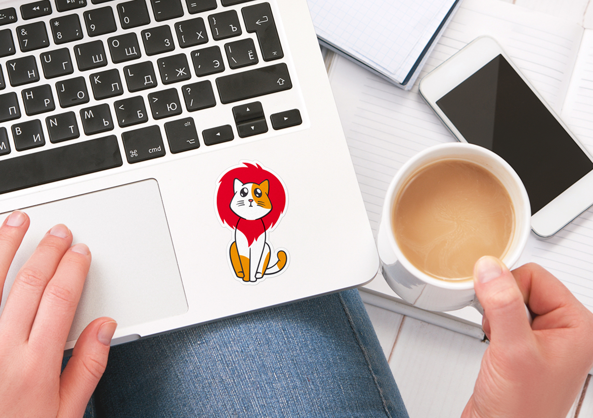
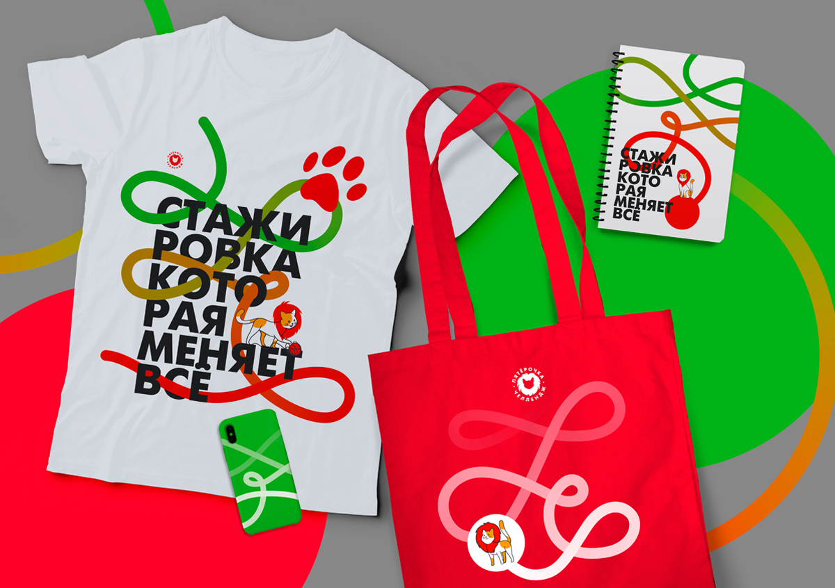
At the end we placed the identity and brand character on the souvenir products – four sets of gift sets, the filling of which varies depending on the status of the internship participants.
The result of the project is an identity that reflects the essence of the internship program and symbolizes the opportunities for professional growth of young specialists in a leading company.

CREDIT
- Agency/Creative: Studio DEZA
- Article Title: Identity and Brand Character of the Internship Program Design by Studio DEZA
- Organisation/Entity: Agency, Published Commercial Design
- Project Type: Packaging
- Agency/Creative Country: Russia
- Market Region: Europe
- Project Deliverables: Brand Creation, Graphic Design, Identity System, Illustration, Research
- Format: Bag
- Substrate: Fabric


