


When we are working for a new HoReCa projects we can try out to make a visual language more emotional.
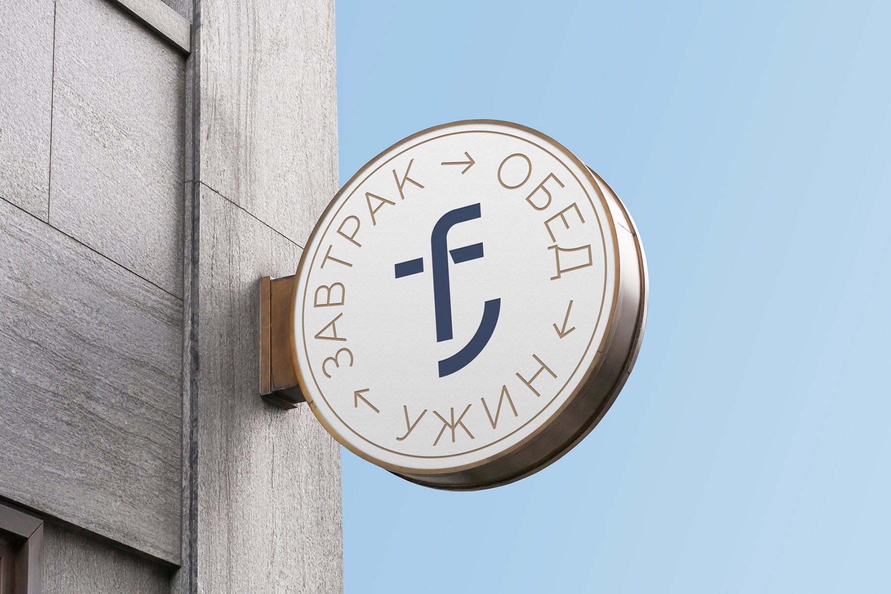
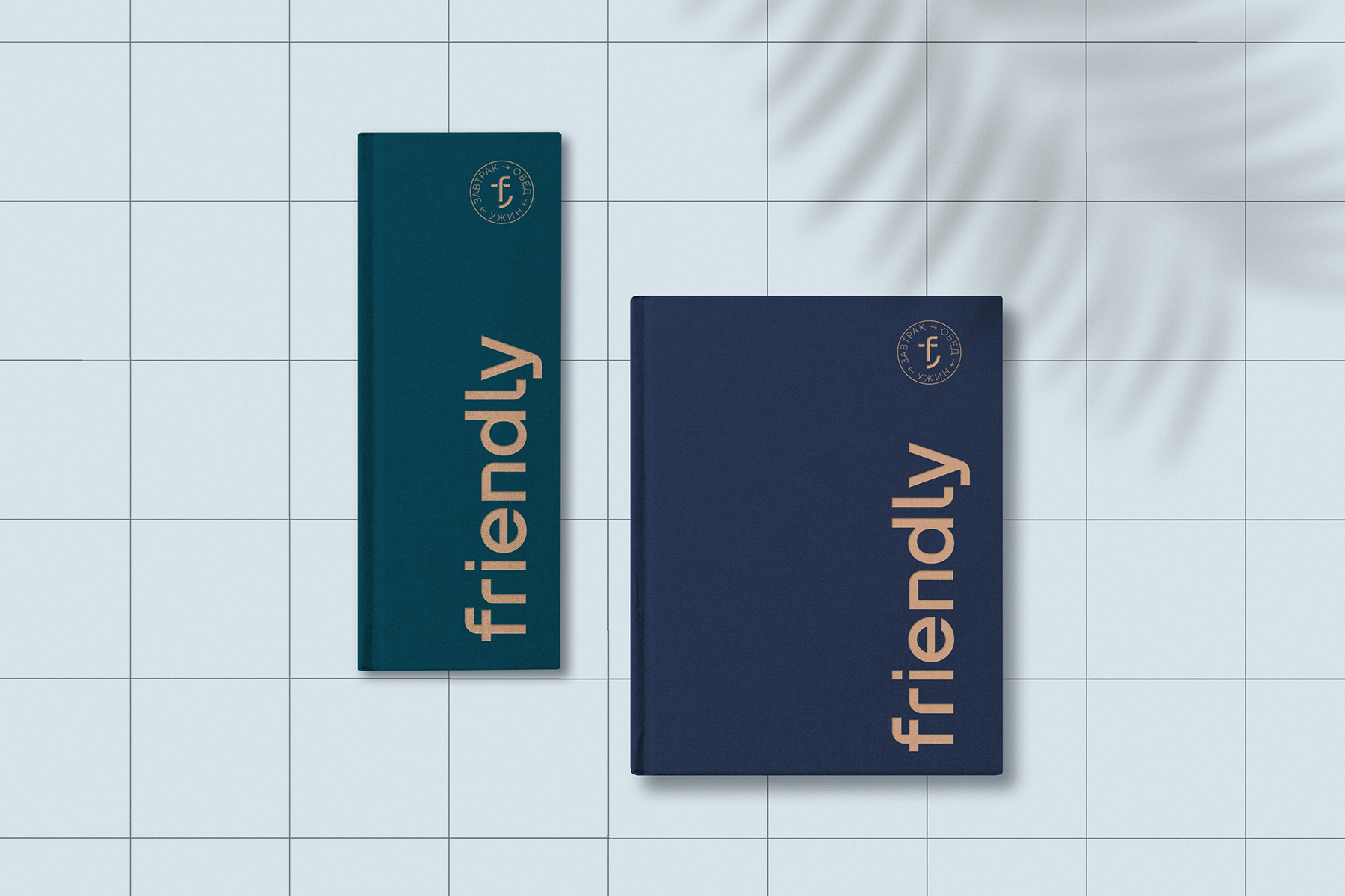
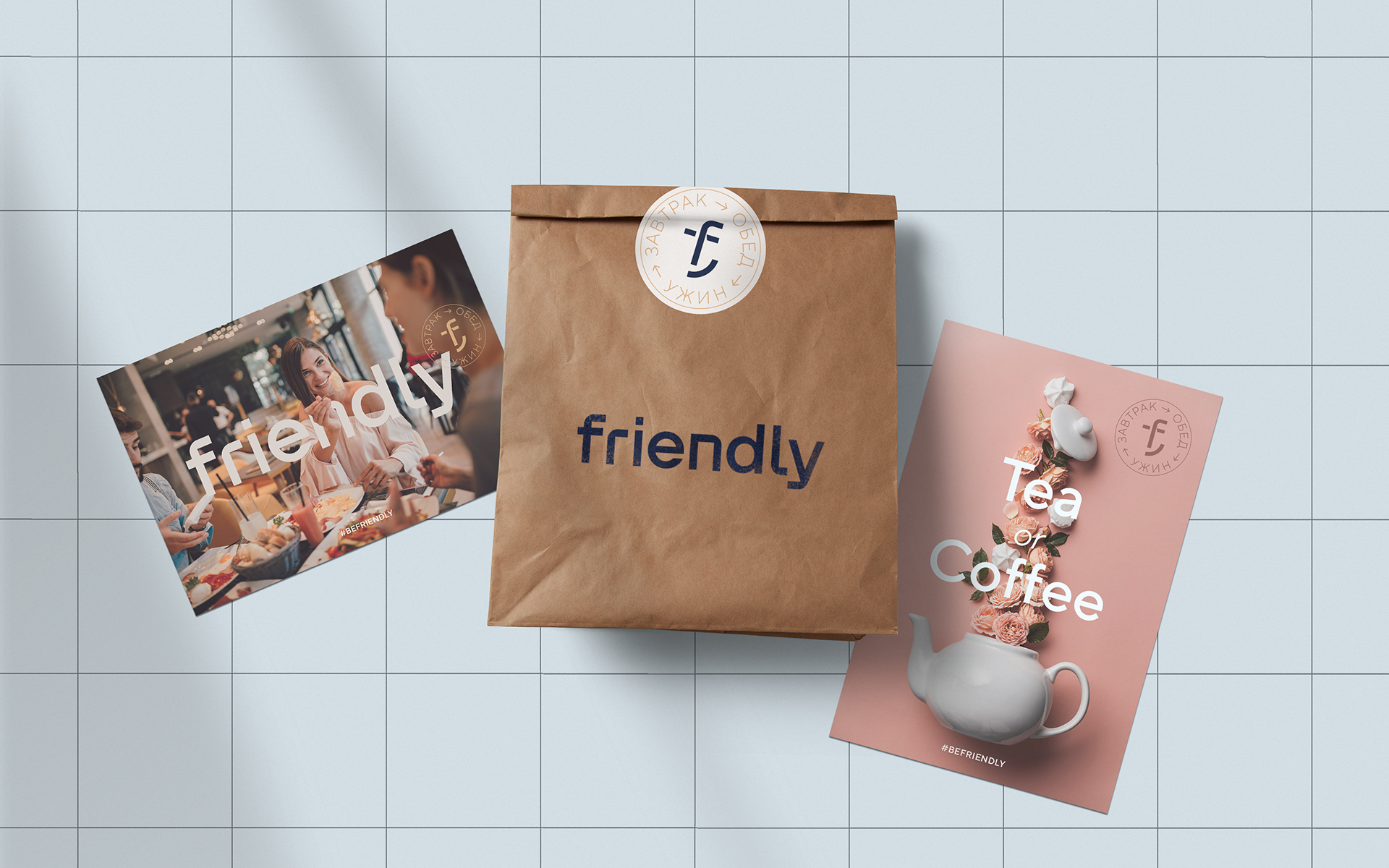
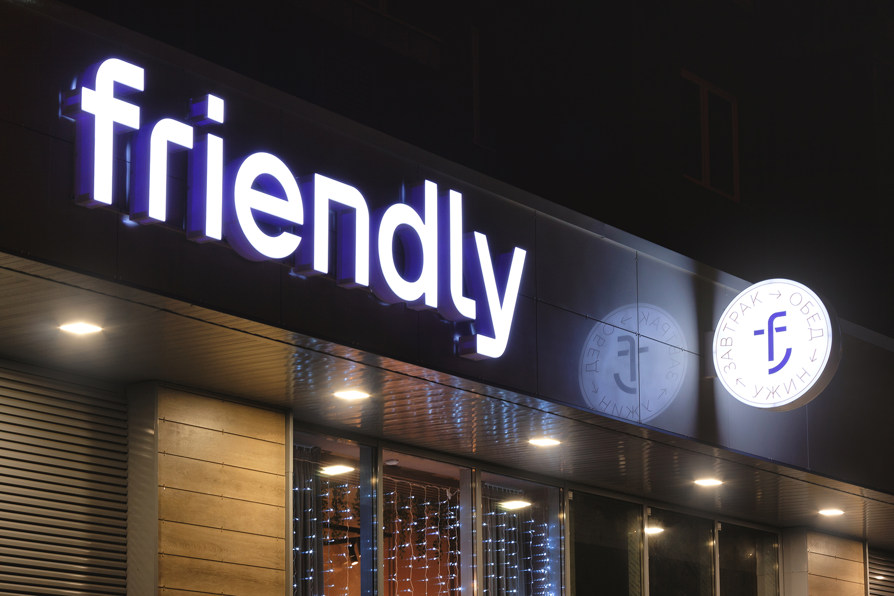
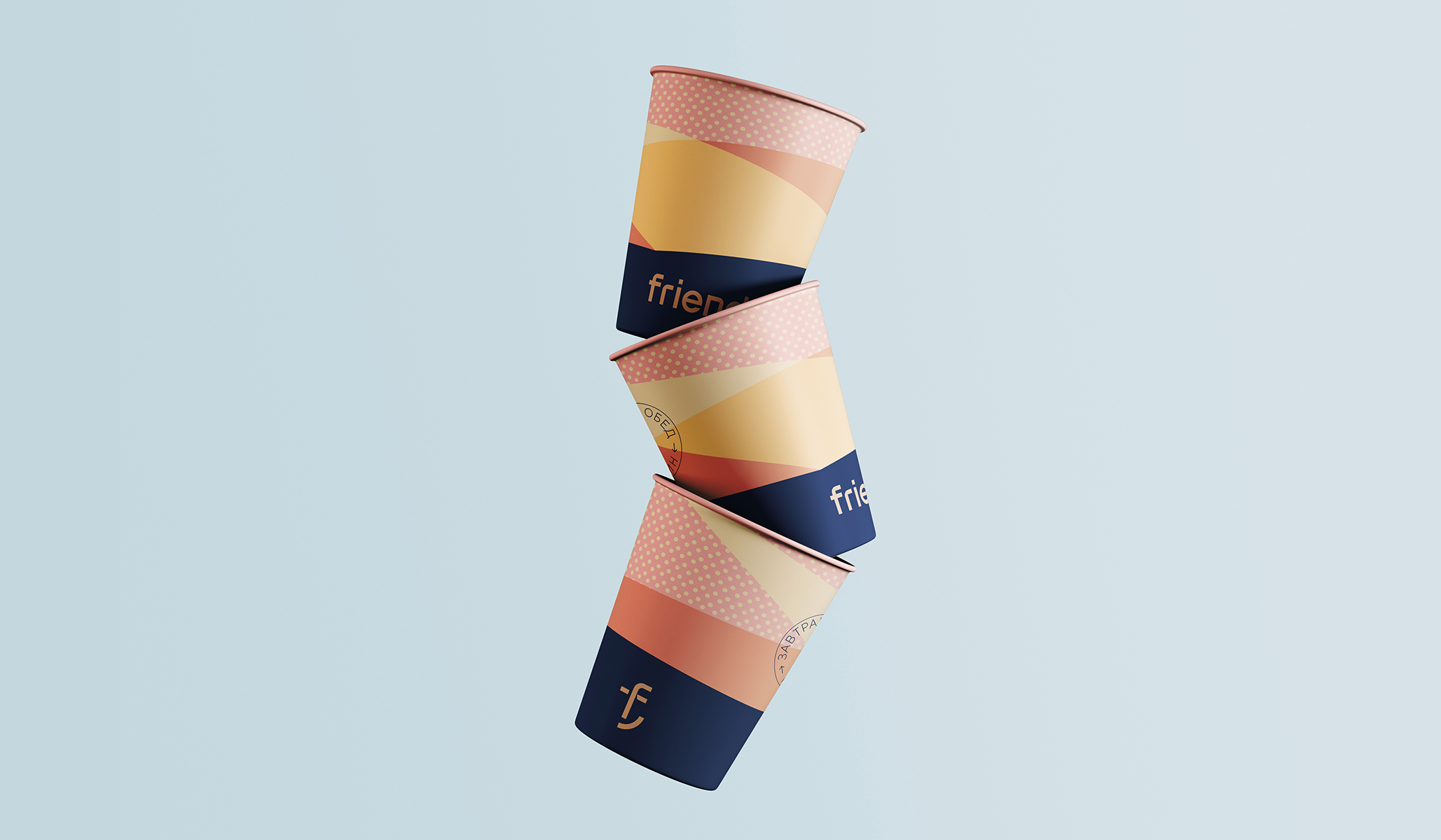
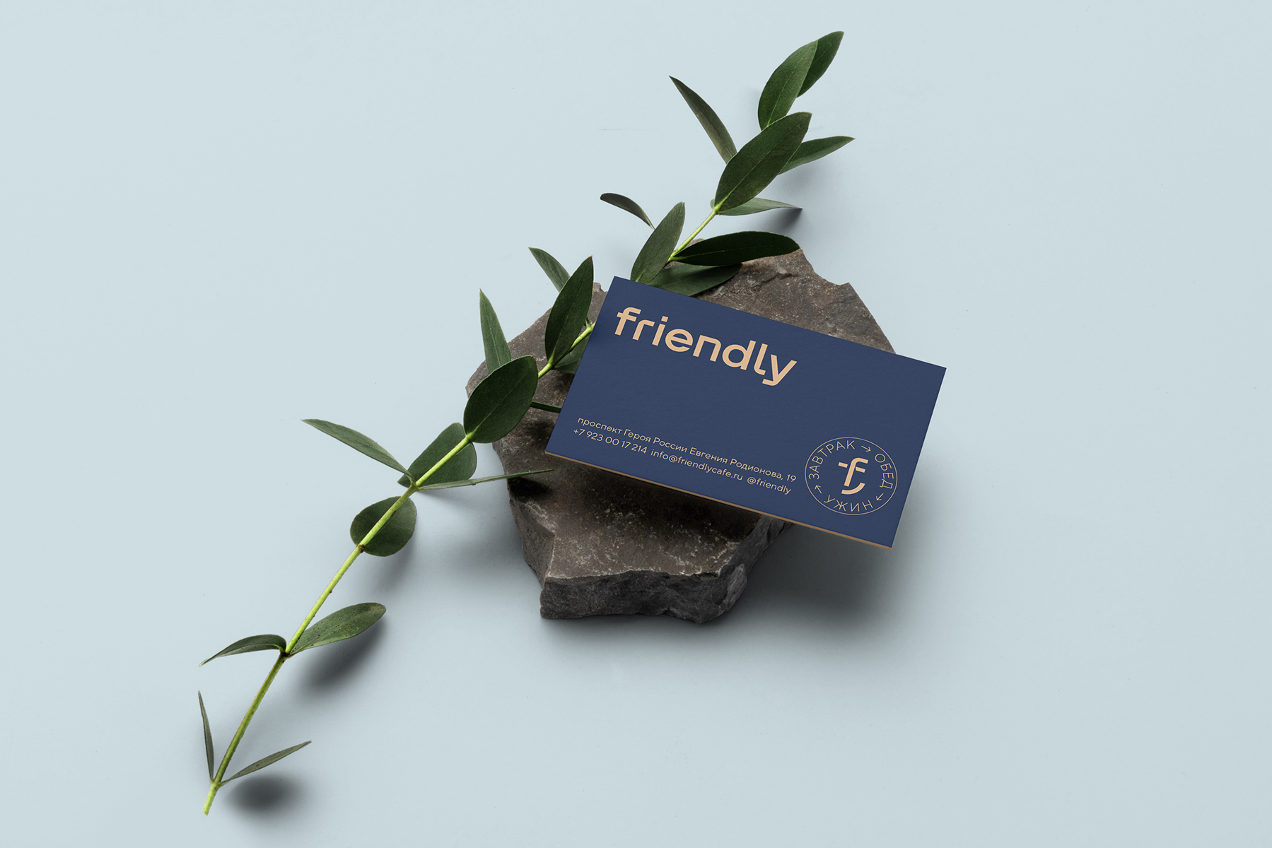
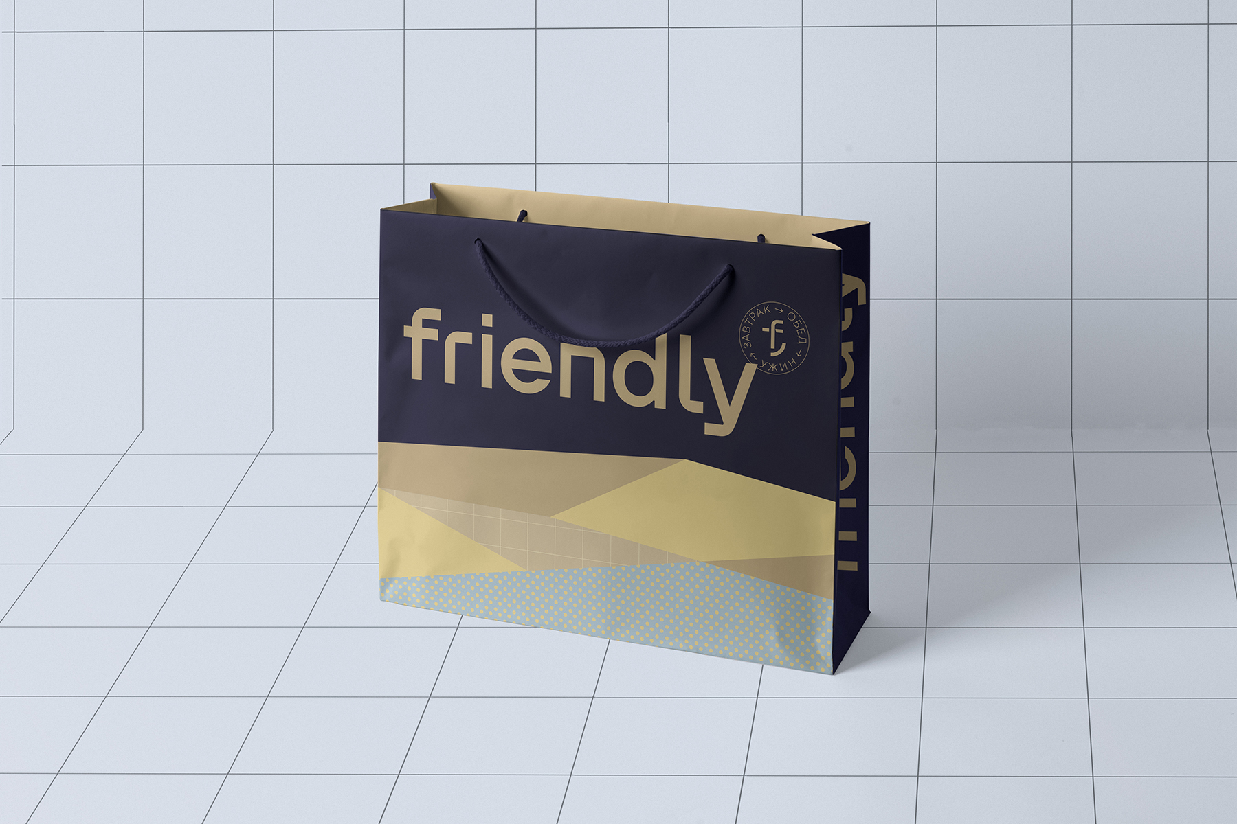
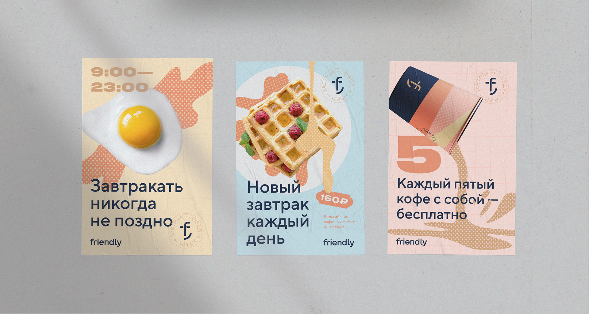
The feature of the Friendly project and its difference to other design projects is the simplicity and flexibility of the visual language.
We’ve created the unique patterns looks like a napkins and table cloths.
These patterns allowed us to transfer the individuality and character of the cafe, at the same time we can create many various and attractive layouts.
CREDIT
- Agency/Creative: Radar Agency
- Article Title: Identity and a Complete Package of Visual Communications for the City Cafe Friendly
- Organisation/Entity: Agency, Published Commercial Design
- Project Type: Identity
- Agency/Creative Country: Russia
- Market Region: Europe
- Project Deliverables: Branding, Graphic Design, Identity System, Research
- Industry: Food/Beverage
- Keywords: cafe, smile, pattern, identity
FEEDBACK
Relevance: Solution/idea in relation to brand, product or service
Implementation: Attention, detailing and finishing of final solution
Presentation: Text, visualisation and quality of the presentation


