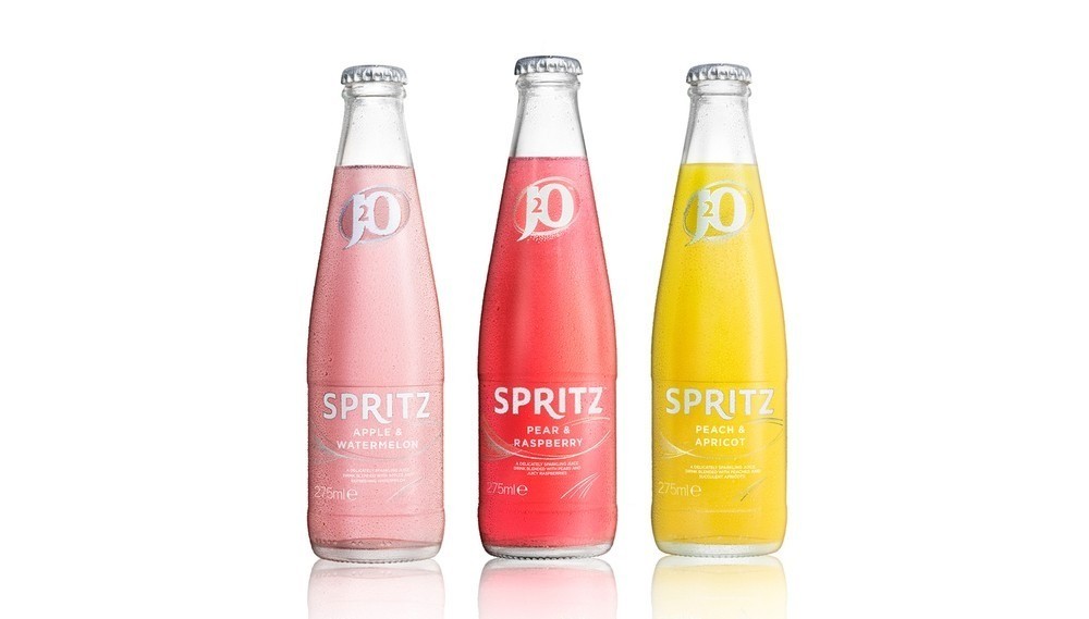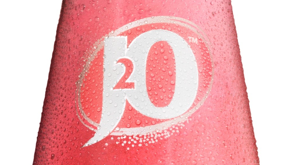
” Identica is appointed by J2O to design the logo and packaging for the new sub brand J2O Spritz, created to take the brand into new occasions.
Britvic created the lightly sparkling variant of J2O for adults looking for choice beyond alcohol when socialising. The name and design needed to appeal to an audience looking for something that feels special, has been designed exclusively for adults, and which fits in at a bar or restaurant when socialising.
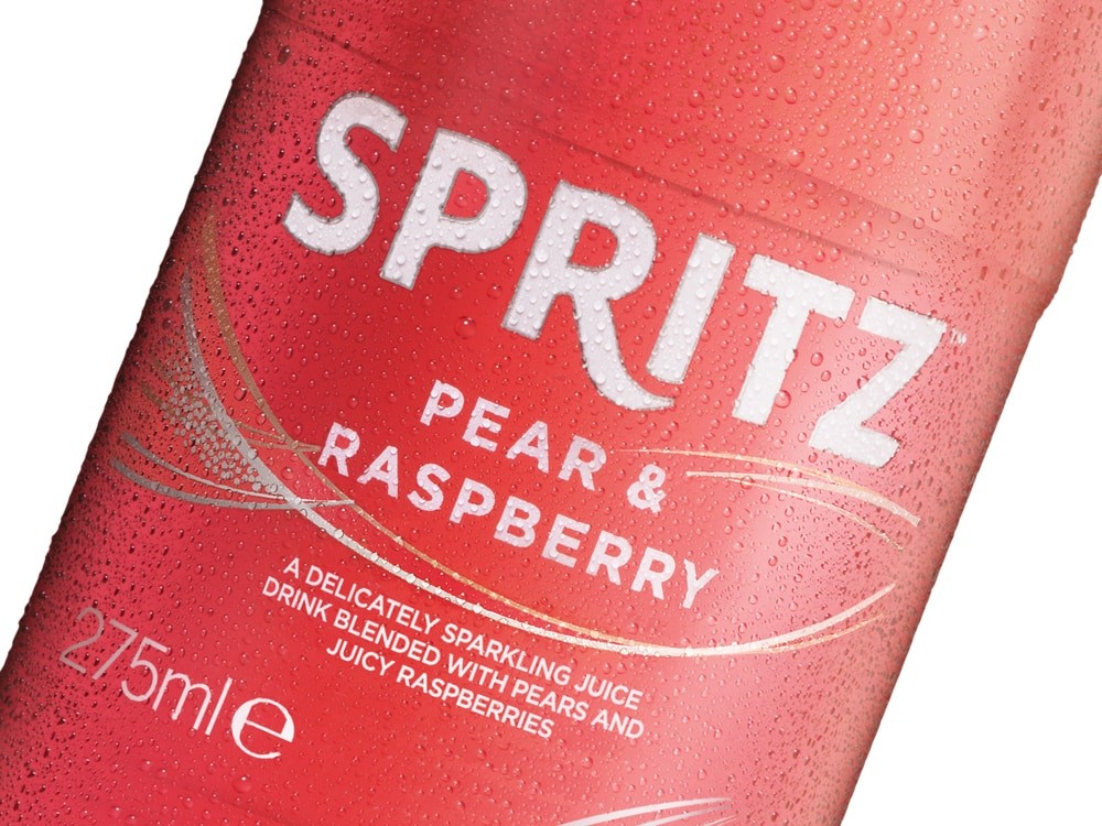
The name Spritz was chosen to communicate the light, sparkling, refreshing nature of the drink. The pack was designed to look premium and sophisticated, using white and silver to give it a minimalist, paired back look to appeal to an audience looking for something that has an understated confidence.
CHALLENGE
Drive J2O brand reappraisal and expand consumption into new social occasions through developing a range of gently sparkling fruit drinks, as a J2O sub brand.
INSIGHT
Adults are looking for a choice beyond alcohol when socialising. We needed to create something that feels special, is self evidently designed for adults, and fits in at a bar or restaurant to give consumers a sophisticated alternative to alcohol.
SOLUTION
The name Spritz was chosen to communicate the light, sparkling, refreshing nature of the drink. The pack was designed to feel sophisticated and special, using white and silver to give it a minimalist, paired back look to appeal to an adult audience. J20 Spritz goes on sale in March 2015, as part of a broader move to re-establish J20 as the soft drink choice for adults when socialising. “


