


Branding of the tourist complex
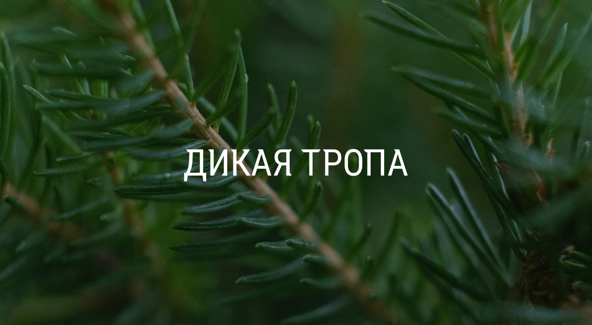
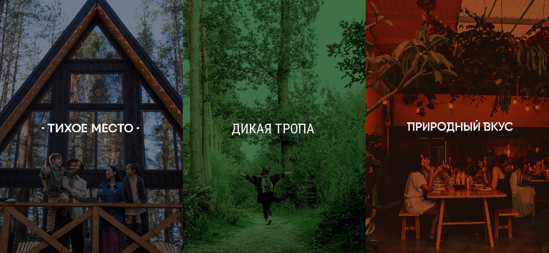
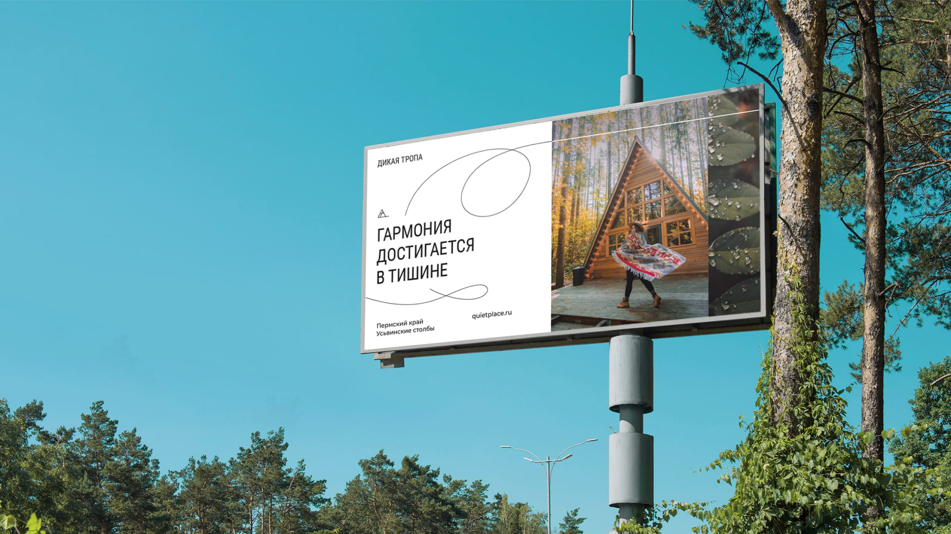
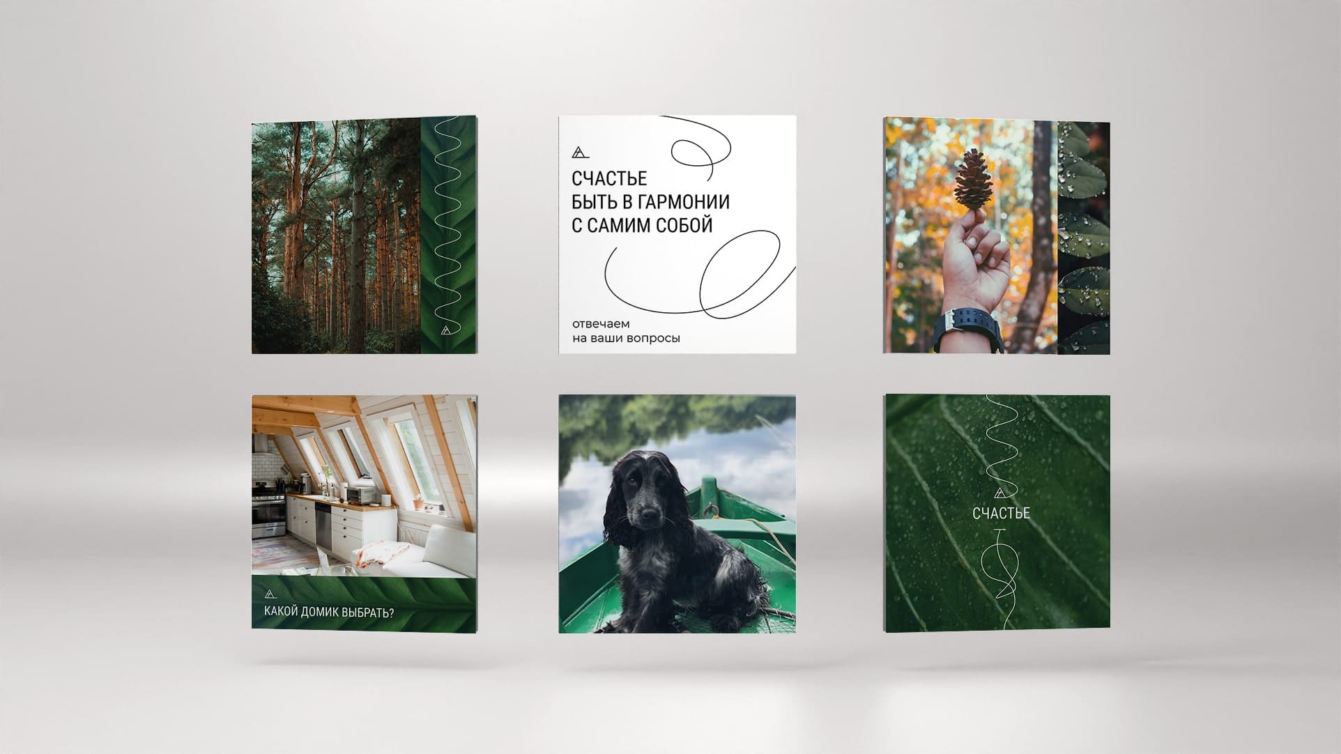
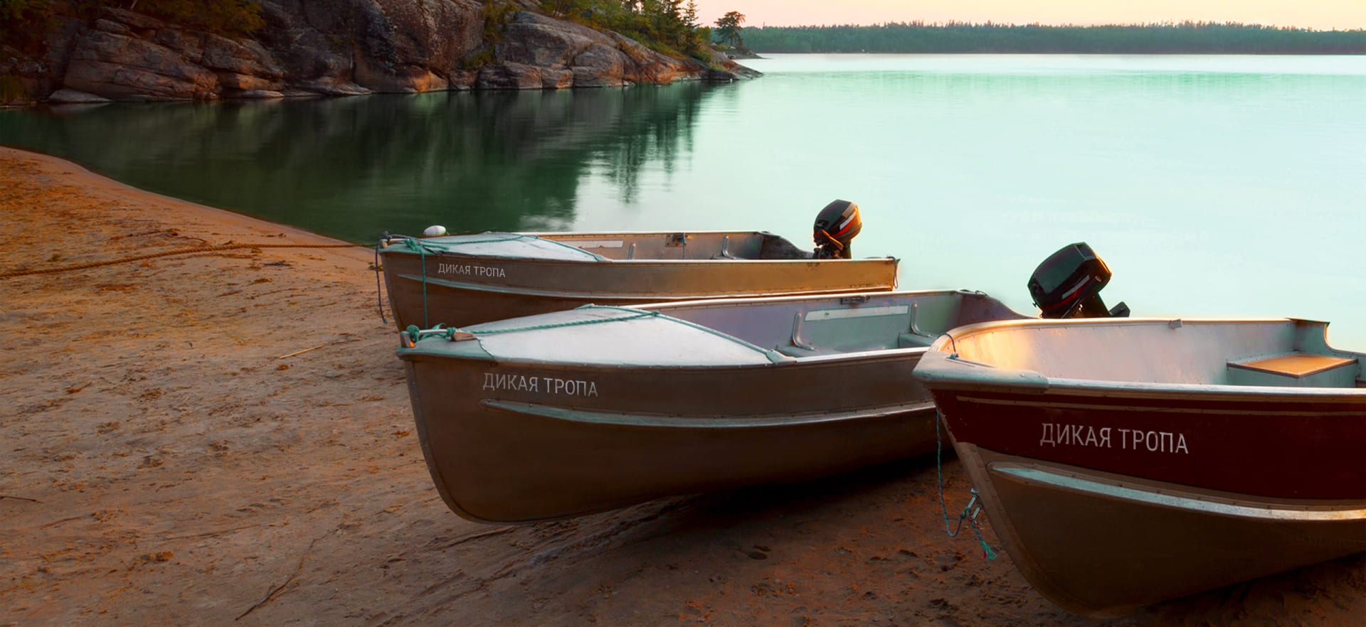
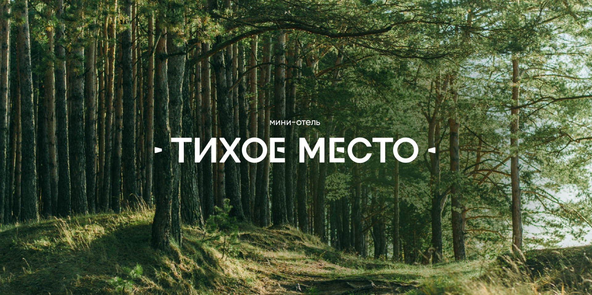
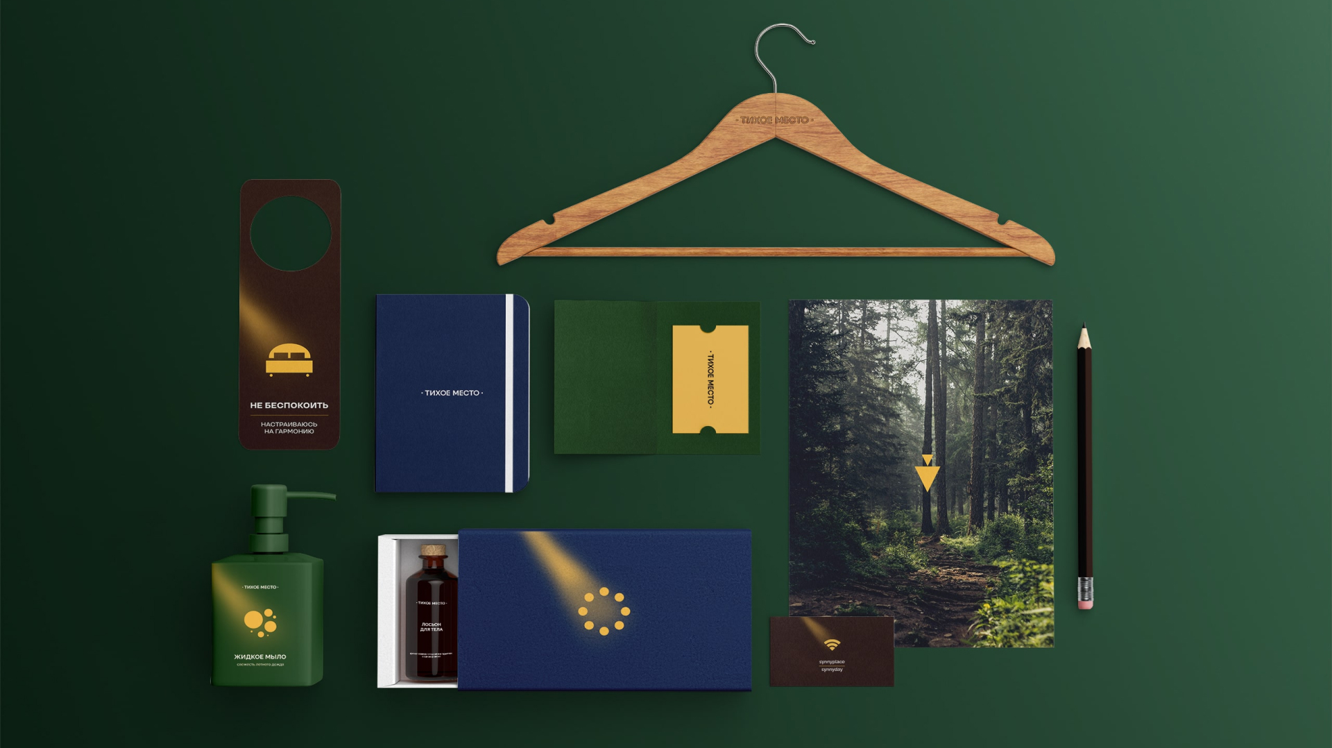
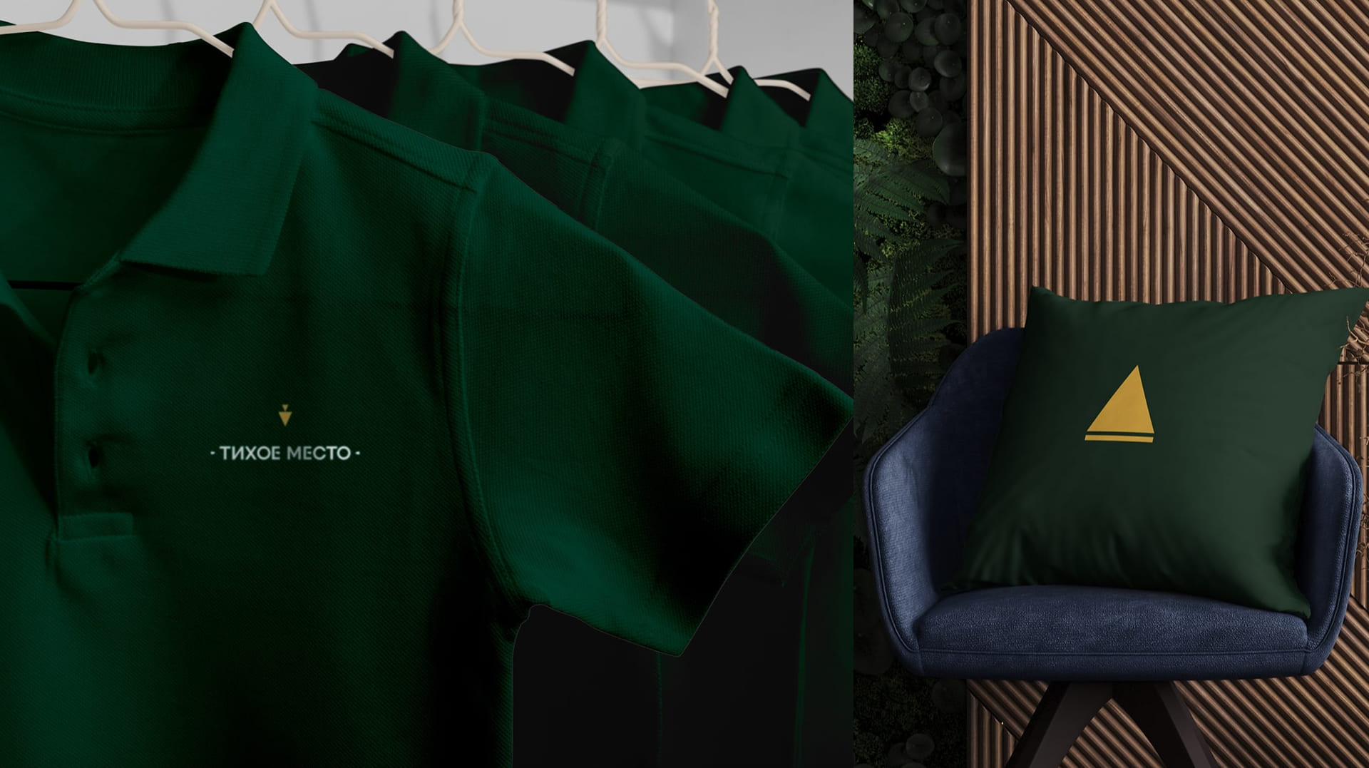
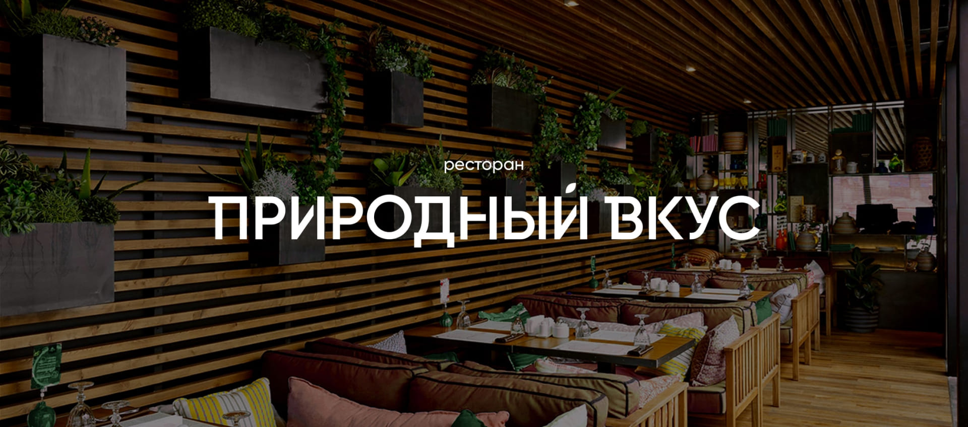
The new project of the suburban tourist complex “Wild Trail” will be located on the territory of the Usvinsky pillars — one of the most picturesque natural zones of the Perm Region. The object consists of an organized route along a mountain trail, a mini-hotel and its own restaurant. Despite belonging to the same project, we were tasked with making individual styles for each object in order to highlight each direction, and at the same time combine them into a single system. After conducting a study of the tourist market of the Urals in the category of suburban recreation, we found several key theses: the first is that the residents of the region have something to choose from for their country leisure, the market is saturated with offers, and the second is that they are open to a more European format of recreation for a change of scenery and new experiences in familiar locations. Based on these conclusions, we have built the image of a new brand.
Ural minimalism
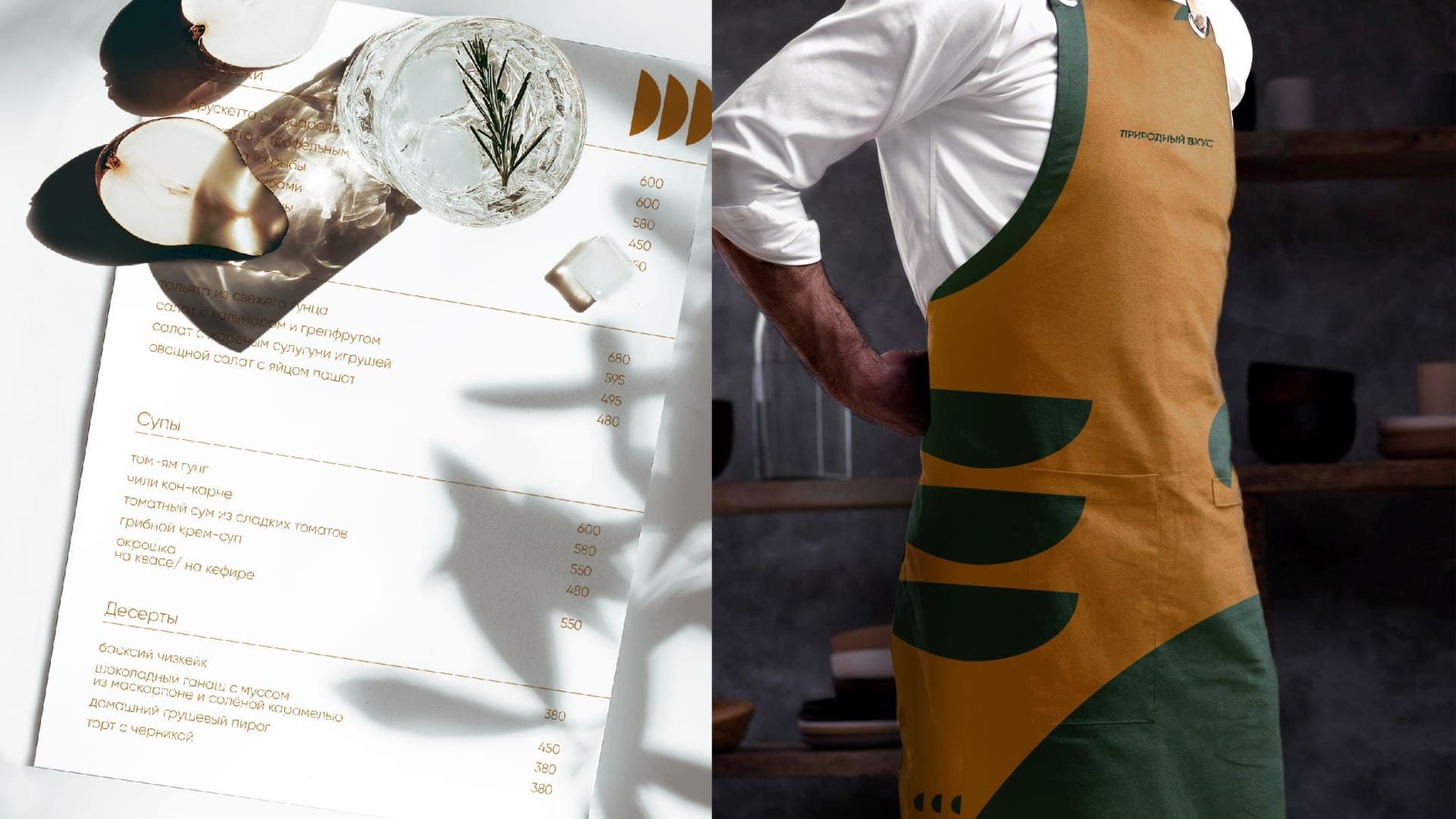
The nature of the Urals is beautiful in itself. In order to keep the focus on local beauties, the key thesis in building the brand was the concept of “Ural minimalism”. In it, we have combined the location binding to the region and the popular global trend in the design of spaces, in the manner of service and even in the way of life. So, in contrast to the opinion about the “severity” of local residents, we create for them the opportunity to choose between a familiar vacation and a place where you can get high service while traveling in the countryside. Ural minimalism is inspired by Scandinavian minimalism and will resonate with connoisseurs of European aesthetics and approach to guests. Individual styles have been developed for different directions, but they are united by common principles: a minimum of details, simple and easy-to-read fonts, natural colors close to natural ones. This will allow the guests of the complex to focus on the service and local views.
CREDIT
- Agency/Creative: ICU
- Article Title: ICU Reflected the Nature of the Urals in the Branding of the Tourist Complex
- Organisation/Entity: Agency
- Project Type: Campaign
- Project Status: Published
- Agency/Creative Country: Thailand
- Agency/Creative City: Bangkok
- Market Region: Global
- Project Deliverables: Brand Identity, Brand Strategy, Branding
- Industry: Entertainment
- Keywords: brand strategy, brand core, brand identity
-
Credits:
Creative Director:: Alexey Molchanov


