


Client
Komandor is a brand of paints and coatings with a history of over 10 years. During this time, the company has successfully identified its target audience and met all the needs within its category: high-quality production, durable coatings, and reasonable pricing. Today, it is a strong player in the paint market.
Task
With such a long history, the brand’s visual identity may become outdated, which is what the production team believed had happened. Our task was to develop a new identity and metaphor for the brand.
Audience research
During the project deep dive, we discovered that the audience perceives the Komandor brand as one that doesn’t strive for sophistication or exclusivity. We further identified that the brand’s audience is not composed of refined designers, but rather construction foremen, finishing specialists, and suburban homeowners. These individuals value simplicity and product efficiency over marketing promises. Based on this data, we decided that the idea should be as straightforward as possible.
Competitor analysis
We analyzed the competitive landscape in terms of color schemes, typography, and stylistic approaches. We identified key trends: the use of paint splashes, packaging overloaded with slogans, massive logos, and a dominance of dark and bright color schemes. There were two options for the brand’s development: to align with these current trends for clarity or to stand out among competitors for better recall. Both the client team and our team agreed that the second option would better reflect the brand’s renewal.
Metaphor
One of the first associations with the word “Komandor” is the sea and navigation. The highly competitive paint market features various brands that can easily confuse the buyer. We will be the one to guide them in the right direction, becoming their navigator in the sea of paints.
Graphic Solution
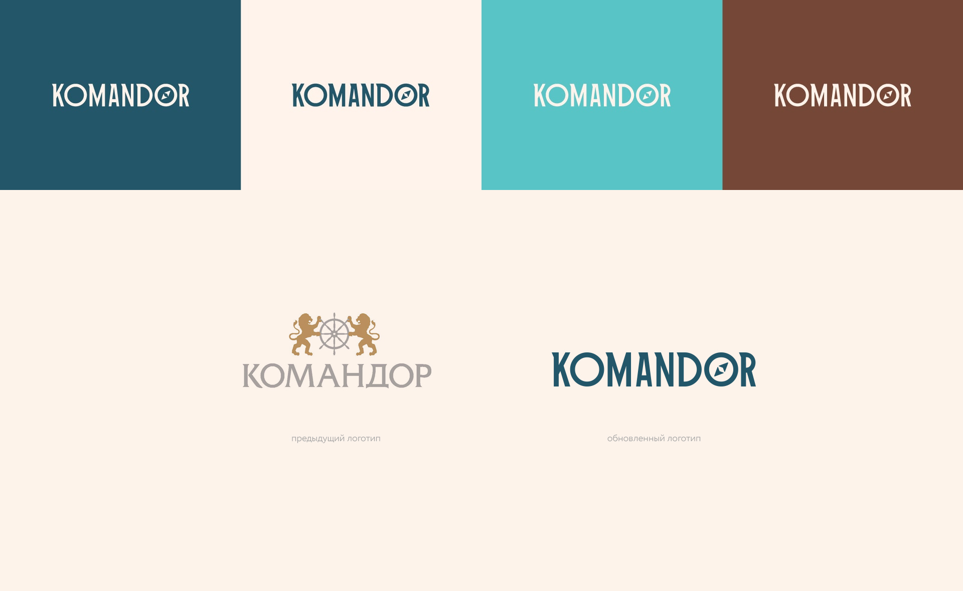
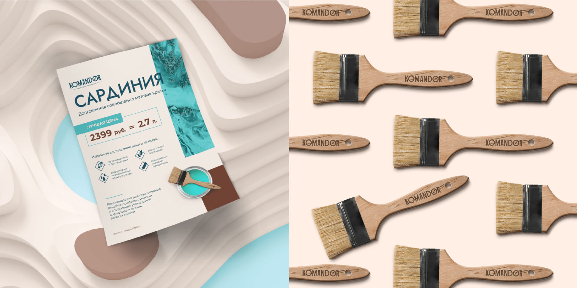
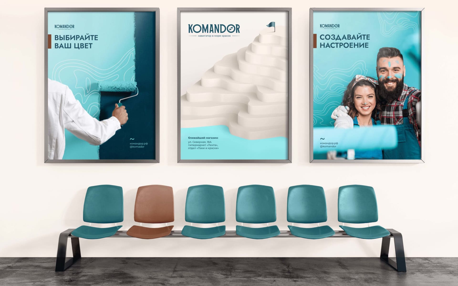
Despite the simple metaphor, it was important to execute it in an original way to help the brand visually stand out on the shelf. We used a vertically stretched font in the logo to convey the company’s leadership qualities and confidence in the results. We integrated a compass into the font to support the navigation metaphor.
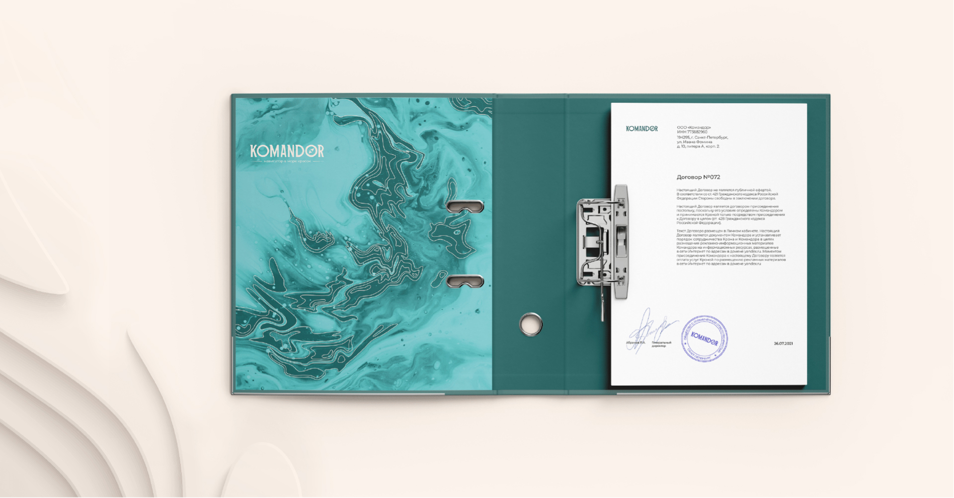
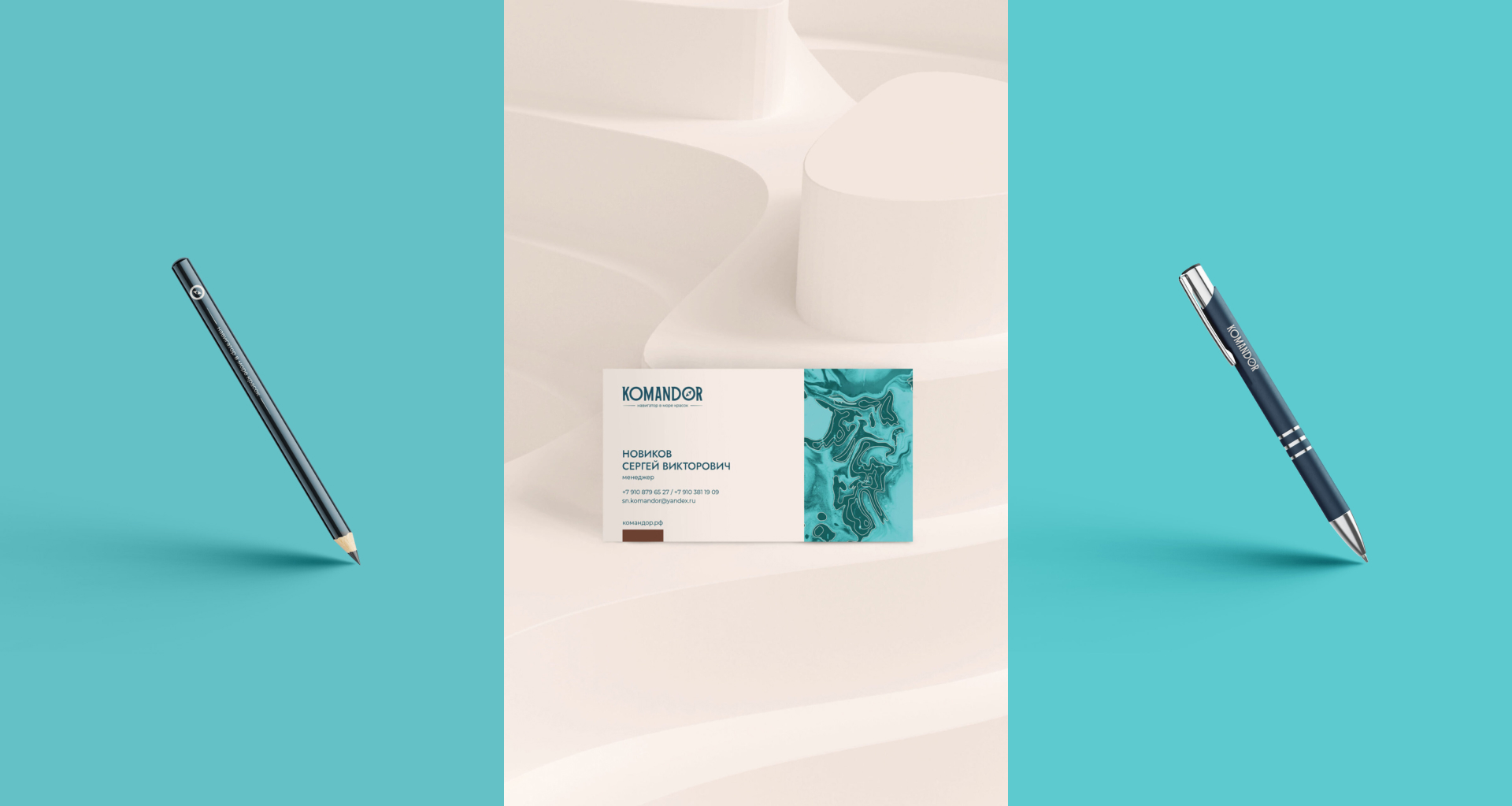
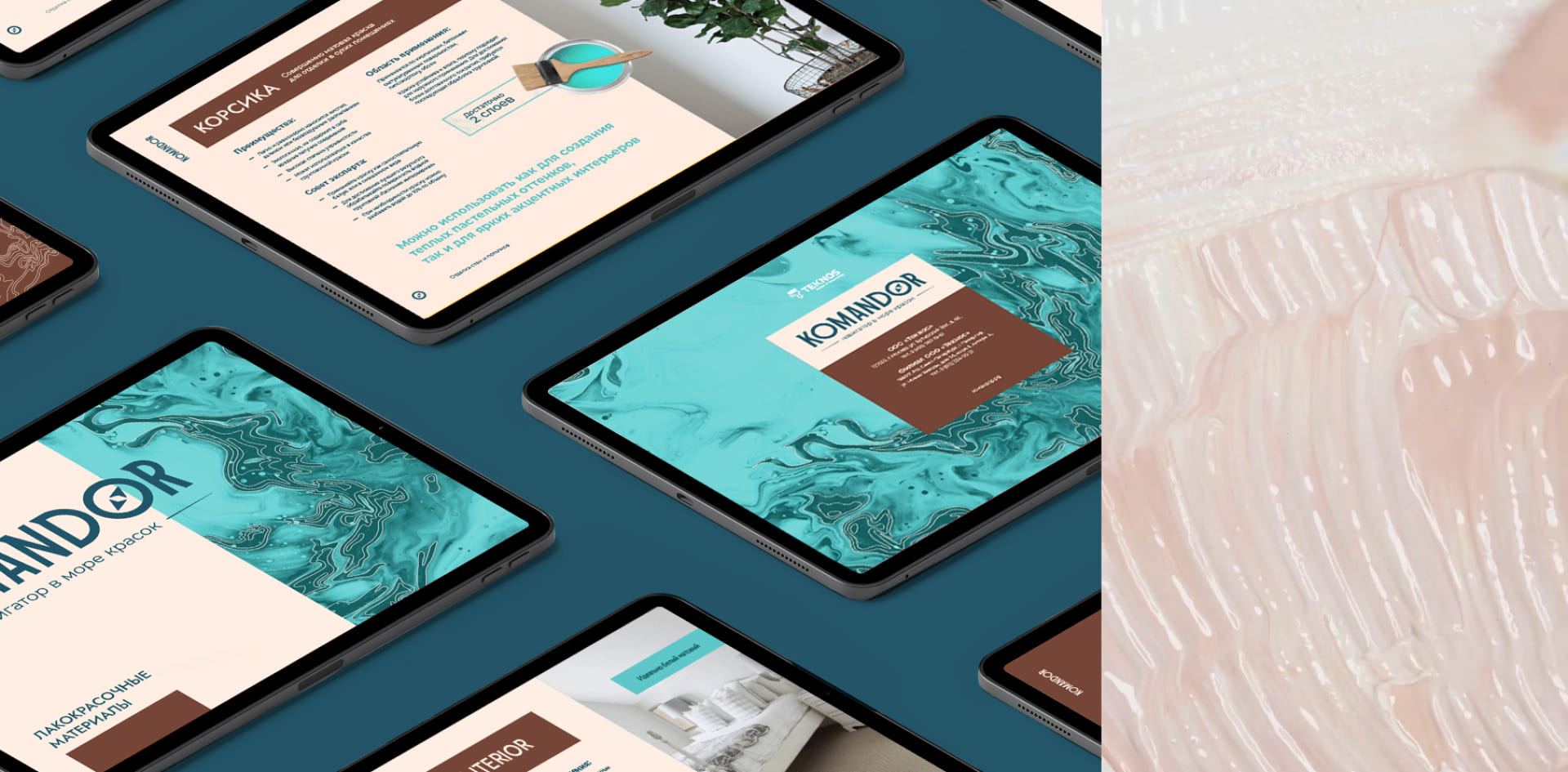
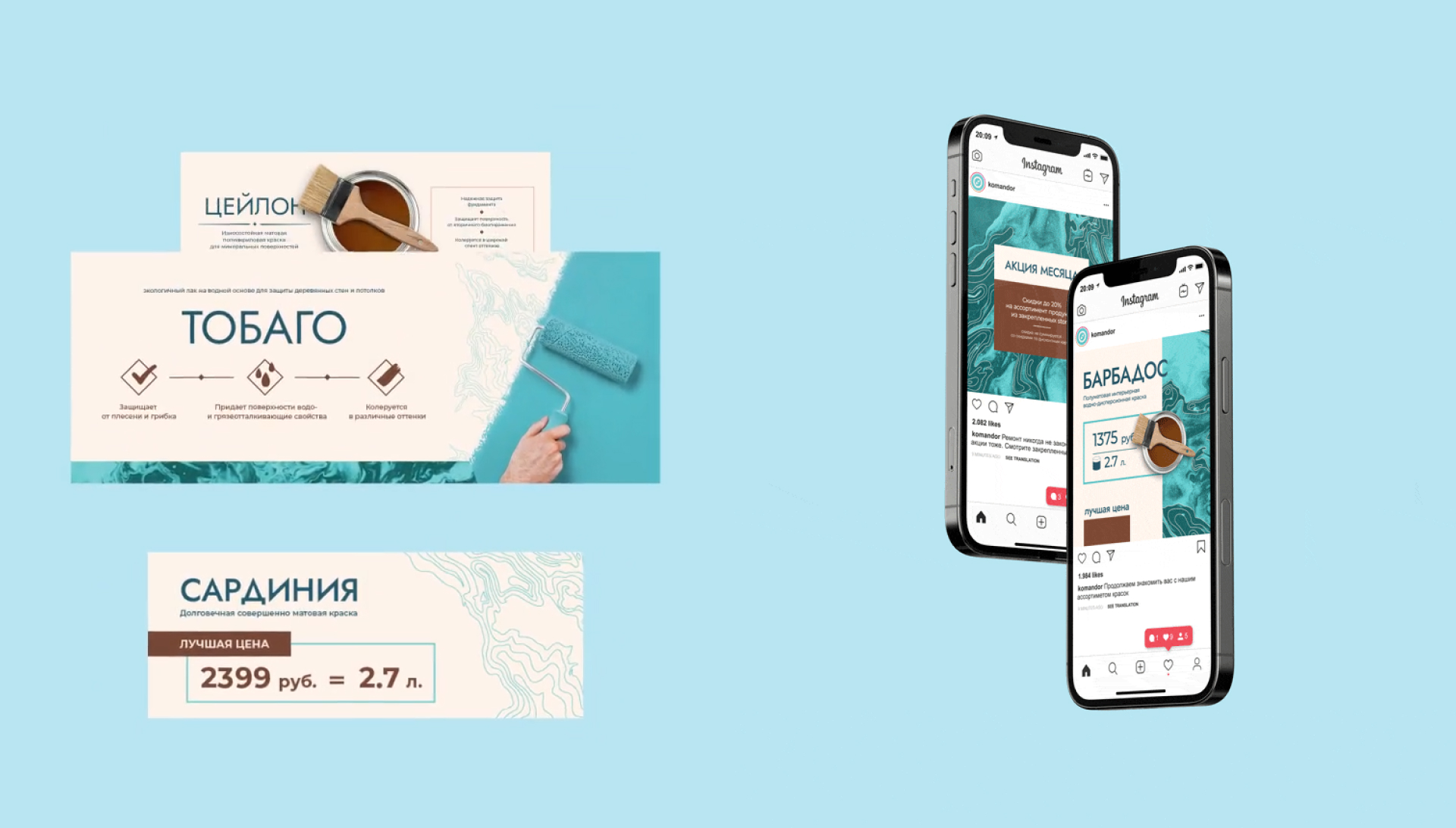
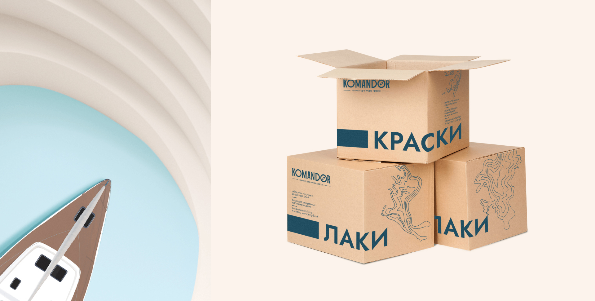
The signature design element became the combination of blurred paint and lines indicating sea depth levels. This created an association with a navigational chart, guiding customers to their ideal paint.
An important decision was to use turquoise instead of blue in the maritime aesthetic. This shade was not used by competitors. The color palette was chosen to reflect the spirit of the sea, a captain’s ship, and the world of maps. Turquoise conveyed the association with the sea and navigation. Brown reflected strong ties to past experience, while beige highlighted ease of use.
When scaling the brand element across different media, a specific pattern was followed. On promotional materials with little information, it occupied the entire surface of the layout. On informational materials, it took up only a small part to avoid complicating text perception.
In the layout of materials, we used a Scandinavian composition style, characterized by a lot of white space and high contrast in typography. By choosing this style, we emphasize the brand’s modern approach to product creation.
The new identity has refreshed the brand’s established values. The unique color palette will help make the product stand out on the shelf, while the light maritime association will easily fit into the minds of consumers who are accustomed to evaluating a product by its functional features.


CREDIT
- Agency/Creative: ICU
- Article Title: ICU Endowed the Value of Traditions with a Modern Look Through the Identity for the Komandor Paint Brand
- Organisation/Entity: Agency
- Project Type: Identity
- Project Status: Published
- Agency/Creative Country: Thailand
- Agency/Creative City: Bangkok
- Market Region: Global
- Project Deliverables: Brand Identity
- Industry: Construction
- Keywords: brand identity
-
Credits:
Creative Director: Alexey Molchanov
Brand Designer: Yulia Sukhareva
Project Manager: Elena Chernikova


