Loved throughout the world for delightful taste and natural healthy Swiss Alpine Herbs, Ricola appeals to a growing consumer base of those seeking a natural alternative, that both tastes good, and does you good.
The brand has a global reach across more than 45 countries, with the US being the biggest market.
A strategic review has led to a refined positioning, supported by design, advertising, and social media. The new positioning builds on Ricola’s roots, expressing the brand as nature-loving and down-to-earth. Offering a holistic vitalising sensation, Ricola is the sweet spot between good health and pure pleasure.
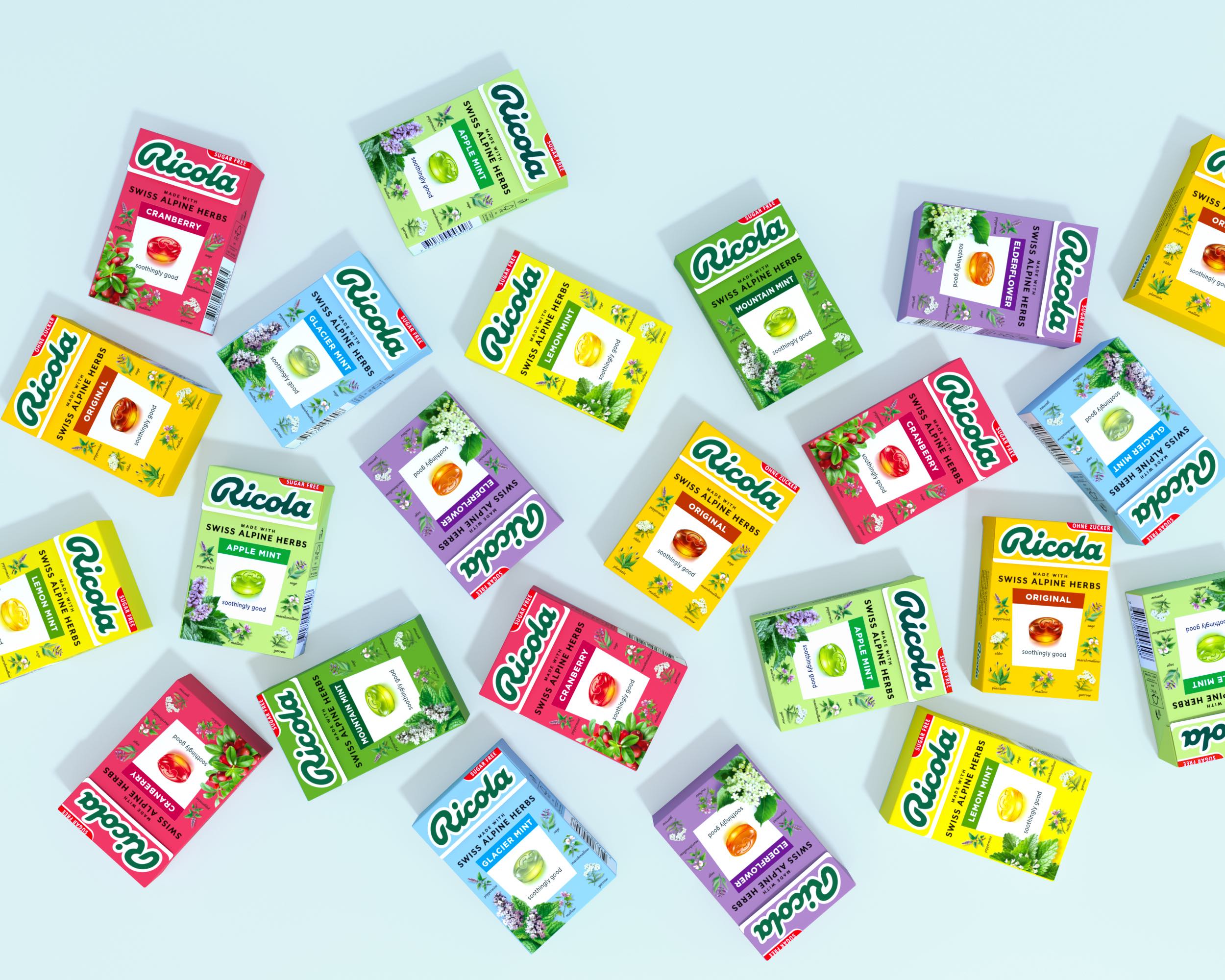
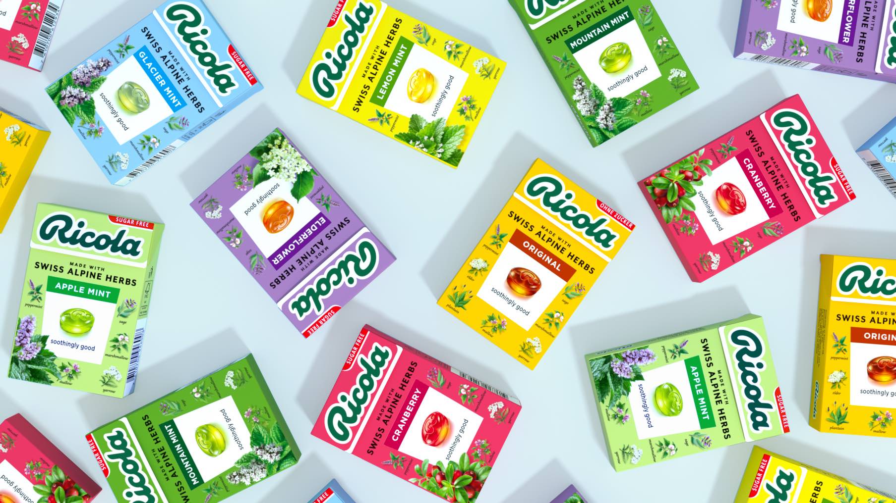
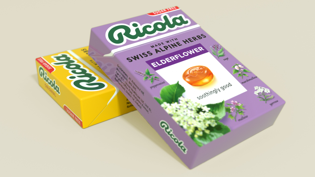
The new brand design by Lewis Moberly reflects this with a more confident contemporary stance, now clearly setting out the unique claim ‘made with Swiss Alpine Herbs’, locked into a modernised logo.
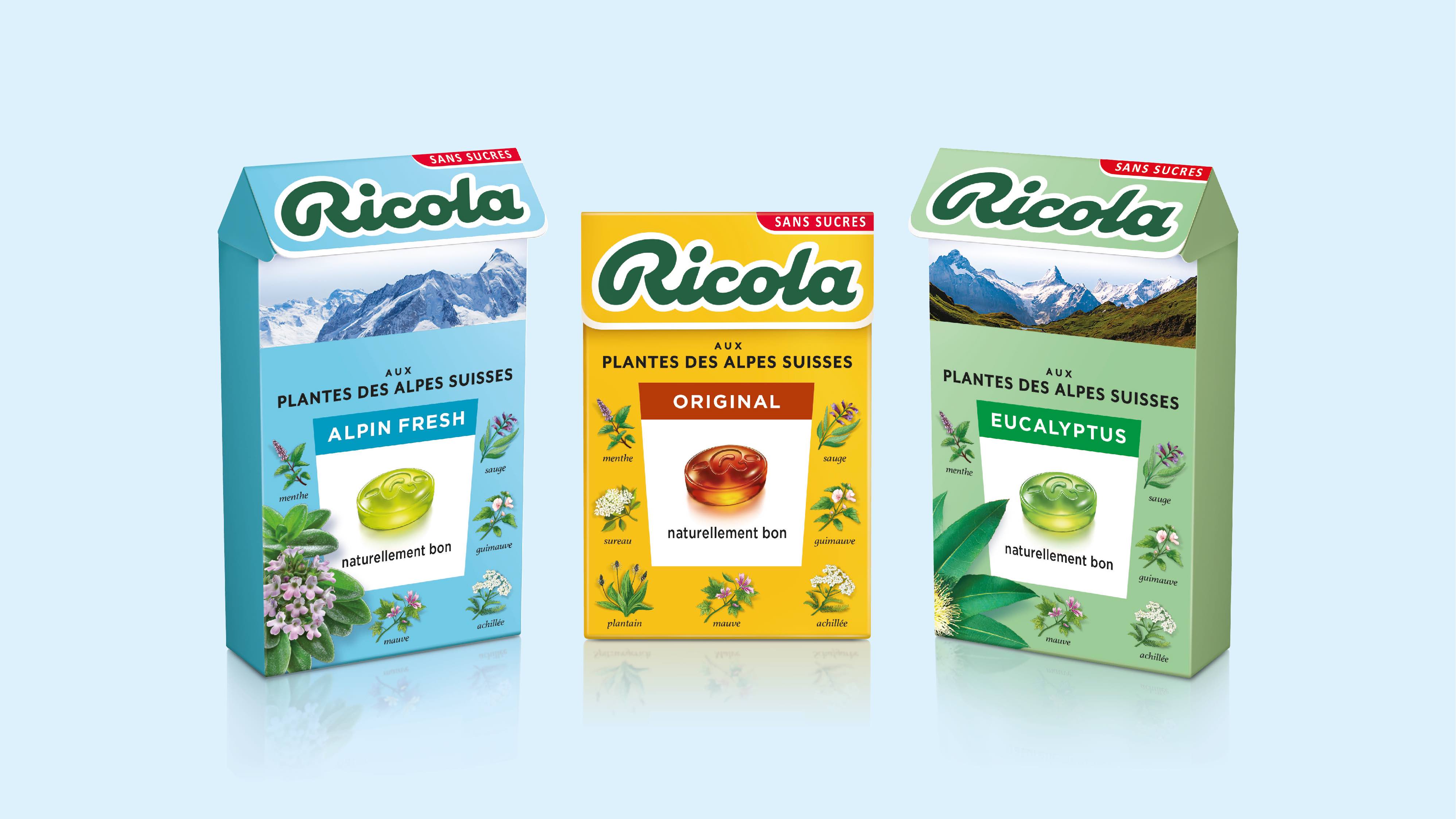
The core design heroes the iconic amber drop framed by the special herbs which form the unique blend of Ricola. Each is beautifully illustrated by a botanical artist. The historical Ricola trapezoid, reminiscent of a plant marker, is central to the design, and the refined, more fluid logo takes the eye from one pack to the next.
The familiar click-box lid now opens to a panoramic scene of the Alps, changing from flavour to flavour. A breath of fresh air in a candy size box.
Creative Director Mary Lewis says, “The challenge for Ricola was to ensure continuity of a heritage brand and define it as a brand of today. Ricola ticks many boxes of a successful brand, love, need, tension, and distinction. Visual communication has to project a cohesive summary.”
Thomas P. Meier, CEO of Ricola says, “We needed to showcase our natural attributes and delightful taste properties and at the same time ensure consumers can navigate an extensive range with ease. Our strategy is seamless with the new design direction, which quite simply makes Ricola more of what it is, and always has been. Staying true to the essence of the brand was very important. Ricola prompts pleasure through its affinity and commitment to nature – a brand for everyone, everyday everywhere”
Thomas P. Meier adds “The packaging design is the key ambassador for the brand. It’s the moment of truth. The new design is more impactful, engaging, and informative. It has the integrity and quality inherent in our brand values.”


CREDIT
- Agency/Creative: Lewis Moberly
- Article Title: Iconic Swiss Brand Ricola Launches Global Brand Design by Lewis Moberly
- Organisation/Entity: Agency
- Project Type: Packaging
- Project Status: Published
- Agency/Creative Country: United Kingdom
- Agency/Creative City: London
- Market Region: Global
- Project Deliverables: Packaging Design
- Format: Box
- Substrate: Pulp Paper
- Industry: Food/Beverage
- Keywords: Ricola, redesign, brand identity, identity design, rebrand, packaging, packaging design
-
Credits:
Creative Director: Emily Fox


