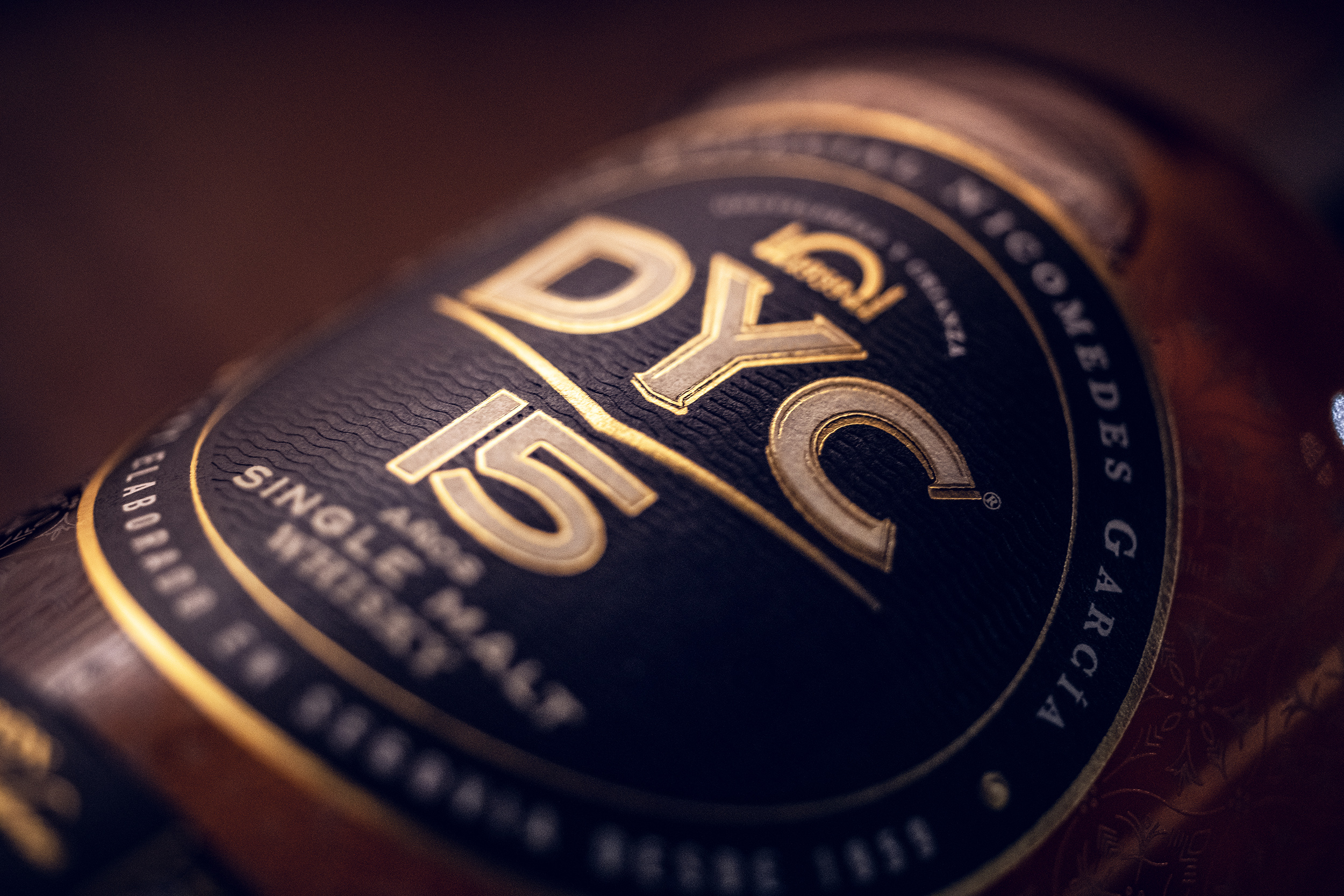
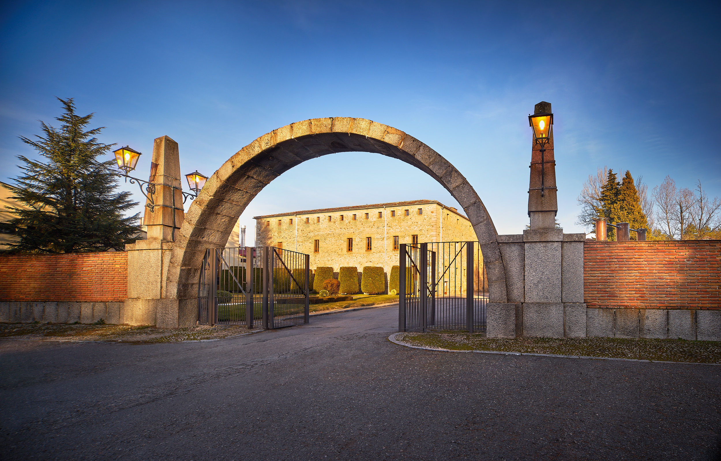
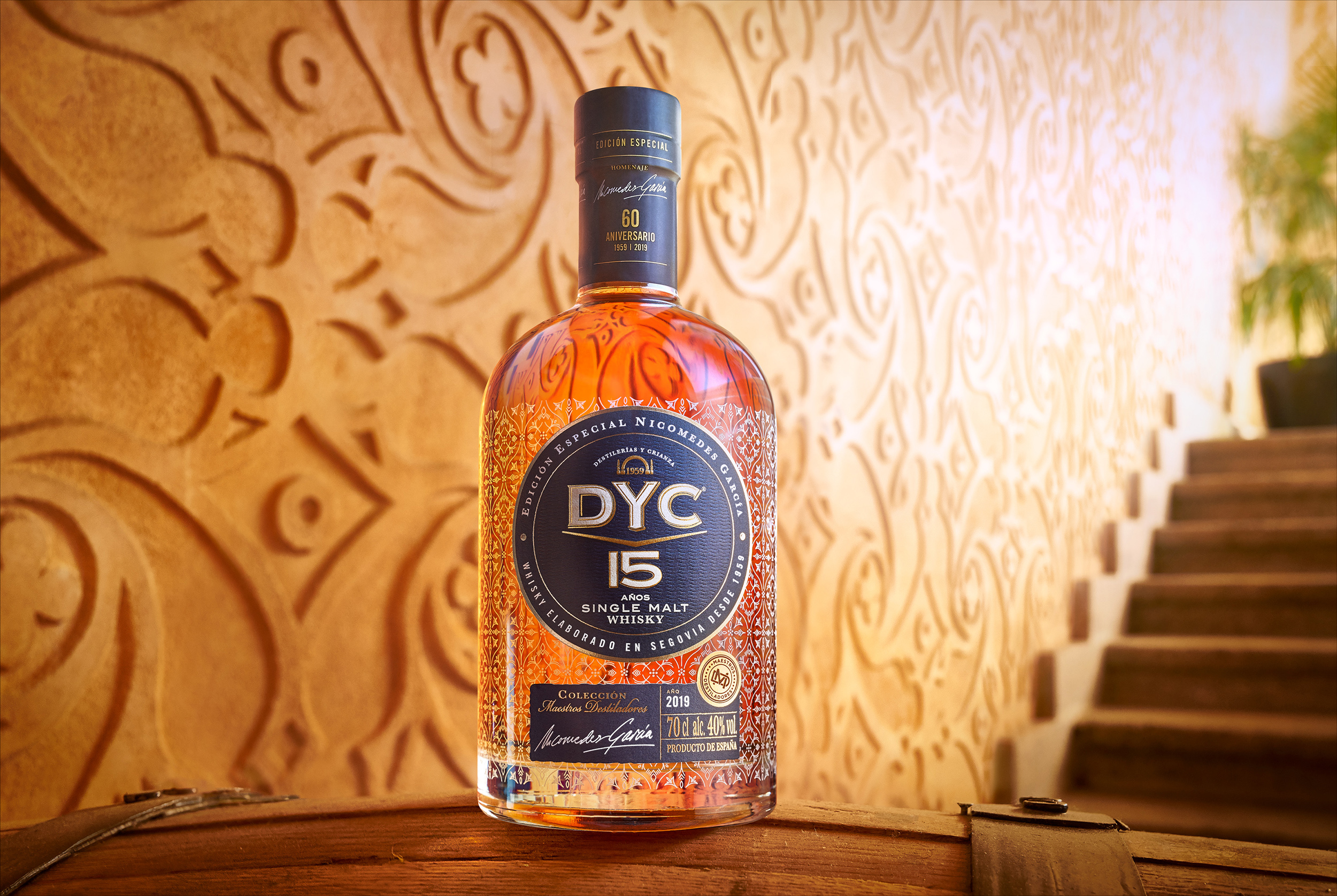
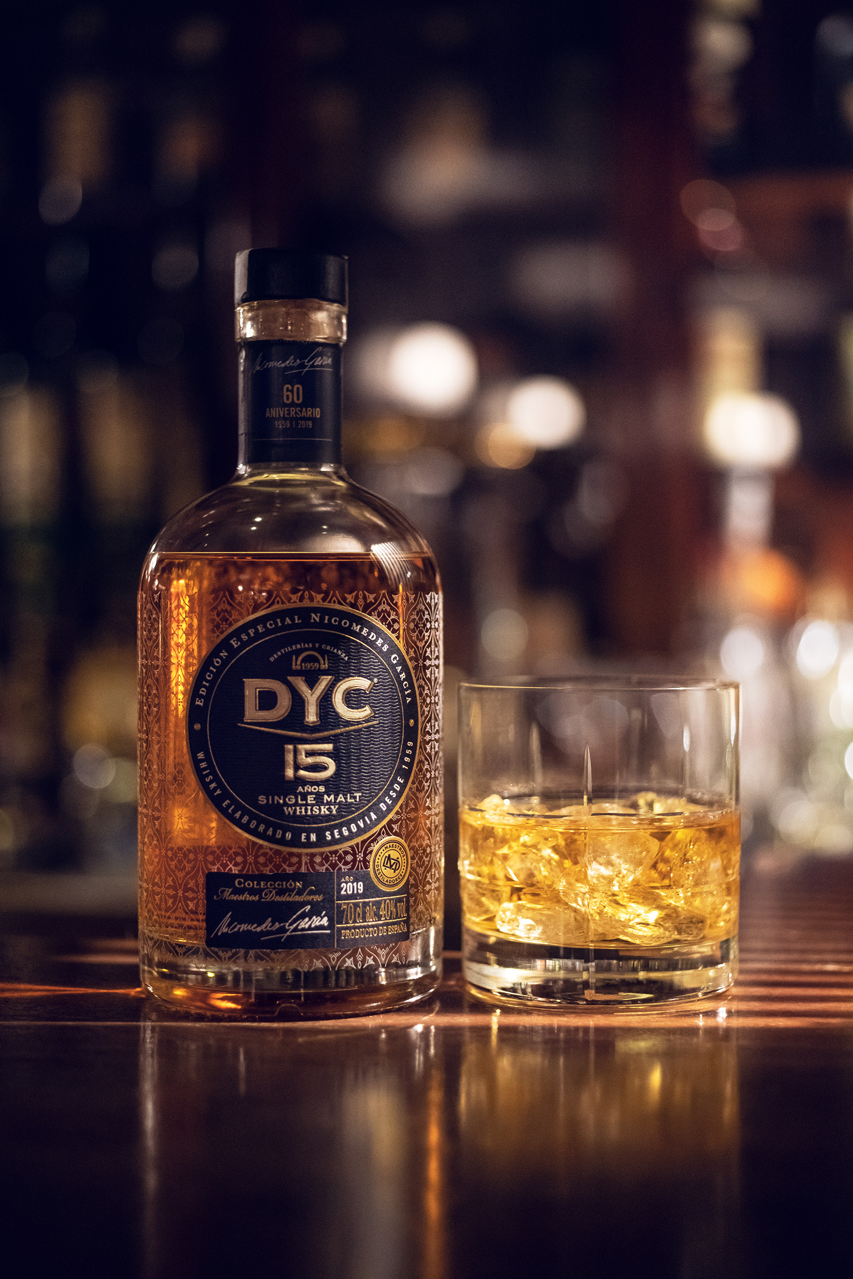
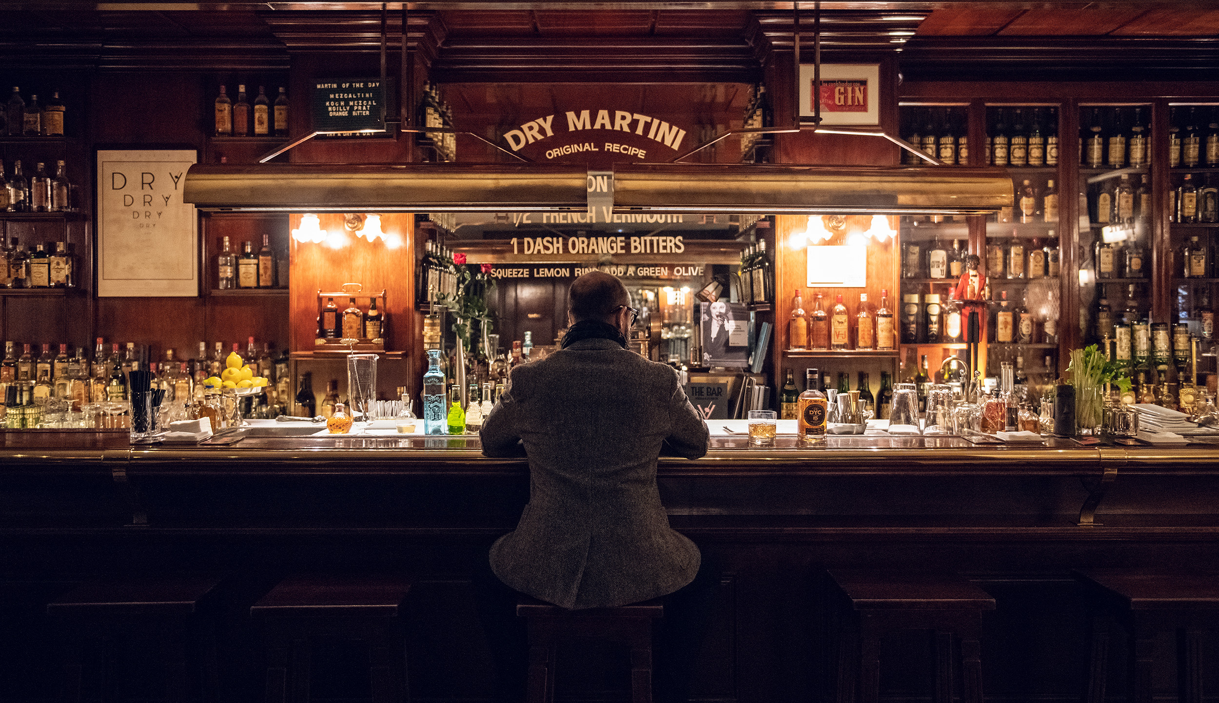
There are products that are born to become legends. When what is distilled is much more than whiskey… it is passion, exclusivity and tradition. The result can only be an authentic star. Iconic Spanish whiskey brand, DYC celebrated its 60th Anniversary by rising to the challenge of launching a limited edition of twelve thousand bottles onto the market. It would pay tribute to the origins and history of the brand and position it in a premium segment. The design of the pack was created as a tribute to DYC’s roots and its founder: Nicomedes García. The new product was to be part of the Master Distillers collection, and needed to stand out for its high quality in the brand’s extensive portfolio: 15 years in barrels and a meticulous distillation process made this edition, DYC’s most exquisite yet. The challenge entailed giving value to the idea of uniqueness and sophistication in a bottle that had to maintain an obvious connection with the other products in the portfolio. We decided to delve into the roots of the brand in search of a differential angle that would bring the design a unique touch: the brand’s own distillery. At the time of its foundation in 1959, this distinctive space was a pioneer in Spain and since then, it has maintained its innovative character and its vocation to remain at the forefront of the sector.
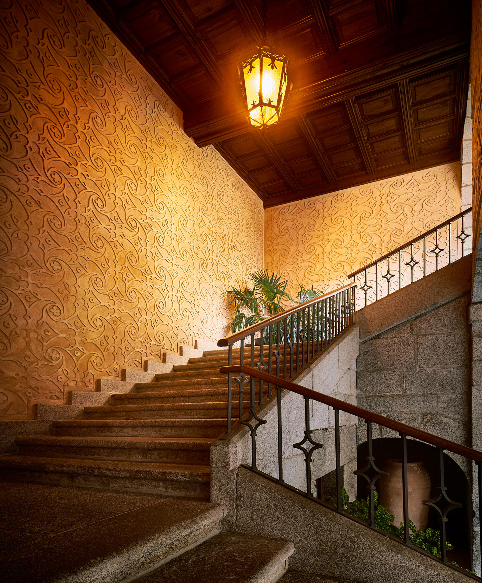
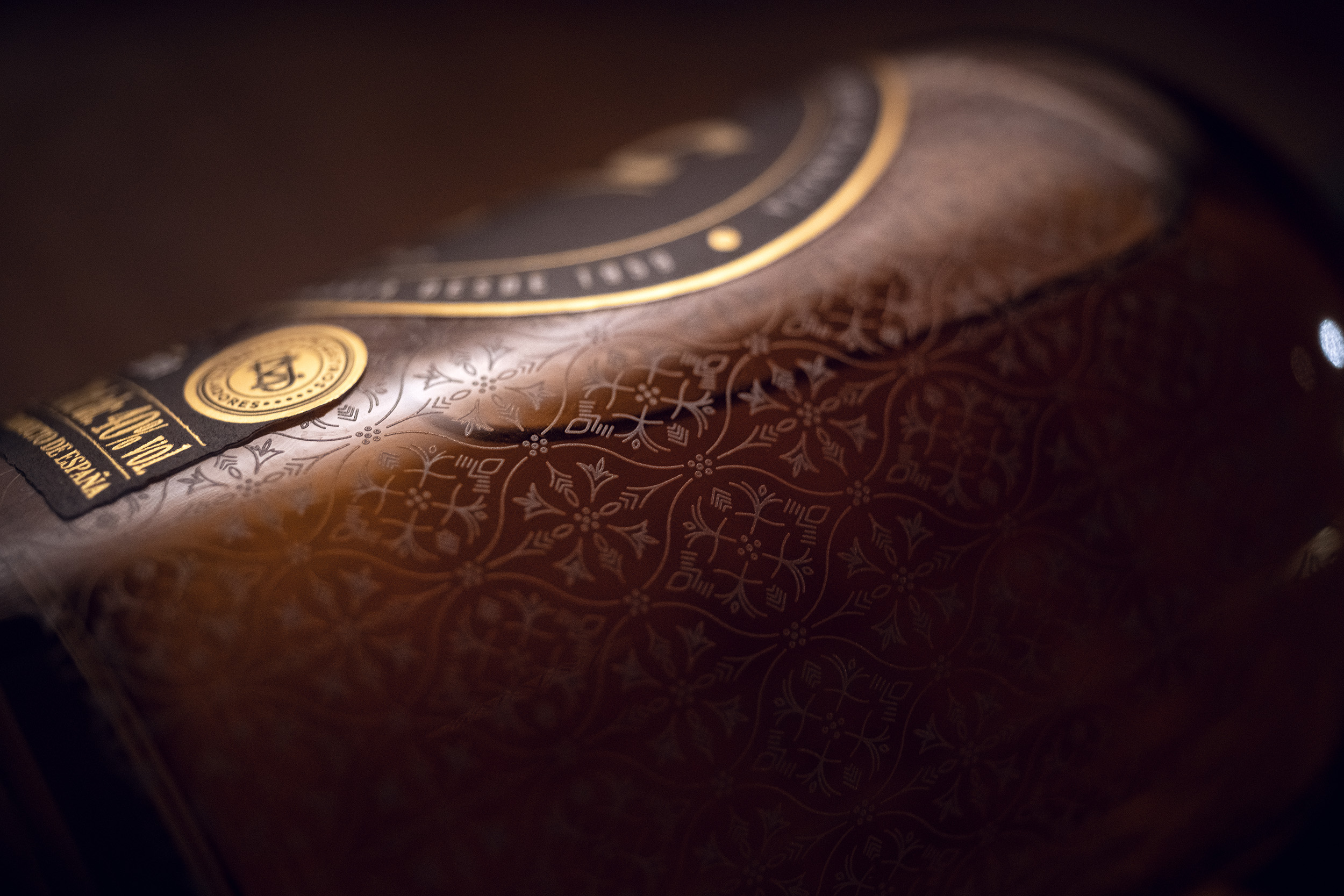
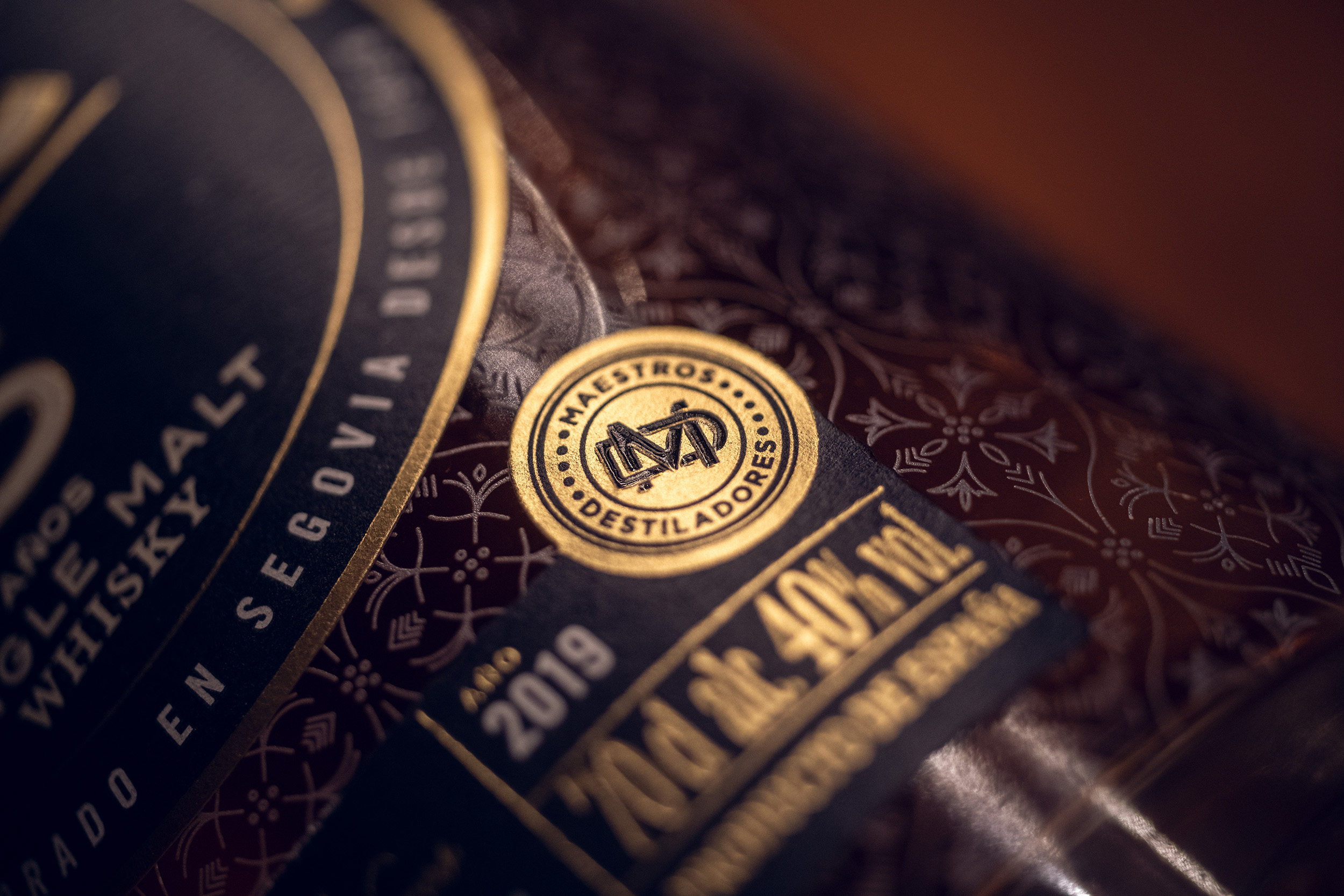
We got inspired by the traditional designs of the houses of Segovia and the architecture of the cellars where the product ages for more than fifteen years. We echoed the unmistakable Segovian engravings that reign in the great hall of the brand’s distillery, reconstructing them into a pattern and transferring it to the bottle by screen printing. The use of patterns allows the generation of a highly recognizable and versatile language that can be extended to other communication elements. In order to maintain the connection with the rest of the portfolio, we sought out a design that respects the brand block of the other products, and framed it in a black circle, to elevate the sophistication and perception of the bottle. The brand block leaves space to communicate the properties that position this product as a high-end reference. We opted for a classic typography and a chromatic palette in black and gold tones to give the label a premium value. Bearing in mind that this edition was designed as a tribute to the founder, the presence of Nicomedes García’s signature was extended on the pack. Finally, a case was designed in accordance with the chromatic palette, as well as an exclusive hanger that evokes the exclusivity of the proposal. The result is a striking reinterpretation of the architecture of the time period, in which every detail is nurtured to shape a limited edition that embodies DYC’s care, passion and experience in the production of whiskeys with an authentic taste and brimming with nuances.

CREDIT
- Agency/Creative: Morillas Branding Agency
- Article Title: Iconic Spanish Whiskey DYC Packaging Design by Morillas
- Organisation/Entity: Agency, Published Commercial Design
- Project Type: Packaging
- Agency/Creative Country: Spain
- Market Region: Global
- Project Deliverables: Brand Advertising, Brand Creation, Industrial Design, Packaging Design, Photography, Rebranding, Research, Tone of Voice
- Format: Bottle
- Substrate: Glass Bottle


