


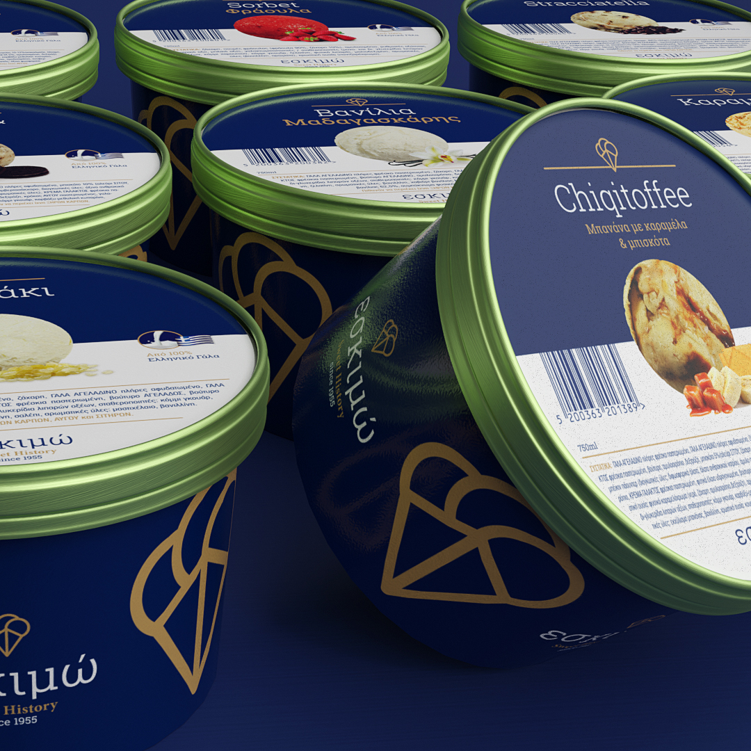
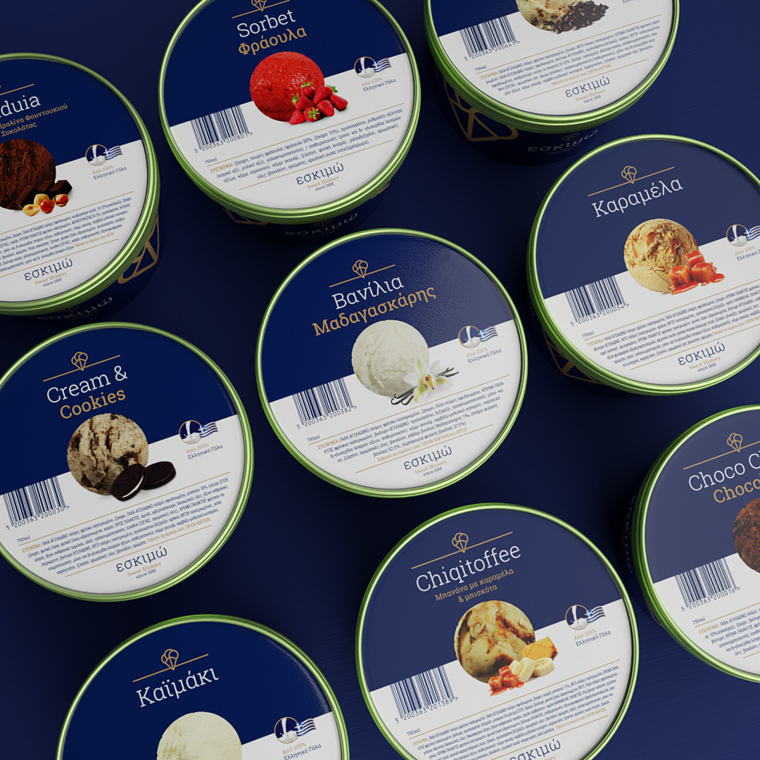
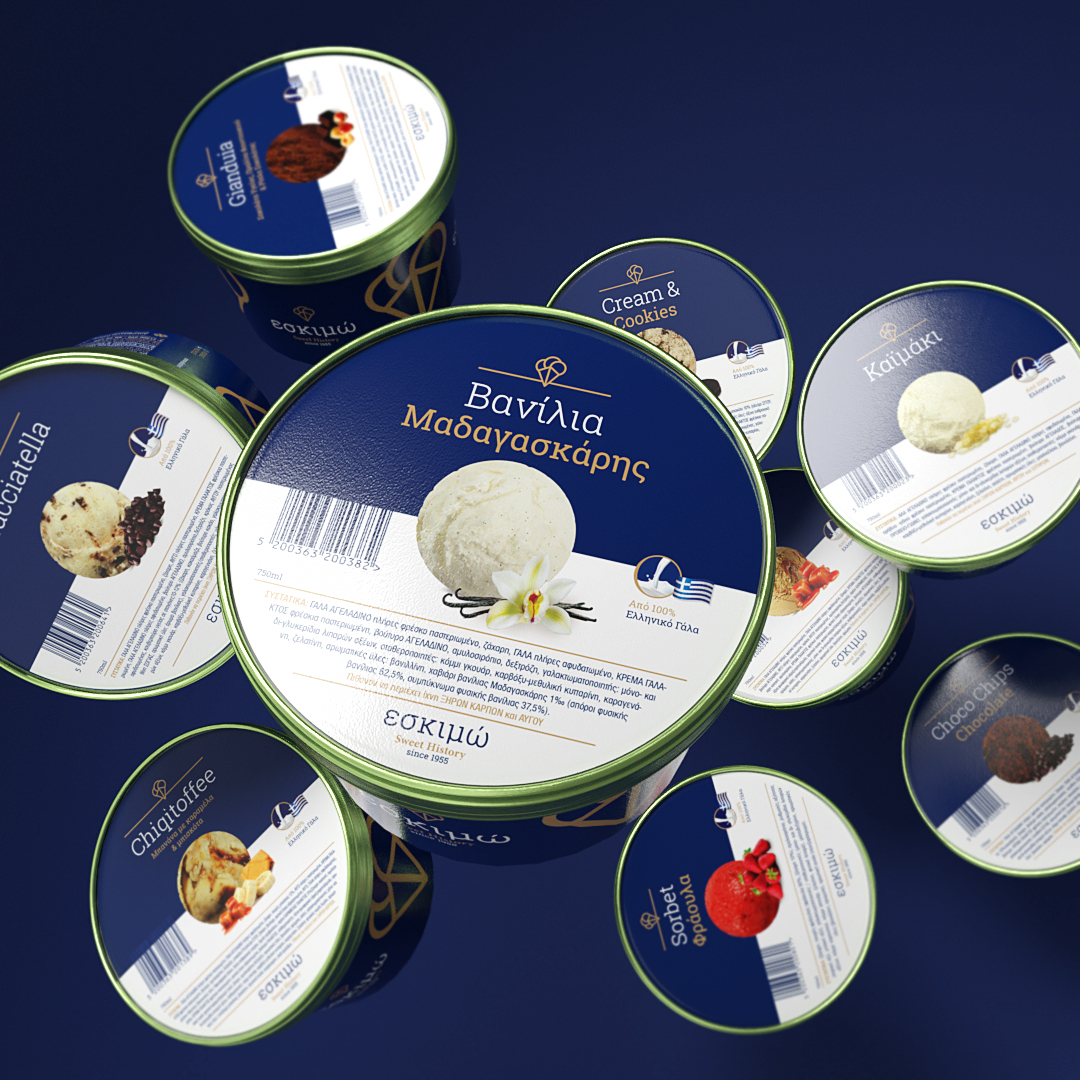
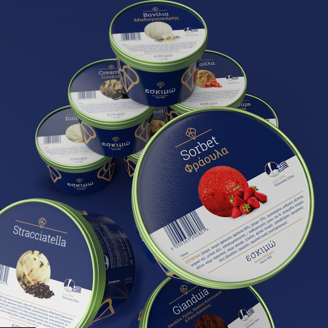
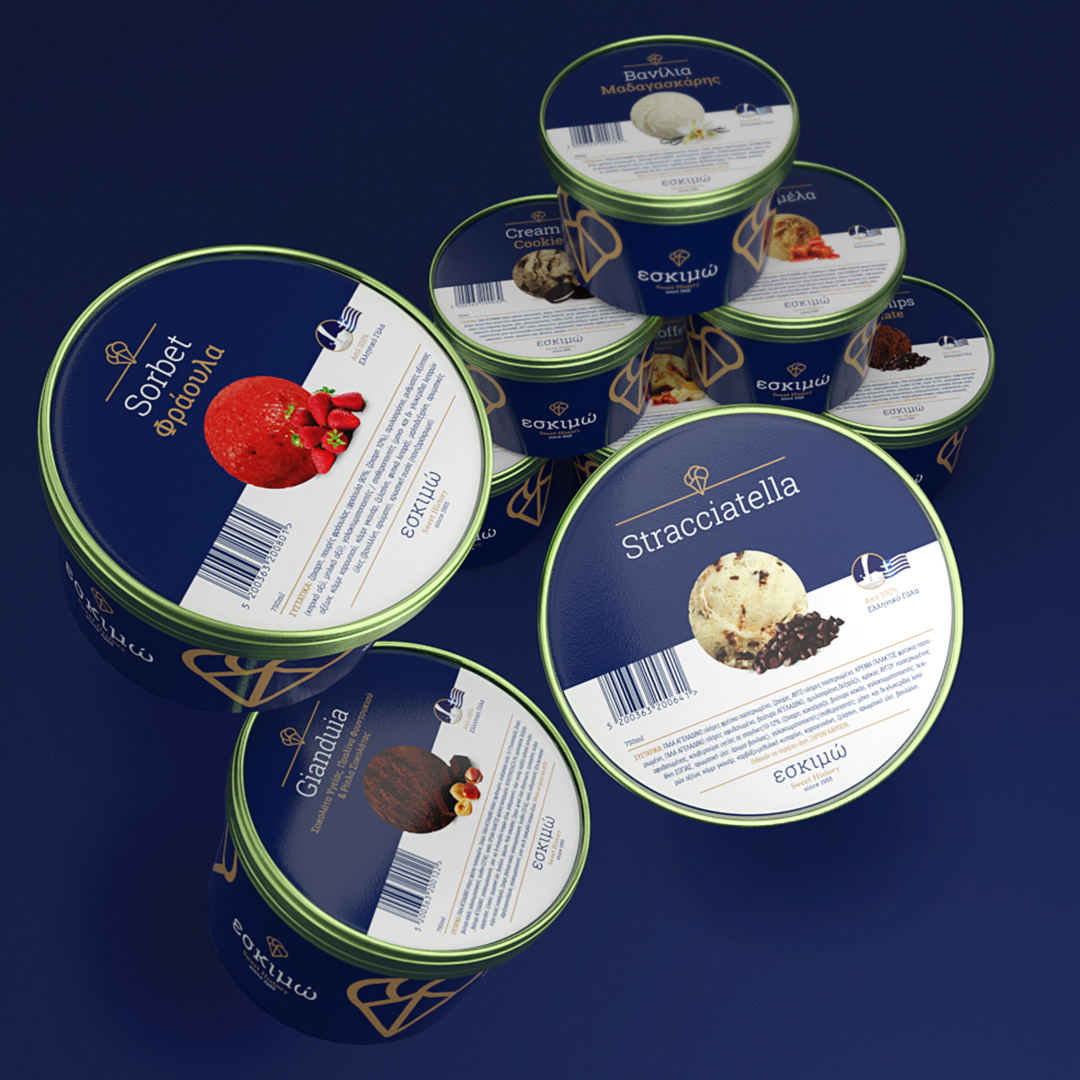
Packaging design for 12 flavour series of ice cream by Eskimo S.A.
The pint is the same for all the flavours and holds information about Eskimo’s ice creams in general as long as maintenance temperatures and contact of the company. The lid is split in half navy blue and half white with a scoup of ice cream of each flavour in the middle. The white space gives it a fresher appeal and it;s useful for printing the small font of the ingredients. It also gives a clear space for the barcode.
CREDIT
- Agency/Creative: Panos Nikolaou
- Article Title: IceCream Packaging Design
- Organisation/Entity: Freelance, Published Commercial Design
- Project Type: Packaging
- Agency/Creative Country: Greece
- Market Region: Europe
- Project Deliverables: Brand Design, Brand Strategy, Branding, Graphic Design, Packaging Design, Research
- Format: Pot
- Substrate: Pulp Paper
FEEDBACK
Relevance: Solution/idea in relation to brand, product or service
Implementation: Attention, detailing and finishing of final solution
Presentation: Text, visualisation and quality of the presentation


