Ice for Life fights against climate change in a fun, friendly and entertaining way. The poles are melting and we have to do something to make people aware that change is necessary and urgent. We have a responsibility to take care of our planet and help new generations to take care of it. Children are the future and we have to teach them as soon as possible to value the planet they live in.
We defend a pleasant and domestic activism. The idea is that the end customer should feel that this is a global problem and that it starts with individual responsibility, wherever he or she is: on the sofa at home, on a walk, at a meal…
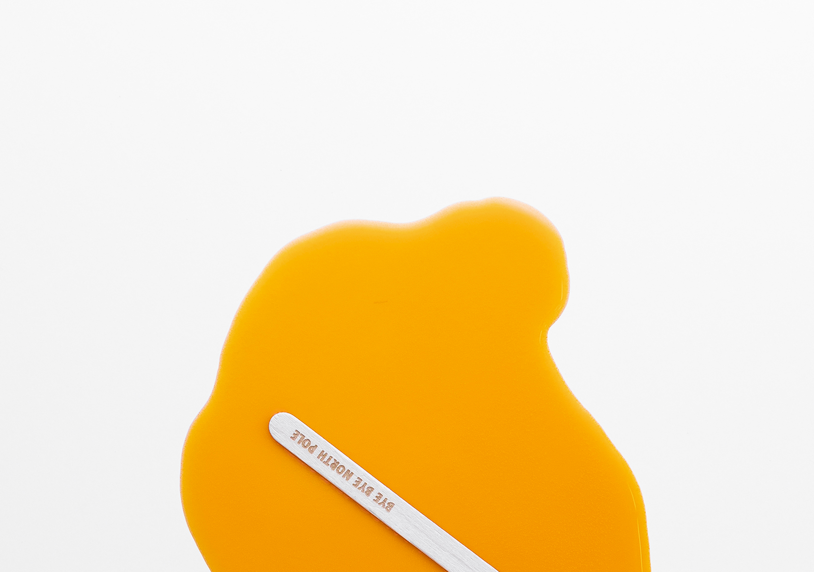
The brand helps us to understand this serious problem with a close and direct narrative. We want to make it clear that what is consumed is not a simple ice cream, but a piece of ice that melts at high speed.
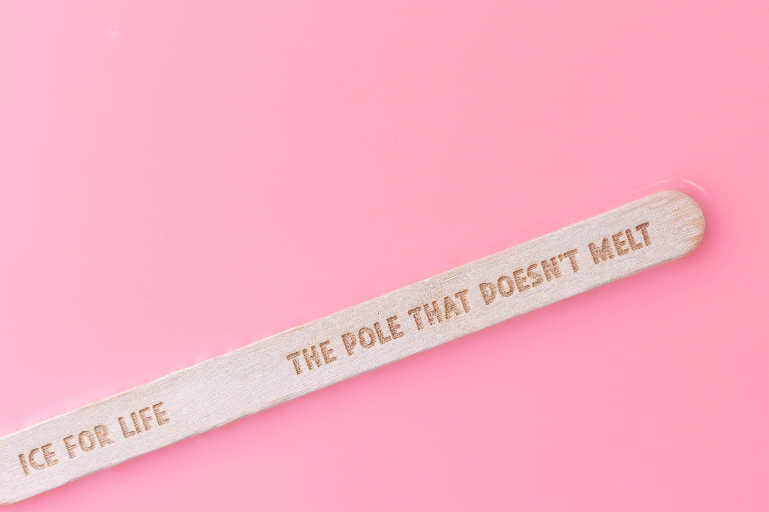
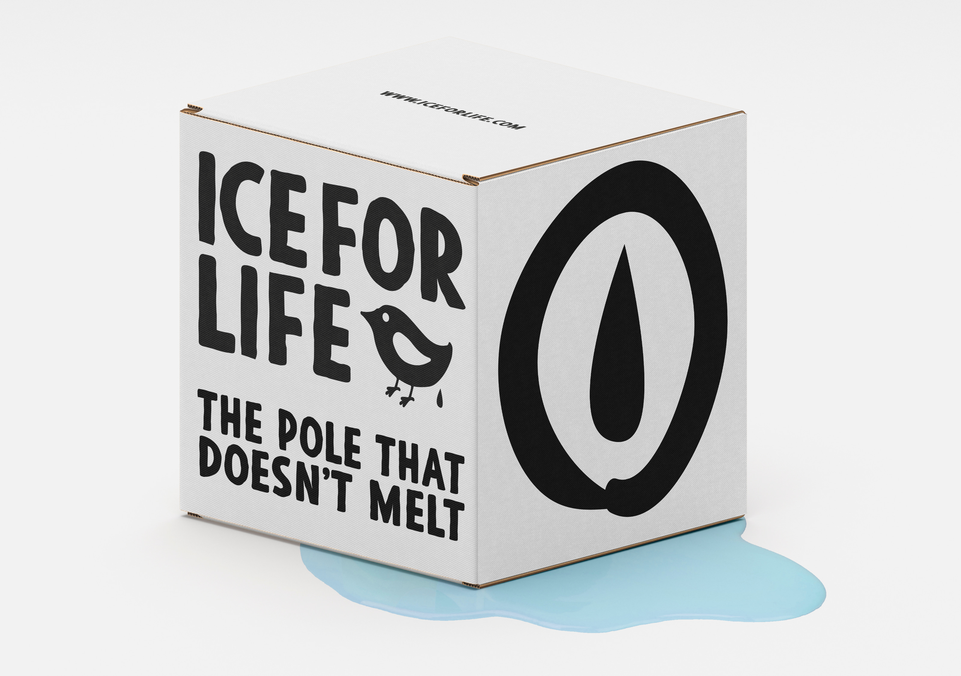
That is why Ice for Life is the Pole That Does Not Melt.
Species extinction, mass migrations, rising sea levels… these are problems that we already have to manage and that have no easy solution.
We must act now!
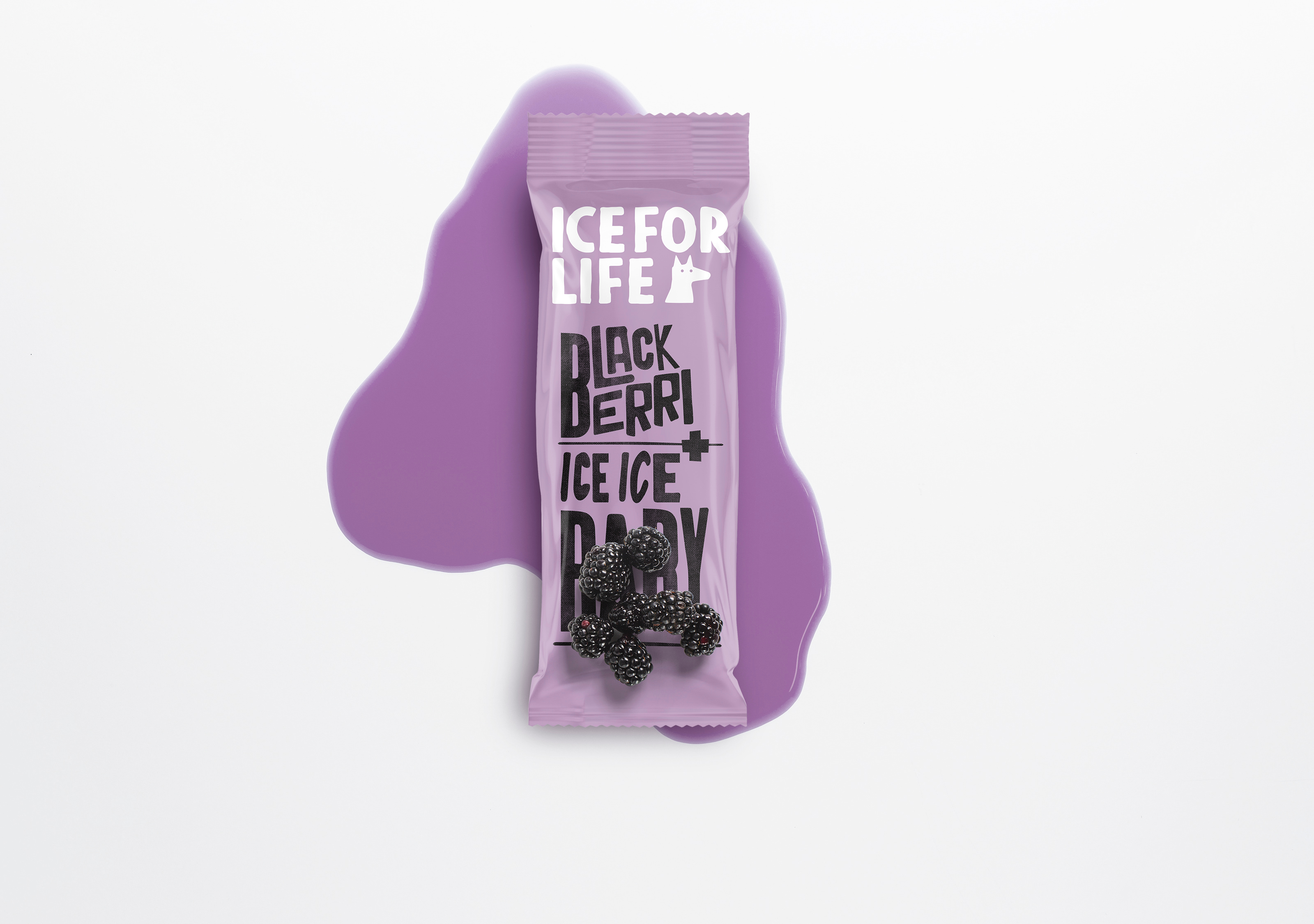
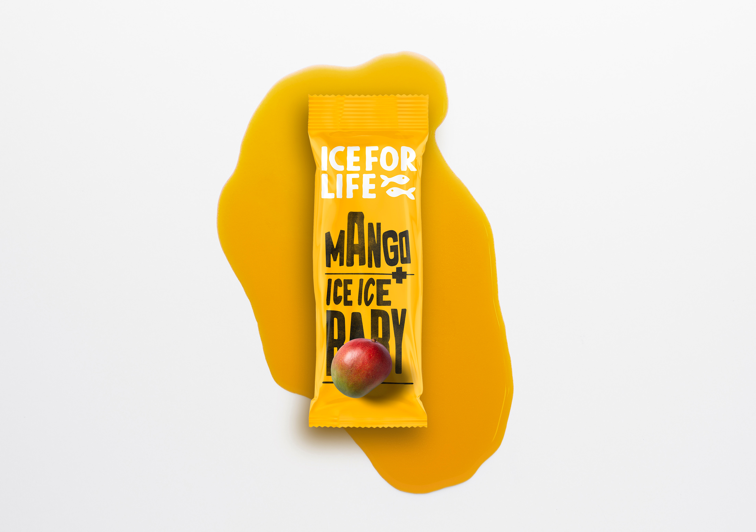
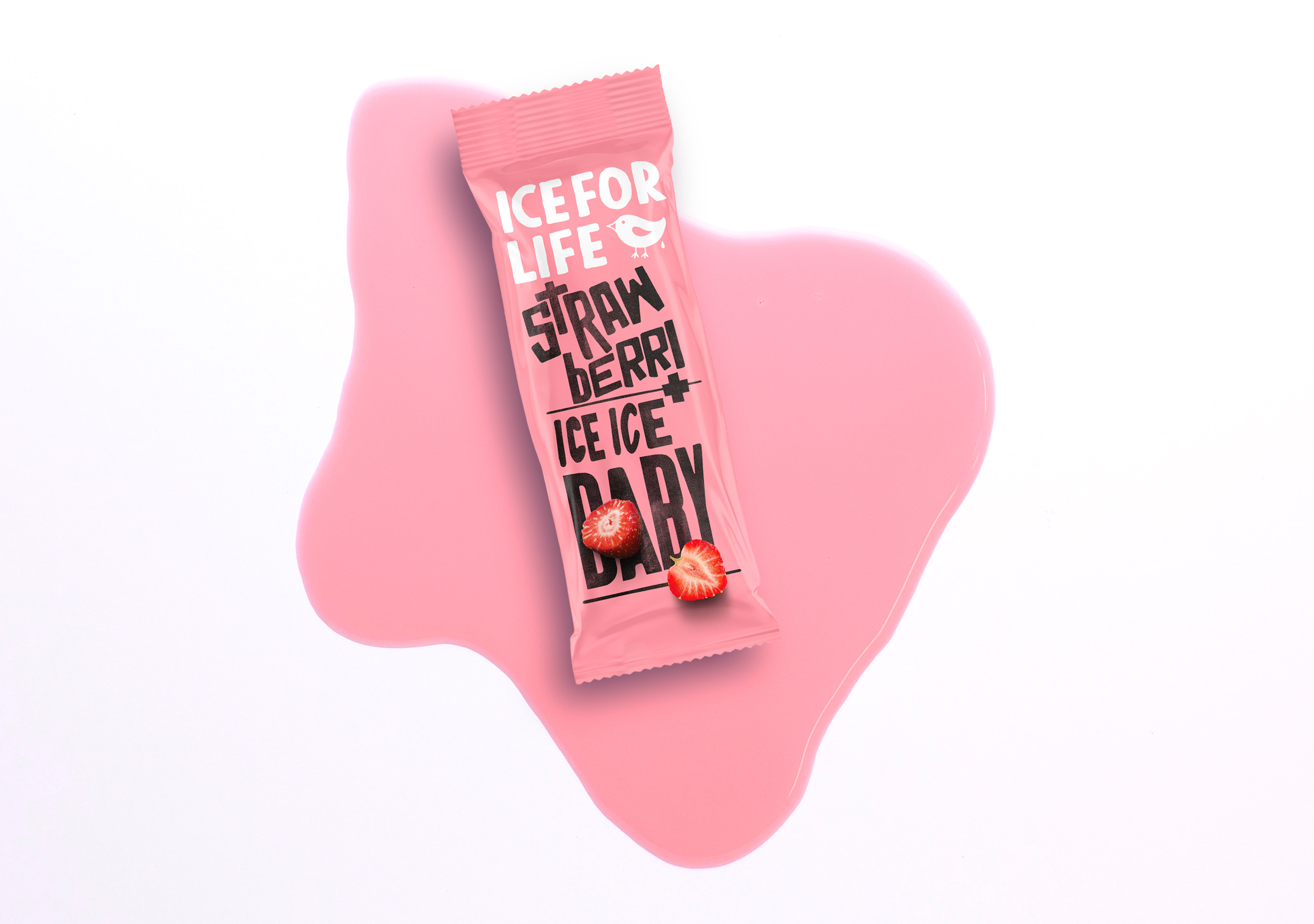
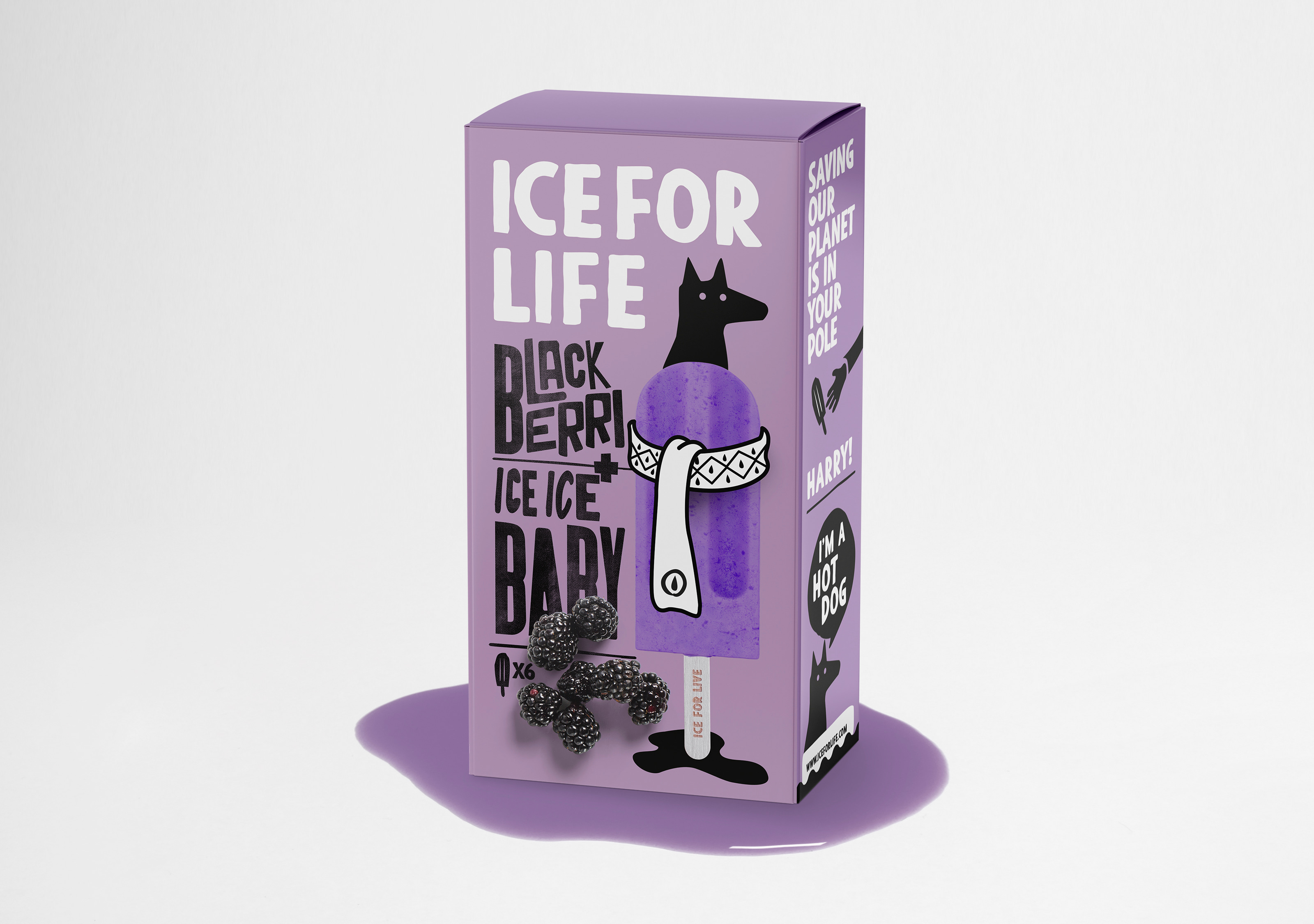
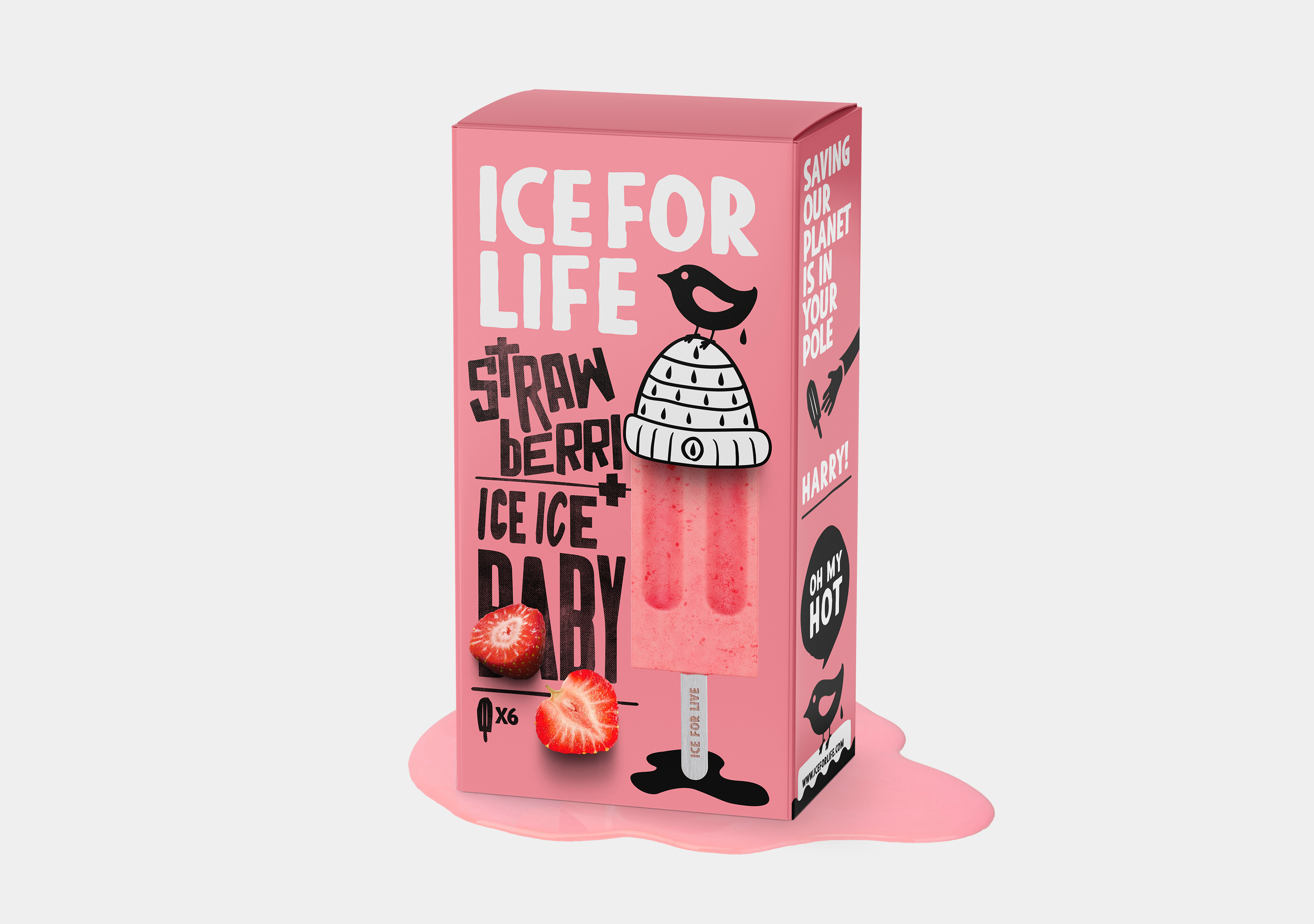
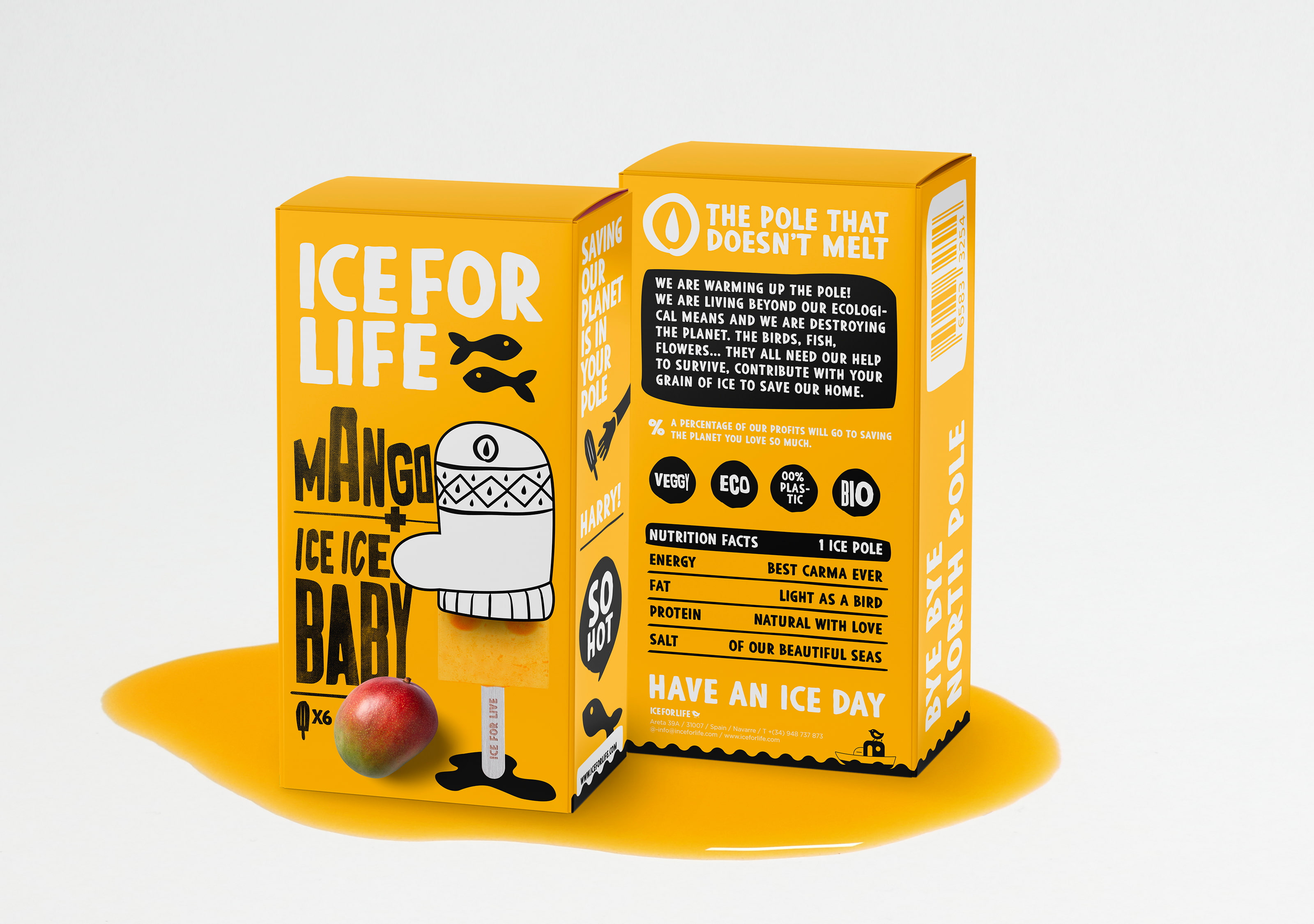
The packaging is developed in colors that represent the flavors of each ice cream to create an easy association and to help the consumer to be clear about what flavor it is. Illustrations have been developed for each packaging representing animals that may be in danger of extinction and also give it a close look.
The winter clothes that dress the poles represent the warming to which we are subjecting the planet, this detail literally represents global warming, a world with a scarf or snow gloves is a world that is subject to the misfortunes of human beings.
A custom-made typography has also been developed for each flavor, giving the brand a much more personalized and genuine character.
CREDIT
- Agency/Creative: Borja Viguiristi
- Article Title: Ice for Life Packaging Design Concept
- Organisation/Entity: Student
- Project Type: Packaging
- Project Status: Non Published
- Agency/Creative Country: Spain
- Agency/Creative City: Salinas de Pamplona
- Market Region: Europe
- Project Deliverables: Packaging Design
- Format: Box
- Substrate: Pulp Paper
- Industry: Food/Beverage
- Keywords: WBDS Student Design Awards 2023/24
- Keywords: Packaging Design ,Product Creation
-
Credits:
Educational Institution: LABASAD - Master in Challenging Branding


