


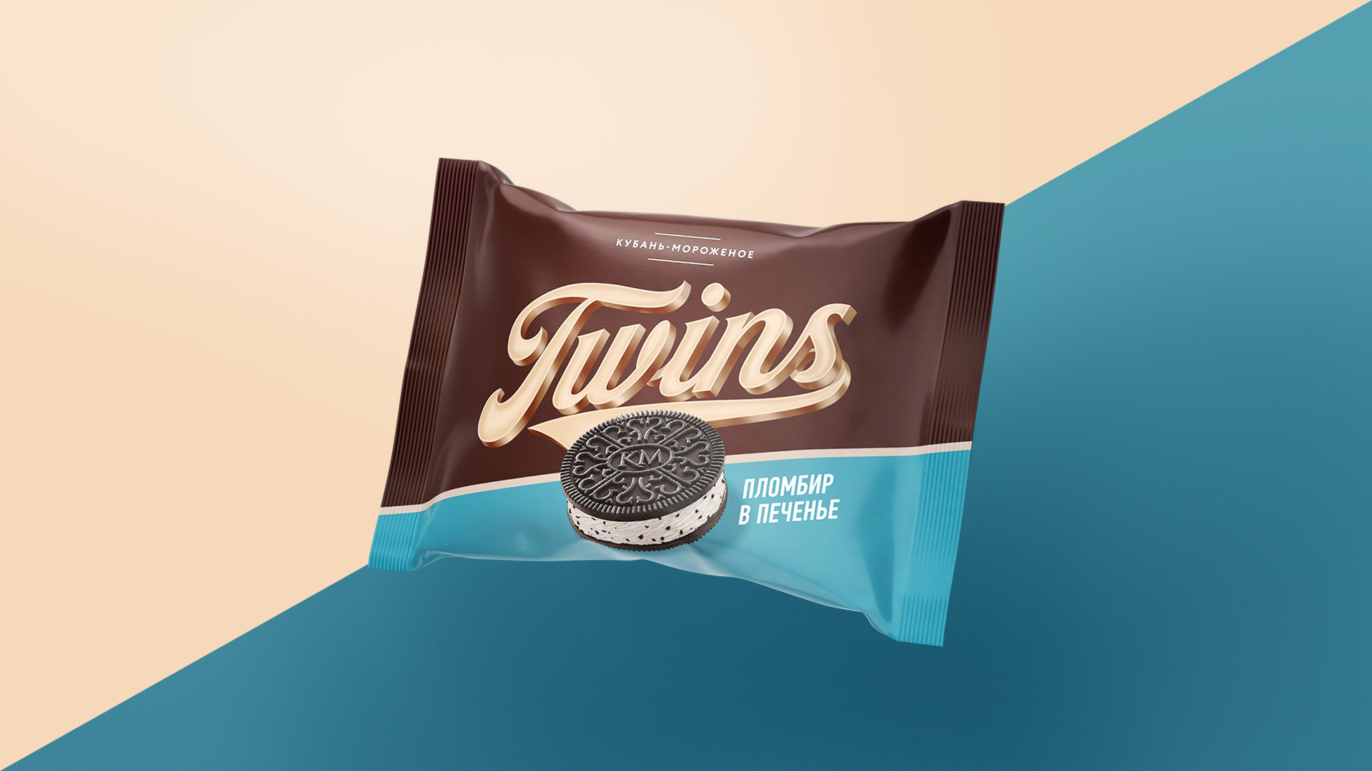
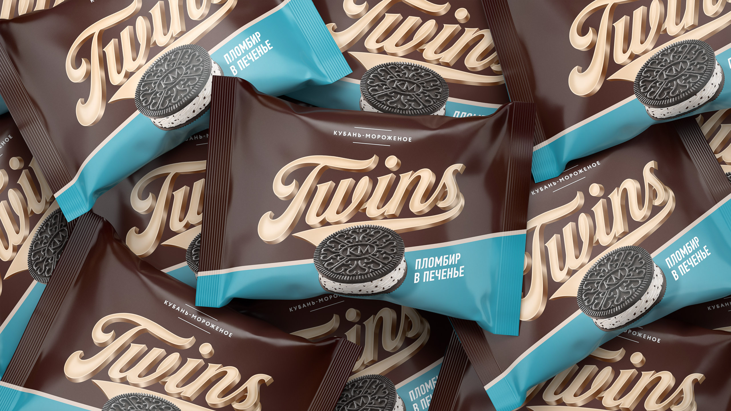
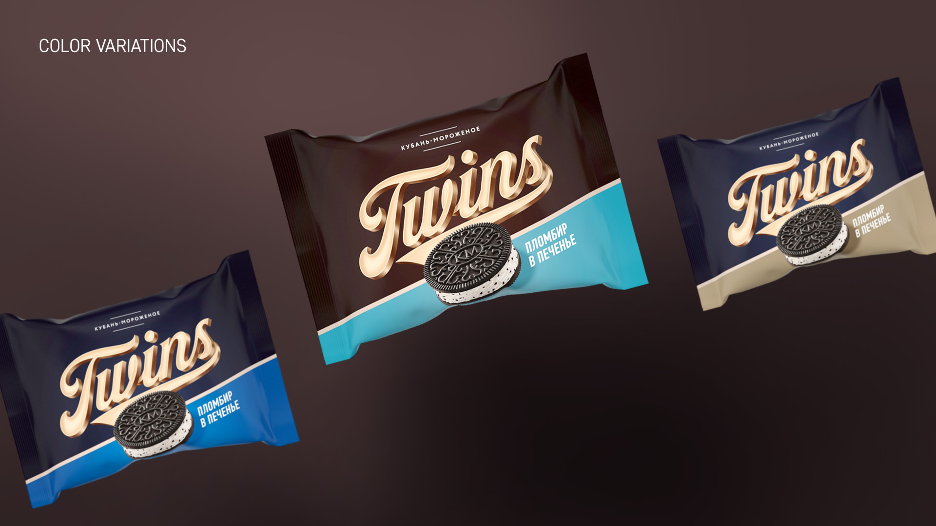
Combination of modern materials and retro-style graphics to find something new to ice-cream shelves in sunny Krasnodar, South of Russia.
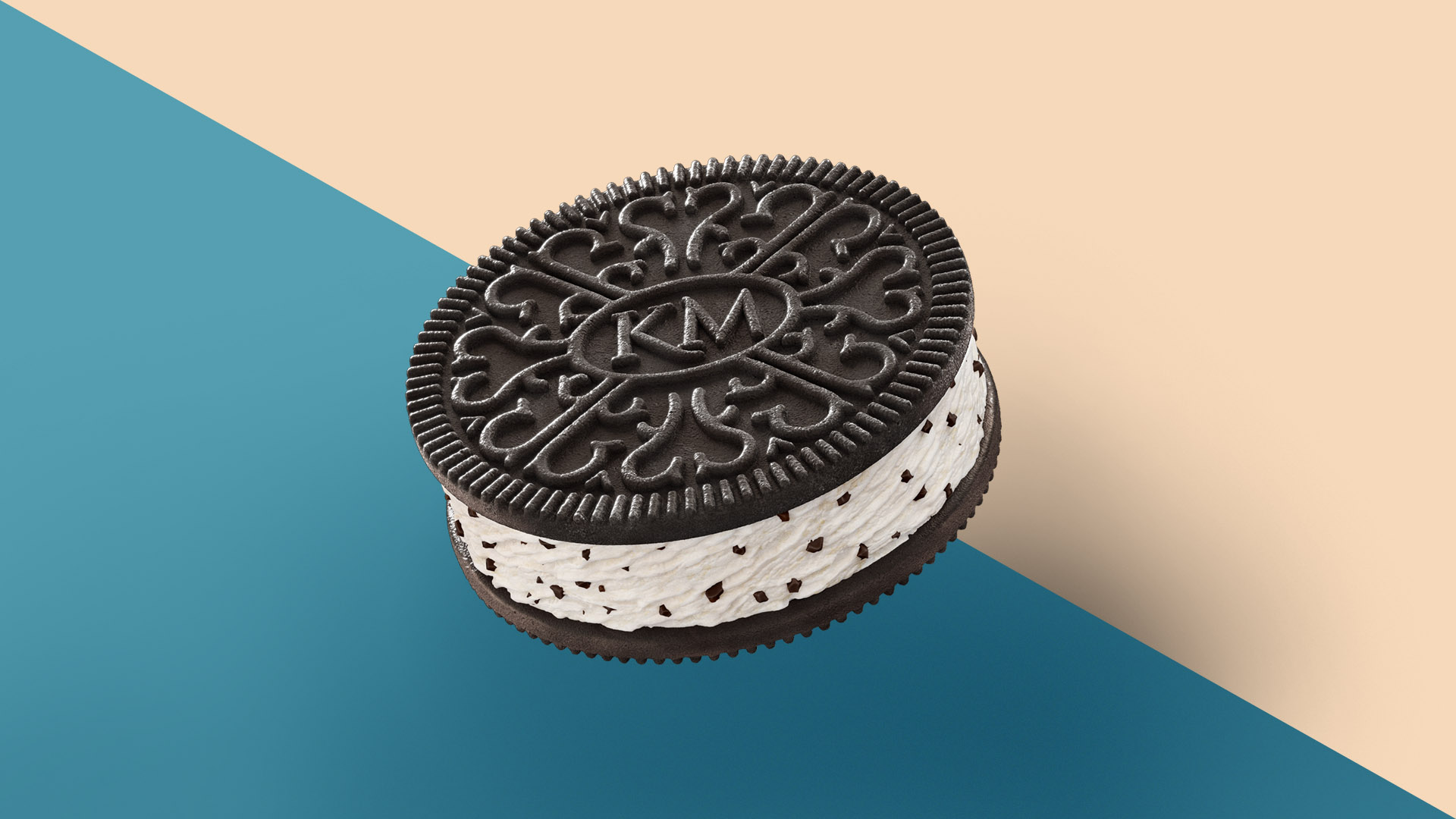
Ice cream producer Kuban-Ice-cream launched a campaign to renew the assortment and began with the introduction of a new brand – Twins. Ice cream sandwich is an ice cream similar to Oreo. Therefore, our task in the design was to step as far as possible and do not look like Oreo. We find a combination of modern materials and retro stylistics, as a symbol of the transition from old to new, and also show how it can represent brand in advertising.


CREDIT
- Agency/Creative: Shinkin.family
- Article Title: Ice-cream Sandwich Twins
- Organisation/Entity: Freelance, Published Commercial Design
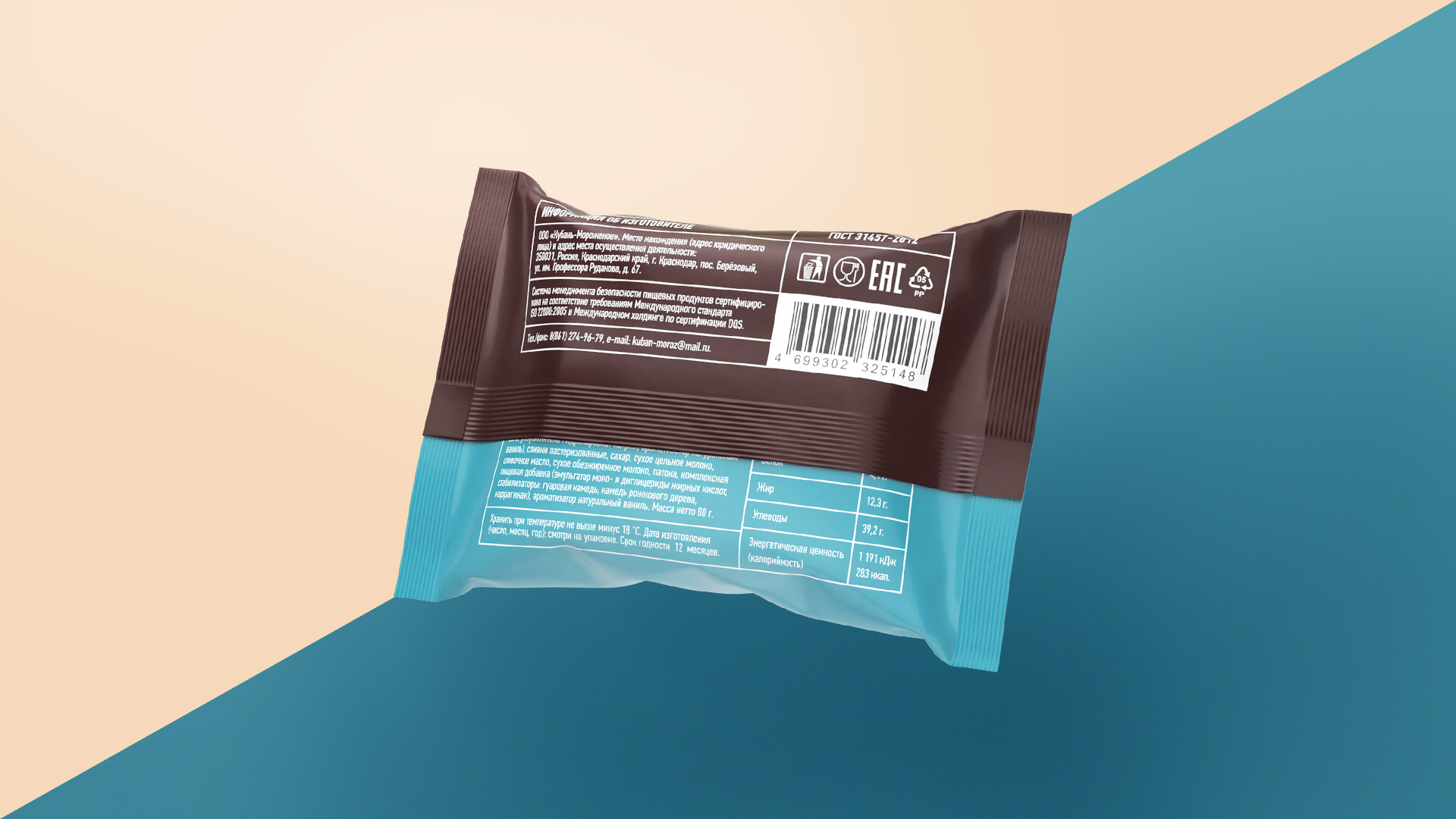
- Project Type: Packaging
- Agency/Creative Country: Russia
- Market Region: Europe
- Project Deliverables: Brand Naming, Packaging Design
- Format: Sachet
- Substrate: Pulp Paper
FEEDBACK
Relevance: Solution/idea in relation to brand, product or service
Implementation: Attention, detailing and finishing of final solution
Presentation: Text, visualisation and quality of the presentation


