


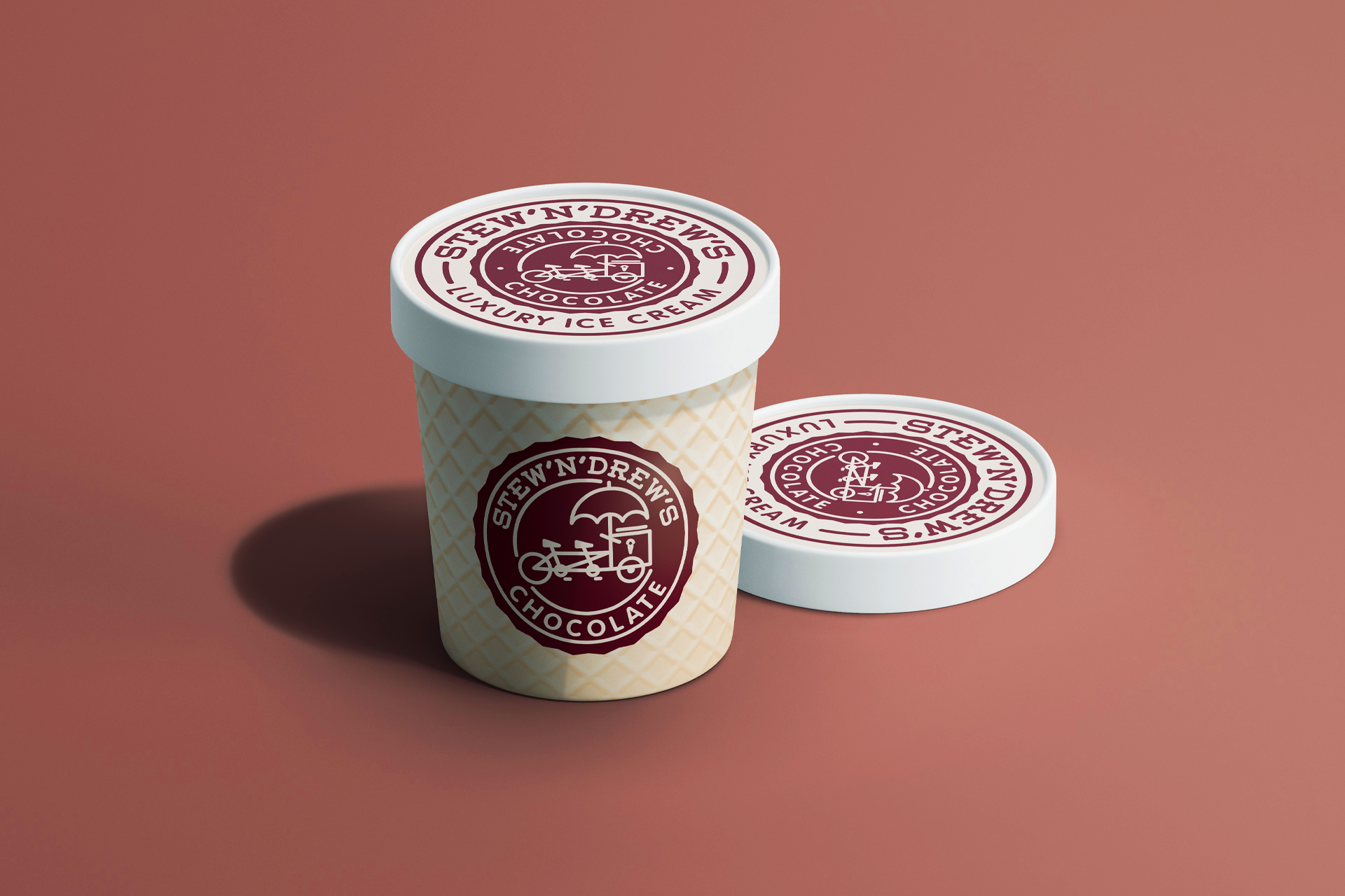
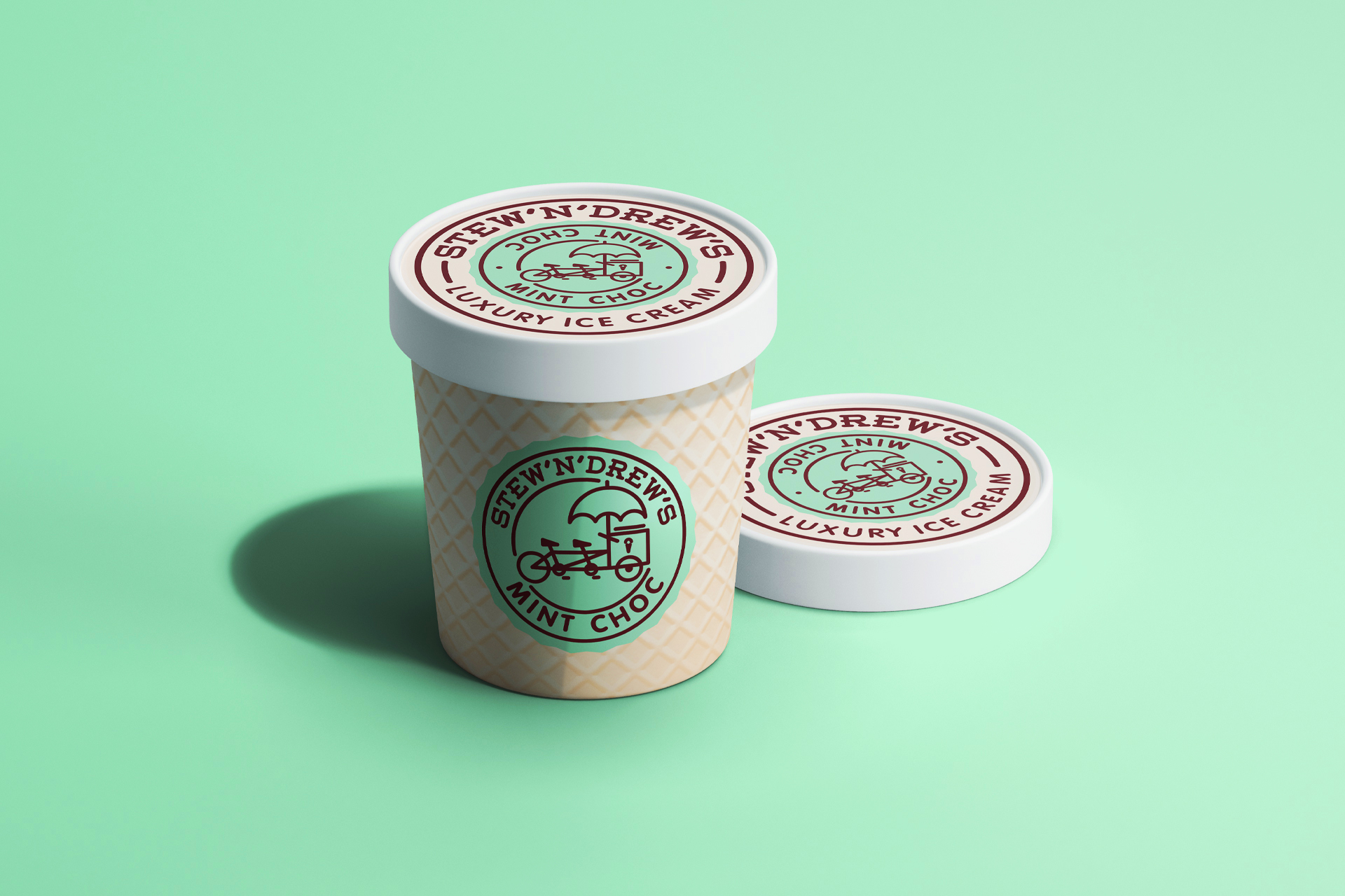
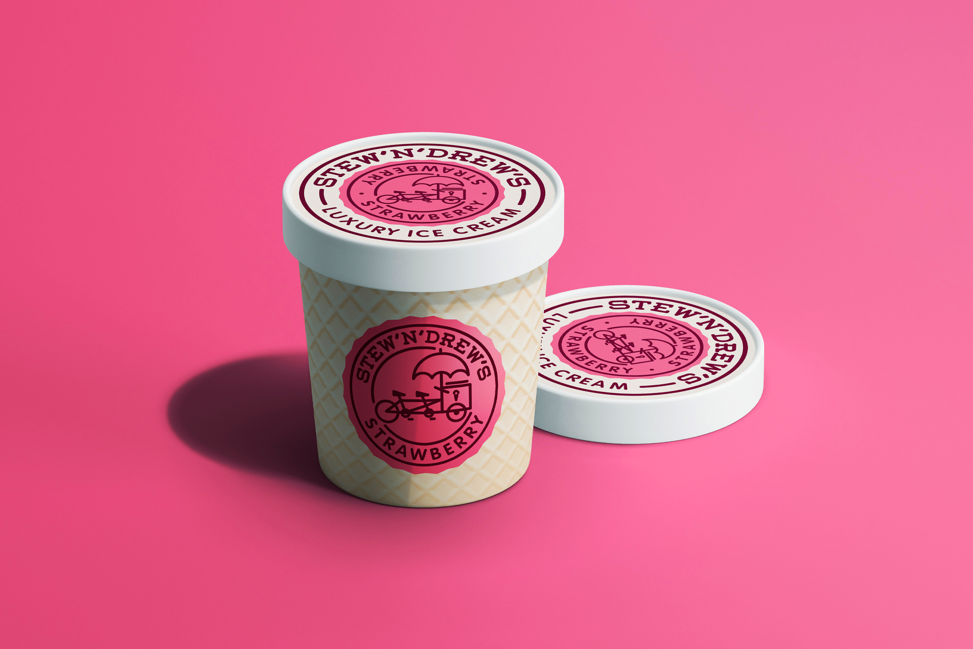
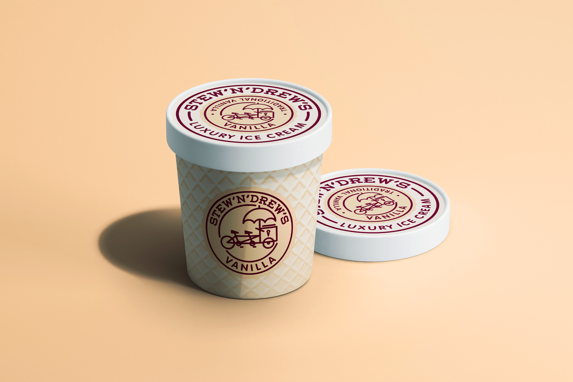
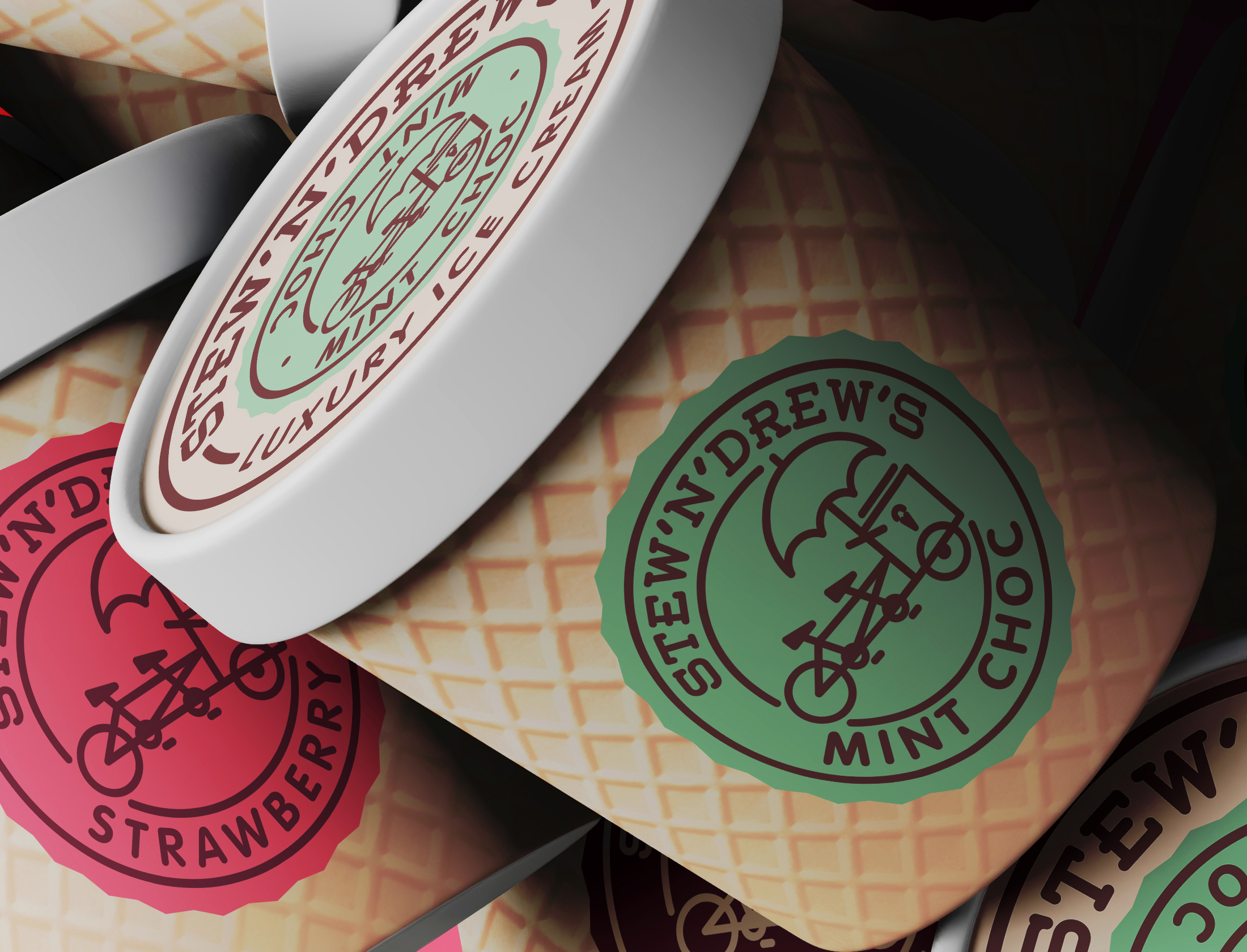
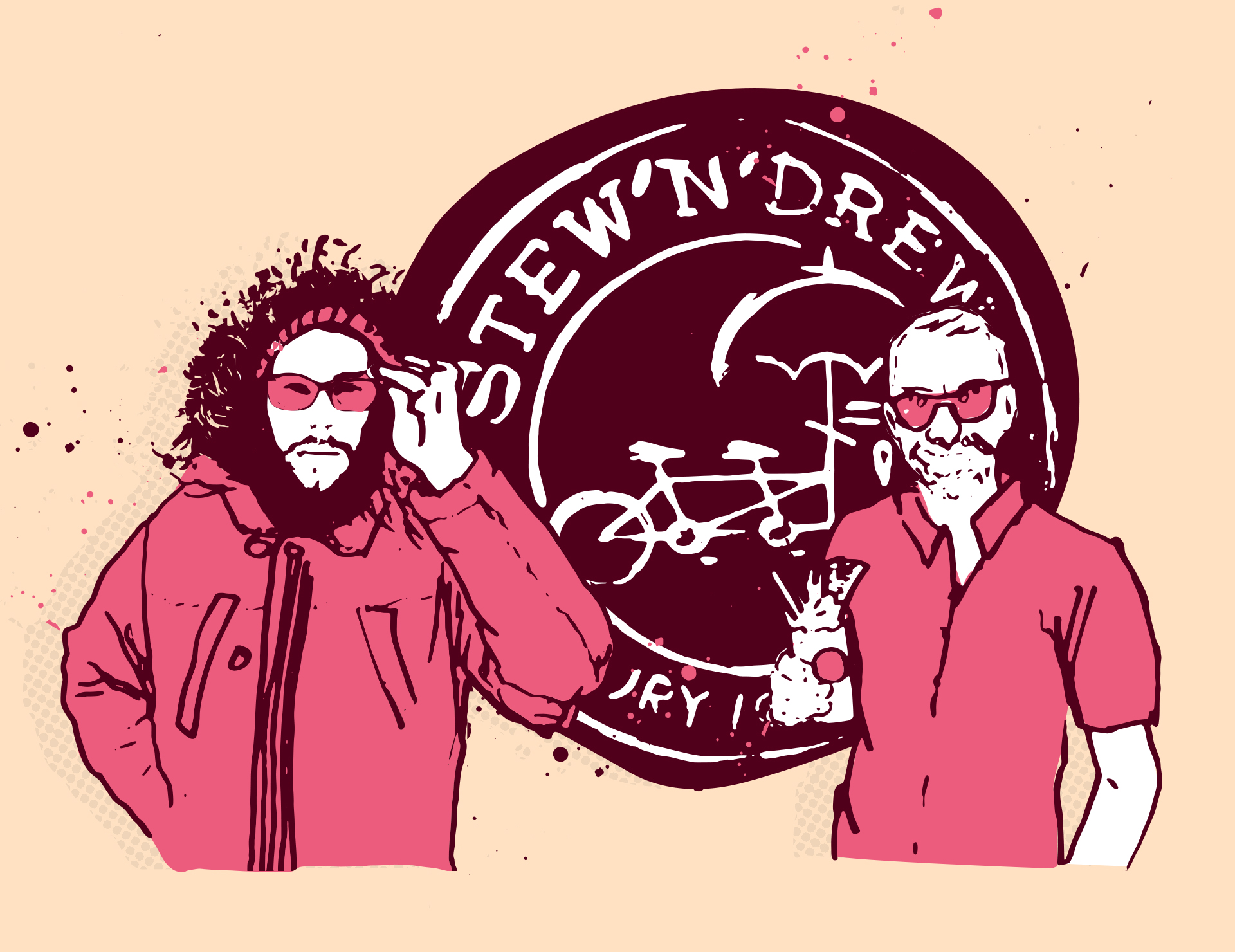
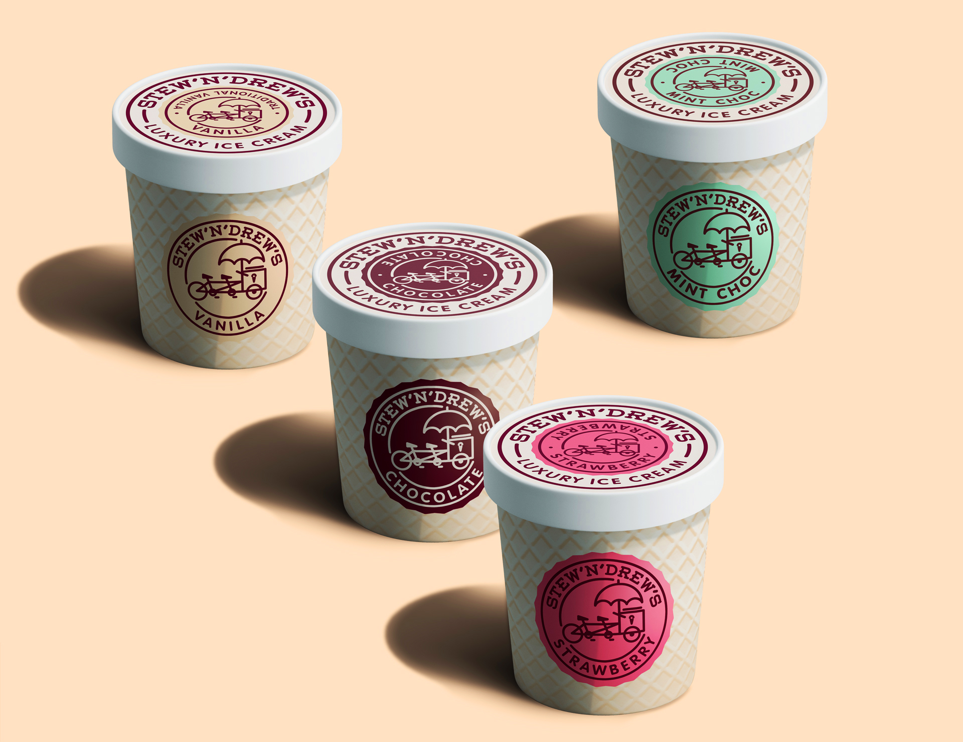
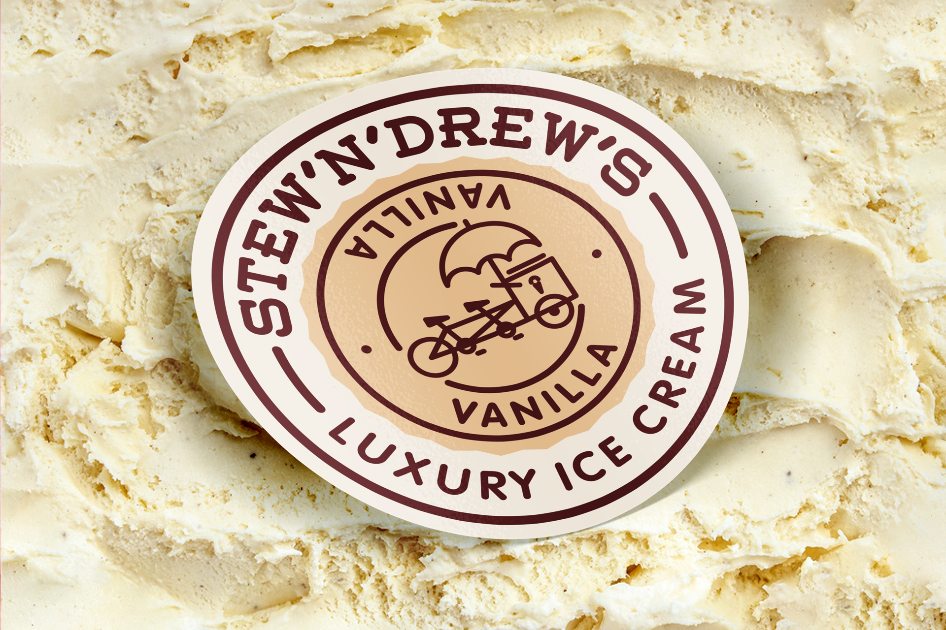
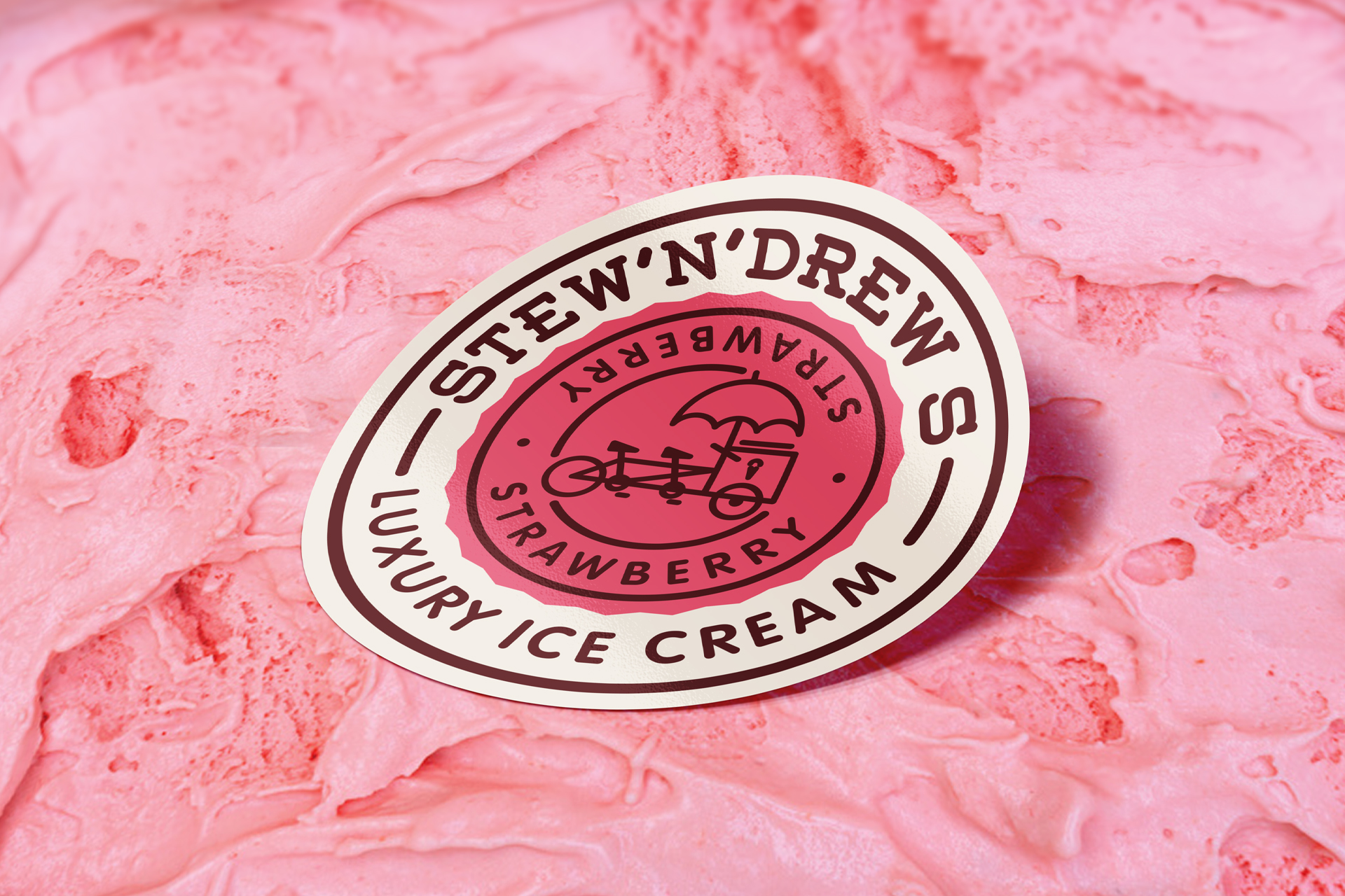
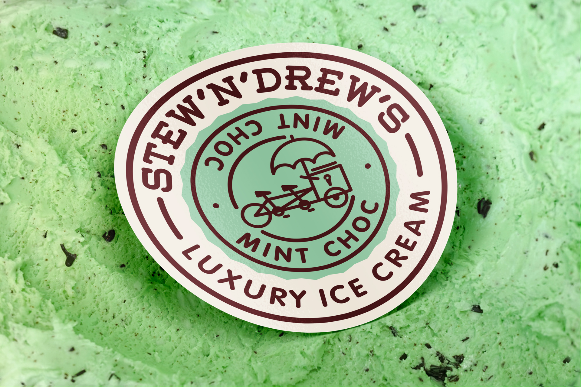
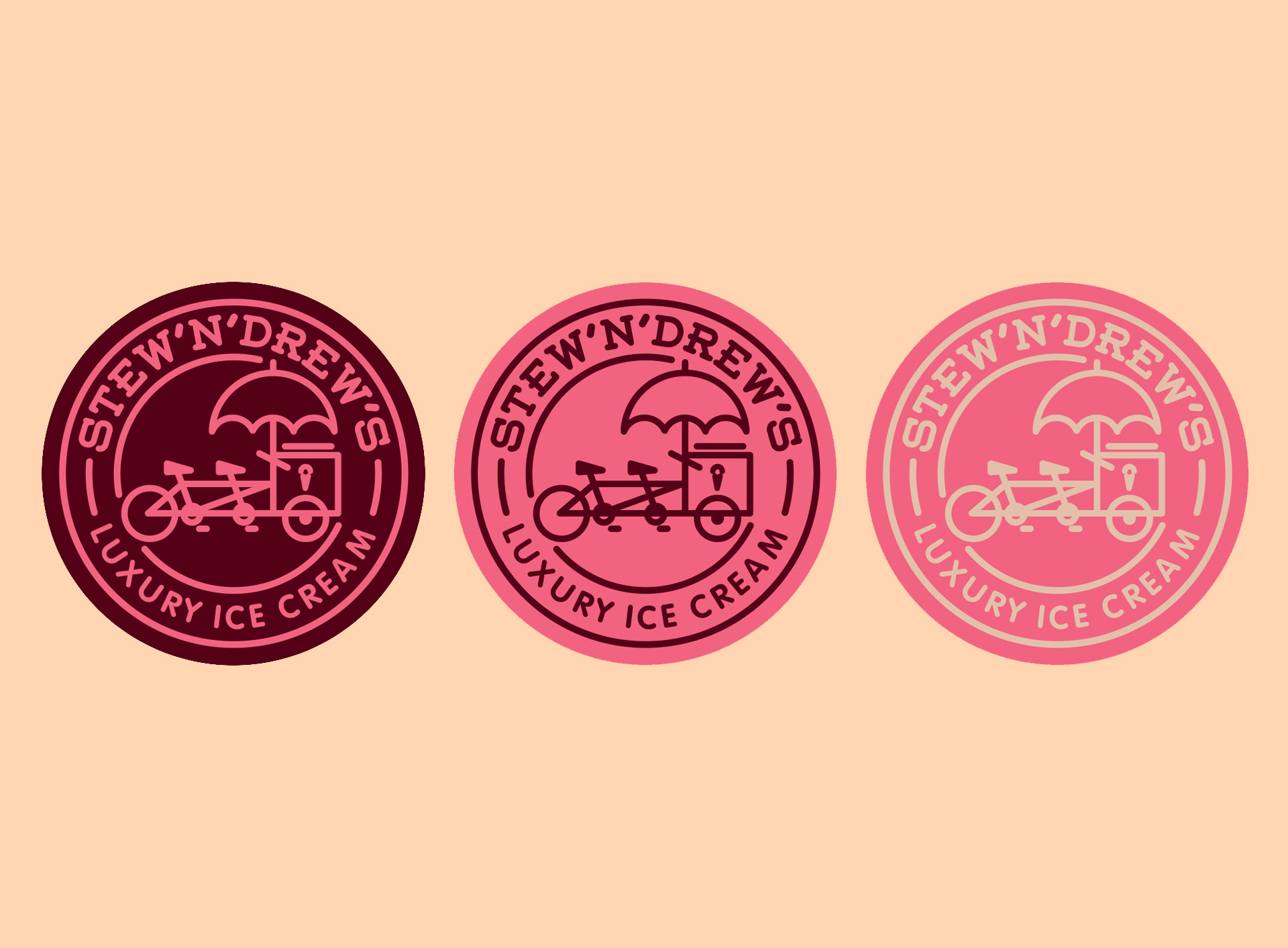
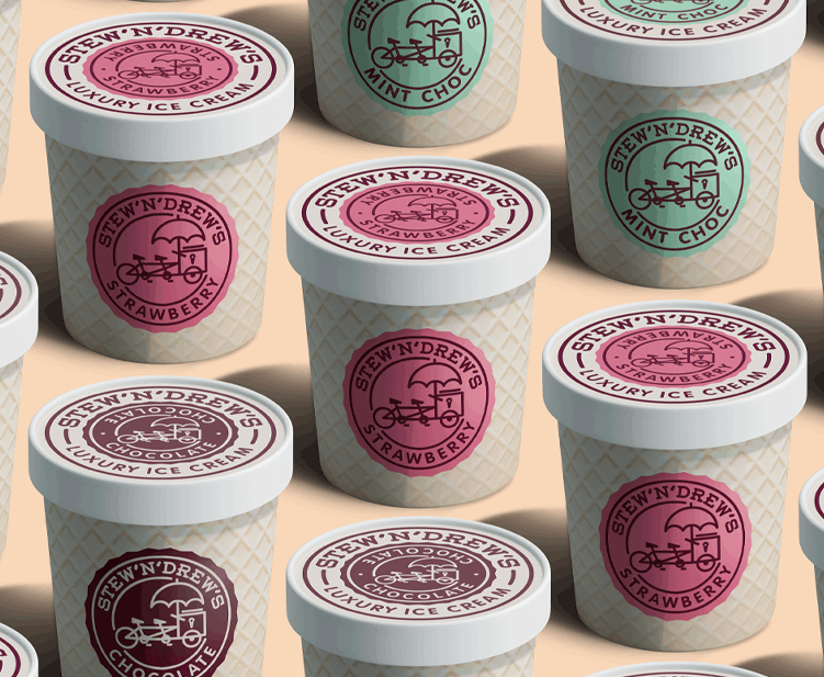
We teamed up with Stew’n’Drew to create a friendly and exciting brand that communicated their passion for quality ice cream directly through their packaging. The 2 boys behind the brand were key to the design as we created a tandem bike motif, a classic ice cream sellers bike, but with 2 seats! This reflected the partners friendship and sense of fun.
Throughout the packaging we wanted to capture the nostalgia attached with ice cream, as well as creating a luxury feel with a sense of humor. We illustrated the body of the containers with a wafer effect and off set this with bold colours and a strong brand presence.
The identity & packaging was an immediate hit with retailers and customers, causing Stew & Drew to spend a few late nights tasting and producing extra supplies of Ice Cream to meet demand.

CREDIT
- Agency/Creative: My Creative
- Article Title: I Scream! You scream! We all Scream for Stwe’N’Drew’s Ice Cream!
- Organisation/Entity: Agency, Published Commercial Design
- Project Type: Identity
- Agency/Creative Country: United Kingdom
- Market Region: Europe
- Project Deliverables: Branding, Identity System, Illustration, Packaging Design, Research, Tone of Voice
- Industry: Food/Beverage
- Keywords: esearch + brand identity, sign design, shopfront elements, FMCG, Logo design, ICE CREAM labels, typography, uniform apparel and packaging.


