High quality products made from 100% products without any concentrates, sugar or preservatives. Today’s users are more aware of their health. It’s not just about eating healthy, but making it a part of your lifestyle.
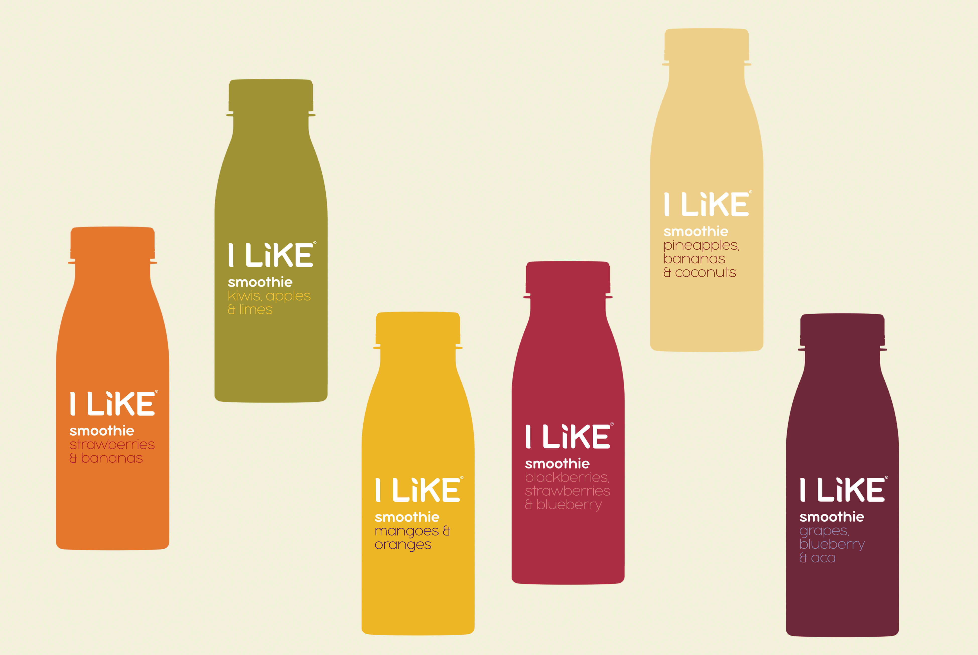
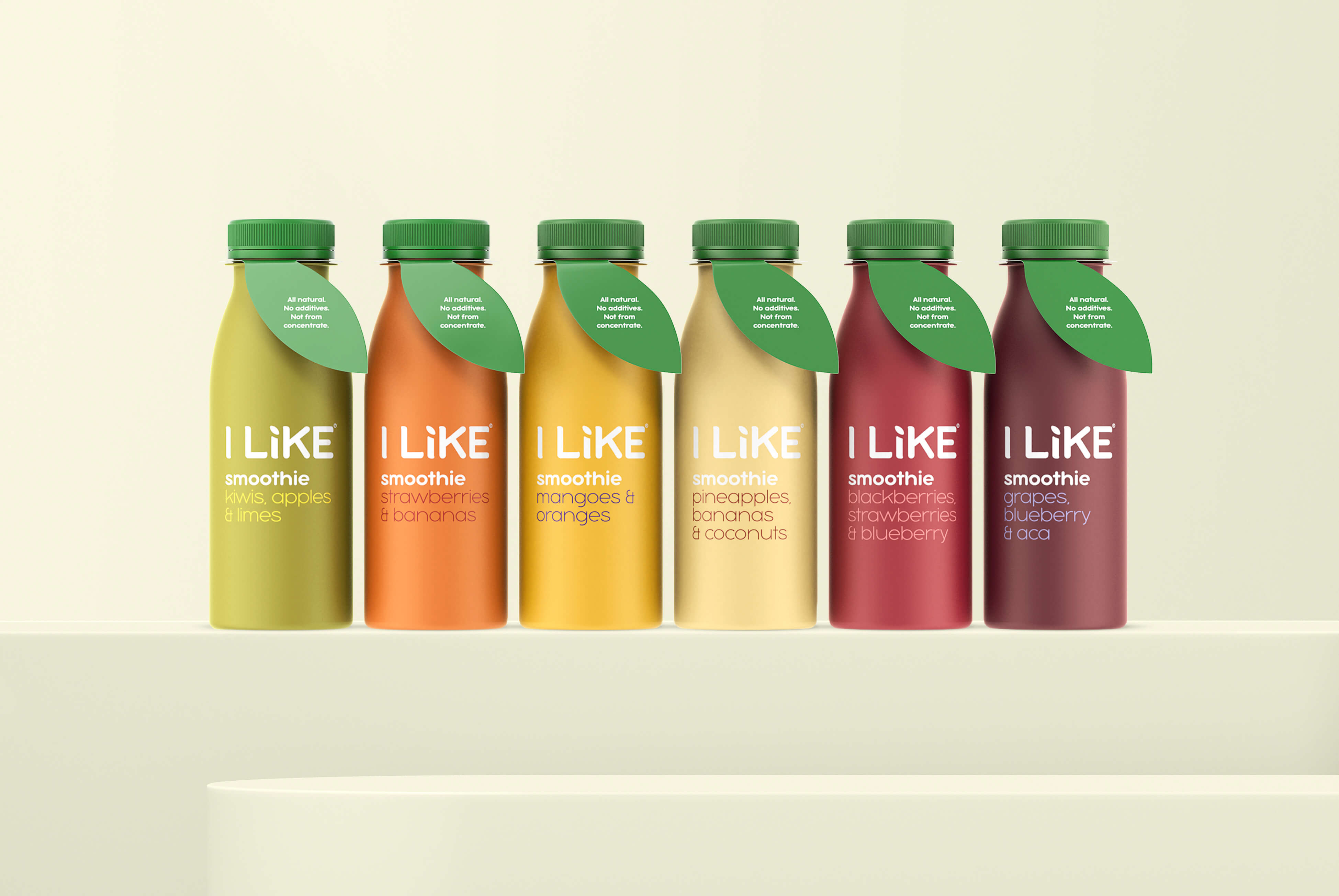
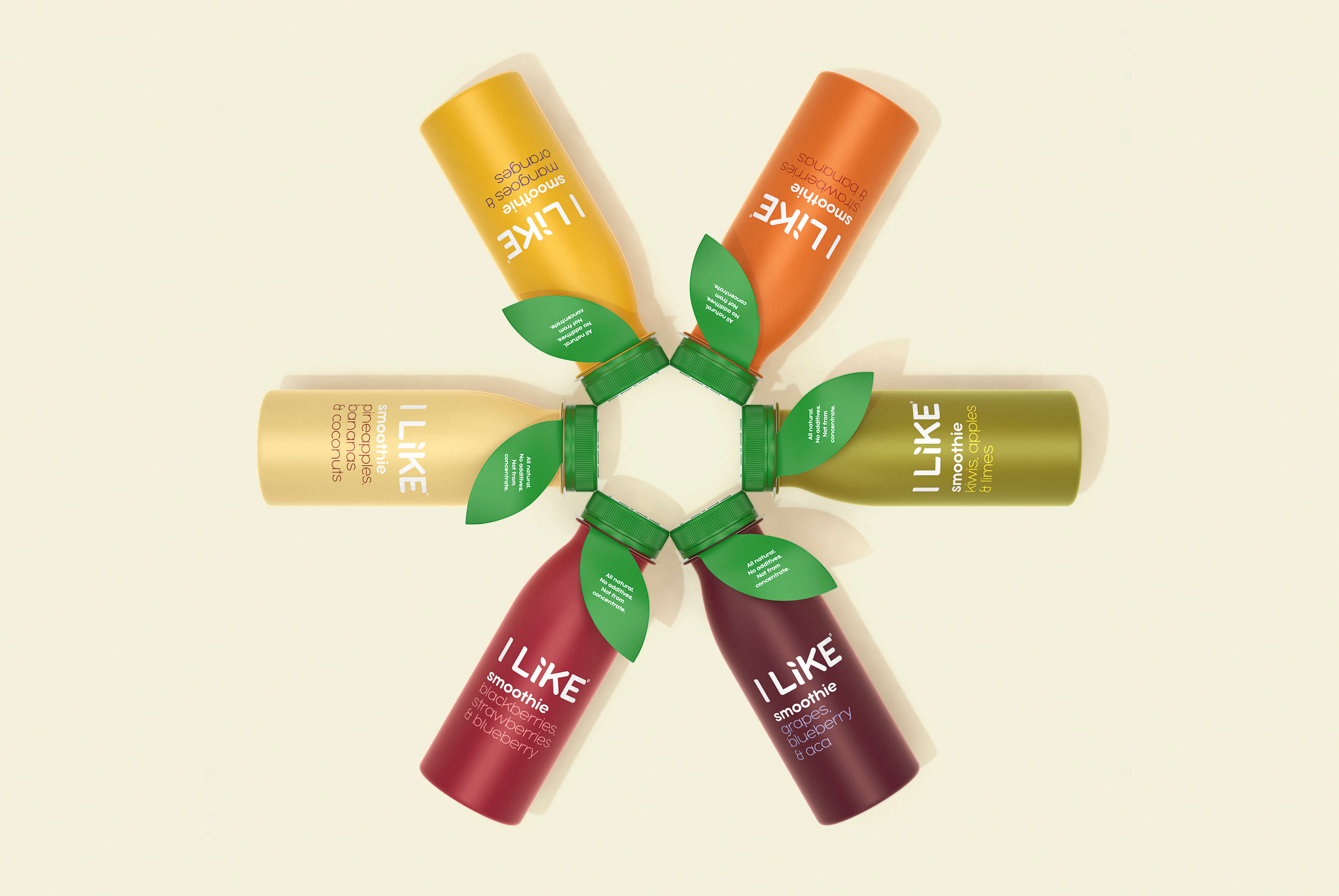
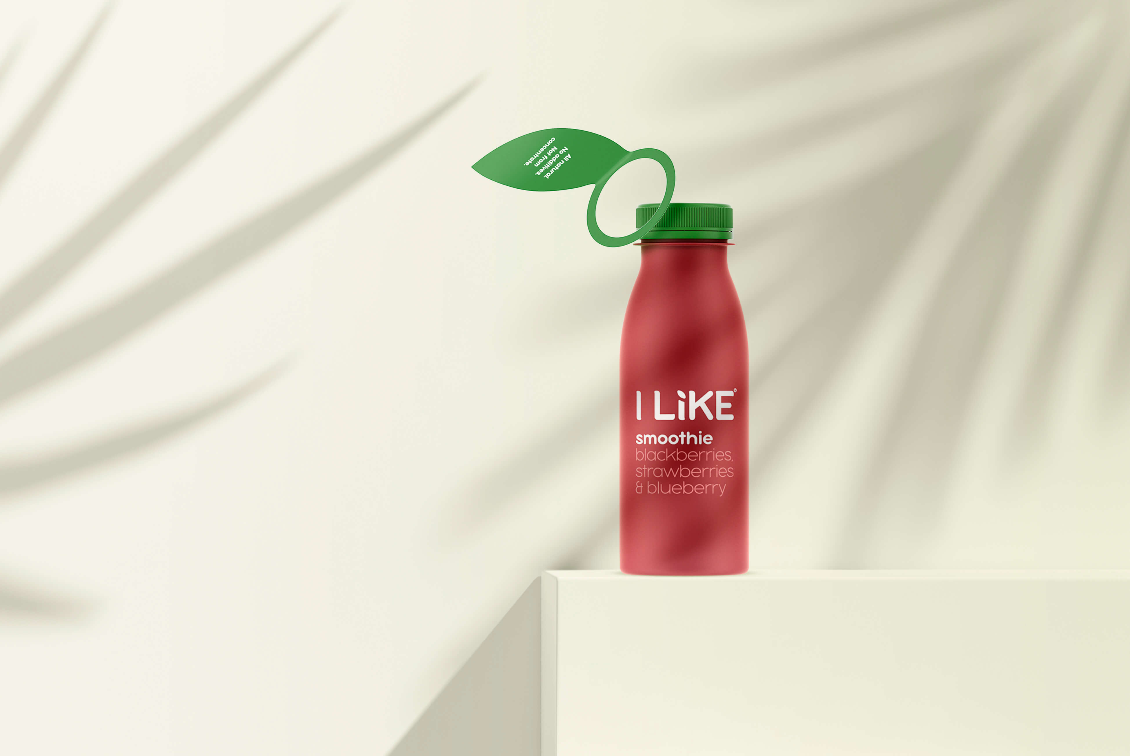
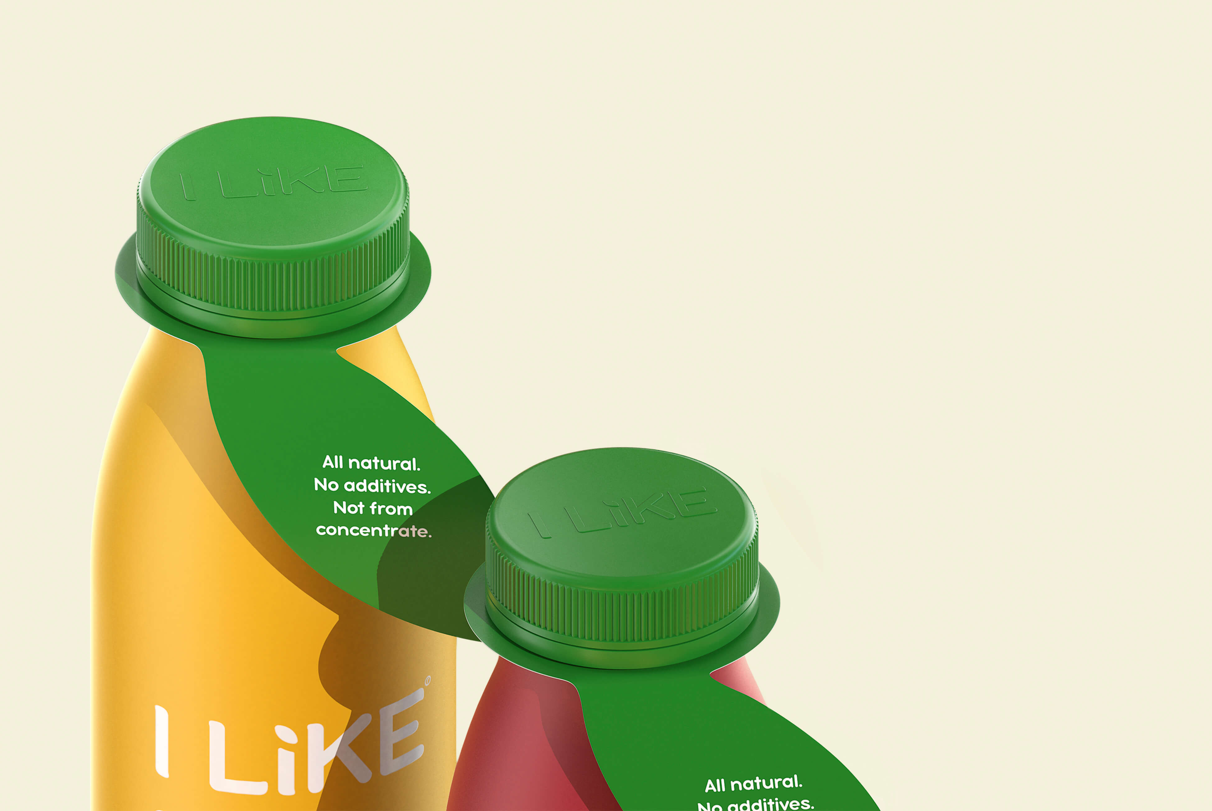
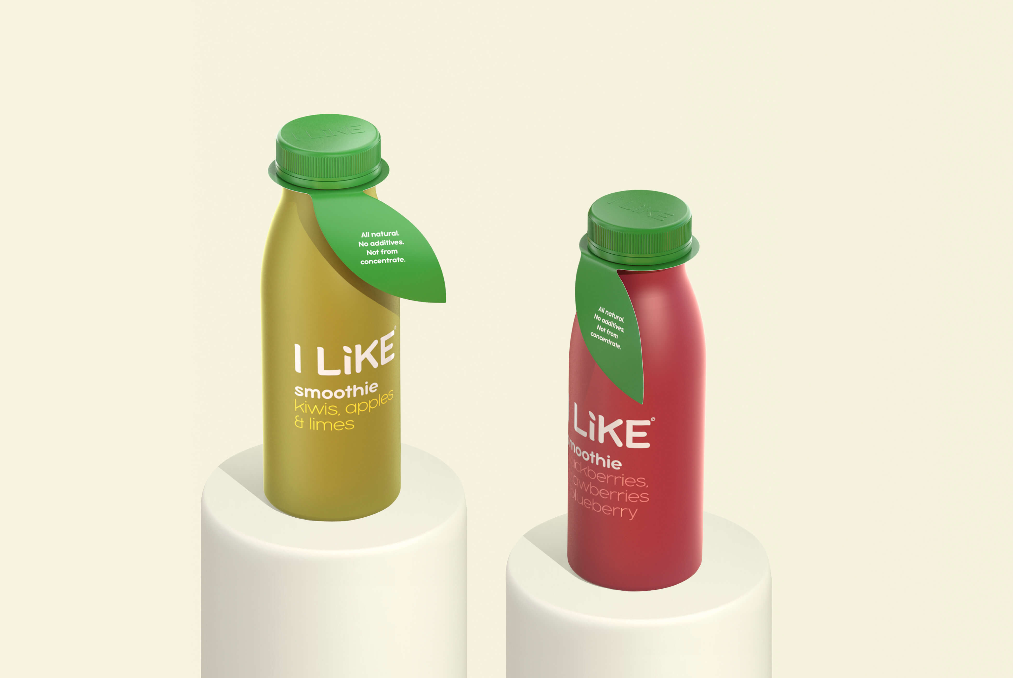
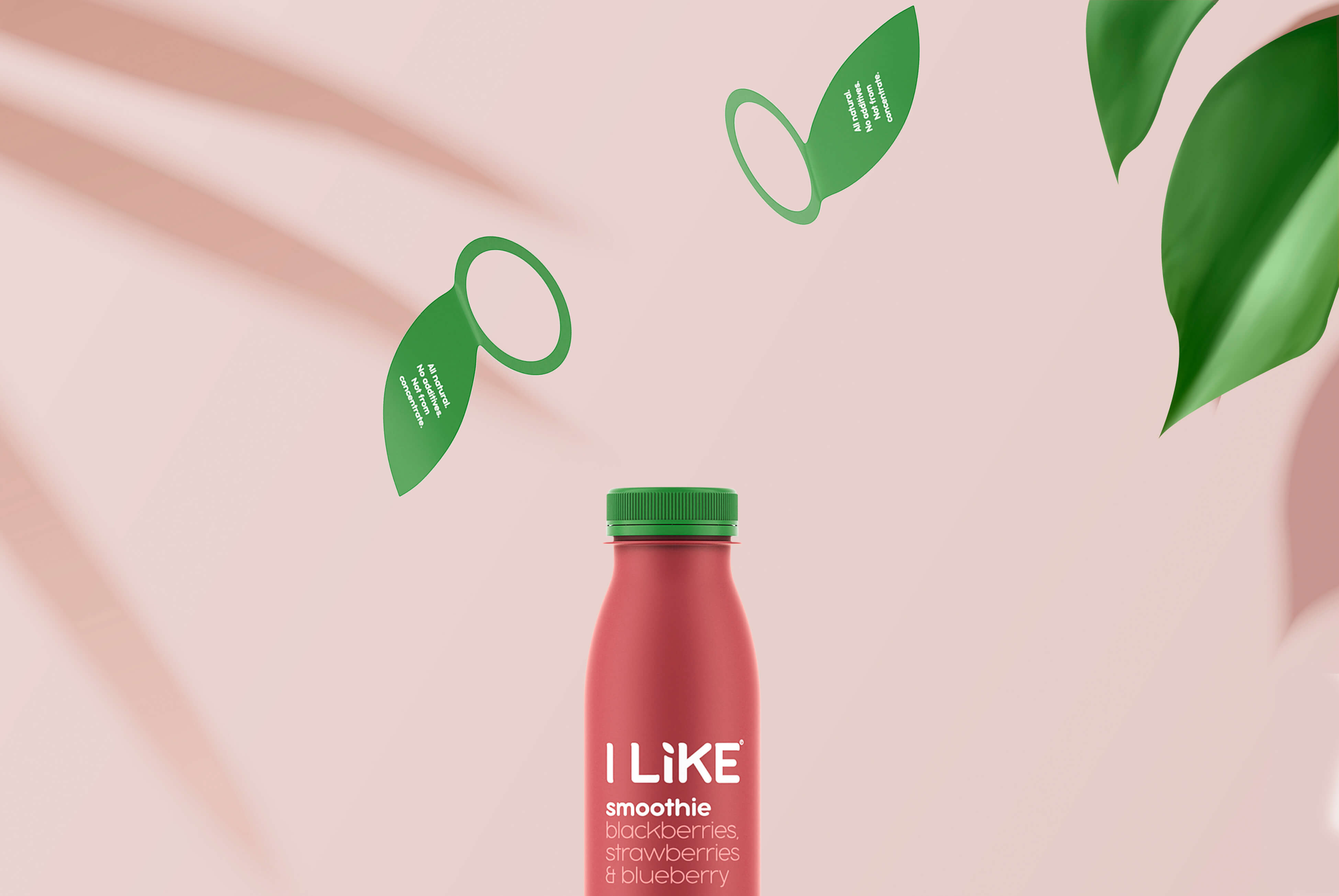
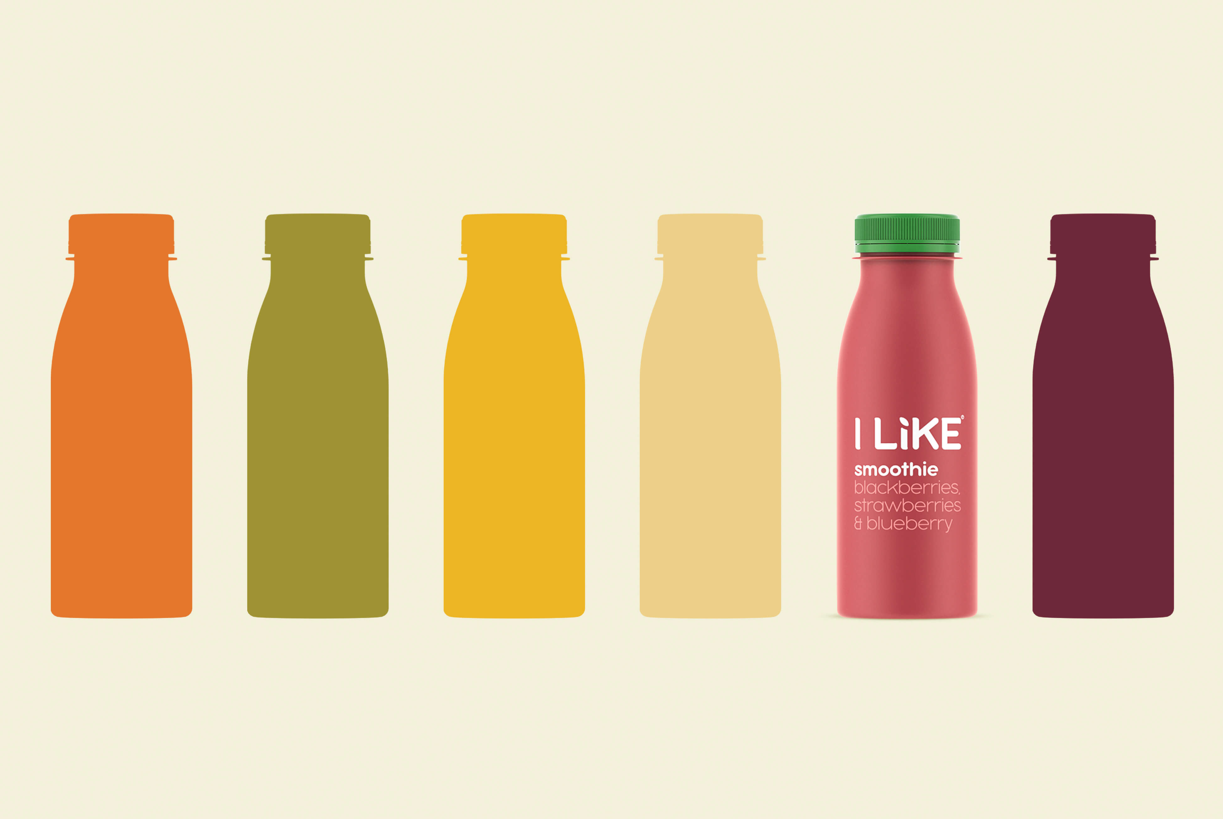
When developing the naming, we wanted to create a connection between the brand name and the type of product. The result is an unobtrusive, funny manifesto – Ilike / smoothie / grapes or Ilike/ smoothie / mangoes. This works well with the entire product line. In the process of developing the style of packaging, we tried to most accurately convey the naturalness of the product, the original color of the drink and its ingredients. The result is natural, not flashy, matte shades. We’ve also added a green leaf – a little extra element that gives the package an image of a freshly harvested fruit.
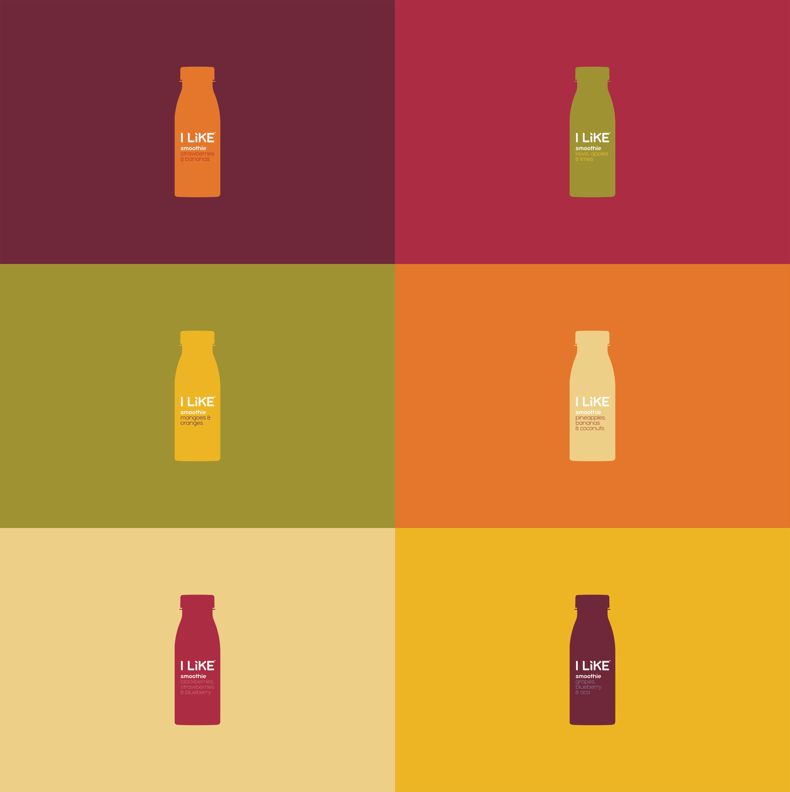
We have created carefully crafted packaging designs along with a coherent brand identity that reflects the resilient brand image as a pioneer in fruit products. The new design continues to delight, reflecting all of the brand’s colors, but with a stronger design structure and a more ambitious and daring approach. Now ILike can be a natural choice for healthy and delicious drinks.
CREDIT
- Agency/Creative: Commersart
- Article Title: I like Smoothies Packaging Design Concept
- Organisation/Entity: Agency, Non Published Concept Design
- Project Type: Packaging
- Agency/Creative Country: Russia
- Market Region: Europe
- Project Deliverables: Branding, Packaging Design, Product Naming, Tone of Voice
- Format: Bottle
- Substrate: Plastic


