BADA, which means “sea” in Korean, is the rebranding project for Busan City. According to the Korea Times, the number of foreign tourists visiting South Korea surged significantly, particularly in 2024. This growth is largely attributed to the phenomenon known as “Hallyu” or the “Korean wave,” which includes South Korean popular culture such as K-Pop, TV shows, and movies. Statista, a global data platform, reports that Seoul, the capital of South Korea, ranked as the top tourist destination in 2022, with Busan, the country’s second-largest city, following closely behind.
Located on the southeastern coast of South Korea, Busan offers a stunning mix of scenic beaches, majestic mountains, vibrant cultural scenes, and a bustling port, blending urban and natural attractions harmoniously.
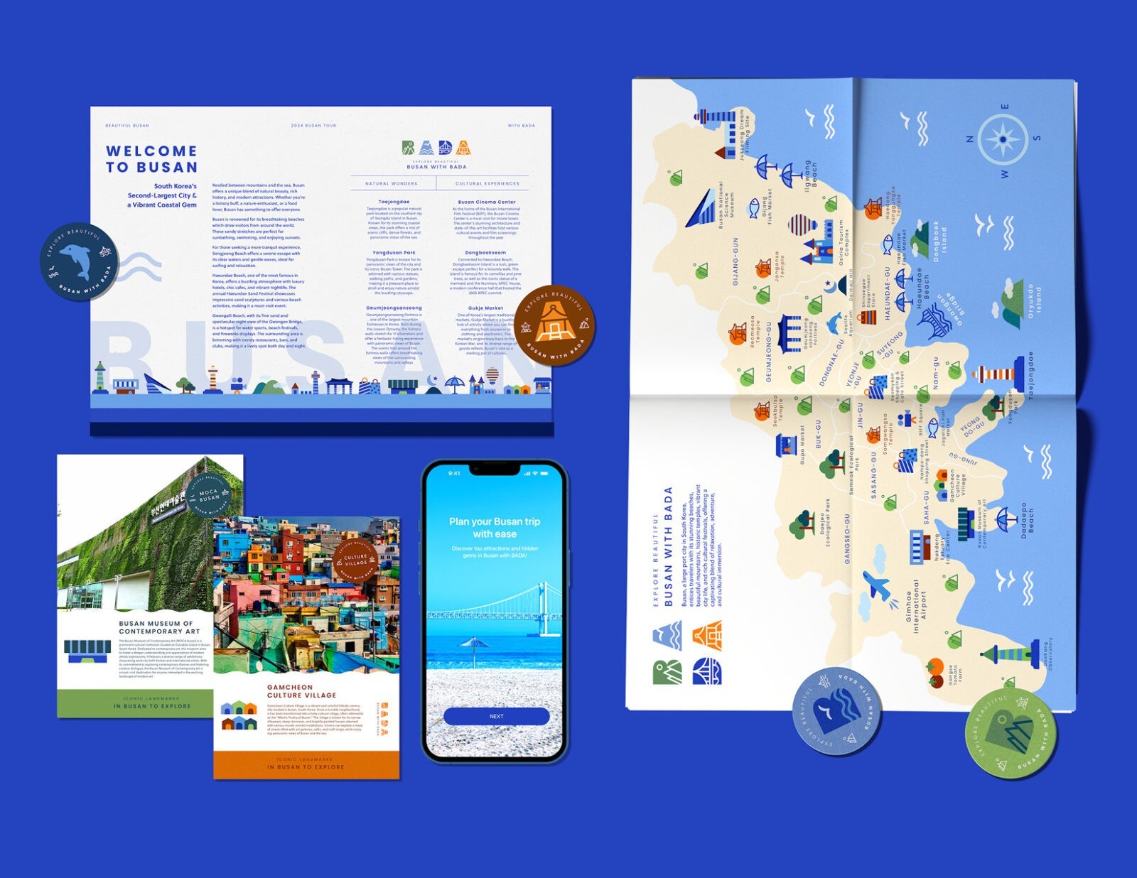
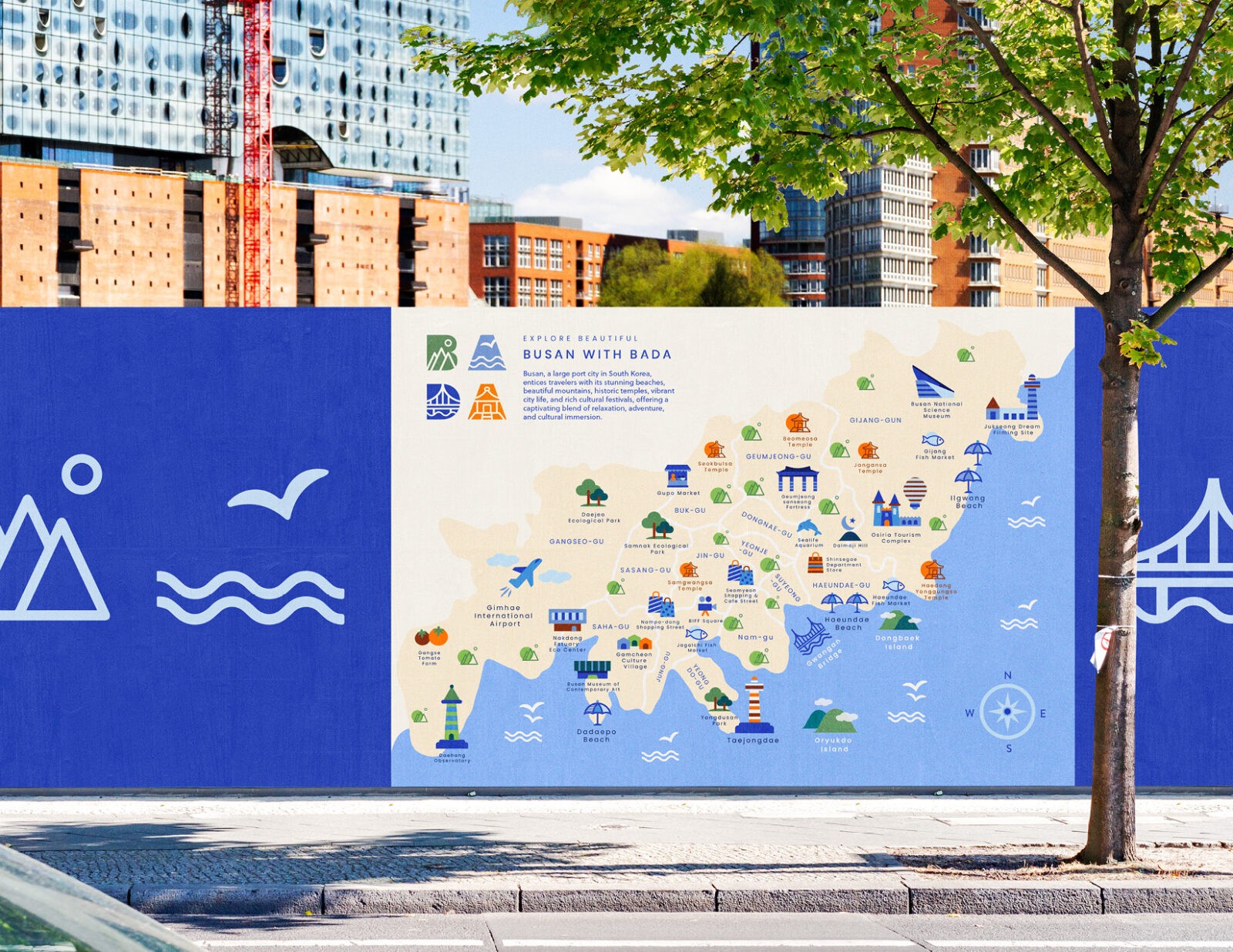
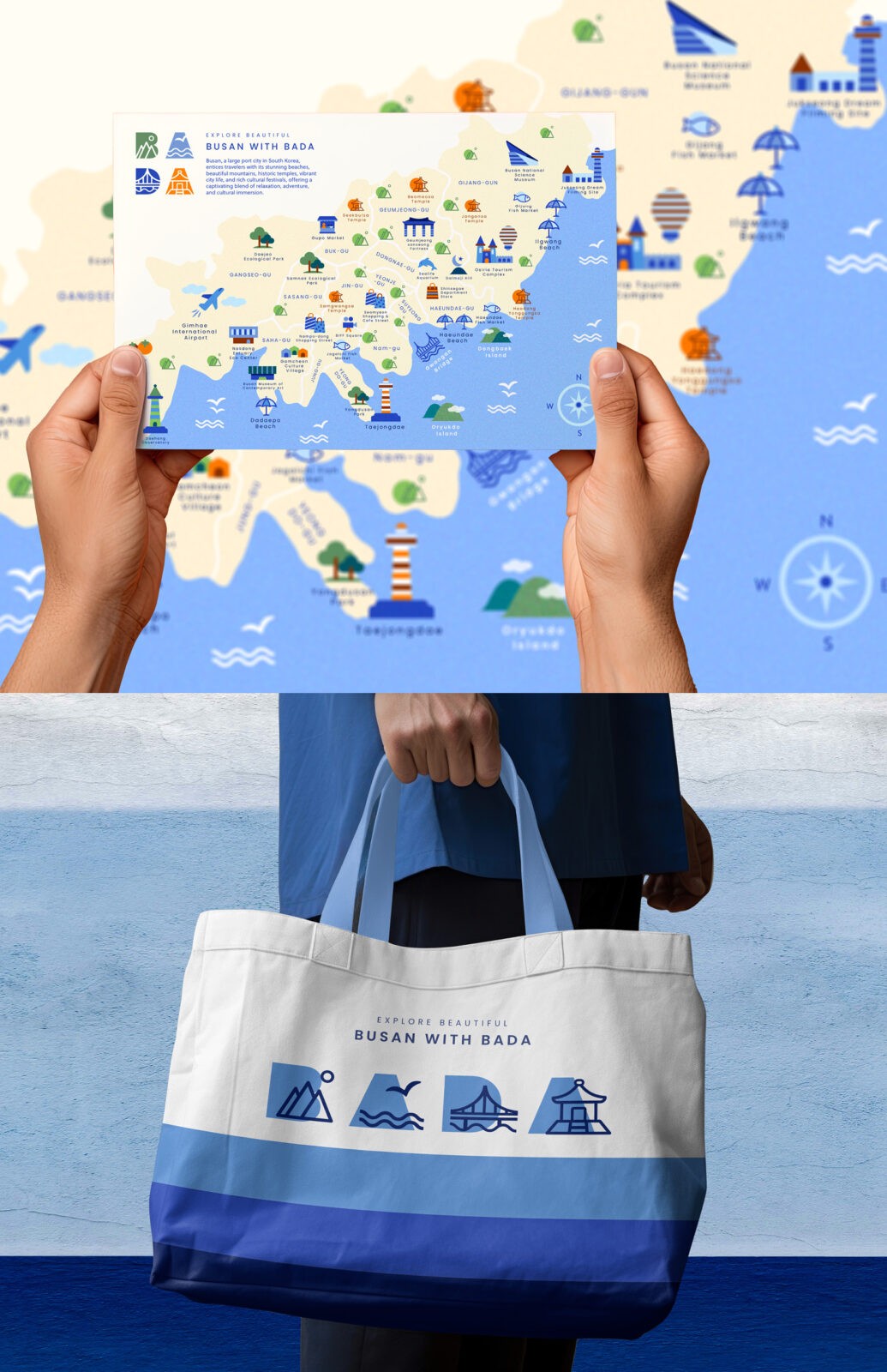
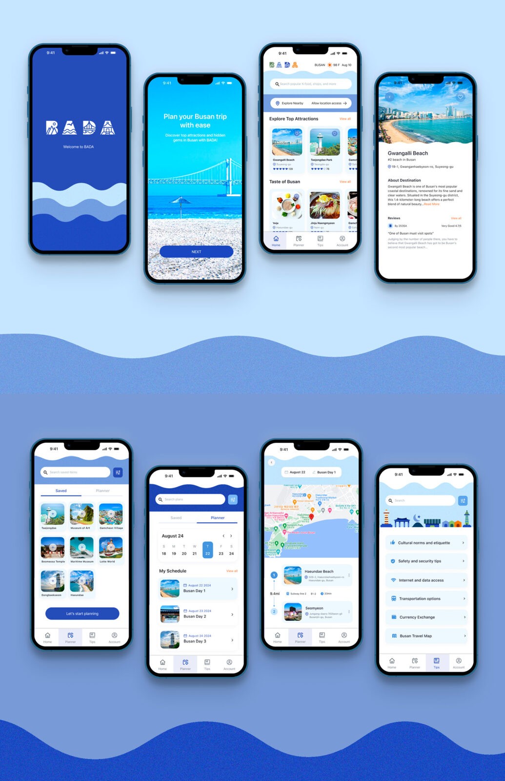
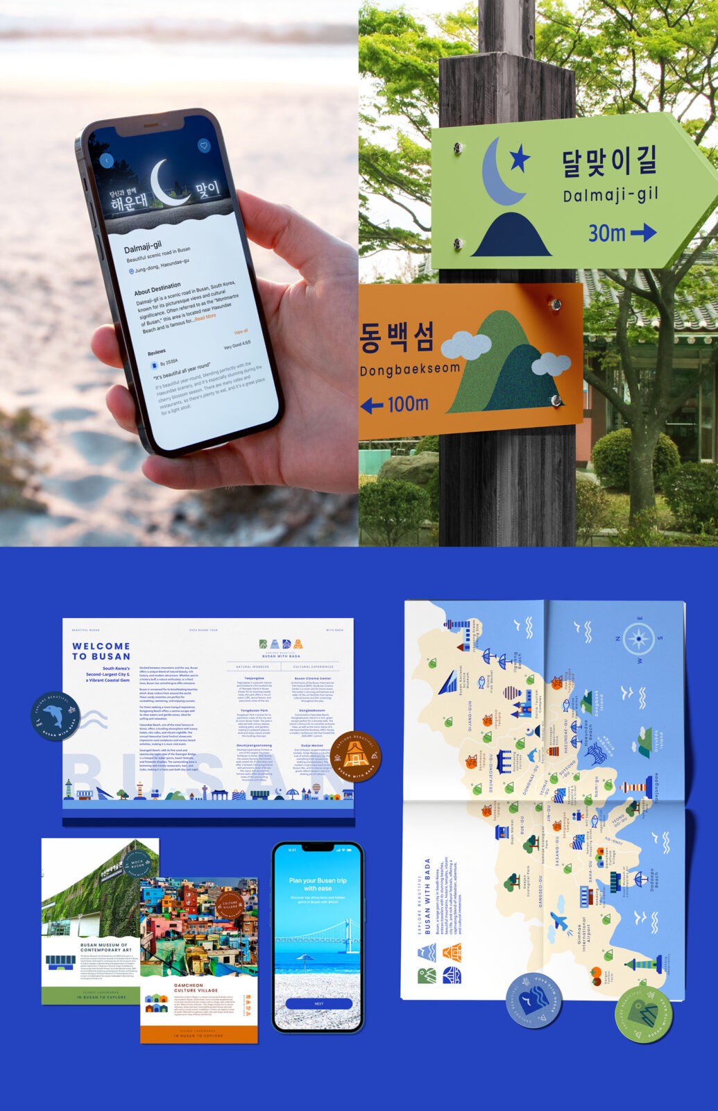
The aim of the BADA project is to showcase the city’s unique cultures and attractions to attract more visitors. It seeks to make exploring Busan easier with a combination of engaging visuals and practical information, ensuring that tourists have a comprehensive guide to the city’s offerings. The design concept is thoughtfully developed to appeal to tourists seeking local gems and distinctive cultural experiences.
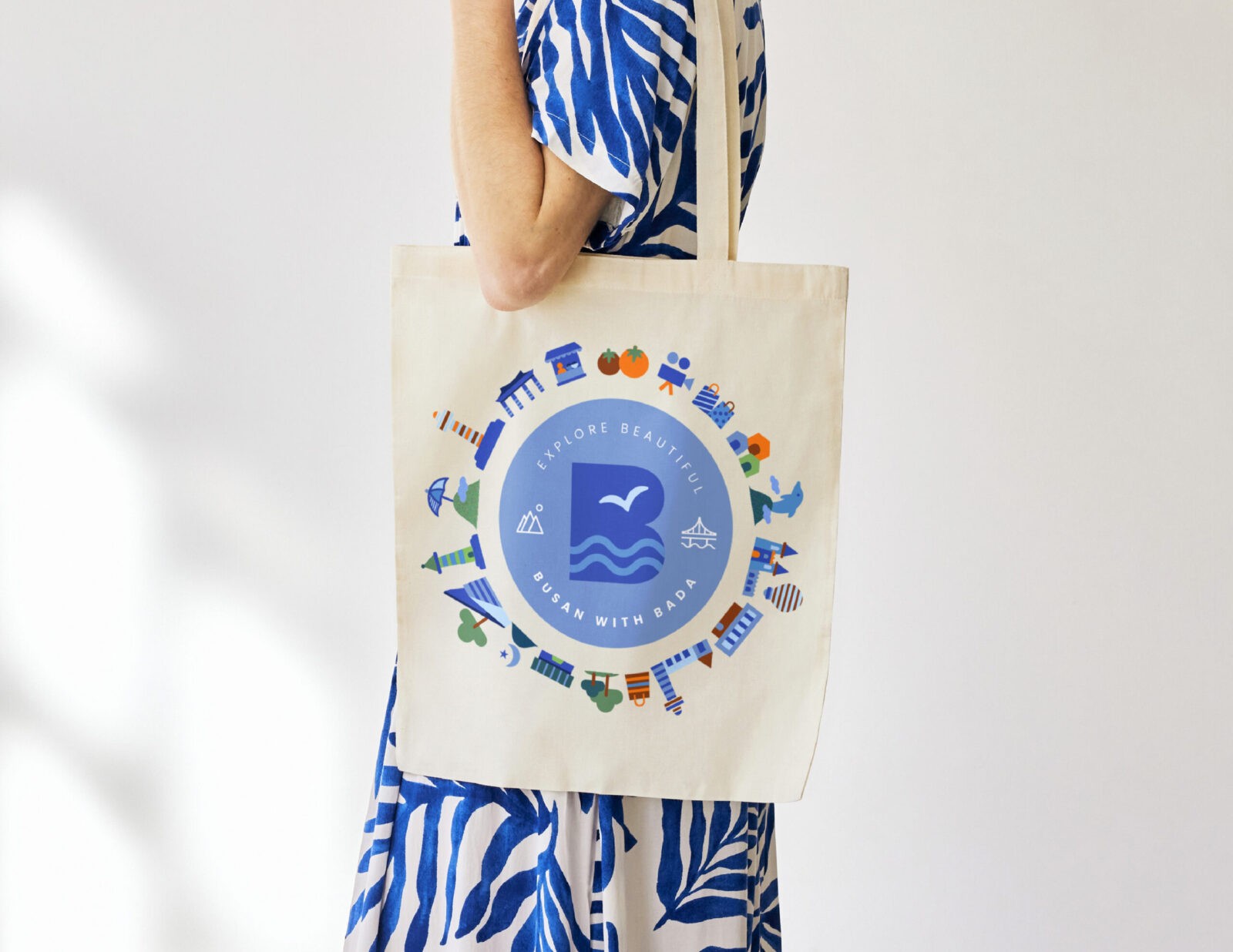
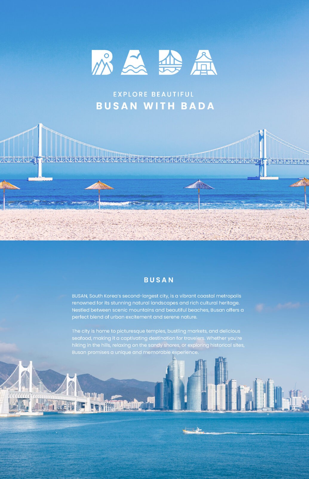
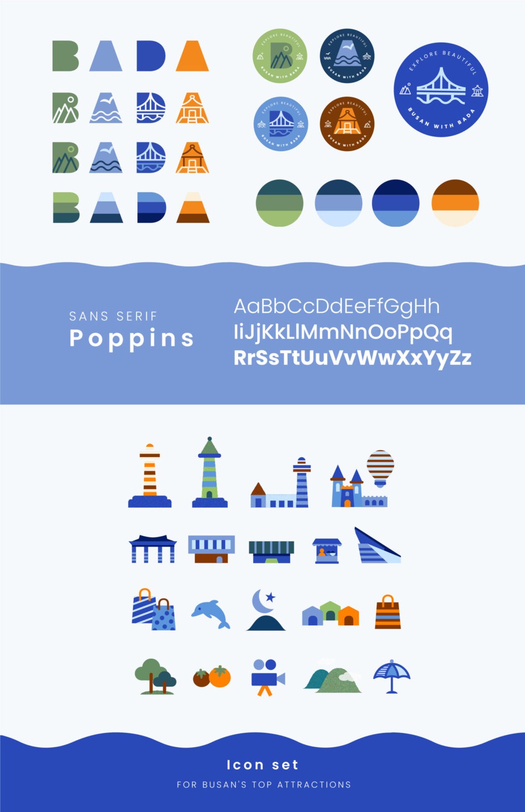
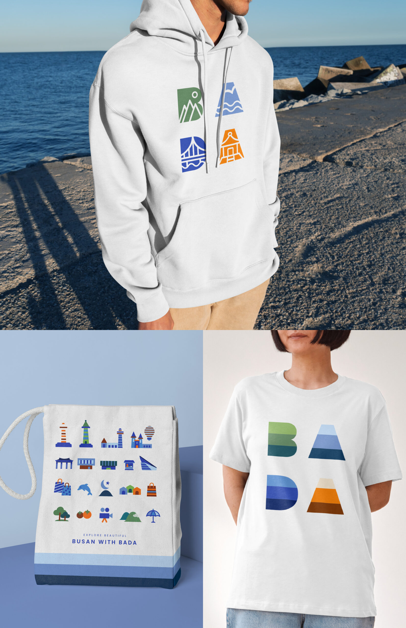
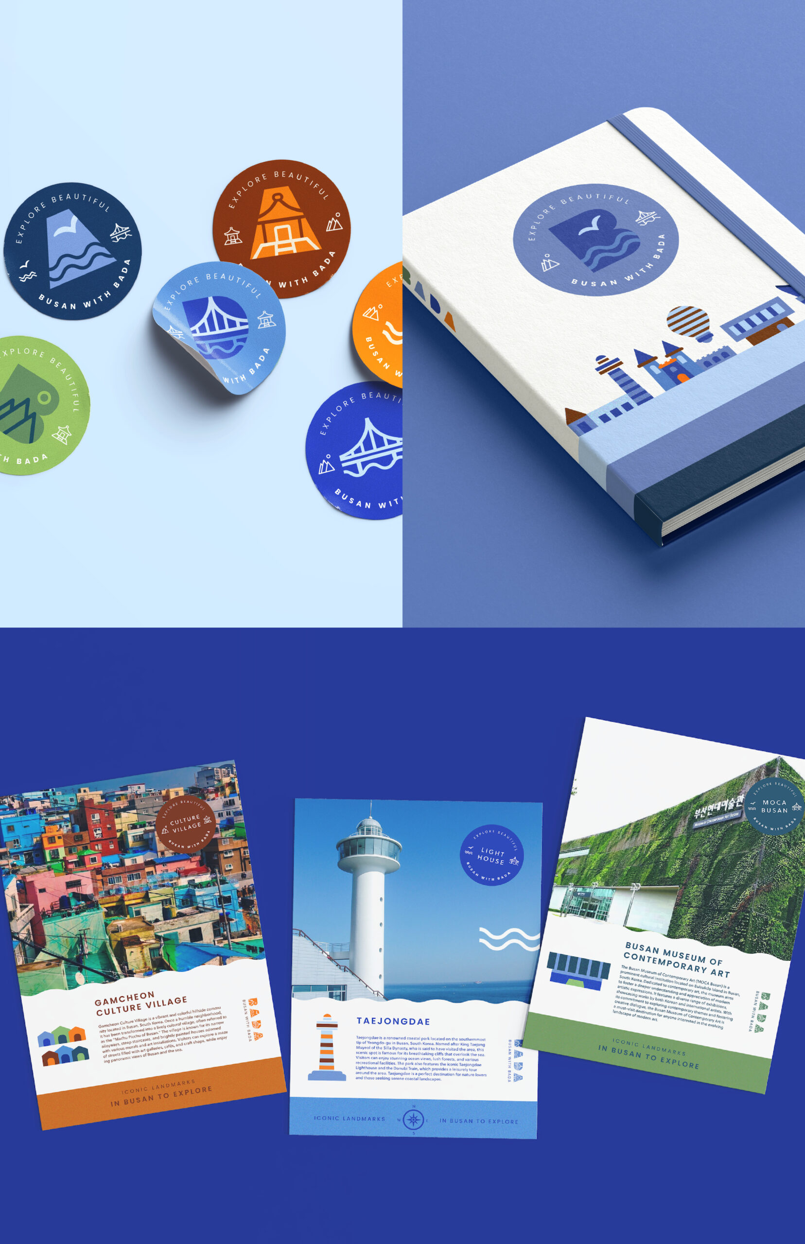
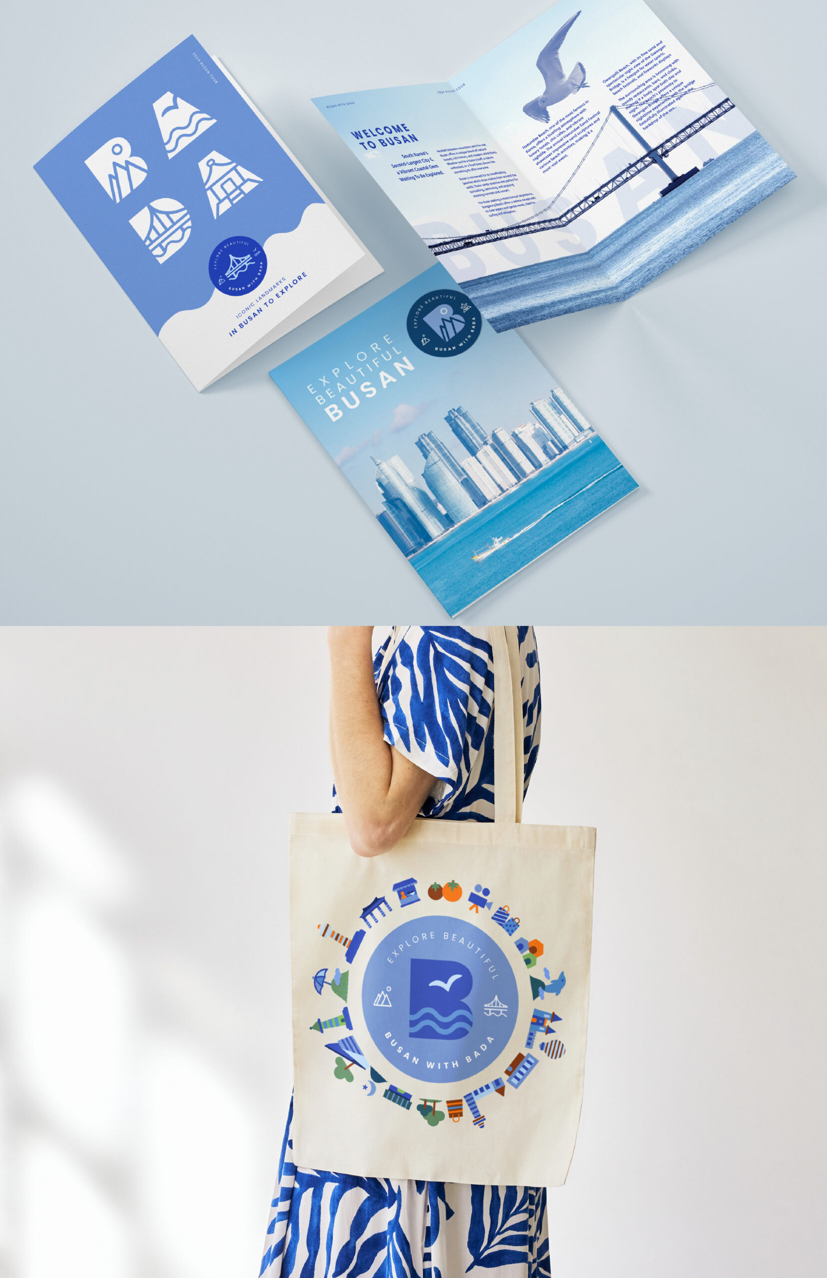
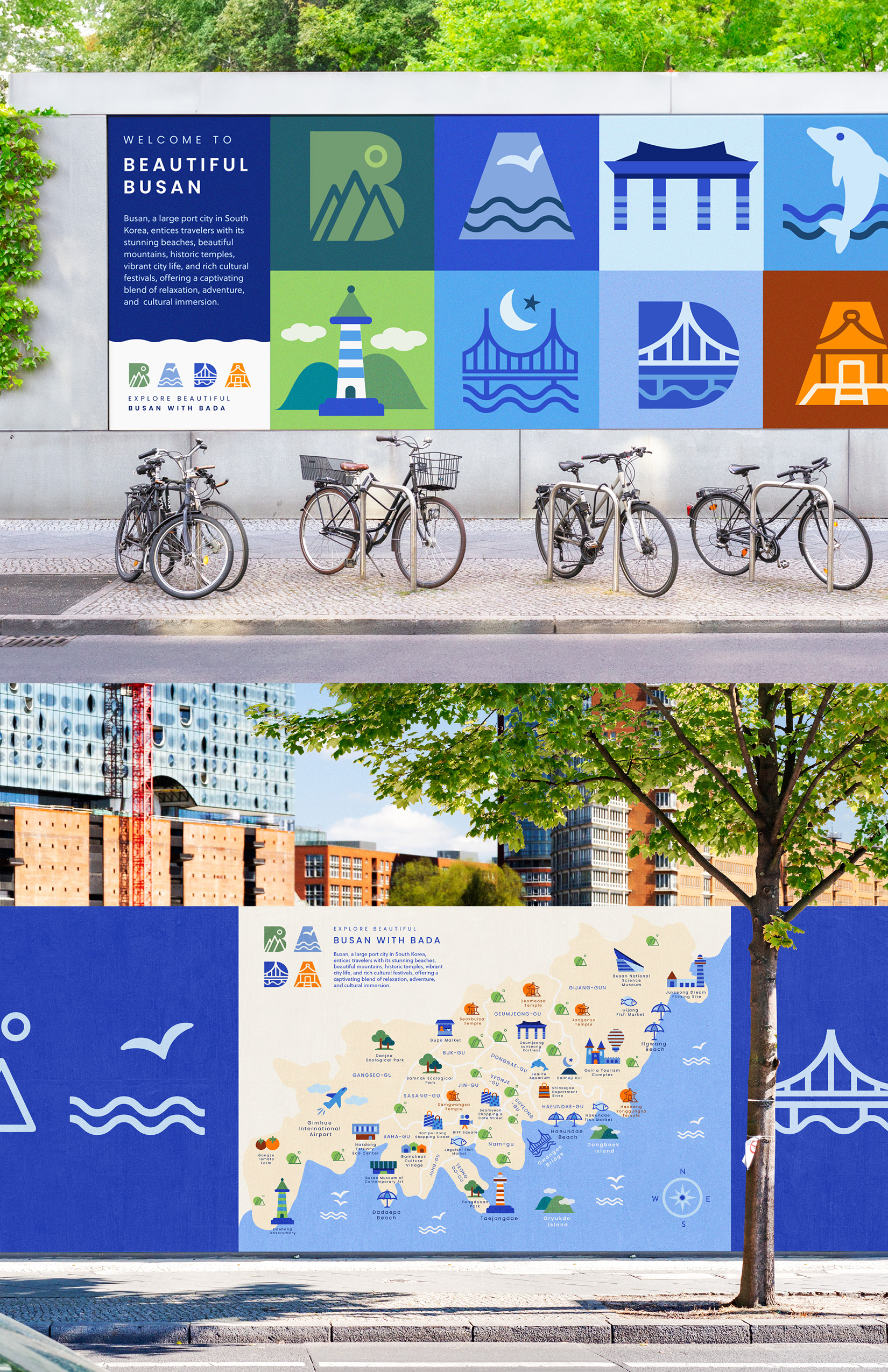
To visually convey Busan’s beautiful beaches, majestic mountains, and historic temples, the logo was carefully designed using minimalistic representations. Additional visual graphics have been created to highlight each attraction, promoting Busan’s famous sites and helping visitors explore the city fully. This cohesive visual identity not only captures Busan’s unique features but also emphasizes the city’s rich cultural diversity.
The branding colors—blue, green, and orange—are strategically chosen to highlight Busan’s unique features and strengthen its identity. Blue represents the sea, green symbolizes the mountains, and orange reflects the temples and vibrant culture of the city. This color palette aims to visually capture the dynamic experiences and distinct characteristics of Busan, creating a memorable and engaging brand presence for the city.
CREDIT
- Agency/Creative: Hyena Nam
- Article Title: Hyena Nam’s BADA Rebranding for Busan Captures the Essence of Sea, Mountains, and Korean Culture
- Organisation/Entity: Creative
- Project Status: Non Published
- Agency/Creative Country: United States of America
- Agency/Creative City: West Des Moines
- Project Deliverables: Brand Redesign, Graphic Design
- Industry: Hospitality
- Keywords: WBDS Creative Design Awards 2024/25
- Keywords: WBDS Creative Design Awards 2024/25


