


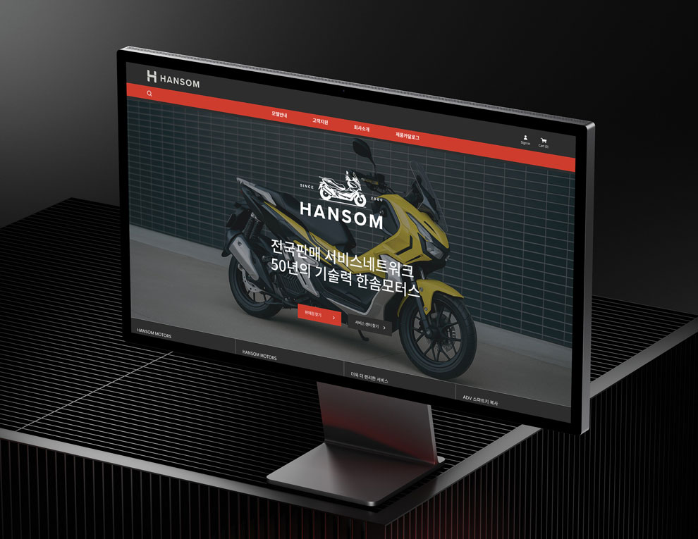
Hansom is a national motorcycle company based in South Korea, recognized for its commitment to producing affordable, efficient, and uniquely styled motorcycles. With a history spanning over 50 years, Hansom has evolved into a trusted brand known for its strong reputation, reliability, and design innovation across the country.
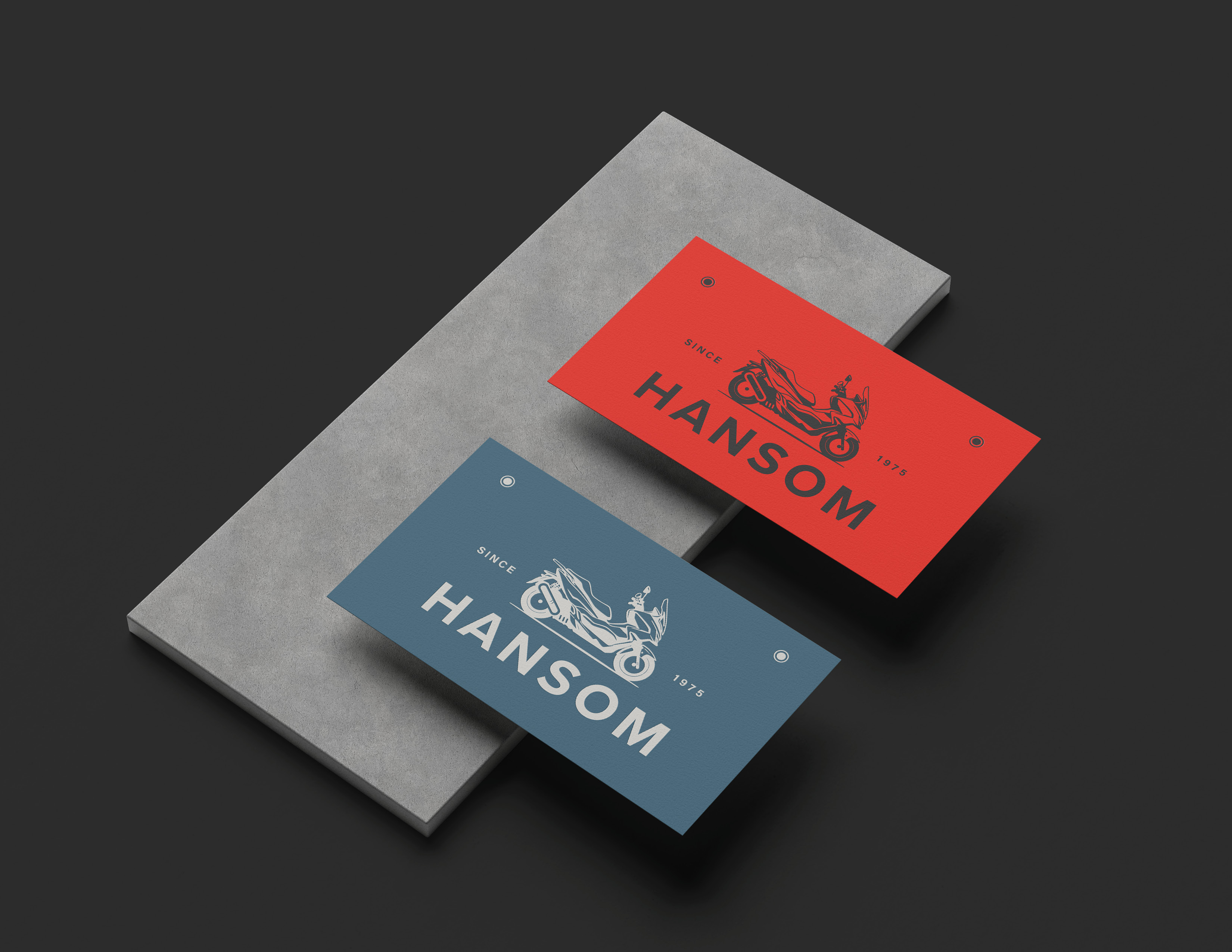
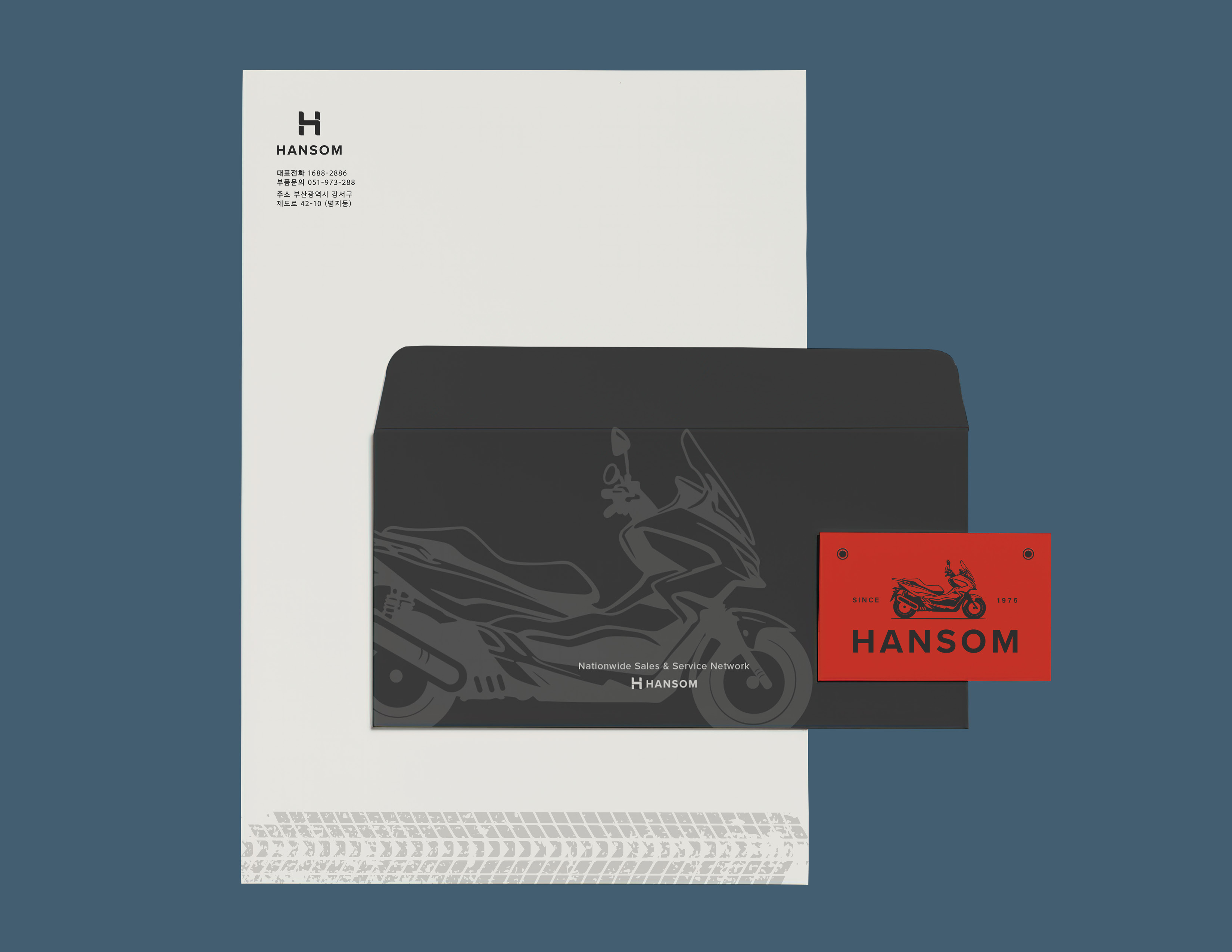
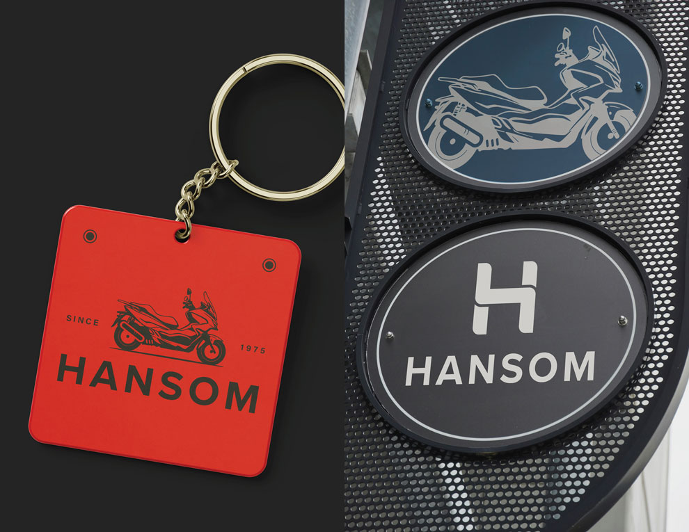
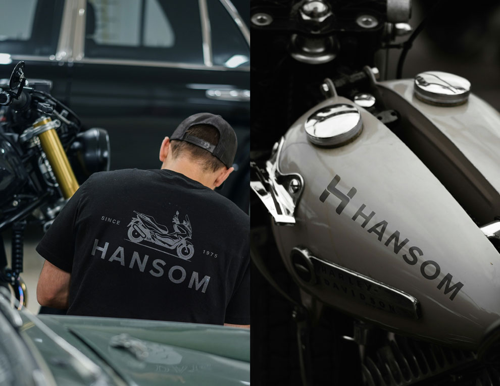
The company’s visual identity system is crafted to reflect its core values and long-standing legacy. At the heart of this system is a custom motorcycle illustration, integrated with the founding year, 1975, symbolizing both Hansom’s heritage and its continued pride and commitment to the motorcycle industry.
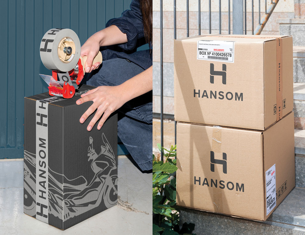
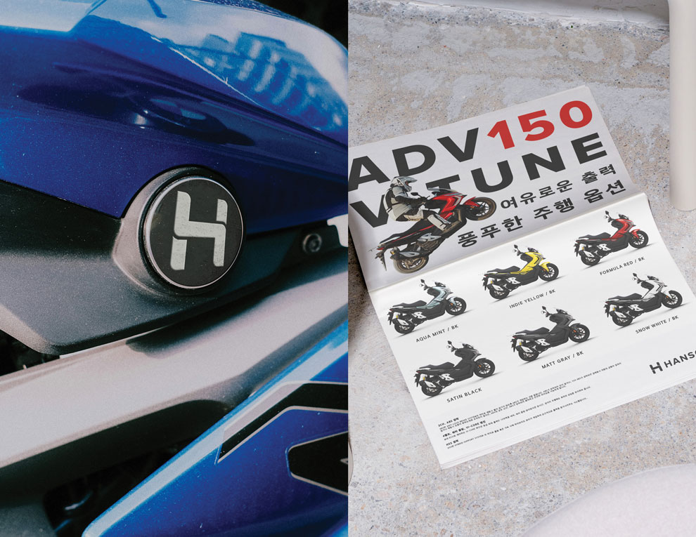
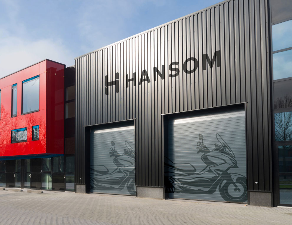
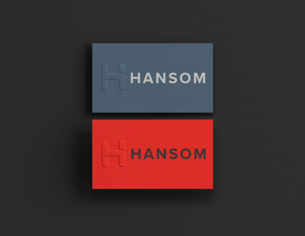
Targeting a young and active audience, the primary logo combines a custom-designed H with the company name, Hansom. The design draws inspiration from the sleek, modern aesthetic of their motorcycles and the metallic elements of motorcycle parts.
Aimed at a young and active audience, the primary logo combines a custom-designed H with the company name, Hansom. This typographic approach draws inspiration from the sleek, modern lines of Hansom’s motorcycles, incorporating the aesthetic of metallic components and mechanical precision.
The color palette features charcoal gray, red, and slate blue, each thoughtfully selected to express the brand’s tone. Red reflects passion and dedication to quality. Charcoal gray conveys professionalism and sophistication, while slate blue suggests the industrial character of motorcycle parts. Together, these colors form a modern, balanced, and cohesive identity.
CREDIT
- Agency/Creative: HYENA NAM
- Article Title: Hyena Nam Channels Mechanical Elegance into Hansom’s New Visual Identity
- Organisation/Entity: Freelance
- Project Type: Identity
- Project Status: Published
- Agency/Creative Country: South Korea
- Agency/Creative City: United States
- Market Region: Asia
- Project Deliverables: 2D Design
- Industry: Manufacturing
- Keywords: Motorcycle
-
Credits:
Art Direction: HYENA NAM


