


HURTS is a conceptual visual identity project that explores the duality between the discomfort of learning and the deeper, often invisible cost of remaining in ignorance. At its core, the project is a visual experiment that contrasts pain and stillness — the friction of growth versus the passive state of not knowing.
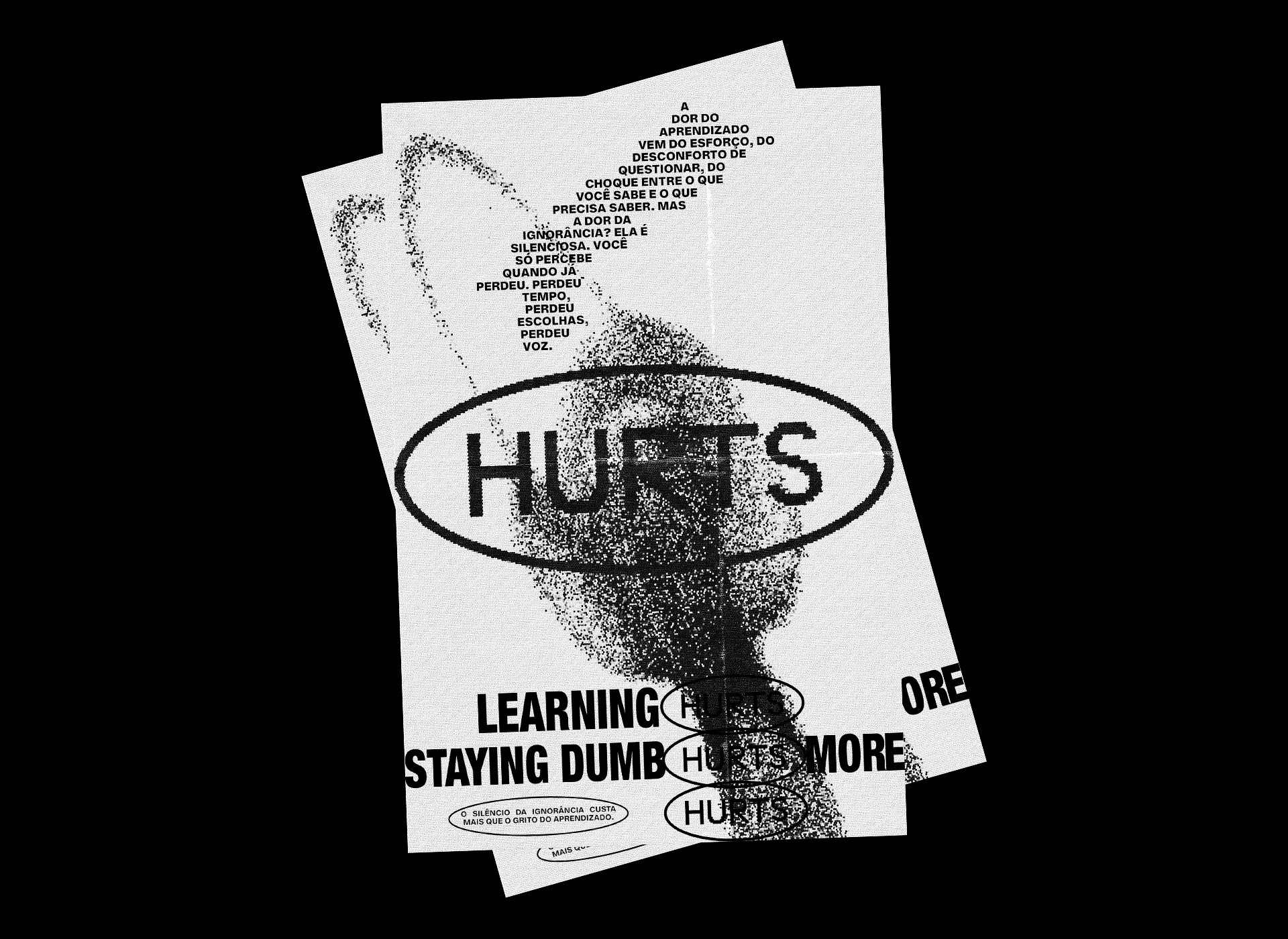
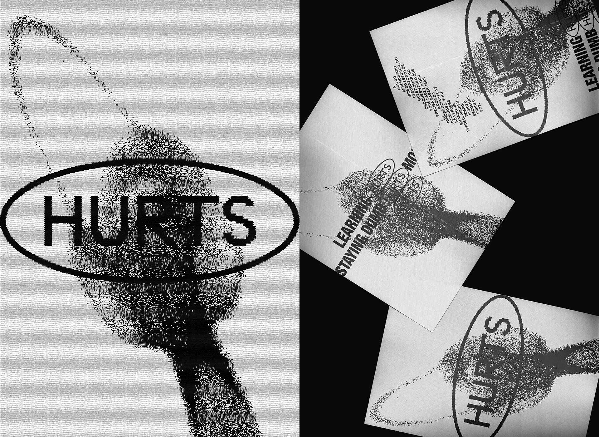
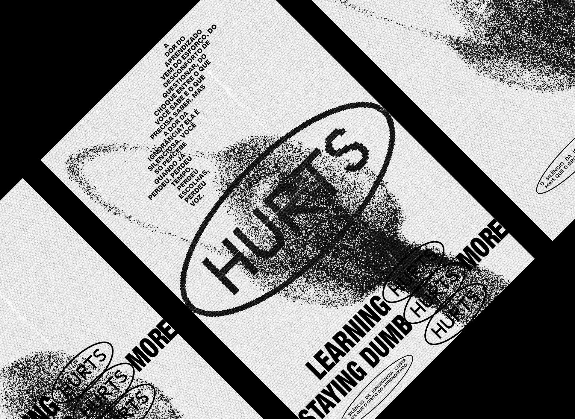
The identity is built on tension: bold typographic compositions meet fragmented visuals, evoking the mental and emotional strain often linked to personal transformation. The use of particles forming a tornado acts as the central metaphor — an unstable, dynamic force representing the whirlwind of thoughts, emotions, and resistance that arise when we confront new knowledge. This storm of ideas is not destructive but constructive — a necessary chaos that precedes clarity.
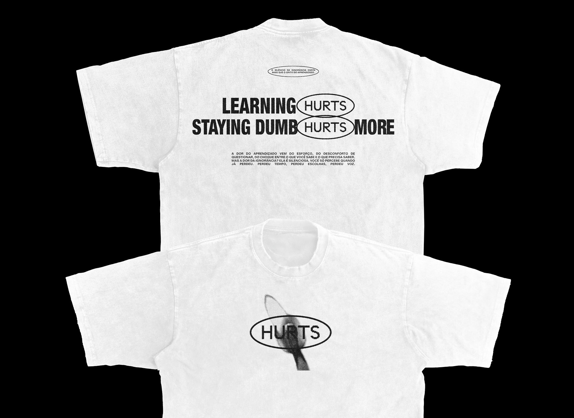
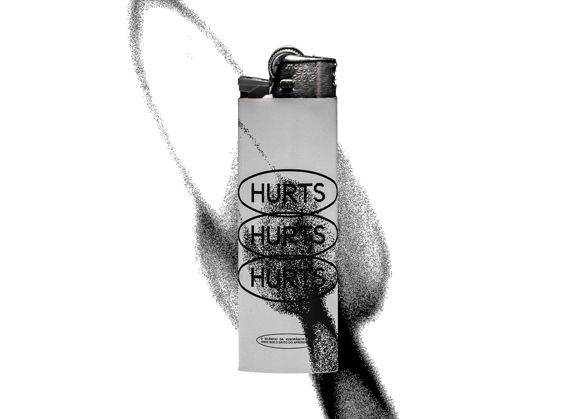
At the centre of this tornado, the image revealed through the particles is that of a lit match — a burning symbol of the effort required to learn. The flame represents the present moment of discomfort: intense, hot, fleeting. It both illuminates and burns. The lit match becomes a visual metaphor for the immediate sacrifice needed to spark transformation. Learning demands energy, friction — and inevitably, a departure from comfort.
Every design decision was intentional in communicating this discomfort: from the raw textures that echo internal noise, to the asymmetrical layouts that disrupt visual balance. The visual language embraces imperfection, framing human vulnerability as a strength rather than a flaw.
The project also challenges how we perceive aesthetics in relation to emotion. Can something painful be beautiful? Can discomfort lead to clarity? HURTS does not offer answers — it creates space for reflection. It invites the viewer to sit with the tension and consider that, no matter how uncomfortable it may feel, learning is always worth the struggle.
This identity was not created for a client — it was born from emotional insight and personal experience. It stands as an expressive, emotional, and experimental exploration of what it means to grow, to change, and to choose knowledge over comfort.
CREDIT
- Agency/Creative: Elias Oliveira
- Article Title: Hurts: A Design Dialogue Between Pain and Aesthetics by Elias Oliveira
- Organisation/Entity: In-House
- Project Type: Graphic
- Project Status: Non Published
- Agency/Creative Country: Brazil
- Agency/Creative City: Brejões, Bahia
- Market Region: Global
- Project Deliverables: Art Direction, Concept Art, Editorial Design, Graphic Design, Poster Design
- Industry: Information
- Keywords: Graphic Design Design Inspiration Poster Design Editorial Layout Conceptual Branding Design Narrative
-
Credits:
Design & Art Direction: Elias Oliveira


