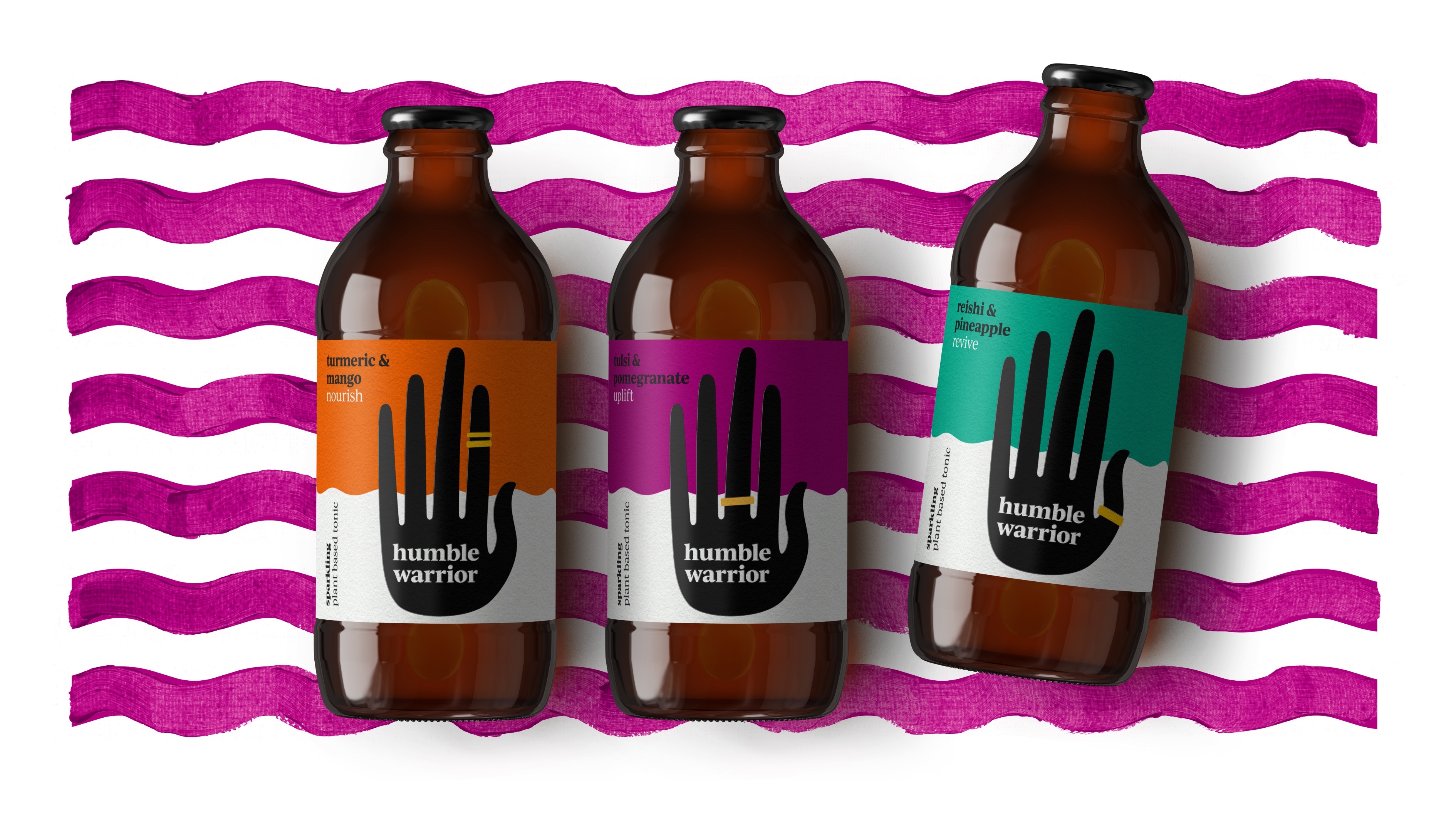
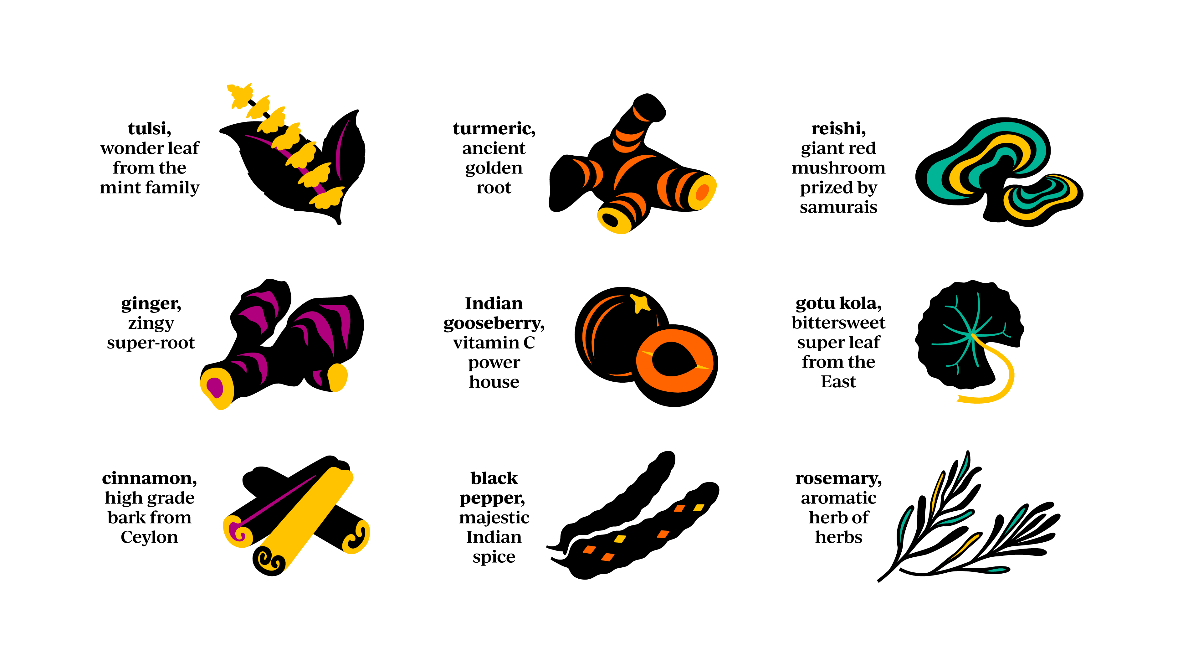
Humble warrior was inspired by Rosh’s (the founder) childhood visits to Sri Lanka and the incredible roots, leaves and spices used for centuries in the East.
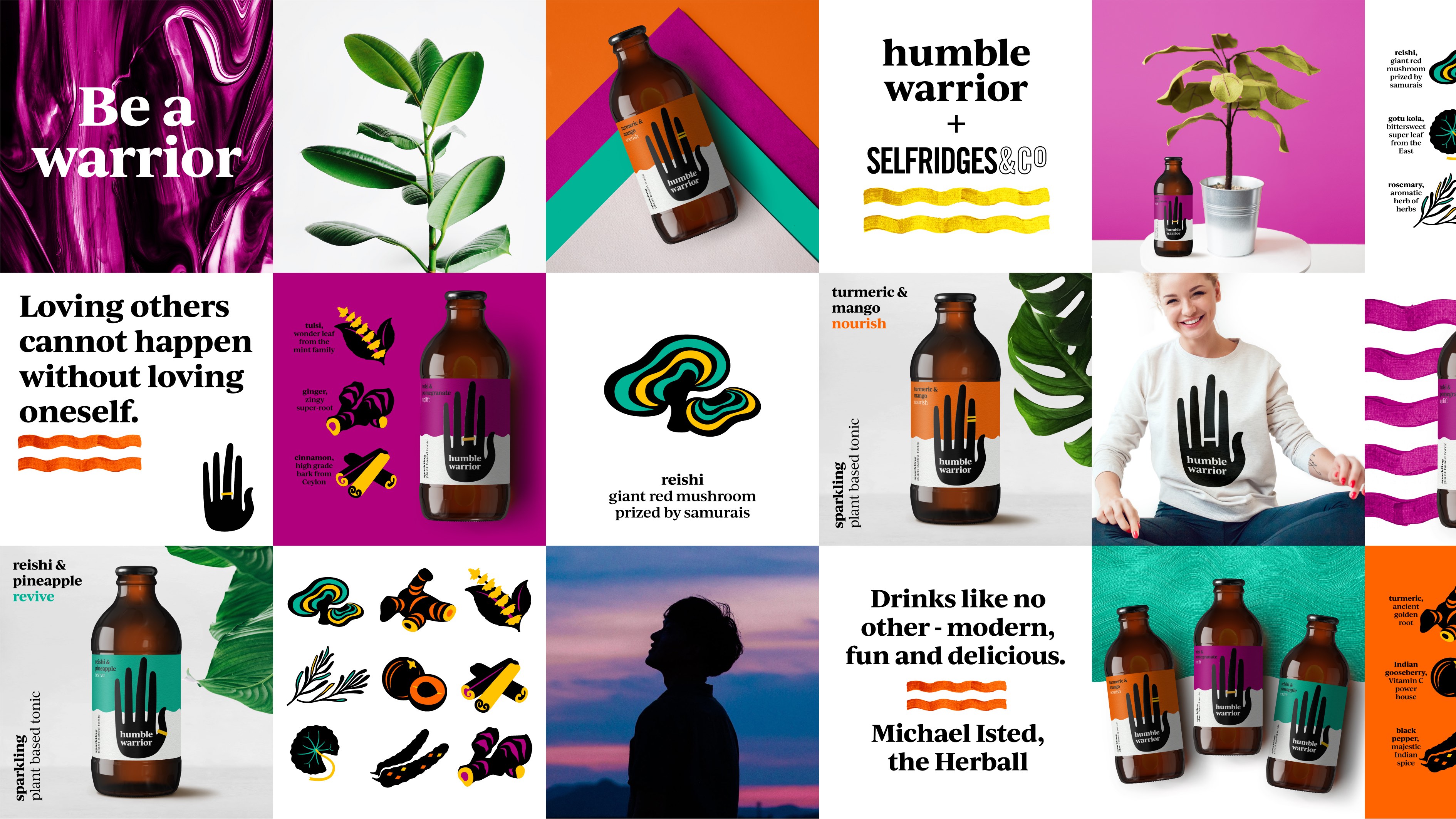
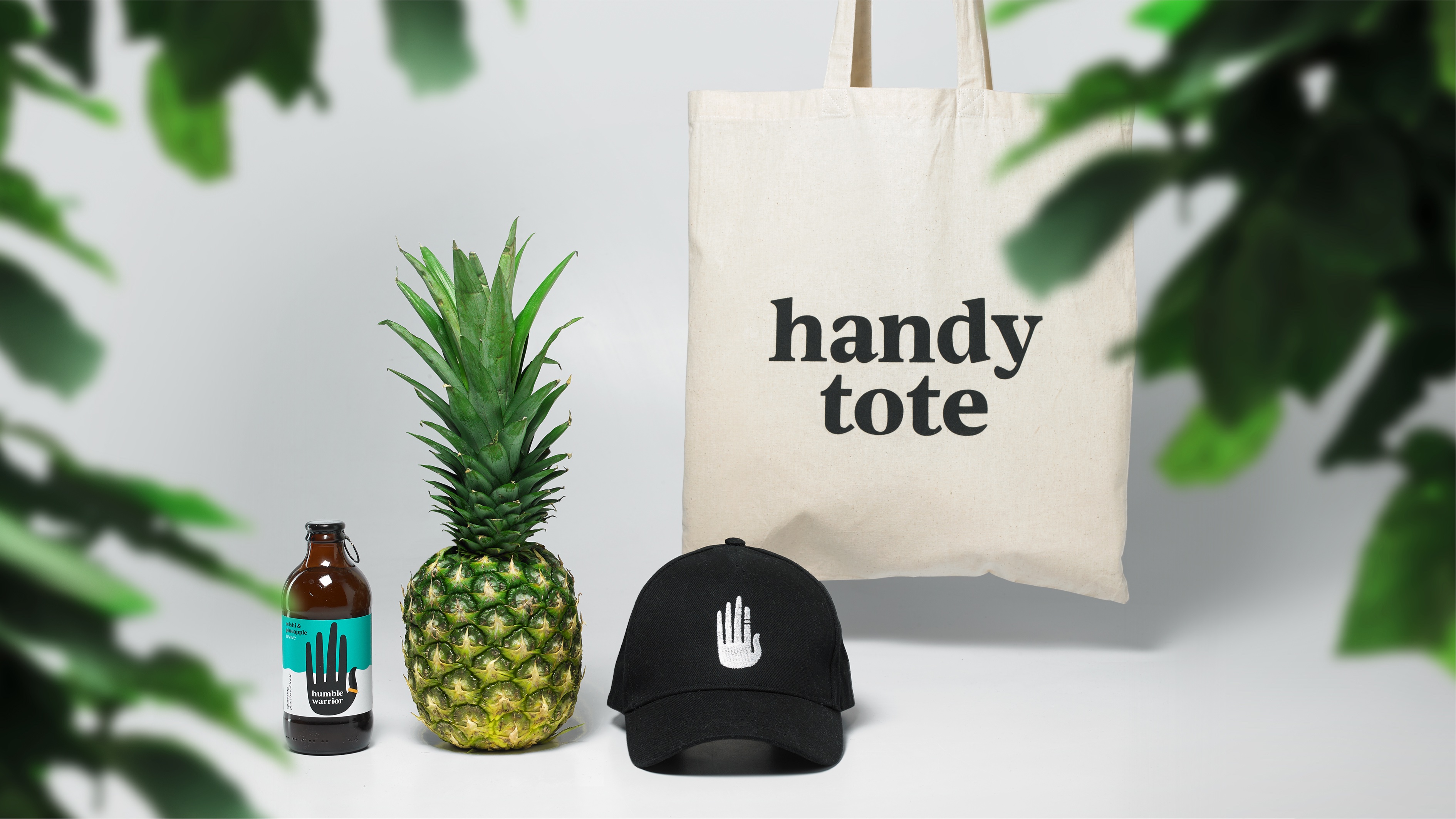
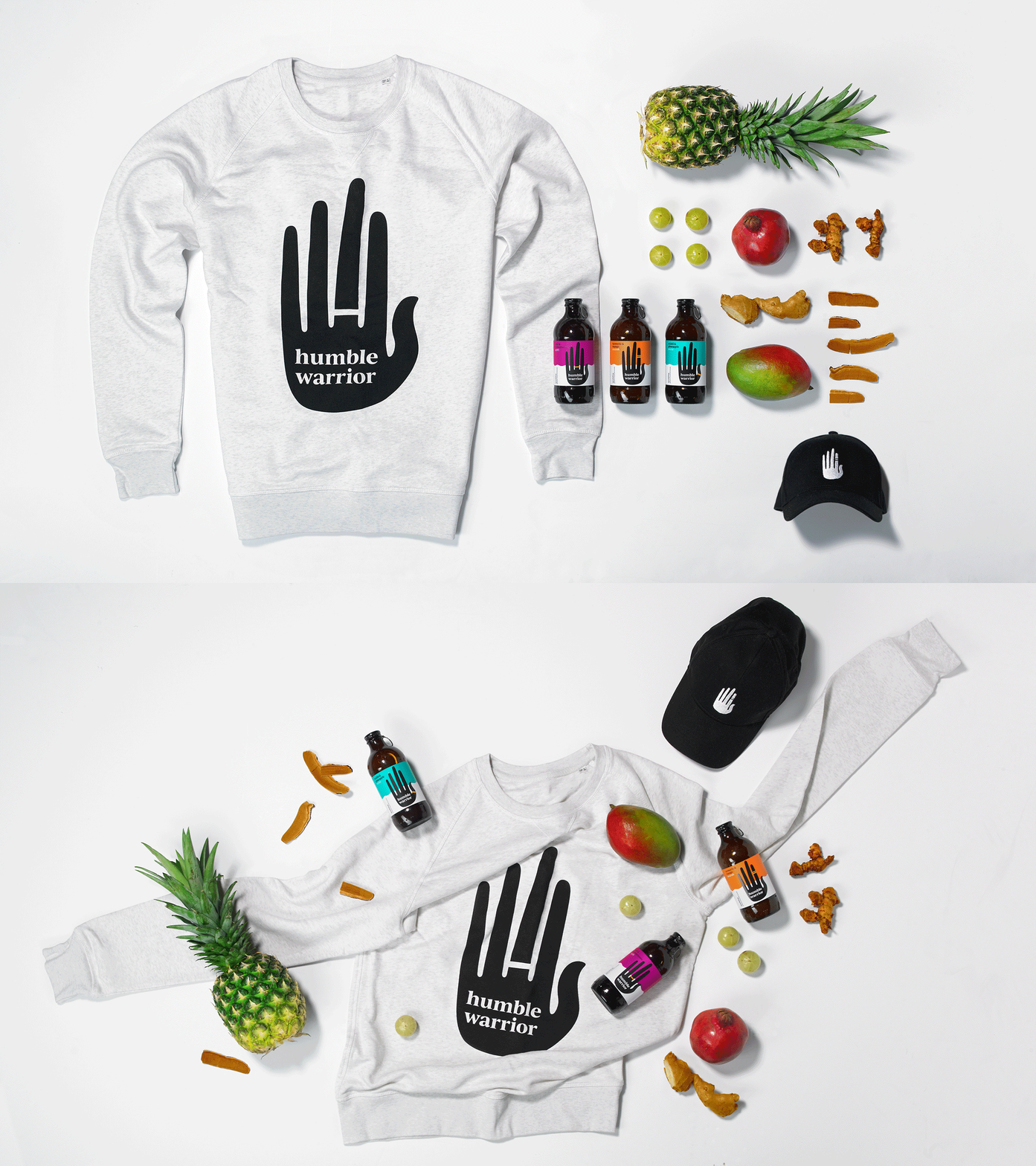
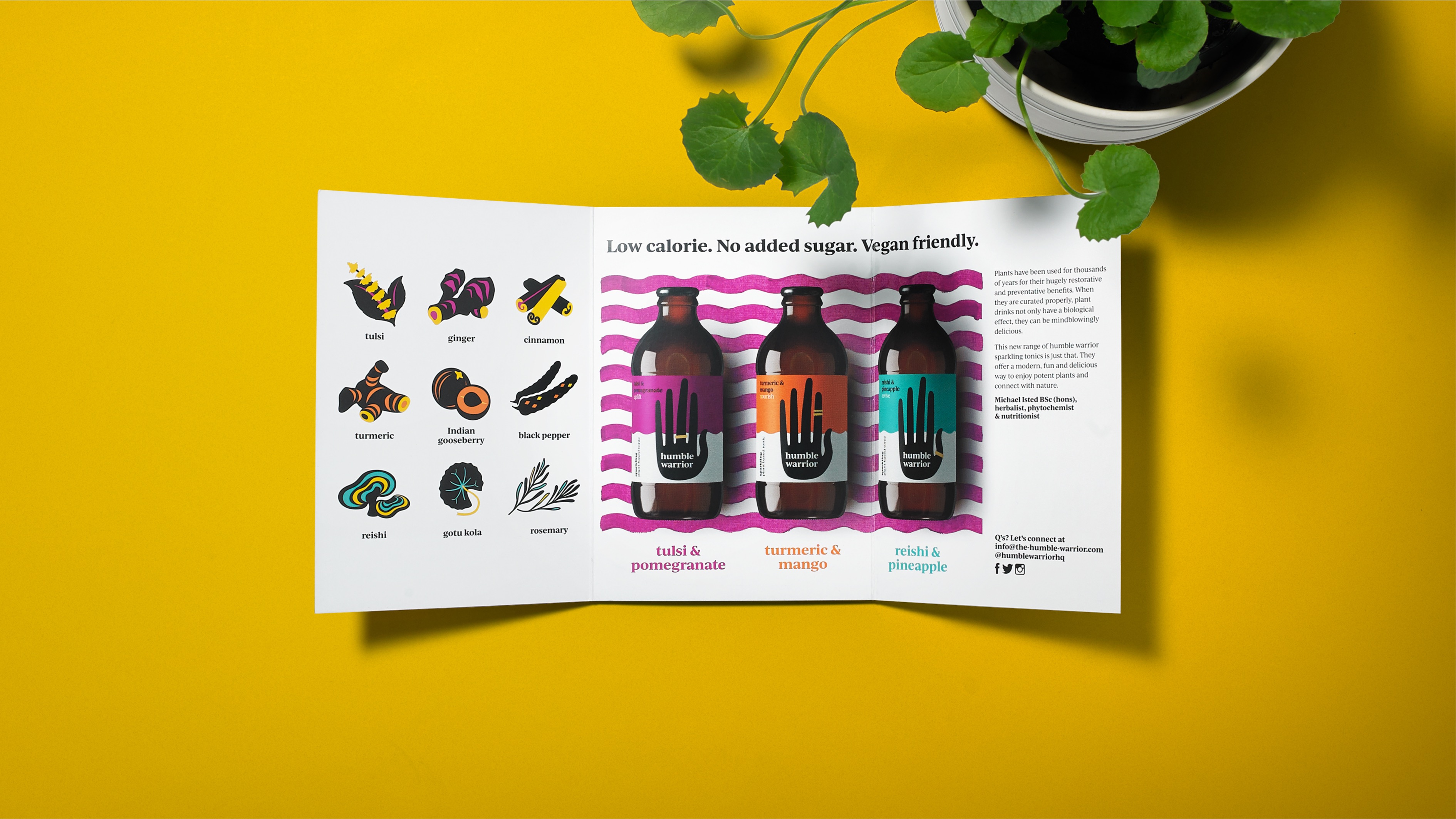
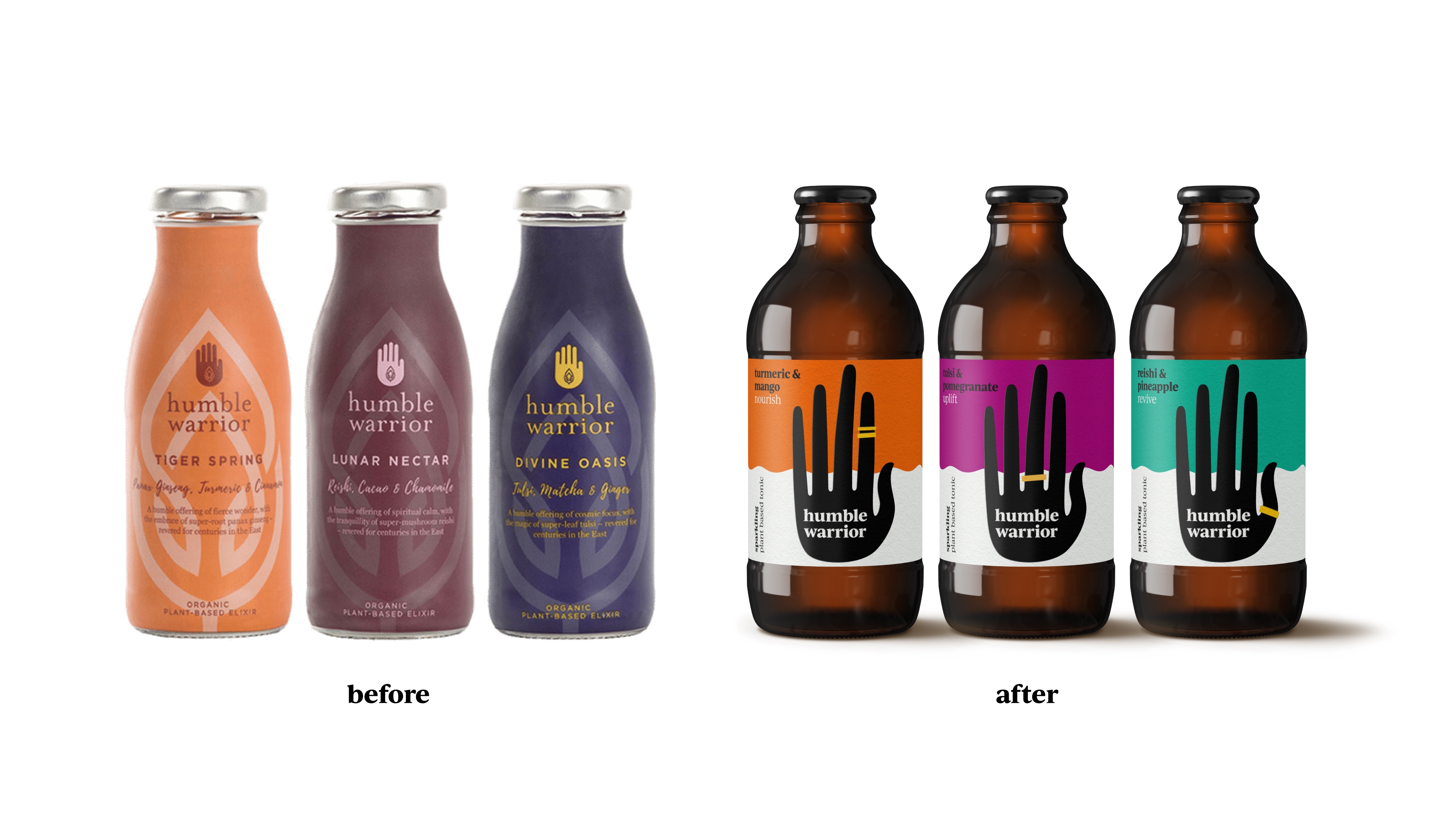
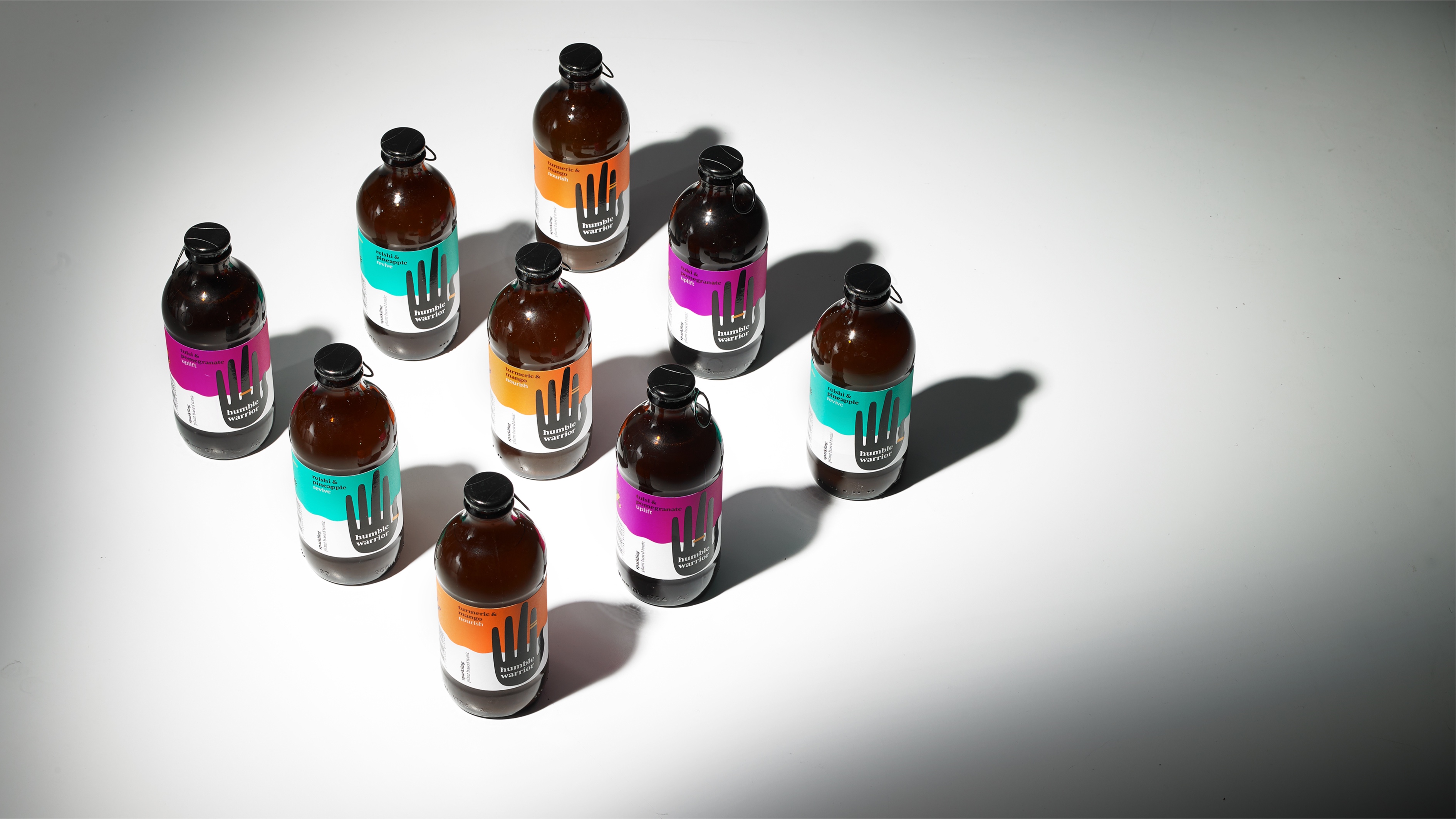
All-natural plant tonics with a gentle spirit and a kick-ass taste, Humble Warrior wanted a rebrand that gave a positive high five to their character.
We led with the Abhayamudra icon – a hand gesture signifying protection, peace, benevolence, and the dispelling of fear – and a flexible, playful and colourful identity that packs a (kind, loving) punch.
CREDIT
- Agency/Creative: Derek&Eric
- Article Title: Humble Warrior Rebrand
- Organisation/Entity: Agency, Published Commercial Design
- Project Type: Packaging
- Agency/Creative Country: United Kingdom
- Market Region: Europe
- Project Deliverables: Brand Identity, Brand Redesign, Brand Strategy, Branding, Graphic Design, Identity System, Illustration, Packaging Design, Rebranding, Research, Tone of Voice
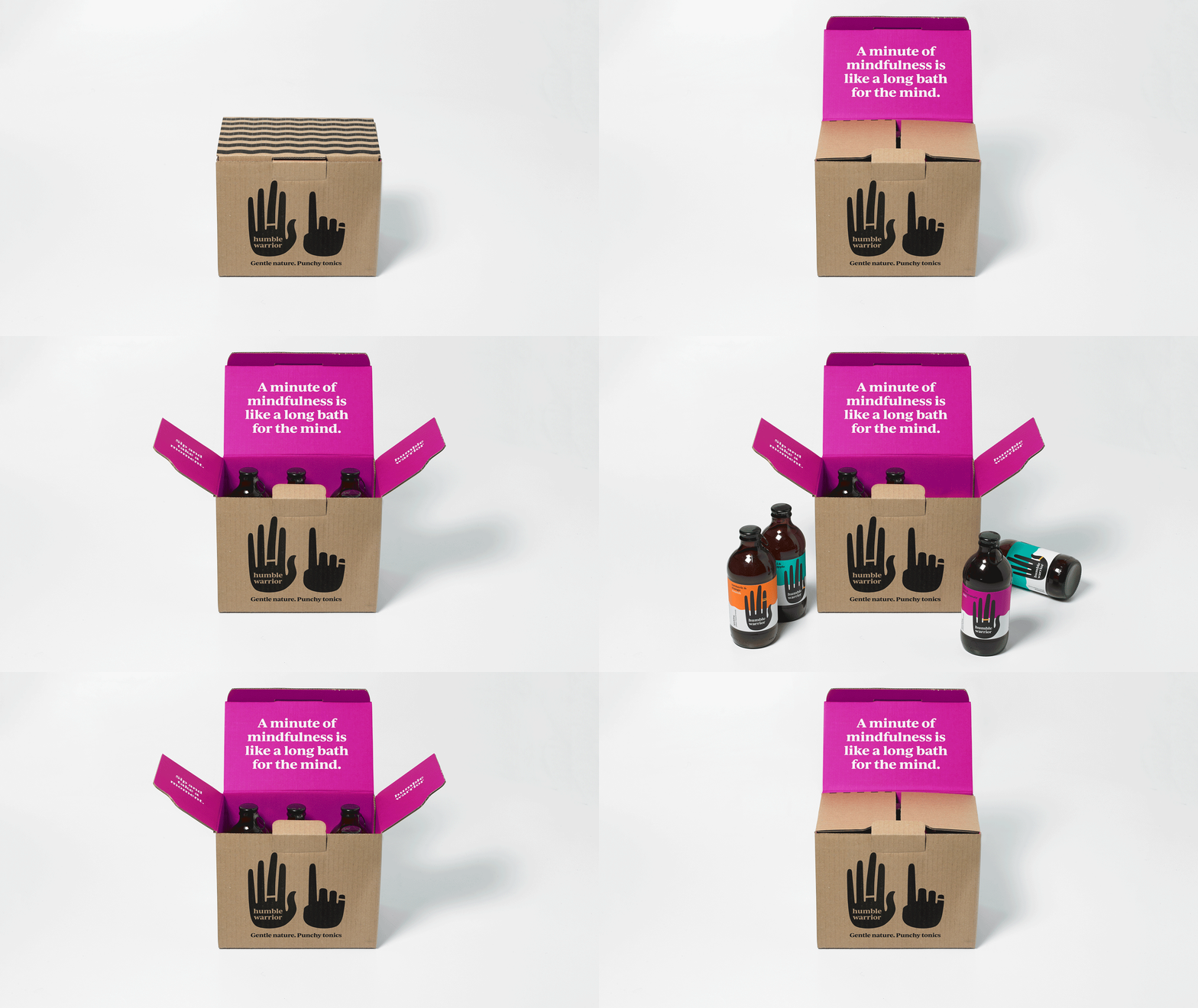
- Format: Bottle, Box
- Substrate: Glass, Glass Bottle, Metal, Pulp Board
FEEDBACK
Relevance: Solution/idea in relation to brand, product or service
Implementation: Attention, detailing and finishing of final solution
Presentation: Text, visualisation and quality of the presentation


