Growing “redondilla” variety olive trees in La Rioja Alta, at an altitude of 654 m, with cold and long winters and short summers and, last but not least, organic, is, as the producers themselves admit, a risky bet, which undoubtedly it requires the collaboration of nature itself.
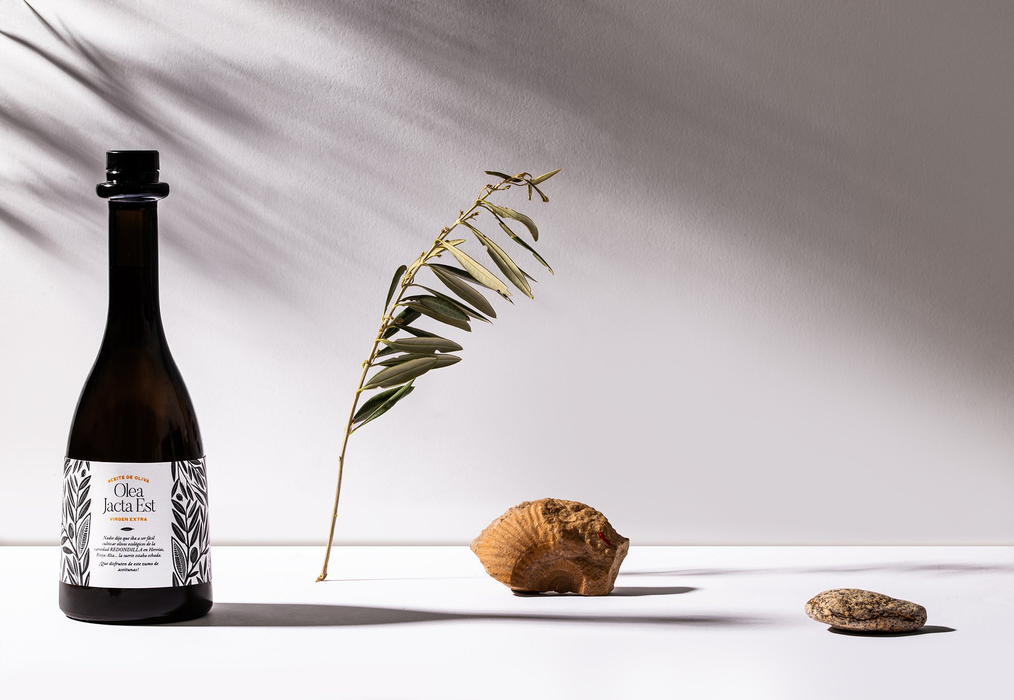
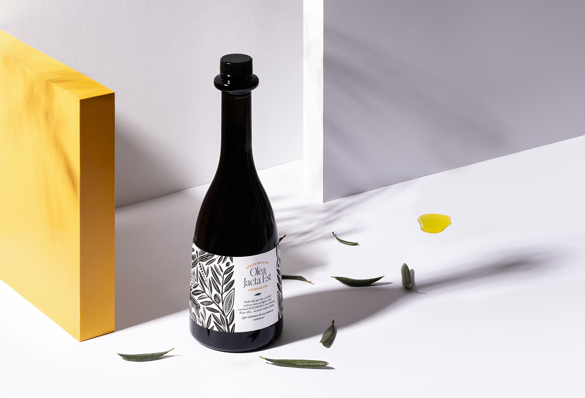
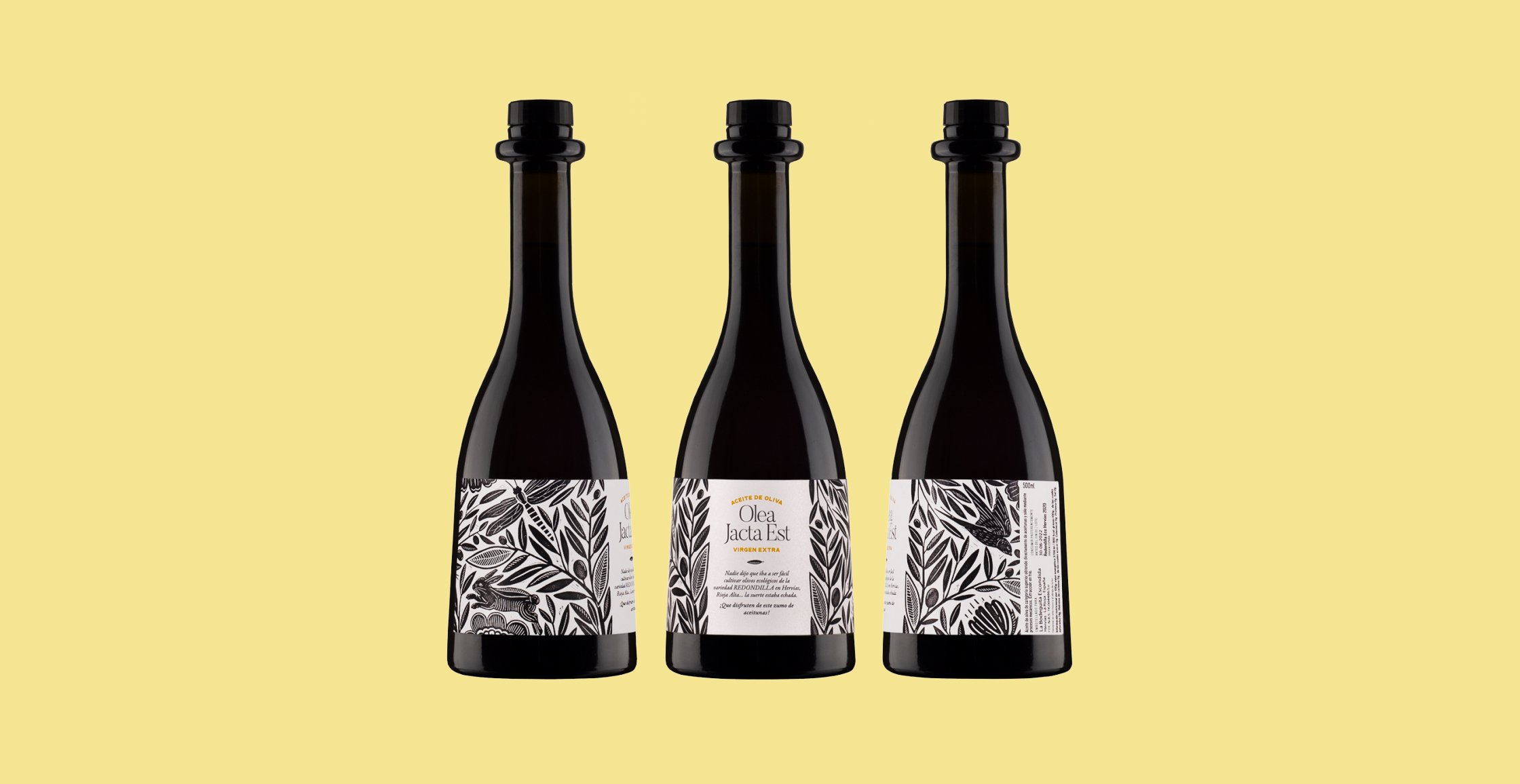
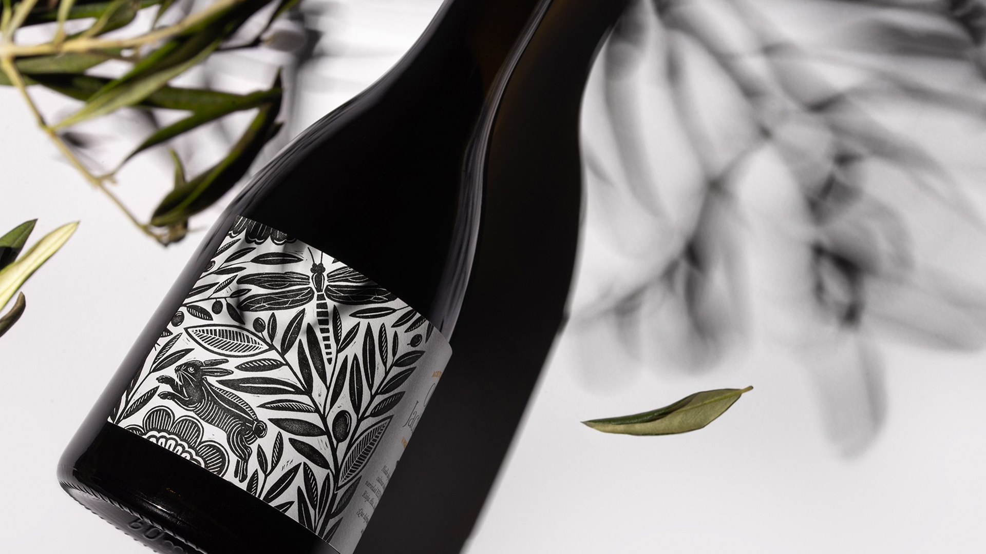
These circumstances were the ones that motivated us to design a label in which the coexistence between the olive trees, grown organically, and the nature of their environment, was represented by the main illustration.
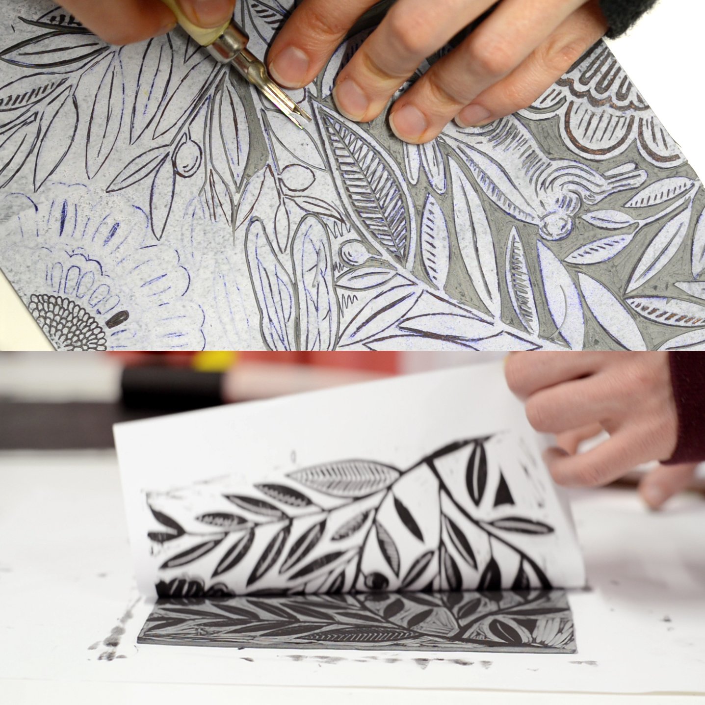
To make the illustration, we resort to this engraving technique, which brings analog finishes to the design, in which error and the trace of craftsmanship, as opposed to the “perfection” of digital finishes, result in an image that is very richer, perceived by the consumer as the image of a product ‘with soul’.
About linocut: Linocut, also known as lino print, lino printing or linoleum art, is a printmaking technique in which a sheet of linoleum is used for a relief surface. A design is cut into the linoleum surface with a sharp knife, V-shaped chisel or gouge, with the raised (uncarved) areas representing a reversal (mirror image) of the parts to show printed. The linoleum sheet is inked with a roller (called a brayer), and then impressed onto paper or fabric. We used this linocut technique for the packaging design for Olea Jacta Est’s olive oil. The fluid and organic design style was intentionally chosen to represent the nature of the olive trees’ environment and the fact that they are organically grown.
CREDIT
- Agency/Creative: Hula Estudio
- Article Title: Hula Estudio Create Olive Oil Label Design for Olea Jacta Est
- Organisation/Entity: Agency
- Project Type: Packaging
- Project Status: Published
- Agency/Creative Country: Spain
- Agency/Creative City: Logroño
- Market Region: Global
- Project Deliverables: Graphic Design, Packaging Design
- Format: Bottle
- Substrate: Glass Bottle
- Industry: Food/Beverage
- Keywords: Olive oil, packaging, linocut, illustration
-
Credits:
Creative Director: Hula Estudio


